1,132 search results
(0.057 seconds)
- HG Soei Kakugothic by RICOH,
$199.00 HG創英角ゴシックLは、極細のゴシック体で、創英企画によるデザインです。シンプルな線で構成された現代的なゴシック体で、仮名が大きめに作られていて、全体的な印象はとても明るくカジュアルです。HG創英角ゴシックUBは、極太のゴシック体で、水本恵子氏のデザインです。仮名はHG創英角ゴシックLと比較すると小さめに設計されていて、現代的でありながらも、フォーマルさも合わせもっています。
 - Windsor by URW Type Foundry,
$35.99 Windsor is an unusual design cut by Stephenson Blake in 1905. Windsor is a bold face with heavy rounded serifs and strong diagonal stress. Capitals M and W are widely splayed, P and R have very large upper bowls. The Lowercase a h m and n of the Windsor font have angled right hand stems, e has an angled cross-stroke. The overall effect is one of friendliness and warmth. Use the Windsor font in advertising, on posters and for general display work.
 - Windsor by Monotype,
$40.99 Windsor is an unusual design cut by Stephenson Blake in 1905. Windsor is a bold face with heavy rounded serifs and strong diagonal stress. Capitals “M” and “W” are widely splayed, “P” and “R” have very large upper bowls. The Lowercase “a”, “h” “m” and “n” of the Windsor font have angled right hand stems, “e” has an angled cross-stroke. The overall effect is one of friendliness and warmth. Use the Windsor font in advertising, on posters and for general display work.
 - HG Heisei Minchotai by RICOH,
$199.00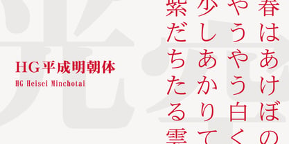 平成明朝体は、ワープロやDTPの普及にともなうフォント需要の高まりに対して供給が遅れていたため、文字フォント開発・普及センターの指揮のもと、製作された、本文用の明朝体です。デザインは、リョービイマジクスが担当。横組み適性を考慮し、視覚的重心が低めになっています。可読性のため、ふところは広めに、また、低解像度出力機での使用を考慮し、直線を多用したシンプルなデザインになっています。
 - Omekashi Font Pro by Norio Kanisawa,
$15.00 I thought that "Anyway cute fonts!", Fancy fonts with pops decorated gorgeous cute illustrations. I tried dressed on the letters as well as wearing my favorite clothes when going out. Although it is lacking in readability, I think whether it is fun to use colors or use them pointwise. Since the decoration is different each character, animals are found in various places, ribbons, hearts, and foods are decorated, so it may be interesting to see it one character at a time. It would be greatly appreciated if you use it, or who looked at it could feel a little happy. <「おめかしふぉんとPro」紹介文> 「とにかくかわいいフォントを!」と思って、文字をかわいいイラストでごてごて派手に飾ったポップでファンシーなフォントです。 お出かけの際にお気に入りの服を着ておめかしをするように、文字にもおめかしをしてみました。 可読性には欠けますが、色を塗ってみたりポイント的に使うと面白いかと思います。 一文字ずつ装飾が違っており、色んなところに動物がいたりリボンやハート、食べ物でデコレーションされているので、一文字ずつ見るのも面白いかもしれません。 使ってくださる方、見てくださる方が少しでも幸せな気分になれれば幸いです。 <スタイルカテゴリー> ファンシー、装飾
 - K&T Martine by K and T,
$70.00 This is an angular typeface inspired by axonometric construction diagrams (for flat-pack furniture), particularly the way their lines impart a sense of 3-D space. The horizontal, vertical, and diagonal constraints of stroke direction produce interesting results in characters such as the 'R', 'S', and 'V' and contribute the mechanical appearance of this typeface. There is a high degree of repetition amongst different characters (upper and lower case) for instance the ’M’ and ‘W’ are similar and so are the ’m’ and ‘w’.
 - Greycliff CF Japanese CF by Connary Fagen,
$35.00 Greycliff Japanese CF is a Japanese-script adaptation of the original Greycliff CF sans serif typeface. The warm, geometric design includes full suite of 9 weights for beautiful dual-language applications. All 3,220 glyphs – covering hiragana, katakana, Joyo kanji, and romaji – were hand-drawn with a careful eye for detail. All Joyo kanji are included. Future updates will add rare name and geographic kanji. グレイクリフは、すでにリリースしている Greycliff CF サンセリフ書体にひらがなや漢字などの日本語が新しく追加されたフォントです。 大きな特徴として、グレイクリフ日本語フォントはローマ字(ラテン文字)のフォントデザインと統一されたバランスのとれたモダンな美しいデザインになっています。 フォントの太さは細字(Thin)から超極太字(Heavy)までの9種類を揃えており、幅広い用途に使用することができます。 ・合わせて約3,220文字を収録しています。 ・ひらがなとカタカナのフルセット ・常用漢字をすべて収録しました(~2136文字)。 今後のアップデート: ・すべての人名漢字を収録予定 ・地名になどに使用される漢字を収録予定
 - Nud Motoya Cedar by Motoya,
$229.00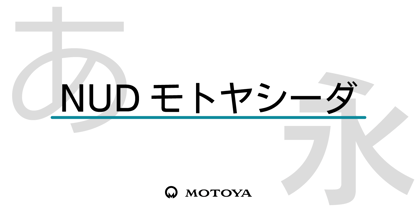 モトヤ書体は活字時代から培った理念により、文字の美しさと優れた可読性を備えており、本来的にユニバーサルデザイン性を有しています。このように、もともとユニバーサルデザインを意識して開発を行ったモトヤフォントですが、社会状況の変化に伴って、より一層の改良を加えて誕生したのがモトヤUD対応フォントです。モトヤUD対応フォントは、可読性・視認性・判読性を併せ持っていますので、あらゆる分野のご使用に自信を持ってお勧めいたします。
 - Nud Motoya Aporo by Motoya,
$229.00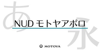 モトヤ書体は活字時代から培った理念により、文字の美しさと優れた可読性を備えており、本来的にユニバーサルデザイン性を有しています。このように、もともとユニバーサルデザインを意識して開発を行ったモトヤフォントですが、社会状況の変化に伴って、より一層の改良を加えて誕生したのがモトヤUD対応フォントです。モトヤUD対応フォントは、可読性・視認性・判読性を併せ持っていますので、あらゆる分野のご使用に自信を持ってお勧めいたします。
 - Nud Motoya Maru by Motoya,
$229.00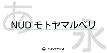 モトヤ書体は活字時代から培った理念により、文字の美しさと優れた可読性を備えており、本来的にユニバーサルデザイン性を有しています。このように、もともとユニバーサルデザインを意識して開発を行ったモトヤフォントですが、社会状況の変化に伴って、より一層の改良を加えて誕生したのがモトヤUD対応フォントです。モトヤUD対応フォントは、可読性・視認性・判読性を併せ持っていますので、あらゆる分野のご使用に自信を持ってお勧めいたします。
 - Nud Motoya Mincho by Motoya,
$229.00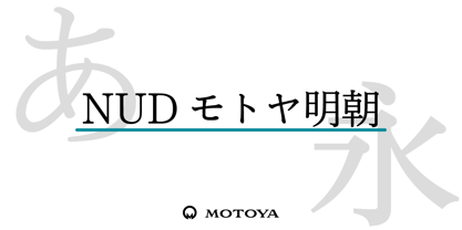 モトヤ書体は活字時代から培った理念により、文字の美しさと優れた可読性を備えており、本来的にユニバーサルデザイン性を有しています。このように、もともとユニバーサルデザインを意識して開発を行ったモトヤフォントですが、社会状況の変化に伴って、より一層の改良を加えて誕生したのがモトヤUD対応フォントです。モトヤUD対応フォントは、可読性・視認性・判読性を併せ持っていますので、あらゆる分野のご使用に自信を持ってお勧めいたします。
 - Iwata Gyousho Pro by IWATA,
$199.00 楷書と草書の中間的な筆法の書体です。 字体を崩しすぎず、読みやすくなるようデザインしています。
 - Iwata Gyousho Std by IWATA,
$149.00 楷書と草書の中間的な筆法の書体です。 字体を崩しすぎず、読みやすくなるようデザインしています。
 - SF Olive by Fonts66,
$16.00 The font for illustrations. Ideal for moving expressions. イラスト風味のフォントの発想から、形の単純な葉のイメージのエレメントを使い読む文字というより、楽しさを感じるフォントにしました。 写真やイラストカードに添えると柔らかな雰囲気がなじみ軽い雰囲気が得られます。 ダンスは風に吹かれたようなスウィングしているような文字です。
 - Magnificent - Personal use only

- SF Cross by Fonts66,
$16.00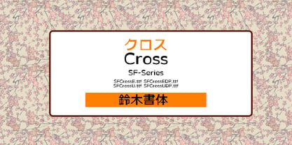 Expressive style for logos and eye catches, titles. 表現力の強い書体。ロゴやアイキャッチ、タイトルに最適。 縦画と横画の太さがほぼ同じのゴシック体の基本を崩して、太さをアトランダムに組み合わせデザインしたのがクロスです。 おやっと思わせるスタイルがアッピール度を高めてアイキャッチを生かしたロゴタイプやヘッドラインなどに適しています。 DPは仮名を大きくし多セットでより強い印象になります。
 - Iwata Reisho Std by IWATA,
$149.00 中国で古くから使用されていた伝統的な隷書を源流にする「イワタ隷書体」と、 新しい感覚の「イワタ新隷書体」の2種類があります。
 - Iwata Reisho Pro by IWATA,
$199.00 中国で古くから使用されていた伝統的な隷書を源流にする「イワタ隷書体」と、 新しい感覚の「イワタ新隷書体」の2種類があります。
 - Iwata New Reisho Std by IWATA,
$149.00 中国で古くから使用されていた伝統的な隷書を源流にする「イワタ隷書体」と、 新しい感覚の「イワタ新隷書体」の2種類があります。
 - Iwata New Reisho Pro by IWATA,
$199.00 中国で古くから使用されていた伝統的な隷書を源流にする「イワタ隷書体」と、 新しい感覚の「イワタ新隷書体」の2種類があります。
 - SWEM - 100% free

- Omekashi Emoji by Norio Kanisawa,
$12.00 This is Emoji font(Dingbat), contains many cute motif like animals, heart, ribbon, foods, fashion goods. I think you can use it for decorate contents for children, and use web font as icon. You can use as it is, I think that you can paint the color inside. It might be interesting even if you hang a hat or put on a ribbon by combining several characters like a sample. I make it will be cute, and you use it with happy feeling, I will be happy if you think so. <「omekashiemoji」紹介文> 動物やハートやリボン、食べ物、ファッション小物などかわいいモチーフがたっぷりな絵文字フォントです。 子供向けコンテンツの装飾に使ったり、webフォントをアイコンとして使ってもいいんじゃないかなと思います。 そのまま使ってもいいですし、中に色を塗ってもいいと思います。サンプルのように数文字組み合わせて帽子を被せたり、リボンをつけたりしても面白いかもしれないです。 かわいくなるように、使って楽しい気分になれるようにとの思いを込めて作りました。 その思いが少しでも伝われば幸いです。 <スタイルカテゴリー> 絵文字、Dingbat <価格> 税抜1200円
 - Slowglass by Adam Jagosz,
$29.00 Slowglass is a geometric semi-serif accompanied by geohumanist italics. Softly rounded edges lend it a friendly tone. The typeface includes two categories of stylistic alternates, available as font features as well as complementary font subfamilies. Text forms for increased legibility (Slowglass Text) and uncial-inspired unicase variants (Slowglass Alt). At over 1500 glyphs per weight, the fonts support 80+ Latin-based languages (incl. Vietnamese), 14 Cyrillic-based languages and polytonic Greek. OpenType features: Six sets of figures: proportional / tabular × oldstyle / lining / petite (ss20) Superscript and subscript figures Fractions, numerators, denominators Optional slashed zero Case-sensitive forms Glyph composition/decomposition (support for Navajo and Greek) Localization (Dutch, Marshallese, Bulgarian) Stylistic Sets: ss01 Roman: Two-story a, loopy α / Italic: Loopy α ss02 Roman: Simple g / Italic: Simple k ss03 Unicase r ss04 Alt f t г п т γ ss05 Descending η χ ss06 Unicase β ζ θ ξ ss07 Alt в г д ж з к п т ю ss08 Latinized ς, cursive и й ss09 Round Δ Λ Д д Л л Љ љ ss10 Full-stem a q ss11 Seriffed I ss12 Unicase A ss13 Unicase E Ω ss14 Descending F T Г П ss15 Descending G P Q Y ss16 Unicase M N И H Y ss17 Extending Φ Ψ ss20 Petite figures
 - Tranceform - 100% free

- Hetilica - Personal use only

- Iwata News Gothic NK Pro by IWATA,
$309.00 数多くの新聞社で使われてきた伝統ある「岩田新聞呉竹体」を再現した「イワタ新聞ゴシック体」と、かなを現代風にアレンジした「イワタ新聞ゴシック体新がな」があります。
 - Iwata News Gothic NK Std by IWATA,
$199.00 数多くの新聞社で使われてきた伝統ある「岩田新聞呉竹体」を再現した「イワタ新聞ゴシック体」と、かなを現代風にアレンジした「イワタ新聞ゴシック体新がな」があります。
 - Iwata News Gothic Std by IWATA,
$199.00 数多くの新聞社で使われてきた伝統ある「岩田新聞呉竹体」を再現した「イワタ新聞ゴシック体」と、かなを現代風にアレンジした「イワタ新聞ゴシック体新がな」があります。
 - Seibi Minato by Nihon Literal,
$169.00 Designed for the covers of children’s literature and picture books, this is a freehand-style, rounded gothic typeface that conveys warmth and softness. It has also been sold as a font for use in game software. 児童書や絵本の表紙向けにデザインされた、あたたかさややわらかさを表現したい場面で使われるフリーハンド(手書き風)書体です。ゲームソフトなどに組み込まれるフォントとしての販売実績もあります。右肩上がりのリズミカルなフリーハンドタッチで、ヨコ組タテ組どちらでも読みやすく組むことができます。
 - Iwata News Mincho Std by IWATA,
$199.00 数多くの新聞社で使われてきた伝統ある「岩田新聞明朝体」を再現した「イワタ新聞明朝体」と、かなを現代風にアレンジした「イワタ新聞明朝体新がな」があります。
 - Iwata News Mincho NK Pro by IWATA,
$309.00 数多くの新聞社で使われてきた伝統ある「岩田新聞明朝体」を再現した「イワタ新聞明朝体」と、かなを現代風にアレンジした「イワタ新聞明朝体新がな」があります。
 - Iwata News Mincho NK Std by IWATA,
$199.00 数多くの新聞社で使われてきた伝統ある「岩田新聞明朝体」を再現した「イワタ新聞明朝体」と、かなを現代風にアレンジした「イワタ新聞明朝体新がな」があります。
 - MC Twinkle Star - Unknown license

- Seibi Ohkido by Nihon Literal,
$169.00 It is a font based on "yose-style characters" used in entertainment during the Edo period for signboards and the rankings of rakugo performers and flyers to attract customers. Kanji in the original yose-style characters is balanced with kana, and is made easier to read by controlling brushstrokes at oblique angles, rising to the right. While the font is arranged in a contemporary style tailored to both horizontal and vertical typesetting, you can still enjoy the essence of handwritten yose-style characters. 江戸時代に使用された演芸文字で落語の看板や番付、客寄せのビラに使用された「寄席文字」をベースにした書体です。寄席文字は舞台芸能で使われる勘亭流と、提灯や半纏に使われた字体の折衷で生まれた文字といわれ、「枠いっぱいに墨たっぷりの太い線でフトコロ(隙間)を埋めて書く= 空席がないように」「右肩上がりに書く= ますます盛況に」と縁起を担いだ装飾文字です。セイビオオキドは、手書きレタリングから引き継がれた寄席文字です。寄席文字本来の漢字とかなのバランスの違いを整え、右肩あがりもおさえて読みやすく、タテヨコでも組みやすく現代風にアレンジしていますが、手書きの寄席文字のような組みができます。
 - POP - Unknown license

- Hachi Maru Pop by Norio Kanisawa,
$40.00 It is a cute font that imaged a circle that was popular among young Japanese girls in the 1970s and 1980s, plus elements of the current round character as well. The momentum of the circle fads of the 70s and 80s back then seemed to have been great, and it seems that there were schools that prohibited the use of the round letters as students were all writing, too. In addition, a circular letter contest was held, and it seems that the work selected from many entries was released as a phototype. I tried to round up to the limit while incorporating the elements of that circle and the elements of the round letters that the current Japanese girls would write. It corresponds to Hiragana · Katakana · Alphabet · Numerals · Symbols · Kanji(chinese characters). You can also write vertically. You can use it easily, because it contains JIS first · second level, and IBM extended Kanji(about 6700chinese characters). I think that it is an eye-catching design although it lacks a little on readability, so it is also recommended to use it point-wise. The name "Hachimaru" is a thing that touched "80" in the 1980s. The 80s is one of my favorite times. I think that the power to young girls 'Kawaii' such as circle letters, fancy goods and idols was a very strong era. I hope I can express even a little "Kawaii" culture of that unique and unique 80's Japan. <「はちまるポップ」紹介文> 1970年〜80年代に、日本の若い女の子の間で流行した丸文字をイメージし、現在の丸文字の要素もプラスしたかわいいフォントです。 70〜80年代当時の丸文字の流行の勢いは凄かったらしく、学生さんもみな書いていたそうで、丸文字の使用を禁止する学校もあったそうです。 また、丸文字のコンテストが行われ、多数の応募から選ばれた作品が写植書体としてリリースされたこともあるそうです。 その丸文字の要素と、現在の日本の女の子が書くような丸文字の要素も取り込みながら、極限まで丸っこくしてみました。 ひらがな・カタカナ・アルファベット・数字・記号類・漢字に対応しており、縦書きもできます。 漢字はJIS第一水準・第二水準・IBM拡張漢字に対応(約6700文字)しているので、使い勝手も良いかと思います。 可読性には少々欠けますが目を引くデザインだと思うので、ポイント的に使うのもオススメです。 名称の「はちまる」は80年代の「80」をもじったものです。 80年代は私の好きな時代の1つです。丸文字をはじめ、ファンシーグッズやアイドルなど、若い女の子の「かわいい」へのパワーがとても強い時代だったんだなぁと思います。 その個性的で独特な80年代日本の「かわいい」カルチャーを少しでも表現できてればいいなぁと思います。 <スタイルカテゴリー> 手書き風、丸ゴシック
 - Promocyja - Unknown license

- HG Kyokashotai by RICOH,
$199.00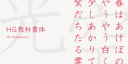 HG教科書体は、日本活字工業の「日活教科書体」を字母とする教科書体で、児童の教科書などの使用が想定される書体です。筆で書いた文字をもとにしていますが、太さはやや細めです。伸びやかで、格調高いデザインの書体で、フォーマルな場面に合います。手書きの要素が強くコントラストも高めなので、小さいサイズでの長文に使用するよりは、それなりのサイズで、かつ、あまり長めでない文章に使用するほうがいいでしょう。
 - Ame Chan Pop Maru by Norio Kanisawa,
$40.00 I make this font imaging rounded candy, this theme is cute and round but you can use scenes less often. Because the circle is interrupted in places such as voiced points and parts of kanji(chinese characters), it may be fun to look for it. It corresponds to Hiragana · Katakana · Alphabet · Numerals · Symbols · Kanji(chinese characters). You can also write vertically. You can use it easily, because it contains JIS first · second level, and IBM extended Kanji(about 6700chinese characters). This font is bold, recommended to use it for headlines and prominent places. It might be good for shop pop etc. Because it is soft, pop and cheerful impression, I recommend it for contents for children. About the name, I like Osaka, and I thought "This font's name that is loved by everyone", and since the sound is also cute, I attached the word "Amechan". I heard they called candy as "Amechan" in Osaka, and some madam in Osaka always have candy, and give it to people. I think this font gives happy feeling to you and people look it, like madam in Osaka gives "Amechan". <「あめちゃんポップ まる」紹介文> ころころ丸っこい飴玉をイメージして、「丸くてかわいいけどシーンをあまり選ばずに使えるフォント」をテーマに作りました。 濁点や漢字の一部など、所々に丸がまぎれてますので、探してみるのも楽しいかもしれません。 ひらがな・カタカナ・アルファベット・数字・記号類・漢字に対応。縦書きもできます。 漢字はJIS第一水準・第二水準・IBM拡張漢字(約6700文字)に対応しているので、使いやすいかと思います。 太めのフォントなので、見出しや目立つ場所に使うのがオススメです。お店のポップなどにもいいかもしれません。 柔らかくポップで元気な印象なので、子供向けのコンテンツにもオススメします。 名称については、大阪が好きなのと「皆に愛されるような名前を」と思って、響きも可愛いので「あめちゃん」という単語を名前につけました。 大阪では飴のことを「あめちゃん」と言うらしく、大阪のおばちゃんの中にはいつも飴を持っている方もいるそうで、色んな人にその飴をあげるそうです。 大阪のおばちゃんが「あめちゃん」をくれる時みたいに、使ったり見てくださる方の心があったかくなるようなフォントになればいいなぁ、と思います。 <スタイルカテゴリー> ファンシー、装飾
 - Galaxus by Sharkshock,
$115.00 Galaxus is an edgy display font defined by its tight spacing, sleekness, and short descenders. Curvature is limited throughout the character set with straightened lines dominating the interior. Traditional diagonals in capitals like M, N, W and Y are given the straight treatment to maintain vertical emphasis. This styling along with the contrast between thick and thin make for a unique look. Galaxus would work well in a logo, on sports apparel, or in a video game. This family is equipped with Basic Latin, Extended Latin, diacritics, punctuation, kerning, and comes in 4 versions.


