1,132 search results
(0.018 seconds)
- M Ling Wai TC by Monotype HK,
$523.99 - M Elite Hei HK by Monotype HK,
$523.99 M Elite Hei HK is a graphic style Traditional Chinese typeface. Graphic font designs have strong personalities and visual impact. Graphic style Traditional Chinese fonts feature decorative elements and pronounced graphics characteristics, suitable for catching attention in display applications.
 - M Young Hei PRC by Monotype HK,
$523.99 M Ying Hei™ is designed by type designer Kenneth Kwok and Robin Hui. Unnecessary details have been eliminated to pursue a minimal form. The structure of characters are well balanced, neat and dignified. Different components of a character are cooperating perfectly in an appropriate proportion. Thickness of strokes are modified according to the number of strokes, thus achieving an even texture throughout the paragraphs. Therefore a perfect choice for prints, user interface and signages. M Ying Hei™ is equipped with 7 weights, which is sufficient for various occasions like matching with different Latin typefaces and handling complex information hierarchy.
 - OCR-B Letterpress M by URW Type Foundry,
$35.00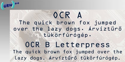
- M Ling Wai SC by Monotype HK,
$523.99 - M Zhi Ngai PRC by Monotype HK,
$523.99 Zhi series is inspired from vertical shop banners/signages from Japan, where each banners is attached to a slim simple structured skeleton. M Zhi Ngai™ takes reference from M Zhi Hei’s straightforwardness and masculinity but inserted plenty of ornaments and gentleness. Featuring a strong thick–thin contrast in the strokes, the typeface looks bright, smart and contemporary, suitable for promotional materials and more other media.
 - M Banquet P PRC by Monotype HK,
$523.99 M Banquet is a humanistic script written by a Chinese restaurant owner, which the name ‘Banquet’ comes from. It is a calligraphic style that always being seen in traditional Chinese banquet menu. Incorporated a feeling of masculinity, fill with strength and energy and attracts eyeballs of customers. It was written with a thin ball pen in a unique, personal and expressive writing style, such that it is realistic, natural and masculine. Contrast of strokes is low and the text is visible and eye-catching. Its light to medium stems (豎) make it suitable for small text to subheading with little conglutination. All strokes are irregular, inconsistent, irregularly oriented and tightly coupled. Spatial distribution, positioning, size and relative proportion of radicals fully reflect a natural and personal style. It is one of the few proportional-width font in a full scale. It is best suited for casual lively atmosphere, illustrations, set upright (non-slanted), non-condensed.
 - M Gothic Gold PRC by Monotype HK,
$523.99 M Gothic Gold PRC is a modulated style Simplified Chinese typeface. Modulated font designs have apparent thick-thin contrast at the strokes, and often include special design characteristics at entry, finial and transitional points of the strokes. Modulated Simplified Chinese font design category includes traditional Song, Ming or Fang Song style typefaces which are popular for continuous reading.
 - M Zuo Hei HK by Monotype HK,
$523.99 M Zuo Hei HK is a graphic style Traditional Chinese typeface. Graphic font designs have strong personalities and visual impact. Graphic style Traditional Chinese fonts feature decorative elements and pronounced graphics characteristics, suitable for catching attention in display applications.
 - M Banquet P HK by Monotype HK,
$523.99 M Banquet is a humanistic script written by a Chinese restaurant owner, which the name ‘Banquet’ comes from. It is a calligraphic style that always being seen in traditional Chinese banquet menu. Incorporated a feeling of masculinity, fill with strength and energy and attracts eyeballs of customers. It was written with a thin ball pen in a unique, personal and expressive writing style, such that it is realistic, natural and masculine. Contrast of strokes is low and the text is visible and eye-catching. Its light to medium stems (豎) make it suitable for small text to subheading with little conglutination. All strokes are irregular, inconsistent, irregularly oriented and tightly coupled. Spatial distribution, positioning, size and relative proportion of radicals fully reflect a natural and personal style. It is one of the few proportional-width font in a full scale. It is best suited for casual lively atmosphere, illustrations, set upright (non-slanted), non-condensed.
 - M Bitmap Square HK by Monotype HK,
$523.99 M Bitmap Square HK is a graphic style Traditional Chinese typeface. Graphic font designs have strong personalities and visual impact. Graphic style Traditional Chinese fonts feature decorative elements and pronounced graphics characteristics, suitable for catching attention in display applications.
 - M J Ngai PRC by Monotype HK,
$523.99 M J Ngai PRC is a graphic style Simplified Chinese typeface. Graphic font designs have strong personalities and visual impact. Graphic style Simplified Chinese fonts feature decorative elements and pronounced graphics characteristics, suitable for catching attention in display applications.
 - M Ling Wai F HK by Monotype HK,
$523.99 M Ling Wai is a humanistic script based on a real handwritten style. It has a feminine, urban and lively character filled with literate finesse. M Ling Wai was written with a thin ball pen by a young woman in a unique, personal, running writing style, such that it is real, natural and feminine. Contrast of strokes is low and the text is visible and eye-catching. Its light to medium stems (豎) make it suitable for small text and subheading with little conglutination. All strokes are highly irregular, inconsistent, irregularly oriented and tightly coupled or connected. Spatial distribution, positioning, size and relative proportion of radicals fully reflect a natural and personal favor. It is one of the first proportional width font in a full scale. It is best suited for casual lively text, illustrations, set upright (non-slanted), non-condensed.
 - M Ling Wai P HK by Monotype HK,
$523.99 M Ling Wai is a humanistic script based on a real handwritten style. It has a feminine, urban and lively character filled with literate finesse. M Ling Wai was written with a thin ball pen by a young woman in a unique, personal, running writing style, such that it is real, natural and feminine. Contrast of strokes is low and the text is visible and eye-catching. Its light to medium stems (豎) make it suitable for small text and subheading with little conglutination. All strokes are highly irregular, inconsistent, irregularly oriented and tightly coupled or connected. Spatial distribution, positioning, size and relative proportion of radicals fully reflect a natural and personal favor. It is one of the first proportional width font in a full scale. It is best suited for casual lively text, illustrations, set upright (non-slanted), non-condensed.
 - M HG Hagoromo T HK by Monotype HK,
$523.99HK series fonts are in Unicode encoding and consists of BIG 5 character set and HKSCS characters. The character glyphs are based on the regular Traditional Chinese writing form and style. It is generally used in Taiwan ROC, Hong Kong and Macau. - M HG Kyokashotai T HK by Monotype HK,
$523.99HK series fonts are in Unicode encoding and consists of BIG 5 character set and HKSCS characters. The character glyphs are based on the regular Traditional Chinese writing form and style. It is generally used in Taiwan ROC, Hong Kong and Macau. - M HG Reithic T HK by Monotype HK,
$523.99HK series fonts are in Unicode encoding and consists of BIG 5 character set and HKSCS characters. The character glyphs are based on the regular Traditional Chinese writing form and style. It is generally used in Taiwan ROC, Hong Kong and Macau. - M XiangHe Hei TC Variable by Monotype,
$1,049.99The M XiangHe Hei Traditional Chinese typeface merges traditional brush strokes with modern letterforms to carefully balance traditional calligraphy with humanist design. Named for the smooth movements of a flying crane, the M XiangHe Hei typeface is designed to glide across the page, and features strokes that are partly derived from the Kaishu calligraphic style – an everyday script which dates back hundreds of years. Seol Sans features Neue Frutiger for its Latin glyphs, and works harmoniously with Neue Frutiger World and Monotype’s CJK typefaces Tazugane Info (Japanese) and Seol Sans (Korean). M XiangHe Hei is a great choice for global brands using sans serif Latin typefaces looking to maintain their visual identity, and communicate with a consistent tone of voice with Traditional Chinese.¶ - M XiangHe Hei SC Pro by Monotype,
$187.99The M XiangHe Hei Simplified Chinese typeface merges traditional brush strokes with modern letterforms to carefully balance traditional calligraphy with humanist design. Named for the smooth movements of a flying crane, the M XiangHe Hei typeface is designed to glide across the page, and features strokes that are partly derived from the Kaishu calligraphic style – an everyday script which dates back hundreds of years. Seol Sans features Neue Frutiger for its Latin glyphs, and works harmoniously with Neue Frutiger World and Monotype’s CJK typefaces Tazugane Info (Japanese) and Seol Sans (Korean). M XiangHe Hei is a great choice for global brands using sans serif Latin typefaces looking to maintain their visual identity, and communicate with a consistent tone of voice with Simplified Chinese. - M XiangHe Hei SC Std by Monotype,
$187.99 The M XiangHe Hei Simplified Chinese typeface merges traditional brush strokes with modern letterforms to carefully balance traditional calligraphy with humanist design. Named for the smooth movements of a flying crane, the M XiangHe Hei typeface is designed to glide across the page, and features strokes that are partly derived from the Kaishu calligraphic style – an everyday script which dates back hundreds of years. M XiangHe Hei SC features Neue Frutiger for its Latin glyphs, and works harmoniously Neue Frutiger World and Monotype’s CJK typefaces: Tazugane Gothic (Japanese) and Seol Sans (Korean). M XiangHe Hei SC is a great choice for global brands using sans serif Latin typefaces looking to maintain their visual identity, and communicate with a consistent tone of voice with Simplified Chinese. The M XiangHe Hei SC Std fonts have over 8,000 glyphs, and support the GB2312 character set for Simplified Chinese.
 - M XiangHe Hei SC Pro Variable by Monotype,
$1,049.99The M XiangHe Hei Simplified Chinese typeface merges traditional brush strokes with modern letterforms to carefully balance traditional calligraphy with humanist design. Named for the smooth movements of a flying crane, the M XiangHe Hei typeface is designed to glide across the page, and features strokes that are partly derived from the Kaishu calligraphic style – an everyday script which dates back hundreds of years. Seol Sans features Neue Frutiger for its Latin glyphs, and works harmoniously with Neue Frutiger World and Monotype’s CJK typefaces Tazugane Info (Japanese) and Seol Sans (Korean). M XiangHe Hei is a great choice for global brands using sans serif Latin typefaces looking to maintain their visual identity, and communicate with a consistent tone of voice with Simplified Chinese. - M XiangHe Hei SC Std Variable by Monotype,
$1,049.99The M XiangHe Hei Simplified Chinese typeface merges traditional brush strokes with modern letterforms to carefully balance traditional calligraphy with humanist design. Named for the smooth movements of a flying crane, the M XiangHe Hei typeface is designed to glide across the page, and features strokes that are partly derived from the Kaishu calligraphic style – an everyday script which dates back hundreds of years. Seol Sans features Neue Frutiger for its Latin glyphs, and works harmoniously with Neue Frutiger World and Monotype’s CJK typefaces Tazugane Info (Japanese) and Seol Sans (Korean). M XiangHe Hei is a great choice for global brands using sans serif Latin typefaces looking to maintain their visual identity, and communicate with a consistent tone of voice with Simplified Chinese. - HG Gothic by RICOH,
$199.00 HGゴシックは、リョービの書体「ゴシック」を字母として作られたフォントです。クラシックなデザインがほどこされた正統派のゴシック体ですが、仮名は大きめに作られていて、読みやすいです。Bウェイトは、MSゴシックと同じデザインになっています。M、Bは、本文用途に向いていますが、見出しにも合います。M、Bよりも太いEは、よく目立つので、大きく使うことで魅力が発揮できるスタイルです。
 - HG Gothic PRO by RICOH,
$199.00 HGゴシックは、リョービの書体「ゴシック」を字母として作られたフォントです。クラシックなデザインがほどこされた正統派のゴシック体ですが、仮名は大きめに作られていて、読みやすいです。Bウェイトは、MSゴシックと同じデザインになっています。M、Bは、本文用途に向いていますが、見出しにも合います。M、Bよりも太いEは、よく目立つので、大きく使うことで魅力が発揮できるスタイルです。
 - HG Marugothic PRO by RICOH,
$199.00 HG丸ゴシックは、リョービの書体「シリウス」を字母とする丸ゴシック体です。L、M、Bと、3つの太さがあります。線はやわらかで、全体的に明るく、あたたかさがあります。ふところは大きくとられていて、かつ、仮名も大きめに作られていて、判別もしやすくなっています。また、それらの特徴から、カジュアルな印象を強く与えますが、ややコントラストがあるため、すっきりとしていて、優しい印象も与えます。
 - HG Marugothic by RICOH,
$199.00 HG丸ゴシックは、リョービの書体「シリウス」を字母とする丸ゴシック体です。L、M、Bと、3つの太さがあります。線はやわらかで、全体的に明るく、あたたかさがあります。ふところは大きくとられていて、かつ、仮名も大きめに作られていて、判別もしやすくなっています。また、それらの特徴から、カジュアルな印象を強く与えますが、ややコントラストがあるため、すっきりとしていて、優しい印象も与えます。
 - Iwata New Gothic by IWATA,
$149.00 漢字・仮名とも天地左右を広くとり、 均整のとれたデザインのゴシック体です。 縦組み横組みどちらでもきれいにラインが揃い、 バランスがとれた美しい組版を実現します。
 - Iwata New Gothic Pro by IWATA,
$199.00 漢字・仮名とも天地左右を広くとり、 均整のとれたデザインのゴシック体です。 縦組み横組みどちらでもきれいにラインが揃い、 バランスがとれた美しい組版を実現します。
 - Oksana Greek by AndrijType,
$25.00 Oksana Greek has only basic Latin and monotonic Greek characters from multilingual Oksana. It has six weights with real italics, and Alt faces with Old Style figures, ampersand, alternative characters -a-g-k-y- and Greek -Ε-Ξ-β-ε-θ-φ-.
 - Motoya Gothic by Motoya,
$229.00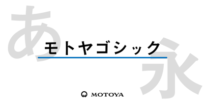 ゴシック体は、明朝体のように横線や縦棒を装飾するウロコや、セリフといったものが無いので、骨格線そのものが命である書体です。また横線にも画数に応じた太さの調整が必要となるので、太さの統一性を持たせるのが非常に難しい書体とも言えます。モトヤのゴシック体ファミリーは、この二つの命題を克服すると同時に、背勢表現(縦棒や横線の両端につけるラッパ状のアクセント)を施すことにより、伝統と力強さと柔らかさを同時に感じさせる書体となっています。
 - HG Reithic by RICOH,
$199.00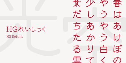 シーアンドジイの「れいしっく」を字母とする書体です。隷書スタイルに影響を受けたクラシックな丸ゴシックというべき書体です。ふところが大きくとられていて判別しやすいですが、隷書の特徴をとりいれているため、カジュアルさはそれほどなく、格式と落ち着きが感じられます。そのため、フォーマルな場面に向くでしょう。隷書の特徴のある漢字はとても目を引くため、大きいサイズで使うのも、個性が発揮できます。
 - Seibi Ai by Nihon Literal,
$169.00 This typeface combines the rhythmic movement of Mincho and the simplicity of Gothic, with a rounded finish for a touch of elegance and style. 明朝のリズム感とゴシックのシンプルさに加え、ラウンド処理することでエレガントでおしゃれなイメージを求めた書体です。タテ画は太く、ヨコ方向はそれより細く、ハネなどはさらに細く、という三段階処理が施されています。昭和50 年(1975 年)頃、レタリング文字として開発。その後デザイン調整を経てフォント化されました。
 - HG Hagoromo by RICOH,
$199.00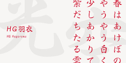 羽衣は、大谷四郎氏によって楷書体と行書体との中間を目指して作られました。楷書の堅さと行書の柔らかさがバランスよく配分されていて、どちらかというとやや楷書寄りのデザインです。楷書体に脈絡線やはね、はらいが加えられたようなデザインになっています。また、行書体ではストロークを繋げたりして省略されている部分を、可能な限り省略しない処理をしています。やや長めの文章から見出しまでフォーマルな場面に向きます。 (『OH 「羽衣」書体について』より一部抜粋)
 - TA KotodamaF by Skill Information"S",
$99.00 TA-kotodama is designed by Masahiko Yamada who is a famous and popular graphic designer. It is a 4 weight family. 「TAことだま」は、グラフィックデザイナーである山田正彦がデザインしたデザイナーズフォントでファミリーとして4書体ある日本で人気のフォントである。
 - HG Mincho PRO by RICOH,
$199.00 HG明朝は、リョービの「本明朝」を字母とする明朝体です。現代的なイメージにするため、仮名文字の一部は変更されています。クラシックでシャープな書体ですが、ふところは大きく、読みやすい書体です。縦、横線の始筆部のふくらみをカットすることで、初期のPCディスプレイでの表示品位向上を実現しています。また、線幅補正ヒンティングのため、線幅の種類を抑制しています。HG明朝Lは、MS明朝と同じデザインです。
 - Seibi Takanawa by Nihon Literal,
$169.00 The category of font type is Kaisho-tai(square style), but it is a similar design to a textbook style with a delicate control over the sharpness of Kaisho-tai. Kanais designed somewhat larger for better line alignment in typesetting. 書体カテゴリーは楷書体ですが、楷書体のメリハリをやや押さえた教科書体に近いデザイン。仮名をやや大きめにデザインし、組み版時のライン揃えを意識しました。L(細)・M(中細)・B(太)・UB(特太)と4 つのウェイトがある楷書体シリーズですが、太さによって性格が違い、厳密にはファミリーではありません。LとMは筆のかすれなど名残を簡素にした教科書体風デザインの楷書体、Bは筆のメリハリを抑えた見出し用楷書体、UBは筆の名残を生かし、極限まで太く力強くインパクトを求めた毛筆体です。Lについては、Mに比べ若干明るく、かながやや小ぶりにデザインされています。
 - 8 bit Darling by Norio Kanisawa,
$5.00 8bit darling is digital taste font. I think digital fonts are bitmap fonts generally, but dared to make digital fonts that are not bitmap fonts and made it. The name "8bit darling" borrowed a name from my favorite song. I made it consciously that it is a digital style but not so much inorganic. It contains hiragana, katakana, alphanumeric characters, some symbols. Horizontal writing only, vertical writing is not possible. Although it is slightly unique, I think choose a scene to use too much. I would be pleased if it could help you. <「エイトビットダーリン」紹介文> カクカクしたデジタル風のフォントです。 デジタル風のフォントといえばビットマップフォントかと一般的には思うのですが、敢えてビットマップフォントではないデジタル風のフォントを作りたいと思って作りました。 「エイトビットダーリン」という名前は私の好きな曲から名前を拝借しました。 デジタル風ではあるけれどもあまり無機質にならないように、と意識して作りました。 収録文字はひらがな、カタカナ、英数字、一部記号です。横書き専用、縦書きはできません。 ちょっと個性的ですがあまり使う場面を選ばないかと思います。 みなさまのお役に立てれば幸いです。 <スタイルカテゴリー> 角ゴシック
 - Iwata Souchou Pro by IWATA,
$199.00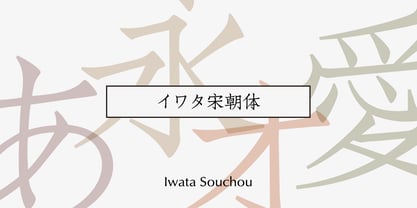 金属活字の「方宋体」をもとに開発した書体です。活字時代の漢字、仮字を再現した「宋朝体」と、仮字デザインを現代風にアレンジした「宋朝体新がな」の2書体があります。
 - Iwata Souchou NK Pro by IWATA,
$199.00 金属活字の「方宋体」をもとに開発した書体です。活字時代の漢字、仮字を再現した「宋朝体」と、仮字デザインを現代風にアレンジした「宋朝体新がな」の2書体があります。
 - Otome Mincyou by Norio Kanisawa,
$50.00 This font is I thought "I wanna try to make cute Mincyoutai.", and made it. I think it is cute font but may have a little nostalgia. It corresponds to Hiragana · Katakana · Alphabet · Numerals · Symbols · Kanji(chinese characters). You can also write vertically. You can use it easily, because it contains JIS first · second level, and IBM extended Kanji(about 6700chinese characters). Since it is little bold Mincyoutai, I think it is useful for headlines and text. About it's name, it is simple but has some childhood and romantic, I named this font "OtomeMincyou". I'm hope you like it. <「乙女みんちょう」紹介文> 「かわいい明朝体を作ってみたい!」と思い作ったフォントです。 かわいい中にもどこか懐かしさを持ったフォントになったかと思います。 ひらがな・カタカナ・アルファベット・数字・記号類・漢字に対応。縦書きもできます。 漢字はJIS第一水準・第二水準・IBM拡張漢字(約6700文字)に対応しているので、使いやすいかと思います。 ちょっと太めの明朝体なので、本文にも見出しにも使えると思います。 名称については、シンプルだけども夢見る少女のような幼さ・ロマンチックさを持っているなぁと思ったので「乙女みんちょう」と名付けました。 皆様のお役に立てれば幸いです。 <スタイルカテゴリー> 明朝体、装飾