10,000 search results
(0.028 seconds)
- RM New Albion by Ray Meadows,
$19.00 A classic blackletter Which looks best at 16pt and above. Due to the modular nature of this design there may be a slight lack of smoothness to the curves at very large point sizes (around 100 pt and above).
 - GHEA Shooter by Edik Ghabuzyan,
$40.00 This UltraLight weight original Display font GHEA Shooter includes Basic Latin, Latin 1 Supplement, Latin extended A, Cyrillic + Bulgarian Cyrillic + Ukrainian Cyrillic, Armenian. May be used in titles, posters, labels, etc. The font looks very nice in large sizes.
 - Roemisch by Linotype,
$29.99The Roemisch type family is a historic hot metal face with left slanted weights that is used for the german cartographic map production. There are also special typefaces required like the Venus type family and Topografische Zahlentafel type family." - HG Gothic by RICOH,
$199.00 HGゴシックは、リョービの書体「ゴシック」を字母として作られたフォントです。クラシックなデザインがほどこされた正統派のゴシック体ですが、仮名は大きめに作られていて、読みやすいです。Bウェイトは、MSゴシックと同じデザインになっています。M、Bは、本文用途に向いていますが、見出しにも合います。M、Bよりも太いEは、よく目立つので、大きく使うことで魅力が発揮できるスタイルです。
 - Hatolie by Gilar Studio,
$16.00 Introducing New Font : Hatolie - Elegant And Luxuries Typeface Hatolie - Elegant And Luxuries Typeface will work perfectly for fashion, e-commerce brands, trend blogs, wedding boutiques or any business that wants to appear upscale and chic. Hatolie - Elegant And Luxuries Typeface also Suitable for Logo, greeting cards, quotes, posters, branding, name card, stationary, design title, blog header, art quote, typography, art, modern envelope lettering or book design, happening style like handdrawn design or watercolor design theme, craft design, any DIY project, book title, or any purpose to make your art/design project look pretty and trendy. Features : Uppercase & Lowercase Numerals & Punctuations (OpenType Standard) Accents/Multilingual characters PUA Encoded Check my other Font here : https://gilarstudio.com/ Give it a try! You will surely love it! Thanks and have a wonderful day, Gilar :)
 - Coal Soul by LomoHiber,
$18.00 I'm so excited to present my Coal Soul typeface. It has been inspired by underground music video and hand drawn with Sharpie marker. Coal Soul has very unique minimalistic low poly letter form, 3 styles, and illustrations which will allow you to create really outstanding designs. It's perfect to use in logos, posters, music covers, clothes prints and other stuff which needs crazy visual style. Coal Soul Features: Uppercase font Full set of alternates for each letter and number to create a more realistic look Bonus wide alternates for letters "B, C, D, E, F, G, O, Q R" Wide language support (Western European, Central European South Eastern European) Carefully tuned kerning Extra illustrations font If you have some issues or questions, please let me know: lhfonts@gmail.com Hope you'll enjoy using Coal Soul!
 - Apron by Hurufatfont,
$29.00 The genesis of Apron font type family is inspired by soft-vertical structure of airplane window. On the other hand Apron is making a reference to technological design mentality of early 2000's. In short texts it has stable view and also humanist effect. Very suitable for mobile apps, web designs, sportive & technological product packs and ads designs. Especially Narrow Bold and Condensed Bold Italic weights have fluid and strong expression for striking headlines. User friendly Apron serves rich opentype properties; small capitals, alternative letters (a, c, e, g, k, l, q, s, y, A, C, G, K, M, N, R, S, 3, 6, 9), stylistic sets, standart and optional ligatures, oldstyle figures, tabular linings, arrows, bullets and wide money currencies, fractions and math symbols. Now please fasten your seat belts and enjoy it.
 - Fornire by Jehoo Creative,
$20.00 The Fornire family of typefaces grew out of a desire to provide a font that has a bold yet simple impression. For this reason, Anwar Patihan drew designs with a high foundation as letters based on humanist shapes and proportions. The letters are kept narrow to enhance the look, and the spacing between characters is narrowed for boldness. While the opentype Fornire feature has an alternate "A B E F P R" letter that looks very striking and easy to recognize, making the Fornire family very suitable for use on Posters, Cover designs, magazines, Banners, packaging designs, design considerations that he put into the Fornire family as well allowing it to perform well in a variety of other design environments. Fornier has a variety of weights ranging from Light, Regular, Medium, Bold
 - ARB-187 Moderne Caps AUG-47 by The Fontry,
$25.00 Beginning in January, 1932, Becker, at the request of then-editor E. Thomas Kelly, supplied SIGNS of the Times magazine’s new Art and Design section with an alphabet a month, a project predicted to last only two years. Misjudging the popularity of the “series”, it instead ran for 27 years, ending finally two months before Becker’s death in 1959, for a grand total of 320 alphabets, a nearly perfect, uninterrupted run. In late 1941, almost ten years after the first alphabet was published, 100 of those alphabets were compiled and published in bookform under the title, “100 Alphabets”, by Alf R. Becker. And so, as published in August, 1937, The Fontry presents the truly "modern" version of Becker’s 187th alphabet, Moderne Caps, complete with OpenType features and Central European language support.
 - Marathon by Linotype,
$29.99Marathon was originally designed by Rudolf Koch in 1931 for Schriftgiesserei Klingspor. It is a roman with short ascenders and descenders. The serifs are small, but longer at the ends of the arms of E, F and L, M is rather splayed and is without top serifs, like M in other typefeaces designed by Rudolf Koch. The lowercase g has no link and an open tail, again like the g in other Koch types. U has the lower-case design. In the W the middle strokes cross, the lower case w has no middle serif. The figures are short-ranging. Ute Harder from the Fachhochschule Hamburg had redesigned Marathon with the help and supervision of Professor Jovica Veljovic. She has added a book weight to offer more flexibility with this beautiful typeface. - Joschmi by Adobe,
$29.00Joost Schmidt?s (1893?1948) name is undoubtedly connected with monolinear condensed letters of geometric appearance ? his unfinished draft of a stencil alphabet, constructed on grid paper in 1930, is much lesser known. These modular shapes simply consist of half circles, quarter circles and square strokes with half-round terminals. From just six original letterforms (a, b, c, d, e, g), Flavia Zimbardi completed Schmidt?s draft and extended it to a full character set for contemporary use, adding upper case letters and different figure sets including old-style. Joschmi overcomes legibility issues usually associated with this stencil style, with special attention to the design of white space. Zimbardi lends the face even more character by carefully adding round terminals in subtle spots of the alphabet, accessible through stylistic sets. - Bethaney Script by Fargun Studio,
$15.00 Brithney Script is a new, fresh, and modern calligraphy font, including decorative characters and a dancing baseline. It's so beautiful on greeting cards, branding materials, business cards, quotes, posters, and more. The included alternative characters were divided into several Open Type features such as Swash, Stylistic Sets, Stylistic Alternates, and Ligature. The Open Type features can be accessed by using Open Type savvy programs such as Adobe Illustrator, Adobe Photoshop, Corel Draw X version, And Microsoft Word. And this Font has given PUA code (specially coded fonts) so that all the alternate characters can easily be accessed. Features: Unique ligatures Stylistic Alternates Stylistic sets Basic Latin A-Z and a-z Numbers International Symbols included Punctuation Need help? If you need help or advice, please contact me by e-mail "fargunstudio@gmail.com"
 - Thinpaw by upirTYPO,
$4.00 Thinpaw is a serif handwritten font perfect for usage in a really big sizes (50 pt+). The stem width is about 0.5 mm (0.019") in 100 pt size. The font comes with central european character set and a set of various glyphs and icons (see preview images). Opentype features: - Standard ligatures - fi, fl, ff - Discretionary Ligatures - ft, fb, fh, fk, fj - Contextual Alternates - a, e, f, g - Stylistic set 01: A Stylistic set 01 changes every dot into the heart shape symbol. It turns every writing into a nice looking love letter! Thinpaw is perfect for wedding proposals, wedding invitations, happy birthday cards or anything personal. For usage on the computer screen, the stem width is about 1 pixel for 50 pt size, and 2 pixel for 100 pt size.
 - HG Gothic PRO by RICOH,
$199.00 HGゴシックは、リョービの書体「ゴシック」を字母として作られたフォントです。クラシックなデザインがほどこされた正統派のゴシック体ですが、仮名は大きめに作られていて、読みやすいです。Bウェイトは、MSゴシックと同じデザインになっています。M、Bは、本文用途に向いていますが、見出しにも合います。M、Bよりも太いEは、よく目立つので、大きく使うことで魅力が発揮できるスタイルです。
 - ApronSoft by Hurufatfont,
$19.00 The genesis of ApronSoft font type family is inspired by soft-vertical structure of airplane window. On the other hand ApronSoft is making a reference to technological design mentality of early 2000's. In short texts it has stable view and also humanist effect. Very suitable for mobile apps, web designs, sportive & technological product packs and ads designs. Especially Narrow Bold and Condensed Bold Italic weights have fluid and strong expression for striking headlines. User friendly ApronSoft serves rich opentype properties; small capitals, alternative letters (a, c, e, g, k, l, q, s, y, A, C, G, K, M, N, R, S), stylistic sets, standart and optional ligatures, oldstyle figures, tabular linings, arrows, bullets and wide money currencies, fractions and math symbols. With reduced file size, it’s softer now!
 - Getty Dubay by Handwriting Success,
$9.00 The Getty-Dubay® family of fonts has been 500 years in the making — so that you can make your handwriting worksheets in seconds. These fonts are modern descendants of the chancery handwriting style (now called “Italic”) from the Italian Renaissance, when master scribes designed a fluid and graceful hand, inspired by the proportions of the golden rectangle and Roman capitals. The Italic style has been in constant use since then. In modern times, it has been celebrated by Alfred Fairbank, Lloyd Reynolds and many others including authors Barbara Getty and Inga Dubay in their Getty-Dubay® Italic method. The Getty-Dubay® monoline handwriting fonts provide a replete resource to effectively model the highly-legible and beautiful Italic handwriting style. These are the official fonts of Getty-Dubay® Italic. Download the Getty-Dubay® Font Guide for everything you need to know about the Getty-Dubay® fonts. The Getty-Dubay® Joined fonts produce a clean cursive handwriting with join-as-you-type ease. Four join options are included: Standard, Pointed (altered joins into m, n and r), e k (utilizing the two-stroke e and one-stroke k), and Beginning (easiest joins only). The Getty-Dubay® Basic fonts provide sans-sarif clarity suitable for young writers. The Getty-Dubay® Precursive fonts add serifs to the lowercase letters, while retaining the pure Roman capitals of Basic Italic. The Getty-Dubay® Smallcaps fonts make mixed capitals easy to use. All Getty-Dubay® fonts come with scaffolds such as dashed contours, ruled lines, directional arrow and starting dots (for Basic and Smallcaps). They support multiple Latin-based languages from around the world. Getty-Dubay® is a registered trademark in the United States.
 - Jenson Classico by Linotype,
$29.99In 1458, Charles VII sent the Frenchman Nicolas Jenson to learn the craft of movable type in Mainz, the city where Gutenberg was working. Jenson was supposed to return to France with his newly learned skills, but instead he traveled to Italy, as did other itinerant printers of the time. From 1468 on, he was in Venice, where he flourished as a punchcutter, printer and publisher. He was probably the first non-German printer of movable type, and he produced about 150 editions. Though his punches have vanished, his books have not, and those produced from about 1470 until his death in 1480 have served as a source of inspiration for type designers over centuries. His Roman type is often called the first true Roman." Notable in almost all Jensonian Romans is the angled crossbar on the lowercase e, which is known as the "Venetian Oldstyle e." In the 1990s, Robert Slimbach designed his contemporary interpretation, Adobe Jenson™. It was first released by Adobe in 1996, and re-released in 2000 as a full-featured OpenType font with extended language support and many typographic refinements. A remarkable tour de force, Adobe Jenson provides flexibility for a complete range of text and display composition; it has huge character sets in specially designed optical sizes for captions, text, subheads, and display. The weight range includes light, regular, semibold, and bold. Jenson did not design an italic type to accompany his roman, so Slimbach used the italic types cut by Ludovico degli Arrighi in 1524-27 as his models for the italics in Adobe Jenson. Use this family for book and magazine composition, or for display work when the design calls for a sense of graciousness and dignity. - Por Siempre Gótica - Personal use only

- Cocaine Nosejob - 100% free

- Kremlin Advisor Display Kaps Bo - Unknown license

- Kremlin Menshevik - Unknown license

- Kremlin Premier - Unknown license

- Frequency Mod - Unknown license

- SquircleCirquare - Unknown license

- Victim - Unknown license

- Amphibia by Storm Type Foundry,
$53.00 On a sans-serif basis it contains trapezoid ascenders, balls & rounded ears, which may resemble the serif feel in smaller sizes, thus long reading is surprisingly easy. Amphibia is suitable for everything from contemporary poetry to branding and informational systems.
 - Columna by Linotype,
$29.99Columna is an all-caps, Classical Roman-inspired typeface designed by the renowned Swiss typographer Max Caflisch (interesting fact: Columna is Caflisch's only typeface). Caflisch's Columna adds a stately elegance to any application, and is best used in large sizes. - RM Victoriana by Ray Meadows,
$19.00 A decorative and fancy slice of the gay '90s (1890s that is). Due to the modular nature of this design there may be a slight lack of smoothness to the curves at very large point sizes (around 100 pt and above).
 - Amore by ParaType,
$30.00 Based on informal handwriting. The face resembles sophisticated but naive childish hand and brings associations of summer vacation and meadows spread with daisies. It may be useful in designing of invitations, picture-cards, posters, funny headers and certainly in advertising.
 - Katydid JNL by Jeff Levine,
$29.00 Vintage sheet music for a song from the Broadway Musical “Kiss Me Kate” is the inspiration for Katydid JNL. The play’s name was written in a ball-and-line type of lettering which somewhat resembles either 'Tinker Toys' or celestial mapping.
 - Kaufmann by URW Type Foundry,
$35.99 Kaufmann is a joining script designed for American Type Founders by Max R Kaufmann, a letterer, typographer and art director of McCalls magazine. Monotone in weight and with short descenders, the Kaufmann font family is useful for advertising and display work.
 - 4 Point Greek Fret by Deniart Systems,
$20.00 A whimsical array of pointers designed with semi-traditional Greek fret pattern (up/down/left/right) - great for adding directions or pointers to documents, maps, posters, greetings, or simply used as decorative elements. See also 4Point Deco and 4Point Florals.
 - Hellshock by Comicraft,
$19.00 Check into your local lunatic asylum with this font, etched on the walls of his padded cell by Comicraft's left-handed right-hand man, Dave Lanphear, for Jae Lee's Image comic 'Hellshock'. Artwork from Elephantmen: War Toys by Starkings & Moritat
 - Classy Vogue by Variatype,
$25.00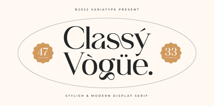 Classy Vogue is a stylish display serif with an elegant and luxury style that perfectly matches your branding project and more. FONT FEATURES Additional Accents 66 Languages Kerning Alternates Ligatures SOFTWARE RECOMMENDATION Adobe Photoshop Adobe Illustrator OS COMPATIBILITY Mac OS Windows
 - Moyenage Sans by Storm Type Foundry,
$55.00Moyenage is a modern replica of blackletter. Whereas the calligraphic typeface family can be used in shorter texts and posters, the sans-serif variation is rather experimental project which may find its use on music cover design, occasional lettering and invitations. - TC Broadway by Monotype,
$29.99 Modeled after a 1928-1928 design by M.F. Benton -- Broadway --, TC Broadway is ideal for show posters and signs for restaurants and boutiques. The TC Broadway font has strong contrasting strokes, and as such is only suitable for short lines.
 - Bloomy by BrandCarry,
$19.00 Bloomy is a picture font consisting of 52 high quality flower shapes with clean outlines and a minimum of vector points. This unique set of natural forms may be well used in graphical design projects like brochures, advertisements, posters, etc.
 - Huntsman by Solotype,
$19.95Issued from the Haddon Foundry in England. Most of their original faces had names beginning with H, like their own name. Some of their types were designed by Phil May, but we cannot guarantee that this is one of them. - Lourino by Mans Greback,
$59.00 Lourino is a flowing script typeface, drawn by Måns Grebäck during 2018 It is a high-quality font with cute letter shapes and large, round capitals. The font has an extensive set of characters and supports all Latin based European languages.
 - Bodoni Unique by Monotype,
$29.99This Bodoni caps only font was an experiment from Dave Farey how tall such a Bodoni could be elongated in its design. It reminds to the look of a fence, but in large sizes it may fit on a narrow window.


