9,682 search results
(0.022 seconds)
- Linotype Didot eText by Linotype,
$50.99 A clear and enjoyable reading experience hinges on the legibility of text copy, especially when reading on screen. This is why Monotype has developed the eText collection of fonts specifically tailored for the text-heavy display environments of e-readers, tablets, mobile devices, and the Web.
 - Regulaire by PizzaDude.dk,
$16.00 Regulaire is my laid back comic font, inspired by graffiti and my everyday regular handwriting. Works quite nice for kids products, comics, party posters - or anything that needs a casual comic look!
 - Povetarac Didone by Tour De Force,
$25.00 Povetarac Didone font family is part of Povetarac Superfamily together with Povetarac Sans and Povetarac Display. Available in 6 weights with matching italics, Povetarac Didone relays on lively uppercase proportions that took inspiration from vintage typefaces. It is well balanced family, elegant and fully recognizable. One of its characteristics are straight and wide terminals without usual serifs for this kind of typefaces. Playful and harmonic italics are one more uniqueness of Povetarac Didone. They were gently crafted to fulfil they role not just for editorial use, but as display typeface as well. Comes with Fractions and extended Latin character map.
 - Price Didone by Eclectotype,
$25.00 PUBLIC SERVICE ANNOUNCEMENT: Price Didone has inspired a full alphabetic font - Mastadoni, so if you're after more than numerals, head over there! Price Didone is a font with a singular purpose: The setting of elegant, stylish price tags. As such it is non-alphabetic, featuring instead numerals, a large array of currency symbols, and a smattering of typographic niceties such as quotes, brackets, pilcrow, daggers and a very curvaceous ampersand. Certain currency symbols that are not independent glyphs (Q, Ft, kr etc.) are included as their constituent letters, some of which also have automatic ligatures for that little something extra. There are currency symbols included which have not (yet) been accepted to unicode, such as the Russian Ruble and Bitcoin symbols. For ease of access, these can be typed using the standard ligatures feature. See features below for the full list. Features: Automatic Fractions - with fractions feature engaged, arbitrary fractions are a doddle. Stylistic Sets: SS01 - an alternate look for 4 SS02 - a double stroked dollar symbol SS03- the # sign becomes a stylish numero Stylistic Alternates - for software that doesn't support stylistic sets, the above three features are grouped into the one SALT feature. Standard Ligatures - certain typed combinations automatically change to different glyphs: B|| = Bitcoin symbol P- = Russian Ruble RM = Malaysian Rimgit symbol Rp = Indonesian Rupiah Rs = Rupees Ft = Hungarian Forint kr = Kroner symbol % off;%off;%ff = Special percent off ligature Discretionary Ligatures - this feature sets decimal prices like $5.95 with the numerals after the period smaller and raised from the baseline, underlined by a nice swoosh. It also shrinks the dollar, sterling, and Euro symbols for a more authentic look. While intended for one sole purpose, Price Didone could nevertheless be quite versatile. Quote marks and typographic symbols can be used for decoration. Everybody loves a nice ampersand and this is one I'm really proud of. Or you might just want some pretty numbers for your house, or sports jersey, or just to stand out a little from the rest of your text. Whatever use you may have in mind, go for it. And do let me know if your currency symbol isn't included, and I'll quickly add it to the glyph set in future versions.
 - Heimat Didone by Atlas Font Foundry,
$50.00 Heimat Didone is the high contrast serif typeface family within the Heimat Collection, also containing Heimat Display, Heimat Sans, Heimat Mono and Heimat Stencil. Heimat Didone is a neo-classical typeface family designed for contemporary typography, especially for use in headlines and on posters, but also for reading purposes. It combines an idiosyncratic appearance with the feeling of a grid-based letter construction of the late 20s. Since the design might be too extreme for some applications, Heimat Didone’s character set provides two alphabets, the regular one plus an alternate design that comes across as less suspenseful. Heimat Didone [872 glyphs] comes in 72 styles and contains 6 optical weights, extra sets of alternate glyphs, many ligatures, lining figures [proportionally spaced and monospaced], hanging figures [proportionally spaced and monospaced], positive and negative circled figures for upper and lower case, superior and inferior, fractions, extensive language support and many more OpenType features.
 - Digot 03 by Fontsphere,
$16.00 DIGOT 03 is an innovative two-font family that blends minimalism and geometric precision to create a visually striking and modern design. These fonts are perfect for those seeking a clean and contemporary look for their projects. --- Usage Recommendations DIGOT 03 is a font that thrives in environments where simplicity and clarity are valued. It works exceptionally well in both digital and print formats. Consider using DIGOT 03 in the following situations: Web Design: DIGOT 03 can add a touch of modernity to website designs, providing a clean and contemporary experience for users. Poster Design: Whether creating event posters or advertising material, DIGOT's bold and eye-catching letterforms make it a perfect choice for grabbing attention. Logo Design: This font, despite its very experimental approach, can help establish a strong and memorable brand identity. Its simplicity allows the logo to be easily recognizable and versatile across various marketing channels. Iconography: As DIGOT 03 is built upon geometric principles, it excels in creating visually appealing icons and symbols that follow the same minimalist style. --- DIGOT 03 is the perfect font for designers and creatives who appreciate simplicity and have a keen eye for detail. With its unique minimalist geometric style, DIGOT offers endless possibilities for creating clean and impactful designs.
 - Cabrito Didone by insigne,
$- A graceful kid if ever you’ve seen one, Cabrito Didone joins the Cabrito family of fonts--a family designed to provide young infants with clear recognition of letter forms. The original letters were released as part of the children’s book about fonts, The Clothes Letters Wear. Now, this latest addition brings a new Didone flavor to the table. But don’t judge the book by its cover. While Didones can be stodgy in the way they deliver a sense of luxury, this stubborn goat of a Didone bucks the stodgy stereotypes with its high-contrast, carefree, flowing fun, taking a more calligraphic direction than most. Cabrito Didone joins structure and handwriting to create a flowing balance of both characteristics. It’s a unique combination of functional and friendly. Its 42 well-designed fonts give you plenty of easy-going, highly readable options to work with as you craft your design. The typeface has unique serifs that give the sense of ink pooling slightly at the points, drawn with a sharp nib. Cabrito Didone supports OpenType features and is packaged with upright obliques, alternates, ligatures, old-fashioned figures, and compact caps. Preview any and all of these features in the interactive PDF manual. The family member font also includes glyphs for 72 languages; over 600 glyphs per font await. Cabrito Didone is an excellent choice for websites as well as flyers and packaging. Like Cabrito, which is currently used by a number of visible brands, Cabrito Didone is also a great option for defining your brand. Grab a taste of the Cabrito Didone flavor--and those of the other Cabrito members: Sans, Semi and Inverto.
 - Digot 02 by Fontsphere,
$16.00 Digot 02 is a pixel-style, grid-based, display typeface. This is another version of Digot typeface. Compared to Digot, it is characterized by a more slender form, the letters are taller and narrower, which makes the font lighter. The font is characterized by its simplicity, attention to detail, and original form. You can use it in a wide variety of projects. It gives many possibilities for creating graphics.
 - Belda Didone by insigne,
$25.00 Belda Didone: the elegant strokes of Belda, now with higher contrast. A sleek Didone fusing graceful motion with an elegant typeface, this family offers new versatility. Belda Didone is a refined gem of a font that provides an unmatched level of luxury. Belda Didone is the child of Belda, offering new opportunities for a brave new world. The high contrast strokes reference the delicate shapes, curves, and sharp serifs of the original. The design of Belda Didone represents a unique balance of harmony and elegance. The architecture is robust and elegant. Belda’s forms have an intense luster and sparkle that captivates the reader’s eye. Belda Didone has plenty of OpenType alternates, including small capitals, titling, and a wealth of weights and widths. This font has the potential to serve as both text and titling. It’s an excellent choice for book jackets, advertising, packaging, and other luxury applications.
 - Mandrel Didone by insigne,
$24.00 A new family has sprung from the world of insigne. Mandrel Didone is his name. The face is well-liked by those with whom it seeks an audience because of its courtly demeanor and exquisite look. Mandrel Didone conducts itself beautifully in front of each set of eyes with a confident attitude, never wavering or tripping in its polished step. But, despite it’s gentility, this exquisite family is not weak in the face of adversity. Mandrel Didone is a powerful and conspicuous typeface that has towering x-heights, great contrast, confident bends, and sharp serifs. It is well-crafted for high-impact resistance. It uses its sharp serif ends deftly, cutting through opponents' clumsy clutter in the battle for the reader's attention. This noble family consists of nine weights and their matching italics, ranging from Thin to Black. Mandrel Didone also comes with a plethora of OpenType options to let you embellish your text. The family's 500 glyphs and support for more than 70 languages are accompanied with ligatures, old-style figures, and stylistic sets. Raise your glass in honor of the new Mandrel Didone! This champion, with its powerful serifs and great contrast, is ready to take on your challenge in many tests to come.
 - Pauline Didone by insigne,
$22.00 An Art Deco, script inspired typeface for 'modern' times, Pauline Didone is a full type family with a unique and flavorful design. It has a sense of femininity and naïveté that comes from its predecessor, Pauline. It's a typeface useful for short bits of copy, logotypes and interesting titling. This typeface family of 10 different fonts includes 5 weights and their italics and a wide range of OpenType alternates. The original Pauline was inspired by and has a strong influence from retro scripts. The typeface is geometric, formed with deliberate contrasting brush strokes and a ostentatious flair. Pauline Didone's high contrast strokes give it a very interesting look that is up to date with latest design trends and very useful for today's design environment. Pauline Didone pairs nicely with the original sans-serif Pauline. The typeface family also includes a full array of alternate forms, including over 150 alternate characters. These alternates can be accessed by activating OpenType features and style sets. Note: In order to use these OpenType features, you will need a program with advanced typography capabilities such as the Adobe Suite or Quark. These alternates also include a group of ball terminals that can be accessed under the swash alternates. Pauline Didone is the latest in a trusted line of typefaces from insigne. Why settle for the ordinary when you can choose Pauline Didone to lend its unique look to your art work?
 - Senlot Didone by insigne,
$35.00 Senlot Didone enchants with this fresh and cutting-edge sequel. It’s a modern interpretation of Senlot that says glamor and seduction. The typeface adds to the original high contrast sans serif with it’s modern high contrast shape, and features a new beauty with the distinctive sinuosity of contrasting forms. Senlot Didone is the sleek, serifed, high contrast follow-up to Senlot, and it's low contrast sequel, Senlot Sans. A serif typeface suitable for text and display work joined in 2019. Senlot Didone includes a wide range of OpenType features, including titling capitals, superscripts and subscripts, and oldstyle figures. Senlot Didone is composed of 3 widths: Condensed, Normal, and Extended, with 9 weights and their italics for a total of 54 fonts with more than 800 glyphs. Senlot Didone is a great display typeface for logos, branding, packaging, and advertising. With its broad palate of options, the font covers over 72 Latin-based languages. Dress your text in any of nine separate styles from Thin to Bold. With Senlot Didone, there's no need to compromise on another font with fewer features. Simple, elegant, and versatile, Senlot Didone now makes perfect more possible. Take the show by storm with this high contrast serif. The seductive figure of Senlot Didone is here to entice your viewer.
 - Lust Didone by Positype,
$49.00 Lust Didone’s character set was expanded as well during the redraw and update, the Italics were separated and reimagined anew from the universal italics in the original offering. Lust Didone also includes the new Fine optical size with complementing Italics for each size as well. And, yes, more swashes. The Lust Collection is the culmination of 5 years of exploration and development, and I am very excited to share it with everyone. When the original Lust was first conceived in 2010 and released a year and half later, I had planned for a Script and a Sans to accompany it. The Script was released about a year later, but I paused the Sans. The primary reason was the amount of feedback and requests I was receiving for alternate versions, expansions, and ‘hey, have you considered making?’ and so on. I listen to my customers and what they are needing… and besides, I was stalling with the Sans. Like Optima and other earlier high-contrast sans, they are difficult to deliver responsibly without suffering from ill-conceived excess or timidity. The new Lust Collection aggregates all of that past customer feedback and distills it into 6 separate families, each adhering to the original Lust precept of exercises in indulgence and each based in large part on the original 2010 exemplars produced for Lust. I just hate that it took so long to deliver, but better right, than rushed, I imagine.
 - Aviano Didone by insigne,
$24.99 First released in 2009, Aviano Didone has been completely remastered and expanded with new weights and optical sizes. Aviano Didone's high contrast forms lend elegant beauty, luxury and romance to your designs and it's extended letterforms provide strength and power. Aviano's foundational classical forms give the face a look that is unique for Didone faces. Aviano Didone is a bold interpretation of vertically contrasted type. Aviano Didone comes in eight different weights and is packed with OpenType features. Want ball terminals for that logotype or headline? Flat serifs? Swash forms? Aviano Didone includes 102 alternate characters. Five style sets are available, and Art Deco inspired alternates, small forms, swash, titling and stylistic alternates. Aviano Didone also includes 40 discretionary ligatures for artistic typographic compositions. The new optical sizes allow Aviano Didone to be used on the web or in print without losing detail. Be sure to check out the rest of the Aviano series which can be used as complementary faces, including Aviano, Aviano Serif, Aviano Sans and Aviano Flare.
 - Varsity Regular - Unknown license

- Ingleby Regular - Personal use only

- MADFONT Regular - Unknown license

- CalliPsoGrafia Regular - 100% free

- Azertype-Regular - Personal use only

- Aracne Regular - Personal use only

- junction regular - 100% free

- Belta Regular - Personal use only

- Lacuna Regular - Unknown license

- Share-Regular - Unknown license

- Capital regular - Personal use only

- Conman Regular - Unknown license

- Savia Regular - Personal use only

- Older Regular - Unknown license

- 7inch Regular - Unknown license

- Salmiak Regular - Unknown license

- Myosotis Regular by La Boîte Graphique,
$30.00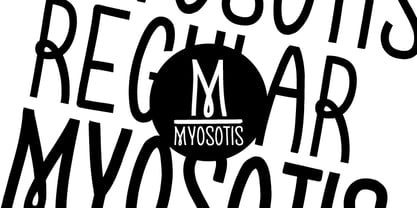 handwriting font
 - OBO Regular by Wilton Foundry,
$29.00 OBO is a modern interpretation of the classical Italian letterforms with the readability of contemporary sans typefaces. OBO is ideally suited for creating identities for branding, posters, book covers, headlines, logotypes, restaurant menus, beer labels.
 - Context Regular by Wilton Foundry,
$19.00 Context Regular is a condensed inline font with a stencil inline glyph - this makes for a smoother visual join of the stems. Context is also mono-case with the most interesting case selected for a pleasing end result. Applications are numerous: Display, Branding, Advertising, Logos, Publications, etc.
 - Mergian Regular by Tebaltipis Studio,
$15.00 Mergian - Modern Ligature Font by Tebaltipisstudio introducing our new "Mergian" Modern Ligature with Elegant Style this is perfect for branding, logos, invitation, masterheads and more. Mergian Features : -Multilanguange -Alternates -PUA Encoded -Ligatures Files Includes : -Mergian Regular.otf -Mergian Regular.ttf -Mergian Slant.otf -Mergian Slantttf If you have any questions, before or after purchase, please feel free to get in touch. Thank you
 - Vinchenso Regular by BA Graphics,
$45.00A strong powerful face that really works well for any application requiring a distinguished, clean look. Headlines, subheads, and text; anything goes. Vinchenso also has a matching Bold weight. - Krifon Regular by Tebaltipis Studio,
$15.00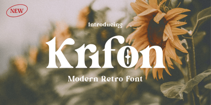 Krifon - Modern Bold Serif Font is a stylish font It has both modern and retro look. Comes with alternatives and ligatures, helps to create stunning logos, quotes, posts, blog posts. branding projects, magazine imagery, wedding invitations, and much more. WHAT'S YOU GET ? Unique Letterforms Works on PC & Mac Simple Installations Accessible in the Adobe Illustrator, Adobe Photoshop, Microsoft Word Fully accessible without additional design software. I really hope you'll get pleasure using Krifon Font and it will be perfect addition to your font collection! Contact me with an inbox message If you have any question. Thank you! Happy Creating.
 - Bondan Regular by Great Studio,
$13.00 Bondan is a family of Sans Serif fonts designed with a modern and vintage feel. Strong and dynamic. We set individual letters of medium with medium spacing for perfect typography. Bondan is very versatile. Perfect for brands, magazines, posters, logos, logotype stickers, website titles, packaging, branding, quotes, business cards and more. Bondan is equipped with a full set of uppercase letters, numbers, punctuation and multilingual support. Each font family version is available in the OTF formats for a total of 5 font files. What is included? • Bondan Light • Bondan Regular • Bondan Bold • Bondan Regular Outline • Bondan Bold Outline
 - Regular Brush by Din Studio,
$29.00 Regular Brush is a elegant brush font. The handwritten combined with brush font will make your design project more attractive. Made for any professional project branding. It is the best for logos, branding and quotes. Includes: Regular Brush (OTF) Features: Stylistic Set Beautiful Ligatures Multilingual Support PUA Encoded Numerals and Punctuation Thank you for downloading premium fonts from Din Studio
 - Troback regular by Alit Design,
$20.00 Introducing Troback - A Vintage Display Font Step into a realm of timeless elegance with Troback, a meticulously crafted vintage display font that pays homage to the design aesthetics of the past. With its distinctive retro charm, Troback encapsulates the spirit of a bygone era, where every letter tells a story. Inspired by the ornate typography of vintage signage, Troback is a masterful blend of boldness and sophistication. Its characters are imbued with intricate details, from the delicate serifs that harken back to a more refined age, to the captivating curves that dance along the baseline with a sense of purpose. This font conjures nostalgia with every stroke, summoning memories of old cigar box labels, antique shop signage, and classic posters that once adorned bustling city streets. Troback isn't just a font; it's a journey through history, a bridge between the craftsmanship of yesterday and the creativity of today. Ideal for branding that craves a touch of vintage authenticity, for designs seeking to recapture the allure of a vintage era, Troback stands as a testament to the enduring power of timeless typography. Let your words resonate with the elegance of a bygone time - let them speak through Troback.
 - Grendel Regular by Robert Petrick,
$19.95 “Grendel Regular” Evolved out of a hand lettering piece I designed for a record album (Royal Crescent Mob). Inspired by old gothic forms, my intention was to create a playful letter form that could be used in an antique as well as a modern context such as food product packaging or fun video projects, etc.


