6,875 search results (0.01 seconds)
  1. Kimono Geo - Unknown license
  2. Zud Juice - Personal use only
  3. Excelerate Outline - Unknown license
  4. SF Burlington Script - Unknown license
  5. Hultog - Unknown license
  6. VTCKomixationSCItalic - Unknown license
  7. VTCKomixationCapsItalic - Unknown license
  8. VTCSundaykomixcaps - Unknown license
  9. VTCGoblinHand - Unknown license
  10. SF Espionage Medium - Unknown license
  11. VTCSundaykomix - Unknown license
  12. VTCKomixationSCBoldItalic - Unknown license
  13. VTCSundaykomix - Unknown license
  14. VTCSundaykomixcaps - Unknown license
  15. Rosango - Unknown license
  16. VTC JoeleneHand - Unknown license
  17. Apollo9 - Unknown license
  18. SF Technodelight - Unknown license
  19. VTCSwitchbladeRomance - Unknown license
  20. SF Chromium 24 - Unknown license
  21. SF Chromium 24 - Unknown license
  22. SF Chaerilidae Outline - Unknown license
  23. Face plant - Unknown license
  24. Face plant hollow 2 - Unknown license
  25. Floopi - Unknown license
  26. VTC Boseephus - Unknown license
  27. Paddington - Unknown license
  28. Subatonik - Unknown license
  29. Qurve Hollow Wide - Unknown license
  30. Sanity Wide - Unknown license
  31. Sham - Unknown license
  32. SF Quartzite Extended - Unknown license
  33. SF Square Root - Unknown license
  34. Ambroise Std by Typofonderie, $59.00
    An exquisite Didot font in 18 series Ambroise is a contemporary interpretation of various typefaces belonging to Didot’s late style, conceived circa 1830, including the original forms of g, y, &; and to a lesser extent, k. These unique glyphs are found in Gras Vibert, cut by Michel Vibert. Vibert was the appointed punchcutter of the Didot family during this period. It is the Heavy, whom sources were surest that Jean François Porchez has been used as the basis for the design of the typeface family. In the second half of the 19th century, it was usual to find fat Didots in several widths in the catalogs of French type foundries. These same typefaces continued to be offered until the demise of the big French foundries in the 1960s. Ambroise attempts to reproduce more of what we see printed on paper in the 19th century; a more accurate representation of Didot punches. So, the unbracketed serifs are not truly square straight-line forms but use tiny transitional curves instead. The result on the page appears softer and less straight, particularly in larger sizes. The illustrious Didot family of type founders and printers Every variation of the typeface carries a name in homage to a member of the illustrious Didot family of type founders and printers. The condensed variant is called Ambroise Firmin. The extra-condensed is called Ambroise François. Ambroise Pro brought back to life: fifteen years in the making! Club des directeurs artistiques, 48e palmarès Bukva:raz 2001
  35. Essonnes by James Todd, $40.00
    Made up of sixteen individual weights and spread over three different optical sizes, Essonnes is designed to bring utility back to the Didot genre. It’s a common belief among designers that Didones don’t work for text. This wasn’t true in 1819 and it isn’t true today. Like its forbearers, Essonnes is a truly optical family—not just a study in adjusting contrast. The text and display weights have been designed from the ground up for their intended roles. This means that everything from the height of the uppercase & lowercase letters have been specifically tuned for their intended purpose. Like many typefaces, Essonnes started after falling in love with a piece of history. In this case, it was the eccentric forms of Pierre Didot’s Type and the evolution of the High contrast Didone throughout the 19th century. It was out of curiosity and love for these forms that led to the first draft of what would become Essonnes back in 2011. These unique situations—screens, modern printing methods, the previous 200 years of typographic innovation since the original design, my own life experiences—have led to a typeface that, while based on history, is not stuck in it.
  36. Moliere by Eurotypo, $44.00
    The life of Molière is a story of struggle, hard work, domestic unhappiness, death and burial in obscurity and almost in shame. Molière left behind a body of work that not only changed the face of French classical comedy, but has also come to influence the work of other dramatists from around the world. Despite his own preference for tragedy, which he had tried to further with the Illustre Théâtre, Molière became famous for his farces, which were generally in one act and performed after the tragedy. Both the comic and the serious drama were powerfully affected by the work of Molière, not only in his own age and country but everywhere and up to the present time. Didot is a name given to a group of typefaces named after the famous French printing and type producing family. The classification is known as modern, or Didone. The typeface we know today was based on a collection of related types developed in the period 1784–1811. Firmin Didot cut the letters, and cast them as type in Paris. Along with Giambattista Bodoni of Italy, Firmin Didot is credited with establishing the use of the "Modern" classification of typefaces. The types that Didot used are characterized by extreme contrast in thick strokes and thin strokes, by the use of hairline serifs and by the vertical stress of the letters. As in the extreme contrasts of the literature of Molière, in Didione's typefaces, thick and thin strokes, straight and curved, are the most relevant characteristic for an era marked by the changes.
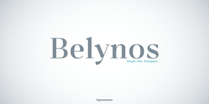
  37. Belynos by Typomancer, $24.00
    Belynos, a simple and elegant didone. Plus a bit of triangular! Font family contains from Light to Black and suitable italic for various designs.
  38. Gwyner by Typomancer, $24.00
    Gwyner, a strengthened didone with sharp and clean characteristics, comes with thin to bold weights and is suitable in italic for various uses. A condensed family for space-saving design.
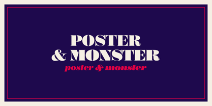
  39. Poster by Extratype, $40.00
    The long awaited full version of Poster, a recreation of Bodonian/Didot excess designed by Iñigo Jerez. The family has been finely improved with more styles. The family consists of: Poster and Poster Italic, a bolder version named Poster Monster and Poster Monster Italic– a virtuoso exercise in counter forms and contrast to be used with power unleashed, as the name suggests–; and finally Poster Display, Poster Display Italic, Poster Display Monster and Poster Display Monster Italic: four styles designed for even bigger sizes, with more contrast and splendor.
  40. Ventography Personal Use Only - Personal use only
Looking for more fonts? Check out our New, Sans, Script, Handwriting fonts or Categories
abstract fontscontact usprivacy policyweb font generator
Processing