10,000 search results
(0.036 seconds)
- Telegrafo by E-phemera,
$12.00Telegrafo was developed from a couple of words on a 1920s telegram from Argentina. - WarpLetunical by Ingrimayne Type,
$9.00 A warped version of the font Letunical, WarpLetunical has a Halloweenish feel to it.
 - BD Varicolor by Typedifferent,
$25.00 BD Varicolor is a display font with a certain twist of Swing and Charleton.
 - Laurentian by Monotype,
$29.99 Maclean's is a weekly Canadian newsmagazine with a broad editorial mission. A typical issue covers everything from violence on the other side of the globe to the largest pumpkin grown in a local county. In 2001, Maclean's invited Rod McDonald to become part of the design team to renovate" the 96-year-old publication. The magazine wanted to offer its readers a typographic voice that was professional, clean, and easy to read. Above all, the typeface had to be able to speak about the hundreds of unrelated subjects addressed in each issue while remaining believable and uncontrived. A tall order, perhaps? Now add in that this would be the first text typeface ever commissioned by a Canadian magazine. McDonald, who some have called Canada's unofficial "typographer laureate," took on the challenge. McDonald used two historic models as the basis for Laurentian's design: the work of French type designer Claude Garamond, and that of the English printer and type founder, William Caslon. From Garamond Laurentian acquired its humanist axis, crisp serifs and terminals that mimic pen strokes. Caslon's letters are less humanistic, with a more marked contrast in stroke weight and serifs that appear constructed rather than drawn. These traits also made their mark on Laurentian. Using these two designs as a foundation, McDonald drew Laurentian with the narrow text columns and small type sizes of magazine composition in mind. He gave his letters strong vertical strokes and sturdy serifs, a robust x-height and a slightly compressed character width A tall order, per McDonald's genius is evident in the face's legibility, quiet liveliness and in the openness of the letters. The result is a typeface that not only met Maclean's demanding design brief, but also provides exceptional service in a wide variety of other applications. Laurentian is available in three weights of Regular, Semi Bold and Bold, with complementary italics for the Regular and Semi Bold, and a suite of titling caps."
 - Rahere Roman Display by ULGA Type,
$30.00 Rahere Roman Display is an elegant design with flared stems and subtle old style features, influenced by Berthold Wolpe’s wonderful Albertus font and (to a lesser extent) fonts based on Roman square capitals. It’s a classic design for the modern age, appealing to serious typographers, graphic designers and anyone looking for a beautiful, multipurpose font that also offers value for money. Originally conceived as a display companion for the Rahere Sans typeface family, Rahere Roman harmonizes perfectly with its sans counterpart: use it for headings, sub-headings or pull-out quotes. Want an eye-catching introduction? The small caps have been sized to optically align with the x-height of Rahere Sans or start a paragraph with a swash drop cap. There are also ornaments and devices on hand to spice things up. Of course, Rahere Roman Display works beautifully as a standalone font too. Although predominantly a display font, with a quick flick of its lowercase switch, Rahere Roman transforms effortlessly into a readable text font. Like a Swiss Army Knife, this is a hugely versatile font, capable of conveying different messages from classic and romantic to historical and modern. It’s suitable for a wide range of applications including: branding, posters, advertising, packaging, labels, signage, wedding stationery, museums, art galleries and book covers. Weighing in at well over 2,000 glyphs, Rahere Roman contains a myriad of alternative characters (mostly capitals) including two sets of small caps that allow certain letter combinations - such as RO, LA, LI, TY, etc. - to mimic ligatures. The advantage of this is that if letter spacing is increased or decreased, the letter combinations aren’t fixed and can move too, which helps the space between letters to remain even. However, for lovers of ligatures there is still a bucketload of goodies to play with, including the obligatory ‘OO’ ligature. If that’s not enough, the font also contains start & end swashes, alternative numerals, seven ampersands, ornaments and devices. .ss01 - Initial swash capitals .ss06 - Superior small capitals (aligned to the cap height) .ss07 - Small capitals (sitting on the baseline)
 - Pueblo by Monotype,
$29.99Like many of Jim Parkinson's alphabets, Pueblo began as poster lettering. It shows a range of influences: turn-of-the-century sign painting, old Speedball lettering books, and a touch of art nouveau. While developing Pueblo, Parkinson debated whether to make the ends of the serifs rounded or square. Rounded looked more like the work of a Speedball lettering pen, but squared stroke endings made the letters more legible at small sizes. The finished design sports serifs that are just slightly rounded. According to Parkinson, the design feature is “enough to be noticed at large sizes, while going virtually unnoticed at smaller point sizes,” adding to the versatility of this distinctive typeface. - Albertus Nova by Monotype,
$50.99 Albertus® Nova is a faithful digital revival of Berthold Wolpe’s earlier design of Albertus and is one of the five designs in The Wolpe Collection of typefaces. This new design enlarges the typeface set from its previous two weights into a robust set of five ranging from thin to black, all with extended language support including Cyrillic and Greek. Berthold Wolpe began working on Albertus in 1932, at the encouragement of Stanley Morison. Morison saw an example of Wolpe’s engraved lettering and liked it so much that he commissioned a typeface based on the design. Since then, the original Albertus typeface has been used on book covers, in branding, on signs and in video games.
 - Nimrod Paneuropean by Monotype,
$92.99Nimrod was released by Monotype in 1980. Designed for current newspaper technology, the Nimrod font family evolved as a result of extensive examination of newspaper industry needs. Nimrod retains many of the features of the traditional newspaper Ionics, but some of the fussier detailing has been replaced by the more sober forms of the old styles, such as Plantin. A highly legible font family, especially in smaller sizes, its clear unambiguous character shapes make easily readable blocks of text. Nimrod also withstands the degradation encountered in newspaper production and printing. First used for body text in the Leicester Mercury newspaper, the Nimrod font family has subsequently become a popular choice in newspapers for text and headlines. - Nouveau Poster JNL by Jeff Levine,
$29.00 When master letterer Hugh Gordon and his student, Ross F. George developed a set of lettering pens between June 16, 1913 and Sept. 1, 1914, they had no idea that their invention (which they named Speed-Ball®) would still be in use nearly a hundred years later. The C. Howard Hunt pen company [originally of Camden, New Jersey] became the original (and sole) distributor of these pens. By 1915 an instructional booklet entitled "Modern Pen Lettering" was produced, and it was copiously illustrated with examples of layouts, lettering techniques and an assortment of alphabets for the user to learn. Nouveau Poster JNL is Jeff Levine's interpretation of a sanserif design found within the pages of this vintage publication.
 - Kuba by Scholtz Fonts,
$19.00KubaApplique is a bold and exciting African font that makes use of the interplay of black and white shapes -- reminiscent of the Kuba cloths that are made and used by the Bakuba tribe. Typified by a balance between dark and light areas, the characters reflect the ethos of Africa. Kuba applique contains the full range of upper and lower case characters, all punctuation and special characters as well as the accented characters used in the major European languages. Because the way in which the individual letters fit together is so important in Kuba Applique, I took especial care of the kerning and spacing of characters. The font is intended to be used as a display font. - Orbi by ParaType,
$30.00 The Orbi type system is a low contrast antiqua of elegant design with a well developed set of members. It consists of 10 roman and italic faces of different proportions and weights and 3 decorative calligraphic fonts. It also contains 3 additional fonts with various decorated initials. The roman includes small capitals. Thanks to its variety of styles the font is suitable for a wide range of applications - the basic styles are good for books and periodicals; the narrow styles work well in the columns and tables of business papers; the decorative styles are ideal for ceremonial typography where swashes, calligraphy and initials are usual. The fonts were designed by Natalia Vasilyeva. Released by ParaType in 2010.
 - Deco Wood Type JNL by Jeff Levine,
$29.00 When people usually think of wood type, images of bold and ornate designs reminiscent of the Old West or the Victorian Era come to mind. In truth, wood type was manufactured well into the late 20th century, and only fell out of favor when the letterpress was replaced by the offset press and computerized typesetting. Although there are hard-core collectors who have started a small resurgence in the preservation and use of wood type, it's the digital interpretations of these classic faces that see the most use in today's electronic layout work. Deco Wood Type JNL reinterprets one of these later designs, a bold sans with a decidedly Art Deco influence.
 - Natom Pro by Mostardesign,
$25.00 A family of fonts with rhythm. Natom Pro is a modern and geometric font family adapted to the professional requirements of graphic designers, web designers and mobile application developers. Comprised of 19 styles including 8 styles designed especially for the design of headlines, Natom Pro is a very versatile family of fonts that can be used in many projects such as editorial design, branding or corporate identity creation, design of posters or logos, the creation of websites or the development of mobile applications. This font, with a resolutely contemporary aspect, also hides a unique typographic design since it has 2 distinct styles (Title and Roman) which have 2 different typographic rhythms in order to graphically differentiate the appearance of titles, subtitles and long paragraphs. With this design of rhythmically differentiated glyphs according to the styles, the headlines have a very graphic aspect while the long texts have a more classic aspect in order to keep optimal readability in all scenarios. Its architecture is also very modern since it was designed and drawn with particular attention to the geometry of the forms with clear and open endings cut at 90 degrees. The number of styles has also been simplified with the most used thicknesses (Extra Light, Light, Regular, Medium, Bold and Black) in order to speed up your graphic design process. For the more experienced designers, Natom Pro is also available in a variable version. Natom Pro is also equipped with powerful OpenType features like case sensitivity, true small caps, full ligature set, tabular figures for tables, « old styles figures » to elegantly insert figures into your sentences, numbers circled or even alternative characters to satisfy the most demanding professionals.
 - Moving Message JNL by Jeff Levine,
$29.00 A vintage printer's cut for the masthead of the "Fed-O-Gram" (a monthly publication of the Farm Bureau Federation, Inc.) had its title set in letters that emulated a moving message board. This design formed the basis for what is Moving Message JNL.
 - CA Trasher by Cape Arcona Type Foundry,
$19.00 A great UGLY font. Beauty lies in the eye of whoever. Maybe the beholder is a beast or a Swiss artist. The SHIFT key will give you alternative character shapes. Remember: beauty doesn’t lie in the eye of the beholder – it lies in yours!
 - Syarom Gladies by Arttype7,
$10.00 Syarom Gladies is a handmade font that has a unique alternative style. This font can be used with a clean style or with an alternative style of the old style. It is very suitable for logos, weddings. magazines, album covers, and much of your work.
 - Savour Pro by profonts,
$51.99 Savour Pro's elegant, classic form has a calligraphic touch, almost a hand-written feel. The individual creation of the characters provide additional dynamics and vitality. Savour Pro comes with a complete set of upper case swashes as well as lining and old style figures.
 - Pen Moderne JNL by Jeff Levine,
$29.00 A classic example of Art Deco lettering made with a round nib ink pen was found within the pages of “Lettering” by Harry B. Wright (circa 1950). Now available as a digital type font, Pen Moderne JNL is available in both regular and oblique versions.
 - Stonehouse by Scriptorium,
$12.00Stonehouse is based on samples of Art Nouveau title lettering, adapted and expanded into a complete titling font. It has a nice intermediate weight ideal for titles on the web or in print, especially for section or topical headers within a body of text. - Amber by MADType,
$21.00 Amber is a minimal font which is built on a grid of 3x3 squares. It was an experiment to see if I could build legible glyphs out of such a small grid. The 3 weights can be layered over each other to create interesting designs.
 - Zalcony by HandletterYean,
$16.00 Introducing Zalcony, a captivating handmade font exuding a simple yet alluringly distorted brush aesthetic. Every letter and character carries its own unique size, beautifully showcasing the authentic, natural flow of handwritten script. With Zalcony, add a touch of genuine, personalized charm to your designs.
 - MBF Urban Poet by Moonbandit,
$15.00 Moonbandit presents Urban Poet, a modern display font with a sophisticated and a little bit of vintage flair. This typeface is inspired by the creative lifestyle of the urban world. Use Urban Poet for logo, poster, display, headline, title, editorial, merchandize and so much more
 - Winter Snowy by Sipanji21,
$10.00 Winter Snowy is a decorative font with a snow decoration on the top of characters. It will elevate a wide range of design projects to the highest level, be it branding, headings, wedding designs, invitations, signatures, logotype, wall art illustration, apparel, labels, and much more!
 - Department Store JNL by Jeff Levine,
$29.00 Amongst a number of items for sale in an online auction was a font of metal type featuring a thin, condensed serif font with decidedly Art Deco styling. This was the inspiration for Department Store JNL, which is available in both regular and oblique versions.
 - Southand by MJB Letters,
$17.00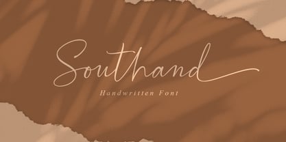 Southand is a handmade calligraphy font that is made with a touch of love in every character. This font is perfect for logos, branding, business cards, watermarks, posters and more. Southand comes with a full set of Uppercase, Lowercase, Numerals, Punctuation, and multilingual support.
 - Grimm by The Type Fetish,
$25.00 The origin of Grimm was to create a typeface in the spirit of Elliott Peter Earls' Subluxation, but somewhere in the process things shifted to a blackletter influenced uppercase while the lowercase became more roman. The end result is a quirky little blackletter display typeface.
 - Bertolessi by Greater Albion Typefounders,
$12.50 Bertolessi is a Roman face made fun, with a healthy dose of filigree curves thrown into the mix. It's an ideal compliment to our extensive Bertoni family, but can be used anywhere a bit of humour and flair is required. Get with the curls!
 - Merlynea by Nissa Nana,
$23.00 merlynea is a delicate, elegant and flowing handwritten font. It has beautiful and well balanced characters and as a result, it matches a wide pool of designs. This font is PUA encoded which means you can access all of the glyphs and swashes with ease!
 - Bullvetti by Nissa Nana,
$25.00 Bullvetti is a delicate, elegant and flowing handwritten font. It has beautiful and well balanced characters and as a result, it matches a wide pool of designs. This font is PUA encoded which means you can access all of the glyphs and swashes with ease!
 - Artane Elongated BT by Bitstream,
$50.99Artane, Tony Fahy's first typeface for Bitstream Inc., has a specific philosophy at the core of it's creation. He decided he would try to create a Roman sans that would have the elegance of a serifed italic, such as Stempel Garamond, Bembo, or Baskerville. - Fan Magazine JNL by Jeff Levine,
$29.00 In the December, 1934 issue of Modern Screen magazine, a number of feature article headlines were hand lettered in a condensed slab serif with a relatively uniform stroke weight. This is now available digitally as Fan Magazine JNL, in both regular and oblique versions.
 - Parenting JNL by Jeff Levine,
$29.00 Parenting JNL is a stylized Art Deco sans serif type design originally found on a vintage WPA (Works Progress Administration) poster designed by the Federal Art Project and touting the topic of "The Job of Being a Parent". Available in regular and oblique versions.
 - Caskier by Hustle Supply Co,
$18.00 CASKIER Caskier is a whiskey inspired layered typeface. With 10 font files, you get access to a variety of potential aesthetics ranging from clean, layered or roughened. What's Included? Regular, Bold, Outlined, Shadow, Roughened + Oblique Versions Western European Character Set A variety of ligatures
 - BearButte by Ingrimayne Type,
$11.95 BearButteT is a square-serifed typeface. The bold version was developed first as a display typeface, and the rest of the family followed. A fifth member of the family includes swash caps on the upper-case keys and small caps on the lower-case keys.
 - Bulmer by Monotype,
$29.00Cut as a private version for the Nonesuch Press in the early 1930s, Monotype Bulmer was first released for general use in 1939. Based on types, cut by William Martin circa 1790, used by the Printer, William Bulmer, in a number of prestigious works, including Boydell's Shakespeare. Martins types combined beauty with functionality. Narrower and with a taller appearance than Baskerville, it anticipated the modern face of Bodoni but retained vital qualities from the old face style. This new digital version of the Bulmer font family was drawn by Monotype following extensive research into the previous hot metal versions and a study of Bulmer's printed works. Additional weights have been designed together with a wide range of Expert and alternative characters. - Aracne by Antipixel,
$15.00 The all-caps Aracne collection features tall, slightly scrawled letterforms, and is available in regular, condensed and ultra condensed styles for maximun functionality. With a spiritted quality and casual character, it will add a personal style to your work. Aracne is a full of energy handwritten font, with light and regular styles, including italics. It provides a wide range of possibilities, including the Aracne Soft and Stamp, which offer softer and cleaner edges. It’s has a glyph coverage supports languages such as English, Spanish, French, German, Polish, Czech, among many others. It’s recommended usage is for display titles, and small ammount of text, because of its good legibility and quality of glyphs. Check out her sisters Aracne Condensed and Aracne Ultra Condensed!
 - BoiTu by Vei Vei,
$16.00 BoiTu is a typeface in the BoiTu project designed by Vei Vei. BoiTu has a strong contrast between bold bars and long sharp hook strokes inspired by pheasant feathers on the hat in Hat Boi costume. "Tuong or Hat Boi is a form of Vietnamese classic opera, combining various elements of arts such as stage, music, fine art, literature, dancing, and martial arts. Older Tuong plays are usually about historical events or tales. Allegories, melodramas, soliloquies, modes of expression, forms of performance, repartee singing and recitative conventions, etc., are constantly updated and elevated, and are quintessential elements in the art of Tuong." Boi Tu is a classic design to bring traditional art and culture closer to everyone. Boi Tu is a Vietnamese font that supports multiple languages.
 - Closet Skeleton by Hanoded,
$20.00 Some time ago I stumbled upon a little book called 'De Sprookjeshoorn' ('Horn of Fairy Tales') by Anton Eijkens (1920 - 2012). It was published in 1946 and contains several authentic and unique fairy tales - unfortunately unreadable to modern children, as the language used is out of date. What caught my eye was the handwritten font on the cover of the booklet. Closet Skeleton is a fairytale font inspired by the one I found on the cover of De Sprookjeshoorn. It comes with several curly alternates and some end-ligatures as well. I added an 'old fashioned' ampersand and a modern one, so you can choose which one to use. Apart from that, Closet Skeleton comes with a closet choc-a-block full of diacritics.
 - Moreno by Typedepot,
$29.00 Meet Moreno – a semi serif typeface full of personality and flavor. A display typeface in its nature Moreno is free and informal yet stable and trustworthy. Moreno comes with extensive OpenType support - with its more than 15 OpenType features Moreno is giving you a great variety of stylistic alternatives as well as wide range of ligatures, tabular lining numerals, oldstyle numerals, fractions and many more. It comes in 8 carefully chosen weights from Extra Thin to Black plus their matching italics. Together with the 4 additional styles, Moreno becomes a diverse type family of 80 fonts suitable for a wide range of design needs like retail, package, food, branding etc. With its language support - over 200 languages, Cyrillic included - it is ready for world domination!
 - FF Bauer Grotesk by FontFont,
$50.99 FF Bauer Grotesk is a revival of the metal type Friedrich Bauer Grotesk, released between 1933 and 1934 by the foundry Trennert & Sohn in Hamburg Altona, Germany. The geometric construction of the typeface, infused with the art déco zeitgeist of that era, is closely related to such famous German designs as Futura, Erbar, Kabel and Super Grotesk that debuted a few years earlier. However, Bauer Grotesk stands out for not being so dogmatic with the geometry, lending the design a warmer, more homogenous feeling. The oval “O” is a good example of that, as well as characteristic shapes like the capital M or the unconventionally differing endings of “c” and “s” which make for a less constructed look. Watch the FF Bauer Grotesk introduction video on Vimeo