10,000 search results
(0.034 seconds)
- Ni Sans by DSType,
$40.00 Ni is a kind of typographic love letter, revealed in three distinct, yet close, type formulas. Ni Serif is a contemporary serif typeface with slight diagonal modulation, amazingly legible, and with a very steady rhythm that allows a wonderful performance, especially in long passages of text. Ni Sans closely match the design characteristics and proportions of the serif counterpart. Ni Sans undeniably shows the strong calligraphic influence that comes from Ni Serif, resulting in a very comfortable humanistic typeface, suited both for print and digital environments. Ni Slab is not a simple Sans with serifs attached. Despite the thick and strong serifs, Ni Slab is a gentle mixture of the DNA of the Serif and Sans counterpart and does not intend to reflect any mechanic approach.
 - Crispo by Resistenza,
$48.00 Prepare to be enchanted by the artistry of "Crispo," a font meticulously crafted through the delicate strokes of pointed pen calligraphy. In the world of typography, each character becomes a masterpiece, resonating with the eloquence of a brushstroke. Experience the Dynamic Elegance of Pointed Pen Mastery: Elegance with "Crispo" transcends mere quality; it embodies the essence of pointed pen calligraphy as a true masterpiece. The flowing lines and timeless grace of every character reflect the precision and artistry embedded in this refined craft. In the realm of fonts, "Crispo" emerges as a distinctive personality, each character meticulously handcrafted with a pointed pen. These letters aren't mere symbols; they roar with the passion and personality of a master calligrapher's ink, leaving an indelible mark on your creative endeavors. "Crispo" is more than a font; it's a genuine work of art inspired by the rich traditions of calligraphy. It serves as the embodiment of the pointed pen's craftsmanship, where each curve and ligature is shaped with meticulous care, inviting you to delve into the world of true artistic expression. The elegance within "Crispo" extends beyond appearances; it resides in the essence of each stroke. Every character, ligature, and swash is a testament to the beauty of pointed pen calligraphy, culminating in a font that stands unparalleled in its grace and sophistication. Whether you're crafting wedding invitations, establishing brand identities, or embarking on any project that craves distinction, "Crispo" unlocks the door to limitless creative expression. Courtesy of pointed pen calligraphy's mastery, this font becomes your brush, painting a story of elegance and distinction. "Crispo" is not just a font; it's a journey through the soul of pointed pen calligraphy. It encapsulates the brushstroke of a skilled hand, the dance of ink on paper, and the unwavering passion behind every character. Step into the enchanting world of "Crispo" and infuse your designs with the dynamic elegance and strong personality of pointed pen calligraphy.
 - Rigatoni by Sudtipos,
$39.00 Rigatoni is a didone display family with exceptional readability. Based on a German mid-century lettering specimen by Nerdinger, designer Alejandro Paul expanded the face into an extensive family, with 5 weights, italics, and a 2 weights stencil version. Its tall letterforms and sturdy serifs give it a noble bearing when set in all caps; in the lower case its large x-height and spacious counters imbue it with a welcoming tone. A plethora of alternate and swash characters let you create distinctive settings for identities, labels, titles, and headlines. Use the shorter ascender and descender variants for aesthetic effects, or to prevent collisions in tightly stacked text. Since we've imagined Rigatoni being used for restaurants, menus, and food packaging, Sudtipos asked to designer Esteban Diácono to create some 3D visualizations. Ale’s type has never looked saucier!
 - Conversation Hearts by Harald Geisler,
$- Conversation Hearts are inspired by the sweethearts and conversation hearts that can be found all over the US and Britain, but not in Germany. A source of endless fun and surprise. As a typographer to me they are also a surprising document of written communication. Most people complain that nowadays the inscriptions are not as sweet as they used to be. While they used to held romantic and promising inscriptions like “Be True” “Sweet Talk”, today they carry “Tweet me” “Ur Hot” and “Party Girl”. So i took this as a motivation to work with conversation sweetheart on a conceptial inspirational and typographical level. The obvious: every letter pressed on the keyboard brings out a conversation heart that starts with the letter - i.e. L = Loverboy, H = Heartless but what to write? Since i didn't want to reproduce the old “Fax me” and “Email me” I had to come up with something new. Something with a personal relation and of course something that I Love - what else could i write in the shape of the heart? So I tried to access my upper subconsciousness and looked for two words for every letter in the alphabet. One for the capital letter pressed and one word for the lowercase letter. Resulting in a Kurt Schwitters worthy assemblage of vocables "Post-office" “Internship” “Zebra” “Answers” etc. It is not easy to read a text set in Conversation Hearts but easier as a text set in Zapf-Dingbats. To sparkle the visual appearance uppercase letters are filled hearts with “carved” inscription, while lowercase letters are an outlined heart with written inscription. Conversations Hearts is a part of the Light Hearted Font Collection that is inspired by a recording of Jean Baudrillard with the title, "Die Macht der Verführung" (The Power of Seduction) from 2006. Further inspiration came from the article, "The shape of the heart: I'm all yours". The heart represents sacred and secular love: a bloodless sacrifice. by British writer Louisa Young printed in EYE magazine (#43) London, 2002.
 - Sweet blink play by Sulthan Studio,
$10.00 Sweet Blink is a cute and friendly handwritten font duo that is perfect for creating charming and playful designs. Its delicate and whimsical letters feature playful curves and loops, giving it a warm and inviting personality. This font is perfect for invitations, greeting cards, and other projects that require a personal and charming touch. The font’s cute and friendly personality is sure to make viewers smile.
 - Narnfont - Personal use only

- Ikusuteito - Unknown license

- KG Beneath Your Beautiful by Kimberly Geswein,
$5.00 Quirky teen unicase handwriting with personality.
 - Neo Contact by Linotype,
$40.99Neo Contact is the typeface used on the packaging of Marlboro cigarettes (Marlboro “Reds,” the main line of the brand). The typeface is bold and condensed, designed in the Egyptienne style. Egyptienne types were first designed in the 1800s, as type founders - especially in the westward-expanding United States - began to dream up newer, bolder styles of letters for advertising usage. During the 1800s, it became increasingly important for businesses to set themselves, and their products, apart from competitors. This desire has remained with corporations, as well as with advertisers and designers, into the 21st century. In addition to cigarette packaging, Neo Contact (as part of Marlboro’s branding efforts) can be seen on numerous items, including Ferrari’s F1 racers, and at Formula 1 race tracks. The letters in Neo Contact are filled with personality. Their forms display two distinct weights of line, and the serifs are made up of tiny, strict slabs. Ball terminals round out the design. Neo Contact is a complete font, with a complete western character set. Typefaces in the Egyptienne style preceded the development and distribution of larger, crazier wood typefaces, but also share many similarities with these descendents. More traditional, text faces in the Egyptienne manner are also available from Linotype GmbH (e.g., Adrian Frutiger’s Egyptienne F). On the opposite end of the spectrum, we offer interesting, personality-filled wood display types, like Ponderosa as well. - Pervitina Dex - Personal use only

- Fleet Street - Unknown license

- Manualito-Flo - Personal use only

- Blooms by DearType,
$29.00 Say hello to Blooms - an edgy, brush script with lots of attitude! All handmade and then vectorized, Blooms is the perfect mix between sexy and serious. The script is made in two variations - one rough and one smooth for a more sleek look. The Blooms family comes with some great additions to support the script - a thick headline font for the ultimate impact and a narrow tagline font for more hand-style expression. Urban, modern and full of personality, Blooms is perfect for various occasions. Wedding invitations, T-shirts or cards, Instagram photos or interactive designs, it covers it all. Throw some ligatures and stylistic alternates on top of that and you have yourself a multipurpose family.
 - Paverify by Esintype,
$14.00 Paverify is an all-caps geometric slab serif display face inspired by a particular pavement tile component which is evoking a blocky “I” letter. All other characters were interpreted based on its look and drawn accordingly. There are three uppercase Roman fonts in different weights and widths substantially. With the additional versions, type family consisting of 7 fonts in total. Over 220 Latin, Cyrillic and Greek script languages supported. Each font contains an extensive multilingual support with more than 1600 glyphs and OpenType features, including number forms, fractions, and stylistic alternate sets those provide different looks by the typographic preferences. For the lowercase letters there are small caps variants, i.e., shorter caps. These also have identical glyphs and matching marks to enable “Small Capitals From Capitals” feature. Narrower Medium and Bold styles was produced to accompany the Black first design. Paverify comes with an ornaments font named as “Extras”, which contains geometric graphical elements, i.e., paver stone patterns, banner/sticker background sets, star comps and a collection of catchwords to simplify creating feature rich layouts. As is known as interlocking paver in certain regions — a rectangular shape with the distinctive diagonal tabs — transcribing the simplest letter to draw into the whole alphabet was a challenging task. Not only it was the single thing that can be used as a source, considering its thick form in roughly 1.2:1 proportions compared to the sophistication of letterforms was the challenge. Starting point was keeping design consistent while both avoiding and preserving a particular appearance to achieve a similar texture, basically a repeating pattern on the streets. In contrary of a traditional approach, Paverify tend to have more contrast than the other slab serifs which helps to reduce massive stem weight of the source form. This look contributes to its hand painted sign effect achieved in a certain degree, which may otherwise impractical to transform because the source material is an inorganic, static form by definition. Tight and even spacing of the pavement tiles was inspirational for the kerning balance of the letters. Although the lighter weights have more space between the letter pairs, black weight adjusted as to be close to each other as the original grid. Tight spacing can be ignored by using Capital Spacing OpenType feature for the Outline versions as layer fonts. In one stroke, this gives an extra space between the letters to avoid diagonal armed letter terminals overlap. Black typographic colour and texture gives a sturdy appearance to the lines, it is useful for the projects where a robust display faces preferred for the titling, strong headlines, letter stacks, dropcaps, initials, short names on materials such as advertisements, book covers, posters, logotypes, wordmarks, package designs, and more in print or digital. Paverify can be paired as a complimentary face in a combination with broader type systems, where vintage look compositions and woodcut style fusions requiring an extra stunning texture.
 - Retromax by Debut Studio,
$15.00 Debut Studio Presents The Retromax.... This Script is a special script or typeface in which the emphasis is reversed from the norm: instead of the vertical lines being wider or thicker than the horizontal lines, which is normal in Latin alphabet writing and especially printing, horizontal lines are the thickest. It's quirky and fun, you can use for any project. Retromax is also a Layered Fonts, Layered fonts have letters that appear raised, or stacked in multiple layers of different shades or colors. Some layered fonts actually include multiple files for each layer. With layered font families, we can create novel combinations of 3D with Shade. Features: Uppercase & Lowercase Number & Punctuation Multiple Language & Stylistic Alternate Files Included: Retromax Regular Retromax Offset Retromax 3D Retromax Shade I hope you like my latest product, This collection will be perfect for creating posters, art prints, apparel and t-shirt designs, Instagram and other social media posts, and many more. if you have questions and problems when using it, please leave a message in the comments or via direct message, I will be very happy to reply, Happy Designing!
 - Quijibo by Matt Frost,
$20.00 Hand-made slab serif. It’s cute, it’s versatile. It has a decorated version called Quijiboquail and a non-decorated version just called Quijibo. Each comes in three weights, plus italic. Each has 3,000+ kerning pairs. Go to http://facebook.com/frostfoundry to share this and see more!
 - Nice Summer by Yoga Letter,
$16.00 "Nice Summer" is a display font with shading on each letter, making this font unique. Equipped with regular and italic letters, uppercase and lowercase numerals, punctuation, and multilingual support. This font can be used for summer moments, holidays, vacations, traveling, graduation, Father's Day, Christmas, and others.
 - French Serif Moderne JNL by Jeff Levine,
$29.00French Serif Moderne JNL gives a slab serif treatment to the lettering comprising Jeff Levine's French Art Initials JNL. The font - containing a full character set - was inspired by a page from an early 20th Century French alphabet book posted online at an image sharing site. - Vanities by Solotype,
$19.95A Victorian type which, like so many others, was originally offered without a lowercase. As we do so often, we designed a matching lowercase for it. We also added a shaded version of the caps, figures and points of our earlier Vanities font. A nice companion face. - Apparel by Latinotype,
$35.00 Inspired by the MacFarland series in the 1912 ATF catalog, Apparel is a typeface that shares similar functional characteristics with Times New Roman and Caslon fonts yet it has its own personality: A great choice for high-impact design. Apparel is a contemporary, classy and fresh serif typeface with a laid-back attitude that best suits your design needs. Its medium-large x-height makes it ideal for headlines and brand identity design. Apparel also includes a version, with a greater contrast between thick and thin strokes, for use in even larger sizes. The font comes with italic styles which can be used individually or in combination with the upright variant. Moderately slanted italics are also available as OpenType Stylistic Alternates. Each font style supports more than 200 Latin-based languages, as you would expect from Latinotype fonts. Apparel also includes a basic Cyrillic set, old style & lining figures, fractions and alternates, among other OpenType features.
 - Scala Pro by Martin Majoor,
$49.00 The award-winning Scala family (1990-1993) is a worldwide bestseller and has established itself as a ‘classic’ among digital fonts. It was one of the first serious digital text fonts to support small caps, ligatures and different set of numbers. In fact Scala and Scala Sans (1990-1993) are two different typefaces sharing a common form principle: the skeletons of both Scala and Scala Sans are identical. Scala’s dark colour and low contrast works to prevent the thin parts from breaking up. The generous length of Scala italic’s serifs gives it a strong rhythm. The bold weight has the same character widths as the normal weight, so changing a text from normal into bold does not affect the set width. Another part of Scala is very popular among its users: Scala Hands, containing more than one hundred decorative hands and pointers, is a free bonus. Scala Jewels is a set of four highly decorative typefaces, based on the bold capitals of Scala.
 - Eclectic One by Altered Ego,
$45.00STF Eclectic One is a visual cornucopia of symbols, like the junk drawer in your kitchen. Stuff you'll need someday for a graphic element, bullet or dingbat application. Perfect for website icons! The Eclectic family is legendary, with a cult-like following among the inititated. As one of the first dingbat fonts available on the web, it gain popularity after its design in the early 1990s. With over 150 characters in the complete set, you'll find yourself using Eclectic One almost daily to add spice to your otherwise san-serif typographic existence. This font is essentially a soap opera of typographic image elements, created for projects when I couldn't find the "thingbat" I needed. Almost more of a collection of illustrations, there are many characters which connect to form patterns, and of course it's like a "small neutral European country" army knife for the creative community. EcOne features complete hour, quarter, and half-hour notations in an analog clock design glyph, recycled/recyclable symbols, a registration mark, a toaster, globes, sideways diamond arrows, spaceships, stoplights, the "running man," several atomic references, da buzz saw, target icons, the unusual smiley face floating in a ball (with a drop shadow, no less!), and the fish skeleton which complements the fallout shelter symbol, and more. Make your own juxtapositions! One reviewer proclaims "for whatever you do, Eclectic One is an excellent dingbat source." Available in Mac and PC formats. License it today! - The Galaxus font is a bold display sans typeface that is strongly themed as futuristic, making it ideal for science fiction and space-related designs. Its characters are heavy and wide, with a unique...
- Xéfora - Personal use only

- Cabaret - Personal use only

- Fraktura - Personal use only

- Hollenbeck JNL by Jeff Levine,
$29.00Hollenbeck JNL is the Art Deco, all-caps cousin of Jeff Levine's Hallandale JNL typeface. This version utilizes the thick-and-thin stroke weights so popular during the Art Deco era, while retaining the look of hand-lettered copy. Best suited at larger point sizes, this font is a nice alternative to the over-used display faces reminiscent of that time period. - BonaVia by Greater Albion Typefounders,
$9.95 BonaVia is an adaptation of Greater Albion's Bonning and Bonnington families. Its purpose made to enable the construction of banners and mastheads in the style of traditional streetsigns, and offered in Regular and 'Blanc' faces. A selection of decorative ends and fleurons are included. BonaVia is splendid on posters, signage, book and CD covers and labels with a period feel.
 - Vantagram by TEKNIKE,
$69.00 Vantagram is a modern display font. The typeface is made from basic square geometry. It is inspired by blackletter typefaces of the medieval period in Europe. The Vantagram name is a combination of two words derived from “vanta” French for boast and “gram” Greek for letter or that which is drawn. Vantagram is great for display work, quotes, titles, headings and posters.
 - Sunshine Delivery by Hanoded,
$15.00 After a long period of wind, rain and cold, summer has finally arrived. It almost felt as if the sunny weather came as a special delivery! Sunshine Delivery is a handmade display font. It comes in a regular, angular version and a rounded one. Need Vietnamese support? Check! Want some Sami? Got it! Feel like a bit of Greek? Dive right in!
 - Fat Kitty Kat by Hanoded,
$20.00 Fat Kitty Kat is a hand made, rather bouncy and happy font. It was thought up, drawn and vectorized during an unusually long rainy period in a small Porto hotel room. Kitty Kat's glyphs are rather rough, but legible and fun to use. The font comes with extensive language support and a full range of alternates for the lower case letters.
 - Duesenberg NF by Nick's Fonts,
$10.00The 1930s produced many distinctive and stylish autos. One was the Auburn, and this typeface was suggested by a period poster for the make. Another fine car of the time gives the font its name, because “it’s a Duesie!” Both versions of this font contain the Unicode 1252 Latin and Unicode 1250 Central European character sets, with localization for Romanian and Moldovan. - Round Nib Deco JNL by Jeff Levine,
$29.00 Great type font inspirations can come from any time period and any location in the world. A Febuary, 1932 issue of an Estonian woman’s magazine called “Eesti Naine” had its name hand lettered using a round nib lettering pen. This extra-wide Art Deco design is now available as Round Nib Deco JNL, and is available in both regular and oblique versions.
 - DeVinne by Linotype,
$29.99 DeVinne Ornamental is a display typeface from the famous Parisian typefoundry Deberny & Peignot, developed around 1900. Its style has become synonymous with the Art Noveau period, which was raging internationally when DeVinne Ornamental's letters were first drawn. The typeface is named after the renowned American printer Theodore Low DeVinne (1828-1914). Optimal uses for DeVinne Ornamental include headlines in magazines and newsletters.
 - Numis by Tyler Jamieson Moulton,
$11.00 Numis was born out of a coin collecting hobby. A quick survey of coins from the late medieval to modern periods to today led to this unicase design. The rounded corners and smoothed edges are meant to evoke a the slightly worn letterfaces found on old coins; a process that tends to bolden the text before being rubbed away completely.
 - Wieynck Gotisch by RMU,
$25.00 Wieynck Gotisch, a 1920s font family created by Heinrich Wieynck, was completely redrawn and redesigned for modern usage. Use this remarkable and eye-catching fonts in an appropriate context. This font contains a bunch of useful ligatures, and by typing 'N', 'o' and period plus activating the OT feature Ordinals you get an oldstyle numbersign. The round ‚s‘ lies on the #-key.
 - Hupp Fraktur by RMU,
$25.00 Otto Hupp's blackletter font, released by Klingspor in 1911, took its inspiration from the then dominating Art Nouveau designs. Some of its capitals express this with their lovely swash forms, and make this fraktur font less stiff. Hupp Fraktur contains a bunch of usefull ligarures, and by typing 'N', 'o' and period you get an oldstyle numbersign by activating the Ordinals feature.
 - Romanesque Monogram by MonogramBros,
$10.00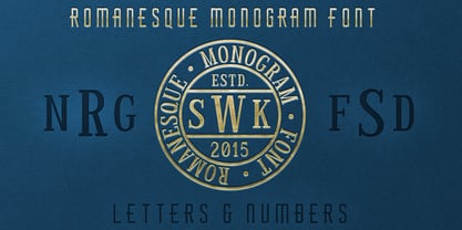 The perfect font for monogramming and personalization.
 - KG She Persisted by Kimberly Geswein,
$5.00 A chunky, playful, feminine font with personality.
 - Ysobel by Monotype,
$29.99 The Ysobel™ typeface family is not only elegant; it is also exceptionally legible and space economical. A collaborative design effort between Robin Nicholas, as lead designer and project director, Delve Withrington and Alice Savoie of Monotype Imaging, the project had the primary design goal of creating a typeface family for setting text in newspapers and periodicals. The result, however, is also ideal for any application that requires quick and easy assimilation of text. According to Nicholas, “The idea for the design started when I was asked to develop a custom version of Century Schoolbook. I wanted to give the design a more contemporary feel, although the client ultimately decided to keep their typeface closer to the original. The project nevertheless gave me ideas for a new design. Since designing Nimrod, some 30 years ago, I had wanted to make a more modern typeface family for newspapers and magazines – this seemed the ideal candidate.” Ysobel (pronounced “Isabel”) has the soft, inviting letter shapes of Century Schoolbook but contrasts these with more incised serifs and terminals. Its capitals are also narrower than those of Century Schoolbook, and care was taken to ensure that they harmonize perfectly with the lowercase. Ysobel’s x-height is full-bodied without disrupting lowercase proportions. In addition, curved terminals, such as those in the “C,” “c” and “e,” were drawn more open as an aid to legibility and readability in text copy. Weight stress is near vertical, and hairlines are robust to ensure character fidelity in small point sizes. Development began with the text version of the family, which has four weights, each with an italic companion. All weights feature lining and old style numerals, fractions, superiors and extended Latin language coverage. Small caps are also available in the Roman Regular design. Ysobel Display is a completely redrawn version of the typeface; it is narrower, and has a slightly smaller x-height, thinner hairlines and subtle design changes to improve its appearance when set at large sizes. The Display Italic received particular attention to make it ideal for setting headlines, subheads and short blocks of copy. Changes include a slightly greater italic angle and more cursive treatment of some letter shapes. Alternative styles of capital “J” and “Q,” to provide variation, are available in all weights.


