10,000 search results
(0.668 seconds)
- Herzchen by Font-o-Rama,
$25.00Herzchen is a well developed sans serif font. The curving and swinging letter forms remind a little of serif fonts, on closer inspection, however, they rather remind of upright italics. Playful details give charm to the typeface and make Herzchen lively and distinctive. With four cuts the typeface is suitable for simple corporate and editorial design projects. In addition there are many ligatures in the expert-set for individual use. - Kleist Fraktur by RMU,
$25.00 In the late 1920s Walter Tiemann cut this font for Klingspor Brothers in Offenbach am Main. It comes close to Luthersche Fraktur and, though quite slender, possesses a good gray value and readability. This blackletter font fits excellently into narrow columns. Kleist Fraktur contains a bunch of useful ligatures, and by typing 'N - o - period', marking this combination and activating OT feature Ordinals you get an oldstyle numbersign.
 - Southern by Atom,
$16.00 Southern is a solid brush font that is made manually with brush strokes on paper. Unique in character and gives a prominent impression, it is suitable for your various design needs. With good kerning this font can also be used for paragraph writing, creating a character and bold design, this will give a huge impact to your advertising media needs. Thank you for purchasing our products, Have a great day! Letteratom
 - Chi Town NF by Nick's Fonts,
$10.00A 1931 poster for the film The Man from Chicago provided the pattern for this quirky Deco delight. Although the fonts is all uppercase, tasty variants have been added in the lowercase positions, and all possible letter combinations have been kerned, so you can mix the forms freely. This font contains the complete Latin language character set (Unicode 1252) plus support for Central European (Unicode 1250) languages as well. - Gibrael by TRF,
$20.00 Gibrael is tattoo script style font. Truly a perfect script for any project that's need delicate typeface such as custom name, greeting card, create logos, etc. A handy font for tattoo designer and artsy creative people! It's a beautiful, elegant, clean and unique typeface you need to have! Contains over 590+ glyphs, it has many alternate characters so you can make a beautiful decorative type easily and multiple language support.
 - Rowboat by Atlantic Fonts,
$26.00 Rowboat is delightful and dependable. Turn on discretionary ligatures and you will find a salty set of interlocking and double letter combinations. Access interlocking ligatures using all caps. Rowboat Pictures contains 26 original Amy Dietrich seaside illustrations from charming ocean animals to nifty nautical gear.... Go ahead and make a splash! Posters feature images from Atlantic Fonts picture fonts including Eeeek Images , Trailmap Pictures, and of course Rowboat Pictures!
 - Quebra Expa by Vanarchiv,
$55.00 Quebra Expa (Expanded) is an extend display sans-serif font family, available with four widths (Extra Condensed, Condensed, Normal and Expanded) and ten weights, italics versions are available. The main strokes contain small breaks simulating modulated variations on the letterforms, these details are more present on large body sizes. All font versions contain Latin and Cyrillic encoding characters and also ligatures, case-sensitive forms, fractions, oldstyle and finally tabular figures.
 - Melancholie by Anmark,
$18.00 I’m pleased to introduce my handwritten font Melancholie. Melancholie is a calm and elegant font. It is perfect for invitations, cards, branding projects, packaging, magazines, social media, logos, signatures, quotes, headers and many more... You can use it for long texts or short phrases. The modern calligraphy uppercase letters are ideal for monograms and logos. Melancholie supports Spanish, German, French, Italian, Portuguese, Swedish, Norwegian, Danish, Finnish and others.
 - Honeyvoid by PizzaDude.dk,
$20.00 Honeyvoid is my handwritten font, and it is perfect for invitations, greetingcards, prints, logos and decorative sayings or headlines. The letters vary beautifully in both height and weight. Using contextual alternates, the font cycles with 5 different versions of each letter - and that’s a sweet trick to make your text look excactly like you did all the brushstrokes! Honeyvoid comes with a large amount of accents, for many languages!
 - Cubest by Mans Greback,
$59.00 Cubest is a geometric sans-serif typeface. Created by Mans Greback in 2021, this futuristic font has a square, monolined appearance with a retro-digital style. The family consists of eight styles: In addition to Light, Medium and Bold, it is also provided as Cubest Monospace and Cubest Variable, plus each weight as Italic. The font supports all European Latin-based languages and contains all symbols, characters, punctuation and numbers.
 - Karmany by Scratch Design,
$8.00 Karmany is a hand drew font made with original brush shapes which make this font look beautiful and will match for your logo designs, flyers, brochures, signature, quote texts and also menu design for food and beverage. Karmany contains Uppercase & Lowercase, Numbers, Punctuation. It offers Multilingual Support, works on Mac and Windows OS and is easy to install. We hope you like it and thank you so much for your purchase.
 - Letteris by Hanzel Space,
$25.00 Introducing of our new product the name is Letteris, the bold script font inspired by Bold hand lettering style, Letteris font is good for branding logotype, headline, book cover, Flyer, Packaging, poster, t-shirt design and any more. Letteris have many alternative character and have opentype features like a stylistic alternatice, stylistic set, ligature and swash so you can mix and match like a you want. MULTiLINGUAL ACCENT šŸÀÁÂÃÄÅÆÇÈÉÊËÌÍÎÏÐÑÒÓÔÕÖØÙÚÛÜÝßàáâãäåæçèéêëìíîïðñòóôõöøùúûüýÿ
 - Caress by Rometheme,
$18.00 Caress is a handwritten Sans serif for cartoons, kids stuff, and that feels fun, fancy, and cool. Highlights: Standard glyphs (Uppercase, Lowercase, Numeral and Punctuation) Work on PC or Mac PUA Encoded Support Fonts include multilingual support ä ö ü Ä Ö Ü ß ¿ ¡ No special software is required, The fonts can be opened and used in Adobe Illustrator, Adobe Photoshop, Adobe InDesign, even works on Microsoft Word.
 - Leafing by Illushvara,
$15.00 Leafing is a modern script font mix featuring leaf and florals with a natural vibe. The script is suitable for a wide range of products, including headlines, logotype, wedding invitations, Valentine’s Day, branding, packaging, advertising, watermark, and much more! This font is PUA encoded which means you can access all of the magical glyphs and swashes with ease! It also features a wealth of special features including alternate glyphs and ligatures.
 - Generic by More Etc,
$15.00 The Generic Typeface Collection is a series of sans-serif typefaces inspired by the craftsmanship of graphic design, typesetting, and printing in the analogue era – before Adobe, Macintosh computers and desktop publishing – when dinosaurs ruled the earth. With the use of various typesetting apparatuses or dry transfer type, photo copiers, and shooting layouts and paste-ups to film, the printed results was not as exact, precise and predictable as it is today. When examining old prints, it is difficult not to like the way that characters in over- or underexposed film have a special type of vibe to them that is often sadly lost in today’s pursuit of total perfection. Encouraged by this, I saw a need for a collection of typefaces that are non-clinical and non-conformist, and some that are coarse, rough and distorted – errors that might come from poor exposure when put on film, enlargements from small point texts, or maybe quality loss from successive generations of photocopies. Or all of the above. This is an attempt to incorporate spirit and personality into a set of typefaces without losing distinction. You might call it a homage to non-perfection. I call it human. The Generic Typeface Collection consists of 11 fonts divided into four series. The three standard series – the Formal Release series, the Coarse Copy series, and the Rough Display series – all contain three fonts each. The Extra Splendor series contains a couple of shadow fonts for that little extra sparkle. Formal Release – Handcrafted & Clean The Formal Release series features sans-serif typefaces for everyday use. They are handcrafted and clean, human and uncomplicated. The Formal Release series contains three typefaces that add tons of personality to any text. G10 FR ‘Slim’ – a slightly under-exposed and clean typeface in a regular weight (228 glyphs - 1 alternate) G20 FR ‘Classic’ – a properly exposed clean typeface in a bold weight (228 glyphs - 1 alternate) G30 FR ‘Bulky’ – a heavily over-exposed clean typeface in an ultra weight (228 glyphs - 1 alternate) Coarse Copy – Dirty & Rough The Coarse Copy series features non-conformist typefaces that are worn and rough, maybe after going through that bad copier a few times too much. The Coarse Copy series contains three sans-serif typefaces that add tons of spirit to any text without compromising too much on legibility. Try them on in poster-sizes and everyone will know that you mean business. G40 CC ‘Slender’ – an under-exposed coarse typeface in a regular weight (228 glyphs - 1 alternate) G50 CC ‘Typic’ – a properly exposed coarse typeface in a bold weight (228 glyphs - 1 alternate) G60 CC ‘Huge’ – a heavily over-exposed coarse typeface in an ultra weight (228 glyphs - 1 alternate) Rough Display – Faded & Decorative The Rough Display series features attention-seeking decorative typefaces in three feature-packed fonts. Faded and gritty like the image distortion and degradation from successive generations of photocopies, they are eye-catching typefaces intended to stand out in bigger point sizes. Use these typefaces for signage, headlines and similar situations were a strong typographic statement is desired. We have packed no less than 1,334 alternate characters and 212 discretionary ligatures into this series for a greater chance of not having characters that look exactly the same more than once. G70 RD ‘Slinky’ – an under-exposed rough and decorative typeface in a regular weight (741 glyphs – 448 alternates – 66 discretionary ligatures) G80 RD ‘Standard’ – a properly-exposed rough and decorative typeface in a bold weight (748 glyphs – 448 alternates – 73 discretionary ligatures) G90 RD ‘Swollen’ – a heavily over-exposed rough and decorative typeface in an ultra weight (748 glyphs – 448 alternates – 73 discretionary ligatures) Extra Splendor – Sparkling & Extraordinary The Extra Splendor series features two shadow typefaces for that little extra sparkle. One clean shadow to be used with G20 FR ‘Classic’, and one rough shadow to be used with G80 RD ‘Standard’. Having the shadows separate from the main typeface adds another layer of expressiveness in that you can try out color combinations for that extra splendor. Tips for matching (applies to both the base font and the shadow font): Set the kerning to Metric, not optical. Increase tracking to accommodate for the shadows extra width. G25 ES ‘Classic Shadow’ – a clean shadow to be used with G20 FR ‘Classic’ (228 glyphs – 1 alternate) G85 ES ‘Standard Shadow’ – a rough shadow to be used with 80 RD ‘Standard’ (227 glyphs) OpenType features – alternate characters and discretionary ligatures – can be accessed by using OpenType friendly professional design applications, such as Adobe Illustrator, Adobe InDesign, and Adobe Photoshop.
 - SoldierWW2 - Unknown license

- Planes-S-Modern - Unknown license

- BranchingMouse Becker - Unknown license

- LaEdith - Unknown license

- Plastic Tomato - Unknown license

- GauFontSpyLetter - Unknown license

- H74 Le Venom by Hydro74,
$25.00 Hell Fire is a hybrid of traditional early sign painters block and a hint of urban modern day culture.
 - Stencil Project JNL by Jeff Levine,
$29.00 Stencil Project JNL combines a number of themes within the many decorative stencil designs re-drawn from vintage sources.
 - Coffee Black by BA Graphics,
$45.00A bold new look great for headlines, magazines very powerful yet very distinguished works extremely well for many applications. - Wackado by BA Graphics,
$45.00A wild and wacky fun filled extreme design that can be used in many ways even in text sizes. - Stereoflows by Maulana Creative,
$16.00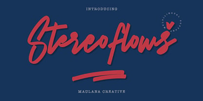 Give your designs an authentic handcrafted feel. � Stereoflows� is perfectly suited to stationery, logos and much more. Many Thanks!
 - Monster Fiesta PB by Pink Broccoli,
$24.00 An offbeat, fun, and frightful serif typeface inspired by the 1969 Rankin Bass animagic classic titled, Mad Monster Party.
 - Banuk by Grontype,
$16.00 Banuk is a brand new techno font designed with slanted line accent, the fonts is rounded edges and little imminent space between fonts. This font is a regular bold font and all caps with different style between uppercase and lowercase. Banuk is perfectly used font in any project such as logo font, flyer header, name card, invitational header, movie poster, poster, website header and much more. Features: Uppercase and lowercase Numeral and punctuation More Alternates and Ligatures Multilingual Support What inside Main Files Banuk .ttf Banuk .otf webfont Thankyou for choosing this font, i hope you enjoy it. Regard, Grontype
 - Majadira by Attype Studio,
$14.00 Introducing Majadira Font - a beautiful digital font that comes in two versions, Regular and Extrude. When combined, these two fonts give a 3D-like appearance to your designs. With its stylistic alternates, Majadira Font is visually appealing and perfect for wedding designs and Valentine's Day themes. Create stunning invitations, posters, and banners with this elegant font. Whether you're designing for a romantic event or just looking for a stylish touch, Majadira Font is the perfect choice. Features : - Majadira Font Family - Stylistic Alternates - Multilingual, US Roman, Latin 1 Support Hope you enjoy with our font! Attype Studio
 - Remora Sans by G-Type,
$39.00 Remora is an extensive new humanist sans serif which comes in 2 style variations, the effervescent Remora Sans and its corporate business partner Remora Corp . Both styles include 5 individual width sets ranging from the condensed W1 to the extra-wide W5. Furthermore, with an impressive 7 weights (Thin to Ultra) and true matching italics in each pack Remora is an ultra versatile super family comprising 140 individual fonts, perfect for any typographic assignment or design brief. Remora was designed by G-Type founder Nick Cooke. Both the Sans and Corp families share the same proportions, with the exception of certain key characters that change the overall appearance. Remora Sans is an exuberant and characterful typeface while Remora Corp, as its name suggests, is a businesslike typeface more suited to corporate typography. Quite early on in the design process Nick decided to give Remora Corp equal billing instead of incorporating these glyphs as alternates or a stylistic set that may get overlooked. “I created two separate families after learning a valuable lesson with one of my earlier typefaces, Houschka”, says Nick. “Houschka contained distinctive rounded A’s W’s and w’s, with ‘straight’ styles as character alternates. Even though style sets and alternates are easy to activate they are rarely used, so after many requests for customised versions of the fonts with the straight characters as defaults it was decided to create the separate ‘Alt’ family. So I cut straight to the chase with the two Remora variants and created two complementary families.” Both sets contain many shared letterforms, but it is the alternate characters that significantly alter the appearance of each font. Remora has been carefully designed for optimum legibility at large and very small sizes. Although fairly monolinear in appearance, especially in the lighter weights, particular attention has been paid to optical correction like the overshoots of the curved characters. Open counters and painstaking attention to detail (e.g. weight contrast between horizontal and vertical strokes, junctions of shoulders and stems etc) all boost readability and make Remora a great choice across all media. Remora Sans and Corp are ‘humanist’ rather than ‘geometric’ in style, meaning they’re not strictly based on rectangles and circles, resulting in a warm and friendlier feel. The slightly ’super-elliptical’ rounded forms create generously attractive curves. Remora has very distinctive italics in that they are only inclined by 8 degrees, but are not just based on slanted uprights. The italic styles are very alluring when used for display at large sizes and the good news is they come bundled free with their respective uprights. Each family also contains many OpenType features including proportional and tabular numbers, small caps, discretionary ligatures, plus five stylistic sets for ultra versatile typography.
 - Remora Corp by G-Type,
$39.00 Remora is an extensive new humanist sans serif which comes in 2 style variations, the effervescent Remora Sans and its corporate business partner Remora Corp. Both styles include 5 individual width sets ranging from the condensed W1 to the extra-wide W5. Furthermore, with an impressive 7 weights (Thin to Ultra) and true matching italics in each pack Remora is an ultra versatile super family comprising 140 individual fonts, perfect for any typographic assignment or design brief. Remora was designed by G-Type founder Nick Cooke. Both the Sans and Corp families share the same proportions, with the exception of certain key characters that change the overall appearance. Remora Sans is an exuberant and characterful typeface while Remora Corp, as its name suggests, is a businesslike typeface more suited to corporate typography. Quite early on in the design process Nick decided to give Remora Corp equal billing instead of incorporating these glyphs as alternates or a stylistic set that may get overlooked. “I created two separate families after learning a valuable lesson with one of my earlier typefaces, Houschka”, says Nick. “Houschka contained distinctive rounded A’s W’s and w’s, with ‘straight’ styles as character alternates. Even though style sets and alternates are easy to activate they are rarely used, so after many requests for customised versions of the fonts with the straight characters as defaults it was decided to create the separate ‘Alt’ family. So I cut straight to the chase with the two Remora variants and created two complementary families.” Both sets contain many shared letterforms, but it is the alternate characters that significantly alter the appearance of each font. Remora has been carefully designed for optimum legibility at large and very small sizes. Although fairly monolinear in appearance, especially in the lighter weights, particular attention has been paid to optical correction like the overshoots of the curved characters. Open counters and painstaking attention to detail (e.g. weight contrast between horizontal and vertical strokes, junctions of shoulders and stems etc) all boost readability and make Remora a great choice across all media. Remora Sans and Corp are ‘humanist’ rather than ‘geometric’ in style, meaning they’re not strictly based on rectangles and circles, resulting in a warm and friendlier feel. The slightly ’super-elliptical’ rounded forms create generously attractive curves. Remora has very distinctive italics in that they are only inclined by 8 degrees, but are not just based on slanted uprights. The italic styles are very alluring when used for display at large sizes and the good news is they come bundled free with their respective uprights. Each family also contains many OpenType features including proportional and tabular numbers, small caps, discretionary ligatures, plus five stylistic sets for ultra versatile typography.
 - Brushbress by Zamjump,
$13.00 Introducing Brushbress, a handwritten font with a dry brush texture with rough details. The Brushbress has been designed to suit a variety of projects with a complete set of alternative characters to completely change the look of your designs. You can use it for business branding, Instagram quotes, blog headers, fashion apparel, sports communities, film, photography, hobbies and much more ... Please note that Brushbress includes standard letters of several ligatures including lines to sweeten the look. The brushbress includes: Brushbress a brush font with upper and lowercase characters, numbers, and punctuation. How to use Brushbress lines in your ligatures, simply type underscore undersecor a,b,c,d,e,f,g,h,i, find the line that fits your character Multilingual support Brushbress supports multilingual characters for languages Brushbress is compatible with any software that can read standard fonts, although substitutes and binders require Opentype-enabled software. Most of the programs are now compatible with Opentype features. Any question? Feel free to contact me, I'll be happy to help you :)
 - Poeta by Tarallo Design,
$18.99 Poeta is an ornamental font for making patterns and text decoration. It contains floral and nature motifs. The symbols are versatile enough for simple decoration or festive holiday moods. Designers can use Poeta to make unique lines, fields, borders, or ornamentation within or around text. Try replacing a simple straight line with repeated symbols. Make a background to add visual interest to a design. Use the forms to decorate a chapter title or to mark the end of a magazine article. Replace a letter in a word with a symbol to create a memorable statement. Poeta will add visual poetry to any design project. This font began with sketches of patterns seen in ceramic tiles around Sicily. It is named Poeta because Sicily is an island rich in poetry traditions. Using this font is simple. Install it and type. Symbols will appear instead of letters. Choose the precise symbols through a software’s glyph palette. Use the type/character menu controls to vary the spacing and density of patterns.
 - Averica by Letteralle,
$23.00 Introducing my latest creation, Averica! a playful and friendly display font that is sure to add a touch of personality to any project. Averica is handmade with love and attention to detail, ensuring that each character is unique and full of charm. Whether you're looking to create eye-catching headlines, playful graphics, or fun social media posts, title, branding, merchandise, ads, poster, Averica is the perfect choice. With its bold and distinctive style, it will help your message stand out and capture the attention of your audience. Crafted with precision and care, Averica boasts smooth curves, clean lines, and just the right amount of quirkiness. It's playful and approachable, yet still maintains a professional feel, making it ideal for a variety of projects. So why settle for a bland and boring font, when you can add a touch of fun and personality to your work with carefully fashioned display font? Try it out today and see the difference it can make! Any Questions? Just Ask! I hope you enjoy! Thank You. Letteralle Studios
 - Explorer by Fenotype,
$30.00 Explorer - a classy typeface collection. Explorer collection includes following: • 8 Fonts - a clean and textured version of each • Catchwords • Swooshes • Pictures Explorer’s core is a strong script type with straight edges. All the fonts are designed to work nice together. Here’s a short introduction to the styles: •Explorer Script is equipped with Contextual Alternates that make the connections between letters smooth. In addition it has Swash, Stylistic and Titling Alternates for standard characters for more customised look. Explorer Script has three weights. •Explorer Sans is a wide all caps sans-serif that doesn’t shy away from taking it’s own space. Explorer Sans has two weights. •Explorer Condensed is a sturdy all caps condensed sans-serif with rounded edges. Explorer Condensed has two weights. •Explorer Serif is a bulky all caps serif. •Explorer Swoosh is a collection of strokes and swooshes designed to go with the Script. Try adding a connecting one in the end of a word written with Script or place a loose swoosh above or below a word. •Explorer Catchword is a collection of catchwords designed to go with Explorer fonts.
 - Senorita Cyrillic Script by Ira Dvilyuk,
$16.00 The hand-drawn script Señorita was handwritten with a dry brush and will look great on branding design, posters, apparel, logotype, website header, fashion design, wedding card design, and more. Hand-drawn script font Señorita contains a full set of uppercase letters and 2 full sets of lowercase letters and 43 ligatures - which can be used to create a handwritten calligraphy look. Use alternate lowercase and double-letter ligatures to create a perfect hand-painted look in your creations. The Cyrillic part of the font contains the uppercase letters and lowercase letters and 17 ligatures, giving a realistic hand-lettered style. Multilingual Support for 32 languages: Latin glyphs for Afrikaans, Albanian, Basque, Bosnian, Catalan, Danish, Dutch, English, Estonian, Faroese, Filipino, Finnish, French, Galician, Indonesian, Irish, Italian, Malay, Norwegian Bokmål, Portuguese, Slovenian, Spanish, Swahili, Swedish, Turkish, Welsh, Zulu. And Cyrillic glyphs support for Russian, Belorussian, Bulgarian, Ukrainian, and Kazakh languages. (Does font support more Cyrillic languages just type a message in the text box below and see if all characters you’ll need are there.)
 - SAQTAH by Twinletter,
$17.00 Welcome to the world of Saqtah! A display font with a superhero style that will bring strength and courage to your projects. Whether you’re working on a film, game, or design with a strong and bold theme, Saqtah is the perfect solution for you. With a stunning appearance, Saqtah will be the main highlight in every design. Each letter is filled with strength and thickness, creating a powerful and impressive look. However, the advantages of Saqtah do not stop there. This font is also equipped with special features. Alternate ligatures and characters allow you to create unique and creative typographical combinations, providing endless possibilities for the expression of your designs. Apart from that, Saqtah also supports multiple languages, so that your message can be well received by audiences from various countries. Make Saqtah your choice and give your project a hero touch. With the strength and boldness that this font has, you can create a bold and unforgettable look, captivating the heart and eye of every viewer. With its special features, Saqtah provides unlimited flexibility and creativity. Let’s be creative and bring an awesome impression with Saqtah in your project. What’s Included : File font All glyphs Iso Latin 1 Alternate, Ligature Simple installations We highly recommend using a program that supports OpenType features and Glyphs panels like many Adobe apps and Corel Draw so that you can see and access all Glyph variations. PUA Encoded Characters – Fully accessible without additional design software. Fonts include Multilingual support
 - Portada by TypeTogether,
$35.00 For everyone wishing for a modern serif that’s as clear and readable as a sans in restrictive digital environments, meet Portada by Veronika Burian and José Scaglione. Sans serifs are commonly used on small screens to save space and carry a modern tone. Serifs may appear fickle and unsteady, pixel grids change from one product to another, and space is at a premium. Portada now provides a serif option for these restrictive digital environments, putting that old trope to rest. The screen has met its serif match. Portada was created from and for the digital world — from e-ink or harsh grids to Retina capability — making it one of the few serifs of its kind. Portada’s text and titling styles were engineered for superlative performance, making great use of sturdy serifs, wide proportions, ample x-height, clear interior negative space, and its subservient personality. After all, words always take priority in text. It’s not all business, though. Portada’s italics contain an artefact of calligraphy in which the directionality of the instrokes and the returning curves of the outstrokes give the family a little unexpected brio. Yet even the terminals are stopped short of flourished self-absorption to retain their digital clarity. When printed these details are downright comforting. Portada’s titling styles enact slight changes while reducing the individual width of each character and keeping the internal space clear. Titling italics have increased expressiveness across a few characters rather than maxing out the personality in each individual glyph. Digital magazines, newspapers, your favourite novel, and all forms of continuous screen reading benefit from Portada’s features. This family can also cover many of the needs developers have: user interface, showing data intensive apps on screen, even one-word directives and dialogs. And, as a free download, an exhaustive set of dark and light icons is included to maintain Portada’s consistent presence, whether as a word or an image. The complete Portada family (eight text styles, ten titling styles, and one icon set) is designed for extensive, clear screen use — a rare serif on equal footing with a sans.
 - Greek by Scholtz Fonts,
$8.95The Greek font started from an experiment with designing fonts based on a geometric grid. I joined the points on the grid with straight lines to form the various characters and found that this resulted in a font that closely resembled Greek writing (derived from inscriptions carved in stone) of ancient times. I continued to develop this theme but I now accentuated the look and feel of Greek writing. The three styles shown are the results of this development. I did not kern or letterspace the individual letters since this would have been out of character with the orignal Greek writing. This means that the font is mono-spaced. At a later stage I may produce more refined and "modern" versions of these fonts. Surprisingly, the Greek SCF styles are very readable. The font is fully professional in terms of its character set. It contains over 235 characters - (upper and lower case characters, punctuation, numerals, symbols and accented characters are present). In fact, it has all the accented characters used in the major European languages. - DT Partel by Dragon Tongue Foundry,
$9.00 DT Portal: This stylised, partially serifed font, made with a slightly rounded square form, may have been inspired initially by old cathode ray tubes and computer screens. Although not intended to be purely a ‘tech’ font, it can have a strong tech feel to it. More suited to being a headline font than body text. It also appears to have a monospaced look to it, since most letters, (other than letters like ‘i, l and t’), do have the same width. There is some automatic contextual shape adjustment happening in places, to avoid taking up too much space, so contextual ligatures should be turned on. As is the case with most of my fonts, when given the choice, ‘metric’ spacing should be used in preference to ‘optical’. Initially this font was going to be called ‘DT Portal’, because its form was similar to that of a window or doorway. But due to other fonts already having that name, I chose to rename it as ‘DT Partel’, for no reason other than it is only a very small change visually.


