10,000 search results
(0.056 seconds)
- Moot jungle by Alit Design,
$18.00 Presenting 🍃The Moot Jungle Nature Font🍃 by alitdesign. "The Moot Jungle" is an elegant serif font with a natural twist. Inspired by the beauty of nature, this font features a stunning swash of leaves that adds a touch of sophistication to any design. The serifs are delicate and refined, making it perfect for elegant, upscale designs. Whether you're creating a logo, invitations, or other design projects, "The Moot Jungle" is sure to make a lasting impression. In addition, "The Moot Jungle" has a versatile design, making it suitable for various uses such as headers, titles, body text, and more. The font supports multiple languages and includes a full set of uppercase and lowercase letters, numbers, and punctuation marks. It also comes with stylistic alternatives and ligatures, adding to its uniqueness and allowing for even more creative freedom. Embrace the beauty of nature and elevate your design with "The Moot Jungle" font. The Moot Jungle font has alternatives that you can combine between swashes and symbols that have the theme of elegant nature. Besides that this font is very easy to use both in design and non-design programs because everything changes and glyphs are supported by Unicode (PUA). The Moot Jungle Font has a total of 700 glyphs including symbol, multilingual. Language Support : Latin, Basic, Western European, Central European, South European,Vietnamese. In order to use the beautiful swashes, you need a program that supports OpenType features such as Adobe Illustrator CS, Adobe Photoshop CC, Adobe Indesign and Corel Draw. but if your software doesn't have Glyphs panel, you can install additional swashes font files.
 - Garelina by Riasyletter_Studio,
$19.00 Looking for a minimalist and luxurious serif font for logos, web design, clothing promotions, brochures, and more? Garelina is the answer. This font has thin and smooth lines that make it look elegant and luxurious. Garelina is perfect for branding and promotion purposes. With its delicate typography, this font can add aesthetic value to your design. Garelina also has several letter variants making it easy to use for various design types. With Garelina, you can create minimalist designs that still look luxurious and elegant. This font is perfect for companies that want to display a professional and stylish image. Do not hesitate to try Garelina on your design now. You will be surprised how easy it is to make elegant and luxurious designs with this serif font. Garelina, the elegant and luxurious serif font for your branding needs. What's Included : - Garelina OTF - More than 250 of glyphs (include Uppercase, Lowercase, Numerals & Punctuations,Ligatures and Stylistic) - Multilingual support - Works on PC & Mac - Simple installations - Accessible in the Adobe Illustrator, Adobe Photoshop, Adobe InDesign, even work on Microsoft Word. - PUA Encoded Characters (fully accessible without additional design software) Support For Language : Albanian, Basque, Breton, Chamorro, Danish, Dutch, English, Finnish, French, Frisian, Galician, German, Italian, Malagasy, Norwegian, Portuguese, Spanish, Alsatian, Aragonese, Arapaho, Arrernte, Asturian, Aymara, Bislama, Cebuano, Corsican, Fijian, French_creole, Genoese, Gilbertese, Greenlandic, Haitian_creole, Hiligaynon, Hmong, Hopi, Ibanag, Iloko_ilokano, Indonesian, Interglossa_glosa, Interlingua, Irish_gaelic, Jerriais, Lojban, Lombard, Luxembourgeois, Manx, Mohawk, Norfolk_pitcairnese, Occitan, Oromo, Pangasinan, Papiamento, Piedmontese, Potawatomi, Rhaeto-romance, Romansh, Rotokas, Sami_lule, Samoan, Sardinian, Scots_gaelic, Seychelles_creole, Shona, Sicilian, Somali, Southern_ndebele, Swahili, Swati_swazi, Tagalog_filipino_pilipino, Tetum, Tok_pisin, Uyghur_latinized, Volapuk, Walloon, Warlpiri, Xhosa, Yapese, Zulu, Latinbasic, Ubasic, Demo
 - Neuzeit Office Soft Rounded by Linotype,
$29.99 Every year, more and more text is read directly on a computer screen in office applications, or from freshly printed sheets from a copier or laser printer. Clear, legible text faces are more imperative to office communication than ever before. Yet every worker desires a small bit of personality in the corporate world. Most office environments are only equipped with a few basic fonts that are truly optimized for use in text, with laser printers, and on screen. The Linotype Office Alliance fonts guarantee data clarity. All of the font weights within the individual family have the same character measurements; individual letters or words may have their styles changed without line wrap being affected! All numbers, mathematical signs, and currency symbols are tabular; they share the same set character width, ensuring that nothing stands in the way of clear graph, chart, and table design. In addition to being extremely open and legible, the characters in this collection's fonts also share the same capital letter height and the same x-height. The production and reading of financial reports is duly streamlined with the Linotype Office Alliance fonts. The Neuzeit Office family is designed after the model of the original sans serif family Neuzeit S, which was produced by D. Stempel AG and the Linotype Design Studio in 1966. Neuzeit S itself was a redesign of D. Stempel AG's DIN Neuzeit, created by Wilhelm Pischner between 1928 and 1939. Intended to represent its own time, DIN Neuzeit must have struck a harmonious chord. DIN Neuzeit is a constructed, geometric sans serif. It was born during the 1920s, a time of design experimentation and standardization, whose ethos has been made famous by the Bauhaus and De Stijl movements in art, architecture, and design. Upon its redesign as Neuzeit S in the 1960s, other developments in sans serif letter design were taken into account. Neuzeit S looks less geometric, and more gothic, or industrial. Separating it from typefaces like Futura, it has a double-storey a, instead of a less legible, single-storey variant. Unlike more popular grotesque sans serifs like Helvetica, Neuzeit S and especially the redesigned Neuzeit Office contain more open, legible letterforms. Neuzeit Office preserves the characteristic number forms that have been associated with its design for years. After four decades, Neuzeit has been retooled once again, and it is more a child of its age than ever before. Akira Kobayashi, Linotype's Type Director, created the revised and updated Neuzeit Office in 2006. His greatest change was to retool the design to make its performance in text far more optimal. Additionally, he created companion oblique to help emphasize text. The other three families in the Office Alliance system include Metro Office, Times Europa Office and Trump Mediaeval Office.Some weights of the Neuzeit Office are availabla as soft rounded versions. "
 - ITC Panache by ITC,
$29.99Typefaces, like most other works of art, provide a small window into the personalities and sensibilities of the artists who create them. ITC Panache not only provides this window, it is also aptly named. Mr. Edward Benguiat the dreator of ITC Panache, has all the dash, verve (and panache) hinted at in the design, Creative, capable and prolific, Ed Benguiat has drawn hundreds of exciting and popular typeface designs. Benguiat's design goal was to create a sans serif typestyle that is versatile, utilitarian - and distinctive. We think he has succeeded admirably. ITC Panache's three weights mix exceptionally well to complement each other or provide emphasis where necessary. Extensive testing at text sizes and design fine-tuning has produced a typeface family which is remarkably homogenous and consistent in color. Text set in ITC Panache is inviting without dissapointment. It is exceptionally easy to read, even in long text blocks of copy or small point sizes. When set in larger sizes or used for headlines, ITC Panache's character traits becomes more apparent and pronounced to the reader. They help to create graphics with distinction and style. Big or small. a little or a lot. it's hard not to use ITC Panache well. If you could pigeonhole ITC Panache, it would probably be classified as a stressed sans", but this would not completely describe, or do justiceto, the design. There is a slight contrast in stroke weight, which becomes more pronounced as the familiy weight increases; but there is a more to distinguish ITC Panache from ather sans serifs. Perhaps most obvious is its high waist and correspondingly slight condensation of the top half of the "round" capitals. Both of these traits link ITC Panache with the sensuous forms of art nouveau creations. In contrast are the typicall old style "e" found in designs like Cloister and ITC Berkeley Old Style, and the two storied "g" common to the early 20th century sans serif designs. The capital "A" even has the cupped top found in Caslon designs. Part of the beauty of ITC Panache is that all of these seemingly unrelated desig traits are melded into a design of exceptional continuity." - Amabile by REN FONT,
$25.00 Hello. Welcome to the Foundry "REN FONT"! I am a Japanese font artist, and this is my first challenge at a full-fledged Latin fonts. The typeface name is “Amabile (Adorable, прекрасный, Αρκετά/Αξιολάτρευτο)”. It means “lovely” in music terms. The design feature reflects the feature of Japanese typeface “Waon”, as the depending latin characters of which this typeface is designed. “Amabile” briefly expresses the basic concept of Waon, to “Express a music with typeface”. The non-Japanese characters in the Japanese font are basically composed with Latin, Cyrillic, and Greek. In addition to these 3 types of characters, “Amabile” have the capability of 87 languages by extending character types so called “W1G”, which consists of Latin supplements, Cyrillic supplements, Greek supplements, Latin extensions. We no longer offer free Regular weights for OpenType. こんにちは。ファウンドリー "REN FONT" へようこそ! 私は日本人のフォント作家ですが、初めて本格的な欧文フォントに挑戦しました。 この書体の名前は「Amabile(アマービレ)」。音楽用語で「愛らしく」という意味があります。 「和音」の従属欧文として制作された性格上、当然ながら「和音」の特長を反映したデザインになっています。 「和音」の基本コンセプトである「文字で音楽を表現する」を、最も端的に文字通り「表現」しているのがこの「Amabile」です。 ほとんどの和文書体の従属欧文は Latin, Cyrillic, Greek の3種類が基本です。「Amabile」はこの3種類に Latin 補助、Cyrillic 補助、Greek 補助、Latin 拡張などを加えた、いわゆるW1Gの規格にプラスアルファし、87か国言語を表現できる多言語フォントに生まれ変わりました。 グリフ形状は、比較的自由にデザイン表現が可能な Latin 以外は「Amabile」の特徴を残しつつ、ネイティブの形状を壊さない、ぎりぎりの選択を施してあります。 OpenType の Regular ウェイトの無料提供は終了しました。
 - Copihue by Letritas,
$30.00 Copihue is the newest font from the foundry of Juan Pablo De Gregorio. A Sans-Serif with some humanist hints, it displays simple and subtle yet sober, vivid strokes. This font’s personality unfolds itself as long as we are reading it. The aim of Copihue is neither to be as neutral as a grotesque font nor to become as predictable as a fully geometric typeface can be. This typography wants to appeal to the likes of designers who prefer all-rounder fonts, the ones who fit well in most layouts. With this purpose in mind, Juan Pablo studied elements of different typefaces and styles to cast them into Copihue, which boasts a personality that makes it a great fit for different compositions and designs. Copihue has a slanted version with "real italics". These italics are slightly more condensed than the regular version, in order to give it a different text texture. The typeface has 9 weights, ranging from “hair” to “black”, and two versions: "regular" and "italic". Its 18 files contain 749 characters with ligatures, alternates, small caps, oldstyle and tabular numbers, fractions, and case sensitive figures. It supports 219 Latin-based languages, spanning through 212 different countries. Copihue supports this languages: Abenaki, Afaan Oromo, Afar, Afrikaans, Albanian, Alsatian, Amis, Anuta, Aragonese, Aranese, Aromanian, Arrernte, Arvanitic (Latin), Asturian, Atayal, Aymara, Bashkir (Latin), Basque, Bemba, Bikol, Bislama, Bosnian, Breton, Cape Verdean Creole, Catalan, Cebuano, Chamorro, Chavacano, Chichewa, Chickasaw, Cimbrian, Cofán, Corsican Creek,Crimean Tatar (Latin),Croatian, Czech, Dawan, Delaware, Dholuo, Drehu, Dutch, English, Estonian, Faroese, Fijian Filipino, Finnish, Folkspraak, French, Frisian, Friulian, Gagauz (Latin), Galician, Ganda, Genoese, German, Gikuyu, Gooniyandi, Greenlandic (Kalaallisut)Guadeloupean, Creole, Gwich’in, Haitian, Creole, Hän, Hawaiian, Hiligaynon, Hopi, Hotc?k (Latin), Hungarian, Icelandic, Ido, IgboI, locano, Indonesian, Interglossa, Interlingua, Irish, Istro-Romanian, Italian, Jamaican, Javanese (Latin), Jèrriais, Kala Lagaw Ya, Kapampangan (Latin), Kaqchikel, Karakalpak (Latin), Karelian (Latin), Kashubian, Kikongo, Kinyarwanda, Kiribati, Kirundi, Klingon, Ladin, Latin, Latino sine Flexione, Latvian, Lithuanian, Lojban, Lombard, Low Saxon, Luxembourgish, Maasai, Makhuwa, Malay, Maltese, Manx, M?ori, Marquesan, Megleno-Romanian, Meriam Mir, Mirandese, Mohawk, Moldovan, Montagnais, Montenegrin, Murrinh-Patha, Nagamese Creole, Ndebele, Neapolitan, Ngiyambaa, Niuean, Noongar, Norwegian, Novial, Occidental, Occitan, Old Icelandic, Old Norse, Oshiwambo, Ossetian (Latin), Palauan, Papiamento, Piedmontese, Polish, Portuguese, Potawatomi, Q’eqchi’, Quechua, Rarotongan, Romanian, Romansh, Rotokas, Sami (Inari Sami), Sami (Lule Sami), Sami (Northern Sami), Sami (Southern Sami), Samoan, Sango, Saramaccan, Sardinian, Scottish Gaelic, Serbian (Latin), Seri, Seychellois Creole, Shawnee, Shona, Sicilian, Silesian, Slovak, Slovenian, Slovio (Latin), Somali, Sorbian (Lower Sorbian), Sorbian (Upper Sorbian), Sotho (Northern), Sotho (Southern), Spanish, Sranan, Sundanese (Latin), Swahili, Swazi, Swedish, Tagalog, Tahitian, Tetum, Tok Pisin, Tokelauan, Tongan, Tshiluba, Tsonga, Tswana, Tumbuka, Turkish, Turkmen (Latin), Tuvaluan, Tzotzil, Uzbek (Latin), Venetian, Vepsian, Volapük, Võro, Wallisian, Walloon, Waray-Waray, Warlpiri, Wayuu, Welsh, Wik-Mungkan, Wiradjuri, Wolof, Xavante, Xhosa, Yapese, Yindjibarndi, Zapotec, Zulu, Zuni.
 - Abimanyu by Goodigital13,
$20.00 perfect for branding, photography, invitations, quotes, watermarks, advertisements, product designs, labels, and much more!. it will make your design project more beautiful. The font is suitable for any design like branding, fashion, print template, quotes, wedding and etc.
 - CLASSIC Line by WAP Type,
$25.00 frontline classic font Font a stylish Font. It’s useful for any Design project. Decal, card, e-card, Good for Logos & Headlines, Poster,Tag design, Newspaper & Magazine Ad Design and many more. True type and Open type font files
 - Nouthend by Lemonthe,
$15.00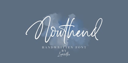 Nouthend is a beautiful and flowing handwritten font with a modern style. This gentle font will look gorgeous on a variety of design ideas such as, logos & branding, invitation, stationery, wedding designs, product designs, labels, photography, and more!
 - Prosaic Std by Typofonderie,
$59.00 A Postmodern vernacular sanserif in 8 fonts Prosaic designed by Aurélien Vret is a Postmodern typographic tribute to the french vernacular signs created by local producers in order to directly market their products visible along the roads. These signs drawn with a brush on artisanal billboards do not respect any typographic rules. The construction of these letterforms is hybrid and does not respect any ductus. Nevertheless the use of certain tools provokes a certain mechanism in the development of letter shapes. It’s after many experiments with a flat brush, that’s these letterforms have been reconstructed and perfected by Aurélien Vret. This is the starting point for the development of an easily reproducible sanserif with different contemporary writing tools. From non-typographical references of Prosaic towards readability innovation The influence of the tool is revealed in the letterforms: angular counterforms contrasting to the smoothed external shapes. This formal contrast gives to Prosaic a good legibility in small sizes. These internal angles indirectly influenced by the tool, open the counterforms. In the past, to deal with phototype limitations in typeface production, some foundries modified the final design by adding ink traps. In our high resolution digital world, these ink traps — now fashionable among some designers — have little or no effect when literally added to any design. Should one see in it a tribute to the previous limitations? Difficult to say. Meanwhile, there are typeface designers such as Ladislas Mandel, Roger Excoffon, and Gerard Unger who have long tried to push the limits of readability by opening the counters of their typefaces. Whatever the technology, such design research for a large counters have a positive impact on visual perception of typefaces in a small body text. The innovative design of counter-forms of the Prosaic appears in this second approach. Itself reinforced by an exaggerated x-height as if attempting to go beyond the formal limits of the Latin typography. It is interesting to note how the analysis of a non-typographical letters process has led to the development of a new typographic concept by improving legibility in small sizes. Disconnected to typical typographic roots in its elaboration, Prosaic is somewhat unclassifiable. The formal result could easily be described as a sturdy Postmodern humanistic sanserif! Humanistic sanserif because of its open endings. Sturdy because of its monumental x-height, featuring a “finish” mixing structured endings details. The visual interplay of angles and roundness produces a design without concessions. Finally, Prosaic is Postmodern in the sense it is a skeptical interpretation of vernacular sign paintings. Starting from a reconstruction of them in order to re-structure new forms with the objective of designing a new typeface. Referring to typographic analogy, the Prosaic Black is comparable to the Antique Olive Nord, while the thinner versions can refer to Frutiger or some versions of the Ladislas Mandel typefaces intended for telephone directories. Prosaic, a Postmodern vernacular sanserif Prosaic is radical, because it comes from a long artistic reflection of its designer, Aurélien Vret, as well a multidisciplinary artist. The Prosaic is also a dual tone typeface because it helps to serve the readability in very small sizes and brings a sturdy typographic power to large sizes. Prosaic, a Postmodern vernacular sanserif
 - Phantom Urbanism Graffiti by Sipanji21,
$22.00 "Phantom Urbanism" is a monoline font with a monoline graffiti theme and an option with stylistic set with arrow effect to add depth and decoration to the font. It is perfect for a wide range of urban or street-themed design projects, such as streetwear design, logo design, car/motosport decals, skateboard decals, and other similar designs. With its edgy and bold appearance, "Phantom Urbanism" brings a sense of energy and attitude to your designs. The font's monoline style and arrow effect optional to adds visual interest and makes your designs stand out. Whether you're looking to create a strong and impactful design or add a touch of urban style to your projects, "Phantom Urbanism" is the font for you.
 - Street Of Exodus by Sipanji21,
$18.00 "Street of Exodus" is a monoline font with a graffiti theme and a slight shadow effect to add depth and decoration to the font. It is perfect for a wide range of urban or street-themed design projects, such as streetwear design, logo design, car/motosport decals, skateboard decals, and other similar designs. With its edgy and bold appearance, "Street of Exodus" brings a sense of energy and attitude to your designs. The font's monoline style and slight shadow effect create a 3D effect that adds visual interest and makes your designs stand out. Whether you're looking to create a strong and impactful design or add a touch of urban style to your projects, "Street of Exodus" is the font for you.
 - Healing Sunday by Gassstype,
$23.00 Here comes a New font, Introducing Healing Sunday It's Fun Comic Font is a Textured Natural Style and Authentic Style, this font is great for your creative projects such as watermark on photography, and perfect for logos & branding, invitation,advertisements,product designs, stationery, wedding designs,label ,product packaging, special events or anything that need handwritting taste. Healing Sunday is a natural Hand Drawn feel. This handmade font will make your design has a beautiful natural touch for each details. It is perfect for any design project as Invitation,logo, book cover, craft or any design purposes,photos, photography overlays, signs, window art, scrapbooking, tags and so much more! It is perfect for any design project as Invitation,logo, book cover, craft or any design purposes.
 - Broken Dreams by Gassstype,
$27.00 Here comes a New font, Introducing Broken Dreams It's Weird Display Font is a Natural Brush Style and Authentic classy style, this font is great for your creative projects such as watermark on photography, and perfect for logos & branding, invitation,advertisements,product designs, stationery, wedding designs,label ,product packaging, special events or anything that need handwritting taste. Broken Dreams is a Brush Hand Drawn feel. This handmade font will make your design has a beautiful natural touch for each details. It is perfect for any design project as Invitation,logo, book cover, craft or any design purposes,photos, photography overlays, signs, window art, scrapbooking, tags and so much more! It is perfect for any design project as Invitation,logo, book cover, craft or any design purposes.
 - Kostanadia by Gassstype,
$23.00 Here comes a New font, Introducing Kostanadia It's Weird Display Font is a Natural Style and Authentic classy style, this font is great for your creative projects such as watermark on photography, and perfect for logos & branding, invitation,advertisements,product designs, stationery, wedding designs,label ,product packaging, special events or anything that need handwritting taste. Kostanadia is a natural Hand Drawn feel. This handmade font will make your design has a beautiful natural touch for each details. It is perfect for any design project as Invitation,logo, book cover, craft or any design purposes,photos, photography overlays, signs, window art, scrapbooking, tags and so much more! It is perfect for any design project as Invitation,logo, book cover, craft or any design purposes.
 - Ainslie Sans by insigne,
$- Say g'day to Ainslie Sans, insigne Design’s new typeface. Like its big brother, the new face incorporates a mix of influences from Oz, although Sans is pared down from the original semi-serif. The original Ainslie was inspired by Mt. Ainslie and the city of Canberra’s inner suburb of the same name. Canberra is Australia’s capital--a planned city designed by American architect Walter Burley Griffin. Griffin’s style and geometric design for the city, which include Mt. Ainslie, are now also the same structure that make up the foundation of Ainslie Sans. Unlike the original Ainslie family member, though, Ainslie Sans does away with much of the aboriginal-inspired touches by eliminating the semi-serifs, forcing the font to borrow more heavily than its predecessor from Canberra’s distinct, geometric design and style. The result’s a spiffy Australian font that’s usable within a wide array of applications. The trendy typeface incorporates a multitude of alternates. You can access these in any OpenType-enabled application. Alternates, swashes and alternate titling caps allow you to customize the look and feel. Also incorporated are capital swash alternates, old style figures, and compact caps. Check out the PDF brochure to view these options in action. OpenType enabled applications can take complete benefit of your automatic replacing ligatures and alternates. This font also presents the glyphs to help a wide array of languages. Try it for copy. Try it for a headline. Try it alongside the original Ainslie. Whichever way suits you best, give it a burl. You won't be sad you did.
 - Wacamóler Caps - Personal use only

- gAbAcHiTA FFP - Personal use only

- Earwig Factory - Unknown license

- Telegrafico - Unknown license

- Hurry Up - Unknown license

- Axaxax - Unknown license

- Delta Hey Max Nine - Unknown license

- Monod Brun by Resident,
$40.00 Created in 2009 by V.H. Fleisher, Monod Brun is a geometric sans-serif typeface. The font has OpenType features that can be accessed in programs like the Adobe Creative Suite. These features include tabular lining figures, titling caps which are heavier & more loosely spaced than the regular caps, alternative punctuation marks, and arbitrary nut fractions (for single digit numerators & denominators). By clicking on the “Gallery” tab above, you can see an illustration of the OpenType features. The “ff” tab on the “Sample Text” bar below allows you to test the OpenType features with your own text. Supported languages include: Albanian, Czech, Danish, Dutch, English, Faroese, Finnish, French, German, Icelandic, Italian, Norwegian, Portuguese, Spanish & Swedish.
 - Store Clerk JNL by Jeff Levine,
$29.00 The cover of the 1929 sheet music from the First National/Vitaphone picture “The Girl from Woolworth’s” had its title (“Someone”) hand lettered. This single word title was the model for Store Clerk JNL, which is available in both regular and oblique versions as well as solid and solid oblique versions (without an inline). A bold, casual sans serif with rounded ends and an inline, Store Clerk JNL is perfectly suited for projects where a strong, yet playful title is necessary to grab the reader’s attention. For those old enough to remember, Woolworth’s was a leading “Five and Dime” store chain, especially in the days when a nickel or a dime actually could purchase something.
 - Bergsland Round by Hackberry Font Foundry,
$24.95 This is a version of the Bergsland Fashion stylized sans serif font family that is very high-waisted and sleek with rounded terminals called Bergsland Round. Round is my favorite out of the group as it is looser and friendlier. This four-font set has a Regular and a Black plus the italics. The stroke is only slightly modulated. The letterforms are higher, with a more open aperture, and sprinkled with breaks to add light and sparkle. This an attempt at a readable sans serif for text. It has many OpenType features and 465 characters per font: Caps, lower case, small caps, old style figures, numerators, denominators, accents characters and so on.
 - Village Green JNL by Jeff Levine,
$29.00 Village Green JNL is based upon a font called “Giraffe Extended” from the 1892 edition of the MacKellar, Smiths & Jordan type specimen book, and is available in both regular and oblique versions. Its Art Nouveau styling can also fit well with 1960s counter-culture revival projects. According to Wikipedia “A village green is a common open area within a village or other settlement. Historically, a village green was common grassland with a pond for watering cattle and other stock, often at the edge of a rural settlement, used for gathering cattle to bring them later on to a common land for grazing. Later, planned greens were built into the centres of villages.”
 - Provan by Matteson Typographics,
$19.95 Provan is a contemporary humanist sans serif with roots in calligraphy and incised letters. These timeless inspirations result in a typeface family that transcends fashion and adds a strong sense of authenticity to brands. The regular version of Provan has angled stem endings and oblique stress in curved shapes which add to its friendly and legible warmth. Provan Formal straightens these stroke endings to bring a more refined alignment of letters. The typefaces include swash capitals, small capitals, old style figures and special Celtic capital variants. The Inline version of Provan is useful for drop capitals, book covers and posters. Provan bucks the ubiquitous neutrality of geometric typefaces and exudes a sense of humanity, craftsmanship and warmth.
 - Sunstone by Supfonts,
$17.00 Sunstone Cyrillic & Latin font Sunstone it is a chic script font with exquisite accents and full Cyrillic support. It is perfect for branding, wedding invitations and invitation cards and many more It includes a full set of gorgeous uppercase and lowercase letters, numbers, a large selection of punctuation marks, and ligatures. Sunstone - это милый шрифт с изысканными акцентами и полной поддержкой кириллицы. Он идеально подходит для брендинга, свадебных приглашений и пригласительных билетов и многого другого Test it out below to see how it could look for your next project! Includes: Regular Script Latin languages support Cyrillic languages support Uppercase and lowercase Numbers and punctuation Ligatures Check out my blog: https://www.instagram.com/zloillev pinterest.com/dmitriychirkov7 Enjoy
 - Schoolroom JNL by Jeff Levine,
$29.00 Based on the type style used for the Superior Sign and Chart Printer No. 929, this simple and clean sans serif font was perfectly suited for use by teachers in the classroom and for businesses and organizations that needed to make signs, price cards, charts and notices. Digitally redrawn as Schoolroom JNL, it is available in both regular and oblique versions. The Superior Marking Equipment Company [formerly of Chicago] was not only a major supplier of materials for the rubber stamp industry, but for most of its existence manufactured date and numbering stamps, sign and chart printers (such as the one used for this font), and a line of children’s printing toys (amongst other items).
 - Elevator Music by PizzaDude.dk,
$16.00 When was the last time you listened to elevator music and found yourself humming along? And perhaps the tune you were listening to, got stuck in your ears for the rest of the day...the rest of the week? That's often what happens with elevator music: maybe you don't notice it - but it is there, and it could most likely be one of your all time favourites! :) My Elevator Music font does somewhat the same: it's nice and pretty harmless - but it works, perhaps even without you noticing! :) I've added 4 slightly different versions of each lowercase letter - and that goes for both Regular and Scratch versions. And they both have multilingual support, because elevator music is universal!
 - Last Date JNL by Jeff Levine,
$29.00 A typographic conundrum presented itself with the hand lettered title on the cover of the 1919 song "I Am Always Building Castles in the Air". The capitalized portion ["Castles in the Air"] was a hybrid mix of a few Art Nouveau-influenced rounded letters, yet along with this were squared letters with rounded corners (reflecting the upcoming Art Deco movement to take place in about another decade). As a complete alphabet, it didnít mix as well as in those few short words. What to do? It was decided to go with the squared look and save the rounder characters for a future project. The end result became Last Date JNL; available in both regular and oblique versions.
 - Applbitz by Joey Maul,
$10.00 Applbitz is a set of three pixel style fonts which include a matching set of food related pix fonts. The regular style is a text font, which is optimal at 14 points when used in flash. Applbitz Pix Base and Pix Top are corresponding food related glyphs, with the top providing a bit of detail. These "friendly" pix characters can also be used in flash using some TLC (and snap to pixel grid). They are fun to add your own color combinations, and are great for a variety of food icons. View the PDF file in the gallery for color suggestions. Special note: to dress the hamburger use "{" and "½" (left brace and one-half) from Pix Top.
 - Liviatica by Letterhend,
$19.00 Liviatica is a sophisticated serif with unique letterform. This typeface has been made carefully to make sure its premium quality and luxury feel. The letterform makes this typeface unique and stands out rather than the regular serif font. Very suitable for logo, headline, tittle, and the other various formal forms such as invitations, labels, logos, magazines, books, greeting / wedding cards, packaging, fashion, make up, stationery, novels, labels or any type of advertising purpose. Features : numbers and punctuation multilingual ligatures alternates PUA encoded We highly recommend using a program that supports OpenType features and Glyphs panels like many of Adobe apps and Corel Draw, so you can see and access all Glyph variations.
 - Rhythmic Revue JNL by Jeff Levine,
$29.00 The vintage sheet music for "Between the Devil and the Deep Blue Sea" yielded another bit of Art Deco-era lettering perfect for developing into a digital font. This time it wasn't the song title, but rather the name of the show it was from serving as the type inspiration - the Cotton Club's 1931 revue "Rhythm-Mania". Harlem's Cotton Club was an "exclusive, whites only" club; both famous for its talent and shows, yet infamous for hiring black acts but not allowing black patronage. On the sheet music, the show title was hand lettered in a bold, slightly stylized fashion which became the basis for Rhythmic Revue JNL; available in both regular and oblique versions.
 - GoGipsy by Latinotype,
$32.00 GoGipsy is a script font based on Coto Mendoza's modern calligraphy works created with the technical assistance of Luciano Vergara. GoGipsy is inspired by a magical journey—full of love, art and nature—through the Mexican Caribbean. GoGipsy tries to capture such incredible blend through gestures and calligraphy strokes, conveying freedom, expressiveness, strength and spontaneity. The family consists of four versions: regular, italic, drop and italic drop plus a set of ornaments based on the visual appealing Mexican textile art and embroidery full of colour and beauty. GoGipsy's baseline emphasises movement and rhythm. Have fun with OpenType features, swashes, ligatures and a wide array of initials. Go Gipsy! Each journey, new inspiration...
 - Laskey by Factory738,
$15.00 Laskey, a new retro serif, is now available! Laskey is a stylish font that is both retro and sophisticated. The serifs bring it back to tradition, while the smooth curves give it a 70s groovy vibe. Laskey is a perfect match for those vintage moodboards and logos. Numbers, punctuation, and multilingual letters are all included, as well as a distinct lower and uppercase. The ligature and italic fonts will come in handy for anything your imagination can think of! Laskey (Regular and Italic) Basic Latin A-Z and a-z Numerals & Punctuation Stylistic Alternates & Ligatures Multilingual Support for ä ö ü Ä Ö Ü ... Free updates and feature additions Thanks for looking, and I hope you enjoy it.
 - Smooth Sailing JNL by Jeff Levine,
$29.00 Songs of the early 1900s were anything but the status quo in topic or style. Excessively long titles, novelty tunes and "foreign themes" permeated the piles of sheet music in the local music shops. 1916's "Oh How She Could Yacki Hacki Wicki Wacki Woo (That's Love in Honolu)" covered a number of these quirks within one publication. This Hawaiian-tinged song evoked the mysterious ways of the South Seas islands, despite the abridging of Honolulu to "Honolu". Nonetheless, the hand lettered title of this particular piece of sheet music featured an Art Nouveau-influenced bold block letter with rounded corners. It's now available digitally as Smooth Sailing JNL, in both regular and oblique versions.
 - Stettinum Nicodemus Pro Sansum by Wardziukiewicz,
$20.00 Stettinum Nicodemus Pro is a project to revitalize lettering from tenement houses in Szczecin. The project includes the digitization of letter remains from ul. Kaszubska in Szczecin to form functional fonts. The main idea of the project was to preserve the disappearing remnants of Szczecin's typographic past, which, despite the span of glyphs limited by time, can be an inspiration for many future extensions of the already established family. Stettinum Nicodemus Pro Sansum is a family of typefaces consisting of 7 variations. The block structure with a regular structure and a relatively high minuscule allows for many different applications. Versions 700, 800 and 900 are intended for titles, headings and emphasis, typefaces 300 to 600 are text typefaces.
 - Artenoir Display by FoxType,
$15.00 Artenoir Display is a Brand New Elegant Typeface with 4 Variants. It has a dependable and uncompromising style, with controlled letterforms and modern touches. It looks amazing in logos, magazines, and movies. Artenoir Font would be perfect for branding, headlines, Captions, paragraphs, and posters. The various weights allow you to experiment with a wide range of applications. It's created to make an impression without sacrificing its beauty and readability. It's shown a clean, warmth, quirky, yet still purposed to be versatile. The Typeface includes Four Weights -Regular, Medium, SemiBold and Bold. Numerals and Extended Punctuation (248 Glyphs). Clean and Modern Glyphs Expert Kerning and Quality Crafting. Thank you for taking the time to look into the font.


