10,000 search results
(0.16 seconds)
- Campaign by Solotype,
$19.95We saw a zigzag type like this made in the 1860s. We copied the idea, but added stars to make it patriotic. As with many highly specialized fonts, you won't want to use this every day but certainly, like other "stars and stripes" types, it implies something about the message even before one reads the words. - Corpo Serif by Borutta Group,
$19.00 Corpo Serif is REFRESHED version of my old font Korpo Serif. Corpo Serif, designed by Mateusz Machalski, is a serif type family with a friendly feel. This type comprises 12 variants with 6 weights. The high contrast and high x height is perfect for headlines and display uses. Corpo Serif is a great complement for Corpo Sans.
 - Sporting Event JNL by Jeff Levine,
$29.00 A British boxing film from 1953 called “The Square Ring” had its titles and credits hand lettered in a slab serif type style commonly referred to as “Egyptian”. Other familiar type fonts which share this influence are Karnak, Stymie and Beton. Sporting Event JNL was modeled from the film’s titles and is available in both regular and oblique versions.
 - Woodbranch JNL by Jeff Levine,
$29.00 Woodbranch JNL is a solid version of the 2013 font release Woodlawn JNL. The design was originally based on examples of an outline (open face) wood type. This interpretation takes on newer, stronger characteristics as a bold typeface when the "inner letters" of the original alphabet were removed, yet the imperfection of the wood type pieces are still maintained.
 - Linotype Auferstehung by Linotype,
$29.99Linotype Auferstehung is part of the Take Type Library, selected from contestants of Linotype’s International Digital Type Design Contests of 1994 and 1997. German designer Johannes Plass was influenced by historic broken letter faces, particularly Caslon Gotisch, although the rounded corners give the font a handwritten look. Linotype Auferstehung is particularly good for headlines in larger point sizes. - Hipsterious by Letterhend,
$15.00 Hipsterious is casual and fun script that stands out from the crowd. Consist of two types, a regular and rough. Perfect to be used especially for logo type, signature, photography, quotes, apparel design, and any design needs. As usual, the font comes with many opentype features such as ligatures, stylistic set alternate, etc and also support multilingual.
 - Hoelderlin by RMU,
$25.00 In 1938 the Frankfurt-based foundry Ludwig & Mayer released Eugen Weiss’ beautiful fraktur ‚Hoelderlin‘. Carefully redrawn and redesigned, this digitized version is intended to add another gem to the enthusiasts’ treasure drove of blackletter types. The font contains the historical long s which can be reached by the OpenType feature historical forms or by typing the integral sign [ ∫ ].
 - AI Wood by Alphabets,
$17.95These six faces are interpreted from examples shown in Rob Roy Kelly's "American Wood Types" They are not merely scanned copies, but have been redrawn from scratch with various optical adjustments. Kelly points out that the true glory of the American Wood Types are the negative spaces, which are, in their dynamic active forms, the antithesis of the anemic flimsy letters produced by type foundries in the 19th century. The Alphabets Wood Types are designed with digital manipulation in mind. Stretch, curve and distort at will! These designs were released prior to similar revivals from Adobe. Each font has two full alphabets (one full height, one smaller) and numerals. However, certain points and accents will not be found. - LTC Kaatskill by Lanston Type Co.,
$24.95LTC Kaatskill was made specifically for use in an edition of Rip Van Winkle for the Limited Editions Club. "I feel that Kaatskill owes nothing in its design to any existing face, and the type therefore is as truly an American type as anything so hidebound by tradition as type can be."- F. Goudy This face was one of the first digital typefaces released by the Lanston Type Co. Ltd. Jim Rimmer took painstaking measures in his faithful revival. Goudy had never designed a specific Italic to accompany this face. The Italic completed by Rimmer is a variation on Deepdene Italic. The font set was re-mastered in 2006 by Colin Kahn. - SF Gushing Meadow - Unknown license

- SF Diego Sans - Unknown license

- SF Wonder Comic - Unknown license

- SF Piezolectric Inline - Unknown license

- SF Chaerilidae Outline - Unknown license

- SF RetroSplice Condensed - Unknown license

- SF Arch Rival - Unknown license

- SF RetroSplice Shaded - Unknown license

- SF Comic Script - Unknown license

- SF Piezolectric Condensed - Unknown license

- SF Piezolectric SFX - Unknown license

- SF Intermosaic B - Unknown license

- SF RetroSplice SC - Unknown license

- SF RetroSplice Outline - Unknown license

- SF Proverbial Gothic - Unknown license

- SF Chaerilidae Shaded - Unknown license

- SF Archery Black - Unknown license

- 1509 Leyden by GLC,
$49.00 This script font was inspired by the type used in Leyden by Jan Seversz to print Breviores elegantioresque epistolae [...], author Francesco Filfelo, circa 1509. The original font contains all lower case characters, except w, eth, thorn, lslash, oslash and so... and almost upper case. In addition, one set of small lombardic initials were also nearly complete. It take place instead of the Bold style (in only one package)offering a real and rare complete historical printing set... The original small "a" hight was 2,8 mm !, the upper case hight no more than nearly 5 mm, the initials hight almost 15 mm, covering nearly two lines. This font includes "long s", naturally, as typically medieval and also a few ligatures, but not any variants. We have entirely recreated some characters, upper, lower and initials, to fill gaps. It is used as variously as web-site titles, posters and fliers design, publishing texts looking like ancient ones, or greeting cards, all various sorts of presentations, menus, certificates, as a very decorative, elegant and unusual font, besides its historical scrupulous reality... This font supports enlargement as well as small size.
 - Handyrush by Zamjump,
$19.00 Introducing Handyrush Script font. It was inspired by retro typography designs in the 80's. There are over 250 glyphs in this font including Multilanguage Support. The OpenType feature with Stylistic Alternate to replace letters in the middle and end with a swash, and there are 3 swashes, and to display stylistic alternates it's quite easy just by typing characters+underscor / underscor+characters. specially for swash just type underscore underscore + a / b / c. Handyrush Script is very suitable for application especially on logos, and various other formal forms such as invitations, labels, logos, magazines, books, greeting / wedding cards, packaging, fashion, make up, stationery, novels, labels or all types of advertising purposes .
 - Legator by Putracetol,
$25.00 Legator - Super Bold Display Font. Legator a super bold, quirky display font with a fun and trendy characters. With a sporty style, it will be very suitable for your project, which is related to sport display. Such as story books, illustrations, comic books, t-shirts, posters, greeting cards, logos, branding, stickers, svg, crafting. The alternative characters were divided into several Open Type features such as Swash, Stylistic Sets, Stylistic Alternates, Contextual Alternates, and Ligature. The Open Type features can be accessed by using Open Type savvy programs such as Adobe Illustrator, Adobe InDesign, Adobe Photoshop Corel Draw X version, And Microsoft Word. Legator is also support multi language.
 - Kessel 105 Text by Talbot Type,
$19.50 Kessel 105 Text is the text specific variation of stablemate, Kessel 105 . With a narrower x-height and longer ascenders and descenders, its more traditional proportions make it more economical with space and better suited to continuous text. It's a versatile, modern sans, highly legible as a text font and with a clean, elegant look as a display font at larger sizes. It has an art deco flavour with sharp points at the apex of many characters. The Kessel 105 Text family comprises of four weights and includes old style non-aligning (lower case) numbers, both proportional and tabular as well as accented characters for Central European languages.
 - Future Bugler Soft by Breauhare,
$35.00 Future Bugler Soft is a soft version of Future Bugler, a font based on the second logo created by Harry Warren in early 1975 for his sixth grade class newsletter, The Broadwater Bugler, at Broadwater Academy in Exmore, Virginia, on Virginia’s Eastern Shore. This font can convey several perspectives or moods. It can suggest a space-age vision of the future, or an art-deco perspective of the future as in the movie “Sky Captain and the World of Tomorrow”. It also communicates the idea of high performance, or extreme sports, without the grunge. Also check out its siblings, the original Future Bugler, and Future Bugler Upright. Digitized by John Bomparte.
 - Kessel 205 by Talbot Type,
$19.50 Kessel 205 is inspired by the classic, geometric sans-serifs such as Futura, but has shallower ascenders and descenders for a more compact look, and features an art deco influence with sharp points at the apex of many characters, lowered crossbars and an oblique crossbar on the lower case e. It's a versatile, modern sans, highly legible as a text font and with a distinctive, elegant look as a display font at larger sizes. It includes old style non-aligning (lower case) numbers, both proportional and tabular as well as accented characters for Central European languages. The Kessel 205 family comprises of six weights and is closely related to Kessel 105.
 - FS Albert by Fontsmith,
$80.00 The x factor How do you make a font like FS Albert unique, distinctive? “When designing a font I try to question every letter,” says Jason Smith, “but all you need is a few that have an x factor. With FS Albert, they’re the lowercase ‘a’ and ‘g’ and the uppercase ‘I’ and ‘J’. “I remember a friend saying, ‘Why on earth have you designed the ‘a’ like that? Isn’t it too friendly for this kind of font?’ And, in a way, that’s what I wanted – honesty and warmth, because a lot of big brands at the time really needed to show a more human side.” Range of weights and styles FS Albert is a charismatic type: a warm, friendly sans serif face with a big personality. Open, strong and amenable, and available in a wide range of weights and styles, FS Albert suits almost every task you put it to. Fontsmith has crafted five finely-tuned upright Roman weights and four italic weights, as well as a special Narrow version to provide the best coverage and give headlines and text an easy-going character. The chunky kid “FS Albert was inspired by – and named after – my son, who was a bit of a chunky kid,” says Jason Smith. “I designed an extra bold weight because I always felt that the really big font heavy weights had the most personality. “I recently told Albert this story. He laughed, and forgave me for thinking he was a fat baby. He liked the big personality bit, though.” 1000s of glyphs Not content with a character set that covered Europe and the whole of the Western world, the studio decided to go further afield. There are now FS Albert character sets that cover western and eastern European languages, including those of Russia, as well as Cyrillic, Arabic and Greek scripts. In fact, the font now covers more than 100 languages, making it ideal for bringing a consistent typographic style to the communications of global brands.
 - FS Albert Paneuropean by Fontsmith,
$90.00The x factor How do you make a font like FS Albert unique, distinctive? “When designing a font I try to question every letter,” says Jason Smith, “but all you need is a few that have an x factor. With FS Albert, they’re the lowercase ‘a’ and ‘g’ and the uppercase ‘I’ and ‘J’. “I remember a friend saying, ‘Why on earth have you designed the ‘a’ like that? Isn’t it too friendly for this kind of font?’ And, in a way, that’s what I wanted – honesty and warmth, because a lot of big brands at the time really needed to show a more human side.” Range of weights and styles FS Albert is a charismatic type: a warm, friendly sans serif face with a big personality. Open, strong and amenable, and available in a wide range of weights and styles, FS Albert suits almost every task you put it to. Fontsmith has crafted five finely-tuned upright Roman weights and four italic weights, as well as a special Narrow version to provide the best coverage and give headlines and text an easy-going character. The chunky kid “FS Albert was inspired by – and named after – my son, who was a bit of a chunky kid,” says Jason Smith. “I designed an extra bold weight because I always felt that the really big font heavy weights had the most personality. “I recently told Albert this story. He laughed, and forgave me for thinking he was a fat baby. He liked the big personality bit, though.” 1000s of glyphs Not content with a character set that covered Europe and the whole of the Western world, the studio decided to go further afield. There are now FS Albert character sets that cover western and eastern European languages, including those of Russia, as well as Cyrillic, Arabic and Greek scripts. In fact, the font now covers more than 100 languages, making it ideal for bringing a consistent typographic style to the communications of global brands. - OK Moral by Tour De Force,
$25.00 Glyphfight at the OK Moral – single weight Western style typeface. High inverted contrast, generous width, decorative serifs, extended Latin support. It is our 103rd release.
 - Arvada JNL by Jeff Levine,
$29.00Arvada JNL is Jeff Levine's interpretation of a classic wood type font. Bold, brash and best at large point sizes, this font design also blends well with sports-themed projects. - Black Oak - Personal use only

- Cinnamon Cookie by Tigade Std,
$10.00 Cinnamon Cookie is combination of cute-uppercase-display-font with beauty-lowercase-script-font. When it is used together, it is almost perfect for various usage such as; wedding invitation, signature, decoration, until the range of kids products. It also support international characters. Other than that, you will get couples of additional stylistic set characters to improve/enhance your design.
 - Fireboys Outline by Sipanji21,
$10.00 Introducing, Fire Boys Font, this is a display and decorative with Burning fire looks!! very suitable for logos, clothing, branding and others. very easy to use without the hassle of drawing, Get inspired by its unique feel, and turn to add a lovely charm to any crafts project just by purchasing this font you can immediately use it for all your needs.
 - Boomolla by Stefani Letter,
$12.00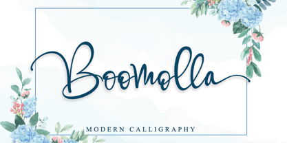 Boomolla is a beautiful handwritten font with a modern look. It features gorgeous swashes and ligatures that make this script incredibly versatile. Boomolla will add a decorative touch in an instant. This font is PUA encoded which means you can access all of the amazing glyphs and swashes with ease! It also features a wealth of special features including alternate glyphs and ligatures.


