10,000 search results
(0.029 seconds)
- Berlin Sans by Font Bureau,
$40.00 Berlin Sans is based on a brilliant alphabet from the late ’20s, originally released by Bauer with the name Negro, the very first sans that Lucian Bernhard ever designed. Assisted by Matthew Butterick, David Berlow expanded this single font into a series of four weights, all complete with expert character sets, plus a dingbat font. Imaginative & little-known, it promises enticing opportunities to the adventurous typographer; FB 1994
 - Old Claude LP by LetterPerfect,
$39.00 Old Claude was drawn by Paul Shaw to simulate an old cut of the classic (Claude) Garamond type designs of the 16th & 17th centuries. The pronounced rough edges and coarse letter shapes create the effect of letterpress printing with old foundry type onto handmade paper. The companion Old Claude Expert includes small caps and old-style figures. This "antiqued" design works equally well for both text and display.
 - Lazurski by ParaType,
$30.00 Designed at Polygraphmash type design bureau in 1984 by Vladimir Yefimov, with the addition of demi and demi italic. Based on a hot-metal typeface (1962) by Moscow book designer Vadim Lazurski (1909–1994), inspired by the early 16th century typefaces of Italian Renaissance. The typeface is useful for text and display composition, in fiction and art books. An 'expert set' was added by ParaType (ParaGraph) in 1997.
 - Adobe Bengali by Adobe,
$29.00The Adobe Bengali typeface was designed by Neelakash Kshetrimayum, with Bengali script expert Fiona Ross consulting on the design. This type family was designed to harmonize with Adobe?s other Brahmic fonts, both in terms of apparent size and style, to ensure that this suite of typefaces families can be typeset together as a system. The primary intended usage ? for printed outputs, particularly continuous text settings ? guided the design direction. - Adobe Kannada by Adobe,
$29.00The Adobe Kannada typeface was designed by Erin McLaughlin, with Brahmic script expert Fiona Ross consulting on the design. This type family was designed to harmonize with Adobe?s other Brahmic fonts, both in terms of apparent size and style, to ensure that this suite of typeface families can be typeset together as a system. The primary intended usage ? for printed outputs, particularly continuous text settings ? guided the design direction. - Captura Now Core Edition by TypeThis!Studio,
$50.00 Carefully refined shapes and sensitively balanced spacing and kerning create the gentle rythm that grants Captura its warm-hearted face, perfect in form and shape. www.typethis.studio This version covers all the essentials of Captura 265 Characters 8 Styles, including Italics Western European Language Support Numbers Symbols Punctuation If you need more features like small caps, special symbols, Cyrillic or Vietnamese language support, you may review the expert version of CapturaNow.
 - Herzchen by Font-o-Rama,
$25.00Herzchen is a well developed sans serif font. The curving and swinging letter forms remind a little of serif fonts, on closer inspection, however, they rather remind of upright italics. Playful details give charm to the typeface and make Herzchen lively and distinctive. With four cuts the typeface is suitable for simple corporate and editorial design projects. In addition there are many ligatures in the expert-set for individual use. - Carmilla Demo, crafted by the notable typographer David F. Nalle, is a distinctive font that reflects a blend of timeless elegance and artistic flair, making it a standout choice for various design p...
- Amherst by Linotype,
$29.99Amherst is a family of blackletter-inspired typefaces. This family, created by British designer Richard Yeend in 2002, is unique in that it mains the feel of blackletter/medieval type without relying directly on historical forms. Amherst is split into two different sub-families, Amherst and Amherst Gothic. Amherst is very geometric interpretation of Fraktur. Fraktur was a style of German type very popular in central Europe from 1517 until the early 20th Century. Its letters appear "broken" at certain angles and joints. Still, we recommend using it primarily for display purposes. Amherst is available in three weights: Regular, Bold, and Heavy. Amherst Gothic is very loosely inspired by late medieval letterforms, often called Texturas or Gothics. However, the letterforms of Amherst Gothic seem just as inspired by the Art Deco movements of the 1920s and by contemporary sans serif type design as anything else. Nevertheless, certain letters in this typeface do appear more "gothic" than others, especially A, D, M, Y, d, r, and x. Amherst Gothic is made up of three fonts, Amherst Gothic Split, Amherst Gothic Split Alternate, and Amherst Gothic Italic. Amherst Gothic Split has in-lined characters, and appears very ornamented. The alternate characters in Amherst Gothic Split Alternate are quite medieval in their appearance. Amherst Gothic Italic is the least medieval-looking of the set; its characters are very round, and more geometric. All six styles of the Amherst Family are OpenType format fonts, and include old style figures. - Kiloton - Unknown license

- Teenick - Unknown license

- Fargo Tuscan by Greater Albion Typefounders,
$20.00 Fargo Tuscan is the first of seven typefaces exploring the decorative possibilities of the Tuscan letter form, all of which are releasing in 2017. It’s the most European of the seven- it’s a Mid-Victorian inspired display face which would have been (and is) at home on either side of the Atlantic, unlike some of the others in this batch of Tuscan faces which are distinctly ‘trans-Atlantic’ (we know, that depends on your point of view but we are Greater ALBION Typefounders after all) in flavour. Fargo Tuscan is replete with decorative features, including Swash Capitals, alternate numeric forms and stylistic alternates ideal for the beginning and ending of words. Have some mid-Victorian mid-Atlantic fun with your next design project!
 - Antique Price Tags JNL by Jeff Levine,
$29.00 Antique Price Tags JNL is a collection of fifty-two decorative price cards recreating the look and charm of turn-of-the-last-century mercantile shops. The design is a hybrid of the decorative frame and dollar sign of antique price cards spotted in an online auction, and prices modeled from some gummed numerals once made by the Tablet and Ticket Company of Chicago under the brand name “Willson’s Gummed Letters” (after the company’s founder). Also included in the font are blank price cards with only a dollar sign, a cents sign or an empty frame, as well as a solid black frame for creating a backfill color. A companion font is available with the numbers in white on black panel backgrounds.
 - Pretty Boy by Creativemedialab,
$24.00 Introducing Pretty Boy a decorative serif family. This font consists of five weights and an ornament and has many alternative options to arrange to get a very beautiful and charming typography art. Pretty Boy Ornament works great to pair with any fonts too! This decorative serif family is perfect for all sorts of designs like movie, poster, wedding invitations, and also work great for logo, branding, headers or labels. how to access alternate? Adobe Photoshop go to Window - glyphs Adobe Illustrator go to Type - glyphs Others ( Canva, Cricut Design Space, etc ) , open font book (mac) / Character map (PC) - Set to view all Glyphs, copy the glyph that you want from Pretty Boy font and paste. Check out Losta Frida which is a great pair for Pretty Boy.
 - Tag Hand Graffiti Trash by TypoGraphicDesign,
$1.00 CHARACTERISTICS The fresh and unique character of the typeface are awesome BOOM! The letter-forms are associated urban graffiti tags and pieces. Many Dingbat symbols like microphone, tape deck, ghetto blaster, vinyl, etc. make this font really fresh n HOT! APPLICATION AREA The handwritten, sloppy, square, shaky and fresh urban script font »Tag Hand Graffiti Trash« BANG! would look good at display size for headlines in magazines or websites, movie posters, music covers artworks or music webbanner. TECHNICAL SPECIFICATIONS Headline Font | Display Font | Fancy Font – Tag Hand Graffiti Trash OpenType Font with 393 glyphs - alternative letters and ligatures like Mr, Mrs, Ltd, Co, Dr, Mc, Dj etc. (with accents & €) & 2 styles (regular & fat) + dingbats like diamant, tape deck, microphone, vinyl etc.
 - Surfbird by Vintage Voyage Design Supply,
$15.00 Summer vibes are here with Surfbird! • A playful Display family with large variety options. Four styles comes with seven widths & two graphic fonts. The point of this family is getting more modern moods into a classical cowboy-western typographic. The result is a playful western slab which can be used for any design project. Home decor / mugs / t-shirts / stickers / music or podcast covers / menu's / logo's / posters. It can be playful with "western cut" and smooth styles or more serious with the sharp styles. • The Surfbird has two graphic styles. 82 decor graphic elements to add more fancy style to your design. The first one is a contour and the second is a fill for them, to get full color elements.
 - Julmeme-Kun by Julmeme,
$25.00 Julmeme-Kun is a fully italic font. This unique characteristic added to its tall and elegant proportions makes it a very dynamic typeface. Applicable for any type of graphic design, especially for posters and logotypes.
 - Pickworth Old Style Pro by Red Rooster Collection,
$60.00 Steve Jackaman & Ashley Muir. An antique, rustic or even mystical design that will grow on you the more you use it. Pickworth contains all the high-end features expected in a quality OpenType Pro font.
 - Eden Pro by Red Rooster Collection,
$60.00 Based on the original 1934 Ludlow drawings by Robert Hunter Middleton, we created two additional weights that round out the family. Eden contains all the high-end features expected in a quality OpenType Pro font.
 - Kinver by Greater Albion Typefounders,
$15.00 Kinver owes it’s inspiration to the masthead of a 19th century handbill. It is designed to particularly complement our extensive ‘Imperial Granum’ typeface family. Bring the spirit of Victorian flair to your next design project!
 - Sablon Class by Roman Cernohous Typotime,
$29.00 Sablon is back! This time on the edge in Thick & Thin version, keeping its significant features especially in letters B, G, M and N. With new expressive figures best suitable in headlines and packaging graphics.
 - Ounce by Typomancer,
$26.00 Ounce is a didone typeface, a combine of high-contrast and rounded characteristic gives a unique feeling. Ounce comes with various weights from Light to Black and two options for Italic. Especially, headline for display.
 - Suomi Slab Serif by Suomi,
$19.00 All typewriter types are rounded and especially American Typewriter has an almost too-slick appearance. Suomi Slab Serif has the glyph shapes similar to typewriting, but the serifs, terminals and connections are crisp and sharp.
 - Alt Gotisch by HiH,
$12.00 Alt-Gotisch Verzierte is a typeface of decorative initials that is Victorian in style and bears a close family resemblance to the many ornamental tuscans cut throughout the nineteenth century by British foundries. Instead of the bifurcated terminals of the archetypical tuscan (see Figgins Tuscan by HiH or Stereopticon by Dan X. Solo), these letters display what Nicolete Gray might call a “wedge and bite” design -- as if they started with the wedge serif of a latin form and someone came along and took a perfectly round bite out of the wedge. We need not dwell on the lack of teeth marks. The calligraphic curls and flourishes are often graceful, sometimes a bit contrived, but always complex. There is a busyness that marks the style of the period. If you ever see an old photograph of a well-appointed Victorian parlor, you will recognize that same quality of busyness. Overdone is a word that frequently comes to mind. Alt-Gotisch Verzierte means “adorned or decorated old gothic.” The typeface is attributed by Alexander Nesbitt to an unidentified German foundry of the nineteenth century (Decorative Alphabets and Initials, Dover, New York 1987, plate 92). The designer is unknown. Our font is supplied with a lower case that is similar to the upper case, but is 15% shorter and is simplified by the omission of the decorative vines. For the lower case, alternate letters A, E, & T; and ligatures LE, OT & LY have been supplied. In addition, a few small decorative vines were planted here and there for optional use. An accented upper case is not part of the original design and is not here supplied. This design is also seen under the name “Sentinel” -- as always, it is worthwhile to compare the completeness of the character set and the faithfulness of the rendering. We believe you will agree that we provide a balance of quality and value that is unmatched in the contemporary marketplace. Alt-Gotisch Einfach is a simplified version of Alt-Gotisch Verzierte. The vine-less lower case of the Verzierte font is the upper case in Einfach. For a lower case for Einfach, the letters were further simplified by stripping away the three-dimensional outline, down to the bare bones and bites, as it were. Einfach, in fact, means “simple” or “plain.” It is interesting to note that this bare bones & bite lower case bears (I have a special license to use two homonyms in the same sentence) a striking resemblance to the 15th & 16th century ornamental letters from Westminster Abbey shown in Plate 47 of Alexander Nesbitt’s Decorative Alphabets and Initials (Dover, New York 1987).
 - Carolingian Majuscul by Kaer,
$28.00 I'm happy to present you my new Romanesque font from the Codex Gigas. The manuscript was created in the early 13th century in the Benedictine monastery of Podlažice in Bohemia. The codex was written in a handwriting atypical for the 13th century, which is actually a late version of the Carolingian minuscule. Texts about repentance and exorcism were written in large Majuscule (Square Capitals (Imperial Roman capitals written with a brush)). Majuscules first incised in stone more than two millennia ago, married to minuscule letterforms that evolved from manuscript hands of the eighth and ninth centuries. Majuscule font is the name given to a type of decorative upper-case letters used in inscriptions and, typically, at the start of a section of text in medieval manuscripts. They are characterized by their straight forms unlike rounded in Lombardic capitals with thick, curved stems. Majuscule capitals were also used to write words or entire phrases. The text is divided into words, punctuation marks are used consistently – periods indicate the end of a sentence and the middle of a phrase. You will get: * Uppercase glyphs * Numbers and symbols * Multilingual support * Ligatures * Free future updates Thank you!
 - OnepunchJim by JOEBOB graphics,
$9.00 OnepunchJim got its name from the way it was created; every character was made in one 'punch'. Very suitable for kids stuff.
 - KR Birdy is a delightful and engaging font created by the talented designer Kat Rakos. This unique typeface immediately captures the attention of its audience with its playful and whimsical character...
- Scribiola by Calligraplay,
$13.00 Scribiola is a charming, casual font that features alternate characters and special ligatures. Its unique double letter pairings make it feel authentically handwritten, perfect for any quirky or craft-related design, especially chalkboards, cards and labels.
 - Heavy Pitch by PizzaDude.dk,
$19.00 Fun packed comic style font. Especially made for commercial products such as all kinds of packaging, cereals, video games, candy, kids toys and alike. I added ligatures for double letters to avoid a repeating look. Enjoy!
 - Worstveld Hand by Typotheticals,
$5.00 A rough hand-drawn plain sans serif that would be good for non-formal use. Do not expect a polished set of fonts from a professional, this family is hand drawn, hand spaced and hand kerned.
 - Jealous Punk by Bogstav,
$15.00 Here's a font that would love to play with your designs! Especially the ones where kids toys or packaging is involved - but feel free to play around with the 5 different versions with your other designs!
 - Magical Source by Java Pep,
$19.00 Introducing Magical Source is a stylish serif font, every character uppercase and lowercase have alternates font. This font is equipped with more than 200 alternative fonts so you can mix and match every alternate based on your taste. This font still outstanding look, although you don't switch on the alternate. Magical Source font is a versatile font, the font can covering to headlines, titles, logotype, branding, pull quotes & monograms, and etc.
 - Realistic Harvest by Timurtype,
$14.00 Introduced by Timurtype Studio! Realistic Harvest is a Handwritten Script Font this font Captivates with elegance Handwritten font, where every curve reveals a story of elegance and every detail is a brushstroke of luxury. A visual symphony for those who appreciate the art of beauty. Realistic Harvest Font also supports multilingualism. Enhance your designs with our original fonts, feel free to comment or provide feedback, Enjoy the fonts Thank You
 - Carlottena by Stefani Letter,
$12.00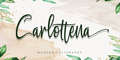 Carlottena is a beautiful and elegant script font. Its modern and classy look is perfect for logos, branding, invitations, social media posts and every other design that needs a handwritten touch and can be used for almost every design. This font is PUA encoded which means you can access all of the amazing glyphs and swashes with ease! It also features a wealth of special features including alternate glyphs and ligatures.
 - Collect Em All BB by Blambot,
$12.00 Blambot’s first font featuring Contextual Alternates: COLLECT EM ALL BB! As you type, you'll discover six versions of every letter, three versions of every number, three versions of the exclamation point and question mark, auto-correction of serif-I per standard American comic book tradition, and if you type from three to six of any letter, you'll get a bouncy baseline! All this, plus a hefty set of European characters.
 - Odisean SC - Personal use only

- Cnabel by Agnieszka Ewa Olszewska,
$20.00 Cnabel, is a display font inspired by the Art Nouveau movement, particularly by Slovenian book illustration from the period. It�s a modern interpretation that took some characteristic features. It has no contrast, large x-height, and rather wide proportions. The typeface feels constructed and futuristic, but at the same time, it has sinuous round lines that provide an organic feel. Its unconventional shapes guarantee a unique design experience. Good for posters, branding, headlines, logotypes, covers. Easy to use, fits nicely to different materials, attracts attention. It supports European languages, has alternates characters, OpenType features, and ligatures. It�s in 3 weights: thin, regular, and bold. It� contains 357 glyphs.
 - Nomad SS by Sensatype Studio,
$15.00 NOMAD is a vintage vibes font are produced with modern style and ready for historical projects. Based on our experience as a graphic designer who works for a lot of companies, we often are requested to design a graphic with a vintage feels and modern style. So, we try to brainstorming and create this font to make the idea is going out. This is perfect for show off in historical style and vintage vibes. You will get vintage, modern, and certainly unique style with this font. NOMAD font is also included full set of: All Uppercase letters Multilingual characters Numerals Punctuations Wish you enjoy our font. :)
 - Naston by Sopheynoft,
$49.00 Naston Regular is the font of choice for those who seek an elegant and versatile typeface. With its timeless design, Naston Regular adds sophistication to a wide array of applications, be it formal invitations, business presentations, or creative projects. Its meticulously crafted letterforms prioritize readability while maintaining a unique and distinctive style, leaving a lasting impression on your audience. This font's broad language support and impeccable craftsmanship ensure a seamless reading experience, making it an excellent choice for anyone who values professionalism and aesthetics in their design projects. Choose Naston Regular to elevate your content and effectively convey your message with clarity and elegance.
 - Prototype by Barnbrook Fonts,
$30.00 Prototype is a typeface with a very contemporary identity crisis—is it old or new? uppercase or lowercase? serif or sans-serif? Prototype tries to be all things to all people. There have been many attempts at creating a universal typeface, one that rationalises the alphabet and removes the inconsistencies of upper and lower case, applying an unreasonable logic to something that has grown organically ...and is already perfectly usable! Prototype was the same experiment carried out at a time when design was experiencing an identity crisis of its own—letterforms that try to be all things to all people but end up being something else entirely.


