10,000 search results
(0.031 seconds)
- Stencil Decor JNL by Jeff Levine,
$29.00 Stencil Decor JNL is loaded with all kinds of antique designs, embellishments and borders to work well alongside your favorite stencil lettering to create a totally retro look. Of course, these designs also make beautiful additions to many other kinds of print and craft projects. PLEASE NOTE: The purchase of this font does not include the right to reproduce the images for resale as stand-alone products (including, but not limited to stencils, ink stamps, stickers, wallpaper, etc.). For this kind of use, contact Jeff Levine Fonts through the email address provided in the EULA to discuss special licensing options and fees.
 - Kuenstler 165 by ParaType,
$30.00 Bitstream typeface based on Koch Antiqua by Rudolph Koch (Klingspor, 1922). Koch Antiqua, also known as Locarno and Eve, is the most popular face of one of the great lettering artists of the 20th century. This delicate display face has a small x-height, very tall ascenders, and main strokes that taper gracefully downward. Koch-Antiqua appeared extensively in advertising between the wars. A refined letterform, it is best used sparingly for a distinctive look in advertising, book, and job work. Two weights of Cyrillic version including alternative lc characters were developed by Isabella Chaeva and released in 2008 by ParaType.
 - Nipey by PizzaDude.dk,
$20.00 Every single character in Nipey is unique! Meaning that no characters is a copy of another. All accented characters therefore are hand-drawn and unique. For example, the letter "ñ" is not a copy of 'n' with a diacritical tilde - and this goes for all accented characters, as well as the ordinary ones! Besides that, Nipey has got autoligatures for doublelettered lower- and uppercase, as well as numbers. But that's not all! Nipey also has got a full set of alternate lower- and uppercase letters! Talk about a unique font, huh! You will need to use OpenType supporting applications to use the autoligatures.
 - ITC Airstream by ITC,
$29.00Timothy Donaldson creates letterforms anywhere using anything: he is just as happy making letters with pens and brushes, many of which he makes himself. Applying his personal commitment to the beauty of hand-drawn letterforms to modern type design methods has ensured that his fonts frequently reveal the presence of a joyful creativity behind the design. Airstreams alphabet is composed of consciously irregular handwriting characters and the overall tone is set by the emphasized vertical strokes. The erratic Airstream with its cheerful, unconventional character is intended for shorter texts and headlines and should be used in point sizes 10 and larger. - Willow by Adobe,
$29.00Willow is an Adobe Originals typeface designed in 1990 by Joy Redick for the Adobe Wood Type series. Willow is a condensed typeface modeled on nineteenth-century wood types known as Clarendons (wood type Clarendons do not resemble the English metal types of that name). Clarendon condensed faces were originally so well-designed that words or a line of display type have an even color that is remarkable for wood types. Taken from proofs of type in the Rob Roy Kelly Collection housed at the University of Texas at Austin, Willow can be used for display work such packaging, advertising, and posters. - Lancar by Twinletter,
$12.00 Lancar is a sans serif font family with lovely curving forms ideal for headings and text. The curves provide your project an exquisite and harmonious design, great for making your project look gorgeous. This font also comes with four families to help you with your job. With this typeface, you can make your project stand out. of course, your various design projects will be perfect and extraordinary if you use this font because this font is equipped with a font family, both for titles and subtitles and sentence text, start using our fonts for your extraordinary projects.
 - Roadie PB by Pink Broccoli,
$16.00 Roadie was inspired by a 1981 Hallmark card with lettering that was full of frolicking fun. Filled with a childish persona and a playful bounce, this Roadie has a lot to offer. As with some of my previous type designs, it is a typographic dance, wonderfully skipping across designs, surprising with each letter typed. With an extensive character set, and clean sharpie marker-like look, Roadie is a joy to typeset with, and it comes with a stylistic alternates feature that shuffles the Capitals and lowercase that share similar unicase forms that add to the quirky playfulness.
 - Peosa by Logofonts,
$10.00 Peosa is Modern sans serif fonts great for product logo, poster, headline, card logo, web, magazine, packaging, stationery and much more. Easily creates your own logo type with fonts. Peosa has an Open Type feature to access a large selection of unique alternative letters and many ligatures to make it easier for you to create. Peosa can be accessed perfectly on design applications such as Adobe Illustrator, Adobe Photoshop, Corel Draw, Affinity Designer but does not rule out the possibility that it can also be accessed using web-based applications such as kittl, canva, artboard studio and others.
 - Belligan by Orenari,
$16.00 Belligan is rounded sans serif which looks calm, feminine yet elegant. Belligan is perfect for your next project, if your project is decided to be simple, modern, clean, and professional touch. Belligan Features: - All Character A-Z, a-z, numeral & punctuation. - Ligatures (BB, CC, DD, EE, FF, GG, LL, MM, NN, OO, PP, RR, SS, TT, Th, ZZ, bb, cc, dd, ee, ff, fi, gg, ll, mm, nn, oo, pp, rr, ss, tt, ti, zz) - Multilingual Support. Oh, and please don't hesitate to drop me a message if you have any questions or you wanna share some jokes! :) Thank You, Ari
 - Valeson by insigne,
$34.00 Feel the funk with the retro-inspired Valeson. This groovy mix of the ‘70s and ‘80s has an upbeat rhythm of its own that will make your project boogie. It’s loads of fun with its swashy, calligraphic twist. Push it to the max with plenty of weights. Denser weights are brawny and robust, fantastic for headlines, while medium weights are swell for short bits of text. With all its options, this fun, throwback personality is still streamlined and plenty useful for today’s jobs. It’s loads of fun with its swashy, calligraphic twist. Production assistance by Lucas Azevedo and ikern.
 - Gioties by IbraCreative,
$11.00 Gioties is an adorable display font that radiates an irresistible charm and playfulness. With its cute and whimsical letterforms, Gioties encapsulates the essence of innocence and joy. The rounded edges and friendly curves of each letter exude a sense of approachability, making it the perfect choice for designs that require a touch of sweetness and lightheartedness. Gioties effortlessly adds a delightful flair to children's books, playful merchandise, and cheerful branding. Its unique character variations and vibrant energy create a captivating visual experience, ensuring that any project adorned with Gioties becomes a canvas of endearing cuteness and boundless creativity.
 - Ozonos by Kufic Studio,
$15.00 Ozonos is a brand & design font to make your products look more bold and elegant. Rounded, Elegant, Minimalist & Bold Font that goes smoothly with any font, especially script fonts. The bold design of the font emphasizes your product, brand design and will surely satisfy your clients. The complete font set will surely bring a chic design touch to your website, the font is designed so easily be read & bring the bold effect to any kind of design. Kufic Studio is a platform that provides professional and high quality designs & fonts to fill the gap that has been missing in the market.
 - Fan Script by Sudtipos,
$99.00 A friend of mine says that sports are the ultimate popular drug. One of his favorite things to say is, “The sun’s always shining on a game somewhere.” It’s hard to argue with that. But that perspective is now the privilege of a society where technology is so high and mighty that it all but shapes such perspectives. These days I can, if I so choose, subscribe to nothing but sports on over a hundred TV channels and a thousand browser bookmarks. But it wasn't always like that. When I was growing up, long before the super-commercialization of the sport, I and other kids spent more than every spare minute of our time memorizing the names and positions of players, collecting team shirts and paraphernalia, making up game scenarios, and just being our generation’s entirely devoted fans. Argentina is one of the nations most obsessed with sports, especially "fútbol" (or soccer to North Americans). The running American joke was that we're all born with a football. When the national team is playing a game, stores actually close their doors, and Buenos Aires looks like a ghost town. Even on the local level, River Plate, my favorite team where I grew up, didn't normally have to worry about empty seats in its home stadium, even though attendance is charged at a high premium. There are things our senses absorb when we are children, yet we don't notice them until much later on in life. A sport’s collage of aesthetics is one of those things. When I was a kid I loved the teams and players that I loved, but I never really stopped to think what solidified them in my memory and made them instantly recognizable to me. Now, thirty-some years later, and after having had the fortune to experience many cultures other than my own, I can safely deduce that a sport’s aesthetic depends on the local or national culture as much as it depends on the sport itself. And the way all that gets molded in a single team’s identity becomes so intricate it is difficult to see where each part comes from to shape the whole. Although “futbol” is still in my blood as an Argentinean, I'm old enough to afford a little cynicism about how extremely corporate most popular sports are. Of course, nothing can now take away the joy I got from football in my childhood and early teens. But over the past few years I've been trying to perceive the sport itself in a global context, even alongside other popular sports in different areas of the world. Being a type designer, I naturally focus in my comparisons on the alphabets used in designing different sports experiences. And from that I've come to a few conclusions about my own taste in sports aesthetic, some of which surprised me. I think I like the baseball and basketball aesthetic better than football, hockey, volleyball, tennis, golf, cricket, rugby, and other sports. This of course is a biased opinion. I'm a lettering guy, and hand lettering is seen much more in baseball and basketball. But there’s a bit more to it than that. Even though all sports can be reduced to a bare-bones series of purposes and goals to reach, the rules and arrangements of baseball and basketball, in spite of their obvious tempo differences, are more suited for overall artistic motion than other sports. So when an application of swashed handlettering is used as part of a team’s identity in baseball or basketball, it becomes a natural fit. The swashes can almost be visual representation of a basketball curving in the air on its way to the hoop, or a baseball on its way out of the park. This expression is invariably backed by and connected to bold, sleak lettering, representing the driving force and precision (arms, bat) behind the artistic motion. It’s a simple and natural connective analysis to a designer, but the normal naked eye still marvels inexplicably at the beauty of such logos and wordmarks. That analytical simplicity was the divining rod behind Fan Script. My own ambitious brief was to build a readable yet very artistic sports script that can be a perfect fit for baseball or basketball identities, but which can also be implemented for other sports. The result turned out to be quite beautiful to my eyes, and I hope you find it satisfactory in your own work. Sports scripts like this one are rooted in showcard lettering models from the late 19th and early 20th century, like Detroit’s lettering teacher C. Strong’s — the same models that continue to influence book designers and sign painters for more than a century now. So as you can see, American turn-of-the-century calligraphy and its long-term influences still remain a subject of fascination to me. This fascination has been the engine of most of my work, and it shows clearly in Fan Script. Fan Script is a lively heavy brush face suitable for sports identities. It includes a variety of swashes of different shapes, both connective and non-connective, and contains a whole range of letter alternates. Users of this font will find a lot of casual freedom in playing with different combinations - a freedom backed by a solid technological undercurrent, where OpenType features provide immediate and logical solutions to problems common to this kind of script. One final thing bears mentioning: After the font design and production were completed, it was surprisingly delightful for me to notice, in the testing stage, that my background as a packaging designer seems to have left a mark on the way the font works overall. The modern improvements I applied to the letter forms have managed to induce a somewhat retro packaging appearance to the totality of the typeface. So I expect Fan Script will be just as useful in packaging as it would be in sports identity, logotype and merchandizing. Ale Paul
 - Once upon a whimsical time in the bustling town of Typeface Village, there lived a jovial and somewhat rotund font named Balloon. Oh, Balloon! With curves as bouncy and spirit as buoyant as its names...
- Bernhard Fashion by URW Type Foundry,
$35.99 Bernhard Fashion is a fine line sans serif typeface designed by Lucian Bernhard in 1929. Use the Bernhard Fashion font for posters, book covers, promotional material and packaging.
 - Metropolis by Monotype,
$29.99Metropolis was designed by W. Schwerdtner and released in 1928. The tapered strokes give the impression of height. The Metropolis font family shares an attractive, informal headline design. - Andina Janelia by Rockboys Studio,
$17.00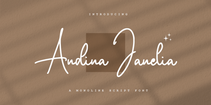 Andina Janelia is a modern signature font which is combining classic calligraphy with a modern style. Its dancing baseline will give your design an elegant and modern touch.
 - PIXymbols FAR Marks by Page Studio Graphics,
$39.00Aircraft marking alphabets and numerals drawn in accordance with FAR Part 45 ¤ 45.29 (c), (d), and (e) of Federal Aviation Regulations. All characters are also in EPS files. - Astallya Script by Rockboys Studio,
$24.00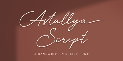 Astallya Script is a modern signature font which is combining classic calligraphy with a modern style. Its dancing baseline will give your design an elegant and modern touch.
 - Aunchanted Elite by Typotheticals,
$5.00 Originally released free as Aunchanted, but completely redrawn with gentler curves to give a softer feel to the face. Aunchanted Elite has been expanded and updated in 2022
 - Mogenta Signature by Rockboys Studio,
$29.00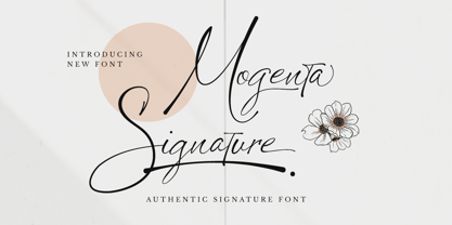 Mogenta Signature is a modern signature font which is combining classic calligraphy with a modern style. Its dancing baseline will give your design an elegant and modern touch.
 - MC Fiton Kiton by Maulana Creative,
$16.00 Fiton Kiton a display font, fun character with a bit of ligatures. To give you an extra creative work. Fiton Kiton font support multilingual more than 100+ language.
 - Tooned Out JNL by Jeff Levine,
$29.00Tooned Out JNL gives a serif treatment to the cartoon-inspired lettering of Toon-In JNL. Both fonts are great for any casual or fun messages or themes. - Letterpress Goodies JNL by Jeff Levine,
$29.00 Letterpress Goodies JNL collects various vintage stock art, decorative elements, border pieces and miscellaneous devices into one handy font file chock full of nostalgia for every print purpose.
 - Jailbreak JNL by Jeff Levine,
$29.00Jailbreak JNL takes the wood type design used for Hoosegow JNL and gives it a stencil treatment; offering a wide and bold stencil alphabet with a Western feel. - PIXymbols Chess by Page Studio Graphics,
$29.00Attractive chess and checkerpieces, as well as board components, in a font. Generate boards with light, bold or no border, or a border with rank and file identifiers. - Circumactio by Lucas Blat,
$10.00 Circumactio, the Latin for Spin, is a thin Typeface based on a grid. The circle in the grid replaces the Crossbar, and gives the Typeface a little differential.
 - Brilliant Gemstone by Rockboys Studio,
$24.00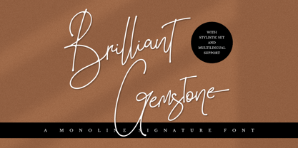 Brilliant Gemstone is a modern signature font which is combining classic calligraphy with a modern style. Its dancing baseline will give your design an elegant and modern touch.
 - Antman by Lebbad Design,
$24.95 Antman is a bold serif font consisting of caps and smallcaps. Wide letterforms taper toward the bottom of each character to give this font a retro vintage feel.
 - Kezuri by Powerfonts,
$16.99 Kezuri is a great choice to give your project a unique feel. Modern yet edgy, Kezuri is suited to high tech applications as well as urban / street projects.
 - Applejack by Jorgensen-fonts,
$30.00A lively, friendly, rounded display face with a country flavour, very suited for comedies or children's books, as well as products with earthy, rustic, organic and rural connotations. - Cigarette by Dharma Type,
$14.99 Experimental typography meets Art deco retro style. Odd contrast gives your work a curious impression.By using 'liga' and 'dlig' feature of OpenType format, you can access advanced typography.
 - LunchBox Slab by Kimmy Design,
$25.00 LunchBox Slab is the pair of LunchBox, a uniquely hand-drawn typeface that gives numerous customizable options and a fully authentic look. The serifs in LunchBox Slab are simple blocks, with bulbous terminals on curved letters, which creates a unique effect. Identical to its pair behind the scenes, LunchBox Slab’s OpenType features allow access to over 1,500 different characters. Contextual alternatives give each letter 4 different character styles, all cycling through each other to ensure that no two letters ever show up together. There is also a custom set of small caps, each with 4 style variations as well. Stylistic alternatives give an extra hand-drawn flourish, loop and slight variation, also with 4 different styles per letter. Discretionary ligatures pertain to both regular all caps LunchBox as well as stylistic alternatives. It gives special letter combinations a unique interaction, giving your design a unique and personalized look without spending hours creating it and outlining your text. Included are also a set of swashes that also have four style variations to both the regular and stylistic alternatives, as well as lowercase letters with ascenders and descenders. All of these options are available in Light, Regular and Bold. LunchBox Slab Ornaments includes nearly 200 different graphics, flourishes, frames, catchwords, text breaks and arrows. If you do not use OpenType but are using a program that includes a full glyph panel, you will be able to manually access each of the style variations you want. Enjoy!
 - Kachelofen by Proportional Lime,
$9.99 Konrad Kachelhofen was a printer in the city of Leipzig beginning around 1483. He printed many works by contemporary authors and also many of the classics. He acquired an unusually large amount of typefaces for his shop, a place that included a wine bar and book store. This particular face is based on the Typ.8:170G GfT101 Gesamtkatalog der Wiegendrucke. He probably died in 1529 after passing his business on to his son-in-law Melchior Lotter.
 - Acrylic Brush by Typodermic,
$11.95 Introducing Acrylic Brush, the perfect script font to add a touch of artistic flair to your designs! With its small-caps and unconnected style, this font brings a unique and sophisticated look to any project. But what really sets Acrylic Brush apart is its faded paint effect, giving your text a handcrafted, vintage vibe. And that’s not all! Thanks to its OpenType features, Acrylic Brush automatically substitutes double letter combinations with ligatures, creating a more natural and seamless appearance. So not only does this font look beautiful, it’s also incredibly easy to use and versatile. Whether you’re designing a logo, creating a poster, or adding text to a photo, Acrylic Brush is the perfect choice for anyone looking to add a touch of creativity and originality to their work. So why settle for ordinary fonts when you can elevate your designs with Acrylic Brush? Give it a try and see for yourself! Most Latin-based European, Greek, and some Cyrillic-based writing systems are supported, including the following languages. Afaan Oromo, Afar, Afrikaans, Albanian, Alsatian, Aromanian, Aymara, Bashkir (Latin), Basque, Belarusian (Latin), Bemba, Bikol, Bosnian, Breton, Bulgarian, Cape Verdean, Creole, Catalan, Cebuano, Chamorro, Chavacano, Chichewa, Crimean Tatar (Latin), Croatian, Czech, Danish, Dawan, Dholuo, Dutch, English, Estonian, Faroese, Fijian, Filipino, Finnish, French, Frisian, Friulian, Gagauz (Latin), Galician, Ganda, Genoese, German, Greek, Greenlandic, Guadeloupean Creole, Haitian Creole, Hawaiian, Hiligaynon, Hungarian, Icelandic, Ilocano, Indonesian, Irish, Italian, Jamaican, Kaqchikel, Karakalpak (Latin), Kashubian, Kikongo, Kinyarwanda, Kirundi, Komi-Permyak, Kurdish (Latin), Latvian, Lithuanian, Lombard, Low Saxon, Luxembourgish, Maasai, Macedonian, Makhuwa, Malay, Maltese, Māori, Moldovan, Montenegrin, Ndebele, Neapolitan, Norwegian, Novial, Occitan, Ossetian, Ossetian (Latin), Papiamento, Piedmontese, Polish, Portuguese, Quechua, Rarotongan, Romanian, Romansh, Russian, Sami, Sango, Saramaccan, Sardinian, Scottish Gaelic, Serbian, Serbian (Latin), Shona, Sicilian, Silesian, Slovak, Slovenian, Somali, Sorbian, Sotho, Spanish, Swahili, Swazi, Swedish, Tagalog, Tahitian, Tetum, Tongan, Tshiluba, Tsonga, Tswana, Tumbuka, Turkish, Turkmen (Latin), Tuvaluan, Uzbek (Latin), Ukrainian, Venetian, Vepsian, Võro, Walloon, Waray-Waray, Wayuu, Welsh, Wolof, Xhosa, Yapese, Zapotec Zulu and Zuni.
 - Special Forces by Typodermic,
$11.95 Special Forces is the commanding slab serif headline typeface that will put some backbone into your message. Its efficient and rugged letterforms will give your words the strength they need to succeed in any mission. With its robust slab serifs, this typeface means business. You won’t find any fancy curves or delicate strokes here—this font is built to withstand the toughest of conditions. Special Forces is ready to take on any challenge, just like our brave soldiers in the field. But this font isn’t just tough—it also commands authority. When you use Special Forces, your message will have the power of a commanding officer. Whether you’re calling your troops to action or announcing a new campaign, this typeface will give your words the weight they deserve. And the best part? Special Forces comes in both regular and oblique styles, so you can choose the right level of intensity for your message. So don’t settle for a weak font that won’t get the job done. Choose Special Forces and take your design to the front lines. Most Latin-based European writing systems are supported, including the following languages. Afaan Oromo, Afar, Afrikaans, Albanian, Alsatian, Aromanian, Aymara, Bashkir (Latin), Basque, Belarusian (Latin), Bemba, Bikol, Bosnian, Breton, Cape Verdean, Creole, Catalan, Cebuano, Chamorro, Chavacano, Chichewa, Crimean Tatar (Latin), Croatian, Czech, Danish, Dawan, Dholuo, Dutch, English, Estonian, Faroese, Fijian, Filipino, Finnish, French, Frisian, Friulian, Gagauz (Latin), Galician, Ganda, Genoese, German, Greenlandic, Guadeloupean Creole, Haitian Creole, Hawaiian, Hiligaynon, Hungarian, Icelandic, Ilocano, Indonesian, Irish, Italian, Jamaican, Kaqchikel, Karakalpak (Latin), Kashubian, Kikongo, Kinyarwanda, Kirundi, Kurdish (Latin), Latvian, Lithuanian, Lombard, Low Saxon, Luxembourgish, Maasai, Makhuwa, Malay, Maltese, Māori, Moldovan, Montenegrin, Ndebele, Neapolitan, Norwegian, Novial, Occitan, Ossetian (Latin), Papiamento, Piedmontese, Polish, Portuguese, Quechua, Rarotongan, Romanian, Romansh, Sami, Sango, Saramaccan, Sardinian, Scottish Gaelic, Serbian (Latin), Shona, Sicilian, Silesian, Slovak, Slovenian, Somali, Sorbian, Sotho, Spanish, Swahili, Swazi, Swedish, Tagalog, Tahitian, Tetum, Tongan, Tshiluba, Tsonga, Tswana, Tumbuka, Turkish, Turkmen (Latin), Tuvaluan, Uzbek (Latin), Venetian, Vepsian, Võro, Walloon, Waray-Waray, Wayuu, Welsh, Wolof, Xhosa, Yapese, Zapotec Zulu and Zuni.
 - The font named KR Crayons, created by Kat Rakos, embodies a playful and creative energy that is both nostalgic and endearing. This distinctive typeface is designed to mimic the look and feel of handw...
- Martin Luther by Harald Geisler,
$59.00 ❧ Useful links: Luther’s Manuscripts at the UNESCO Memory of the World at Google Arts and Culture Martin Luther font on Kickstarter (with Film about the creation) Each letter of the Martin Luther font is strictly based on original samples found in Martin Luther’s 500 year old handwritten manuscripts. Letters that occur more often for example vowels have two or more different versions stored in the font. (➶ Figure 4) These alternative forms are exchanged automatically by the font as you type, and create a vivid look that comes close to actual handwriting. The font avoids that two identical letters are placed next to each other like, for example the two “o” in the word “look”. ➸ What Historic Sources is the Font based on? Two historic documents were used to base the font on. The notes Luther took before giving his speech in Worms in 1521 and a 6 page letter he wrote immediately after to Emperor Charles V., summarising his speech (➶ Figure 2). Both documents have been added to the UNESCO “Memory of the World” and can be seen at the Google Arts and Culture website. ➸ The Creation of a Handwriting Font The creation of a handwriting font is very different from the creation of a regular font. Harald Geisler has specialised in recreating handwriting in preceding projects with Albert Einstein’s, Sigmund Freud’s and his own handwriting. His experience working with Archives and Museums has gone into this project. First Geisler analyses the movement in the writing to understand how each letter is drawn. This involves partially learning how to write like a person. In this process not the outlines of the sample are reproduced but the original movement path of the handwriting (➶ Figure 3). In a second step width and contrast is added to reproduce Martin Luther’s characteristic impetus and the writing tools used at the time. (Link: Youtube Playlist showcasing the creation of individual letters) How about signs that can’t be found in archives? Some Glyphs can not be found in 500 year old manuscripts, for example the @-sign. Towards the end of the creation one collects a profund amount of details about how a writer moves on paper and addresses certain tasks moving the pen. Keeping this knowledge in mind an improvisation can be based on similar letter forms. For example the @ sign is based on of the movement of a lowercase a and parenthesis. ➸ Features of the Martin Luther font ❶ Extensive Documentation of the creation of the font, including high quality reproduction of the used manuscripts. ❷ Additional texts from Historian Dr. Henning Jürgens and Palaeographer (and Luther handwriting expert) Prof. Ulrich Bubenheimer ❸ Alternating Letters - in handwriting every word looks a bit different. To avoid that two identical letterforms are placed next to each other (for example in the word look) the font actively changes between different versions of letters as you type. ❹ Ligatures - characteristic writing forms when two letters are combined (for example “ct”) (➶ Figure 5) ❺ Terminal Letterforms - renders a special letterform when letter is at the end of a word. (➶ Figure 8) ❻ ‘’’Initial and Medial Letterforms''' - some letterforms are different when placed in the beginning or middle of a word, for example the lowercase s. ❼ Luther Rose - is a seal Luther used to authorise his correspondence. Today it is a widely recognized symbol for Luther. When you enter the numbers of Luthers year of birth and death 14831546 using the Martin Luther PRO font, it will render a stylised version of the Luther Rose. (➶ Figure 7) ❽ Historic letter-forms - letter-forms that are specific to medieval writing around 1500. For example the long-s or h with a loop at the bottom. (➶ Figure 6) ⚑ Multi language support - see the technical information tab for a full list of supported languages. (➶ Figure 11) ➸ The different Styles explained ❋ Martin Luther PRO - this includes all features listed above and is geared towards writing texts that are more readable today. It features alternating letters to create a natural handwriting look as well as two stylistic sets accessible through the OpenType menu. Historic forms are available through the glyph picker. ❋ Martin Luther Historic - this font creates a historically correct reproduction (i.e. with long-s) of Luther’s medieval latin handwriting. It features alternating letters to create a natural handwriting look as well as two stylistic sets accessible through the OpenType menu. ❋ Martin Luther Expert-1 - Dedicated access to the first set of letters only. ❋ Martin Luther Expert-2 - Dedicated access to the second set of letters only. ❈❈❈ Family Pack - recieve all fonts at a discounted price. ❈❈❈ ➸ Kickstarter The creation and development of the Martin Luther font was financed by 500 supporters on ➸Kickstarter.
 - Dizengof by Yinon Ezra,
$9.00 'Dizengof' is a Display Typeface, design to deliver a humanistic quality with a unique interpretation for the latin type. The Bold look of 'Dizengof' gives a magnetic visual impact, that is thanks to the strict attention of spaces within and between the letters. Can be used for logos, posters, on video, and of course - branding. The Bold look of 'Dizengof' gives a magnetic visual impact, that is thanks to the strict attention of spaces within and between the letters. Has 2 Stylistic sets.
 - Lina Serif by Caroline Herr,
$18.00 Lina Serif is an antiqua balanced between classic and modern. The design focused on the combination of flowing shapes and partially edged transitions, that give Lina her character. The font plays with a high line contrast in combination with dynamic shapes. This makes Lina a casually elegant display font. The terminals remind on floral shapes. Lina gives your design a human, natural touch. Lina Serif is available in 4 weights or as variable font with infinitely variable interpolation of weight.