10,000 search results
(0.046 seconds)
- Elogy by PizzaDude.dk,
$20.00 Elogy not just a scratchy basic sans serif font - it is a font with a lot of attitude! Every single character is unique! I personally drew every single character - meaning that accented letters are unique! Elogy contains ligatures for both double lowercase, double uppercase and double numers! On top of that, it has got alternate letters for both upper- and lowercase! Talk about unique! You will need to use OpenType supporting applications to use the autoligatures,
 - Receptor by TEKNIKE,
$55.00 Receptor is a geometric monospace display font. The typeface is made from single basic square geometric units grouped together to form a whole. The name is derived from the word 'recept' meaning an idea formed by the repetition of similar or successive percepts of the same object; in science a receptor is a chemical structure that receives and converts signals. Receptor is great for display work, logos, structures, architecture, technology, biology, sports, monograms, quotes, headings and posters.
 - Boffin by Evolutionfonts,
$- A simple little typeface for all things technical. A faux monospaced, semi-serif with rounded corners that you will never forget. The name comes from a British slang word that means "tech-savy person". Or simply "nerd".
 - Danger Girl Hex by Comicraft,
$19.00 A dangerous charm. A death hex. A summoning. An Invocation. An enchantment. An incantation to raise the dead. A supernatural chant. Be careful what you spell out with this font, you might get what you wish for...
 - Breakfast Noodles by Hanoded,
$15.00 I used to be a tour guide and spent a lot of time in Asia. One thing that I really liked, was having noodles, ANY kind of noodles, for breakfast! Breakfast Noodles is a very uncomplicated headline font: I made it while seriously renovating our ‘new’ home (a fixer upper farm), which means that this particular font was made over a period of almost 3 months… It wasn’t exactly a letter at a time, but close. I will try and make the next font in, say, under two months… Hopefully! In the meantime, enjoy this one!
 - Monospasz by Yanone,
$30.00Monospasz means mono-fun in English. It's spelled with 'sz' instead of 'ß' for all you english speaking folks out there who always mistake it with a 'B'. Monospaced fonts keep on drawing attention to them because their proportions stand out from the canon of common fonts. "Yuck. Look at the condensed little m. Isn't that ludicrous?" But Monospasz isn't copycatting traditional typewriters, the most popular of monospaced fonts. It's completely manually ink-written and hand crafted. Monospasz has been designed and first used for the third incarnation of our annual Weimar based typography symposium dubbed "TypograVieh lebt" in the summer 2006. - Mantequilla JNL by Jeff Levine,
$29.00 Some unusual hand lettering was found on the cover of the 1924 edition of a Spanish language novel by Joaquin Belda entitled “La Hora del Abandono” ("The Time of Abandonment"). The title was created as all lower case characters in a semi-serif style reflecting the dawn of the Art Deco movement. A new set of capital letters was created for this digital revival, along with the numbers, punctuation and other necessary glyphs. Mantequilla JNL is available in both regular and oblique versions. For those unfamiliar with the Spanish language, Mantequilla (pronounced mon-tay-key-yuh) means butter.
 - Eckhardt Fancy JNL by Jeff Levine,
$29.00 Eckhardt Fancy JNL was named in honor of Al Eckhardt (1929-2005), a talented sign painter and good friend of font designer Jeff Levine. The design was inspired by a vintage alphabet found within a collection of decorative display alphabets from the type collection of the late Dan X. Solo.
 - KlausBFraktur - 100% free

- Space Time by Lauren Ashpole,
$15.00 What can I say? I like fonts with stars. Space Time is a hand drawn font with a lot of variety. I started designing the regular version with the characters slightly touching but it wasn't quite what I had in my head. I’d imagined tightly spaced letters with overlapping shadows and the only way to get that effect was to create a second version with stackable layers. That means this download includes regular, base, outline, shadow, and stars files. Plus, the base and outline can be used for stacking or work fine as standalone fonts. This font is all caps but the lowercase letters feature alternative styles.
 - Indigena by Latinotype,
$29.00 Mapuche means ‘man of the land’ and it is also the name of a group of indigenous inhabitants in South America. During the southern Winter solstice, between June 21 and June 24, the We Tripantu, the Mapuche New Year fest, takes place with a magical rite in the middle of the nature. Indigena is a dingbat font that remakes the artistic expression of the Mapuche people in Chile, recovering the handmade stroke they used in textiles and ceramics, but with a fresh look. This dingbat is based on pre-Columbian iconographic drawings shown in the book Dibujos Indígenas de Chile (1929) by chilean art teacher Abel Gutiérrez.
 - Delucy by Creative17studio,
$10.00 Introducing...!!! Delucy, a new serif font that is charming, sophisticated, and luxurious. A very versatile font for your design projects, both large and small. This font is made for those of you who need a font with a sophisticated and luxurious style, especially for large design projects. This font is also provided with several alternative fonts, so that they can be adapted to your project. Features : 1. Complete basic character. 2. Multilingual support. 3. Numerals & punctuation. 4. ligatures. 5. Alternate characters. This font is PUA encoded, which means you can access the extra glyphs very easily. Any question? just ask. Free updates Thank you
 - Bayamo by Monotype,
$29.99 Emil Bertell's Bayamo is a contemporary, digital take on the brush script tradition. It echoes the loose forms and energetic personality of sign painted letters, tapping into the current nostalgia for hand-drawn type. “I think most script fonts nowadays are either some kind of modern calligraphy, or synthetic/mechanical scripts,” says Bertell. “This one leans more towards a classic American sign painting tradition.” Contextual alternates ensure that lowercase characters change depending what's next to them, mimicking the more varied word shapes created by sign writers. Well suited for branding projects, packaging and headlines, Bayamo also pairs well with strong sans serif, and other typefaces with angular forms.
 - Iwan Reschniev by FDI,
$29.00 In August 1930, Jan Tschichold described a new typeface, that is "producable by everybody without further knowledge" in the publication Börsenblatt für den Deutschen Buchhandel. Sebastian Nagel has extended the original drawing to 7 weights (black, extrabold, bold, semibold, regular, semilight and light), with full coverage of the Latin 1 character set. All fonts also include small caps and alternate characters.
 - Ongunkan Elder Futhark Viking by Runic World Tamgacı,
$50.00 Vikings or Norses are Scandinavian pirate and merchant tribes. Actually, "Viking" or "Nors" is not a nation name; It is the name given to Dans, Norwegians, Swedes and other Scandinavians regardless of who they are. The Elder Futhark here is a runic script - a version of the Viking script. I will upload other versions over time. Write nice things with pleasure.
 - Burger Honren by IRF Lab Studio,
$12.00 Burger Honren is a beautiful collection of fonts, consisting of scripts, monolines and serifs. In this collection you will see fonts in various styles. With their help, many options open up for you to create your projects, both in vintage and modern styles. The script fonts in this collection provide both charisma and charm, crafted with care and complemented by alternatives and strokes. Serif comes in 10 styles and it is possible to choose the required style for your design. This font is PUA encoded which means you can access all the glyphs and sweeps easily!
 - Rafgins by holyline design,
$15.00 Rafgins is an exquisite and modern sans-serif font. Its clean, minimalist lines and sleek, contemporary style create a sense of understated elegance that is perfect for adding a touch of professionalism to your branding or typography. With its refined and versatile design, this font is sure to impress and inspire. Rafgins have alternate on B, D, P and R. Rafgins perfect for headline, logo, or anything your creativity and want something new with your project. Happy creating with Rafgins by Holyline. It is also PUA encoded which means you can access all of the glyphs and swashes with ease!
 - Narin by Ahmet Altun,
$19.00 Narin Font Family is a geometric sans design with rounded corners which seems much softer and eye-pleasing even though it still has geometric and straight borders. The family comes in six weights with regular and italic forms. Narin Font Family is legible from very small size to very large ones. It is suitable for letterpress and also long texts. With the small caps, all fonts can be used to create great and gorgeous works like logos, texts, presentations, t-shirts etc. and can be used to create the pressworks such as posters, magazines and books. The word "Narin" means "graceful" in Turkish.
 - Zaatar Arabic by Boharat Cairo,
$20.00 Zaatar is a dynamic Arabic typeface abstracted from a mixture of Arabic Ruq’ah and Nastaliq, the slanted baseline with a geometrical contemporary touch, manifest a strong contrast between thick and thin strokes, present a retro-futuristic impression yet an Arabic calligraphic seriousness. and it comes with five stylistic sets giving it a variety of typographic possibilities. Zaatar means thyme, which was first cultivated in Mediterranean Levant, then used by ancient Egyptians for embalming. That's why we found it a perfect name for the first collaboration between Boharat (Cairo) and Hey Porter! (Jordan).
 - Clootie by Hanoded,
$15.00 My wife was watching a baking show in which a Scottish guy attempted to cook a clootie. A what?? A clootie??? Never heard of a clootie! Apparently it is a suet dumpling, containing dried fruits (like raisins) and boiled in a piece of cloth (clootie means ‘rag’ or ‘strip of cloth’ in Scottish). Clootie font is a handmade bundle of happiness. It is rounded, soft and legible and will look particularly good on book covers. And I promise you all: one day I will cook clooties to find out what they taste like!
 - Love Lovely by Letterara,
$12.00 Love Lovely is a cute handwritten font. It features amazing heart-shaped titling. These cute handwritten characters with connecting hearts are great for creating personalized items. This font is PUA encoded which means you can access all of the cute glyphs and swashes with ease. It also features a wealth of special features including alternate glyphs and ligatures. Fall in love with its authentic feel and use Love Lovely to create gorgeous wedding invitations, beautiful stationary art, eye-catching social media posts, cute greeting cards, and much more.
 - Nefarious by Hanoded,
$15.00 A few fonts ago I mentioned the fact that I like posh English words; words you don’t really use in conversation. As I am busy expanding my ‘halloween’ font collection, I came across the beautiful word Nefarious. It means wicked or evil and when you say the word, it even sounds evil! Fantastic! Nefarious is a halloween/witches font. It looks like my Griezelig font, but it is rougher and spikier. Use Nefarious for your halloween invitations, posters and books about evil geniuses. Comes with all diacritics and a bunch of swashes as well.
 - Bali Sky by Epiclinez,
$18.00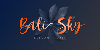 Bali Sky is a stylish and elegant script font. It looks stunning on wedding invitations, thank you cards, quotes, greeting cards, logos, business cards, and every other design which needs a handwritten touch. The font Bali Sky contains 229 glyphs. Supporting more than 66 languages, from English to Zulu. This font is PUA encoded which means you can access all of the glyphs and swashes with ease! So what's included: Basic Latin A-Z & a-z. Numbers, symbols, and punctuations Ligatures Stylistic sets Multilingual Support. Accented Characters : ÀÁÂÃÄÅÆÇÈÉÊËÌÍÎÏÑÒÓÔÕÖØŒŠÙÚÛÜŸÝŽàáâãäåæçèéêëìíîïñòóôõöøœšùúûüýÿžß Thank You
 - Corso by Dominik Krotscheck,
$7.99 Corso is a clean condensed sans serif font family. It comes in upright, slanted and italic, in six weights each. It includes useful typographic features such as fractions, ligatures and case sensitive forms. Also included are double- or single-storey versions of a and g, you can switch via stylistic OpenType sets. Other letters with alternative forms accessible the same way are ß and ampersand. Corso works especially great for larger size uses such as signage, headlines or posters. But that doesn’t mean that it isn’t also useable for short texts.
 - Liquoia by Wiescher Design,
$39.50 Liquoia are three scripts with lots of contrast and different embellishments. Liquoia-A has the elegant, flaming decoration it blends well with Fleurons-Six. Liquoia-B has the flowery embellishments and goes very well with my Ornata-A and Ornata-B. Liquoia-C is the plain, straightforward and solid floating script. The name is derived from "liquid", meaning it is a fluid script that has a distinctive waveform. The "oia" part of the name comes from Sequoia, the sturdiest tree that came to my mind. Your sturdy, floating designer Gert Wiescher
 - Haverj by ParaType,
$30.00 An original typeface designed for ParaType in 2004 by Armenian designer Manvel Shmavonyan. Based on the lettering created in 1970s by outstanding Armenian type designer Henrik Mnatsakanyan (1923-2001) of the same name. In Armenian ‘Haverj’ means ‘Eternally’. The face resembles many regular text serif fonts but elements like serifs and terminals make it eccentric and a little bit funny. The shape of diagonal legs in capital K and R resembles book lettering of the 1950s—60s. Using it in text, advertising and display typography may lead to surprising effects.
 - Transcend by Monotype,
$31.99 Transcend has been designed specifically for titling and branding purposes. This 8-font, all caps typeface is packed with OpenType features including discretionary ligatures and alternates that – when used subtly – help you to create distinctive headline typography. Transcend aims to be “The Ultimate Titling Typeface”. This typeface is an exploration of my own “Carrig” from 2014. I have evolved its core personality and embellished it by means of crisp, sharp lines and serifs, adding stylised ink traps/notches, as well as carefully considered swashes, flourishes, and ligatures that add a touch of class and refinement to every word you type. Key features: • 8 weights – Thin to Ultra • Alternates, Discretionary Ligatures, and Old Style Figures • European Character Set – Latin Only • 600+ glyphs per font.
 - You are my everythink by NJ Studio,
$19.00 Hi...Thank for your visit :) You are my everythink a font duo is a beautiful script font with beginning and ending swash and display font. It features characters that will take your projects to the next level! This font is PUA code which means you can easily access all the glyphs and alternates that are full of love! It also features many special features including glyphs and alternate. font designs that are made for various vector designs, printing such as digital wedding blogs, online shops, social media, while printing can be used in the field of product clothing, accessories, bags, pins, logos, business cards, watermarks and many others ... so it can make your product look cute and attractive, and also Multilingual support!!! Happy design ...
 - Breakers by Kostic,
$40.00 Breakers is a sans serif originally conceived to be a display typeface. Works great in text also, but the diversity in weights is its strong point. It is easy to achieve that high contrast using thin against the ultra weight, but setting tall and lean capitals against the compact and heavy small caps can make really diverse compositions for all kinds of display design. With small caps included, and over 600 glyphs in each weight, it should prove itself useful in finding the right combination for any typographic setting. Breakers has a character set to support Western and Central European languages, and an extended set for monetary symbols. Each weight includes small caps, ligatures, proportional lining and oldstyle numbers, tabular figures, fractions and scientific superior/inferior figures.
 - Tinkuy Patterns by Sudtipos,
$29.00 Meaning of Tinkuy. Tinkuy is a Quechua word that means a meeting of opposing forces that complement each other. A meeting of opposites and differences. A meeting point where different thoughts, interests, feelings and aspirations confront and converge, providing the resurgence of new ways of thinking and that are embodied in confrontational actions, in mobilizations that seek change. Tinkuy patterns is born from the analysis of different archaeological pieces of native cultures of the Andes, where the visual signs that are recorded on them are related to the concept of encounter. It is part of the research project Crónicas Visuales del Abya Yala by designer Vanessa A. Zúñiga Tinizaray. — The Tinkuy Patterns. The Tinkuy Patterns system is divided into six files containing a total of more than 2650 modules that can be combined together creating an infinite range of possibilities. The digitization of the typeface family has been carried out by Ale Paul, through the Sudtipos foundry. An infinite number of possible combinations can be accessed by using the letters on the keyboard. Although a certain shape predominates in each set, they can be combined with each other.
 - Katastrofe by PizzaDude.dk,
$20.00 Katastrofe is danish for … well, catastrophe - you may have guessed that! This font was almost a catastrophe to make! I cut out all the letters in a cardboard, and went outside to spray the letters with a spraycan. Everything went smooth as planned, but suddenly the wind started to blow and the papers started to fly away! Luckily I found some stones I used to make the papers stay in place. Lucky for me - otherwise it would have been a catastrophe! Seconds after finishing this font project, it started to rain…I just avoided a catastrophe! But is this font really a catastrophe, or does it just mimic punk/spray/grunge/riot? Make your own statements using Katastrofe, or perhaps your very own punk sayings like “Punk is not dead”, “Anarchy Rebel” or what suits you the best. Whatever you choose to write, you will definitely get that real punk look! Perhaps you could even do a t-shirt print that says “Katastrofe” :) Comes with different upper and lowercase letters along with alternate versions of each letter - and of course a lot of foreign letters, because punk is not dead and punk is universal!
 - Artis Sans by Wiescher Design,
$30.00 »Artis« is the name for my latest art-project-font. Obviously I just chopped off the last »t«. Then I looked it up on Wikipedia and what do you know, it is of latin descent. »Ars Gratia Artis« which means »art for arts sake« or in French »l’art pour l’art«, a perfect font name. If I would cut off the »s« as well it would mean disambiguation and that in turn is, what I just did here. Enough disambiguation! »Artis« is a modern classical beauty with extreme contrast between up- and downstrokes that make it unique with a touch of art deco and showing Renaissance roots. But – »Artis« is a twin-font that has an elegantly decorated twin sister »Artis-Swing«. Between the 2 fonts you have endless possibilities for combination. I love these twins! It is a great everyday workhorse with seven weights from ExtraLight to Bold and all the necessary weights in between. Great for short copy and elegant headlines! With 879 Glyphs it is a truly European font designed for all Central European and Latin using countries. »Artis« has a set of Cyrillic that is – besides Russia – also good for Serbia, Macedonia and Ukraine. It has oldstyle- and lining-, tabular- and tabular-oldstyle-figures and many ligatures. »Artis« comes in Sans and Swing and is an elegant, playful and friendly font. Enjoy!
 - Turntable Stencil JNL by Jeff Levine,
$29.00 A disc jockey-only promotional sleeve for a 1964 [45 rpm] release of “Close to Me” and “Let Them Talk” by Dan Penn featured the song titles printed in a stencil typeface on the record sleeve. Closely resembling a stencil version of Franklin Gothic but with its own unique characteristics, this design has been reinterpreted as Turntable Stencil JNL and is available in both regular and oblique versions. For trivia buffs, Dan Penn is a singer-songwriter-record producer, often collaborating with Dewey Lindon “Spooner” Oldham; both closely associated with the late Rick Hall’s Fame recording studios in Muscle Shoals, Alabama. In 1964, Hall started the Fame record label, and for a time it was distributed by Vee-Jay Records of Chicago, the first major Black-owned record label in the United States. Penn’s release was only the second for the new label; Fame 6402.
 - Shynta by Malindo Creative,
$10.00 Shynta is a modern hand-based typography, This font is made up of irregularly flowing letters, both between top-down and with subsequent letters, which makes it suitable for Logotype, posters, businness cards, merchandise, wedding invitations, greeting cards, banners blogs, clothing, water-based paint designs / prints, correspondence, quotes and more! This Font Equipped: -Uppercase -Lowercase -Figures & Punctuation -Accented -Stylistic Alternatives -Ligatures -Additional currency symbols To enable the OpenType Stylistic alternates, you need a program that supports OpenType features such as Adobe Indesign, Adobe Illustrator CS & CorelDraw X6-X7, Microsoft Word 2010 or later versions. -This font is PUA encoded which means you can access all of the glyphs and swashes with ease! -If you have any questions, please contact me at. malindocreative@gmail.com. -Thanks for Support -Feel free to contact me if you have any questions, I am happy to help you.
 - Pomerans by Hanoded,
$11.00 Pomerans is a redo of an old font of mine called Suco De Laranja. Since the original font had a citrusy name, I decided to name this reincarnation Pomerans, which means ‘Seville Orange’ in Dutch. I doubt that there are many Dutch people who actually know what a pomerans is! Pomerans is a handmade, all caps font. I kept the look and feel of the original font, but I cleaned up the glyphs, added new glyphs and added additional language support (including Vietnamese and Sami).
 - Shrieky by Gassstype,
$27.00 Hello Everyone, introduce our new product font SHRIEKY is a Bad Brush Font.This is a Textured Natural Style and classy style with a clear style and dramatic movement. This font SHRIEKY is great for your next creative project such as logos, printed quotes, invitations, cards, product packaging, headers, Logotype, Letterhead, Poster, Design this font is great for your creative projects such as watermark on photography, and perfect for logos & branding, This font is PUA encoded which means you can access all of 16 Ligatures glyphs.
 - Miramonte by Ascender,
$29.99 Miramonte Pro was designed by Steve Matteson in 2006 as a friendly sans serif design suitable for user-interface design, corporate branding and publishing. The name means 'behold the mountains' in Spanish, suggesting the rustic, unrefined type design. Miramonte is based on Stanislav Marso's humanist sans serif released by Grafotechna in 1960. This revival includes a cursive style italic rather than a sloped roman. Miramonte Pro includes an extensive character set for publishing Central and Eastern European languages. Its OpenType features include proportional figures, and tabular figures.
 - Breakable by Gassstype,
$23.00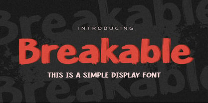 Hello Everyone, introduce our new product Breakable This Is a Simple Display Font with a natural feel. This handmade font will make your design has a beautiful natural touch for each details. It is perfect for any design project as Invitation,logo, book cover, craft or any design purposes. This font is PUA encoded which means you can access all of the magical glyphs with ease!
 - Private Eye JNL by Jeff Levine,
$29.00 From 1958 to 1964, one of ABC-TV’s popular shows was the detective series “77 Sunset Strip”. Based in Los Angeles, the fictional detective agency was located next door to Dino’s Lodge, (partly owned by Dean Martin and actually located at 8532 Sunset). It was originally known as the Alpine Lodge. The adjacent building where Stuart Bailey and Jeff Spencer’s private detective service was located in fact housed a popular modeling agency. The ‘77’ address did not exist outside of the realm of the series. However, a wonderful sign with Art Deco-influenced lettering graced the set (on the wall of the office foyer) saying “Bailey & Spencer Private Investigators Suites 101-102”. A screen capture of this sign served as the working model for Private Eye JNL, which is available in both regular and oblique versions.
 - Magento by Anomali Creative,
$11.00 Introducing MAGENTO MAGENTO is a stylish font It has both modern and retro look - clear, modern and fun. Helps to create layout design in 60s or 70s design projects. This MAGENTO Family has 9 weights from thin to black, and Italic version on it What's you get? Magento TTF, OTF, WOFF Magento Italic TTF, OTF, and WOFF Unique letterforms Works on PC & Mac Simple Installations Accessible in the Adobe Illustrator, Adobe Photoshop, Microsoft Word even work on Canva! Fully accessible without additional design software. For MORE FREEBIES : just like these and more, as well as Font Deals and discounts , visit https://wecreatype.com
