10,000 search results
(0.011 seconds)
- Michousa1 - Unknown license

- Michousa2 - Unknown license

- Invitation Script by Intellecta Design,
$69.00 Iza W and Intellecta Design are proud to announce Invitation Script, a modern and clean revival of the classic work of the Portuguese master penman Manuel de Andrade de Figueiredo, whose work can be seen in “Nova Escola para aprender a ler, escrever, e contar (...)'' (1722). Invitation Script is the third script superfamily published by Intellecta Design, after Penabico and Van den Velde Script. Invitation Script has original letters designed by Iza W. Creative direction and core programming were provided by Paulo W. Chyrllene K assisted with some work on unusual and archaic styles, resulting in a special font - Invitation Script Archaic (soon available). Invitation started out from Andrade’s script style and evolved into a voluptuous script font family. The result is a typeface ideal for beautiful headings, signatures, art work typography, titles and short pieces of hand-lettered text. Invitation family includes two multi-table Opentype fonts, three supplementary fonts for ornaments and fleurons, and the Archaic font with some of the Andrade’s original characters. Embedded in the regular fonts are additional sets of letters. Over 40 variations are available for certain letters via the Special Sets Opentype table. The two regular versions of Invitation Script contains the following: (i) An extensive set of ligatures providing letterform variations that make eye-popping designs or simulate real handwriting. These are accessible via contextual alternates and other open-type features. (ii) Many stylistic alternates for each letter (upper and lowercase, accessed via the glyph palette, encoded in the ranges of the Special Set Opentype feature). Since there are over 1100 glyphs in each font, we suggest using the glyph palette. (iii) A set of ornaments and fleurons accessed with the glyph palette or using the Ornaments feature. Additional ornaments can be found in the two Invitation Script Ornaments fonts. (iv) Initial and final letters with artistic variations accessible using the initial and final form open-type features. (v) Major kerning work: over 6000 kerning pairs, hand-set to avoid collisions and to create intricate combinations of letters, using swashes and other resources. These powerful features are all accessible in InDesign, Illustrator, QuarkXpress and similar software. We recommend exploring the magic of this font using the glyph palette. Our sample illustrations and PDF brochures showcase the power and pizzazz of this calligraphic script. Let your imagination go wild and use Invitation Script in ways that Andrade could not have foreseen. In non-OpenType-savvy applications, Invitation Script is still an exceptionally beautiful calligraphic typeface that stands up to the competition. The regular fonts contains the complete Latin alphabet, including Central European, Vietnamese, Baltic and Turkish, with a full set of diacritics and punctuation marks. --- 1 FIGUEIREDO, Manuel de Andrade de, 1670-1735 Nova Escola para aprender a ler, escrever, e contar. Offerecida á Augusta Magestade do Senhor Dom Joaõ V. Rey de Portugal. Primeira parte / por Manoel de Andrade de Figueiredo, Mestre desta Arte nas cidades de Lisboa Occidental, e Oriental. - Lisboa Occidental: na Officina de Bernardo da Costa de Carvalho, Impressor do Serenissimo Senhor Infante, 1722. - [18], 156 p., 44 f. grav. a buril : il., ; 2º (31 cm)Engraved royal coat of arms supported by angels over the city of Lisbon, engraved portrait of the author (both of the foregoing by Bernard Picart), (12)ff., 156pp., engraved calligraphic section title, 44 engraved plates. Wood-engraved culs-de-lampe and lettrines. Sm. folio. “Andrade de Figueiredo was born in Espirito Santo, where his father was Governor of the ‘Capitania.’ The fine portrait is dated 1721 and is showing Figueiredo at the age of 48. He was an eminent calligrapher and a creator of the Portuguese handwriting until the reign of Don José I (ca. 1755). His work follows the style of the great Italian masters in its use of clubbed ascenders and descenders, and of Diaz Morante, the famous Spanish writing master, in its very elaborate show of command of hand. By his contemporaries, he was known as the ‘Morante portugues’” (Ekström). “Ce livre est un manuel, composé de quatre parties, destiné à apprendre à lire, à écrire, à conter ainsi que l’orthographe. Les planches comportent des examples d’écritures, d’alphabets et de textes ornés de remarquables traits de plume exécutés d’une main sûre et enjouée” (Jammes).
 - Zigfrida by Anderson Ruda,
$20.00 Zigfrida Typeface was born from a process of re-designing a logo where, through a grid created, I was developing all its main characters. As the project grew, it was noted that it was necessary not only to limit itself to the Latin alphabet, but also to develop Cyrillic characters. Its possibilities of use are endless, can be used in projects for your favorite sport, signs, posters, large formats, advertising projects, architectural, packaging, titles, among others. The result of all this was the development of a font that has up to 747 glyphs that can understand 100% of Latin languages and the vast majority of countries that use the Cyrillic alphabet. It has unique personality and characteristics that bring a differential to any project it is part of. ----- A Zigfrida Typeface nasceu a partir de um processo de re-design de um logotipo onde, através de um grid criado, fui desenvolvendo todos os seus principais caracteres. A medida que o projeto foi crescendo, observou-se que era preciso não apenas se limitar ao alfabeto latino, mas também desenvolver os caracteres cirílicos. Suas possibilidades de uso são infinitas, pode ser utilizada em projetos para seu esporte favorito, sinalizações, cartazes, grandes formatos, projetos publicitários, arquitetônicos, embalagens, títulos, entre outros. O resultado de tudo isso foi o desenvolvimento de uma fonte que possui até 747 glifos capaz de compreender 100% dos idiomas latinos e a grande maioria dos países que utilizam o alfabeto cirílico. Tem personalidade e característica únicas que trazem um diferencial para qualquer projeto que ela fizer parte.
 - Tipo Metro CDMX by Ixipcalli,
$- La tipografía “Tipo Metro CDMX” fue desarrollada por Lance Wyman como parte del proyecto “Metro” desde los años setenta, y es uno de los elementos clave de la cultura visual del transporte del Sistema de Transporte Colectivo Metro (STC Metro). Este estilo se ha convertido en el icónico fundamental del trasporte público para los residentes de la Ciudad de México. En esta edición, los tipos minúsculas son una adaptación “no oficial” para el Tipo Metro CDMX, enriqueciendo la tipografía a un estilo visual de altas y bajas, por lo que se prescinde del diseño base como trabajo propio para enfatizar los tipos minúsculas exclusivamente, además de que se han añadido algunos caracteres de acentuación extendiendo su uso a otros lenguajes. Los tipos son una nueva propuesta por Ixipcalli en el presente año 2023. The “Tipo Metro CDMX” typeface was developed by Lance Wyman as part of the “Metro” project since the 1970s, and is one of the key elements of the visual culture of transportation of the Metro Collective Transportation System (STC Metro). This style has become the iconic fundamental of public transportation for the residents of Mexico City. In this edition, the lowercase types are an “unofficial” adaptation for the Tipo Metro CDMX, enriching the typography with a visual style of highs and lows, so the base design is dispensed with as my own work to emphasize the lowercase types exclusively, In addition, some accentuation characters have been added, extending their use to other languages. The types are a new proposal by Ixipcalli in the current year 2023.
 - Gabardina - Personal use only

- Quebrada - 100% free

- Adieu Mon Ami by Hanoded,
$15.00 No, I am not leaving and none of my friends or relatives have packed up and left. I needed a more ‘letter-like’ name for this font and I found Adieu Mon Ami (farewell, my friend in French). Adieu Mon Ami is a handmade pencil font that will add that extra ‘je ne sais quoi’ to your designs. It comes with joie de vivre, un petit peu de vilain, but can be doux comme de la soie as well. Bonne chance!
 - Nue - Personal use only

- Nue Medium - Personal use only

- Erasmus by Red Rooster Collection,
$45.00Based on the S. H. de Roos design, Amsterdam Foundry circa 1923. - Concreta by Just in Type,
$20.00 Concreta was inspired by Josef Albers' work and Augusto de Campos' poetry.
 - Waleed by GrafikarFonts,
$69.00 Waleed est une police de caractère Arabe, et latin inspirée du Naskh
 - Grauman - Unknown license

- Eletric Lady by RM&WD,
$49.00 Electric Lady in a light script with a great amount of different possibilities. With Electric Lady font family you can to turn on various features (Ligatures, Stylistic Alternates, Contextual Alternates, Swashes, 3 completely different Stylistic sets) to auto swap out letter sets with alternate versions. - More than 3,000 glyphs - 100 different numbers shapes - 110 different ornaments In the Extra 2 style, you'll find many different standalone words, kitchen icons, menu icons, swashes, and extra fun characters!
 - Monzo by Panatype Studio,
$5.00 MONZO is Contemporary Fat Font comes with 2 styles ( Regular & Outline ) with corresponding italics. Perfect for Logotype, Head text, Displayed text, and many more). Support for 75+ Language.
 - Derniere - Unknown license

- Round Page by Patria Ari,
$15.00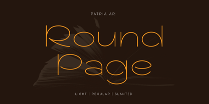 Round Page is an elegant round typeface with 2 weight and 2 styles. This font is a combination between modern, beauty and simplicity. With this typeface, you can use it for branding, merchandise, magazine cover, headline, logo, powerpoint templates design, and many more. What's included? Uppercase Characters Lowercase Characters Multilingual support. Hope you enjoy the products.
 - P22 DeStijl by P22 Type Foundry,
$24.95The Dutch De Stijl movement (1917-1931) sought to create an art which took abstraction to its logical extreme, as exhibited in the paintings of Piet Mondrian. Inspired by the movement's philosophy of pure form, P22's De Stijl set features three rigid, balanced, and angular fonts and a set of geometric extras. - f1 Secuencia Quad ffp - Personal use only

- Mowaq by Ixipcalli,
$27.00 Mowaq es una tipografía limpia, abstracta, moderna, minimalista y de trazos sencillos pero elegantes. Sus cuatro pesos hacen un juego visual de degradados muy marcados. La tipografía Mowaq fue inspirada a partir de los estilos mayúsculas sans-serif, como uso de encabezados y subtítulos en dos libros donde se necesitaba mostrar un aspecto limpio, moderno y minimalista. Los tipos minúsculas fueron adaptados posteriormente a la familia Mowaq. Mowaq is a clean, abstract, modern, minimalist typeface with simple but elegant lines. Its four weights make a visual game of very marked gradients. The Mowaq typeface was inspired by sans-serif uppercase styles, used for headings and subheadings in two books where a clean, modern and minimalist look was needed. The lowercase types were later adapted to the Mowaq family.
 - MachineScript - Unknown license

- VanBerger by The Northern Block,
$12.80 A geometric san serif typeface influenced by Theo Van Doesburg and the De Stijl movement.
 - Libra by Bitstream,
$29.99 A skillful revival of the Uncial by S.H. de Roos for Lettergieterij Amsterdam in 1938.
 - TE Start2 by Tharwat Emara,
$30.00 Start 2 is a mixture of modern style with traditional functionality. It is flexible and has many beautiful and wonderful features. This font will work for modern and important designs.
 - Adelita by Type-Ø-Tones,
$40.00 Adelita by Adela de Bara, Laura Meseguer / OpenType, 4 styles Adelita has its origins from Adela de Bara’s hand drawings, a display typeface with balls at the end of the strokes. Helped by Laura Meseguer, this artist entered our catalogue in the nineties with four weights: three display faces and a collection of naive dingbats.
 - Deep Dope by Creativemedialab,
$18.00 Introducing Deep Dope, another fun retro psychedelic-inspired typeface from creativemedialab. Its unique and consists of 2 styles Regular & Liquify. Perfect for summer theme design concept, branding, logo, and many more.
 - Sucesion Slab - Personal use only

- Blocke by RicardoLetters,
$9.00 Bloque es una fuente moderna de tipo bloque perfecta para proyectos de grandes dimensiones como vallas, pósters artísticos, señalización, packaging, títulos y logotipos. Ya que su contador es tan estrecho no debes usarla en tamaños pequeños porque la definición de cada carácter se perderá. Es una fuente que cuenta con una sensación limpia y minimalista. Bloque es una excelente elección cuando se necesita una fuente impactante de letras en bloque para crear diseños impresionantes. Bloque is a modern block font perfect for large projects like billboards, poster art, signage, packaging, headlines and logos. Since its counter is so narrow you should not use it in small sizes because the definition of each character will be lost. It's a font that boasts a clean, minimalist feel. Bloque is an excellent choice when you need a striking font of block letters to create impressive designs.
 - Annifont - Unknown license

- AlfredDrake - Unknown license

- Alcohole - Unknown license

- Joe - Unknown license

- Rockner by Linotype,
$29.99Rockner is a family of fraktur typefaces designed by the calligrapher/designer Julius de Goede. Like all Blackletter styles, fraktur evolved out of Northern Europe's medieval manuscript tradition. Fraktur was the most used Blackletter variety between the sixteenth and twentieth centuries. Unlike many similar fraktur font families, Rockner is available in three weights: Regular, Medium, and Bold. This flexibility allows for richer design possibilities. The OT fonts contain the many alternate characters, such as the long s and historical ligatures, which are often necessary for the setting of historical documents. - Rameau by Linotype,
$29.99Rameau for classic elegance The type family Rameau™ was designed by Sarah Lazarevic She started with the italics; these she derived from the manuscript of the opera Les fêtes de l´hymen et de l´amour", the music for which was composed by Jean-Philippe Rameau in 1747. In the 18th century, musical compositions were published in the form of impressions from copper plates that had been hand-engraved in contrast with books and other texts, which were printed from moveable lead type. The italic letters of Rameau include many ligatures and are thus typical of the engraving style of the period. Rameau exhibits much of the harmonious rhythm associated with genuine manuscript. The marked Antiqua contrasts make the pages on which the font is used quite literally sparkle. This effect is enhanced by the excessively sharp terminals and the prominent serifs of the upper case letters. This highly legible and stylish type family can be used for printing high quality books, invitations, menus and all kinds of texts - anywhere the grace and elegance of France in the 18th century is to be invoked." - Northash by Arterfak Project,
$17.00 Introducing Northas the vintage stencil font inspired by the old-school signage and military design. This font has a bit condensed letterform that gives a strong look and dignified. Perfect for many themes such as sports, military, urban, wildlife, vintage, and more! Fonts featured : Uppercase Small caps Numbers Symbols & punctuation Accented characters Alternates Catchwords: in, out, the, with, de, of, at, and, etc. Thank you for your support and happy designing!
 - Holitter Titan - 100% free

- Holitter Tittanium - 100% free

- CFT masapunk - Unknown license

- Alger Blanche Pixel by GrafikarFonts,
$159.00 AlgerBlanchePixel est une variante de AlgerBlanche, inspirée du Kufi et naskh, supporte l'Arabe, Tifinagh, Farsi, Ourdou et Latin


