2,608 search results
(0.01 seconds)
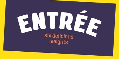
- Entrée by Luke Thompson,
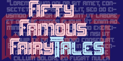
$20.00 - Fifty Famous Fairy Tales by Funk King,
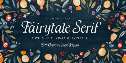
$20.00 - Fairytale Serif Oblique by Nicky Laatz,
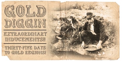
$26.00 - Gold Diggin by Open Window,
$19.95 - P22 Atomica by P22 Type Foundry,
$24.95 - King15 by Typo5,
$5.95King15 is a beautiful script font based on signatures dated back from hundreds of years. Its asymmetry and ink imperfections give it a strong and a truly unique character. - Deadly Breakfast - Unknown license
- TXT Delicate Script by Illustration Ink,
$3.00Go back in time by downloading this calligraphy style script font. The elegant letters are charming additions to any lettering project that needs calls for fancy, stylish, and graceful embellishments. - Honua by EternalEyes,
$22.00 - Guild of Professional Actors - Unknown license
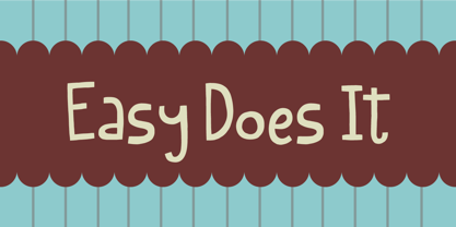
- Easy Does It by Bogstav,
$15.00I started making this font with a few days left at work before my 4 weeks vacation. I managed to finish the font on the day my vacation started - but with no stress. Now I can look forward to 4 good weeks at the summerhouse, and look back at the release of this laid back, handmade and somewhat quirky font. Personally I’d use it for anything that needs an organic handmade look - perhaps packaging, posters, flyers or maybe even clothes or toys for kids! - FontForTheDumped - Unknown license
- Airliner JNL by Jeff Levine,
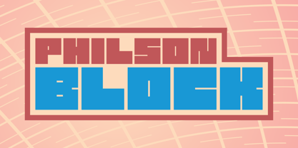
$29.00Airliner JNL is based on hand-lettering found on a promotional postcard for Kitty Davis' Airliner - a popular Miami Beach night spot of the 1940s. All of the usual things that make hand-lettering endearing can be found in the letter shapes of this font. - philson block by chris philson,
$25.00Philson Block is a family with upright and oblique versions. The structure of each character is based on a square divided into simple fractions. Each letter has at least one variation, with angled corners, increased widths, or altered shapes. This font is recommended for display lettering, headlines, and blocks of type that mask images. - Riviera by Solotype,
$19.95This is derived from the Marder, Luce foundry's face called Rivet. A nip and a tuck here and there plus the addition of a lowercase make this into a potentially useful font. - Clarenwood JNL by Jeff Levine,
$29.00 - Aura by Monotype,
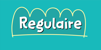
$29.99Aura was designed by Jackson Burke for the Linotype foundry in 1960. Aura is a sans serif display font, very similar to Helvetica Inserat. Use the Aura font for headlines and posters. - Regulaire by PizzaDude.dk,
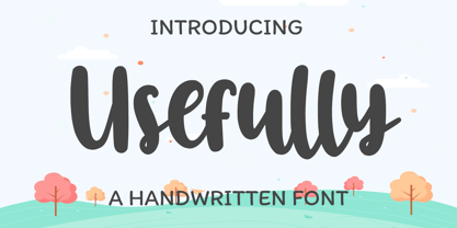
$16.00 - Usefully by Beary,
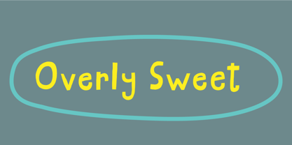
$15.00 - Overly Sweet by Bogstav,
$16.00Usually I prefer desserts that aren't overly sweet, but a week ago I lost my sense of tasting - due to Corona, and when I wanted something sweet...I preferred it overly sweet...of course because I hardly could taste the overwhelming sweetness! But now, I have my sense of tasting (and smelling!) back, and everything is back to normal. And since I completed this easy-recipe-inspired handmade font while suffering from Corona, I thought I'd name it Overly Sweet. And...well. because, the font is somewhat overly sweet (without being over the top sweet!) - Bamberforth by Greater Albion Typefounders,
$12.95Bamberforth is a new take on the type of lettering that was often seen on Railway timetables, share certificates and anything else that needed a distinctive heading in the mid-19th Century. This sort of thing was used on both sides of the Atlantic and can carry us back to another time. Bamberforth aims to give a modern clarity to a style of lettering that, in all other particulars, harks straight back to Victorian times. Bamberforth is ideal for giving anything a 19th century feel-especially posters, book headings, dust jackets and invitations. - Rustica by TipoType,
$24.00The world has changed; we want it to change. But it has a history too. Rustica draws back to the sans typeface tradition and updates it for the 21st century; we aim to go back to the humanist values without dismissing the role played by technology.It’s a GeoHumanist sans serif. Type design looks back at its past to return with renovated strength to its march to the future. Rustica is based on a humanist architecture with the addition of the determination and precision of the geometry of the classic sans of the early 20th century. Thus, a typographic conception typical of 21st century communications: returning to the human values of closeness and proximity, adding the certainty of knowledge and science. Rustica is born out of the DNA of our awarded font Rotunda, contributing to this typographic ecosystem humanist notes enhanced by the precision and discipline of geometry. - Angry bitch - Unknown license
- Cabana Club JNL by Jeff Levine,
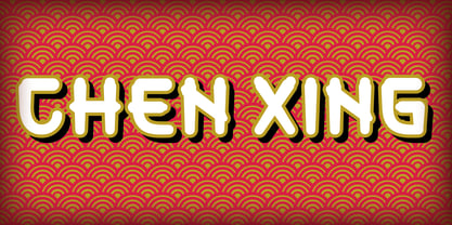
$29.00Bring back the glory of winters in Miami Beach, exotic summer vacations or Deco-era night spots with Cabana Club JNL - a retro-Deco font, complete with contour outline and solid black characters. - Chen Xing by Pelavin Fonts,
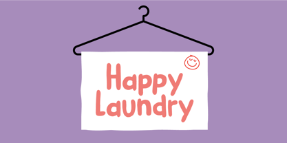
$25.00 - Happy Laundry by PizzaDude.dk,
$17.00 - Valium - Unknown license
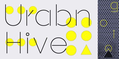
- Urbanhive by Jaetwo Type,
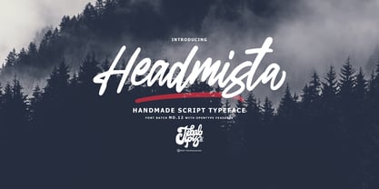
$45.00Urban Hive : reinterpreting three-dimension to the typeface A blueprint consists of two-dimensional elements changes into a three-dimensional structure. What works would be created by reversing the process? The building components were divided into three parts : Facade, Inside space and Construction materials to apply all the features to the typeface. This is Facade version. - Headmista Script by Tebaltipis Studio,
$10.00Headmista is a script typeface with personality. You can use it as a logo, badge, insignia, packaging, headline, poster, etc The alternative characters in this font were divided into several OpenType features such as Stylistic Alternates, Stylistic Sets, and Ligature. The OpenType features can be accessed by using OpenType program such as Adobe Illustrator, Adobe Photoshop, and Adobe InDesign. - Fauna by Del Alma,
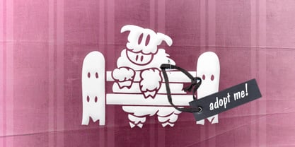
$14.99Fauna is the set of cute animals you were looking for! We know these animals will give their best in order to give a lovely touch to your work. With a total of 108 characters; the font family is divided into two styles of 54 each: Fauna Blanca and Fauna Negra. Choose one of them... or better, choose both! - Tekton by Adobe,
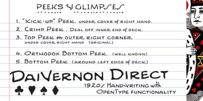
$35.00Tekton font is based on the hand lettering of West Coast architect Frank Ching, who wrote out the text for his books. It is an Adobe Originals typeface designed by David Siegel in 1989. Tekton is ideal for architectural drawing/design software, to match the feel of the type with the designer�s plans, or to give the page an architectural or informal handwritten flavor. Tekton multiple master, released in 1993, has increased the usefulness of the design by adding weight and width axes and making the font more usable for signage and display work, as well as informal correspondence. - Dai Vernon by E-phemera,
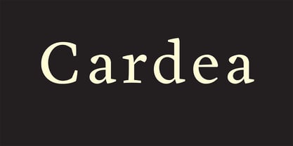
$20.00DaiVernon is based on the handwriting of card magician extraordinaire Dai Vernon. Known as "The Professor", Vernon was a beloved expert in sleight-of-hand and card magic. These fonts are based on the penmanship in his notebooks from the 1920s, which feature almost no lowercase letters. DaiVernon Direct is based on what appears to be his hastier style, while DaiVernon Misdirect is based on his neater hand. Numerous OpenType bonus glyphs, contextual alternates and discretionary ligatures help to create the feel of his handwriting. Thanks go to Michael Albright, David Ben, and Gene Matsuura for helping to provide access to Vernon's notebooks. - Cardea by Emigre,
$39.00The Cardea family of typefaces is the outcome of David Cabianca’s 2003–04 MA Typeface Design experience at the University of Reading. With Cardea, Cabianca intended to mix classical and modern characteristics, and in the process he created a typeface that “sparkles” on the page, with high contrast, luster and crisp edges. The result is a type with a muscular or sculptural feel much like the work of artists like Arne Quinze or Mark di Suvero. Cardea was designed to function as a text face. It features three weights each with accompanying italics, small caps and a variety of ligatures. - Librum by Hackberry Font Foundry,
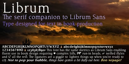
$24.95This is the serif text family for the book design group of font families which David designed in the process of writing "Practical Font Design With FontLab 5". The letterspacing is set wide for body copy use. The main purpose is readability and reading comfort. There are several whimsical graphics, plenty of OpenType features: oldstyle figures [tabular and not], small cap figures, lining figures [tabular and not], discretionary ligatures, small caps, and so on. The feature set is limited for the italic and bold versions. It produces an exceptional book. See Librum Book Design Group for a package containing all fifteen fonts, - Bang by ITC,
$29.00Bang was designed by David Sagorski in 1993 as a playful font of spirals. It consists of two capital alphabets which can be combined like the usual capitals and small caps, although both have the same height. They differ from one another only in the decorative forms which adorn them and the highly decorated characters of one set are complemented by the slightly more reserved characters of the second. Serious this font is not, rather, with its circles and spirals, Bang is best in point sizes 12 and larger and is meant for short texts and headlines. - Chewy Camel by Bogstav,
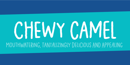
$16.00Originally I wanted to call this font Chewy Caramel, because I love caramel. But that name was already taken, so I deleted two letters in the name and ended up with Chewy Camel instead. I know that the designer of Chewy Caramel don’t mind - because that is my good friend, David, who made that one! :) Chewy Camel was made with a slightly blurry and inky pen, and is suitable for most things that need a true organic hand lettered font. I have added 6 slightly different versions of each letter, and there is multilingual support as well - CrawfishPopsicle - Unknown license
- Anubis by DSType,
$19.00Anubis, the first DSType font at MyFonts is back in an improved Pro version. AnubisPro, a slab serif font with a contemporary feel, with Central Europe diacritics, swashes and ligatures, available in OpenType format. - Diversa Std by DSType,
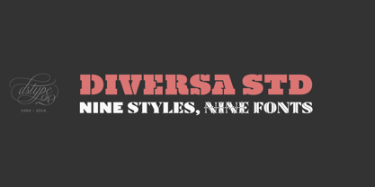
$10.00 - The Elizabeth font, created by the versatile typeface designer David Rakowski, offers a unique blend of historical elegance and contemporary finesse. This font pays homage to the intricate calligraph...
