10,000 search results (0.029 seconds)
  1. maran - Unknown license
  2. my handwriting - Unknown license
  3. Unnamed Melody - Unknown license
  4. Overprint DSG - Unknown license
  5. The Doorman - Unknown license
  6. Doodolonomy Fred - Unknown license
  7. trop flou - Unknown license
  8. The Buns - Unknown license
  9. Teacher's Pet - Unknown license
  10. Tingle Institute - Unknown license
  11. Turtle Club - Unknown license
  12. Courtney Dorkling - Personal use only
  13. Honey Bunches - Unknown license
  14. maran - Unknown license
  15. Dearest Friend lite - Unknown license
  16. Gentle Redhead - Unknown license
  17. Socially Awkward - Unknown license
  18. Hau Ruck - Unknown license
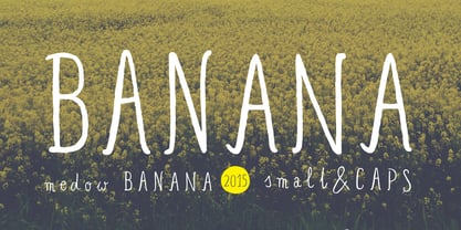
  19. Banana and Sun by Justyna Sokolowska, $15.00
    Banana and Sun is light handwritten font. It’s very suitable for the fashion industry and culinary. This font is crazy but readable, so it can be used for large amounts of text.
  20. Lust Text by Positype, $29.00
    Yes, finally. This one took the most time and the most restarting. Years went into imagining what Lust Text should look like and how it should structurally behave in order to truly improve upon a setting that includes any of the Lust typefaces. I approached it as much from the side of the type designer, as I did a potential user. The flow, the warmth, the personality needed to be there, but all of the excess had to be removed responsibly. In the process, and in need of inspiration, I looked backward to historical artifacts and precedent. In each early Lust Text approach, the solution was lackluster and/or vanilla and not actually a ‘Lust’ typeface. The exercise was not in vain though. By exploring past examples, I found my footing drawing for media now and how it might be used later—all the while, producing seamless, elegant curves and restrained indulgence (that sounds almost silly to say, but I like it). The Lust Collection is the culmination of 5 years of exploration and development, and I am very excited to share it with everyone. When the original Lust was first conceived in 2010 and released a year and half later, I had planned for a Script and a Sans to accompany it. The Script was released about a year later, but I paused the Sans. The primary reason was the amount of feedback and requests I was receiving for alternate versions, expansions, and ‘hey, have you considered making?’ and so on. I listen to my customers and what they are needing… and besides, I was stalling with the Sans. Like Optima and other earlier high-contrast sans, they are difficult to deliver responsibly without suffering from ill-conceived excess or timidity. The new Lust Collection aggregates all of that past customer feedback and distills it into 6 separate families, each adhering to the original Lust precept of exercises in indulgence and each based in large part on the original 2010 exemplars produced for Lust. I just hate that it took so long to deliver, but better right, than rushed, I imagine.
  21. Portada by TypeTogether, $35.00
    For everyone wishing for a modern serif that’s as clear and readable as a sans in restrictive digital environments, meet Portada by Veronika Burian and José Scaglione. Sans serifs are commonly used on small screens to save space and carry a modern tone. Serifs may appear fickle and unsteady, pixel grids change from one product to another, and space is at a premium. Portada now provides a serif option for these restrictive digital environments, putting that old trope to rest. The screen has met its serif match. Portada was created from and for the digital world — from e-ink or harsh grids to Retina capability — making it one of the few serifs of its kind. Portada’s text and titling styles were engineered for superlative performance, making great use of sturdy serifs, wide proportions, ample x-height, clear interior negative space, and its subservient personality. After all, words always take priority in text. It’s not all business, though. Portada’s italics contain an artefact of calligraphy in which the directionality of the instrokes and the returning curves of the outstrokes give the family a little unexpected brio. Yet even the terminals are stopped short of flourished self-absorption to retain their digital clarity. When printed these details are downright comforting. Portada’s titling styles enact slight changes while reducing the individual width of each character and keeping the internal space clear. Titling italics have increased expressiveness across a few characters rather than maxing out the personality in each individual glyph. Digital magazines, newspapers, your favourite novel, and all forms of continuous screen reading benefit from Portada’s features. This family can also cover many of the needs developers have: user interface, showing data intensive apps on screen, even one-word directives and dialogs. And, as a free download, an exhaustive set of dark and light icons is included to maintain Portada’s consistent presence, whether as a word or an image. The complete Portada family (eight text styles, ten titling styles, and one icon set) is designed for extensive, clear screen use — a rare serif on equal footing with a sans.
  22. Font design is a realm that encapsulates mood, culture, and period, all in the structure of letters and symbols. "Club," designed by Keith Bates, is a font that dives deep into these concepts, offeri...
  23. Pattheda - Personal use only
  24. Slicker - Unknown license
  25. Typist - Unknown license
  26. Wild West Shadow - Unknown license
  27. Rivanna - 100% free
  28. Wild West USA - Unknown license
  29. Drinking - Unknown license
  30. Wild West Wind - Unknown license
  31. FuturistStencil - Unknown license
  32. RunyTunesRevisited - Unknown license
  33. ModernTypography - Unknown license
  34. HeraldSquare - Unknown license
  35. DayPosterBlack - Unknown license
  36. Rothman - Unknown license
  37. Toit - Unknown license
  38. ChromeYellow - 100% free
  39. WildWest - Unknown license
  40. Xpressive - Unknown license
Looking for more fonts? Check out our New, Sans, Script, Handwriting fonts or Categories
abstract fontscontact usprivacy policyweb font generator
Processing