10,000 search results
(0.03 seconds)
- Monotype Old English Text by Monotype,
$40.99Old English is a digital font that was produced by Monotype's design staff, circa 1990. But its roots go much further back: the face's design is based on that of Caslon Black, a Blackletter type cast by the venerable William Caslon foundry in England, circa 1760. This design has been popular throughout England for centuries. Its style of lettering, conveniently also called Old English, can be found all over the UK. Old English-style typefaces belong to the Blackletter category. They nicely combine the design attributes of both the medieval and Victorian eras. This is mostly because their Textura forms, which were born during the Middle Ages, became quite fashionable again in the late 1800s! This Old English font is very legible for a Blackletter face. Perhaps that is why it is more familiar to readers in the UK and North American than German Blackletter varieties, like Fraktur. A favorite once again today, Old English is ideal for certificates, diplomas, or any application which calls for the look of stateliness and authority. It's a sturdy and sure bet for newspaper banners, holiday greeting cards, and wedding announcements. - Antafeda by Gloow Studio,
$15.00 Antafeda is our another retro script typeface. Use this typeface and you will make a retro design with ease! Combined your design with dozens of stylistic alternates and elegant swashes which is included in this typeface, this retro typeface is really perfect for logo design, t-shirt, vintage and retro badge, vintage quotes, branding, packaging, etc. Antafeda features: A full set of upper & lowercase characters Numbers & punctuation Multilingual language support PUA Encoded Characters +320 Glyph Up to 80 Stylistic Alternates with Swashes and Ligatures! OpenType Features To enable the OpenType Stylistic alternates, you need a program that supports OpenType features such as Adobe Illustrator CS, Adobe InDesign & CorelDraw X6-X7, Microsoft Word 2010 or later versions. There are additional ways to access alternates/swashes, using Character Map (Windows), Nexus Font (Windows), Font Book (Mac) or a software program such as Pop Char (for Windows and Mac). Thankyou for purchasing our product, hope you like and have fun with our product. If you have any queries, questions or issues, please don't hesitate to contact us directly. If you satisfied with our product, please give 5 stars rating. Happy Designing...
 - Old English by Monotype,
$40.99 Old English is a digital font that was produced by Monotype's design staff, circa 1990. But its roots go much further back: the face's design is based on that of Caslon Black, a Blackletter type cast by the venerable William Caslon foundry in England, circa 1760. This design has been popular throughout England for centuries. Its style of lettering, conveniently also called Old English, can be found all over the UK. Old English-style typefaces belong to the Blackletter category. They nicely combine the design attributes of both the medieval and Victorian eras. This is mostly because their Textura forms, which were born during the Middle Ages, became quite fashionable again in the late 1800s! This Old English font is very legible for a Blackletter face. Perhaps that is why it is more familiar to readers in the UK and North American than German Blackletter varieties, like Fraktur. A favorite once again today, Old English is ideal for certificates, diplomas, or any application which calls for the look of stateliness and authority. It's a sturdy and sure bet for newspaper banners, holiday greeting cards, and wedding announcements.
 - Old English (Let) by ITC,
$29.99 Old English is a digital font that was produced by Monotype's design staff, circa 1990. But its roots go much further back: the face's design is based on that of Caslon Black, a Blackletter type cast by the venerable William Caslon foundry in England, circa 1760. This design has been popular throughout England for centuries. Its style of lettering, conveniently also called Old English, can be found all over the UK. Old English-style typefaces belong to the Blackletter category. They nicely combine the design attributes of both the medieval and Victorian eras. This is mostly because their Textura forms, which were born during the Middle Ages, became quite fashionable again in the late 1800s! This Old English font is very legible for a Blackletter face. Perhaps that is why it is more familiar to readers in the UK and North American than German Blackletter varieties, like Fraktur. A favorite once again today, Old English is ideal for certificates, diplomas, or any application which calls for the look of stateliness and authority. It's a sturdy and sure bet for newspaper banners, holiday greeting cards, and wedding announcements.
 - Corton by Greater Albion Typefounders,
$14.00 Corton was inspired by the traditional lettering on a gravestone in an English village. While that might sound a rather solemn beginning, Corton has wonderfully lively air, with distinctive lively serifs and beautifully swashed downstrokes. Eight faces are offered: regular and titular each in three weights plus regular condensed. Between them they are ideal signage and display faces, merging 'olde-worlde' charm and fun character, but remaining clear and legible.
 - Brocks by Par Défaut,
$9.00Square in appearance but with soft vertices, Brocks is composed of more than 400 characters. From Latin Pro for multiple language usable. The latin alphabet is available, for uppercase and lowercase, in numerator, denominator and ordinal version. The same for the numbers with fraction features until 10 figures on each side. Exist in Light, Regular and Bold weights, in Right and Left slant version. All of this available in Variable version. - HUTagada by Heummdesign,
$15.00 "Disco Pang Pang" is the Korean name for Tagada rides. It is a characteristic typeface that is good to use when you want to make use of a unique and bouncy feeling. Light and Extrabold are made with the thickness of normal typefaces, but Left and Right have strange shapes with stroke thicknesses that are biased to one side. Its unique shape can make a strong impression on people.
 - Fun Play Arabic by FunFont,
$17.00 Fun Play Arabic is sibling of Fun Play comes with Arabic version ; Arabic, Urdu, Persian, Kurdish and Jawi. Fun Play is a Fun and Playful display typeface family with 5 wights variant; from Light to Bold. Comes with many features; Multilingual Support, Ligatures, Stylistic Alternate and more. Each character represents a child's joy. ‘Fun Play’ can be used for branding, packaging, headline and all styles of children-related design.
 - Vanguard CF by Connary Fagen,
$35.00 Constructed for maximum impact in tight horizontal spaces, Vanguard's eight weights span a featherlight Thin to a striking Heavy, with accompanying obliques. Vanguard CF impresses in print, headlines, video, and social media. Vanguard CF pairs excellently with its sibling typeface, Integral CF. It also contrasts well with warmer styles, like Artifex CF and Greycliff CF. All typefaces from Connary Fagen include free updates, including new features, and free technical support.
 - Castre by Nathatype,
$25.00 Be a trendsetter and stand out with bold and sophisticated style font. The epic Castre. Castre is a serif font family to better charm your designing experiences. This package package to please you with a variety of choices for your own project consisting of eight different choices of thickness level. It is designed to be simple and easy to read without losing the modern feels. The uppercases design is paired with thin lines allow us to dive more into the world of modernity. Included: Castre Thin Castre Extra Light Castre Light Castre Regular Castre Medium Castre Semi Bold Castre Bold Castre Extra Bold Slay your design with Castre’s best features so you’ll look your best on what ever your design is, all the time. Features: Ligatures Multilingual Supports PUA Encoded Numerals and Punctuations Castre fits best for any design projects, such as posters, banners, logos, book covers, album covers, quotes, invitations, greeting cards, name cards, headings, printed products, merchandise, social media, etc. Find out more ways to use this font by taking a look at the font preview. Thank you for purchasing our premium fonts. If you have any further question or issues, don’t hesitate to contact. We’re happy to help! Happy Designing.
 - Grymmoire - Unknown license

- Petals BF by Bomparte's Fonts,
$39.00 Ooh so soft, so curvaceous, so voluptuous and so swash-buckling. Hey, I'm talking ’bout Petals BF! Here’s a design inspired by the work of Dave West and infused with a plethora of pleasingly plump letterforms, with swashes reminiscent of 60s and 70s types. But here’s the twist: where you might typically expect to find ball terminals, you'll experience some sensuous curls; and some playful letterforms such as lowercase h, k, m, and n, may even call to mind that groovy look of ’60s bell-bottoms. Spread across its capitals and lowercase are swash variants for beginning, middle and ending letterforms —candy for your eyes. Petals BF is where Didone style happily marries the organic and curvaceous forms of Art Nouveau. Strange I know, but so is a duckbill platypus —and somehow they all seem to work surprisingly well. Among the many typographic niceties you'll discover, are such Opentype features as Contextual and Stylistic alternates, Ligatures, Case-sensitive forms and Fractions. Please note: these magical features demand the use of opentype-savvy applications such as Adobe Creative Suite, QuarkXPress and etc. Petals BF is multilingual, and speaks the languages of Western, Eastern and Central Europe, in addition to Turkish and Baltic. It gets around. So let your creativity blossom with Petals in projects that involve headlines, magazine layouts, product packaging, logos, signage, branding and etc.
 - Serapion by Storm Type Foundry,
$39.00Another variation on the Renaissance-Baroque Roman face, it extends the selection of text type faces. In comparison with Jannon, the contrast within the letters has been enhanced. The dynamic elements of the Renaissance Roman face have been strengthened in a way which is illustrated best in the letters "a", "b" and "s". These letters contain, in condensed form, the principle of this type face - in round shapes the dark stroke invariably has a round finial at one end and a sharp one at the other. Another typical feature is the lower-case "g"; the upper part of this letter consists of two geometrically exact circles, the inner of which, a negative one, is immersed down on the right, upright to the direction of the lower loop and the upright knob. The vertical strokes slightly splay out upwards. Some details of the upper-case letters may seem to be too daring, but they are less apparent in the text sizes. It has to be admitted that typographers tend to draw letters in exaggerated sizes, as a result of which they stick to details. Serapion Italic are italics inspired partly by the Renaissance Cancelleresca. This is obvious from the drop-shaped finials of its lower-case descenders. The type face is suitable for illustrated books, art posters and short texts. It has a rather ugly name - after St. Serapion. - Jannon Pro by Storm Type Foundry,
$55.00 The engraver Jean Jannon ranks among the significant representatives of French typography of the first half of the 17th century. From 1610 he worked in the printing office of the Calvinist Academy in Sedan, where he was awarded the title "Imprimeur de son Excellence et de l'Academie Sédanoise". He began working on his own alphabet in 1615, so that he would not have to order type for his printing office from Paris, Holland and Germany, which at that time was rather difficult. The other reason was that not only the existing type faces, but also the respective punches were rapidly wearing out. Their restoration was extremely painstaking, not to mention the fact that the result would have been just a poor shadow of the original elegance. Thus a new type face came into existence, standing on a traditional basis, but with a life-giving sparkle from its creator. In 1621 Jannon published a Roman type face and italics, derived from the shapes of Garamond's type faces. As late as the start of the 20th century Jannon's type face was mistakenly called Garamond, because it looked like that type face at first sight. Jannon's Early Baroque Roman type face, however, differs from Garamond in contrast and in having grander forms. Jannon's italics rank among the most successful italics of all time – they are brilliantly cut and elegant.
 - TT Backwards by TypeType,
$29.00 TT Backwards useful links: Specimen | Graphic presentation | Customization options About TT Backwards: TT Backwards is an experimental font project inspired by the USSR typography and fonts of the late 70s and early 80s. Shop signs, posters, and book design—this is where we drew the inspiration for our project. TT Backwards consists of two complementary font subfamilies, a Script and a Grotesque, each of them includes 5 typefaces in 5 different weights (Thin, Light, Regular, Bold, Black). TT Backwards Script is a noncontrast almost monolinear solid script inspired by shop signs, poster and book design of the USSR. TT Backwards Script features a large number of Latin and Cyrillic ligatures (more than 70 items), which allows to make the script versatile and sophisticated to the max. And thanks to the implementation of a huge number of context alternates, all lowercase letters are joined softly and without breaks, and they meet the uppercase letters beautifully and correctly. TT Backwards Script supports the following OpenType features: liga, case, ordn, frac, sups, sinf, numr, dnom, tnum, onum, pnum. TT Backwards Sans is a narrow grotesque, which takes us back to the book design of late 70s and early 80s with its ductile characters. It is created considering its use in the small text size. TT Backwards Sans has a number of pronounced peculiarities: high x-height, exaggerated extenders, and big visual compensators and ink traps. Apart from the basic visual solution, TT Backwards Sans contains two experimental stylistic sets, which markedly change the overall visual perception of the text. SS01 alters high-frequency symbols of the Cyrillic alphabet, and SS02 significantly changes the high-frequency symbols of the Latin alphabet. FOLLOW US: Instagram | Facebook | Website TT Backwards OpenType features: case, ordn, frac, sups, sinf, numr, dnom, tnum, pnum, liga, zero, salt, ss01, ss02. TT Backwards language support: Acehnese, Afar, Albanian, Alsatian, Aragonese, Arumanian, Asu, Aymara, Banjar, Basque, Belarusian (cyr), Bemba, Bena, Betawi, Bislama, Boholano, Bosnian (cyr), Bosnian (lat), Breton, Bulgarian (cyr), Cebuano, Chamorro, Chiga, Colognian, Cornish, Corsican, Cree, Croatian, Czech, Danish, Embu, English, Erzya, Estonian, Faroese, Fijian, Filipino, Finnish, French, Friulian, Gaelic, Gagauz (lat), Galician, German, Gusii, Haitian Creole, Hawaiian, Hiri Motu, Hungarian, Icelandic, Ilocano, Indonesian, Innu-aimun, Interlingua, Irish, Italian, Javanese, Judaeo-Spanish, Judaeo-Spanish, Kalenjin, Karachay-Balkar (lat), Karaim (lat), Karakalpak (lat), Kashubian, Khasi, Khvarshi, Kinyarwanda, Kirundi, Kongo, Kumyk, Kurdish (lat), Ladin, Latvian, Laz, Leonese, Lithuanian, Luganda, Luo, Luxembourgish, Luyia, Macedonian, Machame, Makhuwa-Meetto, Makonde, Malay, Manx, Maori, Mauritian Creole, Minangkabau, Moldavian (lat), Montenegrin (lat), Mordvin-moksha, Morisyen, Nahuatl, Nauruan, Ndebele, Nias, Nogai, Norwegian, Nyankole, Occitan, Oromo, Palauan, Polish, Portuguese, Quechua, Rheto-Romance, Rohingya, Romanian, Romansh, Rombo, Rundi, Russian, Rusyn, Rwa, Salar, Samburu, Samoan, Sango, Sangu, Scots, Sena, Serbian (cyr), Serbian (lat), Seychellois Creole, Shambala, Shona, Slovak, Slovenian, Soga, Somali, Sorbian, Sotho, Spanish, Sundanese, Swahili, Swazi, Swedish, Swiss German, Swiss German, Tagalog, Tahitian, Taita, Tatar, Tetum, Tok Pisin, Tongan, Tsonga, Tswana, Turkish, Turkmen (lat), Ukrainian, Uyghur, Vepsian, Volapük, Võro, Vunjo, Xhosa, Zaza, Zulu.
 - Hand Stamp Swiss Rough Sans by TypoGraphicDesign,
$19.00 The typeface Hand Stamp Swiss Rough Sans is designed for the Typo Graphic Design font foundry in 2015 by Manuel Viergutz. A display sans serif type for headlines with an authentic used stamped style by hand. It started analogous with 42 stamps. Vintage look plus state-of-the-art OpenType-features like contextual alternates (calt) for more hand-stamped feeling with the automatic generated stylisitc set loop. Decorative ligatures like CT, LL, LI, LU, MM, OO, TH, TT, TU, UH and Versal Eszett (German Capital Sharp S) type the word LOVE for ❤ and the word SMILE for ☺. Character Set: Latin Extended (Adobe Latin 3). 1086 glyphs with 4× A–Z, 4× a–z, 4× 0–9 and 100+ extra icons like arrows, dingbats, symbols, geomatric shapes, catchwords and many alternative letters. Have fun with this font & use the DEMO-FONT (with reduced glyph-set) FOR FREE! Example of use from the Font The font works best for headline size. Logo, Poster, Editorial Design (Magazine or Fanzine), Flyer, Music Covers or Webdesign (Headline Webfont for your website), Webbanner, Animations … ■ Font Name: Hand Stamp Swiss Rough Sans ■ Font Weights: Regular + Mix + Icons + DEMO (with reduced glyph-set) ■ Font Category: Display & Decorative ■ Font Format: .otf (OpenType Font for Mac + Win) + .ttf (TrueType Font) ■ Glyph Set: 1086 glyphs ■ Language Support: 28+ for Latin Extended (Adobe Latin 3). Afrikaans, Albanian, Catalan, Croatian, Czech, Danish, Dutch, English, Estonian, Finnish, French, German, Hungarian, Icelandic, Italian, Latvian, Lithuanian, Maltese, Norwegian, Polish, Portugese, Romanian, Slovak, Slovenian, Spanisch, Swedish, Turkish, Zulu ■ Specials: 100+ decorative extras like icons for arrows, dingbats, emojis, symbols, geometric shapes, catchwords + German Capital Eszett. Open Type Features: Kerning (kern), Access All Alternates (aalt), Stylistic Alternates (salt), Stylistic Set 1 (ss01) … Stylistic Set 6 (ss06), Localized Forms (locl), Subscript (subs) Superscript (sups), Ordinals (ordn), Proportional Figures (pnum), Oldstyle Figures (onum), Lining Figures (lnum), Tabular Figures (tnum), Slashed Zero (zero), Fractions (frac), Denominators (dnom), Numerators (numr), Standard Ligatures (liga), Contextual Alternates (calt) e. g. Stylistic Set-Loop and Decorative Ligatures (dlig) e. g. type the word “LOVE” for ❤ or “SMILE” for ☺ ■ Design Date: 2015 ■ Type Designer: Manuel Viergutz
 - Lyra by Canada Type,
$39.95 Lyra is an Italian Renaissance script that might have developed if metal type had not broken the evolution of broad pen calligraphy. It lies in the area between the humanist bookhand and the chancery cursive, combining the fullness and articulation of the Roman letters with a moderate italic slant and condensation. A steep pen-angle allows use of a broader pen relative to the x-height, giving the letters more contrast with light verticals and heavy curves. Lyra embodies the Renaissance spirit of refining technical advances of the late middle ages with reintroduction of ancient classical principles. Based on the moving penstroke with constantly changing pen-angle, it brings the vitality of handwriting to the ordered legibility of type. Lyra is a formal italic, too slow for copying books. By eliminating the element of speed, digital technology opens up a new level of calligraphy, bringing it into the sphere of typography as would naturally have happened if metalworkers had not controlled the process. If classical Western traditions are respected, digital calligraphy has the potential to recapture the work of the past and restart its stalled evolution. There is of course no substitute for the charm of actual writing, with each letter made for its space; but the tradeoff is for the formal harmony of classical calligraphy as every curve resonates in tune with every other. This three-weight font family marks Philip Bouwsma's much-requested return from a three year hiatus. It also reminds us of his solid vision in regards to how calligraphy, typography and technology can interact to produce digital beauty and vesatility. Each of the three Lyra fonts contains almost three character sets in a single file. Aside from the usual wealth of alternates normally built into Bouwsma's work, Lyra offers two unique features for the user who appreciates the availability of handy solutions to subtle design space issues: At least three (and as many as six) length variations on ascending and descending forms, and 65 snap-on swashes which can be attached to either end of the majuscules or minuscules. The series also offers 24 dividers and ornaments built into each weight, and a stand-alone font containing 90 stars/snowflakes/flowers, symmetric contstructs for building frames or separators, masking, watermarking, or just good old psychedelia.
 - FS Millbank by Fontsmith,
$80.00 A sign of something better When designer Stuart de Rozario surveyed the fonts used in signage on London’s public transport systems, he reached a dead end. They seemed staid, sterile, lacking in personality, and ill-suited to use by modern brands. He was pointed in another direction entirely. ‘The driving force behind my thoughts was to design something more current and fresh without compromising legibility and clarity. A font with both personality and function, that’s versatile and large and small sizes, and effortless to read, but which also says something new.’ Speed reading Late for a meeting and can’t find your way? Trying to catch a flight? Lost in a hospital? Reading signs is a different business to reading a book or a newspaper. Text on signs needs to be deciphered quickly and effortlessly. So the legibility criteria for signage letterforms are different to those for normal reading, too. Throughout FS Millbank’s uppercase and lowercase alphabets, characters have been given features for extra definition, including: wide ink traps on the A, K, M, V, W, X and Y; a serifed i, accentuated spurs on the a, d, l u; and different x-height shapes on the b, g, p and q. Distinctive forms and generous, open internal shapes all help the quick reading of sign text, and wide, open terminals and counters allow similar letter shapes to be distinguished easily when viewed at different angles. Running down a corridor, maybe... Positive/negative Standard type tends to glow on the kind of dark backgrounds often used for signage, and look heavier than its true weight. To correct the imbalance caused by this optical trick, special weights of the typeface have to be drawn for these ‘negative’, light-on-dark applications. These are lighter than their comparable positive weights to overcome the ‘glow’ effect. After extensive tests of the negative weights, at all sizes, we achieved the right optical balance. Glowing, glowing, gone. Icons This wouldn’t be a signage typeface without its own set of icons, or symbols, to help people find what they’re looking for. So, to sit alongside the positive and negative fonts, we’ve created a comprehensive set of 172 icons, covering a wide range of applications from transport and user interface to information and directional. Designed within the typeface capital height, they sit on the baseline and are spaced centrally.
 - Teio - Personal use only

- Rabanera - Personal use only

- Non Block by Liartgraphic,
$15.00 Hi guys! How are you guys? I bet it's great! Introducing our latest product, we call this product the Non Blok font Non Blok hight is a display type font With a unique and firm touch Non Blok hight font is great to use on: fashion magazines, logos, photography, landing pages, flyers, social media and so on What's included - multilingual support - alternatives - ligatures Thank you, best regards Liarttyype
 - Nightjump by Balpirick,
$15.00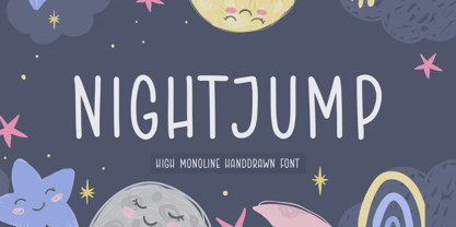 NIGHTJUMP is a High Monoline Hand drawn Font. Night Jump is a handwritten font with a casual look. It is perfect for product packaging, branding project, magazine, social media, wedding, or just used to express words above the background. NIGHTJUMP also multilingual support. Enjoy the font, feel free to comment or feedback, send me PM or email.
 - a Theme for murder - Personal use only

- Selectric - Unknown license

- Dr. Eve L - Unknown license

- It's About Time - Unknown license

- a Theme for murder - Unknown license

- FuzzySock - Unknown license

- Cthulhu Runes - Unknown license

- Damn the Man - Unknown license

- Mr. Quincy - Personal use only

- Corleone - 100% free

- lauralinda - Unknown license

- ZETUEcript - Unknown license

- Keikoku - Unknown license

- Alphapix - Unknown license

- Edgewise NF by Nick's Fonts,
$10.00Considerable heft and clean lines—with a few whimsical grace notes—characterize this font, based on a typeface originally named "Ryter Night". Powerful yet playful, this gentle giant is the perfect choice for engaging headlines. Both versions of the font include 1252 Latin, 1250 CE (with localization for Romanian and Moldovan). - Syracuse BRK - 100% free

- Certto Headline - Unknown license

- Spin Cycle OT - 100% free


