10,000 search results
(0.022 seconds)
- Bhuron by Twinletter,
$15.00 Introducing the Bhuron Blackletter Font. fonts that can give you the option to mix and match for a unique and attractive look. This font can be used in a variety of projects to create a vintage and elegant style. Use it to enhance visual projects, titles, or banners, packaging with a bold classic look that exudes style, elegance, and strong personality.
 - Braylend Script by Tebaltipis Studio,
$15.00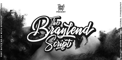 TebTipsudio, Braylend is a script typeface with personality. You can use it as a logo, badge, insignia, packaging, headline, poster, etc The alternative characters in this font were divided into several OpenType features such as Stylistic Alternates, Stylistic Sets, and Ligature. The OpenType features can be accessed by using OpenType program such as Adobe Illustrator, Adobe Photoshop, and Adobe InDesign.
 - Street Smart by Fontysia,
$9.00 Introducing: Street Smart is a fun and bold graffiti font, which includes six versions of each letter which can be used separately or on top of one another for a different look. This font is PUA coded which means you can access all the glyphs and replace them easily! (please type preview to see if I have what you need!)
 - Jampact NF by Nick's Fonts,
$10.00A little Compacta, a little Impact, a little photolettering from the 70s, all rolled into one make for a unique headline face that commands attention. Although this font is primarily unicase, the lowercase positions feature stylistic alternates, so can can mix things up and pack them in. Both versions of the font include 1252 Latin, 1250 CE (with localization for Romanian and Moldovan). - Angelle by Top Type,
$9.00 Angelle is a serif type. Inside there are two options, namely Regular and Bold. In addition, this font also comes with Ligature and Stylistic Alternates features. The font has an elegant, delicate and luxurious character. Very lucky for those of you who can have it. This font can be used to create wedding invitations, presentations, web, magazines, covers, and various other designs.
 - Thimberly by Febri Creative,
$15.00 Thimberly is a modern and awesome handwriting font with extraordinary charm. This will change any design idea to be beautiful and perfect! Thimberly can be used for a logo, branding, or just writing which you can combine into great designs. It has multi-lingual support. Accessible in the Adobe Illustrator, Adobe Photoshop, Adobe InDesign, CorelDraw, even work on Microsoft Word.
 - Sanremo by Larin Type Co,
$14.00 Sanremo - this bold display font is a stylish and original multipurpose font in a modern style with many alternatives and ligatures that are very attractive. With their help you can make your project unique. Use the main set to highlight exactly what you need. All characters in this font are PUA-encoded and can be accessed from the Glyph panel.
 - Asgardian by Letterara,
$16.00 Asgardian is a minimal and modern sans serif font. It can easily be matched to an incredibly large set of projects, so add it to your creative ideas and notice how it makes them stand out! Have fun with this cool font and explore its endless variations. This font is PUA encoded which means you can access all of the glyphs.
 - Sokinz by Aliptype,
$10.00 Introducing Sokinz. Sokinz was round shapes, funky and playfull fonts, made carefully with handdrawn by combining two concepts of graffity style and groovy styles, you can use this font for your creative design, this font was suitable to make posters, pamflets, t-shirt, merch, apparels, brand names, gift cards, products tags, and many more can be discovered by using this fonts.
 - Herkings by Sarid Ezra,
$17.00 Herkings is a serif based font with unique lowercase & uppercase that will make your design looks minimalist yet modern. You can use this font for any purpose, especially for logotype. This font also suitable for branding. You can mix and match the uppercase and lowercase to make your logo more unique and stand-out. This font also support multi language!
 - Hisquins by Sarid Ezra,
$17.00 Hisquins is a serif based font with unique lowercase & uppercase that will make your design looks minimalist yet modern. You can use this font for any purpose, especially for logotype. This font also suitable for branding. You can mix and match the uppercase and lowercase to make your logo more unique and stand-out. This font also support multi language!
 - Epic Miracle by Prestige Artsy Studio,
$29.99 Epic Miracle is beautiful rounded bold retro serif with a 90s touch. A great serif that works beautifully in modern designs. You can definitely create amazing logos, headings, apparel designs and more. Epic Miracle is an essential font for branding as well if you want to go BOLD. I can't wait to see what you can create with Epic Miracle!
 - The Milade by TM Type,
$12.00 The Milade is inspired by the retro style in combination with the hand lettering style.The Milade has many alternative swash & ligatures characters and has opentype features like a stylistic alternatice, stylistic set, ligature, and swash so you can mix and match as you want. This font is PUA encoded which means you can access all of the amazing glyphs and ligatures with ease!
 - Une Nuit Parisienne by Megami Studios,
$10.00 This font is based on a lot of the downtempo culture in Paris. Smoky bars, jazz clubs, that sort of thing. How a font can be influenced by intangibles is a question that I can't quite answer, but I can say that when I created it, it strongly reminded me of a couple of times spent in Paris back in the mid-90s.
 - Blothia by ahweproject,
$9.00 Blothia is a brush script font with a dynamic and energetic style. It can be used for various purposes such as titles, signatures, logotypes, T-shirt designs, letterheads, signage, labels, newsletters, posters, badges, and every other design which needs a unique, striking font. This font is PUA encoded, which means you can access all of the glyphs and swashes with ease!
 - Lafisken Signature by Tebaltipis Studio,
$12.00 Lafisken Signature is a typeface with personality. You can use it as a logo, badge, insignia, packaging, headline, poster, etc The alternative characters in this font were divided into several OpenType features such as Stylistic Alternates, Stylistic Sets, and Ligature. The OpenType features can be accessed by using OpenType program such as Adobe Illustrator, Adobe Photoshop, and Adobe InDesign. Thank you!
 - As of my last update in April 2023, there is no widely recognized or commercially popular font specifically named "Milky" within the standard typographic circles or among major font foundries. Howeve...
- Fely, though not a widely recognized font at the time of my last update, conjures an image of a font that is likely characterized by its unique blend of personality and practicality, based on the tre...
- Disparador, a font designed by Tobias Sommer (who also goes by the nickname "shyfonts"), is a visually striking typeface that imbarks a unique blend of modernity and retro inspiration. Sommer, known ...
- As of my last knowledge update in April 2023, there isn't a widely recognized font specifically named "Panther" that is acknowledged across the major font platforms or in design communities. However,...
- As of my last update in early 2023, the font "Bolid" is not recognized as one of the widely-known or standard typefaces. It's possible that "Bolid" could be a custom, niche, or newly released font th...
- The font "D3 DigiBitMapism Katakana" by D3 is a unique and intriguing typeface with a distinct appearance and a specific purpose. As suggested by its name, this font is deeply rooted in digital aesth...
- "Linearmente," a font crafted by the creative minds at Jambo!, is a striking embodiment of modern design principles merged with minimalist aesthetics. At its core, Linearmente is built on the foundat...
- As of my last update in April 2023, "Paul6" does not appear to be a widely recognized or documented font within the typographic community or among the standard collections from major type foundries. ...
- Golden Record by Mans Greback,
$59.00 Golden Record is an elegant all caps sans serif typeface with a tall, classic, and high-quality feel. Its timeless design is perfect for adding a touch of sophistication to any project. The font's classiness evokes a sense of luxury and opulence, making it ideal for high-end branding and design applications. Golden Record is a versatile typeface family consisting of the styles Light, Regular, Bold, and Outline, each available in Italic, offering a wide range of creative possibilities. The idea for Golden Record came to life when Mans Greback was inspired by the elegance of vintage vinyl records and their iconic gold labels, merging classic aesthetics with modern design principles. Mans Greback is a Swedish typeface designer known for crafting high-quality fonts with a focus on versatility and aesthetics. He created Golden Records to provide designers with a unique and sophisticated typeface for upscale projects. Greback is committed to delivering exceptional quality in every font he designs, consistently pushing the boundaries of typography.
 - Robert Moore by Harvester Type,
$15.00 Robert Moore is a font that was specially designed for comics. A lot of work has been done. At first, glyphs were drawn manually using different markers, then they were transferred to the font. The font was tested on real printing and digital comics. The world of fonts for comics is big and I wanted to create even more variability for authors with one family, which is why a variable version was created containing two axes: weight and italics. This gives you more options. A large number of glyphs, multilingualism, ligatures, and a capital give even more scope for work and creativity. The name was created from the names of the authors of the comics Robert Kirkman and Alana Moore, so the Robert Moore font turned out. Although the font was made for comics, it is not limited to them. Posters, logos, covers, text, headings, prints, product design, web, interfaces are not all options for using the font.
 - Isento by DSType,
$40.00 We always wanted to design a gothic typeface. Our most similar typefaces are Rude and Firme, but Rude has some very delicate curves especially visible in the vertical strokes and Firme introduces a type family with reasonably big ascenders and descenders. On the other hand, Isento has a much more straightforward approach to the particular genre. Loosely inspired by Times Gothic, introduced in the American Type Founders Specimen Book and Catalogue from 1923, soon followed its very own path. Is our first typeface that clearly shows a distinct weight difference between the uppercase and the lowercase and the spacing is very open to provide a much more mechanical feeling. Isento and Isento Slab ranges from Thin to ExtraBold with perfectly matching italics. Immediately seemed very clear that a slab serif companion would follow the sans, therefore Isento Slab is the perfect companion to Isento, with very strong rectangular serifs, ideal to set short passages of text or to become the key actor in a big headline.
 - Korolev Rounded by Device,
$39.00 DF Korolev is a 72 weight geometric sans serif family based on lettering by an anonymous Soviet graphic designer from the propaganda displays at the Communist Red Square parade in 1937. It has been named in honor of Sergey Pavlovich Korolyov, or Korolev, considered by many to be the father of practical astronomics. Rational and robust, it is also elegant and refined. Tracings done in Illustrator over a photograph featuring this type pinned down some of the basic character shapes. These were then imported into FontLab, where the full glyph complement was developed. The lower-case has been designed from scratch, and adheres to the structural logic of the uppercase as closely as possible. The complete Korolev super-family includes standard, italic, condensed, and compressed versions, each in five weights. The Alternate families come with a double-story “a”. Authoritative yet friendly, Korolev Rounded is a versatile addition to the Korolev range.
 - Celias by Type Dynamic,
$37.00 Celias is a geometric with sharp corners. The Celias family includes 7 weights, from Hairline to Black, with their corresponding italics. Each font includes OpenType Features such as Stylistic Alternates, Proportional Figure, Tabular Figures, Numerator, Superscript, Denominators, Scientific Inferiors, Subscript, Ordinals, Ligatures and Fractions. Celias family supports Latin and Cyrillic, all these languages are covered: Latin language support: Afrikaans, Albanian, Asturian, Azeri, Basque, Bosnian, Breton, Bulgarian, Catalan, Cornish, Corsican, Croatian, Czech, Danish, Dutch, English, Esperanto, Estonian, Faroese, Filipino, Finnish, Flemish, French, Frisian, Friulian, Gaelic, Galician, German, Greenlandic, Hungarian, Icelandic, Indonesian, Irish, Italian, Kurdish, Latin, Latvian, Lithuanian, Luxembourgish, Malagasy, Malay, Maltese, Maori, Moldavian, Norwegian, Occitan, Polish, Portuguese, Provençal, Romanian, Romansch, Saami, Samoan, Scots, Scottish, Serbian, Slovak, Slovenian, Spanish, Swahili, Swedish, Tagalog, Turkish, Walloon, Welsh, Wolof Cyrillic language support: Adyghe, Avar, Belarusian, Bulgarian, Buryat, Chechen, Erzya, Ingush, Kabardian, Kalmyk, Karachay-Balkar, Karakalpak, Kazakh, Komi, Kyrgyz, Lak, Macedonian, Moldovan, Mongol, Permyak, Russian, Rusyn, Serbian, Tatar, Tofa, Tuvan, Ukrainian, Uzbek
 - Masteria Script by Mans Greback,
$59.00 Masteria Script is a retro script typeface. An optimistic calligraphy lettering to bring you back to the golden age of hand-drawn advertisements, Masteria is a professional quality handwriting font family. Drawn and created by Mans Greback in 2022, it is perfect for a vintage restaurant headline or nostalgic logotype design. Use underscore _ to make a swash. Example: Mast_eria Use multiple underscores to make a longer swash. Example: Super___human (Download required.) Masteria Script is provided in six diverse styles, such as Thin, Bold, Black, Italic and combinations to compliment each other and maximise your options and design experience. The font is built with advanced OpenType functionality and has a guaranteed top-notch quality, containing stylistic and contextual alternates, ligatures and more features; all to give you full control and customizability. It has extensive lingual support, covering all Latin-based languages, from Northern Europe to South Africa, from America to South-East Asia. It contains all characters and symbols you'll ever need, including all punctuation and numbers.
 - Arial Nova by Monotype,
$45.99The Arial® Nova family takes Arial back to its roots. Character spacing has been adjusted and a number of subtle modifications were made to the design to return the shapes and proportions to those of the original 1982 design created for IBM's then new high-speed laser printers. Although these first Arial fonts, called "Sonora Sans" by IBM, were low-resolution bitmaps, it was apparent that the design could also be an important high-resolution digital typeface, and Arial was redrawn for Monotype's imagesetters in the late 1980s. In the process Arial evolved from its original design loosing some of its earlier personality. The restored Arial Nova family is made up of three weights of roman design of standard proportions and three weights of condensed - all with complementary italic designs. The Arial Nova family is also compatible with the fonts that Microsoft® provides in the Windows® 10 operating system. - Adagio Serif by Borutta Group,
$25.00 The Adagio Family is a part of Mateusz Machalski’s, Warsaw Academy of fine arts Master Degree Diploma in multimedia studio, conducted by Professor Stanisław Wieczorek and his brave PHD Jakub Wróblewski. Adagio is a modern type family. It consists of 3 main varieties: sans, serif and slab. Each one of them has its own “true italic” set. All of the styles together have over 400 characters in 9 different thicknesses. The Adagio family was created mostly for company identities. The idea was to create a wide range of different varieties which are stylistically consistent. Adagio Serif - Characterises with strong contrast and high detail in calligraphic character cuts, what gives it a light feeling. Unlike the Slab version, serif variety has asymmetrical serifs. Thanks to large X length, and highly stretched descenders, it also works correct in longer text, while its strong detail is good for headlines. The Serif version is a great complement for Adagio Sans and Adagio Slab.
 - Adagio Sans by Borutta Group,
$25.00 The Adagio Family is a part of Mateusz Machalski's, Warsaw Academy of fine arts Master Degree Diploma in multimedia studio, conducted by Professor Stanisław Wieczorek and his brave PHD Jakub Wróblewski. Adagio is a modern type family. It consists of 3 main varieties: sans, serif and slab. Each one of them has it's own “true italic” set. All of the styles together have over 400 characters in 9 different thicknesses. The Adagio family was created mostly for company identities. The idea was to create a wide range of different varieties which are stylistically consistent. Adagio Sans - In its character, inspired by classical English typefaces. Sharp chamfers add a strong character. Thanks to delicate contrast and proportions of capitals, this variety has features of humanist grotesque. Thanks to large x length, and highly stretched descenders, it also works correct in longer text, while it’s strong detail is good for headlines. The Sans version is a great complement for Adagio Serif and Adagio Slab.
 - Crete by TypeTogether,
$35.00 A typeface originally inspired by a wall lettering in a small chapel on Crete, Greece. Despite its experimental character it works nicely in a text environment. Crete is perfect for display use where a feminine and elegant touch is desired. The unusual serifs and terminals add to the graceful appearance in the Thin and provide a more robust feel in the Thick. Both weights are metrically interchangeable, so text will not reflow when mixed. The accompanying Italics have several different lettershapes and therefore have, in some cases, their own widths. However, they sit comfortably next to the uprights. The style names refer to the change in serif weight instead of increasing vertical stem widths. Crete features our Basic Extended character set including four sets of numerals, ligatures. fractions, superior/inferior numerals and language support for over 40 languages that use the Latin script. Crete was selected as winner of the Granshan competition 2008 in the display type category.
 - Hudson NY Pro by Arkitype,
$15.00 It's here and it's a major upgrade to Hudson NY. Weight variations and alternate glyphs were some of the requests that were being received for Hudson NY and these have all been taken care of in the Pro Edition of Hudson NY. Hudson NY Pro still comes in Regular, Serif and Slab styles now with completely re-drawn glyphs, there are now six weights as well as italics for each style. Some of the additional features included in the Pro Edition is Small Caps, Stylistic Sets and Alternate Glyphs. Hudson NY is now loads more versatile, it is the perfect Display family for sports, beverage and entertainment. Press versions have been dropped in the Pro Edition as these were the lesser used and sluggish fonts of the original Hudson NY family so the focus was to create a cleaner family with more usability options. Each Hudson NY style now also includes a Variable font which saves you the hassle of installing multiple font files.
 - Karibu by ROHH,
$40.00 Karibu™ is a 100-font original, ultra versatile geometric grotesk family with a lot of character. It is designed for modern projects, to serve as display as well as paragraph text typeface. It is perfect for lots of design situations - from magazine editorial use, logo design & branding, to web design, user interfaces and mobile applications. Main features: - 5 widths (Narrow, Condensed, Normal, Expanded, Wide), each consisting 20 fonts - 10 weights for each width (from Hairline to Black) - handdrawn, carefully crafted italics - alternate stylistic set for more technical and minimalistic projects - pronounced ink traps and large x-height improving legibility in small sizes and adding strong personality to display sizes - flatten letter shapes adding vertical rhythm and elegance to narrow widths - extended latin language support - OpenType features (case sensitive forms, standard and discretionary ligatures, stylistic sets, contextual alternates, lining, oldstyle and tabular figures, slashed zero, fractions, superscript and subscript, ordinals, currencies and symbols)
 - Adagio Slab by Borutta Group,
$25.00 The Adagio Family is a part of Mateusz Machalski’s, Warsaw Academy of fine arts Master Degree Diploma in multimedia studio, conducted by Professor Stanisław Wieczorek and his brave PhD student Jakub Wróblewski. Adagio is a modern type family. It consists of 3 main varieties: sans, serif and slab. Each has its own “true italic” set. All of the styles together have over 400 characters in 9 different thicknesses. The Adagio family was created mostly for company identities. The idea was to create a wide range of different varieties that are stylistically consistent. Adagio Slab - Slab variety combines qualities of the Sans and Serif varieties. It has the same contrast as Sans. As distinct from Serif, Adagio Slab contains strong, beamy and symmetrical serifs in the form of pillows. Thanks to large X height, and highly stretched descenders, it also works correctly in longer text, while its strong detail is good for headlines. Slab version is a great complement for Adagio Serif and Adagio Sans.
 - Guerrer by Wahyu and Sani Co.,
$15.00 Guerrer is modern sans serif family of 20 fonts, 10 weights from thin to black, consists of uprights and matching italics (obliques). It has 300+ glyphs which covers major western languages and has some features, such as fractions, ligatures, alternates, mixed case (unicase) stylistic set, tabular & proportional lining, etc. The mixed case (unicase) feature would be very useful for logo branding project which will give a unique touch to the logotype. Ink traps for bolder styles were adjusted to maintain the legibility at smaller size for both print and digital needs. The typeface was inspired by the strength and the boldness of warriors (guerrer in Catalan). Designed with high x-height and short ascender & descender. The ascender has the same level width the caps height. The uppercase G was specially designed to resemble the warrior head with his armor/helmet. Guerrer would be great choice for branding project, display poster, website, packaging, and broad range of graphic design projects.
 - Komet Pro by Jan Fromm,
$65.00 Komet is a sturdy typeface with a calm and upright feel. Although it derives inspiration from classical English sans-serifs, it’s not too closely related to that model. Komet, instead, feels rather more lively and contemporary. Its compact spacing, low stroke contrast and heavy dots and accents give it an almost monolinear quality. The diagonals are slightly curved and the counters of the round letters such as b, o and q are generously wide. The muted, understated middle weights are built for extended body copy, while Komet’s thin and dark weights look brisk and assertive and make for subtly expressive headlines. Komet is an ideal choice for editorial design, branding and corporate design. The Komet Pro family comes in eight weights with matching italics, from Thin to Black. Each font contains around 850 glyphs, including a rich repertoire of OpenType features. Small caps, ligatures, ten different figure sets with matching currency symbols, stylistic alternates and arrows make Komet Pro a comprehensive toolkit for ambitious typography.
 - Isento Slab by DSType,
$40.00 We always wanted to design a gothic typeface. Our most similar typefaces are Rude and Firme, but Rude has some very delicate curves especially visible in the vertical strokes and Firme introduces a type family with reasonably big ascenders and descenders. On the other hand, Isento has a much more straightforward approach to the particular genre. Loosely inspired by Times Gothic, introduced in the American Type Founders Specimen Book and Catalogue from 1923, soon followed its very own path. Is our first typeface that clearly shows a distinct weight difference between the uppercase and the lowercase and the spacing is very open to provide a much more mechanical feeling. Isento and Isento Slab ranges from Thin to ExtraBold with perfectly matching italics. Immediately seemed very clear that a slab serif companion would follow the sans, therefore Isento Slab is the perfect companion to Isento, with very strong rectangular serifs, ideal to set short passages of text or to become the key actor in a big headline.