10,000 search results
(0.016 seconds)
- Subway Circle by Hanoded,
$15.00 My eldest son Sam always wanted to visit Japan and he has been saving up for a ticket for years now. We should have traveled there this year, but due to the pandemic, that was impossible. We’re now trying to go next year. Sam and I did make some kind of itinerary and I told him how we were going to get around, as I have been to Japan many times. I told him about the Shinkansen trains, the cute Tram in Nagasaki and the immense subway system in Tokyo. One of the lines in Tokyo is the so-called Yamanote Circle Line, which I have used on numerous occasions. A new font name was born and it stuck to this particular font! Subway Circle is a 100% handmade font. It is rounded, slightly slanted and comes with a sunny disposition. I am sure that, when you use it, you will find your 生きがい… ;-)
 - Antipol VF by phospho,
$75.00 With Antipol Variable, the reversed stress font was supplemented with Wide and Extended cuts in the Hairline weight. The ability to stretch single letters extremely wide is an exclusive goodie of the Variable version. Antipol is a Sans Serif design that reverses the conventions of a regular Latin Sans Serif. With a weight emphasis on the horizontals and its vertical terminals Antipol radiates a 1970s charisma known from the like of Antique Olive. Its modern and avantgardistic attributes are most pronounced in the Hairline weight, where ultra thin lines meet distinctive arrowhead-corners. This particular weight is meant for display settings, think full-page magazine titles or posters. Antipol Wide and Antipol Extended are a generous statement for graphic design with enough space to let the type breathe: art catalogs, lead texts, invitations, letterheads or brand identity. Any style comes with a wide range of OpenType features that goes beyond a standard display font: Small Caps, Proportional and Tabular Oldstyle Figures and Lining Figures, Fractions, and much more.
 - Stempel by Linotype,
$29.99The Stempel family consists of two fonts; each made to look like a set of block stamps. Each letter appears inside its own roughly drawn square. Stempel One's letters are very simple form/counterform objects. Stempel Two's forms are more ornate: each square stamp has a thin border inside of it, and then the individual letterforms have been knocked-out, so that the colored area depicts the counters around the letters rather than the letters themselves. As a line of text is typed, a box appears for each letter entered, and all of the boxes slightly nudge against each other to form the line. The Stempel fonts have the appearance of a hand-made quality to them. Their forms appear too random, too delicate, and too thought out to have been made on a machine. Using these fonts will add a nice warm, linoleum-cut touch to your work. Both Stempel One and Stempel Two were designed by German designer Martina Balke in 2002, and are part of the Take Type 5 collection from Linotype GmbH." - Celari Titling by insigne,
$- Need for speed? Satisfy it with insigne’s Celari. Take it for a drive and watch how its simple curves, easy lines, and sturdy shapes handle the edges and corners of your projects with smooth and rapid execution. The negative space cuts through the rounded sans serif letterforms of Celari, giving this all-caps typeface a strong impression of dimension and speed. Celari’s organic stroke direction allows you to ease through its gentle turns, too, causing the font to hum around the lines of your project like a V8 engine on an open Nevada highway. The speed and agility of Celari is built for nothing less than a headline. Use the larger-than-life power of this face for any number of oversized applications--mastheads, posters, web headlines, flyers. It provides excellent performance for service-oriented ads where efficiency and quick buyer service are priorities. Customize your ride, too. The OpenType version of Celari includes some serious add-ons to make it your design. The font incorporates discretionary ligatures for some funky combinations and adds in stylistic and contextual alternates for virtually endless possibilities with the characters, ligatures, and composites. Make sure your setup allows for OpenType fonts (Adobe CS suite or Quark) before unleashing the fun of Celari, though. Be confident with your design. Be quick with your message. Again, take Celari for a drive and unleash the strength and velocity of its character in your design. You've been holding back long enough.
 - Nuku Nuku - Unknown license

- Janda Hide And Seek - Personal use only

- Smiley Font - Unknown license

- Badgery - Unknown license

- Oohlalalulucurvy - Unknown license

- DavysRibbons - Unknown license

- Mail Ray Stuff - Unknown license

- Kicking Limos - Unknown license

- KR Katlings - Unknown license

- Ninces by Twinletter,
$15.00 cartoon, bubble, bubble letter, San serif, funny, kids, movie, cinema, playful, poster, minions, game, handwriting, child, comic, comic book, youtube, school, teacher, cute, dental, quote, event, typeface, children, fun, drink, headlines, magazine, branding,
 - LD Baskin Sundae by Illustration Ink,
$3.00LD Baskin Sundae is as cute as it can be, and versatile too! Use this font to make perfectly designed layouts ...you know, you can complete your paper or scrapbooking creation in minutes! - Bread Crackers by Jehansyah,
$9.00 Want a cute and unique look. "Bread Crackers" suitable for all your design work that wants to look unique and modern, and there are several alternatives that you can use in your design.
 - Trostie Love by Lemonthe,
$9.00 Trostie Love is a handwritten font, cute and fun. This font is perfect for quotes, headings, blogs, logos, invitations, wedding, watermark, social media posts, product packaging, product designs, label, special events and more!
 - Little Aliens by Sealoung,
$10.00 Little Aliens is a sweet and friendly display font. Its natural and cute style makes it incredibly fitting to a large pool of designs. This font is perfect for school and kids projects!
 - Quinlophe by ZetDesign,
$12.00 Quinlophe is a cute font with the theme of romance, and is made by paying attention to the shape and anatomy of the letters so as to produce unique and beautiful letter characters.
 - Love Baby by Andrey Font Design,
$12.00 Love Baby is a cute and flowing handwritten font. Use it to create gorgeous designs! This font is PUA encoded which means you can access all of the glyphs and swashes with ease!
 - Little Witch by Brithos Type,
$11.00 Little Witch is a cute and incredibly unique display font. Masterfully designed to become a true favorite, this font has the potential to bring each of your creative ideas to the highest level!
 - Pinky Juice by Olivetype,
$18.00 Pinky Juice is the perfect way to add some fun and personality to your work. It's a bold, playful font that will make your work stand out. Plus, it's very cute! Thank You!
 - Qundeasy by Tanya Savchenko,
$12.00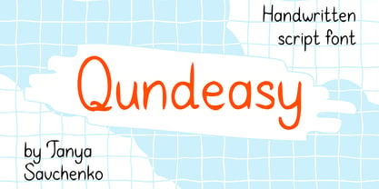 Qundeasy is a sloppy and cute handwritten font. First of all, it is suitable for handmade style design. Сan create interesting logos, posters, banners, social media creatives, postcards and greetings with this font.
 - Wake Up Now by Seemly Fonts,
$12.00 Wake Up Now is a cute and simple lettered handwritten font that can be used for all chalkboard quotes or teaching material! Its authentic look will add a realistic feel to your designs.
 - Pod by kapitza,
$49.00 Pod™ is a cute foliage font consisting of 62 illustrations. It is entirely hand drawn and each character is unique. When combined it is easy to create fantasy forests and magical meadows.
 - Cheerful Yellow by Sakha Design,
$14.00 Cheerful Yellow is a fun and cute display font. It has a playful style and great readability. It looks perfect on cards, branding, stationery, blog design, custom art, quotes, and so much more.
 - Skater Girl by Gleb Guralnyk,
$15.00 Hi! Presenting a cute pin-up style font named Skater Girl. It has a modern and vintage look at the same time. Also few ligatures and alternate glyphs are available in this typeface.
 - Tropical Love by Tigade Std,
$30.00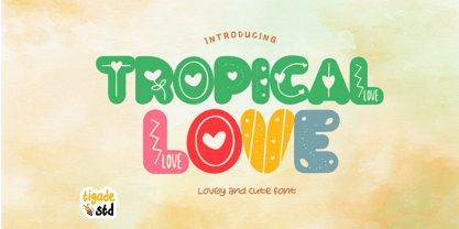 Tropical Love is a cute, quirky, friendly decorative font. It is suitable for cartoon designs, book cover or just any creation that requires a lovely touch, this font will be an fabulous choice.
 - Mafieso by Rometheme,
$6.00 Mafieso is a fun, playful display font created for a large range of different designs. It features a sweet, cute style with bold letters, that will help you with getting your message across.
 - Fluire by Lián Types,
$37.00 MAS AMOR POR FAVOR (1) (more love, please) Fluire means -to flow- in Italian and that’s what this font is all about. The story began when a friend of mine asked for a tattoo with the word -Fluir- (to flow in Spanish). She didn't want a tattoo full of swashes and swirls, like I'm used to doing, but something more fluent, soft and minimal. My very first attempts were more related to copperplate calligraphy but I wasn't even close: I discovered that I needed to forget a little bit about the classic contrast and speed of the engrosser's nib and started playing with a tiny flat metal nib. Letters started to flow, and I immediately thought of turning them into a font. Inspired by the tattoo I created and by other tattoos I saw, I started the journey of what would be a very fun process. The result is a very cute, almost monoline font with a wide range of uses. USES If not used for a tattoo (my first ‘target’), the font delivers amazing results in combination with Fluire Caps: These two need each other, they go together, they talk. I designed Fluire Caps Down and Fluire Caps Up so it’s easier to manage their colors. Also there’s Fluire Caps Down Lines, which has a decorative thin line to add yet another dimension. Use the fonts in magazines, book covers, posters, greeting cards, weddings, lettered walls, storefronts! TIPS Since the font is Open-Type programmed, I strongly recommend using it in applications that support that feature. Also, the font looks way better when -contextual alternates- are activated, but it’s your choice :) Try Fluire, and keep flowing. NOTES (1) The phrase alludes to maybe the most tattooed phrase in Latin America.
 - Choir by Linecreative,
$16.00 Choir is a modern sans serif font. Each letter consists of three combined lines that connect together like a maze. This font is suitable for logos, business cards, magazines header, Flyer Titles, or large-scale oven artworks.
 - Gumdrop by PintassilgoPrints,
$22.00 Gumdrop is a soft sans. Stylish, original and a little bit retro, it’s an all caps font with two options for each letter and number for added spontaneity. Contextual alternates feature is included and manage the instant cycling of these alternates with the click of a button. The regular cut itself is already quite a versatile one, and the family counts yet with a cool halftone cut and a pencil-like outlined version. Is this just another damn handsome font? Hell, yes. Keep it handy!
 - Contane Text by Hoftype,
$49.00 Contane Text is the text optimized version of the Contane family. More solid, more robust, it repesents the down-home addition to the more subtle Contane family. Stronger hairlines, solid serifs, and slightly more comfortable proportions make it appropriate for bold headlines, as well as for small text sizes. 20 styles offer fine graduation of the weights. All weights contain small caps, ligatures, superior characters, proportional lining figures, tabular lining figures, proportional old style figures, lining old style figures, matching currency symbols, fraction- and scientific numerals, matching arrows, and alternate characters.
 - Taxon by Hoftype,
$49.00 Taxon is a straightlined Sans with a clean, fresh and unsentimental look. Related to classical faces like Optima and Imago, it appears more contemporary and merges the austere linearity of the Grotesk with the elegance of the Antiqua. The Taxon family consists of 12 styles and is well suited for ambitious typography. It comes in OpenType format with extended language support. All weights contain ligatures, superior characters, proportional lining figures, tabular lining figures, proportional old style figures, lining old style figures, matching currency symbols, fraction- and scientific numerals, matching arrows and alternate characters.
 - FS Silas Slab by Fontsmith,
$80.00 Slab-like sibling Why stop at sans? Rather than leave FS Silas Sans as an only child, the team wanted to extend the family, and create a complete system for brands and editorial. Unsure what the result would be, the team started experimenting with a slab serif version. ‘We didn’t know how it would turn out, but we really liked it and wanted to take it further. A fresh angle ‘We stuck with the angular theme of the sans by drawing angled slab serifs,’ says Phil Garnham, ‘as opposed to the square serifs that slab fonts usually have. That created an inner dynamism in words and sentences on the page, and a very distinctive, crafted character, like a Victorian soul in a contemporary body.’ These crafted touches include details such as the angled ascenders on the ‘i’ and ‘l’, while characters such as the ‘y’, with its abruptly-ending descender, add a mark of distinction. A perfect pair Silas Slab, like its sibling, offers a clear-cut range of five weights, from the elegant Thin to the monumental ExtraBold. Put it together with Silas Sans and you have the full complement, capable of performing the full range of tasks, above the line and below, in headlines, body copy and logotypes, B2B and B2C. Keep them together; they don’t like it when they’re apart.
 - Clumsy by Gaslight,
$15.00 Clumsy is a two weight all caps handcrafted awkward font with alternates for all characters and digits. The font was inspired by a few lines of text from an old soviet book about vine. Clumsy is a good choice for small amounts of text. When Clumsy is used in OpenType applications, its Contextual Alternates feature produce a striking random-like effect on glyphs distribution, achieved by cycling through alternates. When not using the Contextual Alternates feature, you can still pick the alternates in the Glyphs palette or use the alternates available from the keyboard upper and lower case.
 - Neogrotesk by Los Andes,
$39.00 Not of the Alps but from Los Andes. It tastes a lot more like wine than cheese. Neogrotesk is a versatile and functional workhorse typeface with a neutral look and Latin flavor. The font includes multiple typographic features such as alternates, ligatures, small caps, case-sensitive punctuation, arrows as well as lining, old style and tabular figures. Neogrotesk is the perfect choice for editorial, corporate and advertising design. This 40-style type comes in 5 weights with matching italics and contains 770 glyphs. The complete set consists of 4 sub-families: Essential, Essential Alt, Pro and Small Caps.
 - Organic Thinker by Bogstav,
$19.00 Monospaced fonts can be so dull...they are often only suitable for something like programming and other places where you need the text lined up perfectly. Well, that is not the case with Organic Thinker! Yes, it is monospaced, but it is also handmade and full of vibrant and organic life! Each letter has 5 slightly different versions, and they automatically changes as you type - makes you forget everything about programming, kerning and other dull things! :) Well...you are more than welcome to use Organic Thinker for your next Turbo Pascal text, actually I'd fancy that! :)
 - Naive Inline by S&C Type,
$8.00 Naïve Inline is a layered serif handwritten font designed by Fanny Coulez and Julien Saurin in Paris. Our goal was to draw a font with finely irregular lines that give a human and whimsical feeling. We designed three weights to assure a good readability whatever the size. They can be enhanced with five different interior patterns and three shadows to improve your designs and bring a charming and unusual feeling. To do so, you can simply superimpose the layers with a compatible software like Photoshop, the weight above and the pattern(s) below, then choose a color for each. This font is part of our Naïve superfamily that contains lot of variations: Line, Inline, Serif, Sans Serif, and a special Art Deco one. Just click on our foundry name to see them all! We hope you will enjoy our work. Merci beaucoup!
 - Sacramento Pro by Stiggy & Sands,
$39.00 The Sacramento Pro family of typefaces was inspired by a monoline, semi-connected script from hand-lettering artist brochure work of the 1950's and 1960's. With its sophisticated upright stance, it stands on a thin line between formal and casual lettering styles, yet it has a commanding presence for headlines and titles. The Slim adds a fine pen-line style, while the Stout style expands the formal/casual dichotomy much further than the original weight. Opentype features include: - Contextual Alternates for initial and final forms. - Stylistic Alternates for an alternate lowercase t. - Discretionary Ligatures* for catch words like “and”, “at”, “by”, “for”, “of”, “or”, “the”, “to”, and “with”. - Full set of Inferiors and Superiors for limitless fractions. - Proportional and Oldstyle figure sets. * Discretionary Ligatures not included in the Stout style due to heavyweight nature.


