7,066 search results
(0.056 seconds)
- Ryzes by Ferry Ardana Putra,
$17.00 Introducing "Ryzes" – a font that plunges you into the immersive world of cyber graffiti with a distinct cyberpunk feel. This font is your gateway to a dystopian digital realm, combining edgy aesthetics with a futuristic vibe that speaks of rebellion and technology. "Ryzes" captures the very essence of the cyberpunk genre, offering a text that embodies the rebellious and high-tech spirit of a dystopian future. Each character resonates with the anarchic energy and unconventional style of cyber graffiti, making your designs pop with a captivating and distinctive edge. In our globalized world, language is a bridge that knows no borders. "Ryzes" is equipped with extensive multi-language support, ensuring that your message can be effectively communicated to audiences around the world, regardless of language or script. Complete Character Set: "Ryzes" boasts a comprehensive character set that includes both uppercase and lowercase letters, numerals, and a rich selection of symbols and punctuations. This versatility ensures that your text is not only visually stunning but also functionally adaptable. But that's not all. "Ryzes" takes your creativity a step further with an extruded version. This adds depth and dimension to your designs, allowing you to effortlessly create 3D text that embodies the cyberpunk aesthetic. The combination of the regular and extruded styles offers endless possibilities for crafting captivating 3D designs. Whether you're working on cyberpunk-inspired branding, futuristic posters, or any project that demands a cyber graffiti aesthetic, "Ryzes" is your ultimate companion for pushing the boundaries of design. Dive into a world where rebellion meets technology and let "Ryzes" be your creative tool in crafting designs that resonate with the electrifying spirit of the cyberpunk genre in 2D and 3D dimensions, bursting with color and pop culture excitement. ——— Ryzes features: A full set of Uppercase and Lowercase Numbers and punctuation Multilingual language support PUA Encoded Characters OpenType Features Layered Style +274 Total Glyphs ——— Ryzes Includes: Ryzes Regular Ryzes Extruded Left Ryzes Extruded Right
 - Mauritius by Canada Type,
$29.95 Ten years or so after his unique treatment of Garalde design with Trump Mediaeval, Georg Trump took on the transitional genre with Mauritius, which was to be his last typeface. He started working on it in 1965. The Stuttgart-based Weber foundry published a pamphlet previewing it under the name Barock-Antiqua in 1967, then announced the availability of the metal types (a roman, a bold and an italic) a year later. The global printing industry was already in third gear with cold type technology, so there weren't that many takers, and Weber closed its doors after more than 140 years in business. Subsequently, Trump’s swan song was unfairly overlooked by typography historians and practitioners. It never made it to film technology or scalable fonts. Thus, one of the most original text faces ever made, done by one of the most influential German type designers of the 20th century, was buried under decades of multiple technology shifts and fading records. The metal cuts of Mauritius seem to have been rushed in Weber’s desperation to stay afloat. So the only impressions left of the metal type, the sole records remaining of this design, show substantial problems. Some can be attributed to technological limitations, but some issues in colour, precision and fitting are also quite apparent, particularly in Mauritius Kursiv, the italic metal cut. This digital version is the result of obsessing over a great designer’s final type design effort, and trying to understand the reasons behind its vanishing from typography’s collective mind. While that understanding remains for the most part elusive, the creative and technical work done on these fonts produced very concrete results. All the apparent issues in the metal types were resolved, the design was expanded into a larger family of three weights and two widths, and plenty of 21st century bells and whistles were added. For the full background story, design analysis, details, features, specimens and print tests, consult the PDF available in the Gallery section of this page.
 - Korge by Ferry Ardana Putra,
$19.00 Introducing "Korge", a captivating and versatile retro bold slab serif font that seamlessly marries vintage aesthetics with modern functionality. With its bold design, serif form, and a trio of regular, rounded, and extruded versions, Korge offers a wealth of creative possibilities for your design ventures. Korge is a font that transports your projects back to the golden eras of design. Its bold and distinct serifs evoke a sense of nostalgia, lending your creations a classic and enduring appeal. Korge provides not one, but three distinct styles to choose from. The regular version exudes a commanding presence, while the rounded variant softens the edges for a more approachable feel. The extruded version adds depth and dimension, giving your text a 3D, eye-catching quality. Korge is a font that speaks the language of design across borders. With its multi-language support and PUA encoding, it ensures your message resonates with audiences from diverse linguistic backgrounds. From logo design to branding, packaging, posters, and beyond, Korge adapts seamlessly to a wide array of design projects. Its bold slab serifs demand attention, making sure your message is delivered with both authority and style. Korge invites you to embark on a journey of creative exploration. Craft memorable headlines, iconic logos, or striking signage – this font is your canvas for pushing the boundaries of design. With Korge, the possibilities are limitless. Its vintage-inspired bold slab serif design, multi-language support, and versatile styles make it the ideal choice for designers seeking to infuse their projects with timeless charm and contemporary appeal. Get ready to bring your visions to life with Korge, where classic meets cutting-edge. ——— Korge features: A full set of Uppercase & Lowercase letters Numbers and punctuation Multilingual language support PUA Encoded Characters OpenType Features +237 Total Glyphs Rounded Style + Regular Style Extruded Style Korge Includes: Korge Regular Korge Regular Extruded Left Korge Regular Extruded Right Korge Regular Extruded Left Italic Korge Regular Extruded Right Italic Korge Rounded Korge Rounded Extruded Left Korge Rounded Extruded Right Italic Korge Rounded Extruded Left Korge Rounded Extruded Right Italic
 - Bely by TypeTogether,
$49.00 Bely is the first design by French newcomer Roxane Gataud. Too many typefaces are either governed by fear and never accomplish what they could, or are unrestrained which results in their frenetic dangling like a leaf caught in a spider’s web. Bely’s strength is that it has both restraint and freedom throughout the text weights and into the unique display weight. There is no fear in this type family, but only great respect for both the tradition of reading and the opportunity to make an impression. Bely is a high-class throwback containing four text weights which were built upon classical proportions to capitalise on reading familiarity. Bely Text features balanced capitals and a play between large, triangular serifs at the top and thick, bracketed, rectangular serifs at the bottom. The family is capped by a radical, expressive French-style display weight which pushes the rules of the text weights to their logical extreme. Bely Display, truly daring with its monstrous and angled contrast, exploits the features which make an impression at larger sizes. In the end, Bely Display is adventurous when used in packaging, identities, and headlines with attitude, while Bely Text’s calm baseline and piercing ascenders give paragraphs texture and familiarity. Bely covers the Latin A Extended glyph set and brings its sense of confidence to your projects with its two text weights, matching italics, and unique display style. Bely’s satisfying OpenType features allow for the implementation of typographic niceties such as small caps, both tabular and proportional lining and oldstyle figures, ligatures, alternate characters, case-sensitive variants, and fractions. The complete Bely family, along with our entire catalogue, has been optimised for today’s varied screen uses. Awards – Selected for TypeTogether’s Typeface Publishing Incentive Programme scholarship in 2014. – Selected by French magazine Étapes for the 2014 Diploma Issue. – Selected for the 2014 exhibition “TransFormations” at Centre Pompidou. — Received the SOTA catalyst Award 2016
 - FS Joey Paneuropean by Fontsmith,
$90.00Kangaroo FS Joey was the offspring of a project with Rudd Studio to develop a logotype for an online streaming TV service, in 2008. While under wraps, the secret project was code-named Kangaroo. The logotype led to a second project, to design a corporate typeface for the service. It was the first big project Fernando Mello had worked on with Jason Smith. “Like any designer who just joined a team, I was very excited about it, drawing and sketching lots of ideas. I remember Jason and I experimenting with lots of possibilities, for both the logo and the typeface.” Online As the font for a Spotify-style, internet-based service, FS Joey needed to be highly legible on-screen, including at very small sizes. There had to be a range of weights, and they’d have to work well in print, too. It was also important that it felt corporate, not too quirky, while still having a strong character of its own. Quirkiest “We designed three weights specifically for use on the Web,” says Jason Smith. “There was the usual fight between me and my team. I wanted at least one identifiable letter that was a quirk. As always I went straight for the lowercase ‘g’, and it was drawn numerous times with lots of variation. I got the quirkiest one accepted by the client.” But, later in 2009, the Competition Commission blocked Project Kangaroo, and Fontsmith were left with a couple of weights of an as yet unused font. From Kangaroo, Joey was born. A favourite “Straight away, people started to notice the typeface,” says Jason. “I can take the credit for pushing the art direction and standing up for the quirks. But it was Fernando who was the key to pulling it all together and adding his own distinct flavour. Now it’s one of my favourite designs in our library.” Fresh and friendly, geometric and energetic, Joey is available in five weights, all with italics, all finely-tuned for both screen and print. - FS Joey by Fontsmith,
$80.00 Kangaroo FS Joey was the offspring of a project with Rudd Studio to develop a logotype for an online streaming TV service, in 2008. While under wraps, the secret project was code-named Kangaroo. The logotype led to a second project, to design a corporate typeface for the service. It was the first big project Fernando Mello had worked on with Jason Smith. “Like any designer who just joined a team, I was very excited about it, drawing and sketching lots of ideas. I remember Jason and I experimenting with lots of possibilities, for both the logo and the typeface.” Online As the font for a Spotify-style, internet-based service, FS Joey needed to be highly legible on-screen, including at very small sizes. There had to be a range of weights, and they’d have to work well in print, too. It was also important that it felt corporate, not too quirky, while still having a strong character of its own. Quirkiest “We designed three weights specifically for use on the Web,” says Jason Smith. “There was the usual fight between me and my team. I wanted at least one identifiable letter that was a quirk. As always I went straight for the lowercase ‘g’, and it was drawn numerous times with lots of variation. I got the quirkiest one accepted by the client.” But, later in 2009, the Competition Commission blocked Project Kangaroo, and Fontsmith were left with a couple of weights of an as yet unused font. From Kangaroo, Joey was born. A favourite “Straight away, people started to notice the typeface,” says Jason. “I can take the credit for pushing the art direction and standing up for the quirks. But it was Fernando who was the key to pulling it all together and adding his own distinct flavour. Now it’s one of my favourite designs in our library.” Fresh and friendly, geometric and energetic, Joey is available in five weights, all with italics, all finely-tuned for both screen and print.
 - Lust Sans by Positype,
$39.00 Lust Sans is the penultimate exploration of producing a high-contrast sans wholly influenced by its bracketed ancestor. The aspect of this endeavor I enjoyed the most was finding sneaky ways to infuse warmth and whimsy into the letterforms when you least expect it. The result, however, is subtle and uniquely balances against Lust and Lust Didone without becoming cold and overbearing. To accomplish this, Lust Sans has 6 weights. What I found during development was, based on any setting where Lust or Lust Didone were in the same layout, the amount of contrast shown with Lust Sans needed to be adjusted. Expanding the weight offering, produces opportunities for Lust Sans to modulate the rhythm of the layout comfortably while keeping contrast—this is even more obvious with the Italics. I love those. You will too. If you don’t, you do not have a soul. Not sorry. The Lust Collection is the culmination of 5 years of exploration and development, and I am very excited to share it with everyone. When the original Lust was first conceived in 2010 and released a year and half later, I had planned for a Script and a Sans to accompany it. The Script was released about a year later, but I paused the Sans. The primary reason was the amount of feedback and requests I was receiving for alternate versions, expansions, and ‘hey, have you considered making?’ and so on. I listen to my customers and what they are needing… and besides, I was stalling with the Sans. Like Optima and other earlier high-contrast sans, they are difficult to deliver responsibly without suffering from ill-conceived excess or timidity. The new Lust Collection aggregates all of that past customer feedback and distills it into 6 separate families, each adhering to the original Lust precept of exercises in indulgence and each based in large part on the original 2010 exemplars produced for Lust. I just hate that it took so long to deliver, but better right, than rushed, I imagine.
 - Birthday by Canada Type,
$34.95What do you imagine the ideal casual invitation font would look like? It has to be cheerful, inviting, legible, creative, and loads of fun. But first and foremost, it has to look like real handwriting. Fonts seeming like real handwriting are always a major task, and although Canada Type already has plenty of fonts that solve the “looks like handwriting” issue in a variety of ways, we're once again raising the bar a little higher with this one. Birthday is a massive package that crosses the traditional font/handwriting solution of 2-letter ligatures and waltzes into the land of 3-letter combinations. Plenty of them, too! The complete Postscript and True Type versions of Birthday ship with no less than five separate fonts full of nothing but ligatures. And for even more realism, an alternates font is also included in the package, for a total of seven fonts of happy handwriting that can be used anywhere and everywhere personalization is of importance to a layout. For layout artists with advanced typography tools that take advantage of the power of OpenType, Birthday Pro is a wunderkind. All the individual letter alternates are accessible through the Stylistic Alternates feature, the 2-letter ligatures through the standard Ligatures feature, and the 3-letter ligatures via the Discretionary Ligatures feature (for the technically inclined: this includes a nice liga-to-dlig crossover, where the maximum number of possible ligated letters is automatically chosen at the push of a button). If you enjoy using OpenType, Birthday Pro is definitely for you. If on the other hand you like your fonts in Postsript or True Type, it is advisable to keep a character map handy while using Birthday. You will need it to take advantage of the many, many alternates and ligatures distributed over the fonts. The next time someone asks you for the perfect casual invitation font is, look no further. And as usually is with Canada Type, quality fonts are more affordable than ever. - Blog Script by Sudtipos,
$39.00 Technology is making it so that we’re all connected without the need for the physical-presence kind of being connected. That is strange, fascinating, and has a certain magnetism that is very difficult to resist. What’s at stake is no less than the transformation of centuries of human behaviour, and that’s part of the fascination. But while our existence morphs and we rush headlong into our socially minimalist future, we use our present culture to helplessly signal our nostalgia about our past. We know what our future will be missing, and we’re already full of nostalgia about it, but we know that what little we can do about isn’t going to affect the outcome that much. So, almost in full hindsight now, the DIY implosion of the past few years must have really been a reaction to our technological dis/connection. In typography, the minimalist future is already here, with something as austere as the sans serif having become the preferred expression of progress and fortune, both part of the connected isolation we are undergoing. But when physical interaction must take place, like coffee shops and gin joints, our organic alphabets ride high and mighty. That sense of human heritage — elegance and exuberance in our writing, the use of flaws to charmingly brand our own individualism — keeps turning up in all kinds of places, most unexpected of which is the digital world. The overall message seems to be that we’re still creative, imaginative, and unique. In the digital world, on blogs where we write about our puny music and fashion preferences, we’re just articulating this individualism of ours, this third domain of existence our future seems eager to dismiss. These were the thoughts behind Blog Script, the second collaboration between Carolina Marando and Alejandro Paul, after their successful stint with the Distillery set of fonts. This typeface comes in two weights, alternates for most letters, and a strong aesthetic rooted in individuality and freedom of spirit. Use it to be alone together, to tell the world that we’re still human, for now.
 - Buffet Script by Sudtipos,
$99.00 Buffet Script is based on fantastic calligraphy by Alf Becker, arguably the greatest American sign lettering artist of all time. The Alf Becker series of nameless alphabets published by Sign of the Times magazine in 1941 has attracted letter digitizers for a few years now, so it’s really a wonder that a few of those alphabets are still in the non-digital realm. It is understandable, though, that the basis for Buffet Script was not digitally attempted until now. The page presenting this alphabet shows a jungle of letters running into each others and swashes intertwining. The massive amount of work involved in digitizing such lettering, where scanning is nowhere near being an option, is quite obvious at a mere glance. If anyone was going to commit this particular alphabet to a digital form, it would have to be redrawn stroke by stroke and curve by curve on the computer. And don't we love a challenge! But seriously, the challenge was not the main attraction. In a way, the Becker approach to lettering is so far from digital that the imagination is almost forced to work out possibilities and letter combinations to solve problems presented by the scant showings in that magazine. After a few imaginative visualizations, the digital potential becomes clear in the mind, and the eye and hand follow. The result with Whomp (another Alf Becker-inspired work) was an enormous font with a lot of alternates and ligatures. With Buffet Script the imaginative process was no different, but the result particularly shines here, because this is some of the most fascinating flowing calligraphy ever seen. Calligraphy is where the accountability of all the little extra touches, such as alternates and swashes and ligatures, is raised to a higher level than in most other type categories. Buffet Script’s OpenType programming contains discretionary ligatures, stylistic and contextual alternates, interacting with each other to allow the composition of just the right word or sentence. This font is best used where lush elegance is one of the design’s requirements.
 - Castelan Hispane by Ixipcalli,
$35.00 La tipografía Castelan Hispane es una tipografía inspirada en documentos y textos antiguos históricos españoles del siglo XVI. Los trazos semi-medievales - cursivos, le dan una apariencia antigua pero también moderna para los proyectos en los que se desee utilizar la tipografía. Cuenta con seis estilos y tres pesos, ligera, regular y negrita. Cada peso contiene también su forma “itálica”. The Castelan Hispane typeface is a typeface inspired by ancient Spanish historical documents and texts from the 16th century. The semi-medieval - cursive strokes give it an ancient but also modern appearance for projects in which you want to use typography. It has six styles and three weights, light, regular and bold. Each weight also contains its “italic” form.
 - Geometry pair by Etewut,
$20.00 Welcome to my Geometry Pair. Introducing two fonts Forma & Structure that will make you happy. One of them is a compilation of shadow-based symbols like silhouettes. Another one has a rock of glyphs that don't repeat each other, but looks in the same style. Surprisingly they fit to each other and you can mix them in your works, be it print or web design. Make your graphic works more stylish that highlight your uniqueness from other. Just wonder people who loves funky design and who respect tiny details. Now you have opportunity to grab them both at the same time! There are all caps fonts kerned with microscope with multi language support.
 - Trance FJ by Frncojonastype,
$29.00 «fj Trance™» is the first colaborative display typography of frncojonastype this 2020. «fj Trance™» is a display typography that characterizes. For having reverse contrast and play with the exaggeration of shapes and counterforms from the same typography. Conceptualized and designed originally by Jorge Morales Salas, produced by Franco Jonas Hernandez, collaborating Valentina Pino Faúndes and Rodrigo Araya Salas. Also, Greek and shadow variable version has been designed only available by his distributor of favorite typefaces :) • To exclusive licenses and to follow the develop of this project please visit frncojonas.com Learn about upcoming releases, work in progress and get to know us better! WB: frncojonas.com BE: beh.net/frncojonas TW: @frncojonas ING: @frnco.jonas
 - Droid Serif is a contemporary serif typeface family commissioned by Google and designed by Steve Matteson of Ascender Corporation. Unveiled in 2007 as part of the Droid family of fonts, it was crafte...
- Medina by Hatftype,
$15.00 Medina - Cute Valentine Display Font is a font with distinctive handwritten characters perfect for branding projects, logos, wedding designs, media posts, advertisements, product packaging, product designs, labels, photography, watermarks, invitations, stationery, and any project who need handwritten dishes. Features : • Character Set A-Z • Numerals & Punctuations (OpenType Standard) • Accents (Multilingual characters) • Ligature. Multilingual Support : Afrikaans, Albanian, Asu, Basque, Bemba, Bena, Catalan, Chiga, Cornish, Danish, English, Estonian, Faroese, Filipino, Finnish, French, Friulian, Galician, German, Gusii, Icelandic, Indonesian, Irish, Italian, Kabuverdianu, Kalenjin, Kinyarwanda, Low German, Luo, Luxembourgish, Luyia, Machame, Makhuwa-Meetto, Makonde, Malagasy, Malay, Manx, Morisyen, North Ndebele, Norwegian Bokmål, Norwegian Nynorsk, Nyankole, Oromo, Portuguese, Romansh, Rombo, Rundi, Rwa, Samburu, Sango, Sangu, Scottish Gaelic, Sena, Shambala, Shona, Soga, Somali, Spanish, Swahili, Swedish, Swiss German, Taita, Teso, Vunjo, Zulu. There it is. I really hope you enjoy it. Comments & likes are always welcome and accepted.
 - Samson Classic SG by Spiece Graphics,
$39.00 Here is another classic design by Robert Hunter Middleton for the Ludow Foundry in 1940. Samson Classic is a very heavy display face with a wonderful medley of thick-and-thins. Developed just before World War II, this sturdy, chunky style gained popularity in newspaper advertising work. It appears as though it was created using a broad pen and retains the angled stroke endings. Goes great on certificates and diplomas where just a hint of calligraphy is appropriate. Samson Classic is also available in the OpenType Std format. Some new characters including decorative ornaments for creating certificates have been added to this OpenType version. Advanced features currently work in Adobe Creative Suite InDesign, Creative Suite Illustrator, and Quark XPress 7. Check for OpenType advanced feature support in other applications as it gradually becomes available with upgrades.
 - Corporatus by Alex Rosario,
$60.00 The legendary retro-futuristic typeface returns, now in digital format! While there may be copycats of varying quality, none of them have taken the time and care to revive, reproduce, and expand the original Roc Mitchell “Corporate” typeface like Corporatus has. Made directly from scans of the original type specimens and expanded to include the full WGL4, Corporatus is YOUR solution for your retro, futuristic, and corporate design needs. Descended from Microgramma and originally designed to be the American competition to distant cousin Eurostile, Corporate and subsequently Corporatus is best known for being the typeface used by video game developer and publisher Nintendo for many NES-related media in the West, including its controllers, and by Colecovision for its logo. With the original Latin character set as well as Greek and Cyrillic lettering available, now you're playing with TYPOPOWER!
 - French Croissant by Prioritype,
$21.00 French Croissant - Hand Drawn Display Fonts Presenting a new, very passionate typeface. Yes, this font is hand-drawn with an italic style and is characteristic of various types of letter styles. Very suitable for branding designs, logos, posters, merchandise and more. Grab it to start your Type Game! Features: Uppercase, Lowercase, Numeral, Punctuation, Multilingual, Alternates & Ligatures. Multilingual contained: Afrikaans, Albanian, Asu, Basque, Bemba, Bena, Breton, Catalan, Chiga, Cornish, Danish, Dutch, English, Estonian, Filipino, Finnish, French, Friulian, Galician, German, Gusii, Indonesian, Irish, Italian, Kabuverdianu, Kalenjin, Kinyarwanda, Luo, Luxembourgish, Luyia, Machame, Makhuwa-Meetto, Makonde, Malagasy, Manx, Morisyen, North Ndebele, Norwegian Bokmål, Norwegian Nynorsk, Nyankole, Oromo, Portuguese, Quechua, Romansh, Rombo, Rundi, Rwa, Samburu, Sango, Sangu, Scottish Gaelic, Sena, Shambala, Shona, Soga, Somali, Spanish, Swahili, Swedish, Swiss German, Taita, Teso, Uzbek (Latin), Volapük, Vunjo, Zulu. For any questions please contact me 🙂 Thanks!
 - Ark Monogram SG by Spiece Graphics,
$39.00 Ark is a combination monogram set based on the ATF Virkotype design. By combining variously shaped characters, you can produce initials within an oval frame. Just select a left-hand letter, a center letter, and a right-hand letter. Then place all three on an oval frame of your choice. Great for stationery and company logos. The Ark Monogram Set comes with easy-to-read instructions and a useful character map. Additional alternate characters have been provided for better identification and letter fitting within each font. Ark Monogram is now available in the OpenType Std format. Some new stylistic alternates have been added to this OpenType version. Advanced features work in current versions of Adobe Creative Suite InDesign, Creative Suite Illustrator, and Quark XPress. Check for OpenType advanced feature support in other applications as it gradually becomes available with upgrades.
 - Treading by Prioritype,
$19.00 Presents new paired fonts. A minimal and clean feel paired with a handwritten script font makes your designs even more special. This script font also features ligatures, alternatives, and swash or underscore characters that make it more realistic. Great for logo design, branding, quotes and more. Features: Serif: Uppercase, Lowercase, Numeral, Punctuation & Multilingual. Script: Uppercase, Lowercase, Numeral, Punctuation, Multilingual, Ligatures, Alternates & Swash. Multilingual contained: Afrikaans, Albanian, Asu, Basque, Bemba, Bena, Breton, Catalan, Chiga, Cornish, Danish, Dutch, English, Estonian, Filipino, Finnish, French, Friulian, Galician, German, Gusii, Indonesian, Irish, Italian, Kabuverdianu, Kalenjin, Kinyarwanda, Luo, Luxembourgish, Luyia, Machame, Makhuwa-Meetto, Makonde, Malagasy, Manx, Morisyen, North Ndebele, Norwegian Bokmål, Norwegian Nynorsk, Nyankole, Oromo, Portuguese, Quechua, Romansh, Rombo, Rundi, Rwa, Samburu, Sango, Sangu, Scottish Gaelic, Sena, Shambala, Shona, Soga, Somali, Spanish, Swahili, Swedish, Swiss German, Taita, Teso, Uzbek (Latin), Volapük, Vunjo, Zulu. Thanks!
 - Stellar Classic SG by Spiece Graphics,
$39.00 Designed by the renowned Robert Hunter Middleton of Chicago’s Ludlow Typograph Company, this “serifless roman” was first introduced in 1929. Middleton has created a transitional face linking the traditional thick and thin serifs of the times with the new Futura and Kabel design imports. With its slightly flared main strokes, Stellar predates in many respects Hermann Zapf's Optima by thirty years. Highly effective where an elegant and warm feeling is desired. This typeface is faithful to the original letterforms of the Stellar design. Stellar Classic is also available in the OpenType Std format. Some new characters have been added as stylistic alternates in this new version. Stylistic alternates and other advanced features currently work in Adobe Creative Suite InDesign, Creative Suite Illustrator, and Quark XPress 7. Check for OpenType advanced feature support in other applications as it gradually becomes available with upgrades.
 - Bullmars by LetterStock,
$21.00 **Bullmars Font** This pair was inspired by playful poster design that i saw on some coffee shop, It was crafted by hand specially to add natural handmade feeling in its brand identity than i make it clean with pentool. **Opentype features** Bullmars Font is very good looking in logo, labels, product packaging, invitations, advertising and others. This fonts works with folowing languages: Afrikaans, Albanian, Asu, Basque, Bemba, Bena, Chiga, Cornish, Danish, English, Estonian, Filipino, Finnish, French, Friulian, Galician, German, Gusii, Indonesian, Irish, Italian, Kabuverdianu, Kalenjin, Kinyarwanda, Low German, Luo, Luxembourgish, Luyia, Machame, Makhuwa-Meetto, Makonde, Malagasy, Malay, Manx, Morisyen, North Ndebele, Norwegian Bokmål, Norwegian Nynorsk, Nyankole, Oromo, Portuguese, Romansh, Rombo, Rundi, Rwa, Samburu, Sango, Sangu, Scottish Gaelic, Sena, Shambala, Shona, Soga, Somali, Spanish, Swahili, Swedish, Swiss German, Taita, Teso, Vunjo, Zulu Thank you for using this font. LS
 - Monk SPF by S6 Foundry,
$19.00 Monk is a multi-language geometric harmoniously balanced font in Arabic and Latin. The font family has its origins in Benedictine and Franciscan writing. Both Arabic and Latin work seamlessly together having shared counters, stem thickness, and curved forms. Monk is a type family that seeks a balance between the openness and legibility of humanist sans serifs. Letterforms have a distinct direction of the ductus, a wide overall stance, large open counters that help in its legibility. The typeface is versatile and can be successfully used in magazines, posters, branding, websites, headlines, large-format prints, brand identities, social media, advertising, editorial design, posters. The family contains over 40 alternative glyphs and over 50 ligatures in each style and comes in 10 styles with their corespondent italics. The family Latin supports Western, Central, South Eastern, South American, Oceanian, Pan African, Vietnamese, Sámi & Arabic
 - Scholastyca Typeface by Almeera Studio,
$17.00 Introducing the new Scholastica Modern & Classic Typeface!!! Scholastica is a luxury and glamour serif typeface.This font is both modern and nostalgic and works great for logos, magazine, social media. Already matched up and ready to be used together for your next design! For those of you who are needing a touch of elegant, stylish, classy, chic and modernity for your designs, this font was created for you! Perfect for editorial projects, Logo design, Clothing Branding, product packaging, magazine headers, or simply as a stylish text overlay to any background image. No special software is required to type out the standard characters of the Typeface. To access the Opentype Ligatures, you will need software that supports Opentype features in fonts. Current Language Support : Danish, English, Finnish, French, German, German (Switzerland), Norwegian Bokmål, Norwegian Nynorsk, Portuguese, Spanish, Swedish, Swiss German.
 - Panorama SG by Spiece Graphics,
$39.00 Here is a profoundly delicate and graceful design that has its roots in art deco fashion. This elegant typeface is based on an old 1930s lettering style popularized by Carl Holmes in his wonderful book on the subject. Somewhat condensed with a very tall lowercase, Panorama carries itself beautifully. It is similar to such classics as Stellar and Optima with stems flaring slightly at the ends. Panorama has a great number of alternate capital, small capital, and lowercase characters including two sets of alternate figures. Panorama, Panorama Alts, and Panorama SC are also available in the OpenType Std format. Some new characters have been added to these OpenType versions. Advanced features currently work in Adobe Creative Suite InDesign, Creative Suite Illustrator, and Quark XPress 7. Check for OpenType advanced feature support in other applications as it gradually becomes available with upgrades.
 - Angels Love by Hatftype,
$15.00 Angels Love - Cute Playful Font is a font with distinctive handwritten characters perfect for branding projects, logos, wedding designs, media posts, advertisements, product packaging, product designs, labels, photography, watermarks, invitations, stationery, and any project who need handwritten dishes. Features : • Character Set A-Z • Numerals & Punctuations (OpenType Standard) • Accents (Multilingual characters) • Ligature. Multilingual Support : Afrikaans, Albanian, Asu, Basque, Bemba, Bena, Catalan, Chiga, Cornish, Danish, English, Estonian, Faroese, Filipino, Finnish, French, Friulian, Galician, German, Gusii, Icelandic, Indonesian, Irish, Italian, Kabuverdianu, Kalenjin, Kinyarwanda, Low German, Luo, Luxembourgish, Luyia, Machame, Makhuwa-Meetto, Makonde, Malagasy, Malay, Manx, Morisyen, North Ndebele, Norwegian Bokmål, Norwegian Nynorsk, Nyankole, Oromo, Portuguese, Romansh, Rombo, Rundi, Rwa, Samburu, Sango, Sangu, Scottish Gaelic, Sena, Shambala, Shona, Soga, Somali, Spanish, Swahili, Swedish, Swiss German, Taita, Teso, Vunjo, Zulu. There it is. I really hope you enjoy it. Comments & likes are always welcome and accepted.
 - Rondolux Cyrillic by Ira Dvilyuk,
$18.00 Rondolux Cyrillic Serif Font is a narrow classy all-caps serif typeface with narrow lowercase, wide uppercase letters, and tons of ligatures. Perfect for gorgeous logos and titles, Rondolux Cyrillic Serif Font will pair beautifully with many fonts and work well with whatever project you're working on. You can choose to use narrow or wide glyphs to make your typography more varied. Rondolux Latin part contains 38 ligatures which you can get by typing the number 1 after letters such as OC1 KO1 Lu1... Rondolux Cyrillic part also contains 27 ligatures Multilingual Support for 32 languages: Latin glyphs for Afrikaans, Albanian, Basque, Bosnian, Catalan, Danish, Dutch, English, Estonian, Faroese, Filipino, Finnish, French, Galician, Indonesian, Irish, Italian, Malay, Norwegian Bokmål, Portuguese, Slovenian, Spanish, Swahili, Swedish, Turkish, Welsh, Zulu. And Cyrillic glyphs support Russian, Belorussian, Bulgarian, Ukrainian, and Kazakh languages.
 - IronType SG by Spiece Graphics,
$39.00 IronType (formerly known as Ironman) is an extra bold geometric titling face in the Art Deco poster tradition. A warm sense of strength and playfulness runs throughout this design. Triangular-shaped crossbars are some of its distinguishing characteristics. The face also contains some very amusing alternates. The tails of the alternate cap K and R extend below the line and the alternate cap N has a hump instead of a diagonal stroke. A handy set of lowercase letters with lining and smaller figures are also included. IronType Extra Bold is now available in the OpenType Std format. Some new characters have been added to this OpenType version. These advanced features work in current versions of Adobe Creative Suite InDesign, Creative Suite Illustrator, and Quark XPress. Check for OpenType advanced feature support in other applications as it gradually becomes available with upgrades.
 - Kristall H MfD Pro by Elsner+Flake,
$99.00 The design of Kristall Grotesk is based on a cut by Wagner & Schmidt, Leipzig, from the 30s of the last century. The basis for the digital version of the Stiftung Werkstattmuseum für Druckkunst , Leipzig was the standard font (28p) of the manual cuts as offered by the font foundry Johannes Wagner, Ingolstadt. The implementation was deliberately created as a replica to create a faithful reproduction as a starting point for the design of other design sizes. The present Kristall Grotesk is therefore a headline design. The appearance of the typeface can be varied by a number of alternative forms of capitals, which, according to the taste of the time, contain either pointed or flat formations. Designer: Hausschnitt Johannes Wagner, Leipzig, Redesign Elsner+Flake, Hamburg Designdate: 1937, 2009 Publisher: Elsner+Flake Design Owner: Stiftung Werkstattmuseum für Druckkunst , Leipzig Original Foundry: Wagner & Schmidt, Leipzig
 - Hearthstone by Arendxstudio,
$5.00 Hearthstone - Signature Font is a classy signature script with a natural & stylish flow. This collection of scripts is perfect for personal branding. this works well for many applications. Everything from personal branding & wedding invitations to advertising could benefit from this collection of signature fonts Features : • Character Set A-Z • Numerals & Punctuations (OpenType Standard) • Accents (Multilingual characters) • Ligature • Alternate • Swash Multilingual Support : Afrikaans, Albanian, Asu, Basque, Bemba, Bena, Catalan, Chiga, Cornish, Danish, English, Estonian, Faroese, Filipino, Finnish, French, Friulian, Galician, German, Gusii, Icelandic, Indonesian, Irish, Italian, Kabuverdianu, Kalenjin, Kinyarwanda, Low German, Luo, Luxembourgish, Luyia, Machame, Makhuwa-Meetto, Makonde, Malagasy, Malay, Manx, Morisyen, North Ndebele, Norwegian Bokmål, Norwegian Nynorsk, Nyankole, Oromo, Portuguese, Romansh, Rombo, Rundi, Rwa, Samburu, Sango, Sangu, Scottish Gaelic, Sena, Shambala, Shona, Soga, Somali, Spanish, Swahili, Swedish, Swiss German, Taita, Teso, Vunjo, Zulu There it is! I really hope you enjoy it !
 - Smoothy Casual by Hatftype,
$15.00 Smoothy Casual - Playful Display Font is a font with distinctive handwritten characters perfect for branding projects, logos, wedding designs, media posts, advertisements, product packaging, product designs, labels, photography, watermarks, invitations, stationery, and any project who need handwritten dishes. Features : • Character Set A-Z • Numerals & Punctuations (OpenType Standard) • Accents (Multilingual characters) • Ligature. Multilingual Support : Afrikaans, Albanian, Asu, Basque, Bemba, Bena, Catalan, Chiga, Cornish, Danish, English, Estonian, Faroese, Filipino, Finnish, French, Friulian, Galician, German, Gusii, Icelandic, Indonesian, Irish, Italian, Kabuverdianu, Kalenjin, Kinyarwanda, Low German, Luo, Luxembourgish, Luyia, Machame, Makhuwa-Meetto, Makonde, Malagasy, Malay, Manx, Morisyen, North Ndebele, Norwegian Bokmål, Norwegian Nynorsk, Nyankole, Oromo, Portuguese, Romansh, Rombo, Rundi, Rwa, Samburu, Sango, Sangu, Scottish Gaelic, Sena, Shambala, Shona, Soga, Somali, Spanish, Swahili, Swedish, Swiss German, Taita, Teso, Vunjo, Zulu. There it is. I really hope you enjoy it. Comments & likes are always welcome and accepted.
 - Quick Funny by Hatftype,
$15.00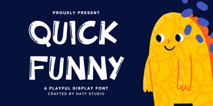 Quick Funny - Playful Display Font is a font with distinctive handwritten characters perfect for branding projects, logos, wedding designs, media posts, advertisements, product packaging, product designs, labels, photography, watermarks, invitations, stationery, and any project who need handwritten dishes. Features : • Character Set A-Z • Numerals & Punctuations (OpenType Standard) • Accents (Multilingual characters) • Ligature. Multilingual Support : Afrikaans, Albanian, Asu, Basque, Bemba, Bena, Catalan, Chiga, Cornish, Danish, English, Estonian, Faroese, Filipino, Finnish, French, Friulian, Galician, German, Gusii, Icelandic, Indonesian, Irish, Italian, Kabuverdianu, Kalenjin, Kinyarwanda, Low German, Luo, Luxembourgish, Luyia, Machame, Makhuwa-Meetto, Makonde, Malagasy, Malay, Manx, Morisyen, North Ndebele, Norwegian Bokmål, Norwegian Nynorsk, Nyankole, Oromo, Portuguese, Romansh, Rombo, Rundi, Rwa, Samburu, Sango, Sangu, Scottish Gaelic, Sena, Shambala, Shona, Soga, Somali, Spanish, Swahili, Swedish, Swiss German, Taita, Teso, Vunjo, Zulu. There it is. I really hope you enjoy it. Comments & likes are always welcome and accepted.
 - Flying Dutchman by FontMesa,
$25.00 In nautical folklore, the Flying Dutchman is a ship that can never go home and is doomed to sail the seas forever as a ghost ship. The story of the Dutchman appeared in print in the 1820s. With different versions written over the years, some date the legend to the 1640s or the early 1700s. The Flying Dutchman font is a revival of an 1876 font from MacKellar, Smiths & Jordan Co. The Truetype and OpenType formats include a larger extended character set with Central and Eastern European accented letters. Extra characters in this font are left and right pointing hands in place of the less than and greater than keys and a pirate flag is on the bracket keys. New to this style is the distressed version where the letters look like they've been hacked by a cutlass.
 - Pop Krinks by Martype co,
$15.00 Introducing Pop Krinks serif display. A new brand serif font family, comes with 7 styles to make it more versatile and stylish. Perfect and suitable for Branding Design, Logotype, Wedding Invitation, Headline, Posters, Business Card and etc. Inspired by henrietta typeface specimen in homage photo the alphabet and born in new modern style and craft. Multilingual Support support many different languages 60+ Afrikaans, Albanian, ,Basque, Bemba, Bena, Breton, Catalan, Chiga, Cornish, Danish, Dutch, English, Estonian, Faroese, Filipino, Finnish, French, Friulian, Galician, German, Gusii, Indonesian, Irish, Italian, Kabuverdianu, Kalenjin, Kinyarwanda, Luo, Luxembourgish, Luyia, Machame, Makhuwa, Meetto, Makonde, Malagasy, Manx, Morisyen, North, Ndebele, Norwegian, Bokmål, Norwegian, Nynorsk, Nyankole, Oromo, Portuguese, Quechua, Romansh, Rombo, Rundi, Rwa, Samburu, Sango, Sangu, Scottish, Gaelic, Sena, Shambala, Shona, Soga, Somali, Spanish, Swahili, Swedish, Swiss, ,German, Taita, Teso, Uzbek (Latin), Volapük, VunjoZulu Thank You, Happy Design! :)
 - Alpha Jimmy by Hatftype,
$15.00 Alpha Jimmy - Cute Display Font is a font with distinctive handwritten characters perfect for branding projects, logos, wedding designs, media posts, advertisements, product packaging, product designs, labels, photography, watermarks, invitations, stationery, and any project who need handwritten dishes. Features : • Character Set A-Z • Numerals & Punctuations (OpenType Standard) • Accents (Multilingual characters) • Ligature. Multilingual Support : Afrikaans, Albanian, Asu, Basque, Bemba, Bena, Catalan, Chiga, Cornish, Danish, English, Estonian, Faroese, Filipino, Finnish, French, Friulian, Galician, German, Gusii, Icelandic, Indonesian, Irish, Italian, Kabuverdianu, Kalenjin, Kinyarwanda, Low German, Luo, Luxembourgish, Luyia, Machame, Makhuwa-Meetto, Makonde, Malagasy, Malay, Manx, Morisyen, North Ndebele, Norwegian Bokmål, Norwegian Nynorsk, Nyankole, Oromo, Portuguese, Romansh, Rombo, Rundi, Rwa, Samburu, Sango, Sangu, Scottish Gaelic, Sena, Shambala, Shona, Soga, Somali, Spanish, Swahili, Swedish, Swiss German, Taita, Teso, Vunjo, Zulu. There it is. I really hope you enjoy it. Comments & likes are always welcome and accepted.
 - Wellsbrook Initials SG by Spiece Graphics,
$39.00 These four sets are based on the elegant and beautiful work of the German graphic designer Emil Rudolf Weiss. The initials were made to complement Weiss’ text fonts and were cast in the 1920s by the Bauer Type Foundry of Frankfurt. Also known as Weiss Initials Series I, II, II Bold, and III, the lettering has a distinct antique quality. These extremely hard-to-find digital versions look superb in large sizes and remain huge favorites among book designers. Wellsbrook Initials are now available in the OpenType Std format. Some new characters have been added to this OpenType version as Stylistic Alternates. This advanced feature works in current versions of Adobe Creative Suite InDesign, Creative Suite Illustrator, and Quark XPress. Check for OpenType advanced feature support in other applications as it gradually becomes available with upgrades.
 - Party Tale by Hatftype,
$15.00 Party Tale - Playful Display Font is a font with distinctive handwritten characters perfect for branding projects, logos, wedding designs, media posts, advertisements, product packaging, product designs, labels, photography, watermarks, invitations, stationery, and any project who need handwritten dishes. Features : • Character Set A-Z • Numerals & Punctuations (OpenType Standard) • Accents (Multilingual characters) • Ligature. Multilingual Support : Afrikaans, Albanian, Asu, Basque, Bemba, Bena, Catalan, Chiga, Cornish, Danish, English, Estonian, Faroese, Filipino, Finnish, French, Friulian, Galician, German, Gusii, Icelandic, Indonesian, Irish, Italian, Kabuverdianu, Kalenjin, Kinyarwanda, Low German, Luo, Luxembourgish, Luyia, Machame, Makhuwa-Meetto, Makonde, Malagasy, Malay, Manx, Morisyen, North Ndebele, Norwegian Bokmål, Norwegian Nynorsk, Nyankole, Oromo, Portuguese, Romansh, Rombo, Rundi, Rwa, Samburu, Sango, Sangu, Scottish Gaelic, Sena, Shambala, Shona, Soga, Somali, Spanish, Swahili, Swedish, Swiss German, Taita, Teso, Vunjo, Zulu. There it is. I really hope you enjoy it. Comments & likes are always welcome and accepted.
 - Column Sans by Campotype,
$25.00 Column Sans, talking about space efficiency. The character set that condensed can maximize the use of limited space without losing good legibility aspects. The typeface is very appropriate to be used as a text in a small column widths, display text, caption, title, author credit on the film, etc. Column Sans is available in OpenType format in the three weights Light, Regular, and Bold, whereby there are corresponding italics for all variants. In the same narrow italic versions, the "a" has a closed form while the "f" has a descender. Besides of standard ligature, this typeface is also equipped with some additional ligature and deligature like "fr", "tt", "cb", "ch", "ck" and so on as well as three "stylistic ligature": "the", "Mr" and "Mrs". Please find more information about the OpenType Manual of this typeface on the gallery page (pdf) if possible.
 - Milan Estate by Hatftype,
$17.00 Milan Estate - Retro Display Font is a font with distinctive handwritten characters perfect for branding projects, logos, wedding designs, media posts, advertisements, product packaging, product designs, labels, photography, watermarks, invitations, stationery, and any project who need handwritten dishes. Features : • Character Set A-Z • Numerals & Punctuations (OpenType Standard) • Accents (Multilingual characters) • Ligature. Multilingual Support : Afrikaans, Albanian, Asu, Basque, Bemba, Bena, Catalan, Chiga, Cornish, Danish, English, Estonian, Faroese, Filipino, Finnish, French, Friulian, Galician, German, Gusii, Icelandic, Indonesian, Irish, Italian, Kabuverdianu, Kalenjin, Kinyarwanda, Low German, Luo, Luxembourgish, Luyia, Machame, Makhuwa-Meetto, Makonde, Malagasy, Malay, Manx, Morisyen, North Ndebele, Norwegian Bokmål, Norwegian Nynorsk, Nyankole, Oromo, Portuguese, Romansh, Rombo, Rundi, Rwa, Samburu, Sango, Sangu, Scottish Gaelic, Sena, Shambala, Shona, Soga, Somali, Spanish, Swahili, Swedish, Swiss German, Taita, Teso, Vunjo, Zulu. There it is. I really hope you enjoy it. Comments & likes are always welcome and accepted.
 - Ginder by Craft Supply Co,
$20.00 Ginder – Bold Serif Font: Striking and Versatile Bold and Commanding Presence: Ginder – Bold Serif Font stands out with its strong, bold character. It’s perfect for titles and posters needing a powerful impact. This font captures attention effortlessly. Ideal for Titles and Posters: With its robust design, Ginder excels in creating striking titles and posters. It enhances visibility and readability. This font is a top choice for impactful visual designs. Adaptable Across Mediums: Despite its boldness, Ginder is surprisingly adaptable. It works well in both digital and print formats. This versatility makes it a valuable tool for various design projects. User-Friendly for Designers: Ginder is designed for ease of use, suitable for all skill levels. Its compatibility with multiple design platforms adds to its appeal. It’s a favorite among graphic designers for its simplicity and impact.