10,000 search results
(0.118 seconds)
- REGISTRATION PLATE UK - Personal use only

- Phoenix - Unknown license

- KonQa - Unknown license

- Andalucia by Pista Mova,
$15.00 Andalucia is a calligraphic script font that comes with beautiful alternate characters. copper plate calligraphy mix with handlettering style. Designed to convey stylish elegance. Andalucia is attractive because it is subtle, clean, feminine, sensual, glamorous, simple and very easy to read. The classic style is very suitable to be applied in all types of formal work such as invitations, labels, menus, logos, fashion, make up, stationery, letterpress, romantic novels, magazines, books, greeting/wedding cards, packaging, labels. Andalucia features a glyph and alternate characters. including multiple language support. It features OpenType with styling, binding, and character strokes, allowing you to mix and match letter pairs to match your design. Files include: To enable the OpenType Stylistic alternative, you need a program that supports OpenType features such as Adobe Illustrator CS, Adobe Indesign & CorelDraw X6-X7, Microsoft Word 2010 or a later version. (Windows), Font Book (Mac) or a software program such as PopChar (for Windows and Mac). How to access all alternative characters using Adobe Illustrator: https://www.youtube.com/watch?v=XzwjMkbB-wQ How to use the font style set in Microsoft Word 2010 or later: https://www.youtube.com/watch?v=NVJlZQ3EZU0 There are additional ways to access the alternative/swash, using Character Maps (Windows), Nexus Fonts (Windows) Font Book (Mac) or a software program such as PopChar (for Windows and Mac). How to access all alternative characters, using the Windows Character Map with Photoshop: https://www.youtube.com/watch?v=Go9vacoYmBw If you need help or advice, please contact me. Thank you for your purchase!
 - The Fottina Script by madjack.font,
$14.00 The Fottina Script is a calligraphic script font that comes with beautiful alternative characters. a mixture of copper calligraphy with a zipper style. Designed to bring the elegance of style. The Fottina Script attracts good, clean, feminine, sensual, glamorous, simple and very easy to read fonts. The classic style is very suitable to be applied in various formal forms such as invitations, labels, menus, logos, fashion, make up, stationery, letterpress, romantic novels, magazines, books, greeting / wedding cards, packaging, labels. The Fottina Script has 450 flying machines. including multiple language support. With OpenType features with alternative styles, binders and characters, it allows you to mix and match pairs of letters to suit your design, as well as a touch of ornament to make this font look elegant. To activate the OpenType Stylistic alternative, you need a program that supports OpenType features such as Adobe Illustrator CS, Adobe Indesign & CorelDraw X6-X7, Microsoft Word 2010 or newer. (Windows), Letter Books (Mac) or software programs such as PopChar (for Windows and Mac). How to access all alternative characters using Adobe Illustrator: https://www.youtube.com/watch?v=XzwjMkbB-wQ How to use the font style set in Microsoft Word 2010 or later: https://www.youtube.com/watch?v=NVJlZQ3EZU0 There are additional ways to access alternatives / swash, use Character Map (Windows), Nexus Fonts (Windows) Font Book (Mac) or software programs like PopChar (for Windows and Mac) How to access all alternative characters, using Windows Character Map with Photoshop: https://www.youtube.com/watch?v=Go9vacoYmBw Thank you for your visit.
 - Gladista Script by Attract Studio,
$10.00 Gladista is a calligraphy script font that comes with lovely alternates character. a mixture of from copperplate calligraphy with handlettering style. Designed to convey style elegance. Gladista is attractive like a smooth, clean, feminine, sensual, glamorous, simple and highly legible typeface. Its classic style is perfect to be applied in any type of formal pieces such invitations, labels, menus, Logos, fashion, make up, stationery, letterpress, romantic novels, magazines, books, greeting / wedding cards, packaging, labels. Gladista features 360+ glyphs and 155 alternative characters. including multiple language support. With OpenType features with stylistic alternates, ligatures and swash characters, that allows you to mix and match pairs of letters to fit your design, and also a touch of ornament makes this font look elegant. To enable the OpenType Stylistic alternates, you need a program that supports OpenType features such as Adobe Illustrator CS, Adobe Indesign & CorelDraw X6-X7, Microsoft Word 2010 or later versions. (Windows), Font Book (Mac) or a software program such as PopChar (for Windows and Mac). How to access all alternative characters using Adobe Illustrator: https://www.youtube.com/watch?v=XzwjMkbB-wQ How to use stylistic sets fonts in Microsoft Word 2010 or later versions: https://www.youtube.com/watch?v=NVJlZQ3EZU0 There are additional ways to access alternates / swashes, using the Character Map (Windows), Nexus Font (Windows) Font Book (Mac) or a software program such as PopChar (for Windows and Mac). How to access all the alternative characters, using the Windows Character Map with Photoshop: https://www.youtube.com/watch?v=Go9vacoYmBw If you need help or advice, please contact me by e-mail.
 - Bringline Script by Hrz Studio,
$15.00 Bringline Script is a calligraphic script font that comes with beautiful alternate characters. copper plate calligraphy mix with hand lettering style. Designed to convey stylish elegance. Bringline Script is attractive because it is subtle, clean, feminine, sensual, glamorous, simple and very easy to read. The classic style is very suitable to be applied in all types of formal work such as invitations, labels, menus, logos, fashion, make up, stationery, letterpress, romantic novels, magazines, books, greeting/wedding cards, packaging, labels. Bringline Script features a glyph and alternate characters. including multiple language support. It features OpenType with styling, binding, and character strokes, allowing you to mix and match letter pairs to match your design. Files include: To enable the OpenType Stylistic alternative, you need a program that supports OpenType features such as Adobe Illustrator CS, Adobe Indesign & CorelDraw X6-X7, Microsoft Word 2010 or a later version. (Windows), Font Book (Mac) or a software program such as PopChar (for Windows and Mac). How to access all alternative characters using Adobe Illustrator: https://www.youtube.com/watch?v=XzwjMkbB-wQ How to use the font style set in Microsoft Word 2010 or later: https://www.youtube.com/watch?v=NVJlZQ3EZU0 There are additional ways to access the alternative/swash, using Character Maps (Windows), Nexus Fonts (Windows) Font Book (Mac) or a software program such as PopChar (for Windows and Mac). How to access all alternative characters, using the Windows Character Map with Photoshop: https://www.youtube.com/watch?v=Go9vacoYmBw If you need help or advice, please contact me. Thank you for your purchase!
 - Elido by Kontour Type,
$50.00 Elido (Odile in reverse) is the sans counterpart to the Odile type. Together they form a sans/serif superfamily with a wide range of variations for editorial use. Elido follows Odile’s proportions and matches the weight and typographic color of its serif twin. Elido is a sans with classical proportions. A slight geometric hint and open counters convey an airy feel. Elido’s family structure and relations within echo the conceptual approach of Odile. The arched stroke low off the stem reveals a script characteristic most pronounced in the Elido Upright Italic. This particular interpretation is gradually diminished in the Italic and becomes even less emphasized in the Regular. Six balanced weights, from an elegant Light to a pronounced Black, are in tune with three display solutions and a set of beautiful Ornaments. These variants allow for a diverse and multifaceted typography for the discerning type user. Sans serif initials amount to a rare finding. The charming monolinear Elido Initials come in two flavors, elaborate and rational, designed to hold their own in editorial and headline sizes. This type design boasts an extensive character set, many OpenType features including roman and italic Small Caps, five sets of numerals, beautiful ligatures, and many more. OT stylistic variants (with accents) offer a one-story “a” for the roman weights, alternate “g” and “s” designs for the italics, and a variant glyph “s” for the Upright Italic. These distinct qualities with its versatile and sincere traits make Elido an excellent choice for text and display use.
 - Draggletail isn't a widely recognized name in the vast expanse of typography where classic, contemporary, and quirky fonts intertwine. However, the mere invocation of its unique name suggests an arti...
- As of my last update in April 2023, Jicama by Chille Graphics is not a widely recognized font in public typography resources or collections. However, I can create a hypothetical description based on ...
- As of my last update in April 2023, there isn't a widely recognized font specifically called "Notepad" that stands apart in the same way as, say, Arial or Times New Roman. However, the concept of a "...
- RNS Baruta Black is part of the RNS Fonts collection, crafted by RNS Foundry, which has been known for offering a diverse array of typeface designs that cater to various aesthetic and functional need...
- Sanserifing by Audrius Skersys is a contemporary typeface that embodies simplicity and versatility in design. Created by the Lithuanian designer Audrius Skersys, the Sanserifing font is a dedication ...
- Picture this: you're about to pen a love letter, the old-fashioned way. You dip your quill in ink, but instead of pressing it to parchment, you tap away at your keyboard and, voilá, out comes Jayne S...
- Ah, the font Oohlalalulucurvy. Imagine, if you will, a font so lively and flamboyant that each letter seems to be thrown into a dance party from the moment it hits the page. This is no ordinary colle...
- FF Pastoral by FontFont,
$50.99 A sturdy workhorse with the grace of a gazelle, the FF Pastoral typeface family marries pure craftsmanship with rapturous excesses of form. With his fifteenth release under the FontFont brand, prolific French designer Xavier Dupré has filled a typographic toolbox with plentiful options ranging from a tender, feathery Thin to a robust, healthy Black. At a glance, FF Pastoral appears deceptively simple, particularly in the middle weights. That surface serenity is intentional and allows for easy reading and quick comprehension of short blocks of copy. Upon closer inspection, FF Pastoral is complex and nuanced, carrying a balanced tension in its forms. This plays particularly well in magazine spreads and corporate logos, where uniqueness is a virtue. In creating his latest design, Dupré drew inspiration from a tasteful mix of references, combining diverse elements with a deft hand. While its letter shapes were informed by humanist-geometric hybrid Gill Sans, FF Pastoral’s proportions have been optimized for contemporary typography. Slightly condensed but generously spaced, FF Pastoral features a tall x-height, open counters, and subtle, sprightly italics slanted at just 5°. Proportional oldstyle figures are the default in the family, with tabular and lining numbers and fractions accessible through OpenType features. Elegant details evocative of calligraphy judiciously pepper the FF Pastoral glyph set. The ‘e’ bears an oblique crossbar, while the right leg of the ‘K’ and the ‘R’ are insouciantly curved in both the upright and italic variants. Further flourishes appear throughout the italics, notably in the ‘T’ and the ‘Z’, the gloriously looped tail of the ‘G’, and an extraordinary ampersand. Sharp-eyed fans of Dupré’s work may feel like they’re in familiar territory, and they would be right. An early version of FF Pastoral sprang to life in 2017 as Malis, a family in four weights on the heavier side of the spectrum. Over time, Dupré refined his original design, expanding it with four lighter styles and including true italics for all. The lightest weights are ethereal, with exquisitely delicate strokes drawing the eye in and across a line of type. The most substantial styles are tremendous in their power, allowing text to make a deep impression in print or on screen. Fully fleshed out, FF Pastoral works sublimely in a vast array of text and display settings. Dupré sees his latest FontFont offering as a ‘cultural’ typeface, perfect for the pages of an oversized coffee-table book or business communications where warmth and informality will win the day. Born in Aubenas, France (1977), Xavier Dupré is a gifted user of type as well as an award-winning type designer and lettering artist. After training in graphic design in Paris, Dupré studied calligraphy and typography at the Scriptorium de Toulouse. Since releasing FF Parango in 2001, Dupré has published such FontFont classics as the FF Absara and FF Sanuk superfamilies, FF Megano, FF Tartine, and FF Yoga. A designer of Khmer fonts as well as Latin typefaces, Dupré splits his time between Europe and Asia.
 - Later On - Unknown license

- After Hours - Unknown license

- Covington SC Shadow is an evocative font that stands out due to its distinct shadow effect, a characteristic that adds depth and dimension to text, making it pop on any backdrop it's placed against. ...
- PS Fournier Std by Typofonderie,
$59.00 Style and elegance in 14 styles PS Fournier, created by Stéphane Elbaz, is designed in tribute to Pierre Simon Fournier. Fournier was the prolific Parisian type designer whose work is best known for its iconic representation of French transitional style. PS Fournier elegantly represents the transition to the modern era of typography. Featuring three optical sizes, PS Fournier is designed to perform in any context. The Pierre Simon Fournier heritage Pierre Simon Fournier (1712—1768) was a leading innovative type designer of the mid-18th century. Early in his career, the young Pierre Simon developed a strong aesthetic that he cultivated throughout his life. His art is representative of the pre-revolutionary “Age of Enlightenment” (Siècle des Lumières). Precursor of the Modern style, Fournier’s body of work deeply influenced his times, and created the fertile ground from which the Didot family and Giambattista Bodoni developed their own styles. During the historical period of the 18th century, Fournier exemplified the intellectual pursuits of the times with his own research on type, documenting in detail the typefounding process. He also offered a unique vision: he is the first to clearly comprehend the concept of “type family,” sorting a set of similarly styled alphabets by sizes, width, and by x-heights. In addition, Fournier is one of the earliest advocates of the point system to organize the practice of typography, the point system that contemporary typographers continue to use to this day. The refined and discreet elegance of PS Fournier With a close look at the family, one finds you’ll find that the difference between the optical sizes (Petit, standard and Grand) is more than a contrast variation between the thin and the thick; the eye can also denote a palette of distinct tones: More streamlined and robust in the smaller sizes (Petit), more refined and detailed in the larger sizes (Grand). The PS Fournier standard family is designed to adapt to any situation with its intermediate optical size, from body copy to headlines. With a bit of tracking, PS Fournier Petit will make the smallest captions perfectly readable. However, Petit family is not limited to body and captions — its “slabby robustness” will make a relevant headline choice as well. PS Fournier Grand presents a higher contrast adapted to large text sizes, displays or banners. Its refined elegance makes it a perfect choice for Design, Fashion or Luxury publications. As a “modern” type PS Fournier Grand features a larger x-height than the preexistent old style typefaces such as Garamond or Jenson. These proportions provide any basic text set in PS Fournier Grand a strong typographic texture. As a result, the PS Fournier global family is a versatile alternative to the Modern typefaces commonly used in the publishing industry. The optical sizes, the large range of weights, and the design variations make this family adaptable to captions, paragraphs, and pages, as well as to large texts and displays. A leading-edge typography in the 18th century In the spirit of modernity, Pierre Simon Fournier did not find any use for the conventional swashes still produced by peers such as Caslon or Baskerville. Nevertheless the French designer created many inventive elements to decorate the page and set delightful variations in the text itself. To this regard PS Fournier includes a large set of glyphs variations, ligatures and more than one hundred glyphs for borders, rules and ornaments or — as called in French — “vignettes.” PS Fournier: A tribute to the French modern typography era by Stéphane Elbaz
 - FS Lucas by Fontsmith,
$80.00 Pure and not-so-simple Maybe it’s the air of purity, openness and transparency that they transmit, but geometric typefaces are more popular than ever among leading brands. Based on near-perfect circles, triangles and squares, geometric letterforms look uncomplicated, even though making them readable is anything but – something the designers of the first wave of geometric fonts discovered nearly a century ago. Many of the world’s most recognisable brands in technology, retail, travel, food, manufacturing and other industries continue to be drawn to the straightforward, honest character that geometric fonts convey. Fontsmith set out in 2015 to develop a typeface in the same tradition, but optimised for the demands of modern brands – online and offline usage, readability and accessibility. And, of course, with the all-important Fontsmith x-factor built in. FS Lucas is the bold and deceptively simple result. Handle with care The letterforms of FS Lucas are round and generous, along the lines of Trajan Column lettering stripped of its serifs. But beware their thorns. Their designer, Stuart de Rozario, who also crafted the award-winning FS Millbank, wanted a contrast between spiky and soft, giving sharp apexes to the more angular letterforms, such as A, M, N, v, w and z. Among his inspirations were the colourful, geometric compositions of Frank Stella, the 1920s art deco poster designs of AM Cassandre, and the triangular cosmic element symbol, which led him to tackle the capital A first, instead of the usual H. The proportions and angles of the triangular form would set the template for many of the other characters. It was this form, and the light-scattering effects of triangular prisms, that lit the path to a name for the typeface: Lucas is derived from lux, the Latin word for light. Recommended reading Early geometric typefaces were accused of putting mathematical integrity before readability. FS Lucas achieves the trick of appearing geometric, while taking the edge off elements that make reading difficult. Perfectly circlular shapes don’t read well. The way around that is to slightly thicken the vertical strokes, and pull out the curves at the corners to compensate; the O and o of FS Lucas are optical illusions. Pointed apexes aren’t as sharp as they look; the flattened tips are an essential design feature. And distinctive details such as the open terminals of the c, e, f, g, j, r and s, and the x-height bar on the i and j, aid legibility, especially on-screen. These and many other features, the product of sketching the letterforms in the first instance by hand rather than mapping them out mechanically by computer, give FS Lucas the built-in humanity and character that make it a better, easier read all-round. Marks of distinction Unlike some of its more buttoned-up geometric bedfellows, FS Lucas can’t contain its natural personality and quirks: the flick of the foot of the l, for example, and the flattish tail on the g and j. The unusual bar on the J improves character recognition, and the G is circular, without a straight stem. There’s a touch of Fontsmith about the t, too, with the curve across the left cross section in the lighter weights, and the ampersand is one of a kind. There’s a lot to like about Lucas. With its 9 weights, perfect proportions and soft but spiky take on the classic geometric font, it’s a typeface that could light up any brand.
 - FS Lucas Paneureopean by Fontsmith,
$90.00Pure and not-so-simple Maybe it’s the air of purity, openness and transparency that they transmit, but geometric typefaces are more popular than ever among leading brands. Based on near-perfect circles, triangles and squares, geometric letterforms look uncomplicated, even though making them readable is anything but – something the designers of the first wave of geometric fonts discovered nearly a century ago. Many of the world’s most recognisable brands in technology, retail, travel, food, manufacturing and other industries continue to be drawn to the straightforward, honest character that geometric fonts convey. Fontsmith set out in 2015 to develop a typeface in the same tradition, but optimised for the demands of modern brands – online and offline usage, readability and accessibility. And, of course, with the all-important Fontsmith x-factor built in. FS Lucas is the bold and deceptively simple result. Handle with care The letterforms of FS Lucas are round and generous, along the lines of Trajan Column lettering stripped of its serifs. But beware their thorns. Their designer, Stuart de Rozario, who also crafted the award-winning FS Millbank, wanted a contrast between spiky and soft, giving sharp apexes to the more angular letterforms, such as A, M, N, v, w and z. Among his inspirations were the colourful, geometric compositions of Frank Stella, the 1920s art deco poster designs of AM Cassandre, and the triangular cosmic element symbol, which led him to tackle the capital A first, instead of the usual H. The proportions and angles of the triangular form would set the template for many of the other characters. It was this form, and the light-scattering effects of triangular prisms, that lit the path to a name for the typeface: Lucas is derived from lux, the Latin word for light. Recommended reading Early geometric typefaces were accused of putting mathematical integrity before readability. FS Lucas achieves the trick of appearing geometric, while taking the edge off elements that make reading difficult. Perfectly circlular shapes don’t read well. The way around that is to slightly thicken the vertical strokes, and pull out the curves at the corners to compensate; the O and o of FS Lucas are optical illusions. Pointed apexes aren’t as sharp as they look; the flattened tips are an essential design feature. And distinctive details such as the open terminals of the c, e, f, g, j, r and s, and the x-height bar on the i and j, aid legibility, especially on-screen. These and many other features, the product of sketching the letterforms in the first instance by hand rather than mapping them out mechanically by computer, give FS Lucas the built-in humanity and character that make it a better, easier read all-round. Marks of distinction Unlike some of its more buttoned-up geometric bedfellows, FS Lucas can’t contain its natural personality and quirks: the flick of the foot of the l, for example, and the flattish tail on the g and j. The unusual bar on the J improves character recognition, and the G is circular, without a straight stem. There’s a touch of Fontsmith about the t, too, with the curve across the left cross section in the lighter weights, and the ampersand is one of a kind. There’s a lot to like about Lucas. With its 9 weights, perfect proportions and soft but spiky take on the classic geometric font, it’s a typeface that could light up any brand. - Anywhere - Unknown license

- Swily Bright by Jolicia Type,
$19.00 Say Hello to Swily Bright. Trendy, classy & modern style serif font for your fancy projects. Elegant, fashion and classic style on Swily Bright font will be great for any branding project. With 2 style Regular and Italic, alternates and ligatures will help you to create unique letters
 - Beba by Eurotypo,
$28.00 Beba is based on geometric structures, where the same formal characteristics are applied to as many letters as possible. It is a sans-serif monoline typeface. It has a modern, clean and minimalist image; ideal to use for advertising, printed or digital graphics and signage system design.
 - AT Orlando by Monotype,
$29.99Orlando is the work of British designer Freda Sack. It is an all capital, outline typeface including a complete set of swash initials and an array of stunning flourishes designed especially for this typeface. Orlando was inspired by and modelled upon 19th century antique type styles. - Adversary BB by Blambot,
$8.00 Blambot's Adversary BB family is a robust sans with a hint of retro-futurism. It was initially created for use in Blambot founder, Nate Piekos's pesonal title block for design projects. It's therefor very clean and extremely legible. The set includes regular, italic, bold, and bold italic.
 - Gulim by Microsoft Corporation,
$129.00Gulim™ features plain strokes similar to sans serif designs, and works well for on-screen display such as user interfaces. This Gulim font file is 5.2 MB in size. Gulim is a trademark of Microsoft Corporation. Gulim Character Set: Latin 1, Korean code page 949 - ITC Mixage by ITC,
$29.99Mixage font is the work of Italian designer Aldo Novarese, who cleverly combined the character shapes and proportions like those of Syntax and Antique Olive with the grace and warmth of a calligraphic typeface. Mixage font is a good alternative to more traditional sans serif designs. - Wood Condensed Grotesk JNL by Jeff Levine,
$29.00 Wood Condensed Grotesk JNL is a more condensed version of the type style found in Wood Type Grotesk JNL. The font was a popular sans used for large posters or broadsheets as well as newspaper titles where more copy needed to be fit into limited space.
 - Presta by Type Juice,
$19.00 Presta is a variable weight sans serif typeface made up of 12 fonts from thin and condensed to wide and bold. Included in the variable font are over 500 alternate glyphs for creative customization. 12 fonts total 5 font weights Upper / lowercase glyphs Multilingual Over 5000 glyphs
 - Belgium by Craft Supply Co,
$15.00 Belgium Font Family is a modern serif font family whose design refers us to the style of modern sans serif. The distinctive features of Belgium Font Family are the relatively low contrast of strokes, the slightly squarish shapes of round characters and the emphasized business like simplicity.
 - Passenger Train JNL by Jeff Levine,
$29.00 A 1940s travel poster for the Florida East Coast Railway (which then carried passengers but is now a freight line) had the railroad’s name hand lettered in a bold Art Deco sans. This inspired Passenger Train JNL, which is available in both regular and oblique versions.
 - Salmander Bentols Script by Maulana Creative,
$13.00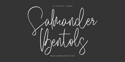 Give your designs an authentic handcrafted feel. "Salmander Bentols Script" is perfectly suited to signature, stationery, logos, typography quotes, magazine or book covers, website headers, clothing, branding, packaging design and more. Salmander Bentols Script contains: - Ligatures - Multilingual Support and is easy to instal Mac and Windows.
 - Thornback by Lauren Ashpole,
$15.00 Thornback is a hand-drawn font that uses quick, scribbled strokes to create it's slightly messy sans-serif characters. The detailed letters make it a good choice for headlines but it's also bold enough to add a homemade touch to smaller text blocks while keeping things legible.
 - Hydrella by Ayca Atalay,
$28.00 Hydrella is a modern sans serif with sharp, unique features and moderately high contrast. Its easily distinguishable attributes provide just enough of a fresh new look without overpowering the overall design. Available in 9 weights, Hydrella works well as both a display typeface and in smaller sizes.
 - Bobgert by Oleg Gert,
$30.00 Bobgert – is a whimsical, optimistic and inspiring modern sans-serif font with a touch of monospace that is wonderful for headings and is perfect for posters, Instagram, magazines, print, branding, logos and anything else you can imagine. I hope my font will help you in your creativity.
 - Aiglon Drame by ErlosDesign,
$19.00 Aiglon Drame is a ligature serif font with modern style. It includes uppercase letters, numeral, a large range of punctuation, ligatures, alternates and also multilingual support. Perfects for poster, web design, magazine cover, album cover, branding and much more. Features: • Works on PC & Mac • Simple installation Enjoy!
 - LGF Besitos Square by LGF Fonts,
$18.00 BESITOS is a deconstruction INSPIRED on a sans serif type, in which the weights of the source did not mark the width of the letter but the lines that compose it is made in two variants according to their lines end up at right angles or curves.
 - Farwell by Balevgraph Studio,
$14.00 Farwell is a stylish and light script font, that exudes elegance and class. This font was particularly crafted for those who need a beautiful and refreshing look to their designs. Included uppercase, lowercase, numerals, punctuations, ligature, alternate, works on PC & mac, simple installations, multilingual support, PUA encoded.


