10,000 search results
(0.024 seconds)
- Vuvuzela NF by Nick's Fonts,
$10.00A signpainter's chapbook called this style Show Card Casual, although "casual" might be understating the case a bit. Guaranteed to put some fun, and a wee bit of mischief, into your headlines. Both versions of this font include the complete Latin 1252 and Central European 1250 character sets. - Pretty Smile by Sronstudio,
$15.00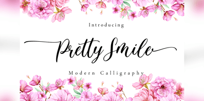 Pretty Smile is a beautiful calligraphy font perfect for crafting, branding, invitation, stationery, wedding designs, social media posts, advertisements, product packaging, product designs, label, photography, watermark, special events or anything. Pretty Smile comes with full set of uppercase and lowercase letters, swash alternates, ligatures,multilingual symbols, numerals and punctuation.
 - Feel Love by Fikryal,
$15.00 Feel Love is a natural script font perfect for crafting, branding, invitation, stationery, wedding designs, social media posts, advertisements, product packaging, product designs, label, photography, watermark, special events, or anything. Feel Love comes with full set of uppercase and lowercase letters, swash alternates, ligatures,multilingual symbols, numerals and punctuation.
 - Pearl White by Fikryal,
$15.00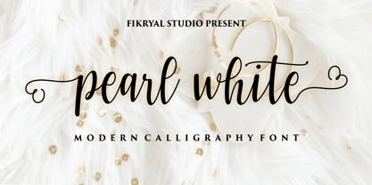 Pearl White is a beautiful calligraphy font perfect for crafting, branding, invitation, stationery, wedding designs, social media posts, advertisements, product packaging, product designs, label, photography, watermark, special events or anything. Pearl White comes with full set of uppercase and lowercase letters, swash alternates, ligatures,multilingual symbols, numerals and punctuation.
 - Brilk by Typesketchbook,
$55.00 Brilk is a condensed Sans-serif typeface made up of 40 fonts across 10 weights with normal and Sans-serif options. It’s a unique and modern sans typeface, which is well suited for a variety of typographic applications such as headlines and small texts. The Brilk font family supports multiple languages and is available as both webfont and desktop font.
 - Sullya by MonoLIne Calligraphy,
$19.00 Sullya is interesting because the typeface is pleasing to the eye, clean, feminine, sensual, glamorous, simple and very easy to read, because there are many fancy letter connections. I also offer a number of decent stylistic alternatives for multiple letters. Classic styles are very suitable to be applied in various formal forms such as invitations, labels, restaurant menus, logos, fashion, make up, stationery, novels, magazines, books, greeting / wedding cards, packaging, labels or all kinds of advertising purposes. . . Sullya has alternative characters, including support for multiple languages. With OpenType features with an alternative style and elegant binding. The OpenType feature does not work automatically, but you can access it manually and for the best results required for your creativity in combining these Glyph / Character variations. Font Features : * Lowercase beginning and ending swash * Uppercase beginning swash * Initials * International Language I heavily use programs that support OpenType features and the Glyphs panel such as Adobe Illustrator, Adobe Photoshop CC, Adobe InDesign, or CorelDraw, so that you can view and access all the variations of the Glyph. Sullya is coded with Unicode PUA, which allows full access to all additional characters without having any special design software. Mac users Mac users, and Windows users can use Character Map to view and copy any of the additional characters to paste into your favorite editor / application.
 - MVB Embarcadero by MVB,
$79.00 MVB Embarcadero lies in a space between grotesque sans serifs and the vernacular signage lettering drawn by engineers. It’s a style that happens to convey credibility and forthrightness without pretense—it’s anti-style, actually. All of this makes for the most versatile of typefaces, capable of delivering any kind of message while staying out of the way. As is often the case with a type design that develops over several years, Embarcadero isn’t the realization of a specific concept. In the ’90s Mark van Bronkhorst began digitizing a blocky slab serif from the Victorian era, which was then set aside for many years. He later revisited the design, paring it down to its bare essentials, and as more time passed, it evolved from a grid-based outline to curves that echoed the rigid skeleton of the original. Eventually it became a complete family with all the readability requirements of a text sans serif, yet maintaining the subtle eccentricities of its inspiration. Functionally, the Embarcadero family is as adaptable as its design. The OpenType Pro set of 20 fonts contains two widths and five weights, each with italics, small caps, a full set of figures, bullets and arrows, and support for most Latin-based languages. In all, Embarcadero is suitable for headlines or text. And—thanks to its simple, square form—it’s ideal for type on screen too.
 - Fragua Pro by deFharo,
$14.00 Fragua Pro is a family of 14 fonts (Latin Extended-A and the Cyrillic alphabet) Condensed Sans Serif of geometric construction inspired by the Russian constructivism of the mid-20th century; the typography has a rounded finish in all corners to avoid the coldness of the rectilinear fonts and providing warmth and docility, the ascending and descending short and a high height of the x make it very compact, all this results in a unique typeface with maximum readability due to the careful configuration of metrics and Kerning. The cursive styles have an inclination of 8 degrees and a narrower proportion than the regular ones, they also have their own letters and meticulous optical corrections to compensate for the deformations produced by the inclination. Fragua Sans has Advanced Open Type functions, several alternative letters, full support for numbers, monetary symbols and crypto currencies and more. 681 glyphs. This typography is specially designed for advertising and editorial composition, behaving correctly in both short and medium texts and headlines where horizontal space saving is needed, being an ideal typographic system for signage, editorial or corporate design. This typography is dedicated to the memory of my grandfather C·ndido (Pa), the blacksmith of my town. THE COMPLETE 14 FONTS PACKAGE INCLUDES THE REGULAR VERSION IN "VARIABLE FONT" FORMAT, compatible with Adobe CC 2018.
 - Officially Funky by SilverStag,
$14.00 officially funky is a brand new, creative & unique font duo. It is a part of my font duo series and after French Lovers & Silver Garden it was time to create a font that is both modern and nostalgic. It is a 2 in 1 font, where the sans makes it modern and alternate serif letters & cool ligatures will make each of projects projects 100% unique. The font also includes over 45 ligatures and I am sure you will love this funky vibe. It also includes full language support, punctuation, numerals and detailed instructions how to use alternate letters most of the apps on your computer, as well as in Canva. I invite you to check out the preview images, and I hope you will be immersed in my vision for this creative typeface that, I am sure, will work for all kinds of interesting projects you might be working on this year. If you end up publishing your designs on Instagram, tag me - @silverstagco and I will make sure to showcase your design and work to my audience as well! Officially Funky - Modern Font Duo Includes: Over 45 ligatures in sans & serif font Numerals & Punctuation Web Font Kit is included as well Detailed instructions on how to use alternates in most of the apps on your computer and in Canva Happy creating everyone!
 - Santhiya by MonoLIne Calligraphy,
$21.00 Santhiya is interesting because the typeface is pleasing to the eye, clean, feminine, sensual, glamorous, simple and very easy to read, because there are many fancy letter connections. I also offer a number of decent stylistic alternatives for multiple letters. Classic styles are very suitable to be applied in various formal forms such as invitations, labels, restaurant menus, logos, fashion, make up, stationery, novels, magazines, books, greeting / wedding cards, packaging, labels or all kinds of advertising purposes. . . Santhiya has alternative characters, including support for multiple languages. With OpenType features with an alternative style and elegant binding. The OpenType feature does not work automatically, but you can access it manually and for the best results required for your creativity in combining these Glyph / Character variations. Font Features : * Lowercase beginning and ending swash * Uppercase beginning swash * Initials * Intenational Language Support I heavily use programs that support OpenType features and the Glyphs panel such as Adobe Illustrator, Adobe Photoshop CC, Adobe InDesign, or CorelDraw, so that you can view and access all the variations of the Glyph. Santhiya is coded with Unicode PUA, which allows full access to all additional characters without having any special design software. Mac users Mac users, and Windows users can use Character Map to view and copy any of the additional characters to paste into your favorite editor / application.
 - Matteya by MonoLIne Calligraphy,
$22.00 Matteya is interesting because the typeface is pleasing to the eye, clean, feminine, sensual, glamorous, simple and very easy to read, because there are many fancy letter connections. I also offer a number of decent stylistic alternatives for multiple letters. Classic styles are very suitable to be applied in various formal forms such as invitations, labels, restaurant menus, logos, fashion, make up, stationery, novels, magazines, books, greeting / wedding cards, packaging, labels or all kinds of advertising purposes. . . Matteya has alternative characters, including support for multiple languages. With OpenType features with an alternative style and elegant binding. The OpenType feature does not work automatically, but you can access it manually and for the best results required for your creativity in combining these Glyph / Character variations. Font Features : * Lowercase beginning and ending swash * Uppercase beginning swash * Initials * Intenational Language Support I heavily use programs that support OpenType features and the Glyphs panel such as Adobe Illustrator, Adobe Photoshop CC, Adobe InDesign, or CorelDraw, so that you can view and access all the variations of the Glyph. Matteya Font is coded with Unicode PUA, which allows full access to all additional characters without having any special design software. Mac users Mac users, and Windows users can use Character Map to view and copy any of the additional characters to paste into your favorite editor / application.
 - Rastilya by MonoLIne Calligraphy,
$17.00 Rastilya is interesting because the typeface is pleasing to the eye, clean, feminine, sensual, glamorous, simple and very easy to read, because there are many fancy letter connections. I also offer a number of decent stylistic alternatives for multiple letters. Classic styles are very suitable to be applied in various formal forms such as invitations, labels, restaurant menus, logos, fashion, make up, stationery, novels, magazines, books, greeting / wedding cards, packaging, labels or all kinds of advertising purposes. . . Rastilya has alternative characters, including support for multiple languages. With OpenType features with an alternative style and elegant binding. The OpenType feature does not work automatically, but you can access it manually and for the best results required for your creativity in combining these Glyph / Character variations. Font Features : * Lowercase beginning and ending swash * Uppercase beginning swash * Initials * Intenational Language Support I heavily use programs that support OpenType features and the Glyphs panel such as Adobe Illustrator, Adobe Photoshop CC, Adobe InDesign, or CorelDraw, so that you can view and access all the variations of the Glyph. Rastilya is coded with Unicode PUA, which allows full access to all additional characters without having any special design software. Mac users Mac users, and Windows users can use Character Map to view and copy any of the additional characters to paste into your favorite editor / application.
 - Kadigan by Missy Meyer,
$12.00 Kadigan: (noun) A placeholder word. A kadigan can be used to substitute for any other noun: persons (John Doe, Acme Company), places (Anytown, 123 Main Street) or things (whatchamacallit, thingamajig). Just like kadigans can be used in nearly any situation, the members of the Kadigan font family can be used in nearly any design! These sans-serif beauties are clear and easy to use, but they also have a little bit of wiggle in their strokes and weights, for a fun hand-lettered look! The three members of the family: - Kadigan Light: An all-purpose lightweight stroke, with sharp corners. - Kadigan: A nice mid-weight stroke, with slightly rounded corners. - Kadigan Heavy: A thick, chonky stroke with pillowy rounded corners. And each member of the family is packed with features, including: - All of the basic stuff you expect from every font; - 340+ extended Latin characters; - Cyrillic character set; - Greek character set; - Those character sets? Support over 110 languages! - 52 double-letter ligatures for variety (That's right, EVERY letter. I'm looking at you, savvy revved trekkers!); - A full set of small caps (including Cyrillic & Greek); - And more! (Seriously, it was hard to stop.) So whether your work is in English, Español, български, ελληνικά, Türkçe, or over a hundred other languages, this cute and fun sans-serif may be just what you've been looking for!
 - One Heart by Bal Studio,
$12.00 Introducing One Heart is a handwritten font, using a brush and ink effects that combine calligraphic brush styles, irregular base lines, rough edges, thick and organic movements. One Heart Script includes 242 characters, ligatures as well as multi-language support. One Heart can be used for various purposes such as posters, logos, t-shirts, signage, business cards, magazines, book covers, wedding invitations, greeting cards,brand projects, product packaging, invitations, news, blogs, everything including personal charm ,etc. Files included: ~One Heart ( otf ) ~One Heart ( ttf ) ~One Heart Swash ( otf ) ~One Heart Swash ( ttf ) To enable OpenType Stylistic Ligatures, you need a program that supports the OpenType feature. such as Adobe Illustrator CS, Adobe Indesign & CorelDraw X6-X7.How to get access ligatures glyphs from open type fonts : http://youtu.be/iptSFA7feQ0 One Heart is coded with PUA Unicode, which allows full access to all the extra characters without having special designing software. You can use the Character Map to view and copy any of the extra characters to paste into your favourite text editor/app. Using Character Map (Windows), Nexus Font (Windows), Font Book (Mac) or a software program such as PopChar (for Windows and Mac).How to access all alternative characters, using Windows Character Map with Photoshop : https://www.youtube.com/watch?v=Go9vacoYmBw Thanks so much for looking and please let me know if you have any questions.
 - Entendre Rough by Wordshape,
$30.00 Entendre Rough defies the conventions of most distressed typefaces, as it is an actual text typeface family. Sure, you can use it for your big display type, but you can also use it for body text. Entendre Rough is a stately, commanding and handsome distressed sans serif typeface family that pulls reference from Trajan capitals, the history of English calligraphy, and a variety of other sources to summon a sense of warmth, consideration, trust and authority. Entendre Rough spans 22 weights and styles including Regular and Condensed versions. The large x-height and refined characteristics of the family lend the family a sober and sophisticated appearance that is suitable for both print design and on-screen use. Entendre Rough includes Central and Eastern European language support as well as Western European language support, including Greek and Cyrillic. Entendre Rough’s generous x-height and medium-length ascenders and descenders offer pronounced readability, making the family useful for text typesetting both in print and on screen. Within, humanist elements are tempered with monumental construction, making the heavier weights go-tos for display design work. All of the Entendre Rough family of typefaces feature Western, Eastern and Central European language support alongside nuanced Greek and Cyrillic. Entendre Rough pairs well with our non-distressed Entendre family and our rounded sans serif family Elpy, sharing similar proportions and spacing.
 - Mellisthya by MonoLIne Calligraphy,
$21.00 Mellisthya is interesting because the typeface is pleasing to the eye, clean, feminine, sensual, glamorous, simple and very easy to read, because there are many fancy letter connections. I also offer a number of decent stylistic alternatives for multiple letters. Classic styles are very suitable to be applied in various formal forms such as invitations, labels, restaurant menus, logos, fashion, make up, stationery, novels, magazines, books, greeting / wedding cards, packaging, labels or all kinds of advertising purposes. . . Mellisthya has alternative characters, including support for multiple languages. With OpenType features with an alternative style and elegant binding. The OpenType feature does not work automatically, but you can access it manually and for the best results required for your creativity in combining these Glyph / Character variations. Font Features : * Lowercase beginning and ending swash * Uppercase beginning swash * Initials * Intenational Language I heavily use programs that support OpenType features and the Glyphs panel such as Adobe Illustrator, Adobe Photoshop CC, Adobe InDesign, or CorelDraw, so that you can view and access all the variations of the Glyph. Mellisthya Font is coded with Unicode PUA, which allows full access to all additional characters without having any special design software. Mac users Mac users, and Windows users can use Character Map to view and copy any of the additional characters to paste into your favorite editor / application.
 - Clear Prairie Dawn by Quadrat,
$25.00Clear Prairie Dawn is an original humanist sans serif family based on the designer's own printing. Designed for use as a text face, as a humanist sans it shares some of the characteristics you might notice in other such faces as Optima, Gill Sans or Stone Sans. The italic is a designed italic, rather than merely a slanted roman, and incorporates many of the ideas that the designer found too lively for the roman fonts. The complete CPD package consists of three weights with italics, and a set of original ornaments. - Motherline by Letterhend,
$16.00 Motherline Reguler : a monoline vintage script typeface which is created based on manual hand lettering with many features such as ligatures, stylistic set alternate, swashes, etc with total 650++ GLYPHS! which is obviously support multi language characters! Provided in both OTF and TTF. Motherline Bold : The bold version of the Motherline Reguler, looks awesome to be used as logotype, badge, emblem which is needed a strong and bold text. Motherline Sans : A complementary sans type font which is perfectly matched with the main font. Motherline Sans Rough : The rough version of the Motherline Sans.
 - Nuno by Type.p,
$28.00 Nuno Sans is an elegant sans-serif typeface with a humanist touch. It offers 72 styles with 4 widths, ranging from Extended to Condensed, including 18 styles of both uprights and italics. This versatile font supports Western, Central, and Eastern European languages, as well as Vietnamese, ensuring widespread accessibility to readers. Nuno Sans excels in various applications and situations, from bold headlines to easy-to-read text, making it suitable for web, print, and corporate identity projects. Nuno Sans is a contemporary and diverse typeface, perfect for any design project.
 - Stanley Union by Ironbird Creative,
$15.00 Stanley Union is a font bundle consisting of serif, sans serif, extended sans and dingbats which is organic and hand-drawn and comes with regular and stamp styles. This typefaces is perfect for people looking for vintage aesthetic and organic feel. What Will You Get : Stanley Union Serif Regular & Stamp Stanley Union Sans Regular & Stamp Stanley Union Extended Sans Regular & Stamp Stanley Union Dingbats We hope you enjoy the font, please feel free to comment if you have any thoughts or feedback. Thanks for purchasing and have fun!
 - nineveh - 100% free

- SPIDER-MAN:ECLIPSE - Personal use only

- DJHappeeFont - Personal use only

- oakland hills 1991 - Personal use only

- Grymmoire - Unknown license

- MythBusters - Personal use only

- A bite - Personal use only

- 1 - Personal use only

- Flying Peace PERSONAL USE - Personal use only

- CREATOR PERSONAL USE - Personal use only

- DAMAS PERSONAL USE - Personal use only

- BEEF 3 PERSONAL USE - Personal use only

- DAMAGEPLAN PERSONAL USE - Unknown license

- Elio & Oliver by SilverStag,
$19.00 I am thrilled to unveil my latest creation, the Elio & Oliver font family. Inspired by the timeless elegance and undeniable allure of Italy, this sans serif typeface captures the essence of sophistication and refinement. Named after the main protagonists of the beloved novel "Call Me by Your Name," Elio & Oliver is a testament to the power of passion, beauty, and the transcendent experiences that shape our lives. Just like their story, this font aims to evoke emotions and create a lasting impression. With nine meticulously crafted weights ranging from the delicate Ultra Light to the bold intensity of Black, Elio & Oliver offers a spectrum of possibilities. Each weight is thoughtfully designed to ensure versatility and harmonious visual aesthetics across various design projects. Intricate and purposeful, the font pack boasts over 30 ligatures that seamlessly combine letters, elevating the fluidity and legibility of your typography. These ligatures add an extra touch of sophistication to your designs, making them truly stand out. Recognizing the importance of language diversity, Elio & Oliver is equipped with full language support, enabling you to effortlessly communicate your message to a global audience. From English to Italian, French to Spanish, and beyond, this font embraces the richness and cultural nuances of different languages. Whether you're working on editorial layouts, branding projects, or digital interfaces, Elio & Oliver will infuse your designs with an air of refined elegance. It is the embodiment of style and grace, effortlessly capturing attention and leaving a lasting impression on viewers. Step into the world of Elio & Oliver, where every letter tells a story and every curve is a testament to the power of design. It's time to elevate your creative projects and evoke the spirit of Italian chicness with this exquisite typeface. Discover Elio & Oliver and let your designs speak the language of timeless elegance. If you end up publishing your designs on Instagram, tag me - @silverstagco and I will make sure to showcase your design and work to my audience as well! Elio & Oliver - Elegant Sans Serif Includes: Elio & Oliver Font Family - 9 Font Weights - From Ultra Light to Black Elio & Oliver Variable Font Over 30 ligatures and alternate letters Numerals & Punctuation Language Support Web Font Kit is included as well Detailed instructions on how to use alternates in most of the apps on your computer as well for Canva Happy creating everyone!
 - Rahere Esoteric by ULGA Type,
$25.00 Rahere Esoteric is a gothic-flavoured, quasi-Roman display font with an eccentric persona and more quirks than a Tim Burton film. A member of the extended Rahere typeface family, it’s the enigmatic cousin of Rahere Roman Display & Rahere Sans. This is a niche display font that doesn’t try to please everyone. Rahere Esoteric revels in its mystical aura, using a bewildering array of ligatures to magically transmute itself as characters loop, curl, jerk and strut, randomly connecting and disconnecting into words like a retro-futuristic steam train clattering along a disused railway track, challenging and delighting the reader at the same time. To add more sparkle, there are alternatives, inferior and superior caps plus a [Wicca] basketful of symbols, ornaments, weird faces and even a snake-infused ampersand. Whilst Rahere Esoteric has been designed primarily as an all-caps font, the lowercase slots contain small caps with corresponding numerals. However, because this is an arcane, unpredictable font, order and regularity are frowned upon, which means there are no tabular numerals – so company reports or accounts are a solid no! Unless they’re for the Golden Circle of Alchemists PLC or Gothic Blackstar Corporation. It is ideal for all things pagan, esoteric, alchemy, other-worldly or magic-related projects and particularly useful for music genres across the Gothic / Darkwave / Ethereal spectrum. What about legibility? Hey, look into my eyes: Esoteric is all about the mystique. If a secondary font is needed for the important stuff, I recommend its cousin, Rahere Sans, which pairs beautifully with this display font and is perfect for long passages or small text. The initial idea for Rahere Esoteric came about during a visit to Whitby, a small coastal town in Yorkshire, UK and famous for its inclusion in Bram Stoker’s novel, Dracula. A Steampunk festival was in full swing and the narrow streets of the town centre were teeming with people adorned in a glorious fusion of clothing and accessories influenced by a love of 19th-century life, science fiction, horror, fashion and art. I was fascinated by the juxtapositions of colour, patterns, material and style – archaic mechanical Sci-fi, gothic, the American Wild West and romantic Victorian. But what intrigued me the most, somehow, all the disparate elements worked as a whole. Thus, like Frankenstein, this font jolted into existence. Supported languages include Western Europe, Vietnamese, Central/Eastern Europe, Baltic, Turkish and Romanian.
 - Robine by Craft Supply Co,
$20.00 Introducing Robine – Condensed Sans Serif Robine – Condensed Sans Serif font is the ideal choice for creating attention-grabbing titles and headings. With its high x-height, this modern sans-serif typeface offers a sleek and contemporary appearance, ensuring your designs will stand out. Stylish and Space-Efficient: Robine – Condensed Sans Serif strikes the perfect balance between style and space efficiency. Its condensed design allows you to fit more text into tight spaces without sacrificing readability. Versatile Usage: This font is incredibly adaptable, making it suitable for a wide range of design projects. Whether you’re designing posters, logos, or web graphics, Robine – Condensed Sans Serif adds a touch of modern sophistication to your work. Exceptional Clarity: Robine – Condensed Sans Serif ensures your titles and headings remain easily readable, even at smaller sizes, thanks to its clear and legible characters. It’s designed to make a bold statement while maintaining clarity.
 - Guayaba Sans, a font crafted by Juan Casco, stands as an example of typographic artistry designed for personal use, embodying the creative spirit and skill of its creator. While I cannot directly obs...
- Robur by Canada Type,
$24.95 It shouldn't be a surprise to anyone that these letter shapes are familiar. They have the unmistakable color and weight of Cooper Black, Oswald Cooper's most famous typeface from 1921. What should be a surprise is that these letters are actually from George Auriol's Robur Noir (or Robur Black), published in France circa 1909 by the Peignot foundry as a bolder, solid counterpart to its popular Auriol typeface (1901). This face precedes Cooper Black by a dozen of years and a whole Great War. Cooper Black has always been a bit of a strange typographical apparition to anyone who tried to explain its original purpose, instant popularity in the 1920s, and major revival in the late 1960s. BB&S and Oswald Cooper PR aside, it is quite evident that the majority of Cooper Black's forms did not evolve from Cooper Old Style, as its originators claimed. And the claim that it collected various Art Nouveau elements is of course too ambiguous to be questioned. But when compared with Robur Noir, the "elements" in question can hardly be debated. The chronology of this "machine age" ad face in metal is amusing and stands as somewhat of a general index of post-Great War global industrial competition: - 1901: Peignot releases Auriol, based on the handwriting of George Auriol (the "quintessential Art Nouveau designer," according to Steven Heller and Louise Fili), and it becomes very popular. - 1909-1912: Peignot releases the Robur family of faces. The eight styles released are Robur Noir and its italic, a condensed version called Robur Noir Allongée (Elongated) and its italic, an outline version called Clair De Lune and its condensed/elongated, a lined/striped version called Robur Tigre, and its condensed/elongated counterpart. - 1914 to 1918: World War One uses up economies on both sides of the Atlantic, claims Georges Peignot with a bullet to the forehead, and non-war industry stalls for 4 years. - 1921: BB&S releases Cooper Black with a lot of hype to hungry publishing, manufacturing and advertising industries. - 1924: Robert Middleton releases Ludlow Black. - 1924: The Stevens Shanks foundry, the British successor to the Figgins legacy, releases its own exact copies of Robur Noir and Robur Noir Allongée, alongside a lined version called Royal Lining. - 1925: Oswald Cooper releases his Cooper Black Condensed, with similar math to Robur Noir Allongée (20% reduction in width and vectical stroke). - 1925: Monotype releases Frederick Goudy's Goudy Heavy, an "answer to Cooper Black". Type historians gravely note it as the "teacher steals from his student" scandal. Goudy Heavy Condensed follows a few years later. - 1928: Linotype releases Chauncey Griffith's Pabst Extra Bold. The condensed counterpart is released in 1931. When type production technologies changed and it was time to retool the old faces for the Typositor age, Cooper Black was a frontrunning candidate, while Robur Noir was all but erased from history. This was mostly due to its commercial revival by flourishing and media-driven music and advertising industries. By the late 1960s variations and spinoffs of Cooper Black were in every typesetting catalog. In the early- to mid-1970s, VGC, wanting to capitalize on the Art Nouveau onslaught, published an uncredited exact copy of Robur Black under the name Skylark. But that also went with the dust of history and PR when digital tech came around, and Cooper Black was once again a prime retooling candidate. The "old fellows stole all of our best ideas" indeed. So almost a hundred years after its initial fizz, Robur is here in digital form, to reclaim its rightful position as the inspiration for, and the best alternative to, Cooper Black. Given that its forms date back to the turn of the century, a time when foundry output had a closer relationship to calligraphic and humanist craft, its shapes are truer to brush strokes and much more idiosyncratic than Cooper Black in their totality's construct. Robur and Robur Italic come in all popular font formats. Language support includes Western, Central and Eastern European character sets, as well as Baltic, Esperanto, Maltese, Turkish, and Celtic/Welsh languages. A range of complementary f-ligatures and a few alternates letters are included within the fonts.
 - Maleha by Afkari Studio,
$13.00 Maleha Bold Modern Sans Serif Font Introducing Maleha, a bold and sophisticated modern sans serif font designed to elevate your projects with its confident and sleek aesthetic. Crafted with precision, Maleha embodies a perfect balance between professionalism and contemporary style. With two versatile styles—regular and slant—Maleha offers a dynamic range of possibilities, enabling you to effortlessly convey a sense of authority and modernity in your designs. The bold strokes and clean lines of Maleha's characters exude confidence, making it ideal for headlines, branding, editorial designs, logos, posters, and more. Its versatile nature ensures readability across various mediums while maintaining a strong visual impact. Maleha's boldness is matched by its adaptability; whether for digital or print, its clarity and elegance remain consistent. The regular style presents a crisp, clean appearance, while the slant adds a touch of dynamic flair, perfect for emphasis or adding a contemporary twist to your typography. Features: - Uppercase, Lowercase, Number, and Punctuation - Standard and Special Ligatures and alternates - Works on PC & Mac - Simple installations - Accessible in Adobe Illustrator, Adobe Photoshop, Adobe InDesign, and even works on Microsoft Word - Fully accessible without additional design software - Multilingual Support, ä, ö, ü, Ä, Ö, Ü, ß, ¿, and ¡. Unleash the power of expression and professionalism with Maleha, the bold modern sans serif font that effortlessly commands attention while conveying a sense of sophistication and modernity in every project.
 - Magnate by Stiggy & Sands,
$29.00 The Magnate Family began as a digitization of a film typeface from LetterGraphics known as "Wilshire". What began as a basic glyphset was fleshed out with a full character set with a smallcaps feature. We also decided to add a slightly more delicate side to Magnate, softening up the sharp flair serifs just a little. See the 5th graphic for a comprehensive character map preview. Opentype features include: - Full set of Inferiors and Superiors for limitless fractions. - SmallCaps feature. - Tabular and Proportional figure sets. - A small collection of Standard Ligatures. - A Stylistic Alternates feature for an alternate lowercase t style. Approx. 687 Character Glyph Set: Each style of Magnate comes with a glyphset that includes standard & punctuation, international language support, and additional features.


