10,000 search results
(0.036 seconds)
- Aloha Brush by Nirmana Visual,
$22.00 Aloha Brush This font is a supercharged, street-wise brush font bursting with energy. With extra feel as a real brush would! Letters are made with brushes on paper. Then scanned and carefully drawn into vector format. Thas 2 styles of regular and italic variations with a more natural look to your text. Aloha Brush is very suitable for use in various media such as; packaging, logos, labels, posters, shirt designs, bulletins, typography, and many other media.
 - Youtesh by Imoodev,
$12.00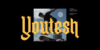 Youtesh is vintage retro fonts with visual elegance, smooth curves, and beautiful ligatures clear, making your work look true and attractive. A very versatile font that works in both large and small sizes. This font is suitable for a wide variety of projects such as invitations, logos, branding, magazine, photography, card, product packaging, mugs, quotes, poster, labels, signatures, and more. A font that is perfect for all business sectors including personal projects, studio, corporate, creative agency, industrial, company, etc.
 - Pawirot by Pandastock,
$12.00 Pawirot is display font style with visual elegance, smooth curves and beautiful ligatures clear, making your work look true and attractive. A very versatile font that works in both large and small sizes. This font is suitable for a wide variety of projects such as invitations, logo, branding, magazine, photography, card, product packaging, mugs, quotes, poster, label, signature and more. Font which is perfect for all business sectors including personal projects, studio, corporate, creative agency, industrial, company, etc.
 - Lundoon by Mazkicibe,
$11.00 Description Hello gaes! How are you guys ? I'm sure it's very good. Introducing, this is our newest product, we call this produc Lundoon Font.. Lundoon Font is Handwritten and modern font combined with a sweet touch and beautifully curved each letter. using a touch of soft curves so that it is pleasing to the eye Lundoon Font Spirit is great for: Wedding invitations, fashion magazines, logos, signatures, and suitable for watermark photography. Features: -Uppercase, -Lowercase, -Numeral, -Punctuation,
 - Off Side by HansCo,
$15.00 Off Side is a bold and chunky lettered display font. Add this font to your creative ideas and notice how it will make them stand out. This texture is very detailed. Off Side is suitable for logos, product branding, printable templates, posters, flyers, shirts, or for text overlay to any background image. This font comes with a FULL CAPS, numbers and punctuation + standard multilingual support in ALL CAPS. We recommend using Adobe Illustrator or Photoshop. Ennjoy!
 - Monkey Rhumble by WingBuk Studio,
$27.00 Monkey Rhumble is an exclusive piece made with a touch of darkness, featuring a heavy and death metal feel to compliment your design. Monkey Rhumble is very easy to use in any variation or writing combination with extra custom bracket, also perfect for metal band logos, merchandise, clothing, apparel, or anything else that calls for a metal feel. Here is tutorial how to use it : https://youtu.be/ezNu7hCqV-w Recomended Software to use: Corel Draw Adobe Photoshop Adobe Illustrator
 - Contamination by Kenn Munk,
$42.00Vowels produce 'end-characters'. These are used whenever a string of symbols start or end. Consonants make 'middle-characters'. Numerals are zero-width characters. these can be used whenever you feel like it, they will float above and below the string of symbols. Puncuation adds extra spice. Hold down 'shift' and you get the individual symbols mirrored. (very useful with the vowels.) Check my website for a more graphic representation and play, for gods sake, play! - Grover Slab by Sudtipos,
$35.00 The object of Grover was to join two distinctive typeface designs: the basic European gothic of the late nineteenth century and the ‘rounded’ style found in 1960s America. The result is a clear, friendly face with subtle yet unforgettable features. Named after Grover Washington, Jr., the jazz saxophone player, Grover is geometrically constructed and yet very human in appearance. Sans and slab serif variations, true italic weights, as well as small caps afford Grover versatility and unique display characteristics.
 - AZN Unified by AthayaDZN,
$14.99 Introducing "AZN Unified" font by AthayaDZN. UNIFIED was inspired by the evolving sports world that recently just expanded into the digital verse. UNIFIED’s rounded and sharp look is representing its nature of unity, equipped with 4 different angles of corners, UNIFIED achieved its mixed modern style of a bold serif font. Language Support : Afrikaans, Albanian, Danish, Dutch, English, Estonian, Filipino, Finnish, French, Galician, Indonesian, Irish, Italian, Luxembourgish, Norwegian, Portuguese, Romansh, Scottish Gaelic, Spanish, Swedish, Swiss German, Uzbek (Latin).
 - Bunga Pro by Graptail,
$15.00 Bunga is a serif typeface that gives a romantic feel to every curve. With 45 ligatures and alternates which are included, it is very helpful in creating the title of each of your projects such as film titles, book covers, branding, logos, packaging, magazines and more. Also supported PUA encoded. Simply copy and paste the alternate characters using the Character Map (Windows), Font Book (Mac) or a software program such as PopChar (for Windows and Mac).
 - Matrike by Pandastock,
$12.00 Matrike is vintage fonts with visual elegance, smooth curves, and beautiful ligatures clear, making your work look true and attractive. A very versatile font that works in both large and small sizes. This font is suitable for a wide variety of projects such as invitations, logos, branding, magazine, photography, card, product packaging, mugs, quotes, poster, labels, signatures, and more. A font that is perfect for all business sectors including personal projects, studio, corporate, creative agency, industrial, company, etc.
 - Mistont by Pandastock,
$12.00 Mistont is beautiful serif fonts with visual elegance, smooth curves and beautiful ligatures clear, making your work look true and attractive. A very versatile font that works in both large and small sizes. This font is suitable for a wide variety of projects such as invitations, logo, branding, magazine, photography, card, product packaging, mugs, quotes, poster, label, signature and more. Font which is perfect for all business sectors including personal projects, studio, corporate, creative agency, industrial, company, etc.
 - Montiago by Cooldesignlab,
$10.00 Introducing a new unique and beautiful outline font - Montiago script. This beautiful script is for those who need elegance and style for their designs and is perfect for wedding invitations, date cards, and feminine branding. Montiago script includes a complete set of Basic Characters, Numerals, and Lowercase Punctuation. Also contains binders and lots of styling alternatives to perfectly recreate natural calligraphy (check the preview to see them all). Thank you very much for visiting my store!
 - Vokrad by Imoodev,
$20.00 Vokrad is modern vintage font with visual elegance, smooth curves, and beautiful ligatures clear, making your work look true and attractive. A very versatile font that works in both large and small sizes. This font is suitable for a wide variety of projects such as invitations, logos, branding, magazine, photography, card, product packaging, mugs, quotes, poster, labels, signatures, and more. A font that is perfect for all business sectors including personal projects, studio, corporate, creative agency, industrial, company, etc.
 - Sunbunny by NJ Studio,
$19.00 Hi...Thank for your visit :) Sunbunny Modern Calligraphy Fonts are font designs that are made for various vector designs, printing such as digital wedding invitations, blogs, online shops, social media, while printing can be used in the field of product clothing, accessories, bags, pins, logos, business cards, watermarks and many others ... Sunbunny is equipped with complete alternates and very beautiful ligature, so it can make your product look elegant and attractive, and also Multilingual support!!! Happy design ...
 - Riemish by Pandastock,
$12.00 Riemish is blackletter font with visual elegance, smooth curves, and beautiful ligatures clear, making your work look true and attractive. A very versatile font that works in both large and small sizes. This font is suitable for a wide variety of projects such as invitations, logos, branding, magazine, photography, card, product packaging, mugs, quotes, poster, labels, signatures, and more. Font which is perfect for all business sectors including personal projects, studio, corporate, creative agency, industrial, company, etc.
 - Baby Algutta by IM Studio,
$19.00 Baby Algutta is a modern, handwritten and modern calligraphy font. The shape is modern and unique and the writing style is very natural. The Baby Algutta features a varied baseline, smooth lines, beautiful glyphs, and amazing alternatives. Hand-drawn design elements allow you to create many beautiful typographic designs in an instant such as branding, web and editorial design, prints, crafts, quotes, It's great for logos, wedding invitations, romantic cards, labels, packaging, name spelling, and more. Thank you.
 - Smothy Bubble by HansCo,
$15.00 Smothy Bubble is a cute and fun display font with bubble style. You will get three types of fonts in this pack, Regular, Bubble and Shadow version. Use this display font to add that special bubble touch to any design idea you can think of! Very suitable for logotype, Stickers, Packaging design, Cricut Project, headlines, brand identity, t shirt or apparel industry, posters, magazines, books, YouTube, Instagram, websites, or any of your creative design projects. Enjoy!
 - Habibie by NJ Studio,
$19.00 Hi...Thank for your visit :) Habibie Modern Script Fonts are font designs that are made for various vector designs, printing such as digital wedding invitations, blogs, online shops, social media, while printing can be used in the field of product clothing, accessories, bags, pins, logos, business cards, watermarks and many others ... Habibie is equipped with complete alternates and very beautiful ligature, so it can make your product look elegant and attractive, and also Multilingual support!!! Happy design ...
 - Maryam by Outras Fontes,
$24.00 Maryam is an Outras Fontes type family designed by Ricardo Esteves Gomes. With moderate contrast, these fonts have elegant and very legible forms even in small x-height sizes. There are more then 70 ligatures in each font, providing a lot of letterform variations that make this type family looks like a real handwriting on a page. It is currently available in two versions (Regular and Alternate) that you can combine with each other as you wish.
 - Kroist by Just Font You,
$16.00 Kroist was born from the rebellious mindset to break the rules of perfection of typographic hierarchy. Pushing to the very edge of possibilities to craft something different yet remarkable in the industry. Combining the reference of classic band posters, old records, and a spirit to be loud in sending the message. Kroist will be your perfect choice for your logo, branding, music project, cover artwork, merchandise, apparel, clothing, fashion, movie title, serial project, and many more.
 - Hello Hoeask by Imoodev,
$12.00 Hello Hoeask is display fonts with visual elegance, smooth curves and beautiful ligatures clear, making your work look true and attractive. A very versatile font that works in both large and small sizes. This font is suitable for a wide variety of projects such as invitations, logo, branding, magazine, photography, card, product packaging, mugs, quotes, poster, label, signature and more. Font which is perfect for all business sectors including personal projects, studio, corporate, creative agency, industrial, company, etc.
 - Sweet Girls by Haksen,
$12.00 Hello all, I will introduce my new font with the name “Sweet Girls” “Sweet Girls” is the form of letters that many variation and look very beautiful. available over than 50 glyphs for alternative letters that will make this font look so cute, funny, beautiful and fascinating. What's Included : Sweet Girls OTF Sweet Girls Slant OTF Sweet Girls Icons OTF Thanks so much for checking out my shop! Hope You enjoy it so much All the best, Haksen
 - Lalalo by Cuda Wianki,
$25.00 Lalalo is a casual, modern sans-serif font family based on hand-lettering. It's oval letter shapes provide soft and friendly appearance. Lalalo font is very legible with a warm touch perfectly suited for children books. Lalalo family consists of 6 weights ( Extra Light, Light, Regular, Semibold, Bold, ExtraBold). You can use it with normal fill or outlined. You can mix various colors and stroke widths to gain interesting results. There is also a set of nice frames available.
 - Mela by Resistenza,
$39.00 Mela was created with a pointed brush and walnut ink using thick brushstrokes. The original idea was to make a kind of urban graffitti with a fat brush, but the final result is more refined and elegant. Something new - light and bold together. The letters are a little bit slanted using sharp strokes, the brush gives the illusion of a fat-tipped marker. This handmade typeface has a lot of contrast, it brings together the beauty of the calligraphic shapes and strokes with the esthetics of a modern urban style. It creates a carefree feeling, contemporary, adding a perfect modern touch to your work. The possibilities for customized layouts are limitless, using the opentype ligatures and alternates to you make Mela your own. Mela Pro contains 473 glyphs: alternates, ligatures, icons, ornaments, and much more. Mela regular is limited to letters, figures and punctuation. Mela & Mela Pro are perfect for headlines and short texts. Use it for magazines, packaging, advertising, branding, posters, editorials, TV, movies and websites to give to your projects the unmistakable human touch of beautiful handwritten letters.
 - Sol Pro by Canada Type,
$29.95 Based on the classic Sol design by Marty Goldstein and C.B. Smith, published by VGC in 1973, Sol Pro goes above and beyond the call of revival/retooling to include plenty of optical improvements to the original design, more weights, italics, small caps, biform shapes, alternates, and extended language support. This particular design is one of the more prominent forefathers and strong influencers of the soft, streamlined aesthetic that has been going strong in branding and geometric design for more than 40 years now. It cuts all links to melancholy and classic empire shapes, and introduces smooth contrast modulation that communicates sleek, adaptable youth, confidence, knowledge, and modern hi-tech presence. This is not your grandfather's Eurostile. This is your offspring's global hope, optimism, and total awareness. Sol Pro's extended character set and range of weights and widths makes it quite suitable for applications of all sizes, from small collateral to product branding and massive marketing campaigns. The Sol Pro complete family comes in 20 fonts, each containing over 520 characters. Available in single fonts or value-maximizing packages.
 - Benton Sans Std by Font Bureau,
$40.00 In 1903, faced with the welter of sanserif typefaces offered by ATF, Morris Fuller Benton designed News Gothic, which became a 20th-century standard. In 1995 Tobias Frere-Jones studied drawings in the Smithsonian and started a redesign. Cyrus Highsmith reviewed News Gothic, and with the Font Bureau studio expanded it into Benton Sans, a far-reaching new series, with matched weights and widths, offering performance well beyond the limits of the original; FB 1995-2012
 - XLeefMeAlone by Ingrimayne Type,
$14.95 XLeafMeAlone is a collection of leaf silhouettes from common Indiana trees based on actual leaves. Various leaves, selected for their good looks not their intelligence, were scanned and hand-traced. Some species, such as some oaks, are over-represented because they are more picturesque than others, such as apple or peach. LeafMeAlone was featured in the “Type Drawer” column of Personal Publishing (later renamed Business Publishing--I do not know if it still exists) in November of 1990.
 - Adenium by Inumocca,
$17.00 Adenium Typeface inspired by the Shape of the Adenium Tree, Vintage Display typeface , Classic Taste with some Curly and Curved its Great flexible typeface. unique Stylictic Set and Beautiful Ligature, Really playful typeface to covering your Project, like Lettering, Website Interface, Bookcover or Book Content, Magazine cover, Branding, Poster, wedding invitations, Quotes Lettering, Logos, and more your project design. - Unique glyphs - Multilingual Characters - UPPERCASE - Lowercase - Numeric - Symbol - Punctuation Character - Ligature - SS01, SS02, SS03, SS04 inumoccatype Studio
 - Verdure by Sanyukt Foundry,
$12.00 The roundness of fresh Dewey leaves, the bending branches of canopy trees and the curvy luscious greens of dense forests; are all the things that inspire this clean display font. Its effortless and natural aesthetic makes it perfect for organic and luxurious brands. The strokes have a great contrast to give it a beautiful end to a long journey. The easy and elegant flow of the font brings one back right into the comforting arms of nature.
 - Springwood by Hanoded,
$12.00 Spring is in the air! At least, where I live. My two pear trees are in bloom, bees are buzzing and everything turns a brighter shade of green. Time for a new and fresh font package with a spring-inspired name! Springwood is a handmade set of fonts, ranging from a fat display font to a messy script font. Use it for your freshest ideas, your coolest designs or just anything that needs a bit of springtime.
 - Dual Line Deco JNL by Jeff Levine,
$29.00 Sheet music for the title song from the 1933 Jean Harlow-Clark Gable film "Hold Your Man" has the movie title hand lettered in a dual line sans serif with Art Deco influences. This is now available as Dual Line Deco, and is available in both regular and oblique versions. The song itself was written by Arthur Freed and Nacio Herb Brown, whose vast catalog of musical compositions was tapped for the 1952 musical classic "Singing in the Rain".
 - Pragmata Pro by FSD,
$73.00PragmataPro™ is a condensed monospaced font optimized for screen, designed by Fabrizio Schiavi to be the ideal font for coding, math and engineering. More than 9000 characters optimized from 9pt to 48pt to guarantee the best possible readability. Designed for every programming language and context: Haskell, Agda, APL, Needle, IPA Phonetics, HTML 5 entities, all the Unicode arrows, Symbols for Legacy Computing, Git tree command line, Agnoster, Poker cards and all the functional programming languages. - Mr Cyrk by Hipopotam Studio,
$18.00 Hand drawn typeface designed for one of our books. You can layer different styles over the background style to achieve lots of colorful effects. Use just one style to get a single color letter or set the fillOne and fillTwo over the background style to get a full, tree color mode. Mr Cyrk has only uppercase characters with alternate glyphs in place of lowercase letters. You can have one style for $18 or all of them for $30.
 - MGT Vallery Hills by Magetype,
$15.00 When I was surfing the internet, with rock n 'roll music. I accidentally found a picture of a hotel sign with a very unique style, namely: Mid-century Modern (MCM). It looks very pretty and charming to me. And inspired me to create Font Family. And I am proud to present the Vallery Hills Font Family. This font is in the Retro style of the 50s to 60s. Okay, here are the specifications. 1. Vallery Hills Schrift There is one unique thing about this font. Usually, script fonts with Retro style always have an angled anatomical shape, but I made this font upright. The goal is to make a difference with other script fonts I've seen. By the way, this font comes in two styles, namely: Regular and Bouncy. Why do I make it like that? Because I want to make this font into two different functions, namely: If you want to make it a Display Font, which is usually used for Headings, then use the Bouncy style. And if you want to use it as Bodytext, then use Regular. 2. Vallery Hills Sherift This second font is a font that is very synonymous with the Mid-century Modern (MCM) era. A very distinctive form of the serif font of that era. Similar to the first font, this font also has 2 styles, namely: Regular and Bouncy. You can combine this font with the other two fonts in Vallery Hills. It could be Title, or Bodytext. And you can also combine two styles, namely: Regular and Bouncy. Try! 3. Vallery Hills Suns Sherift This last font is Sans Serif. Also has 2 styles like his two brothers, namely: Regular and Bouncy. The goal is actually the same. I am sure you are cooler to create a design that uses this font family. Well, there is one advantage of this font from its two siblings, which is that it has a feature, namely: SMALLCAPS. Which will be an option when you are bored with the mediocre shape or style of Lowercase. Try combining the Smallcaps with Uppercase or Lowercase. Must be cool! : D Oops, almost forgot. This font consists of several font formats, namely: OTF, TTF, and Webfonts. And of course everything is MULTILANGUAGE. OK, friends. That's all I can describe about the Vallery Hills Family. Hopefully it will please all of you. Cheers!
 - Apolline Std by Typofonderie,
$59.00 A Venetian serif in 6 styles The Apolline typeface family was created by Jean François Porchez as a means to study the transition from Renaissance writing into the first printing types. Rather than sticking to the method commonly used these days for the creation of revivals of Jenson or Bembo types, it seemed more interesting to try and get in the same mindset as those exceptional designers during this pivotal period in the history of typography. Thus Apolline is an exploration of the design methods used by people like Nicolas Jenson and his contemporaries for adapting handwriting with its multiple occurrences (a, a, a, b, b, b…) into single, unique signs (a, b…). Initially Jean François made drawings modelled after his own calligraphy. They were done at a very small size on tracing paper (2 cm high for the capitals) to preserve the irregularity of human handwriting. Besides emphasising the horizontal parts of the letter forms, the serifs were designed asymmetrically to reinforce the rhythm of the writing. The final drawings were produced at a large size (10 cm high for the capitals) to allow for subtle optimisation of specific details. The very narrow and fluid Apolline italic Influenced by various concepts for an ideal italic by Van Krimpen, Gill, etc. Apolline italic was designed at 8° degrees. Although the structure of the letterforms were informed by chancery scripts, the italic has full serifs like the roman. Very narrow and fluid, its unique design creates a good contrast when used in combination with its upright counterparts. Thanks to the presence of the serifs similar to roman typefaces it sets very neatly in large sizes. The next step was digitising the drawings with Ikarus (the pre-Bézier-curves era) to create the final roman and italic fonts. Two years later, when the family was expanded to six series the same method was used, this time with Fontographer. This was necessary for correcting a few problems caused by the conversion to Bézier outlines, and to add intermediate weights. Before the advent of feature-rich OpenType, quality type families consisted of several separate fonts for each weight to provide users with various sets of numerals, an extended ligature set and alternates, ornaments, and so on. Introducing Apolline Morisawa Awards 1993
 - Savigny by insigne,
$22.00 Savigny began as an offshoot of Le Havre. Le Havre met my design objective of a geometric sans serif with a strong art deco touch. Le Havre’s primary inspiration came from the art deco titling of the 1930’s, and the lower case was just icing. The art of the 1930’s is of particular interest to me, and I love the art deco era and its art, and the simplicity of geometric shapes. I am mostly interested in designing display typefaces. In many ways Le Havre was the exact opposite of another popular insigne offering, Aviano Sans. Le Havre has very high ascenders, a lower case and is very condensed. Aviano Sans has no lowercase and extremely extended capitals. With the rise of webfonts I began to see Le Havre being used frequently online. It’s short x-height and very tall ascenders made it difficult to read in on screen text settings as it was intended as display type. With this observation, I felt that there is more room for a geometric sans in the insigne catalog. So I set about to design a new geometric sans using the successful skeleton of the Le Havre family. Although I planned to extend the Le Havre line, the new family is so drastically different I decided on a new name: Savigny. The face evolved and began to take on a few humanist touches. Designed from the very beginning as a webfont, the design is open and pleasing to the eye, with a tall x-height. To optimize it for onscreen settings, the spacing is generous. In addition, it includes extended and condensed members, making it insigne’s first superfamily. The family includes over 100 OpenType alternate characters. These include several style sets. Some are stemless, others are purely geometric, and in a nod to Savigny’s origins, Art Deco titling alternates. Please see the informative .pdf brochure to see these features in action. OpenType capable applications such as Quark or the Adobe suite can take full advantage of the automatically replacing ligatures and alternates. This family also includes the glyphs to support a wide range of languages. Savigny is a great choice for a professional designer who wants a well rounded typeface family that is ready for the web.
 - DT Paper Type by Dragon Tongue Foundry,
$9.00 DT PaperType has evolved and morphed over time from quite distant origins. I previously created DT Paperside. It was neither Papyrus nor SSI Countryside, but was inspired in some ways by the Papyrus form, although untextured and smoother, and had the more open dimensions and proportions, similar to that of Countryside SSi, with its larger easily readable lowercase body, and more consistent, shorter stems. DT Paperside had an open scripted feel which was pleasing to the eye and easy to read. DT PaperType has since been crafted from of the original Paperside font. The Organic flow and comfortable form of Paperside has been retained, but it has been shifted very much from the feel of a script font, into a quality, extremely readable, organic and friendly, serif font, retaining its clarity, while adding a great deal of pose and class. This font is primarily suited to body text, and as such is extremely readable. It does however also make an excellent Display font, and comes with a full set of over sized Caps that drop below the line to stand out on a headline when required. Paperside can also automatically enhance the first letter of most sentences, and changes other letters to suit their position within words, and the letters they appear beside. Now comes with an italic that curves and softens various letters. For best results, use this ‘smart font’ with Contextual Ligatures turned on. Mulitiple Stylistic Alternatives are included. Inspiration for this fonts predecessor (Paperside) came from two other fonts. Papyrus: designed by Chris Costello and created in 1982, it is a hand-drawn textured typeface, emulating texts written in biblical times. One of the most used (and misused) fonts of all times. Owned by Letraset, and currently published by the Internation Typeface Corporating (ITC). Countryside SSi: The serif font of an unknown designer, currently licensed by Southern Software Inc. Feel free to preview some other Dragon Tongue fonts that are yet to be released, at https://www.dragon-tongue.com/fonts
 - Hamlet by Canada Type,
$24.95Based on a specimen of an obscure and uncredited old face called Kitterland, Hamlet is one of those curiosities hardly ever noticed in the world of modern fonts, the kind that infuses a variety of historic Blackletter and calligraphy traits in an otherwise Roman alphabet. Such typefaces, what few of them exist, are almost always classified by typophiles as traditional decorative Roman alphabets. We beg to differ. We think such hybrids are fascinating enough to deserve a classification of their own. And we think today's aspiring letterers and type designers would benefit from paying special attention to this kind of hybrid alphabet, not only because it has much more hand than machine in it, but also because it is a prime example of how to succeed in mixing different lettering techniques into one self-contained and distinctly functional alphabet. As in any efficient mixture of lettering methods, Hamlet ended up with characters that are uniquely its own, such as the cupped A, M, V, W and Y, the very luscious and inviting curves on the arms of E, F, L and T, both single- and double-story forms of the a, and the humblest, friendliest g and y ever. A dozen alternate characters are sprinkled throughout the character set, so check out the map for a few pleasant surprises. We also made the Handtooled and Headstone styles because we thought these friendly forms were just crying out for such treatments. The Handtooled version turned out quite lovely, if we may say so ourselves, perhaps even better than the main font. The Headstone version is available as a free bonus to those who purchase the complete Hamlet package. All Hamlet styles come with lining figures as well as old style ones. Hamlet comes in all popular font formats. The OpenType fonts contain push-button swapping alternates and figures, which come in handy in software programs that support this kind of thing. - LT Sweet Nothings - Personal use only

