2,844 search results
(0.011 seconds)
- Bodoni Classic Chancery by Wiescher Design,
$55.00 I became interested in designing Bodoni Classic because of a lazy graphic designer at Jacques Damase publishing house. He had to change a single letter on a bookcover about J. B. BODONI. The French call him Jean Baptiste instead of Giambattista! And that unknown graphic designer just took any old “J” from some newly cut Bodoni. All the new Bodoni cuts have square serifs, whereas the originals had rounded serifs and slightly concave feet. The single letter “J” with the squared off serif was for me like a road sign to start redesigning the entire Bodoni family. That’s exactly what I started in 1993 and a dozen years later I am finished. Okay, I am still adding new Bodoni Classics, but those are my personal additions. Yours very retro, Gert Wiescher
 - Frieze by Fine Fonts,
$29.00 The origin of this font was a frieze in the RAF Chapel in Westminster Abbey which Michael Harvey was commissioned to design and create. It was comprised of the names of the top brass in wartime Bomber Command, namely Dowding, Harris, Newall, Tedder, Portal and Douglas. The Brief was to cut the letters in bronze and gild them. Instead, they were cut in perspex and gilded. To sit comfortably within the long and narrow vertical space available beneath the chapel’s stained glass window, extended letterforms were used with many vertical serifs omitted and with lengthened horizontal serifs. Some twenty years later, the missing upper-case letters were drawn together with the lowercase letters and Frieze, the font, was born. Subsequently, additional weights and styles were added to create a font family of six styles.
 - Bodoni Classic Text by Wiescher Design,
$55.00 I became interested in designing Bodoni Classic because of a lazy graphic designer at Jacques Damase publishing house. He had to change a single letter on a bookcover about J. B. BODONI. The French call him Jean Baptiste instead of Giambattista! And that unknown graphic designer just took any old “J” from some newly cut Bodoni. All the new Bodoni cuts have square serifs, whereas the originals had rounded serifs and slightly concave feet. The single letter “J” with the squared off serif was for me like a road sign to start redesigning the entire Bodoni family. That’s exactly what I started in 1993 and a dozen years later I am finished. Okay, I am still adding new Bodoni Classics, but those are my personal additions. Yours very retro, Gert Wiescher
 - Stanzer by FaceType,
$35.00 Stanzer is an interpretation of wood type combined with the idea of modern stencils. Instead of cutting every letter, we are presenting an example of how a modern stencil typeface could look like, as we have come to the conclusion that almost every letter works without cutting it. Stanzer is a Unicase typeface, available in three OpenType weights: Black, Shadow and Block. Stanzer first started as part of our diploma 2010 (it was called Stanley at that time). The basic idea behind this typeface is that it is fully stencil usable, and, unlike other stencil fonts, does not require any bridges (except for the O and Q). Almost every letter can be sprayed without inserting planks. However, Stanzer also offers the display weight Block, which is only suitable for print or online usage.
 - Bodoni Classic Hand by Wiescher Design,
$55.00 I became interested in designing Bodoni Classic because of a lazy graphic designer at Jacques Damase publishing house. He had to change a single letter on a bookcover about J. B. BODONI. The French call him Jean Baptiste instead of Giambattista! And that unknown graphic designer just took any old “J” from some newly cut Bodoni. All the new Bodoni cuts have square serifs, whereas the originals had rounded serifs and slightly concave feet. The single letter “J” with the squared off serif was for me like a road sign to start redesigning the entire Bodoni family. That’s exactly what I started in 1993 and a dozen years later I am finished. Okay, I am still adding new Bodoni Classics, but those are my personal additions. Yours very retro, Gert Wiescher
 - Shinn Kickers JNL by Jeff Levine,
$29.00 Conrad X. 'Cobb' Shinn (Sept. 4, 1887- Jan. 28, 1951) was a Fillmore, Indiana-born post card illustrator who sold a series of successful novelty postcard lines which included (among others) Charlie Chaplin, automobiles and the Dutch culture in the beginning years of the 20th Century. After serving in World War I, Shinn found the market for novelty postcards dwindling, and he also lent his artistic skills to cartoon features and illustrating many children's books [including his own, under the nickname 'Uncle Cobb'] which taught easy step-by-step drawing methods. Some time in the 1920s, he eventually migrated into the field of supplying electrotypes and stereotypes of 'stock cuts' of photos and line art to the printing trade. In the days of letterpress printing, this was the forerunner of paper clip art and its successor, electronic clip art. Purchasing many of his designs from 'journeyman' artists of the time, the diversity of Cobb Shinn's stock cuts library grew with the passing years, reflecting changing times, styles and topics. Some of the illustrators whose signed works were presented in Shinn's 'CUTalogs' [as he called his stock cuts catalogs] include Mary Clemmitt, Louis H. Hippe, E.C. Klinge, Nelson White, Harvey Fuller, Bess Livings, Lois Head, Harvey Peake and Van Tuyl. Upon his passing in 1951, it's not known how long the Indianapolis-based company existed before finally closing its doors. One of the more popular series of cartoons were the line illustrations of men and women affectionately called 'little big head guys' by many modern fans of these cuts because the heads of the characters were drawn somewhat larger than the rest of their bodies. Shinn Kickers JNL is a collection twenty-six of these illustrations, and just like a kick in the shin (as the pun in the name implies), these charming cartoons get your attention.
 - the EV$NT - Personal use only

- Adinah by Brink,
$30.00 Adinah is a lively brush script with a strong sense of rhythm. Adinah’s expressive letterforms are based on pointed brush calligraphy with a hint of sign painting. This Sign painting influence reveals itself the further you dig into the family styles. Eight combined styles are complimented by a sub family of Six Layered Font options.
 - ITC Eras by ITC,
$40.99 ITC Eras font is the work of French designers Albert Boton and Albert Hollenstein. It is a typical sans serif typeface distinguished by its unusual slight forward slant and subtle variations in stroke weight. ITC Eras is an open and airy typeface inspired by both Greek stone-cut lapidary letters as well as Roman capitals.
 - MattsDinosaurStencils by Ingrimayne Type,
$11.95 This typeface is mostly composed of images of dinosaur skeletons drawn by Matthew Schenk and used as stencils for decoration. I thought they would also make a nice typeface. Check the key map—some of the very large critters are cut into pieces and put on several keys—this may help printing in some situations.
 - C Elle F by TeGeType,
$19.00 The "C Elle F" is a typographic family, as a stencil letter, originally intended for cutting and engraving to carry out marking and signaling work. But of course, the very characteristic shape of these letters evokes much more. This typographic family can therefore be used for communication in various fields, commercial, import-export, military, etc.
 - Duquesne Dark Woodcut by Greater Albion Typefounders,
$18.00 Duquesne Dark Woodcut is a new typeface in the spirit of 19th century American wood cut typefaces. There is an almost rustic simplicity to its heavily serifed letter forms, ideal for capturing the spirit of the mid-west, or early Victorian Britain. Long live the era of the Cowboy and the Steam Navigation Canal!
 - Supernouveau by Intellecta Design,
$39.90 Supernouveau is a handfull and easy to use font with 244 pieces of art nouveau elements of decoration : frames, cuts, tailipieces, headpieces among others... Ready to use to make patterns, book coovers, públishing design, package material and all you need in your design with a XIX to XX centuru first decades feeling of beauty.
 - Deck by Turtle Arts,
$20.00Deck is a font inspired by old decks of playing cards and even some old tarot decks. Deck is an all caps font; the lower case letters and the punctuation are actually different playing card and tarot symbols like: hearts, diamonds, spaces, clubs. This font is great for designing your own deck of cards. - Tilly by Angele Kamp,
$20.00 Tilly is a lovely font with a feminine, whimsical feel. This gorgeous font will look lovely on wedding invites, logos, quotes and it has nice smooth lines which makes it perfect for crafters and cutting machines. I've also added a lovely set of bonus clipart which will make designing so much easier and more fun.
 - Berling by URW Type Foundry,
$35.99 Berling is an old style typeface based on the classical Venetian model used by Aldus Manutius at the end of the fifteenth century. Berling was first cut by the Berling foundry in 1951 with further weights released in 1958. The Berling font family is intended primarily for setting text in books~ journals and magazines.
 - Catalog Serif JNL by Jeff Levine,
$29.00 Based on text used as sub-headings within a reproduction of a sales catalog for stencil punch dies manufactured by S.M. Spencer & Co. (originally of Brattleboro, VT), circa 1868. Catalog Serif JNL is available in regular, oblique, condensed, condensed oblique, extra condensed, extra condensed oblique, ultra condensed, ultra condensed oblique, compressed and compressed oblique versions.
 - Printers Assistants JNL by Jeff Levine,
$29.00 Printers Assistants JNL is a collection of vintage letterpress stock cuts and embellishments features monthly title blocks (for newsletters or calendars of events) in an Art Deco style, a cartoon character counting [with fingers] one through five to emphasize selling points and assorted cartoons and decorations sure to please any lover of nostalgic art.
 - Botobe by T4 Foundry,
$21.00 Botobe is a new script from Swedish type designer Bo Berndal and the T4 font foundry. Botobe is a playful and friendly script that has lots of character. It gives text a genuine handwritten style and comes in two different cuts, regular and italic. It is an OpenType creation, for both PC and Mac.
 - Andis by JAM Type Design,
$- Andis’ rough cut makes it an interesting display typeface, but thanks to its generous x-height and firm serifs, Andis works equally well in text sizes. The typeface’s idiosyncratic italic builds a strong contrast with the roman. Andis is both functional and expressive; using it lends a humanistic touch to editorial or advertising work.
 - Alambart by Greater Albion Typefounders,
$18.00 Alambart is one of a new series of ‘wood type’ inspired fonts. Alambart is a hand-cut oblique Roman, suggesting the late Victorian era, but the type of thing that continued in use well into the twentieth century. If you want a title face that has versatility and suggests a past history, this is it!
 - Maximillian CT by CastleType,
$19.00 Another one of those faces that caught my eye in one of my art deco type books, and I wanted it. After I finished the face, I noticed that there is a more clean-cut version of this face in digital format, but my version retains more of the funkiness of the original drawings.
 - Green by ITC,
$29.99Green is the work of British designer Timothy Donaldson, known for his experimentation with letter forms. This typeface features a sharp stroke contrast and eccentric lower case letters, giving it a vital, clean-cut style. Green is perfect in both large display sizes and small text sizes and gives any work a fresh, new look. - Fresh Pineapple by Zeenesia Studio,
$12.00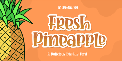 Fresh Pineapple, Delicious handwritten font. It is a beautiful quirky font that perfect for a lettering project like t-shirt design, mugs, advertisements, cutting vinyl, silhouettes, book covers, posters, business cards, social media and more. It supports multiple languages and offers PUA encoding. The doodles make this font so perfect. Hope you love it
 - PaperCutAlmond by PineStreet,
$25.00 PaperCutAlmond breathes just the hands-on self-made authentic happy feeling you may be looking for. Each and every glyph is based on a paper letter cut by hand with a pair of scissors by me in my studio. Ideal for packaging for organic products, illustrated goods, book covers, editorial illustrations and other freestyle projects.
 - Free Form Retro JNL by Jeff Levine,
$29.00 The titles and credits from the 1960 French film “Le Passage Du Rhin” (English release title: “Tomorrow is My Turn”)” are hand made in a free form bold alphabet resembling both cut paper and quickly sketched lettering. This avant garde style inspired the digital type revival, which is available in both regular and oblique versions.
 - Rapido by Typestation,
$20.00 Rapido is a kind of Italic hand lettering typeface. We designed it with the phenomenon of writing fast and perfect cutting edges. Rapido is available in Light, Regular and Ultra Bold weights to make your work look perfect at various movements. Rapido will work best on magazines/ menus/ books quotes and everything you're gonna initiate.
 - Under Summer by Abo Daniel,
$17.00 introducing UNDER SUMMER - handwritten script - UNDER SUMMER is natural handwritten font. It is great for quotes, card, banner, book, cutting, silhouette, social media content and anything of your project. I created some ligatures to make it look so natural. Features: - Uppercase - Number & punctuations - Multilingual - PUA encoded I hope you love it... regards, Abo Daniel Studio
 - Buratino by ParaType,
$25.00 Buratino font got its name from a title character of Russian fairy tale — a clone of Pinocchio. Initially font was cut from a log and then scanned and converted into outline format. The font contains just upper case characters. Can be used in advertising and display typography. Designer — Gennady Fridman. Released by ParaType in 2009.
 - Trencher JNL by Jeff Levine,
$29.00 Trencher JNL is based on hand-cut stencils spray-painted onto a vintage 1947 Cleveland Trencher acquired by the Marine Corps Mechanized Museum at Camp Pendleton, California. Restoration volunteer Brian Platzer supplied to Jeff Levine the images of the stencil markings - and they were quickly re-drawn and turned into a digital type face.
 - Stonecut JNL by Jeff Levine,
$29.00 Stonecut JNL is an adaptation of a novelty display face found in one of the Dan X. Solo lettering books. Resembling letters made from cut stone, both the inline and solid black versions are perfect for themes encompassing outdoors, the Stone Age, "macho" events or anything where an unpolished or rustic look can be adapted.
 - Ghost Show by Solotype,
$19.95Back in the days when we earned our living with a travelling magic show, we took the shaded font Lithotint, filled it in, modified some characters, and here is the result. In those days, to use the font we had to cut and paste stats of individual letters by hand. You have it easier! - Lilycat by Letters&Numbers,
$26.00 Lilycat is based on paper cut-outs of circles and rectangles. Letter shapes share characteristics of early modern fonts such as Futura. Uneven edges give the typeface a hand-made, playful, authentic feel. The font is suitable for use in short paragraphs, headings and captions, logo types or whatever use you see fit. Enjoy!
 - Reading And Writing Doodles by Outside the Line,
$19.00Reading & Writing Doodles is just that. 27 low-tech illustrations of books, pens, pencils and paper. Along with some hand lettered phrases, "My Book", "Ex Libris" and "From The Desk Of:" A fresh approach for Save a Date Cards and From The Desk Of notepads. An absolute must for bookplates and your book club graphics. - Karara Shadow by Kufic Studio,
$20.00 Karara Shadow, a complete font set and additional font style of Karara. The word Karara means patience & steady. The style is achieved by practicing and studying the modern techniques to deliver high-end professional font. This specific font had a tint of wall chalking & texture. Carefully engraved and stenciled to delivery clean cuts and design.
 - Headstone Roman JNL by Jeff Levine,
$29.00 Despite its macabre-sounding name, Headstone Roman JNL is not a novelty font for Halloween or horror movies. Instead, it's an attractive Roman typeface based on an example provided of a guide for stonecutters to use when cutting epitaphs into tombstones. Headstone Roman JNL is available in regular, oblique, condensed and condensed oblique versions.
 - Doright Black NF by Nick's Fonts,
$10.00 This typeface takes its design cues from Dudley Upright, a Dan X. Solo find from the sixties. This version is considerably wider than the original, which increases its legibility while retaining its flower-power vibe. Both flavors of this font feature the 1252 Latin, 1250 Central European, 1254 Turkish and 1257 Baltic character sets.
 - Flower Child by Angele Kamp,
$24.00 Flower Child is a whimsical, carefree, brush font with a bouncing baseline. This playful font will give your designs that fresh, handwritten feel to it and will look lovely on cards, headers, quotes and all your other lovely projects. Flower Child has nice smooth lines which makes it perfect for crafters and cutting machines.
 - The Socker by Mozatype,
$11.00 THE SHOCKER a natural brush font. THE SHOCKER would be perfect for sports, music festivals, quotes, special events, or anything. What’s Included : - Works on PC & Mac - Easy to use ( Installations ) - Compatibility Windows, Apple, Linux, Cricut, Silhouette, and Other cutting machines Thank you for purchasing this font. Please appreciate, if you like this. ENJOY it :)
 - Q-bo - Personal use only


