10,000 search results
(0.02 seconds)
- Cut Paper Stencil JNL by Jeff Levine,
$29.00 - KG Thinking Out Loud by Kimberly Geswein,
$5.00
- KG Sorry Not Sorry by Kimberly Geswein,
$5.00
- P22 Way Out West by P22 Type Foundry,
$24.95
- Junge Holiday Cuts NF by Nick's Fonts,
$10.00 - Not So Grotesk JNL by Jeff Levine,
$29.00
- Printers Stock Cuts JNL by Jeff Levine,
$29.00
- Hand Cut Stencil JNL by Jeff Levine,
$29.00
- Same Same But Different by Hanoded,
$15.00
- Letterpress Stock Cuts JNL by Jeff Levine,
$29.00
- Print Shop Cuts JNL by Jeff Levine,
$29.00
- Put My Foot Down by Ingrimayne Type,
$14.95
- Printing Press Cuts JNL by Jeff Levine,
$29.00
- the EV$NT - Personal use only

- Nu School Munitions - Unknown license

- Nu World Tight - Unknown license

- NT Louis Douze by Novo Typo,
$26.00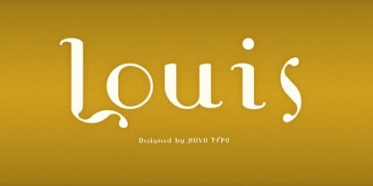
- NT Brick Sans by Nurrontype,
$17.00
- NT Tonight Show by Nurrontype,
$21.00
- UT Sugar Cane by Uniontype,
$15.00
- NT Therese Quatorze by Novo Typo,
$26.00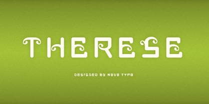
- Diet Riot by PizzaDude.dk,
$15.00 - Cheesegum by PizzaDude.dk,
$20.00
- KG This Is Not Goodbye - Personal use only

- A Cut Above The Rest - Unknown license

- Do not eat this Italic - Unknown license

- Do not eat this Skew - Unknown license

- Do not eat this Fat - Unknown license

- No Harmony Left Side Cut - Unknown license

- KR Out Of This World - Unknown license

- Out of Line Pro BB by Blambot,
$10.00
- KG This Is Not Goodbye by Kimberly Geswein,
$5.00
- I am not a robot by PizzaDude.dk,
$15.00
- Ps Willy Small But Fine by Fontopia,
$13.99
- Is Not A Brazilian Font by Intellecta Design,
$17.95
- ITC Out of the Fridge by ITC,
$29.99 - Thursday Afternoon by Bogstav,
$15.00
- Do not eat this Fat Italic - Unknown license

- Mummbler by PizzaDude.dk,
$20.00
- Buddy Tequila by PizzaDude.dk,
$15.00


