6,776 search results
(0.159 seconds)
- Chalk Hand Lettering by Fontscafe,
$39.00 If you are into the vintage feel, you will love this one. This is as vintage as it probably gets. There are probably only a handful of places in the world where schools still use blackboards and chalk – they’ve given way to their white board and marker counterparts for decades now. White boards are definitely more practical and less messy when compared to chalk, but then if you are creatively inclined you will agree that a little bit of mess is worth it if you are going to get the effects that you desired! Well, we can give you the effects minus the mess with our chalk hand lettering fonts! As the name suggests, this font gives you that distinctly unique chalk on slate feel, and if you are wondering what’s distinct about it; writing on slate or blackboard was a slow process which required deliberated and concentrated efforts resulting in a handwriting which was usually quite different to a person’s handwriting on paper. Typography of chalk on slate was an everyday event in the classrooms of yesterday, and today we hardly ever get to see one of these if it all. Writing on a black board with chalk was quite an interesting achievement in its own right, if you ended up with anything legible and if your writing remained focused and ‘in-line’! But of course like everything else, his took time to master and when you did get it right, chalk hand lettering was quite an enjoyable experience! For semi-permanent designs, say for example an eventful day at school; students of the day would create beautiful typography on the boards, and add a solidarity to it sometimes by shading one side of the lettering – usual y the right side towards which the lettering leaned. This is the effect our chalk hands lettering shaded variation gives you. You could get this font individually, but we strongly advise you check out the “chalk hand lettering pack” font. It includes the simple “chalk hand lettering” (minus the shading effect) and also a “chalk hand elements” bag of tricks. The elements is a collection of graphic art which resemble shapes and designs that used to be added to chalk art, to beautify the typography. If you enjoyed seeing the effects of our Chalk Hands font, and the shaded variant – you are simply going to go gaga over Chalk Hand Elements! The chalk hand font of course enables you to make typographic art similar to the effect of chalks on slates and black boards. This was quite the art form in the days gone by! The shaded variation added a bit of solidarity and the technique was commonly used to make semi-permanent designs say for example a welcome note when somebody important was to visit. Classic chalk hand designs, especially the semi permanent ones often had little pieces of art to help beautify the creation as a whole. It could simply be symmetrical graphics appearing before and after the title and headings, maybe just an interesting shape to fill in an empty area on the board, and such…our Chalk Hand Elements offers you a ton of such graphics. The two chalk hand variations and the elements are all included in the Chalk Hand Family, and this is strongly recommended if you want to make designs that are truly reminiscent of the days of chalk on slate.
 - Tom's New Roman - Unknown license

- Quickflio by Brenners Template,
$19.00 A font family with excellent visibility and aesthetic originality was developed after years of troubleshooting. It will be the best choice for designers as it contains a variable font with two axes. A variety of styles, including stem widths from 10pt to 220pt, will be an exciting attempt for unique typography. And, 44 beautiful and amazing ligatures will make your imagination deeper and richer. On the Typographic Foundation, it makes sense to break most of the ligatures used here into discretionary ligatures. However, in view of the trend of modern typography, in which the essential boundary between function and decoration is increasingly blurred, it may be meaningful to use them together. All ligatures of this font family are included in Standard Ligatures. Your choices become easier and clearer. Its name is Quickflio. OpenType Features 44 Ligatures : Am, An, Br, Cr, Gr, Le, Lo, Op, ad, am, an, at, ba, ck, ct, da, de, do, er, es, ff, fo, fi, fl, gh, ha, hn, hs, in, le, ll, lo, ma, ns, oe, om, on, re, sh, st, um, un, ve, wa Ordinals Oldstyle Figures Tabular Figures Fractions Scientific Inferiors Superscrpt
 - Dirtstorm by Typodermic,
$11.95 Introducing Dirtstorm—the ultimate street stencil typeface that is sure to make your message stand out from the rest. With its raw, hand-cut edges and tattered texture, this font exudes an undeniable edge that will leave an impression on anyone who sees it. Featuring unique OpenType ligatures, Dirtstorm creates bespoke character sequences that add an extra layer of realism to your design. Whether you’re creating posters, flyers, or social media graphics, this typeface is the perfect way to convey your message with a distinct, grungy tone. Dirtstorm is not your typical, cookie-cutter font. It’s a rebellious, handcrafted typeface that embraces the imperfections and roughness of street art. So if you’re looking for a font that speaks volumes and demands attention, look no further than Dirtstorm. Most Latin-based European writing systems are supported, including the following languages. Afaan Oromo, Afar, Afrikaans, Albanian, Alsatian, Aromanian, Aymara, Bashkir (Latin), Basque, Belarusian (Latin), Bemba, Bikol, Bosnian, Breton, Cape Verdean, Creole, Catalan, Cebuano, Chamorro, Chavacano, Chichewa, Crimean Tatar (Latin), Croatian, Czech, Danish, Dawan, Dholuo, Dutch, English, Estonian, Faroese, Fijian, Filipino, Finnish, French, Frisian, Friulian, Gagauz (Latin), Galician, Ganda, Genoese, German, Greenlandic, Guadeloupean Creole, Haitian Creole, Hawaiian, Hiligaynon, Hungarian, Icelandic, Ilocano, Indonesian, Irish, Italian, Jamaican, Kaqchikel, Karakalpak (Latin), Kashubian, Kikongo, Kinyarwanda, Kirundi, Kurdish (Latin), Latvian, Lithuanian, Lombard, Low Saxon, Luxembourgish, Maasai, Makhuwa, Malay, Maltese, Māori, Moldovan, Montenegrin, Ndebele, Neapolitan, Norwegian, Novial, Occitan, Ossetian (Latin), Papiamento, Piedmontese, Polish, Portuguese, Quechua, Rarotongan, Romanian, Romansh, Sami, Sango, Saramaccan, Sardinian, Scottish Gaelic, Serbian (Latin), Shona, Sicilian, Silesian, Slovak, Slovenian, Somali, Sorbian, Sotho, Spanish, Swahili, Swazi, Swedish, Tagalog, Tahitian, Tetum, Tongan, Tshiluba, Tsonga, Tswana, Tumbuka, Turkish, Turkmen (Latin), Tuvaluan, Uzbek (Latin), Venetian, Vepsian, Võro, Walloon, Waray-Waray, Wayuu, Welsh, Wolof, Xhosa, Yapese, Zapotec Zulu and Zuni.
 - Bank Sans EF by Elsner+Flake,
$35.00 With its extended complement, this comprehensive redesign of Bank Gothic by Elsner+Flake offers a wide spectrum for usage. After 80 years, the typeface Bank Gothic, designed by Morris Fuller Benton in 1930, is still as desirable for all areas of graphic design as it has ever been. Its usage spans the design of headlines to exterior design. Game manufacturers adopt this spry typeface, so reminiscent of the Bauhaus and its geometric forms, as often as do architects and web designers. The creative path of the Bank Gothic from hot metal type via phototypesetting to digital variations created by desktop designers has by now taken on great breadth. The number of cuts has increased. The original Roman weight has been augmented by Oblique and Italic variants. The original versions came with just a complement of Small Caps. Now, they are, however, enlarged by often quite individualized lower case letters. In order to do justice to the form changes and in order to differentiate between the various versions, the Bank Gothic, since 2007 a US trademark of the Grosse Pointe Group (Trademark FontHaus, USA), is nowadays available under a variety of different names. Some of these variations remain close to the original concept, others strive for greater individualism in their designs. The typeface family which was cut by the American typefoundry ATF (American Type Founders) in the early 1930’s consisted of a normal and a narrow type family, each one in the weights Light, Medium and Bold. In addition to its basic ornamental structure which has its origin in square or rectangular geometric forms, there is another unique feature of the Bank Gothic: the normally round upper case letters such as B, C, G, O, P, Q, R and U are also rectangular. The one exception is the upper case letter D, which remains round, most likely for legibility reasons (there is the danger of mistaking it for the letter O.) Because of the huge success of this type design, which follows the design principles of the more square and the more contemporary adaption of the already existing Copperplate, it was soon adopted by all of the major type and typesetting manufacturers. Thus, the Bank Gothic appeared at Linotype; as Commerce Gothic it was brought out by Ludlow; and as Deluxe Gothic on Intertype typesetters. Among others, it was also available from Monotype and sold under the name Stationer’s Gothic. In 1936, Linotype introduced 6pt and 12pt weights of the condensed version as Card Gothic. Lateron, Linotype came out with Bank Gothic Medium Condensed in larger sizes and a more narrow set width and named it Poster Gothic. With the advent of photoypesetters and CRT technologies, the Bank Gothic experienced an even wider acceptance. The first digital versions, designed according to present computing technologies, was created by Bitstream whose PostScript fonts in Regular and Medium weights have been available through FontShop since 1991. These were followed by digital redesigns by FontHaus, USA, and, in 1996, by Elsner+Flake who were also the first company to add cursive cuts. In 2009, they extended the family to 16 weights in both Roman and Oblique designs. In addition, they created the long-awaited Cyrillic complement. In 2010, Elsner+Flake completed the set with lowercase letters and small caps. Since its redesign the type family has been available from Elsner+Flake under the name Bank Sans®. The character set of the Bank Sans® Caps and the Bank Sans® covers almost all latin-based languages (Europe Plus) as well as the Cyrillic character set MAC OS Cyrillic and MS Windows 1251. Both families are available in Normal, Condensed and Compressed weights in 4 stroke widths each (Light, Regular, Medium and Bold). The basic stroke widths of the different weights have been kept even which allows the mixing of, for instance, normal upper case letters and the more narrow small caps. This gives the family an even wider and more interactive range of use. There are, furthermore, extensive sets of numerals which can be accessed via OpenType-Features. The Bank Sans® type family, as opposed to the Bank Sans® Caps family, contains, instead of the optically reduced upper case letters, newly designed lower case letters and the matching small caps. Bank Sans® fonts are available in the formats OpenType and TrueType.
 - Evita by ITC,
$29.99Gérard Mariscalchi is a self-made designer. Born in Southern France of a Spanish mother and an Italian father, he has worked as a mechanic, salesman, pilot, college teacher – even a poet (with poetry being the worst-paying of these professions, he reports.) “Throughout all this, the backbone of my career has always been design,” Mariscalchi says. “I’ve been drawing since I was five, but it wasn’t until I was twenty-four that I learned that my hobby could also help me earn a living.” It was about this same time that Mariscalchi fell in love with type. He studied the designs of masters like Excoffon, Usherwood and Frutiger, as well as the work of calligraphers and type designers such as Plantin, Cochin and Dürer. With such an eclectic background, it’s no surprise that Mariscalchi’s typeface designs are inspired by many sources. Baylac and Evita reflect the style of the art nouveau and art deco periods, while Marnie was created as an homage to the great Lithuanian calligrapher Villu Toots. However, the touch of French elegance and distinction Mariscalchi brings to his work is all his own. Baylac Who says thirteen is an unlucky number? Three capitals and ten lowercase letters from a poster by L. Baylac, a relatively obscure Art Nouveau designer, served as the foundation for this typeface. The finished design has lush curves that give the face drama without diminishing its versatility. On the practical side, Baylac’s condensed proportions make it perfect for those situations where there’s a lot to say and not much room in which to say it Evita Mariscalchi based the design of Evita on hand lettering he found in a restaurant menu, and considers this typeface one of his most difficult design challenges. “The main problem was to render the big weight difference between the thin and the thick strokes without creating printing problems at small point sizes,” he says. Unlike most scripts, Evita is upright, with the design characteristics of a serif typeface. Mariscalchi named the face for a close friend. The end result is a charming design that is light, airy, and slightly sassy. Marnie Based on Art Nouveau calligraphic lettering, Marnie is elegant, inviting, and absolutely charming. Mariscalchi paid special attention to letter shapes and proportions to guarantee high levels of character legibility. He also kept weight transition in character strokes to modest levels, enabling the face to be used at relatively small sizes – an unusual asset for a formal script. Marnie’s capital letters are expansive designs with flowing swash strokes that wrap affectionately around adjoining lowercase letters. The design easily captures the spontaneous qualities of hand-rendered brush lettering. - Baylac by ITC,
$29.99Gérard Mariscalchi is a self-made designer. Born in Southern France of a Spanish mother and an Italian father, he has worked as a mechanic, salesman, pilot, college teacher – even a poet (with poetry being the worst-paying of these professions, he reports.) “Throughout all this, the backbone of my career has always been design,” Mariscalchi says. “I’ve been drawing since I was five, but it wasn’t until I was twenty-four that I learned that my hobby could also help me earn a living.” It was about this same time that Mariscalchi fell in love with type. He studied the designs of masters like Excoffon, Usherwood and Frutiger, as well as the work of calligraphers and type designers such as Plantin, Cochin and Dürer. With such an eclectic background, it’s no surprise that Mariscalchi’s typeface designs are inspired by many sources. Baylac and Evita reflect the style of the art nouveau and art deco periods, while Marnie was created as an homage to the great Lithuanian calligrapher Villu Toots. However, the touch of French elegance and distinction Mariscalchi brings to his work is all his own. Baylac Who says thirteen is an unlucky number? Three capitals and ten lowercase letters from a poster by L. Baylac, a relatively obscure Art Nouveau designer, served as the foundation for this typeface. The finished design has lush curves that give the face drama without diminishing its versatility. On the practical side, Baylac’s condensed proportions make it perfect for those situations where there’s a lot to say and not much room in which to say it Evita Mariscalchi based the design of Evita on hand lettering he found in a restaurant menu, and considers this typeface one of his most difficult design challenges. “The main problem was to render the big weight difference between the thin and the thick strokes without creating printing problems at small point sizes,” he says. Unlike most scripts, Evita is upright, with the design characteristics of a serif typeface. Mariscalchi named the face for a close friend. The end result is a charming design that is light, airy, and slightly sassy. Marnie Based on Art Nouveau calligraphic lettering, Marnie is elegant, inviting, and absolutely charming. Mariscalchi paid special attention to letter shapes and proportions to guarantee high levels of character legibility. He also kept weight transition in character strokes to modest levels, enabling the face to be used at relatively small sizes – an unusual asset for a formal script. Marnie’s capital letters are expansive designs with flowing swash strokes that wrap affectionately around adjoining lowercase letters. The design easily captures the spontaneous qualities of hand-rendered brush lettering. - Marnie by ITC,
$29.99Gérard Mariscalchi is a self-made designer. Born in Southern France of a Spanish mother and an Italian father, he has worked as a mechanic, salesman, pilot, college teacher – even a poet (with poetry being the worst-paying of these professions, he reports.) “Throughout all this, the backbone of my career has always been design,” Mariscalchi says. “I’ve been drawing since I was five, but it wasn’t until I was twenty-four that I learned that my hobby could also help me earn a living.” It was about this same time that Mariscalchi fell in love with type. He studied the designs of masters like Excoffon, Usherwood and Frutiger, as well as the work of calligraphers and type designers such as Plantin, Cochin and Dürer. With such an eclectic background, it’s no surprise that Mariscalchi’s typeface designs are inspired by many sources. Baylac and Evita reflect the style of the art nouveau and art deco periods, while Marnie was created as an homage to the great Lithuanian calligrapher Villu Toots. However, the touch of French elegance and distinction Mariscalchi brings to his work is all his own. Baylac Who says thirteen is an unlucky number? Three capitals and ten lowercase letters from a poster by L. Baylac, a relatively obscure Art Nouveau designer, served as the foundation for this typeface. The finished design has lush curves that give the face drama without diminishing its versatility. On the practical side, Baylac’s condensed proportions make it perfect for those situations where there’s a lot to say and not much room in which to say it Evita Mariscalchi based the design of Evita on hand lettering he found in a restaurant menu, and considers this typeface one of his most difficult design challenges. “The main problem was to render the big weight difference between the thin and the thick strokes without creating printing problems at small point sizes,” he says. Unlike most scripts, Evita is upright, with the design characteristics of a serif typeface. Mariscalchi named the face for a close friend. The end result is a charming design that is light, airy, and slightly sassy. Marnie Based on Art Nouveau calligraphic lettering, Marnie is elegant, inviting, and absolutely charming. Mariscalchi paid special attention to letter shapes and proportions to guarantee high levels of character legibility. He also kept weight transition in character strokes to modest levels, enabling the face to be used at relatively small sizes – an unusual asset for a formal script. Marnie’s capital letters are expansive designs with flowing swash strokes that wrap affectionately around adjoining lowercase letters. The design easily captures the spontaneous qualities of hand-rendered brush lettering. - Imagine if your quill had a cheeky mind of its own, dancing merrily across a canvas of parchment— that's RememberReinerFS for you, a font that carries the playful spirit of its creator, Manfred Klein...
- Ah, Squareroque! Picture this: It's as though the straight-laced geometry of squares decided to throw a wild party with the ornate swirls and twirls of the Baroque period. Squareroque is one heck of ...
- "Frank Knows" is a captivating and versatile font designed by Chris Hansen, which exudes both personality and practicality. At first glance, it is the kind of typeface that greets you like an old fri...
- Gord by Typodermic,
$11.95 Gord’s unique blend of typefaces creates a mesmerizing and trippy effect that will transport you straight back to the era of disco balls, bell-bottoms, and groovy tunes. This typeface is like no other—it’s a puree of samples that will make your design stand out from the crowd. Gord’s ugly design is so bad, it’s good! Its quirky, uneven shapes and mismatched curves give your text a distinctive retro look that’s perfect for any project that needs a touch of 70s nostalgia. So if you’re ready to embrace the beauty of ugly and want to add some vintage flair to your design, Gord is the typeface for you. Get ready to unleash your inner boogie and take a trip back to the era of peace, love, and funk with Gord! Most Latin-based European writing systems are supported, including the following languages. Afaan Oromo, Afar, Afrikaans, Albanian, Alsatian, Aromanian, Aymara, Bashkir (Latin), Basque, Belarusian (Latin), Bemba, Bikol, Bosnian, Breton, Cape Verdean, Creole, Catalan, Cebuano, Chamorro, Chavacano, Chichewa, Crimean Tatar (Latin), Croatian, Czech, Danish, Dawan, Dholuo, Dutch, English, Estonian, Faroese, Fijian, Filipino, Finnish, French, Frisian, Friulian, Gagauz (Latin), Galician, Ganda, Genoese, German, Greenlandic, Guadeloupean Creole, Haitian Creole, Hawaiian, Hiligaynon, Hungarian, Icelandic, Ilocano, Indonesian, Irish, Italian, Jamaican, Kaqchikel, Karakalpak (Latin), Kashubian, Kikongo, Kinyarwanda, Kirundi, Kurdish (Latin), Latvian, Lithuanian, Lombard, Low Saxon, Luxembourgish, Maasai, Makhuwa, Malay, Maltese, Māori, Moldovan, Montenegrin, Ndebele, Neapolitan, Norwegian, Novial, Occitan, Ossetian (Latin), Papiamento, Piedmontese, Polish, Portuguese, Quechua, Rarotongan, Romanian, Romansh, Sami, Sango, Saramaccan, Sardinian, Scottish Gaelic, Serbian (Latin), Shona, Sicilian, Silesian, Slovak, Slovenian, Somali, Sorbian, Sotho, Spanish, Swahili, Swazi, Swedish, Tagalog, Tahitian, Tetum, Tongan, Tshiluba, Tsonga, Tswana, Tumbuka, Turkish, Turkmen (Latin), Tuvaluan, Uzbek (Latin), Venetian, Vepsian, Võro, Walloon, Waray-Waray, Wayuu, Welsh, Wolof, Xhosa, Yapese, Zapotec Zulu and Zuni.
 - Expline Variable by Formatype Foundry,
$140.00 Expline typeface finds its roots in modernist design but subtly pays homage to early Modern Industrial Grotesks. This fusion creates a font that encapsulates the essence of tradition while embracing the contemporary. The font incorporates sharp details in select characters and curves, imparting a delicate sweetness while preserving the robust character associated with Grotesk fonts. This unique blend allows Expline to strike a perfect balance between display and text usage, making it a versatile choice for a variety of design projects. Expline's flexibility shines through its extensive weight options. The font family offers eight distinct weights, each thoughtfully crafted to establish a clear typographic hierarchy. Designers can easily choose the right weight to suit the specific needs of their projects, whether it's a bold headline or a refined body text. This variety ensures that your typography will always make the right visual impact. Expline typeface doesn't stop at weights. It provides expansive character sets across each weight, encompassing all Western European diacritics, Punctuation, Mathematics, and Numerics. This ensures that your typography will seamlessly support various languages and punctuation marks, making it a global choice. In addition, the font boasts OpenType features, granting the flexibility to explore multiple subsets. This includes alternate capital letterforms, tabular and lining numerals (both proportional and old-style), enabling endless typographic possibilities. Whether you're designing for print or web, these features allow you to fine-tune your typography for a perfect fit. Expline is a font that bridges the gap between modernist design principles and early industrial influences, resulting in a Neo-Grotesk font with a contemporary twist. Its comprehensive weight options, expansive character sets, and OpenType features make it a versatile choice for any medium between print and screen.
 - Expline by Formatype Foundry,
$39.00 Expline typeface finds its roots in modernist design but subtly pays homage to early Modern Industrial Grotesks. This fusion creates a font that encapsulates the essence of tradition while embracing the contemporary. The font incorporates sharp details in select characters and curves, imparting a delicate sweetness while preserving the robust character associated with grotesk fonts. This unique blend allows Expline to strike a perfect balance between display and text usage, making it a versatile choice for a variety of design projects. Expline's flexibility shines through its extensive weight options. The font family offers eight distinct weights, each thoughtfully crafted to establish a clear typographic hierarchy. Designers can easily choose the right weight to suit the specific needs of their projects, whether it's a bold headline or a refined body text. This variety ensures that your typography will always make the right visual impact. Expline typeface doesn't stop at weights. It provides expansive character sets across each weight, encompassing all Western European diacritics, Punctuation, Mathematics, and Numerics. This ensures that your typography will seamlessly support various languages and punctuation marks, making it a global choice. In addition, the font boasts OpenType features, granting the flexibility to explore multiple subsets. This includes alternate capital letterforms, tabular and lining numerals (both proportional and old-style), enabling endless typographic possibilities. Whether you're designing for print or web, these features allow you to fine-tune your typography for a perfect fit. Expline is a font that bridges the gap between modernist design principles and early industrial influences, resulting in a Neo-Grotesk font with a contemporary twist. Its comprehensive weight options, expansive character sets, and OpenType features make it a versatile choice for any medium between print and screen.
 - Ebony by TypeTogether,
$35.00 Some typefaces need time to ripen; Burian and Scaglione made the first sketches for Ebony back in 2008, but it took a few years of maturing in a drawer to be developed into a multi-functional type family. While keeping in tune with TypeTogether’s focus on complex typographic structures needed for magazine, newspapers and books —whether printed or digital—, Ebony goes far beyond editorial use and promises great performance in branding and advertising. The range of dark weights with taut and powerful curves can boost any headline, while the lighter styles create an approachable and clean feel in blocks of continuous text. Ebony does not fall short on aiding legibility either; letterforms have a distinct direction of ductus and features like the top serif on ‘l’ help making them clearly distinguishable from each other. It is a type family that cleverly seeks a balance between the openness and legibility of humanist sans serifs and the striking and more regularised character of grotesques. The letter-shapes feature generous counters and open terminals with crisp angles, and daringly grow both in colour and width as the fonts get bolder. Infused with this strength, Ebony also shows a quirky side in some of her shapes; the vertical fractions, the at-symbol, the old-style numbers, … The predominantly slanted style of the italics is broken up in some letterforms, such as ‘a e f l’, that are more in line with a classic cursive appearance. This, together with a forceful italic angle, ensure a change in texture within a block of text, despite sharing the same letter weight and width with the uprights. With 18 styles, tending towards the heavier part of the weight-spectrum, this face has a powerful quality!
 - Maassslicer3D - 100% free

- StageDive - Unknown license

- Dining Room JNL by Jeff Levine,
$29.00 Inspired by the basic letter concept of Walter Huxley's 1935 gem Huxley Vertical, Dining Room JNL is a completely re-drawn typeface, adding even more of an Art Deco feel to an already classic Deco-era letter form consisting of condensed, rounded letters. Thick vertical lines balance against lighter weight ones, giving a dramatic contrast so typical of the Streamline Era of design concepts. This font marks another milestone in the Jeff Levine library of retro-inspired type faces. Beginning in 2006 with only ten designs, the collection has grown steadily with Dining Room JNL being the 750th font in the library.
 - Collette by Scholtz Fonts,
$21.00Collette was named in honor of an art deco font called "Independent" designed in the 1930s by Collette and Dufour. Collette is influenced by the design of the original font, however, there are substantial differences: instead of small caps, a true lower case was created, the upper case character proportions and shapes have been greatly modified, and all missing characters have been created to make a truly modern font which nevertheless has all of the panache of the original. It is best used to create a retro feel and in headings, subheads and in short passages of text. - Saint Pauline by Keristyper Studio,
$14.00 Saint Pauline is a modern minimalist serif font. Elegant Vintage aesthetic design inspired by the Art deco era. This font is good for logo design, Social media, Movie Titles, Books Titles, short text even long text letters, and good for your secondary text font with sans or serif. Featured: Standard Uppercase & Lowercase Numeral & Punctuation Multilingual : ä ö ü Ä Ö Ü ß ¿ ¡ Alternate & Ligature PUA encoded We recommend programs that support the OpenType feature and the Glyphs panel such as Adobe applications or Corel Draw. so you can use all the variations of the glyphs. Hope you enjoy our fonts!
 - Mister Dangerous by Arterfak Project,
$16.00 Introducing Mister Dangerous, inspired by the graffiti tags found in urban street art. Designed with dynamic freestyle flair, it brings the spirit of graffiti to your creative ideas. This font is the perfect choice to add an urban touch to your designs, including films, posters, stickers, labels, flyers, apparel, packaging, and more. Mister Dangerous features All-Capitals with numerous special characters for endless combinations, along with additional swashes to make your work stand out. Embrace the artistic power of Mister Dangerous for unforgettable and edgy designs. What you'll get : All-capitals characters Numbers & punctuation Stylistic alternates
 - Anthology SG by Spiece Graphics,
$39.00 Anthology is a contemporary design with a faintly mystical flavor. A curious collection of miscellaneous parts including blade-like curved crossbars, angle-cut serifs, and egg-shaped glyphs make for an intriguing futuristic blend. Great for games, science-fiction, or high-technology projects. Anthology is now available in the OpenType Std format. Some additional characters have been added to this OpenType version as stylistic alternates. This advanced feature works in current versions of Adobe Creative Suite InDesign, Creative Suite Illustrator, and Quark XPress. Check for OpenType advanced feature support in other applications as it gradually becomes available with upgrades.
 - Ardagh by SIAS,
$44.90 Ardagh is the younger ›Irish brother‹ of Arthur Sans. I thought it was about time for a new Art-Deco exercise in Irish type. Ardagh will adorn your title settings and headings, ennoble a new menu card, festivity invitation or label design. For a perfect combination with other languages in mixed settings, go to the Arthur Sans or Arthur Cabinet series. Ardagh matches Arthur Sans Medium and Arthur Cabinet Diamond, Onyx, Pearl and Timber in proportions and stroke weight. • Please note that ARDAGH is a capitals-only product! For more new wonderful Irish fonts look at Andron Gaeilge and Hibernica!
 - Alegros by Letterara,
$16.00 Alegros is a stylish and elegant serif font. It is suitable for a wide variety of designs due to its neat and clean style. Incredibly versatile, this font fits a vast pool of designs, elevating them to the highest levels. Comes with some alternates and ligatures, so you can combine them to make a perfect typography design. It is ideal for your upcoming projects. Such as luxury logo and branding, classy editorial design, magazines, Packaging, poster, movie, cosmetic brand, fashion promotions, art gallery branding, and more. This font is PUA encoded which means you can access all of the glyphs.
 - Arigola by Hashtag Type,
$27.97 Arigola is a beautiful slab serif defined by its Art Nouveau spirit that gives it a particular charm; one that is eye pleasing and helps distinguish products against its competitors. Naturally highlighting words to give a striking title and create an extra visual weight, Arigola embraces natural forms inspired by the living world with great rhythm. Arigola offers an excellent range of alternative characters to add personality to projects and stand out from the crowd with its own voice. Full details include 4 weights with over 500 characters, manually edited kerning and a range of OpenType features.
 - WL Rasteroids Old by Writ Large,
$5.00 Rasteroids Old is a typographic flashback to computing of the early 1980s, when 7-pin dot-matrix printers were the state of the art, and most home computer displays were TVs hooked up to RF modulators. Rasteroids Old not only captures the dot-matrix printer look, but recreates the rasterized appearance of text on those lower-resolution monitors. Rasteroids Old is a fixed width font lacking any descenders. Furthermore, the character set is limited to the subset of US-ASCII that would be available on a typical machine of 1980. As such, it is not intended for large areas of copy.
 - Swan Song by Canada Type,
$24.95Swan Song is a digitization of gorgeous free form calligraphy by British artist Rachel Yallop. It first appeared in The Calligraphy Source Book edited by Miriam Stribley (Running Press, 1986). Rooted in day to day handwriting, Swan Song is a quick and irregular artistic jolt at first impression, and surprisingly richly-textured art at second glance. Whatever these letters are used to communicate, the communicator is content, confident, humorous, strong and experienced, and the reader will be glad to receive the personal contact of such a communicator. Swan Song comes in all popular font formats, and includes plenty of built-in alternates. - Scott McCloud by Comicraft,
$39.00 Whether you're Making, Understanding or Reinventing comics, you'll need a comic book font that makes your comic book—or comic book about making, understanding or reinventing comic books—look like a, um, comic book. Yes, it's all very well writing about the Invisible Art of Making Comics, but if you can't read about the Storytelling Secrets of Comics, Manga and Graphic Novels, they'll still be secrets, won't they? That's why Scott McCloud came to us to create the official "Making Comics: Storytelling Secrets of Comics, Manga and Graphic Novels" comic book font, or as we like to call it: McComicBookFont.
 - Disalina by Picador,
$29.00 Disalina is a typeface adjusted to your needs. You are looking for geometrical shapes, stylized ligatures or lettering reminiscent of Art Nouveau? Three stylistic sets that are included in every weight will make your project more creative. The Disalina family was inspired by the lettering and posters of late 1800s and the beginning of the 1900s. It merges beautiful vintage design and modern graphic thinking. The whole family consists of 7 weights – you will find different opentype features such as ligatures, stylistic sets, arrows, swashes and more. Disalina is a true friend – no more different fonts to mix & match different styles.
 - Hidalgo by Graphicfresh,
$16.00 Introducing our bold and versatile font collection, perfect for creating retro, classic, and vintage designs inspired by the iconic styles of the 70s, 80s, and 90s. Whether you're working on a poster, magazine layout, or logo for your brand, this font adds a touch of modern elegance to any creative project. Transform your designs into stunning works of art with our bold and vintage-inspired font, capturing the essence of the 70s, 80s, and 90s. From logos to branding and magazine layouts to posters, this modern and elegant typeface is the perfect choice for creating eye-catching visuals that leave a lasting impression.
 - Pennyroyal by Stiggy & Sands,
$29.00 A Historic Revival with a Sophisticated Rustic Edge Pennyroyal began as a Barnhart Brothers & Spindler typeface called Plymouth Bold, first cut in 1900. What began as a straightforward rustic typestyle has been revived to include a more extensive character set. But this font wasn’t just revived, it has come alive with character and personality. Pennyroyal includes 564 characters. The expanded SmallCaps option for gives the typestyle a more sophisticated look, expanding on the original typeface inspiration. Opentype features include: A collection of ligatures. Smallcaps. Full set of Inferiors and Superiors. Proportional figures and Oldstyle figure sets
 - Stay Bold by Set Sail Studios,
$12.00 #boldisbeautiful, and there's a whole lotta bold in this hand painted brush font, Stay Bold! With extra chunk in the trunk and a rough paintbrushed edge, Stay Bold cuts straight to the point; ideal for designing big impact merchandise, eye catching social media & marketing posts, and attention-grabbing product packaging & branding projects. Stay Bold supports uppercase, lowercase, numerals and a large range of punctuation. Includes multilingual support for the following languages; English, French, Italian, Spanish, Portuguese, German, Swedish, Norweigen, Danish, Dutch, Turkish, Polish, Finnish, Indonesian, Filipino, Malay Thanks for checking it out, and don't forget; Fortune favours the bold.
 - Artographie by Mans Greback,
$49.00 Artographie is a Art Deco sans-serif family. The lettering was designed by Måns Grebäck during 2019 and 2020. It gives any project a moderist appearance, as a reinvention of the hundred-year-old style of design, adapted and adjusted to fit in present-time purposes and technology. The typeface is a family containing five styles: Thin, Light, Medium, Bold and Black. The weights are top quality and created to balance perfectly against each other. It has a very extensive lingual support, covering all European Latin scripts. The font contains all characters you'll ever need, including all punctuation and numbers.
 - Silex by Our House Graphics,
$14.00 A different kind of beauty. Silex began life in the labs of R.U.S.S.T Institute a number of years ago, starting with a skeleton of C.A.D./C.A.M system fonts, a disused tungsten carbide blade off an old milling machine for a soul and a little box of OpenType features for brains. This family of 3 solid, Silex is a hard-edged, hard-working display fonts. Suitable for headlines, logos, heavy equipment and... If you are a wrestler or mixed martial arts fighter, your resume. OpenType features include stylistic alternates, discretionarily ligatures, case sensitive glyphs, small caps, dozens of standard and discretionary ligatures.
 - Module by Sébastien Truchet,
$40.00 Sébastien Truchet designed a modular typographic system during his last year in the School of Fine Arts of Besançon. The system is made of a unique grid and 6 modules which are the components to build several typefaces. The most radical is the "2-2". The last one is the "10-12".This is the "2-3". The goal is to use a grid made of 2 modules in width and three in height. This version is the most pertinent minimalist typeface which keeps plasticity and legibility. There is a character set of capitals tied to the origin of the project
 - J Scott Campbell by Comicraft,
$29.00 Cliffhanger's top-selling DANGER GIRL creator and artist, Jeff Campbell, also topped our first MASTERS OF COMIC BOOK ART poll. Originally Jeff wanted his font to be wholly exclusive to the DANGER GIRL book, but we begged him, we pleaded with him and, eventually, we took photographs of him (in compromising positions with his "models") and he relented. Now, at long last we are making this slick and stylish font available as a part of our catalog, and you no longer need be a stranger to danger. See these families related to J Scott Campbell: J Scott Campbell Lower & J Scott Campbell Sketchbook .
 - Natural Curves OG by Kingpin Designs,
$9.00 'Natural Curves OG' is a friendly typeface that works seamlessly without any trimmings. It's perfect for giving any work a hand-drawn look and feel. The typeface is balanced so the eye doesn't move straight to any singular letter, which means that creating a hierarchy with other elements in your design is simple. Colour blocking to support brand identity is easy with this typeface, and it adds character simply and authentically. This typeface was created for my own brand's identity, and it's been great to add splashes of art in the form of type all over my website and collateral.
 - Adelios by Ilham Herry,
$20.00 Adelios is a display typeface with 12 styles that can stand alone or with layering system. There are 6 styles that can stand alone: Outline, Base 01, Inline, Block, Wireframe, and Monoline, and also allows for mix and match to make this font more decorative by adding Outline, Extrude, Line, Cast, Light, Bottom. Traveling posters, movie theater sign, and Building art deco were the main inspiration for this font. Geometric and decorative shapes are the main characteristics of this font. This font is perfect for Headline, Poster, Signage, Menuboard, Greetingcard, etc. Hope you enjoy with this font.
 - Calathos by Gassstype,
$25.00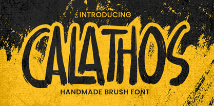 Introducing Calathos– Handmade Brush Font is a Signature Style and classy style, this font is great for your creative projects such as watermark on photography, and perfect for logos & branding, photography, invitation, watermark,advertisements,product designs, stationery, wedding designs,label ,product packaging, special events or anything that need handwritting taste. Calathos a natural handwritten feel. This handmade font will make your design has a beautiful natural touch for each details. It is perfect for any design project as Invitation,logo, book cover, craft or any design purposes. photos, photography overlays, signs, window art, scrapbooking, tags and so much more!
 - Torio by DSType,
$55.00 Our main purpose while developing this typeface was to reconstruct, in the most precise way, the first ten plates of the “Arte de Escribir”, in a chapter named “Enseñanza de la letra italiana, y sus principales variaciones, autores, sistemas, &c.”, dedicated to the analysis of the Italian Script. We decided by this plates because those are the few that don’t refer, directly or indirectly, to any author in particular. We strongly believe that these plates reflect the freedom of his very own calligraphy and are closely related to the calligraphic style that was a success among the spanish calligraphers: the Spanish Bastarda.


