10,000 search results
(0.05 seconds)
- Curwen Sans by K-Type,
$20.00 Curwen Sans is a monoline sans-serif dating from the early twentieth century. Though contemporary with Johnston’s Underground and Gill Sans, and emerging from the same artistic milieu, Curwen Sans was created solely for in-house use at the Curwen Press in London so never achieved a wide audience or recognition. The original face was cut only in a Medium weight, but the new digital family consists of four weights, each with an optically corrected Oblique, and all containing a full complement of Latin Extended-A characters. K-Type Curwen Sans comprises three packages: • Basic Family (Regular, Oblique, Bold, and Bold Oblique) • Light (Light and Light Oblique) • Medium (Medium and Medium Oblique)
 - Printers Lot JNL by Jeff Levine,
$29.00 Printers Lot JNL is another eclectic mix of cartoons, ornaments, catch words, decorations and embellishments re-drawn from vintage source material used in the days of letterpress printing. For those who like to assemble their own larger borders, a set of elements is on the 2-9 keystrokes, but it must be noted that some manual adjustment is necessary to line up all of the parts in a complete border pattern. From a Happy New Year greeting to whimsical cartoon characters; from singular ornamental design elements to beautiful brackets, this mix of subjects is a great overview of the kinds of cuts found in printers' job case drawers in years gone by.
 - Minimal Nahidha by Attype Studio,
$19.00 Minimal Nahidha is a minimalist sans serif typeface with a casual and trendy outlook. Minimal Nahidha was built to balance the geometric qualities of a san-serif typeface with all the benefits of traditional serif fonts, like readability and personality. Minimal Nahidha comes in Regular and Slant version, each with its own unique set of characters & it has ligatures and stylistic alternates that make it easy to customize your designs. The fonts works best as display typefaces or as beautiful headline fonts, but can also be used in other ways to create stunning designs. Features : - Minimal Nahidha Family Font - Ligatures - Stylistic Alternates - Multilingual, US Roman, Latin 1 Support Hope you enjoy with our font! Attype Studio
 - TF Bleedwax by Teenage Foundry,
$19.00 TF Bleedwax Font - an eerie and spine-chilling typeface perfectly suited for Halloween-themed designs. This font exudes a horror style, created specifically to send shivers down your spine. Each letter is meticulously crafted to resemble dripping blood, giving your designs a blood-curdling and macabre feel. With its gory and unsettling appearance, "TF Bleedwax" font is sure to add a terrifying touch to any Halloween project, horror movie poster, haunted house flyer, or spooky party invitation. Let this font unleash a wave of fear and make your designs stand out in the dark and creepy night. Multilingual contained: Afrikaans, Albanian, Asu, Basque, Bemba, Bena, Breton, Catalan, Chiga, Cornish, Danish, Dutch, English, Estonian, Filipino, Finnish, French, Friulian, Galician, German, Gusii, Indonesian, Irish, Italian, Kabuverdianu, Kalenjin, Kinyarwanda, Luo, Luxembourgish, Luyia, Machame, Makhuwa-Meetto, Makonde, Malagasy, Manx, Morisyen, North Ndebele, Norwegian Bokmål, Norwegian Nynorsk, Nyankole, Oromo, Portuguese, Quechua, Romansh, Rombo, Rundi, Rwa, Samburu, Sango, Sangu, Scottish Gaelic, Sena, Shambala, Shona, Soga, Somali, Spanish, Swahili, Swedish, Swiss German, Taita, Teso, Uzbek (Latin), Volapük, Vunjo, Zulu. For any questions please contact me 🙂 Thanks!
 - Permanent Park by Wing's Art Studio,
$16.00 Permanent Park - 1990s Graffiti Inspired Marker Pen Font A hand-drawn marker pen font inspired by graffiti tags and 1990s Hip Hop. Permanent Park is a marker pen font with a graffiti tag aesthetic inspired by the golden-age of Hip Hop and 1990s TV shows. It’s 100% hand-drawn and comes packed with alternative characters for creating truly natural looking type treatments. No repeated oo’s, ee’s and ll’s that are a dead give-away of lazy lettering! Permanent Park is a highly customisable all-caps design featuring a complete set of uppercase and lowercase characters, along with numerals, punctuation and language support. It also features a complete set of alternatives with additional lowercase characters (for mixing things up even more), and a selection of underlines and symbols for an illustrative flourish. It’s a uniquely fun, urban looking font, typical of 90s music videos and TV shows, and equally suited to sports, travel and food themes. Check out my visuals for ideas on how you might use it on posters, movie titles, product packaging, broadcast and advertising.
 - Break Brush by Blankids,
$24.00 Hello, Are you looking for a wild brush font? Do you want of creating Something that stand out and inspire creativity, imagination, and endless fun? Wait no more, we will give you the best choice. Break brush a Wild brush Font Break brush a Wild brush Font, Inspiring from brush lettering style typography. This font is perfect for a design that makes it more attractive and playful. made with a very good level of aesthetics making this font suitable for book cover, poster, packging, merchandise, logotype and much more. Break brush font includes Multilingual Support, among others : Afrikaans, Albanian, Asu, Basque, Bemba, Bena, Breton, Catalan, Chiga, Cornish, Danish, Dutch, English, Estonian, Faroese, Filipino, Finnish, French, Friulian, Galician, German, Gusii, Indonesian, Irish, Italian, Kabuverdianu, Kalenjin, Kinyarwanda, Luo, Luxembourgish, Luyia, Machame, Makhuwa, Meetto, Makonde, Malagasy, Manx, Morisyen, North Ndebele, Norwegian Bokmål, Norwegian Nynorsk, Nyankole, Oromo, Portuguese, Quechua, Romansh, Rombo, Rundi, Rwa, Samburu, Sango, Sangu, Scottish Gaelic, Sena, Shambala, Shona, Soga, Somali, Spanish, Swahili, Swedish, Swiss German, Taita, Teso, Uzbek (Latin), Volapük, Vunjo, Zulu FEATURES : Uppercase Lowercase Number Punctuation Multilingual PUA Encode Opentype
 - Novety Script by Mans Greback,
$59.00 Novety Script is a quirky script typeface, drawn and created by Mans Greback. It has a great contrast, with bold calligraphic curves and hair thin conjunctions, giving the lettering a juicy, swirly appearance. Use underscore _ anywhere in a word to make a swash. Example: Nov_ety Use multiple underscore to make different swashes. Example: Cute___ness (Download required.) Optimized for logotype and header usage, Novety Script works great for product branding or as a signature, or for a beautiful wallpaper quote graphic. It has a modern style and a strong personality to make it stand out. Novety Script is provided in four styles: Regular, Italic, Bold and Bold Italic. The font is built with advanced OpenType functionality and has a guaranteed top-notch quality, containing stylistic and contextual alternates, ligatures and more features; all to give you full control and customizability. It has extensive lingual support, covering all Latin-based languages, from North Europe to South Africa, from America to South-East Asia. It contains all characters and symbols you'll ever need, including all punctuation and numbers.
 - Clarkson by Krafted,
$10.00 Whether you’re promoting your business, designing merchandise, or creating a new social media campaign, good presentation is crucial. The font you choose plays a key role – it completely shapes your audience’s reaction. Introducing Clarkson – A Retro Brush Script Font. Perfectly balanced between power and refinement, this handcrafted font delivers your message with style. The modern take on the retro design makes it ideal for branding, business cards, presentations, logos, clothing, packaging, banners, ads, and much, much more. What you’ll get: Multilingual & Ligature Support Full sets of Punctuation and Numerals Compatible with: Adobe Suite Microsoft Office KeyNote Pages Software Requirements: The fonts that you’ll receive in the pack are widely supported by most software. In order to get the full functionality of the selection of standard ligatures (custom created letters) in the script font, any software that can read OpenType fonts will work. We hope you enjoy this font and that it makes your branding sparkle! Feel free to reach out to us if you’d like more information or if you have any concerns.
 - Isabel Condensed by Letritas,
$30.00 Isabel Condensed and Isabel were made out of necessity to create a new font for children and teenagers, that could be enough friendly and versatile for text in words or even easy-to-read long texts. The purpose of Isabel is to combine all the nice and friendly features of the simple letters that the teachers teach to the pupils at primary school, as they starting to learn to read, together with the normal editorial fonts we read every day. In this way it generates a very joyful serif font, or even friendly font, with some conservative aspects. In other words, Isabel is a font that, despite of being a “classic features” typography, is proud to show its innocent and ingenuous elements, this gives to the font a new point of view. The family is composed of 3 parts: the regular version, the italic version and the unicase version. Each one of them has 5 weights. The italic version has 825 characters; the regular and unicase have 739 and are composed for 220 latin languages, plus cyrilic.
 - Detective Client JNL by Jeff Levine,
$29.00 There is no doubt that the 1941 version of “The Maltese Falcon” was superior to the prior two attempts by Warner Brothers at filming Dashiell Hammett’s 1930 novel. Sam Spade was perfectly portrayed by Humphrey Bogart, and the supporting cast of Mary Astor, Peter Lorre, Sidney Greenstreet and Elisha Cook, Jr. rounded out the main players in a great suspense film that is considered to be the first (if not one of the first) of the film noir genre. The title cards for the production and cast credits were hand-lettered in a spurred serif type style strongly reminiscent of the Art Nouveau period, so instead of naming the digital version with some “tough guy detective” moniker, it was decided that Detective Client JNL was more appropriate. After all, this is a reasonably attractive font, and in this kind of film it’s usually the “attractive damsel in distress” [be she the victim or the actual perpetrator] that gets the story rolling… Detective Client JNL is available in both regular and oblique versions.
 - Bernhard Gothic SG by Spiece Graphics,
$39.00 This design is one of the true gems to come out of the 1930s typeface era. Even though the face was originally designed to counter the invasion of European sans-serifs, it remains faithful to the principles found in its creator's poster work. Lucian Bernhard's lettering creation for American Type Founders is to this day a favorite among font connoisseurs worldwide. It has a unique personality. This deluxe version is packed with extras including the original oldstyle figures, alternates, and ligatures. A number of styles and alternate characters have been added to the family such as heavy italics, extra heavy italics, and capital figures. And an easier-to-identify "flagged" figure one and the new euro symbol are now located in each individual style. Bernhard Gothic is also available in the OpenType Std format. Lining and oldstyle figures, stylistic alternates, and additional discretionary ligatures are now combined in each style. These advanced features currently work in Adobe Creative Suite InDesign, Creative Suite Illustrator, and Quark XPress 7. Check for OpenType advanced feature support in other applications as it gradually becomes available with upgrades.
 - Subway Hunter by Variatype,
$24.00 Waltowns is a dynamic and expressive typeface that captures the essence of street art with its bold and energetic design. The letters are characterized by organic shapes, reminiscent of marker strokes on urban surfaces. The font exudes a raw and brave vibe, reflecting the spirit of graffiti culture. The font includes a diverse set of characters, allowing for creative and eye-catching compositions. Whether you’re designing posters, album covers, or any other graphic project, Waltowns inject a sense of urban attitude and artistic edge. Its versatility makes it suitable for a wide range of applications, making your designs stand out in the crowd. Waltowns is not just a font; it’s a statement. It represents expression, the vibrancy of the streets, and the bold creativity that defines graffiti art. Use Waltowns to bring a touch of urban authenticity to your design projects and let your creativity run wild on the walls of the digital world. FONT FEATURES Additional Accents 68 Languages Kerning SOFTWARE RECOMMENDATION Adobe Photoshop CC 2020 or later Adobe Illustrator CC 2020 or later
 - Protrakt Variable by Arkitype,
$10.00 Protrakt is inspired by city life and sport. It has been designed as a variable font and is best to use as a variable font to get the full enjoyment of using this typeface. However, if you do not have access to variable technology through your software, there are nine widths in the font family so this will give you just as much access to the creativity this font can provide. By using the variable sliders in your design software you have a range of weight and width options. Play around with individual letters to give your type a unique look. Included in this family are alternate characters to add even more styling options. *Unfortunately there is no option to test out the variable capabilities on MyFonts as yet. Please have a look at the poster images to get a great idea of how I have used this font. By using the variable version you only need to install one font file instead of the entire family, this saves space and time to manually select individual styles.
 - Dark Brush by Blankids,
$20.00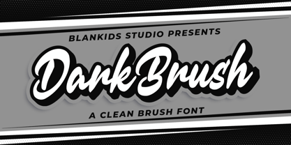 Hello, Are you looking for a clean brush script font? Do you want of creating Something that stand out and inspire creativity, imagination, and endless fun? Wait no more, we will give you the best choice. Dark brush a Clean Brush Font Dark brush a Clean Brush Font, Inspiring from brush lettering style typography. This font is perfect for a design that makes it more attractive and playful. made with a very good level of aesthetics making this font suitable for book cover, poster, packging, merchandise, logotype and much more. Dark brush font includes Multilingual Support, among others : Afrikaans, Albanian, Asu, Basque, Bemba, Bena, Breton, Catalan, Chiga, Cornish, Danish, Dutch, English, Estonian, Faroese, Filipino, Finnish, French, Friulian, Galician, German, Gusii, Indonesian, Irish, Italian, Kabuverdianu, Kalenjin, Kinyarwanda, Luo, Luxembourgish, Luyia, Machame, Makhuwa, Meetto, Makonde, Malagasy, Manx, Morisyen, North Ndebele, Norwegian Bokmål, Norwegian Nynorsk, Nyankole, Oromo, Portuguese, Quechua, Romansh, Rombo, Rundi, Rwa, Samburu, Sango, Sangu, Scottish Gaelic, Sena, Shambala, Shona, Soga, Somali, Spanish, Swahili, Swedish, Swiss German, Taita, Teso, Uzbek (Latin), Volapük, Vunjo, Zulu FEATURES : Uppercase Lowercase Number Punctuation Multilingual PUA Encode Opentype
 - Alstera by Adam Fathony,
$16.00 Alstera is an Oblique Serif Modern Display Type. Inspired by a luxurious & elegant brand that use minimalist design language. Alstera created in a simplicity, a minimalist, luxury and also looks elegant. Designed for a Display fonts that perfectly fits for Headlines, Logo, Branding, Packaging, T-shirt, or any design with a stand out or big typography. Alstera Comes with an option for alternate characters Uppercase and Lowercase. It's great when use for Title Case or Sentence Case. Ligatures are also available on the capital combination letters. Language Support : Afrikaans, Albanian, Asu, Basque, Bemba, Bena, Catalan, Chiga, Cornish, Danish, Dutch, English, Estonian, Faroese, Filipino, Finnish, French, Friulian, Galician, Ganda, German, Greek, Gusii, Icelandic, Indonesian, Irish, Italian, Jola-Fonyi, Kabuverdianu, Kalenjin, Kinyarwanda, Low German, Luo, Luxembourgish, Luyia, Machame, Makhuwa-Meetto, Makonde, Malagasy, Malay, Manx, Morisyen, North Ndebele, Norwegian Bokmål, Norwegian Nynorsk, Nyankole, Oromo, Portuguese, Romansh, Rombo, Rundi, Rwa, Samburu, Sango, Sangu, Scottish Gaelic, Sena, Shambala, Shona, Soga, Somali, Spanish, Swahili, Swedish, Swiss German, Taita, Teso, Vunjo, Welsh, Western Frisian, Wolof, Zulu Thank You !
 - Jackloft by Mofr24,
$11.00 Introducing Jackloft, the ultimate display font for all your design needs! With its energetic and bold brush textured style, Jackloft is perfect for advertising, headlines, posters, thumbnails, and much more. What makes Jackloft unique is its ability to stand out in any design while still maintaining legibility. This font includes a full set of uppercase and lowercase letters, numbers, and punctuation marks. It pairs well with sans-serif fonts for a modern look or can be paired with other brush script fonts for a cohesive design. The design concept behind Jackloft was to create a font that could convey a sense of energy and excitement while still being readable. The brush textured style gives the font a handcrafted feel, making it perfect for designs that require a personal touch. Jackloft is not a revival or based on a historical design. Instead, it was created to fill a gap in the market for a display font that was both bold and legible. So, whether you're designing a poster or creating a social media graphic, Jackloft has got you covered!
 - ND Kern by NeueDeutsche,
$17.50 Introducing ND Kern, a contemporary geometric sans-serif font that blends classic elegance with modernity. This versatile typeface is perfect for branding, advertising, editorial design, and any project that requires a clean, stylish look. With its tall x-height and clean, modern letterforms, ND Kern is ideal for headlines, titles, and short blocks of text. Its sleek and minimalistic design, combined with unique details that draw inspiration from Cyrillic script, makes it a perfect choice for modern and sophisticated designs. ND Kern includes a full set of uppercase and lowercase letters, numerals, punctuation, and multilingual support for both Latin and Cyrillic scripts. The font family also comes with a range of OpenType features, including ligatures, alternate characters, and stylistic sets, which offer even more design possibilities. Whether you're creating a minimalist logo, a trendy fashion campaign, or an edgy editorial spread, ND Kern is the font you need to stand out. With its balance of classic and modern design elements, influenced by both Latin and Cyrillic scripts, ND Kern is a versatile choice that will add a touch of sophistication to any project.
 - Inbadge by Blankids,
$30.00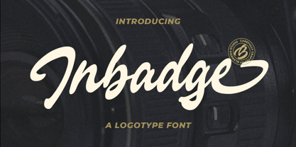 Hello, Are you looking for a modern trandy script font? Do you want of creating Something that stand out and inspire creativity, imagination, and endless fun? Wait no more, we will give you the best choice. Inbadge a Branding Logotype Font Inbadge a Branding Logotype Font, Inspiring from brush lettering style typography. This font is perfect for a design that makes it more attractive and playful. made with a very good level of aesthetics making this font suitable for book cover, poster, packging, merchandise, logotype and much more. Inbadge font includes Multilingual Support, among others : Afrikaans, Albanian, Asu, Basque, Bemba, Bena, Breton, Catalan, Chiga, Cornish, Danish, Dutch, English, Estonian, Faroese, Filipino, Finnish, French, Friulian, Galician, German, Gusii, Indonesian, Irish, Italian, Kabuverdianu, Kalenjin, Kinyarwanda, Luo, Luxembourgish, Luyia, Machame, Makhuwa, Meetto, Makonde, Malagasy, Manx, Morisyen, North Ndebele, Norwegian Bokmål, Norwegian Nynorsk, Nyankole, Oromo, Portuguese, Quechua, Romansh, Rombo, Rundi, Rwa, Samburu, Sango, Sangu, Scottish Gaelic, Sena, Shambala, Shona, Soga, Somali, Spanish, Swahili, Swedish, Swiss German, Taita, Teso, Uzbek (Latin), Volapük, Vunjo, Zulu FEATURES : Uppercase Lowercase Number Punctuation Multilingual PUA Encode Opentype
 - American Brush by Blankids,
$20.00 Hello, Are you looking for a brush font? Do you want of creating Something that stand out and inspire creativity, imagination, and endless fun? Wait no more, we will give you the best choice. American Brush a Modern Brush Font, Inspiring from lettering brush style typography. This font is perfect for a design that makes it more attractive and playful. made with a very good level of aesthetics making this font suitable for book cover, poster, packging, merchandise, logotype and much more. American Brush font includes Multilingual Support, among others : Afrikaans, Albanian, Asu, Basque, Bemba, Bena, Breton, Catalan, Chiga, Cornish, Danish, Dutch, English, Estonian, Faroese, Filipino, Finnish, French, Friulian, Galician, German, Gusii, Indonesian, Irish, Italian, Kabuverdianu, Kalenjin, Kinyarwanda, Luo, Luxembourgish, Luyia, Machame, Makhuwa, Meetto, Makonde, Malagasy, Manx, Morisyen, North Ndebele, Norwegian Bokmål, Norwegian Nynorsk, Nyankole, Oromo, Portuguese, Quechua, Romansh, Rombo, Rundi, Rwa, Samburu, Sango, Sangu, Scottish Gaelic, Sena, Shambala, Shona, Soga, Somali, Spanish, Swahili, Swedish, Swiss German, Taita, Teso, Uzbek (Latin), Volapük, Vunjo, Zulu FEATURES : Uppercase Lowercase Number Punctuation Multilingual PUA Encode Opentype
 - Hivives by IbraCreative,
$17.00 Hivives – A Geometric Sans Serif Typeface Hivives is a contemporary geometric sans serif typeface that embodies a harmonious balance between precision and warmth. With its clean, straight lines and minimalist design, this typeface exudes a modern aesthetic while maintaining a sense of approachability. The geometric construction of Hivivies lends it a distinct and timeless quality, making it versatile for a wide range of design applications. The letterforms are characterized by consistent stroke widths, sharp angles, and well-defined geometric shapes, resulting in a visually cohesive and sophisticated appearance. Hivives stands out as a stylish choice for branding, editorial design, and digital interfaces, where its crisp and clear lettering contributes to a polished and contemporary visual identity. Hivives is perfect for branding projects, logo, wedding designs, social media posts, advertisements, product packaging, product designs, label, photography, watermark, invitation, stationery, game, fashion and any projects. Fonts include multilingual support for; Afrikaans, Albanian, Czech, Danish, Dutch, English, Estonian, Finnish, French, German, Hungarian, Italian, Latvian, Lithuanian, Norwegian, Polish, Portuguese, Slovak, Slovenian, Spanish, Swedish.
 - Soda Fountain JNL by Jeff Levine,
$29.00 In most cities during the 1950s and 1960s the corner pharmacy or soda shop was a mainstay of teenage life. It was a place to hang out with friends, hear the latest hits on the jukebox and indulge in everything sugary from malted milkshakes to banana splits. During this time, a popular form of window advertising was supplied by the Coca-Cola Company to promote its product being served by these locations. Specialty window decals designed to emulate drawn (raised) Venetian blinds "bookmarked" by the soda's logo were adhered to the shop's windows, with a space provided to add in customized lettering. The store's name or its specialties were applied to each window pane, and this formed a consistent border at the top of all of the shop's windows. Although few visual images exist of this specific bit of advertising nostalgia, an old record album by a late-1950s singer named Chip Fisher called "Chipper at the Sugar Bowl" provided a somewhat usable sample for what is now Soda Fountain JNL.
 - Rantic Kafis by Product Type,
$17.00 Introducing Rantic Kafis, a classic modern font with a bold and elegant touch. This font features thick strokes and rounded edges, giving it a distinctive and sophisticated look. With its stylistic set options for upper and lowercase letters, Rantic Kafis adds a touch of individuality and creativity to any design. Rantic Kafis is the perfect font to add a classic modern feel to your work. Its thick strokes and rounded edges make it highly legible, ensuring that your designs are easy to read and understand. So if you’re looking for a font that combines the best of classic and modern design, look no further than Rantic Kafis. Download it now and start creating stunning designs that stand out from the crowd! What’s Included : - File font - All glyphs Iso Latin 1 - We highly recommend using a program that supports OpenType features and Glyphs panels like many Adobe apps and Corel Draw, so you can see and access all Glyph variations. - PUA Encoded Characters – Fully accessible without additional design software. - Fonts include Multilingual support
 - Kit Cloudkicker by Anastasia Kuznetsova,
$19.00 I present to you the universal everyday font 'Kit Cloudkicker'!! This font is very versatile and can be used in various styles of projects where a fast relaxed handwritten font is required. Filled with fun and energetic brush strokes, this font will undoubtedly add a touch of playfulness to your text - perfect for greeting cards, branding, merchandise, invitations and handmade quotes! The 'Kit Cloudkicker' font is so easy to use and create completely unique, hand-made words every time. It looks so great!! Font Features A-Z; a-z character set; 1 language (English); numbers and punctuation marks, symbols. A font containing uppercase and lowercase letters, numbers, and a wide range of punctuation marks. Fonts can be opened and used in any software that can read standard fonts, even in MS Word. No special software is required, and to get started. It is recommended to use it in Adobe Illustrator or Adobe Photoshop Made with love and magic ♡ Thanks for checking it out, and feel free to drop me a message if you had any queries! ~ Anastasia
 - Reglest by Blankids,
$25.00 Hello, Are you looking for a modern Natural handlettering script font? Do you want of creating Something that stand out and inspire creativity, imagination, and endless fun? Wait no more, we will give you the best choice. Reglest a Natural Handlettering Font Reglest a Natural Handlettering Font, Inspiring from brush lettering style typography. This font is perfect for a design that makes it more attractive and playful. made with a very good level of aesthetics making this font suitable for book cover, poster, packging, merchandise, logotype and much more. Reglest font includes Multilingual Support, among others : Afrikaans, Albanian, Asu, Basque, Bemba, Bena, Breton, Catalan, Chiga, Cornish, Danish, Dutch, English, Estonian, Faroese, Filipino, Finnish, French, Friulian, Galician, German, Gusii, Indonesian, Irish, Italian, Kabuverdianu, Kalenjin, Kinyarwanda, Luo, Luxembourgish, Luyia, Machame, Makhuwa, Meetto, Makonde, Malagasy, Manx, Morisyen, North Ndebele, Norwegian Bokmål, Norwegian Nynorsk, Nyankole, Oromo, Portuguese, Quechua, Romansh, Rombo, Rundi, Rwa, Samburu, Sango, Sangu, Scottish Gaelic, Sena, Shambala, Shona, Soga, Somali, Spanish, Swahili, Swedish, Swiss German, Taita, Teso, Uzbek (Latin), Volapük, Vunjo, Zulu FEATURES : Uppercase Lowercase Number Punctuation Multilingual PUA Encode Opentype
 - Brekgu by Twinletter,
$17.00 Brekgu is ideal for projects that require a futuristic, sci-fi, or high-tech atmosphere. This typeface has a unique, modern appearance and includes features such as ligature, alternative, and multilingual support. Brekgu allows you to give your designs a bold, dynamic, and attractive style. The letters’ unusual and futuristic shape will make your project stand out from the crowd. Brekgu, when combined with ligatures and alternates, will aid in the creation of incredibly unique and eye-catching designs. Brekgu is bilingual and adaptable to different languages, allowing you to utilize it for a wide range of worldwide design projects. Don’t pass up the opportunity to use this powerful and stylish font for your creations! What’s Included : - File font - All glyphs Iso Latin 1 - Alternate, Ligature - Simple installations - We highly recommend using a program that supports OpenType features and Glyphs panels like many Adobe apps and Corel Draw so that you can see and access all Glyph variations. - PUA Encoded Characters – Fully accessible without additional design software. - Fonts include Multilingual support
 - Hostilica by Heypentype,
$20.00 Hostilica is a semi-serif family designed by mixing classic serifs in the age of romanticism era with contemporary modern shape and curves. It gives a warm, friendly, and inviting feeling without losing a formality of text fonts. Every weight was designed carefully to provide a unique look while maintained the unity of the type family. A thin weight gives your content an elegant, luxurious design feel. While the regular weight, designed for body text, gives your content a warm and friendly design feel. The bold weight will make your headlines stand-out with its fat counters and curves. Therefore, Hostilica will accomodate all your design needs, from text to display, from catchy to luxury. The italics of each weight will spice up your design project especially with letter 'f,s,r,k, and y'. Those italic versions paired with alternate and discretional ligatures will add an organic feeling to your designs. The italic styles are designed by emulating a handwriting stroke, and will give a more personal feel while still maintained a formal sense.
 - Saturday Champagne by Roland Hüse Design,
$18.00 SATURDAY CHAMPAGNE is a monoline modern calligraphy script. Perfect for titles, headings and logotypes for blogs, ads, quote prints, home decor, book title, invitation, birthday, custom product, lifestyle imagery (like quotes and stuff). This font is written by the amazing hand letterer and fellow artist of mine, Leah Chong, and is a collaboration project. The character set contains Western and Eastern European accents and extra characters, symbols and the following open type features: Ligatures: ff ll oo rr th tt ty Finals: b c d l g p y z Instagram: @leahdesign @rolandhusedesign https://leahdesign.sg https://rolandhuse.com Awesome background image for main poster by Simon Buchou from Unsplash https://unsplash.com/@simon_buchou Background mock ups for Girls Night Out and White Sea Cosmetics are from graphicburger.com http://graphicburger.com The Quote "Reality aligns with your mindset" is my favorite and is from Matt Lopez from the Lambo Goal podcast, picture is taken and photoshopped by me. Thank you I hope you like this font & good luck with your project! Roland
 - Isabel SemiCondensed by Letritas,
$30.00 Isabel SemiCondensed, together with Isabel condensed and Isabel were made out of necessity to create a new font for children and teenagers, that could be enough friendly and versatile for text in words or even easy-to- read long texts. The purpose of Isabel is to combine all the nice and friendly features of the simple letters that the teachers teach to the pupils at primary school, as they starting to learn to read, together with the normal editorial fonts we read every day. In this way it generates a very joyful serif font, or even friendly font, with some conservative aspects. In other words, Isabel is a font that, despite of being a “classic features” typography, is proud to show its innocent and ingenuous elements, this gives to the font a new point of view. The family is composed of 3 parts: the regular version, the italic version and the unicase version. Each one of them has 5 weights. The italic version has 825 characters; the regular and unicase have 739 and are composed for 220 latin languages, plus cyrilic.
 - Luminaire by Muksal Creatives,
$17.00 Luminaire is an intriguing and modern sans serif font. With its clean and minimalist characteristics, Luminaire exudes a professional and contemporary impression when used in designs. One of the captivating features of Luminaire is its alternate style, specifically the display style. This unique feature allows users to combine two different styles within a single word, creating a distinct and eye-catching visual appearance. In display mode, Luminaire offers experimental and striking variations of letterforms. Certain characters exhibit alternative shapes with artistic touches, such as curved lines or changes in the basic structure of the letters. This grants greater design flexibility and makes words written in Luminaire font stand out. Luminaire also maintains the essential aspects of clarity and legibility expected from a sans serif font. When used in longer texts or paragraphs, this font remains easy to read and provides a professional and well-organized appearance.Overall, Luminaire is an appealing sans serif font with a modern style and a unique alternate style feature. It can add artistic touches and uniqueness to your designs while preserving the important aspects of clarity and legibility.
 - Hello Honey by Krafted,
$10.00 Looking for a font that’ll make your branding sparkle? A versatile, modern, and happy font? Introducing Hello Honey - A Bold Script Font. This bold script font can be used for various different promotions or projects. Use it to create standout headings, promote your online sales, Instagram quotes, YouTube vlogs, and even printed materials like business cards, t-shirts, or invitations. Get ready to attract your audience and make your branding bold with Hello Honey. What you’ll get: Multilingual & Ligature Support Full sets of Punctuation and Numerals Compatible with: Adobe Suite Microsoft Office KeyNote Pages Software Requirements: The fonts that you’ll receive in the pack are widely supported by most software. In order to get the full functionality of the selection of standard ligatures (custom created letters) in the script font, any software that can read OpenType fonts will work. We hope you enjoy this font and that it makes your branding sparkle! Feel free to reach out to us if you’d like more information or if you have any concerns.
 - Mingo Gothic SG by Spiece Graphics,
$39.00 This typeface appears to be straight out of a science fiction movie thriller. Mingo is a slightly condensed, somewhat vain gothic with thick vertical strokes proudly tapering downward. Capitals which are normally completely round are now square inside with curving outside corners. Lowercase letters carry the same design traits. And, in the capital A and H, crossbars extend on both sides helping give the face a pronounced retro look. Mingo Gothic is a close cousin to Raleigh Gothic and is an excellent choice for book covers and large display settings. Small caps, fractions, and alternate characters have also been developed for greater layout versatility. Mingo Gothic Bold is now available in the OpenType format. Some new characters have been added to this OpenType version as stylistic alternates, historical forms, small caps, oldstyle figures, ornaments, and f-ligatures. These advanced features work in current versions of Adobe Creative Suite InDesign, Creative Suite Illustrator, and Quark XPress. Check for OpenType advanced feature support in other applications as it gradually becomes available with upgrades.
 - Metub by Twinletter,
$17.00 Introducing Metub, the superhero display font with a unique and powerful serif style that’s sure to make your designs stand out. Each letter is meticulously crafted to convey strength and individuality, making this font the perfect choice for bold and impactful projects. With 52 stylish alternate characters and 32 beautifully designed ligatures, Metub offers endless design possibilities that are sure to elevate your work to new heights. Whether you’re designing posters, logos, or branding materials, Metub is the ideal font for any project that demands a strong and unique aesthetic. And with multilingual support, this font is perfect for projects with a global reach. Give your designs a powerful edge with Metub today. What’s Included : - File font - All glyphs Iso Latin 1 - Alternate, Ligature - Simple installations - We highly recommend using a program that supports OpenType features and Glyphs panels like many Adobe apps and Corel Draw so that you can see and access all Glyph variations. - PUA Encoded Characters – Fully accessible without additional design software. - Fonts include Multilingual support
 - View Roman Black - Personal use only

- URLOP by Mikołaj Grabowski,
$9.00 Colour is more fun than black, but multicolour is even better. Let me introduce URLOP, a wide type family suitable for your fancy posters, headlines, covers, illustrations, websites, initials, blackmails, chronicles, signboards, poems and many others. Twelve basic styles, which make the overall construction, give a wide range of opportunities. All of them, being able to mix with each other, vary from a thin INSIDE, through a medium FILL, to a double-stem PLUS styles. And then comes a range of colour fonts, so you don’t have to waste any of your precious time for experiments, because I’ve already done it for you! URLOP is an all-caps display collection consisting of three sub-families of fonts, divided by the usage they are designed for. First of all, there is a wide range of alphabets made in the new OpenType-SVG colour fonts format. This is quite a novelty and a very promising technology at the same time. It allows designers to store colour information inside the font. Due to my experience with layered colour thinking that I explored in my first family - Epilepsja , I decided to make several preset layer combinations in this auspicious format. This sub-group is tagged RGB. Make sure that your field of usage and software support OT-SVG format. However, if you feel a need to experiment in the old-fashioned way, you may buy separate layers under the DIY tag. The last group is very similar to the DIY, but it was optimized to look better when standing without other layers. It’s called PRO*. All styles cover Latin alphabets of Europe, basic Cyrillic and Greek sets. Have fun! Before using the font, read the instructions and specimen attached to font files in the purchased package or download them from the Gallery tab on this site. This will help you avoid making unexpected mistakes when combining layers. *PRO subfamily release planned in 2019.
 - C-Nation by URW Type Foundry,
$39.99 Marit Otto about C-Nation: The building typeface. Although the 70ties were very liberating and progressive, still girls played mainly with dolls and sweet things and boys with all kinds of challenging stuff. They did all sorts of basic scientific experiments in mini labs and of course built cool things with Meccano building sets. As a girl I was perfectly happy with the toys I had access to. But at the same time I was very curious about all the adventure toys and discoveries my brother did. It also made me wonder why the grown up people thought that our world could be separated so easily by separating our toys in pink and blue sections. At this day of age Meccano is probably hopelessly old fashioned and far to manual. Children of today are fed by fast images and cool animations on screen, they learn, play, communicate and relax in the same space, the digital space. The special feature of Meccano was that even though it was very basic there was the promise you could create anything. It might even contribute to a logical mind. The typeface I designed refers to the Meccano feel. It is a creative typeface. A bit masculine and bold looking perhaps but after the first impression a subtle and refined female touch is revealed. It has links to architecture and associations with metal constructions like ‘The Eiffel Tower’ and (old railway) bridges. I am convinced that we all think of that as very charming man-made objects.
 - Symptomatic by Hanoded,
$15.00 No, rest assured - I am not ill. I just liked the letter combination of Symptomatic! Symptomatic is a messy connected brush script. Use if for your book titles, posters and product packaging. Comes with double letter ligatures and a whole lotta diacritics.
 - Ramelik by Letterena Studios,
$17.00 Proudly present Ramelik, a modern and classy black letter font that has a unique style and modern look. This typeface is perfect for an elegant & luxury logo, book or movie title design, fashion brand, magazine, clothes, lettering, quotes, and so much more. ** Uppercase
 - Toucan Tango JNL by Jeff Levine,
$29.00In the days before vinyl sign lettering overran the landscape, talented neighborhood sign painters and show card writers made attractive displays for local merchants. Toucan Tango JNL is Jeff Levine's interpretation of a sign painter's sans serif letter with a distinctive inline. - Home Address JNL by Jeff Levine,
$29.00 Some vintage Beacon metal door letters used for identifying addresses on home and business buildings was spotted in an online auction from England. Those few letters were the inspiration for Home Address JNL, which is available in both regular and oblique versions.
 - Da Mane by Tugrul Mustafa Gunaydin,
$15.00 DaMane Display combines the decorative design style used in the past and the minimal design used today. Simple lines, sharp and radius corners come together harmoniously in the letters. High contrast letters create an elegant visual perception. It has nearly 400 glyph sets.
