10,000 search results
(0.036 seconds)
- Agentic by Artisticandunique,
$55.00 Agentic Serif font family has 18 styles and multi-language support. It is ideal for creating your articles thanks to its easy readability. The combination of sharp corners and soft turns in the characters offers alternatives to create different moods in your projects. You can create creative and stylish designs with combinations of upper and lowercase letters in the title and text. This font helps you discover the best mood for your projects, from body text to big headlines, classic to modern and bold looks. Well suited for books and magazines, magazine covers, editorials, headlines, websites, logos, invitations, branding, advertisements and more.
 - Stempel Sans Print Neo by TypoGraphicDesign,
$9.00 The typeface Stempel Sans Print Neo is designed from 2022 for the font foundry Typo Graphic Design by Manuel Viergutz. The display font based on a original set of 29 old rubber stamps (6 cm height). Digitized via hand-stamped, a scanner and Glyphs app. 3 font-styles (Rough, Misprint, Black) with 321 glyphs incl. decorative extras like icons, arrows, dingbats, emojis, symbols, geometric shapes (type the word #LOVE for ♥︎or #SMILE for ☻ as OpenType-Feature dlig) and stylistic alternates (6 stylistic sets). For use in logos, magazines, posters, advertisement plus as webfont for decorative headlines. The font works best for display size. Have fun with this font & use the DEMO-FONT (with reduced glyph-set) FOR FREE! Font Specifications ■ Font Name: Stempel Sans Print Neo ■ Font Styles: 3 font styles (Rough, Misprint, Black) + DEMO (with reduced glyph-set) ■ Font Category: Display Script for headline size ■ Glyph Set: 321 glyphs (incl. decorative extras) ■ Language Support (36 languages): Asu Bemba Bena Chiga Cornish English German Gusii Indonesian Kalenjin Kinyarwanda Luo Luyia Machame Makhuwa-Meetto Makonde Morisyen North Ndebele Nyankole Oromo Rombo Rundi Rwa Samburu Sangu Shambala Shona Soga Somali Swahili Swiss German Taita Teso Uzbek (Latin) Vunjo Zulu ■ OpenType features (16): aalt calt case ccmp dlig liga lnum onum ss01 ss02 ss03 ss04 ss05 ss06 mark mkmk ■ Design Date: 2022 ■ Type Designer: Manuel Viergutz
 - Raw Street Wall by Volcano Type,
$25.00 The typeface Raw Street Wall is designed for the Typo Graphic Design font foundry from 2011–2017 by Manuel Viergutz. A playful display type for headlines with a street-art graffiti-style by hand. Rough-look plus state-of-the-art automatic generated OpenType-features (like contextual alternates (calt)). 567 glyphs with extras like emoticons/icons, arrows, dingbats, symbols, geomatric shapes, catchwords and many alternative letters. Multilingual support with 27 languages. Have fun with this font & try the DEMO-FONT (with reduced glyph-set) FOR FREE! Example of use It’s your turn … for example everywhere where it makes sense. Maybe for use in magazines, posters, headlines and advertisement, plus as webfont for decorative headlines. Technical Specifications ■ Font Name: Raw Street Wall ■ Font Weights: Regular + DEMO (with reduced glyph-set) ■ Font Category: Display for headline size ■ Font Format: .otf (OpenType Font for Mac + Win) + .ttf (TrueType Font) ■ Glyph Set: 567 glyphs ■ Language Support: 27: Afrikaans, Albanian, Catalan, Croatian, Czech, Danish, Dutch, English, Estonian, Finnish, French, German, Hungarian, Italian, Latvian, Lithuanian, Maltese, Norwegian, Polish, Portugese, Romanian, Slovak, Slovenian, Spanisch, Swedish, Turkish, Zulu ■ Specials: Extras like emoticons/icons, arrows, dingbats, symbols, geomatric shapes, catchwords and many alternative letters plus OpenType-Features. ■ Design Date: 2011–2017 ■ Type Designer: Manuel Viergutz ■ License: Desktop license, Web license, App license, eBook license, Server license
 - Aldero by R9 Type+Design,
$48.00 Aldero™ strives to be as useful to any design environment as Alder trees are to the forest. Wildlife and insects feed on Alder leaves and seeds. The tree also provides shelter for animals in winter while its shades keep streams from getting too hot in summer. The trunks and branches are excellent habitats for lichens and mosses. The nitrogen-rich leaves help fertilize the soil where they landed. Alder’s utilitarian nature inspires us to create Aldero™, a handy, versatile, go-to type family for all professional designers. To achieve what we set out to do, we gave Aldero™ the two-in-one looks, doubled the sets of ligatures, and loaded it with plenty more of Opentype features. We put in long hours, months after months, until we are proud of the outcome. And we truly believe that you will enjoy working with this typeface as much as we do. With five weights, ten styles, and 1,100+ glyphs per style, this versatile typeface comes with virtually two looks. The standard glyph set is perfect for formal, corporate design, while the stylistic alternate set elicits a fun, friendly, and casual feel. You can use each style separately or mix and match them to achieve your design aesthetic. Thanks to these options, a wide range of design possibilities are at your fingertips. In addition to the two large sets of ligatures (for both the standard and the stylistic glyph sets), we also pack tons of Opentype features into Aldero™ to improve your user experience while working with this typeface. To activate the case-sensitive features, for example, highlight the phrase with the type tool, then hit the “All Caps” button; or select each mark, punctuations, or symbols with the type tool, then choose the case-sensitive option from the Opentype popup window. Hope you enjoy working with Aldero™ as much as we do! To find out more about Aldero™ Opentype features and type specimen, please visit https://r9typedesign.com/aldero-features
 - Helvetica Now by Monotype,
$42.99 Every single glyph of Helvetica has been redrawn and redesigned for this expansive new edition – which preserves the typeface's Swiss mantra of clarity, simplicity and neutrality, while updating it for the demands of contemporary design and branding. Helvetica Now comprises 96 fonts, consisting of three distinct optical sizes: Micro, Text and Display, all in two widths. Each one has been carefully tailored to the demands of its size. The larger Display versions are drawn to show off the subtlety of Helvetica and spaced with headlines in mind, while the Text sizes focus on legibility, using robust strokes and comfortably loose spaces. The Micro sizes address an issue Helvetica has long faced – that of being 'micro type challenged'. In the past, the typeface struggled to be legible at tiny sizes because of its compactness and closed apertures. Helvetica Now's Micro designs are simplified and exaggerated to maintain the impression of Helvetica in tiny type, and their spacing is loose, providing remarkable legibility at microscopic sizes and in low-res environments. There's also an extensive set of alternates, which allow designers the opportunity to experiment with and adapt Helvetica's tone of voice. This includes a hooked version of the lowercase l (addressing a common complaint that the capital I and lowercase l are indistinguishable) as well as a rounded G, and a straight-legged R, a single storey a and a lowercase u without a trailing serif. In the past, designers had to nudge, trim and contort the design to create stylish display-type lockups with Helvetica. Helvetica Now Display was designed and spaced with those modifications in mind—saving effort and providing more consistent (and more stylish) results. “Helvetica is the gold standard,' says Monotype Type Director Charles Nix. “To use it is to claim that you are the ultimate expression of whatever your brand aspires to be. Its blankness is its power.” Helvetica Now User Guide PDF. Featured in: Best Fonts for Resumes, Best Fonts for Websites, Best Fonts for PowerPoints
 - MMC Insignia Pro by MMC-TypEngine,
$42.50 MMC INSIGNIA PRO, is an Iconic & Emblematic Neogothic Geometric Display… Assembled by Trivial Squares and Diagonals Symbols Pattern from a puzzled grid Aftermath!! Includes Small Caps & Stylistic Alternates!! +Extra Monospaced Figures. In 22 styles, with Obliques, both for single display and layer Typesetting, plus OpenType Features & Bonus Blocks Fonts! MMC Insignia Pro, is the cursive version of MMC Insignia and the default or main lowercases in ‘SC’ feature plus cursive stylistic alternates and sets such as Monospaced figures… Its atmosphere stands by on both Corporative to Decorative, Modern & Fashion, Federalist, Bohemian, Romantic, Ludic, Treasured Look, Etc. This Display font-family is the result of the repeated applications of this unique infamous Icon or Symbol, of two counterpointed triangles, implicit as hourglasses, in order to compose an innovative and unprecedented typographic pattern and modulation concept through the letterforms, in an extremely Geometric style. The Graphic Sign used throughout this type, is a remarkable trend used already in Logos of different businesses, whose most famous case refers to a famous International Bank, which doesn’t need to be mentioned, as it is instantly associated! This characteristic innovation was the main motivation while creating this type. Usage Suggestions: Type Fancy Titling texts, Display Remarkable Logos, Branding Projects, Labels, Emblems, Fashion Patterns, or in everything Noble and designed for Excellence as a type of Insignia, or distinguished marks and attributes of Royalty and Power!! That’s also forwardly, the reason why it was named MMC Insignia… TIPS: 1-Combine styles into innumerous possibilities of Chromatic Typesetting, by ‘central pasting’ layers… You may dislocate layers for improvisations! 2-USE BLOCK “FREE-STYLES” 1 & 2 also to add default 3D! Change 3D directions by switching Block 1 to Block 2, that way you can Zig-Zag words and lines. *Also shift the block layer up to bottom limit, it makes the 3D direction turn upside down. Greetings! André, MMC-TypEngine.
 - Weird Better by Heyfonts,
$15.00 Weird Better fonts are typography designs that imitate or simulate the appearance of liquids. They are often fluid and dynamic in nature, providing an illusion of movement and flow in letters and characters. Weird Better fonts can be created using different design techniques, including hand-drawn illustrations, digital effects, or 3D modeling software. Some common features of liquid fonts include: Fluid and dynamic appearance: Weird Better fonts have a free-flowing and organic appearance, mimicking the look and movement of liquids such as water, ink, or paint. Variations in thickness: The thickness of the lines and curves in Weird Better fonts can vary, creating an uneven and organic appearance. Versatile use: Weird Better fonts are commonly used in creative designs such as logos, album covers, and advertising campaigns to create an eye-catching and memorable visual impact. Overall, Weird Better fonts are a unique and creative way to portray text, giving a sense of energy, motion, and fluidity to design projects.
 - Liquidity by Heyfonts,
$15.00 Liquidity fonts are typography designs that imitate or simulate the appearance of liquids. They are often fluid and dynamic in nature, providing an illusion of movement and flow in letters and characters. Liquid fonts can be created using different design techniques, including hand-drawn illustrations, digital effects, or 3D modeling software. Some common features of Liquidity fonts include: Fluid and dynamic appearance: Liquidity fonts have a free-flowing and organic appearance, mimicking the look and movement of liquids such as water, ink, or paint. Variations in thickness: The thickness of the lines and curves in liquid fonts can vary, creating an uneven and organic appearance. Versatile use: Liquidity fonts are commonly used in creative designs such as logos, album covers, and advertising campaigns to create an eye-catching and memorable visual impact. Overall, Liquidity fonts are a unique and creative way to portray text, giving a sense of energy, motion, and fluidity to design projects.
 - Poipoi by Dharma Type,
$14.99 Extraordinary impact and visual conspicuousness. Poipoi is a super 3D sans family for posters, logos and all display. The basic idea is not a brand new. The Stacking type system has been used since before wood type age. As you imagined, colored wood type(woodcut), many other engravings and contemporary printer machine print many colors separately with different printing plates for each color. Poipoi uses the same system for 3d effect. Please use Photoshop or Illustrator, or your favorite graphic design apps that can handle layers. Layers are the printing plates of wood type. You should be able to change text color for each layer. Poipoi "Standard" style is the base of this font family. You can add effects by stacking Highlight and shadow layers. Stacked layers in different color make the text in 3D. Instruction 1. Type your text as you like. 2. Set font-name "Poipoi" and font-style "Standard" 3. Set color of "Standard" layer. 4. Duplicate the "Standard" layer twice (One for Highlight, one for Shadow). 4'. The layer order should be Highlight, Standard, and Shadow from top to bottom. 5. Set font-style and color of "Highlight" and "Shadow" layers. 6. Adjust tracking if you need. (Please use same tracking value for all 3 layers.) For further detail, https://www.dropbox.com/s/xymis7dh5hwxn9q/Poipoi.pdf Poipoi Standard, Highlighted, and shadowed style can be used solely. Rounded terminals add soft, cute, and casual impressions to your design. Spec: Over 400 glyphs! Basic Latin ✓ Western Europe ✓ Central Europe ✓ South Eastern Europe ✓ Mac Roman ✓ Windows 1252 ✓ Adobe Latin 1 ✓ Adobe Latin 2 ✓ Adobe Latin 3 ✓ Almost all Latins are covered.
 - Down Home JNL by Jeff Levine,
$29.00 In the October 31, 1920 edition of Wid's Daily (the predecessor to The Film Daily), a block of ad copy from a 1920 film called "Down Home" had the text printed in such a fluent pen-lettered style that a bit of a shortcut was used at the beginning of the design process for this typeface. Normally, font inspirations are redrawn [and not by simply using auto-trace] except under specialized circumstances like this one where that feature is a help, rather than a replacement for the creative process. The entire block of text copy was auto-traced, then the necessary letters were selected from the available wording and cleaned up to remove any sharp points and irregular curves in an effort to make the end results as close to the original and unusual hand-drawn text. From there the missing characters needed to produce a finished type font were created utilizing the standard methods of drawing and font construction. The end results turned out very well. Using the film's title as its namesake, this design is now available digitally as Down Home JNL in both regular and oblique versions.
 - Dinah by Anastasia Kuznetsova,
$24.00 I present to you the font "Dinah" - an elegant "two-faced" serif with both modern and vintage curves, which creates an incredible vintage aesthetic. Use this serif font to add that special retro touch to any design idea you can come up with! This font is able to take your every creative idea to a high level, providing you with many fascinating custom text compositions! Because of its split personality, Dinah is a very versatile font, covering a wide range of project types, from bold images in magazines to wedding invitations, branding, poster design and more. Font Features A-Z; a-z character set; ligatures 1 language (English); numbers and punctuation marks, symbols A font containing uppercase and lowercase letters, numbers, and a wide range of punctuation marks. Fonts can be opened and used in any software that can read standard fonts, even in MS Word. No special software is required, and to get started. It is recommended to use it in Adobe Illustrator or Adobe Photoshop Made with love ♡ Thanks for checking it out, and feel free to drop me a message if you had any queries! ~ Anastasia
 - Linotype Maral Armenian by Linotype,
$104.99Linotype Maral is based on an historic Armenian typeface which was originally designed by Henrik Mnatsakanyan. Hrant Papazian has revieved and digitized this four weight type family . Armenian keyboard drivers for Mac OS 9 (and under) as well as for Windows are included when any of the Linotype Maral fonts are purchased. These drivers must be installed before the fonts may be used properly. Linotype Maral will not function properly under Mac OS X, unless you are using the OpenType-format version, which does not work under OS 9! The Linotype Maral family includes four fonts: Linotype Maral Regular, Linotype Maral Oblique, Linotype Maral Bold, Linotype Maral Bold Oblique. The Armenian language is written with its own script. This script and its language are written and spoken in the Republic of Armenia and by the Armenian Diaspora. The Armenian alphabet first appeared around 406 A.D. Its creation is attributed to St. Miesrop Mashtots (died 441), but it is most likely an independent modification and extension of the Greek alphabet created by Gregorian denomination.* * (Source: The book Schrift- und Buchkunst, by Albert Kapr [Leipzig: 1982], references Quadra della storia letteraria della Armenia by Ph. Lukias Somal for this information) - Nsai by AukimVisuel,
$15.00 Nsai is a modern sans serif font family with a geometric twist, created in 2021 by a Congolese type designer, Audry Kitoko Makelele. It is available in two versions (normal and extended) making a total of 36 fonts. There are 9 weights with their true italics. Over 600 glyphs per font provide a wide range of language support, from Latin to Cyrillic, as well as powerful Opentype features such as professional kerning, stylistic variations, very special ligatures, old-fashioned tabular figures, Fractions, denominators, exponents, unlimited indices, arrows and more to satisfy the most demanding professionals. On the one hand, it features rounded curves with very open terminals that make this font family elegant, user-friendly and contemporary and on the other hand very useful for writing titles on any medium. Perfectly suited for graphic design and any display use. It could easily work for web, signage, corporate as well as editorial design. It’s a wonderful, bold and elegant font. This font is guaranteed to make your design stand out from the crowd and leave a lasting impression, as it has the potential to enhance any creation.
 - Lialisa by Gatype,
$14.00 Lialisa is a smooth, elegant and flowing handwritten font. It has a beautifully balanced character, goes well with many designs. Lialisa features varied baselines, smooth lines, beautiful glyphs, and stunning alternatives. Hand-drawn design elements allow you to create many beautiful typographic designs in an instant such as branding, web and editorial designs, prints, crafts, quotes, It's great for logo types, wedding invitations, romantic cards, labels, packaging, name spelling and other . Add to your most creative ideas and see how they make it happen. Lialisa is coded with PUA Unicode, which allows full access to all additional characters without having to design special software. Mac users can use Font Book , and Windows users can use Character Map to view and copy any additional characters to paste into your favorite text editor/application. Lialisa includes OpenType style alternatives, ligatures, and International support for most Western Languages. To enable the OpenType Stylistic alternative, you need a supporting program such as Adobe Illustrator CS, Adobe Indesign & CorelDraw X6-X7, Microsoft Word 2010 or a later version. How to access all alternative characters using Adobe Illustrator: https://www.youtube.com/watch?v=XzwjMkbB-wQ
 - Broadgauge Ornate by FontMesa,
$25.00Broadgauge Ornate originated from MacKellar, Smiths & Jordan in 1869 and was only available as an all caps font with numbers. Today this old beautiful wood type rises again from the archives complete with original numbers and an all new lowercase. An all caps Greek character set has also been added plus accented characters for western, central and Eastern European countries. Included in each font file are two sets of left and right pointing hands located on the Less Than and Greater Than keys and also on the Bracket keys. Because this font works well with a Las Vegas theme I've decided to make the pointing hands gambling related with one set of hands rolling dice and the other holding cards. The condensed versions were created because in today's computer graphics applications people stretch and condense fonts to fit their project but don't notice the change in vertical stroke widths or line thickness. After compressing the letter shapes of each Broadgauge Ornate condensed font the vertical lines were corrected making sure they were the proper width or thickness. The results are balanced condensed versions that weren't simply compressed with out consideration for their appearance. - Moderately by Alex Jacque,
$35.00 Introducing Moderately, a chunky and friendly typeface that makes a bold statement. This high-impact font is specifically crafted for designers seeking a display typeface with presence, perfect for applications where large, expressive type is a must. The defining features of Moderately include a generous x-height, soft curves, and tight spacing, ensuring a punchy and fresh aesthetic. Moderately is a deliberate departure from your contemporary sans with nary a straight line to see, embracing the organic and dynamic qualities reminiscent of blocky Art Nouveau typefaces, notably inspired by the works of Alfred Roller. While drawing influence from psychedelic / Art Nouveau revival typefaces of the 1960s, Moderately strikes a contemporary balance, delivering a design that is both impactful and approachable. Each glyph in Moderately attempts to maximize its space within the em square, incorporating slim carve outs for counters and apertures. The name "Moderately" adds a touch of irony, as this typeface is anything but plain – it exudes affable confidence and subtle flair. Created with versatility in mind, Moderately offers broad support for Latin-based languages, ensuring its adaptability for a wide range of creative projects.
 - Structurosa - Unknown license

- Chesterfield - Personal use only

- Azertype-Regular - Personal use only

- Starstruc - Personal use only

- NovaMono - Personal use only

- Jack Fancy - Unknown license

- Squabble - Unknown license

- Gears - Unknown license

- Digitize - Unknown license

- Block Plus - Unknown license

- Lower Face - Unknown license

- gridbreak sans - Unknown license

- Masphalt - Unknown license

- Tristeak Ribbon - Unknown license

- BiggerBetterFasterStrongerPeter - Unknown license

- 1896 - Personal use only

- Kreased - Personal use only

- Creamy Orange by Asd Studio,
$10.00 Introducing Creamy Orange, created by Asd Studio is a quirky and relaxed handwritten font. Whatever the topic, this font will be a wonderful asset to your font library, as it has the potential to enhance any creation. What's Included? :: Uppercase & Lowercase :: Numbers & Punctuation :: Multilingual Support Enjoy our font, thank you.
 - Capcay Spicy by Asd Studio,
$10.00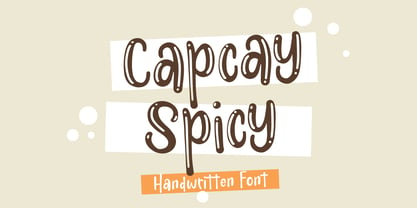 ntroducing Capcay Spicy, created by Asd Studio is a quirky and relaxed handwritten font. Whatever the topic, this font will be a wonderful asset to your font library, as it has the potential to enhance any creation. What's Included? :: Uppercase & Lowercase :: Numbers & Punctuation :: Multilingual Support Enjoy our font, thank you.
 - Melted Cheese by Asd Studio,
$10.00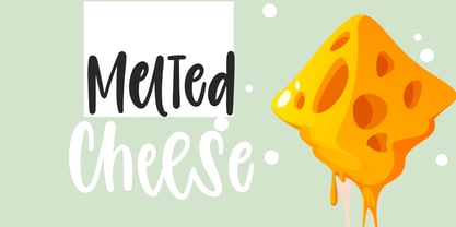 Introducing Melted Cheese, created by Asd Studio is a quirky and relaxed handwritten font. Whatever the topic, this font will be a wonderful asset to your font library, as it has the potential to enhance any creation. What's Included? :: Uppercase & Lowercase :: Numbers & Punctuation :: Multilingual Support Enjoy our font, thank you.
 - HF Bigcuat by Holis.Mjd,
$12.00 HF Bigcuat is a thick or bold handwritten cartoon font made from markers with a natural and organic texture and roughness that creates a playful and funny impression for your design. HF Bigcuat is available in a natural doodle/dingbats version which can add creativity to the design you will use.
 - F2F Shakkarakk by Linotype,
$29.99The Techno sound of the 1990s, a personal computer, a font creation software and some inspiration had been the sources to the F2F (Face2Face) font series. Thomas Nagel and his friends had the demand to create new unusual faces that should be used in the leading german techno magazine Frontpage"." - The Old Navy by Larin Type Co,
$12.00 The Old Navy - a new stencil style font collection. These fonts are ideal for military-style branding and will decorate any of your projects. You can also use them to create a logo or use for small businesses, t-shirts, hoody, book covers, stationery, logo creation, marketing, blogs, magazines, and more.
 - Gollder Vintage by Jinan Studio,
$12.00 Introducing, Gollder Vintage Font Duo is an excellent choice for logo design, branding, packaging, business cards, and adventure-themed designs. Its combination of script and sans serif styles, along with the textured and solid options, provides ample creative opportunities for designers to explore and create stunning visual identities and marketing materials.


