10,000 search results
(0.041 seconds)
- BackSplatter - Unknown license

- Special K - Unknown license

- Rogaton - 100% free

- Crown Doodle {denne} - Unknown license

- KR Holiday Frames 1 - Unknown license

- F*ck Beans - 100% free

- NoRefunds - Unknown license

- Barrio 30 - Unknown license

- Bunnigrrrls handwriting YOFF - Personal use only

- Tarantis - Unknown license

- Monster boxes - Personal use only

- Pinocchio - Unknown license

- Austin Antique by HiH,
$10.00 “More is better” may have been the motto of Richard Austin of Austin and Son’s Imperial Letter-Foundry on Worship Street at Finsbury Square in London when he designed and cut his Antique typeface. The year it was created is uncertain, but it is known to have appeared in a specimen book produced in 1827. At first glance, the upper case letters of Austin Antique look very much like Figgins Antique. But, upon examination, one will note that the Austin face is much darker. In general, the letters designed and cut by Richard Austin have fatter strokes, larger serifs and smaller counters -- more metal and less daylight. The premise was that the darker the letter, the more attention an ad using the typeface would receive. In old pictures of London and Paris one may see walls crowded with posters and “bills” -- competing for the attention of the passerby. Morris and Updike aside, the early nineteenth century marked the beginning of a commercial as well as industrial revolution. Patterns of commerce were changing. With new methods of marketing came the need for new typefaces to support the new methods. Foundries found the display types were very profitable and competed most energetically and creatively for the trade. There was a lot of trial-and-error. Some ideas faded away. Others, like the Antiques or Egyptians, were refined and developed. From them came the Clarendons that were to prove both popular and long lasting -- because they worked. Their job was to sell goods, not please the aesthetic sensibilities of the critics. They did their job well. Austin Antique has a full Western European character set, plus the following ligatures: ct, st, fi, fl, ff, ffi and ffl. Tabular numbers. Surprisingly readable.
 - Caros by cretype,
$20.00 Caros Family is a modern sans-serif typeface that is clean, simple and highly readable. Letters in this type family are designed with geometric shapes without any decorative distractions. The spaces between individual letter forms are precisely adjusted to create the perfect typesetting. Caros is a versatile type family of 18 fonts. Caros family consists of 9 weights (Thin, ExtraLight, Light, Regular, Medium, Bold, ExtraBold, Heavy & Black) with their corresponding italics. The Open Type fonts contain complete Latin 1252, Cyrillic, Central European 1250, Turkish 1254 character sets. Each font includes proportional figures, tabular figures, numerators, denominators, superscript, scientific inferiors, subscript, fractions and case features. We highly recommend it for use in books, web pages, screen displays, and so on.
 - Newkids Crew by IKIIKOWRK,
$17.00 Proudly present New Kids Crew - Graffiti Type, created by ikiiko. New Kids Crew is a raw and expressive brush font with touch of street style. This type has a freestyle shape that has the characteristics of freedom, youth and is filled with unique characters. This type is very suitable for making a poster, magazine layout, brand logo, sleeve cover, party flyer, quotes, or simply as a stylish text overlay to any background image. What's Included? 2 Weight : Regular & Oblique Uppercase & Lowercase Numbers & Punctuation Alternates & Ligature Multilingual Support Get also a good offer & FREEBIE at our site : www.ikiiko.com Enjoy our font and if you have any questions, you can contact us by email : ikiikowrk@gmail.com
 - Chatoyer by SG Type,
$19.00 Chatoyer - A luxurious typeface with elegant swashes, special characters and multilingual support. This elegant display font has a seductive, feminine appeal. It features beautiful swashes and numerous creative ligatures incl. nested or overlapping caps. The large selection of stylistic alternations and ligatures makes this font extremely versatile. Perfect for elegant projects and luxurious branding.
 - Christian Crosses III - Unknown license

- Another - Unknown license

- Ulse Freehand - Unknown license

- Mike Kunkel by Comicraft,
$29.00 Yes it's true, from time to time those awfully nice chaps at Comicraft have been known to create fonts for artists simply because We Love Their Work. Affable HEROBEAR AND THE KID kreator, Mike "He's just like your Favorite Uncle" Kunkel was lettering his beautiful children's comic strip with a font used by many, many other comic strip creators. John "JG" Roshell put a stop to all that and created a font based on Mike's own unique hand lettering style and now we make it available to you so that you can bring a little bit of Mike's Magick to your own warm and fuzzy work... because the Mike Kunkel font will help you remember your childhood... pass it on.
 - Lounger - Unknown license

- MMC Insignia by MMC-TypEngine,
$30.00 MMC Insignia, is an Iconic & Emblematic Neogothic Geometric Capitals Display… Assembled by Trivial Squares and Diagonals Symbols Pattern from a puzzled grid Aftermath!! Includes Stylistic Alternates!! +Extra Monospaced Figures. In 22 styles, with Obliques, both for single display and layer Typesetting, plus OpenType Features & Bonus Blocks Fonts! MMC Insignia is a Small Caps Typeface, which default lowercases character set is included in the Pro family, its cursive version, apart from it, has also Exclusive Stylistic Alternates… Its atmosphere stands by on both Corporative to Decorative, Modern, Fashion, Federalist, Bohemian, Romantic, Ludic, Treasured Look, Etc. This Display font-family is the result of the repeated applications of this unique infamous Icon or Symbol, of two counterpointed triangles, implicit as hourglasses, in order to compose an innovative and unprecedented typographic pattern and modulation concept through the letterforms, in an extremely Geometric style. The Graphic Sign used throughout this type, is a remarkable trend used already in Logos of different businesses, whose most famous case refers to a famous International Bank, which doesn’t need to be mentioned, as it is instantly associated! This characteristic innovation was the main motivation while creating this type. Usage Suggestions: Type Fancy Titling texts, Display Remarkable Logos, Branding Projects, Labels, Emblems, Fashion Patterns, or in everything Noble and designed for Excellence as a type of Insignia, or distinguished marks and attributes of Royalty and Power!! That’s also forwardly, the reason why it was named MMC Insignia… TIPS: 1-Combine styles into innumerous possibilities of Chromatic Typesetting, by ‘central pasting’ layers… You may dislocate layers for improvisations! 2-USE BLOCK “FREE-STYLES” 1 & 2 also to add default 3D! Change 3D directions by switching Block 1 to Block 2, that way you can Zig-Zag words and lines. *Also shift the block layer up to bottom limit, it makes the 3D direction turn upside down. Greetings! André, MMC-TypEngine.
 - SF Buttacup - Unknown license

- Nouveau Nights JNL by Jeff Levine,
$29.00 The deep well of creativity that is the era of the hand lettered sheet music title page brings forth Nouveau Nights JNL. Re-drawn from a period example of the 1920s, this titling font perfectly captures the warm "human" look of pen and ink lettering, long before the advent of "perfect" digital type.
 - Csorna by Edcreative,
$15.00 Csorna is a script typeface with a monoline style. Perfect for your next creative project like Logo Type, printed quotes, invitations, cards, product packaging, headers, letterheads, posters, clothing designs, labels and more. The name Costa itself is taken from the name of a city in Hungary and this name already has special permission
 - Adore by Canada Type,
$24.95 In 1939 the Stephenson Blake Company bought a very popular script called Undine Ronde and began marketing under the name Amanda Ronde. Although Undine/Amanda was quite popular and can be seen in many advertisements from the 1930s and 1940s, there seems to be no surviving record stating the original foundry or designer. We thought that six and half decades of dust layers over the once-popular typeface were enough, so here and now you have its complete and expanded digital incarnation, Adore. It is quite easy to see why this typeface was popular. A round script with graceful meaty curves is rarely found and can be used in plenty of applications. Wedding paraphernalia, chapter titles, posters, poetry, book covers, religious literature... you name it, Adore can fit it. Aside from its totality being unmatched by currently available designs, Adore also possesses some of the most unique and imaginative letter shapes. The narrow loops on the B, P and R, the minuscule-like Z, the looped b and d, the descending h... all these shapes contribute to a breathtaking and adorable calligraphic work unlike any other. The original design came in a basic alphabet, but we have updated it for current digital technologies, and expanded it to include plenty of alternates and ligatures, as well as some ornaments. The Postscript Type 1 and True Type versions come in two fonts, the second containing the alternates and extras, while the Open Type version is a single font containing all the alternates and extras in conveniently programmed features, easily accessible at the push of a button in OpenType-supporting software. We also encourage you to take a look at Typodermic's Mecheria font, which is further experimentation with the same letter forms, resulting in a quirky, friendly, curly, angular gothic-like creature.
 - ITC Adderville by ITC,
$29.99On a cold winter's night, George Ryan, of Galápagos Design Group, began musing on the possibilities for a “truly original” sans serif typeface. What came out of his musing, and his always-present sketchpad, was ITC Adderville, a typeface whose visual impact is immediate and strong. Ryan explains how he did it: “The rounded ends of its strokes and their skewed baseline contact create an illusion of dancing feet. The tops of lowercase stems emit serif buds, suggesting transition into or out of the serifed form. The spear-like lowercase stroke terminators, along with other distinctive elements such as the stylized reticulation of the lowercase 'g' segments, the salute of that same character's spur, and the bold, non-self-conscious 'i' and 'j' dots, all contribute to the playful and unique nature of this design.” The result is a friendly, lively type family whose graduated weights -- book, medium, and heavy -- lend themselves especially well to use at small display sizes and in short blocks of text. - Syntax Next by Linotype,
$50.99 Syntax was designed by Swiss typographer Hans Eduard Meier, and issued in 1968 by the D. Stempel AG type foundry as their last hot metal type family. Meier used an unusual rationale in the design of this sans serif typeface; it has the shapes of humanist letters or oldstyle types (such as Sabon), but with a modified monoline treatment. The original drawings were done in 1954; first by writing the letters with a brush, then redrawing their essential linear forms, and finally adding balanced amounts of weight to the skeletons to produce optically monoline letterforms. Meier wanted to subtly express the rhythmical dynamism of written letters and at the same time produce a legible sans serif typeface. This theme was supported by using a very slight slope in the roman, tall ascenders, terminals at right angles to stroke direction, caps with classical proportions, and the humanist style a and g. The original foundry metal type was digitized in 1989 to make this family of four romans and one italic. Meier completely reworked Syntax in 2000, completing an expanded and improved font family that is available exclusively from Linotype GmbH as Linotype Syntax. In 2009 the typeface family was renamed into a more logical naming of "Syntax Next" to fit better in the Platinum Collection naming." Syntax® Next font field guide including best practices, font pairings and alternatives.
 - Normandia by Canada Type,
$30.00 Designed over three years after the second World War, and published in 1949 by the Nebiolo foundry, Normandia was Alessandro Butti’s take on the fat face. As it usually was with Butti’s designs, this face effectively injected a catchy yet expertly calculated calligraphic spin into its source of inspiration — which was the essentially geometric/deco, thicker model of Bodoni’s very popular aesthetic. The metal Normandia saw some widespread use for a handful of years after its publication, not least because of the multitude of sizes in which it was available. It stepped out of the limelight by the mid-1950s, due to a combination of the popularity of cold type and Nebiolo’s refusal to retool its faces for new technologies. It was copied by a few small film typesetting outfits on both sides of the Atlantic, but never really found its way back to the mainstream. By the time computer type became the norm, Normandia was pretty much relegated to a type historian’s collection of anecdotes. This digital update of the classic series revives and refines the three original metal designs (Tonda/Regular, Corsiva/Italic, and Contornata/Outline) and expands the character set to more than 600 glyphs per font, including small caps, six types of figures, fractions and nut fractions, a full set of f-ligatures, some stylistic alternates, and other fine typography niceties.
 - Impact Wide by Geoffrey Lee,
$21.00Impact wide was developed from the designer's original drawings for the production of 'Impact' metal type, with many detail changes because of the density of the letters. These include the restoration of the bevelled i and j dots of the original. Character maps show some useful alternative characters in both roman and italic. Included are a crossbar numeral 1, mirror quotes and some sorts which were cast in metal but never reproduced in digitized versions of the typeface. There is also a font-specific Euro symbol. (Impact is a trademark of The Type Museum, London). - Pargrid by Linotype,
$29.99Pargrid is a grid-based typographic experiment from the young Swiss designer Michael Parson. In the Pargrid family, which contains three separate weights, Parson has created an intriguing system of small circles-similar to LED's or light bulbs-that live separately on a grid, creating unique letterforms. In small sizes, these circles blend together to create seemingly fluid lines, giving Pargrid's letters a wide, rectangular appearance. In larger sizes, the letterforms transform themselves into objects d'art-virtual and ordered communities populated by various points. Fantastic in both display settings as well as short strings of text, Pargrid may offer the exact look that your next project is looking for. Pargrid and nine other constructed type designs from Parson are included in Take Type 5 collection, from Linotype GmbH." - Stuffed Shirt JNL by Jeff Levine,
$29.00 Stuffed Shirt JNL acquires its name from a term popularized during the years when the Art Deco period flourished. The Great Depression further widened the gap between the 'haves' and the 'have nots'. Occasionally, some of those that 'had' (and some who pretended they did) came off as standoffish, egotistical and pompously arrogant. Such individuals were referred to as a "stuffed shirt"; a blowhard who thought he was better than others. In this case, Stuffed Shirt JNL is no more than a dual-line adaptation of Playwright JNL, itself an interpretation of the classic Broadway type design in a way that emulates the hand lettering of old-time sign painters.
 - Forte by Monotype,
$29.99 Forte was designed by the Austrian commercial artist by Carl Reissberger who was trained as a compositor and later taught typography and drawing in Vienna. The idea for the Forte script font came from the study of plants, individual letter forms being inspired by the long stems and furry heads of the reed. Slightly inclined, it gives the impression of having been made with a bold brush or marker, and can therefore be used in work that requires an informal appearance. Forte is a strong design which contrasts well with sans serif faces and classical modern types. Use the Forte font in advertising, flyers and labels.
 - Simplesky by Timurtype,
$14.00 Introducing by Timur type Proudly Present, Simplesky Simplesky A Handwritten Script Font, which was created with great care and specially created for you ✨ Simplesky is perfect for product packaging, branding project, megazine, social media, wedding, or just used to express words above the background. Simplesky also multilingual support. Embelish your designs with our original fonts. Enjoy the font 😉 Thank you!
 - Rocksoldier by Timurtype,
$14.00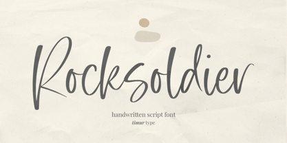 Introducing by Timur type Proudly Present, Rocksoldier ✨ Rocksoldier A Handwritten Script Font, which was created with great care and specially created for you 😊 Rocksoldier is perfect for product packaging, branding project, megazine, social media, wedding, or just used to express words above the background. Simplesky also multilingual support. Embelish your designs with our original fonts. Enjoy the font 😉 Thank you!
 - Sapeca by Just in Type,
$35.00 This project started from an idea to create a fun & informal typeface that would be cool for designers and for the general public. So, Just in Type designed a font with several OpenType features to create different letterings for different occasions, always in a cute way, sometimes even fancy. Have a look at the Sapeca Manual in the Gallery Menu.
 - Warm Thanksgiving by Mvmet,
$15.00 Warm Thanksgiving is a warm and fun font for your thanksgiving day, you can use it for everyday use too for its versatility. Create something with it from regular typing notes, to t-shirts, kids’ book designs, greeting cards, stickers, posters, or anything that needs a casual touch. Fall in love with its incredible style and use it to create lovely designs!
 - Oggie Marker by Dear Sue,
$15.00 Oggie Marker is a hand drawn thick marker display font with a textured edge. It has a raw but whimsical feel, which makes it perfect for posters, signage, menus, comics and toys/ product/ packaging for kids. Try it on themes of summer, Halloween, camping/ outdoors, and more!
 - Atomic Marker by Set Sail Studios,
$16.99 Inject some energy into your design with the ATOMIC Marker Font. This loud and proud all-caps font was hand-drawn with a real acrylic marker, maintaining the authentic high definition brush detail in each stroke. It’s an exhilarating font choice perfect for header text, poster designs, album covers, product designs, merchandise, logos & more. The Atomic Marker family includes 2 fonts; Atomic Marker • Includes 2 sets of uppercase characters, simply switch between upper & lowercase on your keyboard to access the 2 sets. Also included are 18 ligatures (double letter pairings), which can be accessed by turning on ‘Standard Ligatures’, and 6 Small Caps, which can be accessed by turning on Small Caps. (All characters can also be accessed via a Glyphs panel). Atomic Marker Extras • Includes 26 ‘doodles’ (see images), and 23 underlines, designed to perfectly pair with the Atomic Marker font letters. Simply install this as it’s own separate font, and type A-Z (doodles) or a-w (underlines) to access each design. Language Support; Atomic Marker supports the following languages; English, French, Italian, Spanish, Portuguese, German, Swedish, Norwegian, Danish, Dutch, Finnish, Indonesian, Malay, Hungarian, Polish, Croatian, Turkish, Romanian, Czech, Latvian, Lithuanian, Slovak, Slovenian
 - KG BLESS YOUR HEART by Kimberly Geswein,
$5.00 An all-caps font with blackout lettering perfect for stencils. Use alternating caps and lowercase for bouncy lettering.


