10,000 search results
(0.049 seconds)
- Outspace Fighter by Ditatype,
$29.00 Outspace Fighter is an electrifying game-themed display font designed in uppercase, capturing the essence of futuristic space battles. This font is made in boxy shapes with sharp corners, evoking a sense of strength and precision. Each uppercase letter is meticulously crafted to exude a futuristic aesthetic, mirroring the angular and geometric forms found in the vast expanse of outer space. This design choice gives the font a sleek and modern appeal, perfect for conveying the intensity of space battles. With low-contrast letters, this font places emphasis on the overall form and structure of the font. The subtle differences in stroke width create a balanced and unified visual experience. This design choice ensures legibility while maintaining a cohesive and visually appealing composition, allowing your audience to effortlessly engage with your game-themed designs. You can also enjoy the available features here. Features: Stylistic Sets Multilingual Supports PUA Encoded Numerals and Punctuations Outspace Fighter fits in headlines, logos, posters, titles, branding materials, print media, editorial layouts, website headers, and any other projects. Find out more ways to use this font by taking a look at the font preview. Thanks for purchasing our fonts. Hopefully, you have a great time using our font. Feel free to contact us anytime for further information or when you have trouble with the font. Thanks a lot and happy designing.
 - Torus Pro by Monotype,
$40.00 Torus Pro is a rounded monoline typeface. As its name suggests, this is a more professional version of my original Torus family released in 2017. Each glyph has been scrutinised and redrawn where necessary. In addition, there are now italics, small caps, old style figures, and numerous other improvements. Torus Pro includes many new decorative alternates and ligatures that will add distinctive flourishes to your typographic compositions. With up to nine alternates for some glyphs, these additional styles include stencilled, simple dots, looped and smooth swashes, plus a more aggressive angled option for those looking for something a little different. When used subtly, these alternates and glyph combinations will add flair and personality to your own creations. Perfect for titling and branding, Torus Pro also packs a punch without these features activated, as well as being a comfortable read in long runs of text. There are 12 fonts altogether, ranging from Thin to Heavy weights in both roman and italic. The variable font versions of the family allow you to define the weight exactly to your liking. Torus Pro has an extensive character set that covers all Latin European languages. Key features: 6 weights in both roman and italic Variable fonts included with full family 212 Alternates 20 Ligatures Small Caps Full European character set (Latin only) 1450+ glyphs per font.
 - Qualion Text by ROHH,
$39.00 Qualion Text™ is a modern geometric sans serif typeface with humanist and calligraphic inspirations. It is a text family designed for excellent legibility. Qualion Text™ is a sibling of Qualion™ & Qualion Round™, geometric family with lots of swashes and ornaments. Letter shapes and proportions has been adjusted to fit paragraph text and small sizes: - typeface is narrower now in order to fit more text in the design space - larger stroke contrast - pronounced ink traps and tapering - elegant true italics made even more calligraphic - adjusted spacing and kerning - adjusted font weights The main purpose of the family is clean and legible paragraph text, however it is very attractive choice for branding, headlines and display use, too. The italic styles as well as thin, bold and black upright styles have very strong character and look great in display sizes. Italics are very fluent, calligraphic, subtle and elegant, from the other side bold and black uprigths are very modern, powerful and unique thanks to the pronounced ink traps. Qualion Text™ family consists of 20 styles - 10 weights with corresponding true italics. Both have extended language support, as well as broad number of OpenType features, such as small caps, case sensitive forms, standard and discretionary ligatures, swashes, stylistic sets, contextual alternates, lining, oldstyle, tabular and small cap figures, slashed zero, fractions, superscript and subscript, ordinals, currencies and symbols.
 - Duvall by John Moore Type Foundry,
$19.95 Duvall is an idealization created from the Edward J. Duvall lettering. Mr. Duvall was a teacher in lettering, who was well known for his book “Modern Sign Painting” in the late 40s and early 50s. Duvall cursive script is presented in five weights, Duvall 1, as a light version, to Duvall 5 as a bold version, and Duvall Style a decorative typeface with Inline, ideal for set in color layers combined with Duvall 5. Duvall is a Script font with low contrast, not intended to be used as a type of reading, but is however well adapted to small sizes because its simple form is easy to read. It is advisable to use this font for large to medium sizes. Duvall is ideal for composition, ordinal, superior and inferior numbers, and thanks to the OpenType features you can compose with alternate characters, old style numbers and with a complete set of glyphs for Eastern and Western European languages. The Duvall set comes with a font called Duvall Ribbons, a dingbats font with which you can create interesting headlines with the taste of the advertising of the 50s. Duvall FunWords is a dingbats playing with funny words in English, French and Spanish phrases. Duvall is ideal for packaging, signs, banners, branding and graphic design in general and can be combined harmonically with your favorite sans fonts.
 - Gridink by Ckhans Fonts,
$34.00 Description Features: • Support for 28 languages: Afrikaans Albanian Catalan Croatian Czech Danish Dutch English Estonian Finnish French German Hungarian Icelandic Italian Latvian Lithuanian Maltese Norwegian Polish Portugese Romanian SlovakSlovenian Spanisch Swedish Turkish Zulu Swedish Turkish Zulu • Contains OpenType features with alternates or substitutes • Tabular Figures • Ordinal numbers • 74 icons (It will keep updating.) • 72 graphic patterns for designer (It will keep updating.) • 28 brand symbols (It will keep updating.) • 27 arrows glyphs • 0-99 line circled glyphs • 0-99 solid circled glyphs • A-Z line circled glyphs • A-Z solid circled glyphs Gridink is a modern sans serif with a geometric touch. It comes in 9 weights, 18 uprights and its matching italics, patterns, so you can use them to your heart’s content. Designed with powerful opentype features in mind. Each weight includes extended language support, fractions, tabular figures, arrows, ligatures, icons and patterned. Gridink family consists of 19 styles (9 weights, 9 Italics and 1 patterns), in each of which there are more than 940+ glyphs. In the typeface, each weight includes extended language support, fractions, tabular figures, arrows, ligatures and more. Perfectly suited for graphic design and any display use. It could easily work for web, signage, corporate as well as for editorial design. documents and folders, mobile interface. Useful links: Gravitica PDF Type Guide and Specimen (You can know how to use icons and arrows, other glyphs.)
 - Dienstag by insigne,
$24.99 With its extended sans-serif style, Dienstag boasts a sleek and sophisticated look that's perfect for a wide range of projects. Whether you're designing a website, creating branding materials, or producing print publications, Dienstag's refined elegance is sure to make a lasting impression. Compared to Montag, Dienstag has a slightly more formal feel, thanks to its lack of rounded terminators. But that doesn't mean it's any less versatile – in fact, Dienstag's four original weights have now been expanded to ten, giving you even more flexibility in your designs. With OpenType features that include simplified versions of many characters, you can easily create unique and eye-catching titles that stand out from the crowd. But Dienstag is just one part of the larger Montag superfamily, which also includes Mittwoch, and Donnerstag. Each font in this collection offers its own unique style and flair, giving you a wealth of options to choose from when it comes to your next project. Whether you're looking for a bold and dynamic font or a more refined and understated style, you're sure to find the perfect fit in the Montag family. So why wait? Check out Dienstag and the rest of the Montag superfamily today, and start creating designs that are sure to captivate and inspire! With its elegant style and versatile functionality, Dienstag is the perfect choice for designers who demand the best.
 - Cabrito Flare by insigne,
$35.00 Cabrito Flare joins the Cabrito font family, a family designed to help younglings with the recognition of letter shapes. The original fonts are part of the development of a children's book, The Clothes Letters Wear. Cabrito Flare combines the simplicity and readability of the original Cabrito with an elegant flare serif. Now, this latest addition brings a new flavor to the table. Cabrito Flare brings fluid, carefree, medium contrast fun. It takes a more calligraphic direction than most. Cabrito combines structure and handwriting. There's a fluid balance of both characteristics, and Flare is no exception. It’s a unique combination of functional elegance with a little spice and a dollop of friendly. Fifty-four well-designed fonts give you many readable options to work with while developing your design. Cabrito Flare includes a suite of OpenType features. Alternative forms, ligatures, figures, and titling caps are all here. Preview these functions in the interactive PDF manual. There are glyphs for 72 languages; more than 600 glyphs await you. Cabrito Flare is an excellent choice for websites, as well as for brochures and packaging. Like Cabrito, used by several visible brands, Cabrito Flare is also an excellent option to define your logo. Try the taste of Cabrito Flare and be sure to dip in and sample some of the other Cabrito members: Original flavor, Didone, Sans, Serif, Semi, Contrast, and Inverto.
 - TG Riota Gothic by Tegami Type,
$35.00 TG Riota Gothic is a brand new digital sans serif typeface in geometric style with many faces and possibilities with good proportions forms. TG Riota Gothic is outstanding for use in small text or even bigger sizes with seven weights, two axes & 14 styles, including the variable font. It comes with three alternative groups (single story alternates, no tail alternates & square dot alternates), which you can combine to maximize your needs—also supplied with a bunch of ligatures (standard & discretionary ligatures), lining figures (proportional, denominators, numerators, fractions, subscript & superscript), case-sensitive forms, symbol & Each typeface contains over 674 glyphs covered more than 90 languages Latin based. Language Supports: Afrikaans, Albanian, Asu, Azerbaijani, Basque, Bemba, Bena, Bosnian, Catalan, Chiga, Colognian, Cornish, Croatian, Czech, Danish, Dutch, Embu, English, Estonian, Faroese, Filipino, Finnish, French, Friulian, Galician, German, Gusii, Hungarian, Icelandic, Indonesian, Irish, Italian, Kabuverdianu, Kalaallisut, Kalenjin, Kamba, Kikuyu, Kinyarwanda, Latvian, Lithuanian, Low German, Lower Sorbian, Luo, Luxembourgish, Luyia, Machame, Makhuwa-Meetto, Makonde, Malagasy, Malay, Maltese, Manx, Meru, Morisyen, North Ndebele, Norwegian Bokmål, Norwegian Nynorsk, Nyankole, Oromo, Polish, Portuguese, Romanian, Romansh, Rombo, Rundi, Rwa, Samburu, Sango, Sangu, Scottish Gaelic, Sena, Shambala, Shona, Slovak, Slovenian, Soga, Somali, Spanish, Swahili, Swedish, Swiss-German, Taita, Teso, Thai, Turkish, Turkmen, Upper Sorbian, Vunjo, Walser, Welsh, Western Frisian, Zulu. Typeface Designed by Iqbal Firdaus Published by Tegamitype® Foundry Presentation Design by Eunike Agatha & Dennise Nathalie
 - FM Bolyar Pro by The Fontmaker,
$29.00 Bolyar Pro type family is the ancestor of our successful font Bolyar . We decided to develop it to a new higher level - making it more sophisticated, detailed and useful at the same time. The new improved Bolyar is able to satisfy every typographic taste and meet the ever growing design requirements for high quality typefaces. If you are addicted to classic vintage style, then you could easily use Bolyar Pro for almost anything - from letterhead, logos and catchy headlines to elegant packaging, book covers and wine labels. Alternates, Swashes and Ligatures will help you customize almost every single letter and fit perfectly to your artwork. Bolyar Pro type family is showing an abundance of many new useful features and options like: - Five weights each sold as separate font - Over 1200 glyphs per weight - Full multilingual support of all European languages as well Greek and Cyrillic - Brand new Alternates and Swashes fully supported in all languages (even with accented characters) - Many useful ligatures - Full Open Type and True Type support for Mac and Win Platforms - New Bolyar Ornaments - a new complimentary font exclusively designed to fit the new Bolyar Pro, containig decorative shields, frames, ornaments and borders. Bolyar Pro font family is great for any kind of labels - in this link you could see some amazing examples how to use it alone or in combination with our Bolyar Ornate Pro font family.
 - ALS SyysScript by Art. Lebedev Studio,
$63.00 Handwriting of a strong Carelian personality revived: It’s autumn time once again, harvesting season, mushroom & berry time – the favourite season of my Karelian aunt Katri. A postcard she sent me more than twenty years ago had inspired me to SyysScript, “Script of Autumn” in Finnish. Katri had a very kind but also energetic personality, and I always thought her handwriting was a mirror of it. By making SyysScript I felt I could revive some of her unforgettable character. My Finnish autumn font has by now become a favourite for many and is branding fine food in both the Eastern and the Western hemisphere – even far beyond the arctic circle. “SyysScript“ is actually a growing family. For enhanced functionality in small sizes I added “SyysScript Eco” a year ago, a style with shortened extensions and simplified letterforms especially suited for packaging. And this autumn, a special one for Finland which is celebrating its 99th birthday, SyysScript grew again: Two long awaited newcomers, “SyysScript FeltTip” and “SyysScript FeltTip Eco” joined the family. They are bolder and softer than the previous styles but keep their positive, lighthearted feel. Use them to make a powerful individual mark on any background. – They are equally well suited for paper, packaging, a screen or even a concrete wall! Language support: Western and Central European, Extended Cyrillic.
 - Ardalista by Mercurial,
$17.00 Ardalista is lovely script calligraphy made with a touch of sweet, lovely and charming attraction that adds to the impression of a beautiful and elegant. a charming typeface and So beautiful on invitation like greeting cards, sublimation, wedding invitation, branding materials, business cards, quotes, posters, headings, signature, logos, t-shirt, letterhead, signage, lable, news, posters, badges and more What is interesting? Imagine you get a beautiful and very charming font in the design you make. that would be the answer you wanted right now. Ardalista has a script typeface and extra letters that allows you to be more free in designing. What's new? Hey..look at this. besides you get a font with over 150 alternates, ligatures and swashes. let's imagine what you can do with all that. yeah that's awesome. For those with Opentype capable software ( Photoshop CC or any version of Illustrator/ Indesign), Ardalista also comes with Opentype features such as access to all the alternate letters and double letter ligatures. And this Font has given PUA unicode (specially coded fonts). so that all the alternate characters can easily be accessed in full by a craftsman or designer. Don't forget to check out other cool fonts on our store and wait for new fonts. Follow our shop for upcoming updates including additional glyphs and language support. feel free to send me a message, comment, like and share.
 - BlincType Letterpress Fontpak by Chank,
$99.00 Add some old fashioned charm to your designs with the distressed alphabets in the new BLINCtype Letterpress Fontpak, a brand new font collection containing 8 letterpress-inspired fonts from the creative minds at Blinc Publishing in St. Paul, MN. The BLINCtype Letterpress Fontpak contains a handy concise assortment of old-school display fonts. From the old Western "WANTED" poster look of Prospect Modern, to the no-nonsense all-caps classic Goshen and its lowercase companion Gideon, these fonts are inspired by wooden letterpress blocks and other archaic technologies. It's like having your own letterpress print studio! Except it's all instantly downloadable right now as easy-to-use fonts! Designers love working with the Cheltenham-esque Gomorrah and its grittier, grungier counterpart, Sodom. The bouncy Golgotha has a rough and tumble readiness that exudes a hand-made charm, while Hamilton Offset has a cryptic, experimental look and feel that gives the impression of double-vision. You also get the newest member of the Blinc font family, Player Piano, which was based on punch-cut stencil letters on an old player piano paper song roll. Purchase the BLINCtype Letterpress Fontpak today and you'll be able to download and start using these 8 great fonts right away! The BLINCtype Letterpress Fontpak contains the fonts: Gideon, Golgotha, Gomorrah, Goshen, Hamilton Offset, Player Piano, Prospect Modern and Sodom.
 - Delirian by Andrey Sharonov,
$35.00 Delirian Script & Ornaments Delirian is elegant script with contemporary mood and perfect forms, inspired by immortal classic calligraphy. Not too thin and not too thick, good balanced and variable, born for luxury and beauty. In my examples I show how this script can be used. It's great for logotypes, branding, wedding invitations, romantic cards, alcohol labels, packaging, spelling of names and others. Delirian Script comes with beautiful Uppercase and Lowercase letters, numbers and punctuation. In addition to the main character set, there are 158 alternates characters, 36 ligatures and 10 lengths of end-swashes. You also get Ornament set of 26 elements which harmoniously complements original script. Multilingual Support Script support Western European characters and works with following languages: English, Croatian, Danish, Dutch, Estonian, Faroese, Filipino, Finnish, French, German, Hungarian, Icelandic, Irish, Italian, Norwegian, Polish, Portuguese, Slovenian, Spanish, Swedish, Turkish. OpenType Stylistic Alternates works on the principle of simple combinations with activated Standard Ligatures option in OpenType panel (Adobe Photoshop, Adobe Illustrator). To get alternate just add for example number 2 (two) after any letter. Every Uppercase has 1-2 variations and Lowercase about 3-4 alternate characters. For example: A2 A3 - Uppercase; a2 a3 a4 - Lowercase; a.1 a.2 - Lowercase with underline. _1 _2 _3 - End-swashes Ligatures works with activated Discretionary Ligatures option in OpenType panel. This special features don't work in Microsoft Word.
 - Wanderlust Collection by Cultivated Mind,
$32.00 Wanderlust Letters has returned, but now offered in a beautiful collection of hand painted scripts. New versions include Wanderlust Letters Pro, Decorative, Boho, Chic, Shine, Gold, Caps, and Ornaments. Wanderlust Letters Pro is an extended version of the immensely popular Wanderlust Letters. This latest version includes three sets of basic alternates, one set of decorative alternates, and one set of ligatures. Wanderlust Decorative Pro offers a magnificent updated flow from the initial Wanderlust Letters release. Decorative Pro includes two sets of decorative alternates, two sets of basic alternates, and one set of ligatures. Decorative Regular comes with one set of decorative alternates. Boho, Chic, Shine and Gold are an updated spin off of Wanderlust Letters. These fonts offer new letter styles that blend seamlessly with all Wanderlust fonts. Pro versions of Chic, Shine and Gold comes with three sets of basic alternates and one set of decorative alternates. Boho Pro comes with with two sets of basic alternates and two sets of decorative alternates. Caps is a perfect choice for headline use since it’s an all uppercase font. But don't be afraid to mix it up with all the other Wanderlust fonts. The entire Wanderlust Collection works impeccably to enhance your magazine, packaging, advertising, branding, posters, websites, and films. Combine all Wanderlust fonts with Ornaments to create unique hand painted typography art.
 - Danube Pro by CheapProFonts,
$10.00 This cool techno font is easily recognizable with its quite unique stroke endings. I have increased the ascenders and descenders slightly (so they would work better with the new diacritic letters) and introduced a few alternate letterforms in addition to generally expanding the character set. A totally enjoyable reworking of an original design. Now also with a Bold and a brand new Light variant! Please note that these variants are made by adding/removing from the regular shape, so the letters no longer sits on the baseline. ALL fonts from CheapProFonts have very extensive language support: They contain some unusual diacritic letters (some of which are contained in the Latin Extended-B Unicode block) supporting: Cornish, Filipino (Tagalog), Guarani, Luxembourgian, Malagasy, Romanian, Ulithian and Welsh. They also contain all glyphs in the Latin Extended-A Unicode block (which among others cover the Central European and Baltic areas) supporting: Afrikaans, Belarusian (Lacinka), Bosnian, Catalan, Chichewa, Croatian, Czech, Dutch, Esperanto, Greenlandic, Hungarian, Kashubian, Kurdish (Kurmanji), Latvian, Lithuanian, Maltese, Maori, Polish, Saami (Inari), Saami (North), Serbian (latin), Slovak(ian), Slovene, Sorbian (Lower), Sorbian (Upper), Turkish and Turkmen. And they of course contain all the usual "western" glyphs supporting: Albanian, Basque, Breton, Chamorro, Danish, Estonian, Faroese, Finnish, French, Frisian, Galican, German, Icelandic, Indonesian, Irish (Gaelic), Italian, Northern Sotho, Norwegian, Occitan, Portuguese, Rhaeto-Romance, Sami (Lule), Sami (South), Scots (Gaelic), Spanish, Swedish, Tswana, Walloon and Yapese.
 - Gravitica Rounded by Ckhans Fonts,
$34.00 Features: • Support for 28 languages: Afrikaans Albanian Catalan Croatian Czech Danish Dutch English Estonian Finnish French German Hungarian Icelandic Italian Latvian Lithuanian Maltese Norwegian Polish Portugese Romanian SlovakSlovenian Spanisch Swedish Turkish Zulu Swedish Turkish Zulu • Contains OpenType features with alternates or substitutes • Tabular Figures • Ordinal numbers • 74 icons (It will keep updating.) • 28 brand symbols (It will keep updating.) • 27 arrows glyphs • 0-99 line circled glyphs • 0-99 solid circled glyphs • A-Z line circled glyphs • A-Z solid circled glyphs Gravitica is a modern sans serif with a geometric touch. It comes in 6 weights, 13 uprights and its matching rounded, italics, patterned, so you can use them to your heart’s content. Designed with powerful opentype features in mind. Each weight includes extended language support, fractions, tabular figures, arrows, ligatures, icons and patterned. Gravitica family consists of 13 styles (6 weights, 6 Italics, 1 patterned), in each of which there are more than 940+ glyphs. In the typeface, each weight includes extended language support, fractions, tabular figures, arrows, ligatures and more. Perfectly suited for graphic design and any display use. It could easily work for web, signage, corporate as well as for editorial design. documents and folders, mobile interface. Useful links: Gravitica PDF Type Guide and Specimen (You can know how to use icons and arrows, other glyphs.)
 - Axiforma by Kastelov,
$55.00 Axiforma was designed with the single idea of creating a font that starts with the letter A, because let's face it, this is the best letter. For those of you who didn't see it coming, Axiforma is a /drum roll/ geometric sans in 20 weights. If you are thinking "Oh boy, another geometric sans", you clearly know your stuff. Yet, Axiforma is different in at least three crucial ways: 1) It's made by me 2) It's not free 3) It's polite and humble Additionally, Axiforma is packed with Opentype such as oldstyle numbers, fractions, case sensitive alternates, localized forms, stylistic sets, cyrillic alphabets (Bulgarian & Russian) and many more. Basically it's quite extensive and kinda great. Upon using Axiforma, clients will start to behave differently around you and may even start paying you. Your spouse will start working out again just to gain your attention and your kid will become instantly popular at school. After all you are using Axiforma and rumors do spread quickly. That's what we are talking about - raw font power. With Axiforma regular typed text is suddently transformed into first class design. That includes branding, posters, headlines, display, presentation materials, websites, logotypes, etc. The world will now be your playground. To sum it up, Axiforma is badass, thus you should have it and use it everywhere.
 - LC Trinidad by Compañía Tipográfica de Chile,
$34.00 Lc Trinidad is the result of a series of wonderings regarding geometric Sans Serif typography design, in particular; Futura of Paul Renner. A “conversation” arose between me and the designer – actually there was no conversation, it is an euphemism for “I saw his designs, I draw them and discussed with myself some of his decisions – that ended up being the origin of this font firsts glyphs: A, H, N, O, R and S. I started with uppercase letters, and here is when Rudolf Koch with Kabel and his “Das schreibbuchlein” joined the conversation. This is how I could develop some alternative lowercase letters so as to illustrate this imaginary discussion. The result is a sans serif, geometric, modern typeface with classical Roman proportion in the uppercase letters; two stylistic sets for lowercase letters (setKoch and setRenner), rational, open and sharp ends. It is ideal to form titles, medium length texts, branding, exhibitions and animations. The family consists of 9 weight variants and their corresponding oblique versions and small caps. With more than 900 glyphs, it covers more than 190 Latin languages and together with its Opentype functions it creates a modern and versatile family. Besides, it has powerful OpenType features for each style, including stylistic sets, extended language support, ligatures, contextual alternates, lining figures, oldstyle figures, small caps numbers, arrows, fractions, superscripts, subscripts and many more.
 - Gravitica Slab by Ckhans Fonts,
$34.00 Features: • Support for 28 languages: Afrikaans Albanian Catalan Croatian Czech Danish Dutch English Estonian Finnish French German Hungarian Icelandic Italian Latvian Lithuanian Maltese Norwegian Polish Portugese Romanian SlovakSlovenian Spanisch Swedish Turkish Zulu Swedish Turkish Zulu • Contains OpenType features with alternates or substitutes • Tabular Figures • Ordinal numbers • 74 icons (It will keep updating.) • 72 graphic patterns for designer (It will keep updating.) • 28 brand symbols (It will keep updating.) • 27 arrows glyphs • 0-99 line circled glyphs • 0-99 solid circled glyphs • A-Z line circled glyphs • A-Z solid circled glyphs Gravitica Slab is a modern serif with a geometric touch. It comes in 6 weights, 12 uprights and its matching italics, so you can use them to your heart’s content. Designed with powerful opentype features in mind. Each weight includes extended language support, fractions, tabular figures, arrows, ligatures, icons and patterned. Gravitica Slab family consists of 12 styles (12 weights, 12 Italics), in each of which there are more than 940+ glyphs. In the typeface, each weight includes extended language support, fractions, tabular figures, arrows, ligatures and more. Perfectly suited for graphic design and any display use. It could easily work for web, signage, corporate as well as for editorial design. documents and folders, mobile interface. Useful links: Gravitica PDF Type Guide and Specimen (You can know how to use icons and arrows, other glyphs.)
 - FS Hackney by Fontsmith,
$80.00 Elliptical The squareness of curves. That was the elliptical – in more than one sense – notion being explored in the making of FS Hackney. The squareness of curves and vertical terminals to create a gentle, soft sans serif, with a little bit of magic. A momentary thought – “It doesn’t have to be like this” – provided the spur to explore the verticals and skeletons of letterforms beyond conventional type design limits. A 12-month gestation period gave rise to a font with a larger-than-usual character set, including non-lining figures, small caps and superior and inferior numbers. It’s a collection that speaks confidently for itself. Assertive It was the Hackney carriage – the black London cab – that gave this font its name, not the north London neighbourhood. Solid, dependable, effective and built to last, FS Hackney was honed to perform in all conditions. Cool, compelling lines and a satisfying overall simplicity lend FS Hackney its assertive air. Assured, versatile and effective; just like a black cab (but without the grumbling). Machined Over a string of meetings, Jason Smith and FS Hackney designer Nick Job worked out how to infuse Nick’s sketched letterforms with Fontsmith’s familiar geniality. “Nick is very meticulous and produces very clean design work,” says Jason. “Hackney is ideal for branding as it’s very clear and its quirks are sensible ones, not odd ones, that don’t distract from the message.”
 - TA Charged by Tural Alisoy,
$20.00 Consisting of 5 fonts in 5 weights, it features an extended charset of over 520 glyphs, covering multilingual support, including Western European, Central European, and Southeastern European. Complete with advanced open type features like stylistic alternates, discretionary ligatures, ordinals, small caps, fractions, and case-sensitive forms. The elegant and refined details seen in this font provide a new aesthetic input, satisfy contemporary style, and give a range of choices for luxury typographic projects. This font is perfectly suited for high-impact headlines. Advance open-type features are stunning on logos, branding, magazines, website, etc. Supports languages: Afrikaans, Albanian, Asu, Azerbaijani, Basque, Bemba, Bena, Bosnian, Catalan, Cebuano, Chiga, Colognian, Cornish, Corsican, Croatian, Czech, Danish, Dutch, English, Estonian, Faroese, Filipino, Finnish, French, Friulian, Galician, Ganda, German, Gusii, Hungarian, Icelandic, Ido, Inari Sami, Indonesian, Interlingua, Irish, Italian, Javanese, Jju, Jola-Fonyi, Kabuverdianu, Kalaallisut, Kalenjin, Kinyarwanda, Kurdish, Latvian, Lithuanian, Lojban, Low German, Lower Sorbian, Luo, Luxembourgish, Luyia, Machame, Makhuwa-Meetto, Makonde, Malagasy, Malay, Maltese, Manx, Maori, Morisyen, North Ndebele, Northern Sami, Northern Sotho, Norwegian Bokmål, Norwegian Nynorsk, Nyanja, Nyankole, Occitan, Oromo, Polish, Portuguese, Romanian, Romansh, Rombo, Rundi, Rwa, Samburu, Sango, Sangu, Sardinian, Scottish Gaelic, Sena, Shambala, Shona, Slovak, Slovenian, Soga, Somali, South Ndebele, Southern Sotho, Spanish, Swahili, Swati, Swedish, Swiss German, Taita, Taroko, Teso, Tsonga, Tswana, Turkish, Turkmen, Upper Sorbian, Vunjo, Walloon, Welsh, Western Frisian, Wolof, Xhosa, Zulu
 - Lebensjoy by Monotype,
$29.99Lebensjoy was used by the Co-op chain stores in Sweden for a nationwide fortnightly flyer (called Livsgldje = Joy of Life) during 1993 and 1994. They wanted a simple but still lively and active letterform. - Kinver by Greater Albion Typefounders,
$15.00 Kinver owes it’s inspiration to the masthead of a 19th century handbill. It is designed to particularly complement our extensive ‘Imperial Granum’ typeface family. Bring the spirit of Victorian flair to your next design project!
 - Happy Serif - Personal use only

- Happy Sans - Personal use only

- PetalGlyph - Unknown license

- Futurex - Unknown license

- Futurex Arthur - Unknown license

- Futurex Arthur - Unknown license

- Futurex - Unknown license

- Futurex Parts - Unknown license

- Retroxoid by PizzaDude.dk,
$20.00 You may recognize the looks of Retroxoid - if not, then let me help you out: Retroxoid is actually a font I made back in 2007. I ran prints of the font, through a very bad copymachine, used a wet cloth to make the print look worn, scanned the prints and voila! Retrozoid, my very first Open Type font, was born! Now in 2010, Retroxoid has risen from the past, and is ready to burst your designs with clean, round and futuristic shapes!
 - MC Rocket Stars by Maulana Creative,
$12.00 Rocket Stars is a classic display serif font. With medium low contrast stroke, fun character with a bit of ligatures and alternates. To give you an extra creative work. Rocket Stars font support multilingual more than 100+ language. This font is good for logo design, Social media, Movie Titles, Books Titles, a short text even a long text letter and good for your secondary text font with script or serif. Make a stunning work with Rocket Stars font. Cheers, Maulana Creative
 - Dez Squeeze by Dezcom,
$29.00 When you don't want to speak softly, Squeeze can shout above the crowd. Say it loudly and proudly, this face does not have a weight problem. The Dez Squeeze Pro Family is also now available from Dezcom in seven widths. http://www.myfonts.com/fonts/dezcom/dez-squeeze-pro/ Dez Squeeze has 483 glyphs with uppercase, lowercase, proportional lining figures, unicase, stylistic sets, alternates, ordinals, and case specific punctuation. It has a full range of diacritics and covers all European languages using the Latin script.
 - Cover Sans by Latinotype,
$26.00 Cover Sans is a humanist geometric typeface with an orthogonal structure, which provides stability when composing a text. Open shapes and low x-height give this font balance and makes it an air-breathing typeface. Cover Sans is a stable and strong condensed font that works well for magazines and publishing. The strong personality of its alternative characters gives the font a modern and elegant style, which makes it ideal for use on annual reports as well as on business logotypes.
 - Garden Bed by Hanoded,
$15.00 A couple of weeks ago, I found my ink well, which I thought I had lost. I decided (there and then) to create a bunch of inky brush fonts, which resulted in Dirrrty and Scrawny Cat. And now, needless to say, Garden Bed. It is named after a strophe from one of my favorite Soundgarden songs: Just Like Suicide. Garden Bed is a hand made didone-ish font, with a very irregular baseline, some interesting glyphs and a secret garden filled with diacritics.
 - Sharon by Haksen,
$20.00 Sharon is a Classic Display serif style with Uppercase and Lowercase feel nice balanced. Provide alternates font in uppercase and lowercase variant style make the design letter looks incredible. Honestly it works perfectly for headlines, logos, posters, packaging, T-shirts and much more. Recommended to use in Adobe Illustrator or Adobe Photoshop with opentype feature. How to access Alternate Characters? Open glyphs panel : In Adobe Photoshop choose tool Window glyphs In Adobe Illustrator choose tool Type glyphs Have a great day, Haksen
 - Fonton by PeGGO Fonts,
$24.00 Fonton is a contemporary and modern bigger display font, inspired on bigger ton barrel shape, designed as posters font, with very soft curves drawing each stroke, The project regards 2 weight sizes, regular & small. Is useful in poster but also in covers and headings, letterhead, magazines, POP & Graphic culture, hip-hop topics, urban representations, and big sizes prints, Volumetric 3D shapes, etc. Now decorative ligatures, alternates and figures as the same graphic style as Fonton all powered by OTF technology.
 - MC High Nobiety by Maulana Creative,
$24.00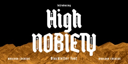 High Nobiety is a modern style of blackletter font. With medium low contrast stroke, fun character with a bit of ligatures and alternates. To give you an extra creative work. High Nobiety font support multilingual more than 100+ language. This font is good for logo design, Social media, Movie Titles, Books Titles, a short text even a long text letter and good for your secondary text font with sans or serif. Make a stunning work with High Nobiety font. Cheers, Maulana Creative
 - Wood Fancy Reverse JNL by Jeff Levine,
$29.00 Amongst some pages scanned and posted online of old wood type alphabets comes this lovely, ornamental design in a reversed style of white lettering on black rectangular boxes. This classic set of wood type is now available digitally as Wood Fancy Reverse JNL. There is a narrow blank box on the “less than” key for use as an end cap, and a wider blank box on the “greater than” key to use between words as a blank space if so desired.


