10,000 search results
(0.041 seconds)
- Alma Serif by Alma Type,
$19.00 Alma Serif is a typeface that tries to combine the modern shape of serif magazines such as Times New Roman with the atmosphere of classic typefaces such as Baskerville. I was working on the universality of the typeface, so that it would be suitable for both long papers and books, but also for formatting narrow columns in magazines.
 - Boucle2 by TipografiaRamis,
$39.00 Bouclé.2 – an upgraded edition of Bouclé fonts (2009), with careful refinements to glyph shapes and extension of glyph amounts, which enabled support of more Latin languages. New edition consists of eight styles: Light, Regular, Bold weights for plain and round fonts respectably, plus Regular and Light italics. Typeface is released in OpenType format with some OpenType features.
 - Soap Opera by Gassstype,
$22.00 Here comes a New font, Soap Opera is a Funny Handmade Brush Font that is written casually and quickly amazing. Letters are made with brushes on Procreate. Then crafted carefully drawn into vector format. That is why Soap Opera has Stylish and unique characteristic more natural look to your text with a more modern look to your text.
 - Churchward Freedom by BluHead Studio,
$25.00BluHead Studio LLC is pleased to announce the release of 7 fonts from the Churchward Freedom family designed by New Zealand typeface designer Joseph Churchward. BluHead Studio is in the process of digitizing many of the fonts in Churchward's extensive library of exciting and unique designs and will be releasing them in OpenType format on a regular basis. - Bentto by Twinletter,
$12.00 Our sans serif font, Named Bentto. This simple, dynamic and exotic themed font has a character that is suitable for you to use in formal and informal design themes, both feminine and masculine design characters. this font will look beautiful. This font is very suitable as text with displays for various kinds of branding, advertisements, posters, banners, packaging, news headlines, magazines, websites, logo design, banners, social media design and of course you can use a lot more.
 - Marker O Type by O Type Foundry,
$15.00 Introducing, Marker O Type. Marker O Type is new signature font like a child's handwriting. The unique typeface brush also feels childish look similar like comic sans. Great for body text in comic book. A unique brush typeface with chill out. This font is perfectly made to be applied mainly in logos and various other formal forms such as invitations, labels, magazines, books, greeting / wedding cards, packaging, fashion, make up, stationery, novels, labels or any type of advertising purpose.
 - Quirked by Letterhend,
$17.00 Quirked is a quirky bold font with unique letterform. You can playaround to fit the form using standard character with alternate character to create new looks. This font perfectly made to be applied especially in logo, and the other various formal forms such as invitations, labels, logos, magazines, books, greeting / wedding cards, packaging, fashion, make up, stationery, novels, labels or any type of advertising purpose. Features : Uppercase & lowercase Numbers and punctuation Alternates/Ligatures Multilingual PUA encoded
 - Obvia Wide by Typefolio,
$29.00 'Obvia' appeared as a result of direct observation on typefaces classified as geometric and the plan to explore for the first time width axes Condensed, Narrow (soon), Normal and new Wide and Expanded. The idea behind 'Obvia's design was to create a distancing from geometrically pure shapes, in this case, square shapes. Then some details were added, such as subtle inktraps, concave endings of the stems and carefully drawn alternate characters, giving a 'geohumanist' tone to the font. This first family of 'Obvia' has 9 weights ranging from Thin to Black, delivering a strong typographic identity, from the paper to the pixel.
 - Obvia Expanded by Typefolio,
$29.00 'Obvia' appeared as a result of direct observation on typefaces classified as geometric and the plan to explore for the first time width axes Condensed, Narrow (soon), Normal and new Wide and Expanded. The idea behind 'Obvia's design was to create a distancing from geometrically pure shapes, in this case, square shapes. Then some details were added, such as subtle inktraps, concave endings of the stems and carefully drawn alternate characters, giving a 'geohumanist' tone to the font. This first family of 'Obvia' has 9 weights ranging from Thin to Black, delivering a strong typographic identity, from the paper to the pixel.
 - Sommerwerk Ink by Sommerwerk,
$29.00 This font is inspired by typography found on old German shop windows. It is a script font, but instead of imitating human handwriting and the gestures connected to it, the goal was to come up with a new writing flow and stroke order. As opposed to handwriting Latin script letters, which normally means drawing each character and then connecting it to the next one, the strokes of this font run across multiple glyphs. Intentionally, the design aims to achieve a flowing transition between each glyph without making use of contextual alternates, taking the limitations of classic machine lettering as a challenge.
 - Mohr Rounded by Latinotype,
$29.00 Mohr Rounded—the new version of the original Mohr typeface—features curved and softer terminals which make the font look more organic, warm and friendly. The Mohr Rounded family comes in three versions: normal, alt and italic, each with 9 weights, from Thin to Heavy, resulting in a total of 27 styles. The versatility of the font makes it suitable for a wide range of applications, from small text to high-impact headlines. Mohr Rounded also includes initial and terminal swashes in most of the uppercase and lowercase characters. This provides a greater range of uses such as branding, packaging and identity design.
 - Martinez by Arterfak Project,
$11.00 Greetings. Introducing our new font, "Martinez". Made with vintage references like a cowboy, lumberjack, wooden and handcraft. A modern slab serif that you can apply for your headline, sub headline even your body text. There is a Normal and a Shadow style that gives you lots of possibilities. "Martinez" is a western font with a lot of features inside. Make your own combination with ligatures, alternates and swashes. Recommended for any style, especially vintage, retro, minimalism and contemporary design. This font is made with simple shapes that you can apply too in your print works like t-shirt, embroidery, posters and craft.
 - Exec by Wiescher Design,
$35.00 I created my new »EXEC« sans font during the years 2018 to mid 2020. The Normal »EXEC«-family has 7 weights, ranging from Thin to Bold (plus 7 italics). This elegant Sans is suited for editorial, book text, advertising and packaging, logo, branding, small text as well as web and screen design. »EXEC« has advanced typographical support including ligatures, small caps, alternate characters, case-sensitive forms, fractions, super- and subscript characters. »EXEC« comes with a range of figures—oldstyle and lining figures, each in tabular and proportional widths. »EXEC« supports Basic-, Western-, and Central-European Latin-based languages.
 - Triump by Latinotype,
$26.00 The typeface family Triump is a simple sans serif with 6 weights from Thin, ideal for use as an epigraph, to Black for head titles of special impact. Excellent for applying in graphic design as logos, trademarks, posters, editorial and web design. Inspired by the classic types of the late twentieth century with rounded corners that give the typography a smooth appearance with rounded ends, with a horizontal stroke that exceeds the vertical in the letters A, E, F, H, J and K which gives a distinct personality. Triump comes with a Black weight in normal and italic Line both upper and lowercase letters, especially to give a vintage look to the designs.
 - Unpredictable by Putracetol,
$28.00 Unpredictable is a display sans font with variations of different heights and baseline position. In this font there are several heights and baselines that you can combine. For height (normal, low, and high), for the baseline (normal, above and below). This tyepeface is unique and very suitable for logos, Tshirt, apparel, quote, handwritten quotes, product packaging, tittle header, poster, merchandise, social media, labels, branding & greeting cards.
 - LaPerutaFLF - Unknown license

- Covington - Unknown license

- Abrect by Hackberry Font Foundry,
$24.95 My first font for the summer of 2009, Abrect is a new sans serif font where I try to maximize the x-height and keep the design fresh and personal. It fits in with my continuing objective of designing book fonts that I can really use. Abrect is a tangent for me just taking an idea out to its end. In particular, it is a radical modification of my first font in 1993, Nuevo Litho. The hand-drawn shapes vary a lot, many pushing the boundaries of the normal character. With many of the new releases I see, the digital perfection is getting pretty extreme. It’s looking like a Rococo stage of development for many with decoration taking over from function. I'm consciously trying to head a different direction. This is not a normal font for me in that it has caps, lowercase, with the appropriate figures for each case, no small caps. This is the first time I have skipped small caps in over a decade. This font has all the OpenType features in the display set for 2009 except for the small caps. There are several ligatures for your fun and enjoyment: bb gg ff fi fl ffi ffl ffy fj ft tt ty Wh Th and more and many of them are experimental in form. Enjoy!
 - Bebas Neue Semi Rounded by Dharma Type,
$4.99 Bebas Neue SemiRounded is the Bebas Neue with rounded corners. As you know, Bebas Neue is the most widely used free font recently. This semi-rounded version is the new style for more widely use. The basic theory and proportion are same as Bebas Neue but rounded shape gives a warm, soft and natural impression. A bit more rigid than Bebas Neue Rounded. Available at an affordable price.
 - Crossfit by TypeThis!Studio,
$54.00 Crossfit is a new headline font family, designed by Anita Jürgeleit at TypeThis!Studio. It’s suitable for big sizes and titles, such as big movie posters, advertising or editorial headlines. Matching topics might be adventures, sports, strong nature and all kind of challenging life events. Its bold stability transformes your creation into a non questionable design. It is bold, clear and also friendly thanks to its rounded corners. www.typethis.studio
 - Bispo by Custom Types,
$- Bispo is a script typeface family made based on italic chancery calligraphy. After one year of it first launch, Bispo family now has another variant, a Bispo Pro version. The Pro version now contains more than 450 glyphs and new OpenType features, enjoy!
 - DIN Next Devanagari by Monotype,
$103.99DIN Next is a typeface family inspired by the classic industrial German engineering designs, DIN 1451 Engschrift and Mittelschrift. Akira Kobayashi began by revising these two faces-who names just mean ""condensed"" and ""regular"" before expanding them into a new family with seven weights (Light to Black). Each weight ships in three varieties: Regular, Italic, and Condensed, bringing the total number of fonts in the DIN Next family to 21. DIN Next is part of Linotype's Platinum Collection. Linotype has been supplying its customers with the two DIN 1451 fonts since 1980. Recently, they have become more popular than ever, with designers regularly asking for additional weights. The abbreviation ""DIN"" stands for ""Deutsches Institut für Normung e.V."", which is the German Institute for Industrial Standardization. In 1936 the German Standard Committee settled upon DIN 1451 as the standard font for the areas of technology, traffic, administration and business. The design was to be used on German street signs and house numbers. The committee wanted a sans serif, thinking it would be more legible, straightforward, and easy to reproduce. They did not intend for the design to be used for advertisements and other artistically oriented purposes. Nevertheless, because DIN 1451 was seen all over Germany on signs for town names and traffic directions, it became familiar enough to make its way onto the palettes of graphic designers and advertising art directors. The digital version of DIN 1451 would go on to be adopted and used by designers in other countries as well, solidifying its worldwide design reputation. There are many subtle differences in DIN Next's letters when compared with DIN 1451 original. These were added by Kobayashi to make the new family even more versatile in 21st-century media. For instance, although DIN 1451's corners are all pointed angles, DIN Next has rounded them all slightly. Even this softening is a nod to part of DIN 1451's past, however. Many of the signs that use DIN 1451 are cut with routers, which cannot make perfect corners; their rounded heads cut rounded corners best. Linotype's DIN 1451 Engschrift and Mittelschrift are certified by the German DIN Institute for use on official signage projects. Since DIN Next is a new design, these applications within Germany are not possible with it. However, DIN Next may be used for any other project, and it may be used for industrial signage in any other country! DIN Next has been tailored especially for graphic designers, but its industrial heritage makes it surprisingly functional in just about any application. The DIN Next family has been extended with seven Arabic weights and five Devanagari weights. The display of the Devanagari fonts on the website does not show all features of the font and therefore not all language features may be displayed correctly. - DIN Next Cyrillic by Monotype,
$65.00DIN Next is a typeface family inspired by the classic industrial German engineering designs, DIN 1451 Engschrift and Mittelschrift. Akira Kobayashi began by revising these two faces-who names just mean ""condensed"" and ""regular"" before expanding them into a new family with seven weights (Light to Black). Each weight ships in three varieties: Regular, Italic, and Condensed, bringing the total number of fonts in the DIN Next family to 21. DIN Next is part of Linotype's Platinum Collection. Linotype has been supplying its customers with the two DIN 1451 fonts since 1980. Recently, they have become more popular than ever, with designers regularly asking for additional weights. The abbreviation ""DIN"" stands for ""Deutsches Institut für Normung e.V."", which is the German Institute for Industrial Standardization. In 1936 the German Standard Committee settled upon DIN 1451 as the standard font for the areas of technology, traffic, administration and business. The design was to be used on German street signs and house numbers. The committee wanted a sans serif, thinking it would be more legible, straightforward, and easy to reproduce. They did not intend for the design to be used for advertisements and other artistically oriented purposes. Nevertheless, because DIN 1451 was seen all over Germany on signs for town names and traffic directions, it became familiar enough to make its way onto the palettes of graphic designers and advertising art directors. The digital version of DIN 1451 would go on to be adopted and used by designers in other countries as well, solidifying its worldwide design reputation. There are many subtle differences in DIN Next's letters when compared with DIN 1451 original. These were added by Kobayashi to make the new family even more versatile in 21st-century media. For instance, although DIN 1451's corners are all pointed angles, DIN Next has rounded them all slightly. Even this softening is a nod to part of DIN 1451's past, however. Many of the signs that use DIN 1451 are cut with routers, which cannot make perfect corners; their rounded heads cut rounded corners best. Linotype's DIN 1451 Engschrift and Mittelschrift are certified by the German DIN Institute for use on official signage projects. Since DIN Next is a new design, these applications within Germany are not possible with it. However, DIN Next may be used for any other project, and it may be used for industrial signage in any other country! DIN Next has been tailored especially for graphic designers, but its industrial heritage makes it surprisingly functional in just about any application. The DIN Next family has been extended with seven Arabic weights and five Devanagari weights. The display of the Devanagari fonts on the website does not show all features of the font and therefore not all language features may be displayed correctly. - DIN Next Paneuropean by Monotype,
$92.99DIN Next is a typeface family inspired by the classic industrial German engineering designs, DIN 1451 Engschrift and Mittelschrift. Akira Kobayashi began by revising these two faces-who names just mean ""condensed"" and ""regular"" before expanding them into a new family with seven weights (Light to Black). Each weight ships in three varieties: Regular, Italic, and Condensed, bringing the total number of fonts in the DIN Next family to 21. DIN Next is part of Linotype's Platinum Collection. Linotype has been supplying its customers with the two DIN 1451 fonts since 1980. Recently, they have become more popular than ever, with designers regularly asking for additional weights. The abbreviation ""DIN"" stands for ""Deutsches Institut für Normung e.V."", which is the German Institute for Industrial Standardization. In 1936 the German Standard Committee settled upon DIN 1451 as the standard font for the areas of technology, traffic, administration and business. The design was to be used on German street signs and house numbers. The committee wanted a sans serif, thinking it would be more legible, straightforward, and easy to reproduce. They did not intend for the design to be used for advertisements and other artistically oriented purposes. Nevertheless, because DIN 1451 was seen all over Germany on signs for town names and traffic directions, it became familiar enough to make its way onto the palettes of graphic designers and advertising art directors. The digital version of DIN 1451 would go on to be adopted and used by designers in other countries as well, solidifying its worldwide design reputation. There are many subtle differences in DIN Next's letters when compared with DIN 1451 original. These were added by Kobayashi to make the new family even more versatile in 21st-century media. For instance, although DIN 1451's corners are all pointed angles, DIN Next has rounded them all slightly. Even this softening is a nod to part of DIN 1451's past, however. Many of the signs that use DIN 1451 are cut with routers, which cannot make perfect corners; their rounded heads cut rounded corners best. Linotype's DIN 1451 Engschrift and Mittelschrift are certified by the German DIN Institute for use on official signage projects. Since DIN Next is a new design, these applications within Germany are not possible with it. However, DIN Next may be used for any other project, and it may be used for industrial signage in any other country! DIN Next has been tailored especially for graphic designers, but its industrial heritage makes it surprisingly functional in just about any application. The DIN Next family has been extended with seven Arabic weights and five Devanagari weights. The display of the Devanagari fonts on the website does not show all features of the font and therefore not all language features may be displayed correctly. - Arbeit Pro by Studio Few,
$24.00 A remaster of Neo Grotesk family - Arbeit. It employs improved letterform balance and contrast throughout. All weights feature a set of new alternates under the style 'Contrast'.
 - Printing Press Extras JNL by Jeff Levine,
$29.00Printing Press Extras JNL is another collection of classic printing embellishments and stock cuts from Jeff Levine, with a few new ones thrown in for good measure. - Koweti by Twinletter,
$15.00 Introducing Koweti, a premium Arabic style font. Specially designed to bring luxury and prestige to your designs. This unique letterform gives you the flexibility to create the look and feel you need for any occasion. Using this font is the best choice to bring harmony to your designs.
 - Hisbullah by ARToni,
$23.00 Hisbullah is a bold, unique and stylish display font with an Arabic look. Designed to give a luxurious and elegant impression by combining modern and classic styles to make it timeless. This font is suitable for any purpose such as industrial, religious, gaming, movie, music themes, and so on
 - Kofin by Attractype,
$14.00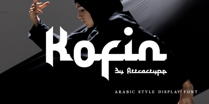 Kofin is arabic style display font that looks stylish, elegant and futuristic. Kofin will perfect for your latest project. Kofin is perfect for many your projects like logo branding, photography, watermarks, invitations, visiting cards, advertisements, product designs, stationery, wedding designs, labels, product packaging, special events and much more.
 - Yalla by Borutta Group,
$39.00 Yalla was inspired during a trip Mateusz Machalski took to Cairo (Egypt). The vast array of strong Arabic headline type, geometric forms working in interesting ways and contrasting with smooth, calligraphic details fed the design. Due to the same proportions and heights, Yalla works great together with Afronaut.
 - Coronette by Chank,
$99.00 The exciting new typewriter font, Coronette, combines old-fashioned charm with modern typographic sensibilities. Originally commissioned as a custom font for Magnetic Poetry, this clean, medium-weight typewriter font is now available to the general font-lovin' public. Enjoy a new, multi-purpose workhorse font for all your labeling and page layout needs.
 - Veto Sans by Monotype,
$50.99 Veto® Sans is both highly legible and handsomely distinctive – a rare blend in a typeface. It’s a design that stands out and fits in. Veto Sans is equally competent on screen and in print. It’s four carefully determined weights in both normal and condensed proportions, each with an italic complement, give the family an exceptionally deep range of applications. All the designs in the family are valuable design tools. None are superfluous. Advertising, brand, corporate, editorial and interactive design are all in Veto Sans’ wheelhouse. It also shines in wayfinding and other signage projects. And to all these, it brings a warmth and personality. An ample x-height, open counters, vertical stroke endings and subtly condensed capital letters enable Veto Sans fonts to perform with grace in print and digital environments while being space efficient. An added benefit is that all-capital typography set in Veto Sans is not only space saving, it’s also easy to read. Drawn as a complete reimaging of his earlier Veto design, Swiss designer Marco Ganz worked to create character shapes distilled to their purest forms while maintaining a relaxed and natural demeanor. Ganz, who is also a three-dimensional artist, is acutely aware that the negative space between letters and the internal space within letters is as important as the positive shape of the letters themselves. This dynamic balance between the negative and positive aspects of character forms gives Veto Sans a sense of immediacy without looking hurried. Ganz also took great care to draw a suite of italic designs that not only complement the roman weights perfectly, but also give the family a dynamic verve. A large international character set also ensures ease of localization. “Veto Sans,” says Ganz, “is a typeface for designers that search for a new and different solution to age-old typographic challenges.”
 - ParmaPetit - 100% free

- Space Up Yer Life - Unknown license

- 57 Rodeo by Baseline Fonts,
$24.00A practical yet unique display face designed to offer attention-getting headlines and an alternative to the normal wild west faces. - Troglen by Letterhend,
$17.00 Troglen Sans is a professional, bold sans-serif font that's perfect for grabbing attention. With a modern, casual feel and thick strokes, it's perfect for headlines and making a statement that's both bold and confident.This font perfectly made to be applied especially in logo, and the other various formal forms such as invitations, labels, logos, magazines, books, greeting / wedding cards, packaging, fashion, make up, stationery, novels, labels or any type of advertising purpose. Features : Uppercase & lowercase Numbers and punctuation Alternates & Ligatures Multilingual PUA encoded We highly recommend using a program that supports OpenType features and Glyphs panels like many of Adobe apps and Corel Draw, so you can see and access all Glyph variations.
 - Ports Play by Alandya TypeFoundry,
$19.00 Port Play ... Based on Density Slab Serif, now with other styles, Normal and Expand, equipped with alternative letters that are so wide that they give a strong, clear, masculine feel, and have good legibility. Port Play comes in regular, oblique, outline, and outline oblique styles along with regular and oblique variable files. This font is perfect for every project. suitable for branding logo, badge design, or apparel design. This font also comes with multilingual support.
 - Geogrotesque Expanded Series by Emtype Foundry,
$69.00 Geogrotesque Expanded Series comes in three widths: Wide, Extended and Expanded, that go between 120% and 200% of the normal width. Since the original Geogrotesque is slightly condensed, the Wide family becomes a good option for texts. Whereas the Extended and Expanded are ideal for display sizes. With the inclusion of the Expanded Series and the preceding Condensed ones, the Geogrotesque super family is now a complete widths system. For more details see the PDF.
 - Minik by Ahmet Altun,
$16.00 Minik Font Family comes in 2 weights; Regular and Bold. It is completely hand-drawn. While the capital letters have normal sizes, the lowercase letters are smaller than the common form in the vertical axis to have a cute view. The Minik Font Family has a few ornaments and stylistic alternates. With this font family, you can create eye-pleasing and nice works such as posters, printings, t-shirts, adds, magazines etc.
 - Naughties by Chank,
$59.00The Naughties font was meant to be a happy new typestyle for a naughty new decade. It turned into a neo-classic FUN font. This font is sent to you from the light-hearted, long-ago past of 1999 in an effort to promote a new name for the current decade. Both the font and the decade should be referred to as "the naughties". Please make a note of it. Thank you.


