3,566 search results
(0.016 seconds)
- M Ying Hei PRC by Monotype HK,
$523.99 M Ying Hei™ is designed by type designer Kenneth Kwok and Robin Hui. Unnecessary details have been eliminated to pursue a minimal form. The structure of characters are well balanced, neat and dignified. Different components of a character are cooperating perfectly in an appropriate proportion. Thickness of strokes are modified according to the number of strokes, thus achieving an even texture throughout the paragraphs. Therefore a perfect choice for prints, user interface and signages. M Ying Hei™ is equipped with 7 weights, which is sufficient for various occasions like matching with different Latin typefaces and handling complex information hierarchy.
 - SK Parnik by Shriftovik,
$32.00 SK Parnik is a modern display font inspired by the culture of vegetarianism. This font is based on the shape of a bean pod, which gives the symbols a unique playful character, perfect for working with the branding of companies that are aimed at a children's audience, as well as engaged in restaurant activities. The character composition consists of uppercase and lowercase letters and supports extended Cyrillic and Latin letters. This allows you to expand the scope of this font. Despite the pronounced decorative component, thanks to its tools, the font will fit perfectly into the collection of any designer.
 - M Young Hei PRC by Monotype HK,
$523.99 M Ying Hei™ is designed by type designer Kenneth Kwok and Robin Hui. Unnecessary details have been eliminated to pursue a minimal form. The structure of characters are well balanced, neat and dignified. Different components of a character are cooperating perfectly in an appropriate proportion. Thickness of strokes are modified according to the number of strokes, thus achieving an even texture throughout the paragraphs. Therefore a perfect choice for prints, user interface and signages. M Ying Hei™ is equipped with 7 weights, which is sufficient for various occasions like matching with different Latin typefaces and handling complex information hierarchy.
 - Toy Decals JNL by Jeff Levine,
$29.00 For decades, cereal companies have included premiums [promotional gifts] inside their packages, printed on the cartons or to send for with a special coupon and redemption instructions. During the 1940s, Pep cereal [a long-discontinued Kellogg's brand] offered a series of water-applied decals within its boxes. Most likely made by the Meyercord Company (one of America's largest transfer decal manufacturers at the time), one decal in particular had an alphabet in gold letters with black outlines. (One can only presume the marketing strategy was to have kids bug their parents to buy more Pep cereal if the child needed more than one letter of the alphabet for his or her initials!) Those decal letters have inspired a digital version as the outline character font Toy Decals JNL, which is available in regular oblique, solid and solid oblique styles.
 - ITC Sportbet by ITC,
$40.99Looking for something new for setting powerful headlines? Need a font that can create logos with ease? How about something masculine, a design with authority and panache? Then ITC’s newest typeface, ITC Sportbet™, may be the perfect choice. ITC Sportbet is a design that should be set tight, creating an arresting graphic image as well as words. Although a capital-only typeface, it benefits from a large suite of alternate characters that enable individual words and headlines to be customized with a distinctive personality. In addition to the obvious power of ITC Sportbet’s square-jawed character shapes, it’s fun to use. Exchange one or two letters with their alternative designs and a brand new headline or logo appears. ITC Sportbet was designed by Dane Wilson, the principal of the London-based design firm of Dane Design. Although this is his first commercial typeface design, Wilson has ample experience creating logos and custom typefaces for corporate branding. In fact, Sportbet grew out of such a project. “The idea initially came from wanting to provide a client with a stylish, modern and graphically impactful corporate identity logo font,” recalls Wilson. “Although the first sketches looked promising as a typeface, because of time and budget constraints, developing an entire alphabet would be overambitious.” Not to be deterred, Wilson continued to work on the design when time permitted. He eventually completed the font and started final application tests. The results looked good to Wilson, but he felt that the design was missing something. “I hit upon the idea of breaking out the left side of all the closed counters,” Wilson wrote about the design. “This simple device gave Sportbet the kick it needed.” Although one weight and a capital-only typeface, Wilson’s ITC Sportbet should prove to be a powerful and versatile communicator. - Allez Hop by Hanoded,
$15.00 Allez Hop is a very useful font: it comes with all accents, bells and whistles and has been created using scans of handwritten text. It has a certain 'quickness' to it, not unlike someone jotted down a couple of lines on a notepad.
 - Mafond by Etewut,
$25.00 Mafond is a fresh slab serif. It supports all european languages. The family is rounded as never before and includes 5 styles. Each of them has alternates for basic latin and a couple of ligatures. In case of success Mafond becomes Yofond.
 - Rigney by Solotype,
$19.95Bill Rigney, an old job printer in my home town, established his shop in 1896, closed it in 1900 to take a steady job, stored the equipment in a large shed, and reopened for business upon his retirement in 1950. What a find! A bonanza of old type! We became good friends and upon his death I bought the type. Bless you Bill. - Haboro Slab by insigne,
$- Haboro Slab. It’s a nose-to-the-grindstone kind of font like the first of its family. This slab serif pushes through the clutter powerfully in editorial and corporate work such as business websites and software. The Haboro hyperfamily as a whole is known for its ability to make the work clear and simple, even with the fonts’ advanced angle--and Slab is no change here. Consistent with Haboro, too, the simplified geometric features of the slab face just make sense, no matter where you use it. Its timeless wedge-molded serifs give this family the formula it needs to function flexibly in jobs from fashion to packaging. Enhance your output with the font’s wide range of ligatures and alternates, including OpenType alternates. Use Haboro Slab’s large pair of solution glyphs and various other OpenType specifics, too, to give your message the clarity it deserves. Even more, it couples well with the sophisticated didone of the Haboro hyperfamily to further expand your capabilities. Haboro Slab has every quality you need for successful lettering. Use this modification on a classy tradition to mold and shape your next layout, whether website, iPhone app, advertising, or newspaper. There is no work Haboro Slab won’t power through.
 - Pamplemousse by The Ampersand Forest,
$19.00 Meet Pamplemousse, a display font that's part fun, casual script and part elegant typeface! Pamplemousse is most decidedly a fellow who enjoys lazy Sunday mornings spent sipping mimosas or bloody marys over a plate of eggs benedict and the New York Times crossword puzzle. He enjoys dressing up for use in branding and headlines (he looks particularly dashing in all caps) and also sitting back and composing a casual note to a dear friend. Pamplemousse is mostly sweet and just a little sophisticated, and he likes being just as he is. Pamplemousse started out as a typeface based on the lettering of Gustav Klimt in his poster for the first exhibition of the Vienna Secession movement (Art Nouveau). This drifted into an homage to Rea Irvin's iconic masthead typeface for the New Yorker magazine. Finally, with the addition of a lowercase (absent from Irvin's typeface), a significant revision away from both Klimt and Irvin into a more casual space, Pamplemousse was born! Oh — why "pamplemousse?" "Pamplemousse" is French for grapefruit. What goes better in your Sunday gin and tonic than an aromatic slice of pamplemousse? Say it a few times. Preferably after a couple of those g & t's. You'll see how fun he can be...
 - Dokument Pro by Canada Type,
$29.95 Jim Rimmer aptly described his Dokument family as a sans serif in the vein of News Gothic that takes nothing from News Gothic. Building on that internal analysis, Dokument Pro is the thoroughly reworked and expanded of the original main set released in 2005, with different widths still in the pipeline. This new version updates Jim’s work to six Pro weights and their italic counterparts, each of which takes advantage of OpenType stylistic sets to introduce different degrees of graduation from gothic to humanist. Dokument Pro is now a unique text sans family, with an adaptable personality suitable for the kind of edgy, uncompromising corporate and media typography that just tells it like it is, instead of having to resort to the common contemporary luring and baiting tactics. Dokument Pro’s range of weights, styles and features (over 775 glyphs per font, built-in small caps, alternates galore, and support for over 45 Latin languages) allows for multi-application versatility and clear, precise emotional delivery. This is the kind of straight-shooter sans that should be in every designer’s toolbelt. For more details on the fonts' features, text and display specimens and print tests, consult the Dokument Pro PDF availabe in the Gallery section of this page. 20% of Dokument Pro’s revenues will be donated to the Canada Type Scholarship Fund, supporting higher typography education in Canada.
 - Directa Serif Variable by Outras Fontes,
$170.00 Directa Serif Variable is a text type family in one single font file. It explores new possibilities for the original type family released by Outras Fontes some years earlier, which is designed to save space with the highest readability. The variable font is composed of two axes of variation: Weight (100–900) and Italic (0–1). It also contains 18 predefined styles between Thin and Heavy and their respective italics. So now you can adjust the weight of the type by interpolating it in real time using any variable font compatible app. There are hundreds of possibilities between the values of 100 (Thin) and 900 (Heavy). And if you're feeling adventurous, you can also use the Italic axis to interpolate instances between Roman (0) and Italic (1) and see what happens in the middle. This new technology can be very useful for web and video animations. Directa Serif Variable is also highly recommended for newspapers, magazines, corporate communication and so on. It has a large set of characters, including Western, Central European, Baltic, Scandinavian, Icelandic, Romanian and Turkish unicode ranges. The variable font also includes several ligatures, a complete set of small caps, sets of lining, old style and tabular figures, as well as fractions, superior and inferior numbers. These features can be easily accessed using any OpenType-compatible software.
 - Silent Waste by Bogstav,
$16.00 Silent Waste is based upon a misspelling on a sign. It's handdrawn, yet digitally manipulated. But you can't tell!
 - VTCTattooScriptTwo - Personal use only

- The font "Chopin-Bold" evokes a sense of elegance and grandeur that is truly reminiscent of its namesake, the famed composer Frédéric Chopin. Known for his romantic-era compositions that stir the sou...
- FS Joey Paneuropean by Fontsmith,
$90.00Kangaroo FS Joey was the offspring of a project with Rudd Studio to develop a logotype for an online streaming TV service, in 2008. While under wraps, the secret project was code-named Kangaroo. The logotype led to a second project, to design a corporate typeface for the service. It was the first big project Fernando Mello had worked on with Jason Smith. “Like any designer who just joined a team, I was very excited about it, drawing and sketching lots of ideas. I remember Jason and I experimenting with lots of possibilities, for both the logo and the typeface.” Online As the font for a Spotify-style, internet-based service, FS Joey needed to be highly legible on-screen, including at very small sizes. There had to be a range of weights, and they’d have to work well in print, too. It was also important that it felt corporate, not too quirky, while still having a strong character of its own. Quirkiest “We designed three weights specifically for use on the Web,” says Jason Smith. “There was the usual fight between me and my team. I wanted at least one identifiable letter that was a quirk. As always I went straight for the lowercase ‘g’, and it was drawn numerous times with lots of variation. I got the quirkiest one accepted by the client.” But, later in 2009, the Competition Commission blocked Project Kangaroo, and Fontsmith were left with a couple of weights of an as yet unused font. From Kangaroo, Joey was born. A favourite “Straight away, people started to notice the typeface,” says Jason. “I can take the credit for pushing the art direction and standing up for the quirks. But it was Fernando who was the key to pulling it all together and adding his own distinct flavour. Now it’s one of my favourite designs in our library.” Fresh and friendly, geometric and energetic, Joey is available in five weights, all with italics, all finely-tuned for both screen and print. - FS Joey by Fontsmith,
$80.00 Kangaroo FS Joey was the offspring of a project with Rudd Studio to develop a logotype for an online streaming TV service, in 2008. While under wraps, the secret project was code-named Kangaroo. The logotype led to a second project, to design a corporate typeface for the service. It was the first big project Fernando Mello had worked on with Jason Smith. “Like any designer who just joined a team, I was very excited about it, drawing and sketching lots of ideas. I remember Jason and I experimenting with lots of possibilities, for both the logo and the typeface.” Online As the font for a Spotify-style, internet-based service, FS Joey needed to be highly legible on-screen, including at very small sizes. There had to be a range of weights, and they’d have to work well in print, too. It was also important that it felt corporate, not too quirky, while still having a strong character of its own. Quirkiest “We designed three weights specifically for use on the Web,” says Jason Smith. “There was the usual fight between me and my team. I wanted at least one identifiable letter that was a quirk. As always I went straight for the lowercase ‘g’, and it was drawn numerous times with lots of variation. I got the quirkiest one accepted by the client.” But, later in 2009, the Competition Commission blocked Project Kangaroo, and Fontsmith were left with a couple of weights of an as yet unused font. From Kangaroo, Joey was born. A favourite “Straight away, people started to notice the typeface,” says Jason. “I can take the credit for pushing the art direction and standing up for the quirks. But it was Fernando who was the key to pulling it all together and adding his own distinct flavour. Now it’s one of my favourite designs in our library.” Fresh and friendly, geometric and energetic, Joey is available in five weights, all with italics, all finely-tuned for both screen and print.
 - BrushtipTravis by JOEBOB graphics,
$19.00 Slightly slanted brush tip handwriting script that looks both elegant and streetwise, very suitable for all your poetry, lyrics and memoires. The font comes with a couple of swashes to use as you please and includes all eastern European, Baltic, Scandinavian and Turkish characters.
 - Yellow Magician - Unknown license

- Reactor A1 - Personal use only

- Romance fatal LCD - Personal use only

- Casa Sans - 100% free

- A Fire Inside The Walls - 100% free

- Citaro Voor (Dubbele hoogte, breed) - 100% free

- JD Gina - 100% free

- Hollenbeck JNL by Jeff Levine,
$29.00Hollenbeck JNL is the Art Deco, all-caps cousin of Jeff Levine's Hallandale JNL typeface. This version utilizes the thick-and-thin stroke weights so popular during the Art Deco era, while retaining the look of hand-lettered copy. Best suited at larger point sizes, this font is a nice alternative to the over-used display faces reminiscent of that time period. - Amiga by Volcano Type,
$19.00 The Amiga is a family of home computers originally developed by Amiga Corporation as an advanced game console. Development on the Amiga began in 1982. Commodore International introduced the machine to the market in 1985, after having bought Amiga Corp. The machine was ahead of its time, sporting a custom chipset with advanced graphics and sound capabilities, and a sophisticated multitasking operating system.
 - Cyntho Next Slab by Mint Type,
$35.00 Cyntho Next Slab is a totally reworked typeface based on our previous bestseller Cyntho Slab Pro. Cyntho Next Slab is the slab serif companion to Cyntho Next . It is a modern geometric slab serif based on a hybrid waterdrop-like shape with extensive language support including Cyrillic, rich with OpenType features, perfect for magazines, posters, advertising, corporate identity, and much more.
 - P22 Cage by P22 Type Foundry,
$24.95 Based on the handwriting and sketches of American experimental composer John Cage, this set was produced in conjunction with The Museum of Contemporary Art in Los Angeles and the John Cage Trust. This unique collection includes 52 graphic extras culled from the composer's notes and scores, as well as the "Cage Silence" font inspired by Cage's seminal work 4' 33".
 - Komsomol by Hanoded,
$15.00 Komsomol (short for Kommunisticheskii Soyuz Molodyozhi) was the youth division of the Communist Party of the Soviet Union. Komsomol font was modeled on several Soviet propaganda posters which all had one thing in common: a very loud message in a very clear typeface. Komsomol is an all caps typeface which comes with extensive language support in order to educate the masses.
 - 3D Blocky by Okaycat,
$29.50 3D Blocky is a hand-drawn 3-D font. Composed of friendly & fun letters, this font is sure to become a favorite for you. There is a sprinkling of dingbats scattered around the alternates, just there to make this font extra fun and useful . Check it out! 3D Blocky is extended, containing West European diacritics & ligatures, making it suitable for multilingual environments & publications.
 - Tact New by Pesic,
$29.00 Tact New family is geometrically sans serif font, with 3 weights, condensed looks glyphs, with an alternative glyph set to improve its use in different graphic contexts. It is suitable for use in the fields of science, art, architecture, urban planning, techniques, electronics, advertising, posters, corporate designs, futuristic themes, sport, film, computers, phones, video games, publishing... Contains all Latin and Cyrillic glyphs.
 - Eastgood by Wacaksara co,
$12.00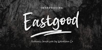 Eastgood Font is a hand brush script font and dramatic movement. This font is great for your next creative project such as Logotype, printed quotes, invitations, cards, product packaging, headers, Letterhead, Poster, Apparel Design, Label, and etc. Eastgood comes with uppercase, lowercase, numerals, punctuations and so many variations on each character include OpenType alternates, and common ligatures to let you customize your designs.
 - Statue Of Liberty's Underwear by Vic Fieger,
$6.99Inspired by a handwritten Cyrillic placard seen in a book about the Soviet Union, Statue of Liberty's Underwear was envisioned as having been written with a very thick pen with a flat tip held horizontally. Additionally, the letterforms were sculpted to resemble lettering common in early 20th-century Russian constructivism pieces. A Cyrillic alphabet, or "azbuka", set was included in the font. - Baker Signet by ParaType,
$25.00 Bitsream version of Baker Signet typeface designed by well-known calligrapher Arthur Baker in 1965 for Visual Graphic Corporation (VGC). A design on classical lines with subtle but effective calligraphic touches and flare stroke terminals. For use in advertising and display typography as well as for headlines and small texts. Cyrillic version was developed by Eugene Sadko and released by ParaType in 2008.
 - Necia by Graviton,
$20.00 Necia font family has been designed for Graviton Font Foundry by Pablo Balcells in 2014. It is a modular, geometric and slightly condensed typeface which has been conceived to be primarily a display typeface, but given its clarity it can also be used for composing short and intermediate length texts. Necia consists of 8 styles. Each containing small caps and several alternate characters.
 - Ingy Star Tilings by Ingrimayne Type,
$9.00 IngyStarTilings allows one to create a variety of patterns that have stars. Some of them are quite common and others less so. A sample file is available that shows possible patterns that can be constructed with this typeface, including some non-star repeating patterns. As the posters indicate, some of the patterns constructed with the regular version are intended to be multicolored.
 - Aguda by Graviton,
$20.00 Aguda font family has been designed for Graviton Font Foundry by Pablo Balcells in 2014. It is a modular, geometric typeface which has been conceived to be primarily a display typeface, but given its clarity it can also be used for composing short and intermediate length texts. Aguda consists of 8 styles. Each containing small caps and several alternate characters.
 - Browar by Spacemotion,
$35.00 Browar is a display Grotesk typeface which has Latin & Cyrillic scripts. It comes in 1 weight and it contains 416 characters. Browar includes extended language support (+ Cyrillic), fractions, tabular figures, arrows, ligatures and more. Perfectly suited for graphic design and any display use. It could easily work for web, signage, corporate, newspaper, display, magazines, game ui as well as for editorial design.
 - Kaisar by Hazztype,
$21.00 Kaisar is a geometric sans serif typeface that draws inspiration from Eurostile or similar typefaces, with less boxy feels. It comes with 9 weights and matching italics and contains 400+ glyphs that support broad latin language. Kaisar was designed to give a corporate, technological, futuristic look, great for many contexts from web to print, as a headline or as a body text.


