1,739 search results
(0.014 seconds)
- 20th Century German by Celebrity Fontz,
$24.99Ornamental initials superimposed on elaborate drawings of men and women in scenes from 20th Century German country life, with flowers, cottages, churches, and towns in the background. Includes one set of A-Z ornamental initials conveniently assigned to both the upper and lower case alphabet characters. - Regina Tiffany by Artchitype Studio,
$22.00 Regina Tiffany is classy display serif font with 250+ characters. Includes uppercase, lowercase characters, multilingual, alternates and most common other characters. Regina Tiffany is perfect for logos, social media posts, product packaging, product designs, and other projects. FEATURES : Uppercase Number Punctuation Multilingual Alternate Ligature Multilingual Support
 - Inventory JNL by Jeff Levine,
$29.00Inventory JNL is based on a "solid letter" stencil where you trace the body of the letter and fill in the top and bottom connecting lines to each character. This is another font in Jeff Levine's series of digital designs based on classic lettering stencil guides. - Hangout by PizzaDude.dk,
$20.00 Hangout has got a big mouthful of ligatures - including substitution for double letters and numbers - and on top of that, almost 200 substitutions for the most common letter combinations - almost 250 ligatures in total. Furthermore, Hangout also includes alternate version of lowercase letters! Take that and chew!!!
 - Melodiously by Get Studio,
$19.00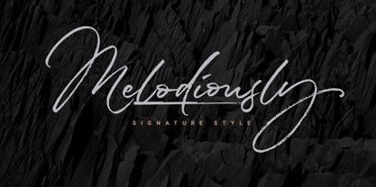 Melodiously Script is handwritten signature style font with stunning brush characters. Include OpenType alternates and common ligatures. Ideal for logos, name tag, handwritten quotes, product packaging, merchandise, social media & greeting cards. Try the alternates and ligatures to give your designs looks good, fresh, casual, stylish, and modern.
 - Hinny by Elemeno,
$15.00Another cartoony handwriting font, Hinny (named for the offspring of a donkey and a horse, but less common than a mule) is unassuming and narrow, perfect for fitting a lot of words in a small space. Please note that this font has a limited character set. - ShadyCharacters by Ingrimayne Type,
$4.95 ShadyCharacters is an all-caps font with a ziggy, hollow top and a solid bottom. With lots of imagination, you might see the letters as tree-like, hence its name. The ShadyCharactersInside font can be layered over letters of ShadyCharacters to fill in the tops with color.
 - Bodywerk by PizzaDude.dk,
$20.00 Bodywerk is a futuristic looking font, but worn and torn! The font has got more than 200 ligatures - including double letter and number substitution - along with a huge load of most common letter combinations! You will need to use OpenType supporting applications to use the autoligatures.
 - Linger On by Gustav & Brun,
$16.00 Linger On is a handwritten fairly rough brush script. It’s equipped with some Open Type features and an extra set of the most common used letters. It also includes lines and endings for you to have more fun with and make Linger On even more unique.
 - SantaCruz by Wilton Foundry,
$29.00I wanted to capture a sense of California with this font - generous, warm, open, bold and sunny - all this imagery is captured in Santa Cruz. It is the quintessential California beach town like the world-famous Boardwalk with everything from the Giant Dipper roller coaster to cotton candy, corn dogs on a stick and chocolate-coated bananas. In fact, the Santa Cruz Boardwalk is the West Coast's last remaining seaside amusement park. It has miles of sandy beaches, giant redwood forests and great wineries. I know you will find many great applications to use SantaCruz, the font, whenever you have a need to extress a warm, sunny and generous spirit! SantaCruz is available in Opentype, PostScript and Truetype formats for both Mac and Windows. - Tight - Unknown license

- eyesore - Unknown license

- 15x5 - Unknown license

- schnee - 100% free

- kindergaden - Unknown license

- bellafonte - Unknown license

- Texture - Unknown license

- 07x5 - Unknown license

- BPbigHead - Unknown license

- Osnova by AndrijType,
$18.75 The common Slavic word Osnova means basis in English. This universal but still distinctive typeface can make a good foundation for any design project. There is the main Osnova version and separated faces Osnova Alt, Osnova Fancy and Osnova Small Caps for Western Latin, Greek and Cyrillic languages.
 - Summer Love by Komet & Flicker,
$15.00 Good Vibes Only! This hand drawn brush font gives a loose and laid-back feeling to any project. Included with are 10 common connector words like "the" "and" and "with" which can easily be accessed through Illustrator's glyphs panel. Also included are 24 hand drawn sun & surf themed icons.
 - Nat Pictures by ParaType,
$25.00 Two sets of signs and pictures designed by Natalia Vasilyeva. The first one includes figures, arrows, geometric shapes and other signs of abstract nature. The second set — pictures of flora and fauna (animals, fishes, birds, insects, plants,...) and pictures of common staff (houseware, instruments,…). Released by ParaType in 2009.
 - Arbordale by Aerotype,
$49.00 OpenType users benefit from an array of alternate glyphs for lowercase characters including non-connecting contextual alternates for word endings. Other features include crossbar ligatures for common letter pairings, case-sensitive quotes and smart apostrophes. Arbordale Pro extends the character set to support Eastern European and Baltic languages.
 - Imaginary Cash by PizzaDude.dk,
$15.00 Here's Imaginary Cash - it features a full set of crusty upper- and lowercase letters, as well as ligatures for the most common double-letters (bb, cc, dd, ee, ff, gg, hh, kk, ll, mm, nn, oo, pp, rr, ss, tt, ww, xx and zz) Included is also multilingual support
 - Punctured Bicycle by PizzaDude.dk,
$20.00Punctured Bicycle is a true grunge font. It comes with more than 200 ligatures - to be precise 235! That includes both double letters, double numbers, unique accented characters and a huge number of common letter combinations! You will need to use OpenType supporting applications to use the autoligatures. - Xenois Soft by Linotype,
$29.99Xenois is a sweeping suite of designs that will provide solutions for a multitude of projects. Annual reports, restaurant menus, business correspondence, corporate identity programs, movie credits and advertising campaigns can all be set with various faces from the family. Interrelating perfectly, the sub-families within the series include Xenois Sans, Serif, Semi, Soft, Slab and Super. The designs have a common and obvious design bond, yet each is able to stand on its own as a distinct typestyle. The Xenois typefaces are based on a common underlying model; they have the same cap height, the same lowercase x-height, the same stem weights, and the same basic character shapes. This unity of shape and proportion results in a remarkably complementary set of typeface designs. - Xenois Slab by Linotype,
$40.99Xenois is a sweeping suite of designs that will provide solutions for a multitude of projects. Annual reports, restaurant menus, business correspondence, corporate identity programs, movie credits and advertising campaigns can all be set with various faces from the family. Interrelating perfectly, the sub-families within the series include Xenois Sans, Serif, Semi, Soft, Slab and Super. The designs have a common and obvious design bond, yet each is able to stand on its own as a distinct typestyle. The Xenois typefaces are based on a common underlying model; they have the same cap height, the same lowercase x-height, the same stem weights, and the same basic character shapes. This unity of shape and proportion results in a remarkably complementary set of typeface designs. - Ongunkan Proto Canaanite by Runic World Tamgacı,
$75.00 Proto-Sinaitic (also referred to as Proto-Canaanite when found in Canaan, or Early Alphabetic) is found in a small corpus of c. 40 inscriptions and fragments, the vast majority from Serabit el-Khadim in the Sinai Peninsula, dating to the Middle Bronze Age. They are considered the earliest trace of alphabetic writing and the common ancestor of both the Ancient South Arabian script and the Phoenician alphabet, which led to many modern alphabets including the Greek alphabet. According to common theory, Canaanites or Hyksos who spoke a Canaanite language repurposed Egyptian hieroglyphs to construct a different script. The earliest Proto-Sinaitic inscriptions are mostly dated to between the mid-19th (early date) and the mid-16th (late date) century BC.
 - Rotulo Variable by Huy!Fonts,
$195.00 Rotulo Variable is a contrasted sans family which combines the Thick & Thin signpainter's style and some 70s feeling in a huge font family with three axis: Width, Weight and Slant. A visit to an exhibition of Spanish movie posters by Jano was the beginning of Rótulo (Spanish for Sign) project. Classic thick & thin signpainter style was featured in many letterings of those posters, as it was a very common style in 60s and 70s Spanish design. Unfortunately, today very few Contrasted Sans are seen, something that was quite common years ago has fallen into disuse in favor of Helvetic monotony. Rótulo recapture all that personality, with an extense range of weights and widths to be used in striking headlines and short texts.
 - Xenois Super by Linotype,
$29.99Xenois is a sweeping suite of designs that will provide solutions for a multitude of projects. Annual reports, restaurant menus, business correspondence, corporate identity programs, movie credits and advertising campaigns can all be set with various faces from the family. Interrelating perfectly, the sub-families within the series include Xenois Sans, Serif, Semi, Soft, Slab and Super. The designs have a common and obvious design bond, yet each is able to stand on its own as a distinct typestyle. The Xenois typefaces are based on a common underlying model; they have the same cap height, the same lowercase x-height, the same stem weights, and the same basic character shapes. This unity of shape and proportion results in a remarkably complementary set of typeface designs. - Structurosa - Unknown license

- Chesterfield - Personal use only

- Azertype-Regular - Personal use only

- Starstruc - Personal use only

- NovaMono - Personal use only

- Jack Fancy - Unknown license

- Squabble - Unknown license

- Gears - Unknown license

- Digitize - Unknown license

- Block Plus - Unknown license


