10,000 search results
(0.059 seconds)
- Fearlessly Authentic by Ahmad Jamaludin,
$19.00 Say hello to the new classic nineties retro font, Fearlessly Authentic! The trend is to make thin serif fonts that made the 80s and 90s style, so we wanted to make them too but with a different touch. Make it slightly rounded for a retro look and make your design look great! Fearlessly Authentic - A classic nineties retro with a complementary italic version. In the italic family, we make it different from the regular and make a shape with a unique uppercase so it looks more classic, retro but a little modern We've also been loving combining the regular and italic, especially for logos (see the "Symphatize logo, image #3) Included : Regular and Italic Letters, numbers, symbols, and punctuation Use in many programs even in Canva Multilingual Support Language Support: Danish, English, Estonian, Filipino, Finnish, French, Friulian, Galician, German, Gusii, Indonesian, Irish, Italian, Luxembourgish, Norwegian Bokmål, Norwegian Nynorsk, Nyankole, Oromo, Portuguese, Romansh, Rombo, Spanish, Swedish, Swiss-German, Uzbek (Latin) Come and say hello over on Instagram! https://www.instagram.com/dharmas.studio/ Dharmas Studio
 - Queulat by Latinotype,
$- Queulat is a hybrid typeface that combines two different styles, reflecting charm, freshness and, especially, a strong personality. The font is inspired by Modern and Grotesk styles. The former is shown in some characteristic features such as teardrop terminals, which give the typeface an attractive unique look, making it an ideal choice for logotypes and labelling. The latter, with its rationality, makes Queulat a stable and strong face for headings and subheadings. The combination of styles can be clearly seen by comparing the regular with the alt version. The regular version is more simple than the alt one. Differently, the alternative version possesses more features of the Modern style, like teardrop terminals in ‘k’ and ‘v’. Queulat also comes with a Unicase version, in which a higher number of shapes can be found, resulting in a unique colourful display.
 - Queulat Soft by Latinotype,
$- The font is the soft version of the Queulat basic and condensed families, but keeping the same features as the original typeface. Queulat Soft is a hybrid font that combines different styles, reflecting charm, freshness and, especially, a strong personality. The font is inspired by Modern and Grotesk styles. The former is shown in some characteristic features such as teardrop terminals, which give the typeface an attractive unique look, making it an ideal choice for logotypes and labelling. The latter, with its rationality, makes Queulat Soft a stable and strong face for headings and subheadings. The combination of styles can be clearly seen by comparing the Regular with the Alt version. The Regular version is more simple than the Alt one. Differently, the alternative version possesses more features of the Modern style, like teardrop terminals in ‘k’ and ‘v’.
 - Wouldkat by Joachim Frank,
$11.00 Inspired by an old house font of an anthroposophical hospital in Germany, this font was created: coarse, irregular, with corners and edges. In nature there are no right angles, no symmetries, no evenness: and so is this font. Tis is not a fine font, Like a woodcut this font roars: Look at me, I am here! Ideal for posters, leaflets, posters, billboards. Designed by Joachim Frank (Germany) in 2021
 - Conthey Inline by ROHH,
$29.00 Conthey Inline™ is your new retro-display best friend! The one and only, unique IN-AND-OUT typeface with strong personality and outstanding flexibility. This display sans features amazing variable fonts letting you adjust not only width of the letters, but also let you fluently transition from thin inline styles to thin outline ones. This mechanics opens a world full of layering possibilities as well as a great fine-tuning ability. The family consists of 39 OpenType fonts - 18 pure inline/outline styles in 3 widths (Narrow, Condensed, Normal) and 21 styles carefully prepared and tuned for layering. For even greater flexibility 3 variable fonts are included in the set. In addition to flexible width and inline-outline transitioning, this playful typeface features 4 different inline styles to spice up things even more! All styles were meticulously crafted with the highest attention to detail in the letterforms as well as spacing. Conthey Inline is a sibling of Conthey, a display unicase family as well as Lutschine, a versatile modern narrow display typeface. Conthey Inline composes perfectly with its family members, covering a very broad range of design scenarios. All these typefaces are a part of big type system containing also a workhorse sans serifs such as Rothorn and Montreux Grotesk. You will have a lot of success using Conthey Inline for any kind of playful, vintage/retro, organic, friendly and stylized designs. Especially, industries such as food & beverage, travel, hospitality, fashion, healthcare, sports, lifestyle, music, art, entertainment and products for youth are perfect areas to make Conthey Inline shine with all its charm.
 - Sweet Steeffie - Personal use only

- CA Saygon by Cape Arcona Type Foundry,
$40.00 CA Saygon was originally conceived for a large corporate design project, but as this was never implemented, the way was free to make a public font. As a striking corporate typeface, it transports the fractions of a society after the post-modernist phase. After hundreds of sketches a bunch full of letters were selected, some of them quite twisted, others rather conventional. The combination of these letters reflects a rebellion of individuality but also leads to a coherent typeface. Additionally there are alternative letterforms in the Stylistic Sets or in the glyphs palette, which keeps the font always exciting to the designer. Thanks to the Cyrillic and Latin Extended character sets, a huge language area is covered that even extends to Vietnam! Numerous OpenType features make life easier for the professional typographer: There are fractions, superscript and subscript numbers, as well as proportional and tabular numbers.
 - Meristmas by HansCo,
$17.00 Meristmas is a beautiful and sweet handwritten font. It is fresh, clean, and elegant. This font will look amazing in a great amount of projects, both formal and informal. Meristmas is the perfect font for making craft original and outstanding designs. Its casual charm makes it appear wonderfully down-to-earth, readable and, ultimately, incredibly versatile. You can also get alternate ornament / swashes in this font. Just type 0 - 9 and block one characters ( number ) / highlight and you can get alternate swash in here. If you use character Map please convert to .ttf format to get swash alternate. Comes with a full uppercase, lowercase, numbers and punctuation + standard multilingual support. It’s great for branding, logo designs, lettering, logotype, craft, posters, packaging and much more. We recommend using Adobe Illustrator or Photoshop. Tutorial how to Install & use Alternate / Special Character : https://hanscostudio.com/tutorial/ Enjoy!
 - Desirable Calligraphy by Alcode,
$23.00 The Desirable calligraphy is a font with a classic style and a touch of elegance, inspired by the handwriting of Italian women and ancient manuscripts. Carefully designed to work together in harmony that makes it very suitable for wedding media, book covers, greeting cards, logos, branding, business cards and certificates, even for any design work that requires a classic, formal or luxurious touch. Try Desirable Calligraphy, enjoy the richness of OpenType features and let her fun and elegant excitement make you happy and enhance your creativity! You can use this font very easily. Multiligual support and special ligatures Your download will include OTF & TTF format files. If you do not have programs that support OpenType features like Adobe Illustrator and CorelDraw X Versions, you can access all alternative flying machines using Font Book (Mac) or Character Map (Windows).
 - Organon Serif by G-Type,
$60.00 The six weight Organon Serif typeface is a stylish and feature-laden OpenType family which complements its sister Organon Sans, both components working in tandem to create an elegant, legible and thoughtfully designed suite of fonts which share similar cap & x heights, stem widths and ascender/descender values. Organon Serif mixes slab and calligraphic traits to create a truly impressive modern serif face fully loaded with typographic options.
 - Calder by Inhouse Type,
$27.26 Calder is a display typeface collection. It incorporates 10 styles and offers two distinctive voices: a playful semi-connected script and a selection of subtle yet authentic sans serifs. Designed to complement each other, they offer a unique and engaging visual tool. Inspired by the pursuit of the outdoors, Calder began as a personal experience and endeavor to express and share the spirit of adventure connected with this renewed, growing movement.
 - Linotype Dot by Linotype,
$29.99Linotype Dot is part of the Take Type Library, featuring the winners of Linotype’s International Digital Type Design Contest. Designed by Lucy Davies, the figures are composed of a combination of white and black dots and the contrast makes the font look like points of light and darkness. The general impression of Dot lies somewhere between ornamental and technical. It combines well with sans serif and calligraphy fonts. - Luengo by Hashtag Type,
$25.00 Luengo is a modern geometric sans serif font family. Rounded corners give a natural and overall home-felt feel with an accessible air and an elegant touch. Luengo is for display purpose, but it also looks great in longer copy, making this family of 5 weights perfect for a range of uses such as brand identities, packaging and editorial. Luengo offers ligatures and alternatives with manual kerning and spacing.
 - Blauth by Latinotype,
$29.00 Blauth—a versatile and contemporary sans serif typeface—comes in 8 weights, ranging from Thin to Black, with matching italics and contains a set of alternate characters. Its small x-height gives it an elegant feel that reminds us of classic typefaces. Blauth is well-suited to continuous text and its uppercase set is ideal for high-impact headlines while its softened corners give your designs a warm and contemporary look.
 - Cogenta Text by SRS Type,
$25.00 Cogenta Text is a geometric sans-serif typefaces. It showcases reduced contrast and a more neutral appearance compared to the lowercase joint of Cogenta. Its low cap height makes it an ideal choice for mobile and web applications. Precise kerning enhances readability, ensuring a satisfying user experience. Cogenta Text effortlessly complements diverse design applications, including logos, branding, posters, editorial design, websites, and more, consistently delivering exceptional quality results.
 - Sofia Pro Condensed by Mostardesign,
$25.00 A geometric sans for space saving typography Sofia Pro Condensed is the condensed version of the popular Sofia Pro font family. This typeface was completely drawn with the look of the original normal-width version. Sofia Pro Condensed contains 16 styles from Ultra Light to Black (Ultra Light, Extra Light, Light, Regular, Medium, Semi Bold, Bold and Black) with an alternative glyph set to improve its use in different graphic contexts. This typeface will be suitable for many projects such as titles, subtitles, long editorials, brand building, mobile applications, ebooks, websites or company signage. Its contemporary aspect and its condensed style will also be suitable for editorial projects who needs to save space. Sofia Pro Condensed also has many powerful OpenType features such as case sensitivite forms, old style and tabular figures, ligatures, capital spacing, fractions and alternative characters to give personality to graphic design projects. Designed also for complex editorial content, this typeface has a powerful home kerning system called “Pro Kerning”. With more than 1500 pairs of glyphs in many languages, Pro Kerning optimizes headlines, subtitles, texts as well as long paragraphs in real time. In addition to all the features of its kind, Sofia Pro Condensed is part of a very complete “type system” with style variants such as the normal-width-version (Sofia Pro), the soft version (Sofia Soft) or the rough version (Sofia Rough). With all these typefaces, you have more than 40 styles to make your own vibrant and professional graphics or web creations while maintaining consistency in your creations. The OpenType features of Sofia Pro Condensed have an extended character set to support Central and Eastern European as well as Western European languages, Cyrillic and Greek. For more info about the powerful opentype features and the complete character map of Sofia Pro Condensed, download the PDF specimen to get a detailed view of all features.
 - Målestok by Wilton Foundry,
$39.00 The Målestok family (Light, Light Italic, Bold, Bold Italic) is an eclectic solution for a broad range of applications. The rounded outer corners combined with select stencil effects makes for an interesting and friendly face. In large sizes, the bold version is strong and engaging, while the lighter weights are stylish and friendly. Thanks to its distinctive slightly technical style, both print and interactive designers will find that Målestok provides a multitude creative options with the perfect solution to draw attention with style. Målestok family his ideal for branding, collateral, advertising and packaging design. Målestok also fits comfortably in fashion , retail and sport related categories. Målestok family was designed in Norway, The Netherlands and USA.
 - Lumina by Scholtz Fonts,
$21.00Lumina combines a fluid, informal look with an upright, fairly formal character structure. The font is reminiscent of leaded or stained glass, suggesting a trying to-be-solid outline with flowing inner spaces. Characters are softened by the use of staggered heights and slightly irregular widths, creating the impression of hand-crafted, ink-drawn shapes. Lumina is unusual in that it gives a medieval treatment to a modern character outline. The outline has been given an irregular, slightly hand-crafted look that is at variance with its modern character and hints at both the informality of a grunge font and the carefully hand-drawn quality of medieval illuminated scripts (hence its name). It is one of the few informal, compressed fonts that retains a high degree of legibility. Use it when you want your text to be both relaxed and readable, and yet take up very little space on the page. Lumina Regular is not an outline font in the usual sense, since it contains one or more rounded hollows or lacunae within its outline. Use Lumina for: —Ecclesiastical book headings and illustrations —Church posters —Book covers —Greeting card design —Advertisements —The "fine print" The font contains a full 256 character set (upper and lower case, punctuation, diacritical characters, special symbols and numerals), in which all characters have been fully kerned and letter-spaced. - Regatino by Kulokale,
$17.00 Regatino is an geometric display sans font, and with a style that is very different from the others. This font comes in Regular and Oblique Version. Regatino is well-suited for posters, social media, headlines, magazine titles, clothing, large print formats - and wherever you want to be seen. Inspired by the style of design that is currently popular, and this is the answer to all the needs of every idea that you will pour in this modern era. We highly recommend using a program that supports OpenType features and Glyphs panels such as Adobe Illustrator, Adobe Photoshop CC, Adobe InDesign, or CorelDraw, so you can see and access all Glyph variations. This font is encoded with Unicode PUA, which allows full access to all additional characters without having special design software. Mac users can use Font Book, and Windows users can use Character Map to view and copy one of the extra characters to paste into your favorite text editor / application. Thank You.
 - Film P2 by Fontsphere,
$12.00 Film-P2 is an Ultra Condensed sans serif display typeface designed by Bartosz Panek. It is the follower of the geometric 'Film Poster' (https://www.myfonts.com/fonts/fontsphere/film-poster/) which was inspired by futuristic movie posters. In Film-P2, the letter design is more neutral, the font is more versatile, but no less expressive, which was one of the assumptions of the project. This allows many different application possibilities. In titles, headings, longer text compositions, bold and custom juxtapositions, and in many different formats. The differences in the width of the letters in the narrow, regular, wide versions are not significant, they are fairly balanced, but they give a lot of variation depending on the method of application and design characteristics, e.g. text size, background type, etc. The entire Film-P2 family offers many creative possibilities in graphic design, branding, printing and website design. Each font include multilingual support, numerals and a large range of special characters.
 - Blood Of Witch by Mvmet,
$15.00 Blood of Witch is a very cool and unique blood-dripping display font. You can use it for your horror and Halloween themed needs! You can use it for anything ranging from t-shirts and clothing, for your scary book designs, Halloween party needs, greeting cards, stickers, posters, banners, or anything that needs a horror touch. Try it to create fabulous designs and feel the horror and Halloween vibes with it!
 - Halloween Carve by Mvmet,
$10.00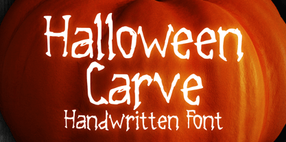 Halloween Carve is a must have cool skinny display font. You can use it for your horror and Halloween themed needs! You can use it for anything ranging from t-shirts and clothing, for your scary book designs, Halloween party needs, greeting cards, stickers, posters, banners, or anything that needs a horror touch. Try it to create fabulous designs and feel the horror and Halloween vibes with it!
 - Lhont Down by Alit Design,
$15.00 Introducing Lhont Down Typeface The Lhont Down font is designed with a serif font concept that has a decorative display style. Irregular dynamic shapes but impressively bold and unique make the font "Lhont Down" different and steal attention. The "Lhont Down" font has 2 font styles, namely decorative ones with irregular shapes with standard or normal font styles. Can be combined so that the designed design has a different rhythm. The lhon Down font is perfect for serious or non-serious design concepts, also suitable for classic retro designs, fashion, pop designs and so on. Serif typefaces such as "Lhont Down" are very easy to apply to any design, especially those with an retro and classic concept, besides that this font is very easy to use both in design and non-design programs because everything changes and glyphs are supported by Unicode (PUA). The "Lhont Down"contains 692 glyphs with many unique and interesting alternative options.
 - Croteau by Typodermic,
$11.95 Welcome to the world of horror! Meet Croteau, the scariest typeface you’ll ever lay your eyes on. This font is inspired by the 1960s horror movies, so you know it’s going to be good. Use it to enhance the horribleness of your message and terrify your audience. With 250 spooky bespoke ligatures, Croteau can produce an intriguing interlocking letter effect that will give your design an eerie look. The letter pair ligatures help break up the monotony of plainly repeating characters, adding an extra layer of horror to your design. Use this OpenType-savvy app to create an unforgettable experience for your audience. But beware, turning off the “standard ligatures” functionality in your app may eliminate this effect. So keep it on and let the horror unfold. Step into the world of horror with Croteau, and give your designs a spine-chilling twist. Get ready to be scared out of your mind! Most Latin-based European writing systems are supported, including the following languages. Afaan Oromo, Afar, Afrikaans, Albanian, Alsatian, Aromanian, Aymara, Bashkir (Latin), Basque, Belarusian (Latin), Bemba, Bikol, Bosnian, Breton, Cape Verdean, Creole, Catalan, Cebuano, Chamorro, Chavacano, Chichewa, Crimean Tatar (Latin), Croatian, Czech, Danish, Dawan, Dholuo, Dutch, English, Estonian, Faroese, Fijian, Filipino, Finnish, French, Frisian, Friulian, Gagauz (Latin), Galician, Ganda, Genoese, German, Greenlandic, Guadeloupean Creole, Haitian Creole, Hawaiian, Hiligaynon, Hungarian, Icelandic, Ilocano, Indonesian, Irish, Italian, Jamaican, Kaqchikel, Karakalpak (Latin), Kashubian, Kikongo, Kinyarwanda, Kirundi, Kurdish (Latin), Latvian, Lithuanian, Lombard, Low Saxon, Luxembourgish, Maasai, Makhuwa, Malay, Maltese, Māori, Moldovan, Montenegrin, Ndebele, Neapolitan, Norwegian, Novial, Occitan, Ossetian (Latin), Papiamento, Piedmontese, Polish, Portuguese, Quechua, Rarotongan, Romanian, Romansh, Sami, Sango, Saramaccan, Sardinian, Scottish Gaelic, Serbian (Latin), Shona, Sicilian, Silesian, Slovak, Slovenian, Somali, Sorbian, Sotho, Spanish, Swahili, Swazi, Swedish, Tagalog, Tahitian, Tetum, Tongan, Tshiluba, Tsonga, Tswana, Tumbuka, Turkish, Turkmen (Latin), Tuvaluan, Uzbek (Latin), Venetian, Vepsian, Võro, Walloon, Waray-Waray, Wayuu, Welsh, Wolof, Xhosa, Yapese, Zapotec Zulu and Zuni.
 - Kiro by Dharma Type,
$24.99 Kiro is a minimal, simple condensed sans-serif family designed by Ryoichi Tsunekawa and the whole family consists of 12 style: six weights from Thin to ExtraBold and their matching Italics. The range of styles provides flexibility for title, headline and body text. And the large x-heights gives them legibility and readability. The basic skeleton was designed semi-modularly and the letterform was minimalized by removing their unnecessary stems. Their corners were finished with subtle rounded effect. The minimalized semi-modular design gives this family contemporary urbane taste and rounded corners make this family warm and friendly. Kiro supports almost all European languages: Western, Central, South Eastern Europeans and afrikaans. And superior figures, inferior figures, denominators, numerators and fraction can be accessed by using OpenType features.
 - Botanika by Suitcase Type Foundry,
$75.00The motivation behind the Botanika family was the desire to create a text version of the Magion font. Although the glyphs were originally drawn using the same proportions, they were subsequently adjusted in order to improve legibility. The font retains certain characteristics of the original, such as the top serif on the “i” and the similar bottom serif on the “l”. Lowering the x-height lent the family a new and original character. The italics are slightly more condensed than the regular weight, without losing the austere grace of the regular weight. They are distinct enough to stand out in the text. Alternative characters can be selected to spice up the setting, or conversely to subdue headlines by using more traditional letter shapes. Small caps are available as well. The monospace version is a 10 pitch font: at 10 pt type size 10 characters fit exactly into the width of one inch, meaning that individual letters Take up 60 % of an em in width. The family is provided with matching italics. The modifications made during the OpenType transition included the addition of missing glyphs to cover the Suitcase Standard set and adding relevant kerning pairs, plus redrawing the bold weight and the accents. Despite its lower x-height, the font is often used for setting medium to long texts. Its slightly archaic feel lends text set in Botanika an air of novelty, which may be the reason why it is so popular in extensive corporate identity systems. If you are looking for an alternative to the cold, neutral sans serifs which are so popular these days, Botanika is the perfect choice. - Wood Clarendon JNL by Jeff Levine,
$29.00 Wood Clarendon JNL is based on Hamilton Clarendon Condensed (circa 1899) and is available in both regular and oblique versions. The design of this typeface retains many of the charming (but slight) design irregularities often found within pantograph-cut wood type from the 1800s through the early 1900s.
 - Piano Lesson JNL by Jeff Levine,
$29.00 Piano Lesson JNL comes from the hand lettered title on a 1940s-era piece of sheet music called "The Adult Explorer at the Piano". The mix of both regular and irregular character shapes makes for an interesting font that's Art Deco influenced, yet has its own individual personality.
 - Standing Stones by Solotype,
$19.95Redrawn from a strange type originally made about 1850, and sold by the Connors Foundry, New York. We cannot guarantee that Connors originated it, since they were among the first to have facilities for pirating other foundries' types. - Zombie Predator by Yoga Letter,
$18.00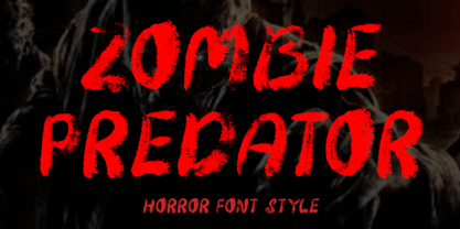 "Zombie Predator" is a scary horror display font. This font is very suitable for horror movie titles, Halloween, banners, posters, stickers, branding, book titles, and more. This font is equipped with uppercase, lowercase, numerals, punctuation, and multilingual support.
 - Moho Sport Pro by John Moore Type Foundry,
$36.00 As an ingredient of the large family of display typefaces "Moho", John Moore Type Foundry presents another variation of fonts consisting of two components: a main font Moho Sport based on a thick outline overlapping and Moho Sport Top, a counterblocks as shape or inside filler. Both typographic forms, Open Type, empty and filled complement one another to create interesting layering headlines for announcements, posters, marks or logo design, labels etc. This combination of both typefaces can still gain more interest if the forms are colored using graphic patterns, drawings or photographs. A nonoverlapping version is also available in Moho Sport Fat and your partner Moho Sport Fattop.
 - Aspire Narrow SmallCaps by Grype,
$18.00 While the Aspire SmallCaps family finds its roots of inspiration in the ACURA automotive company logo, with its wider base, the Aspire Narrow SmallCaps family condenses those styles into something more suitable for larger bodies of text in a more standardized width. Aspire Narrow SmallCaps is perhaps the most true to form tribute to the original all capitals inspiration logotype. It maintains all capital forms (whether standard or smallcaps) and yet is still strikingly powerful in its presence and readability including numerals, and a comprehensive range of weights, creating a straightforward, uncompromising collection of typefaces that lend a solid foundation and a broad range of expression for designers. Here's what's included with the Aspire Narrow SmallCaps Family bundle: - 430 glyphs per style - including Capitals, Small Caps, Numerals, Punctuation and an extensive character set that covers multilingual support of latin based languages. (see the 6th graphic for a preview of the characters included) - Stylistic Alternates - alternate characters that remove the angled stencil cuts for a more standardized text look. - 3 weights in the family: Light, Regular, & Black. - 3 obliques in the family, one for each weight: Light, Regular, & Black. - Fonts are provided in TTF & OTF formats. The TTF format is the standard go to for most users, although the OTF and TTF function exactly the same. Here's why the Aspire Narrow SmallCaps Family is for you: - You're in need of automotive sans font family with a range of weights and obliques - You're love that ACURA letter styling, and want to design anything within that genre - You're looking for an alternative to Eurostile with more stylized letterforms. - You're looking for a battle-tech typeface for your futuristic war chest labelling. - You just like to collect quality fonts to add to your design arsenal
 - Aspire Narrow by Grype,
$18.00 While the Aspire family finds its roots of inspiration in the ACURA automotive company logo, with its wider base, the Aspire Narrow family condenses those styles into something more suitable for larger bodies of text in a more standardized width. Aspire pays homage the techno display styling of the inspiration logotype, further evolving beyond its brand inspired origin to give birth to a font family that pulls on modern and historical styles. It adopts a sturdy yet approachable style with its uniform stroke forms and curves, and goes on to include a lowercase, numerals, and a comprehensive range of weights, creating a straightforward, uncompromising collection of typefaces that lend a solid foundation and a broad range of expression for designers. Here’s what’s included with the Aspire Narrow Family bundle: 477 glyphs per style - including Capitals, Lowercase, Numerals, Punctuation and an extensive character set that covers multilingual support of latin based languages. (see the 6th graphic for a preview of the characters included) Stylistic Alternates - alternate characters that remove the angled stencil cuts for a more standardized text look. 3 weights in the family: Light, Regular, & Black. 3 obliques in the family, one for each weight: Light, Regular, & Black. Fonts are available in TTF & OTF formats. The TTF format is the standard go to for most users, although the OTF and TTF function exactly the same. Here’s why the Aspire Narrow Family is for you: - You’re in need of a narrow automotive sans font family with a range of weights and obliques. - You’re love that ACURA letter styling, and want to design with a narrow font within that genre. - You’re looking for an alternative to Eurostile with more stylized letterforms. - You’re looking for a clean techno typeface for your starship console labelling. - You just like to collect quality fonts to add to your design arsenal.
 - Avionic by Grype,
$16.00 The aviation world contains loads of stylish logotypes, from handwritten scripts to geometric styles and so on. The Avionic Condensed family finds its origins of inspiration in the Air China company logotype, and from there has been expanded upon to create a large stylistic family of 40 fonts. Avionic celebrates the geometric sans serif styling of the original logotype, evolving beyond the condensed all capital set logo to include a lowercase designed in parity with the original design style, as well as many weights and widths to offer a fresh diversity. Each subfamily includes a full standard character set with expansive international support of latin based languages, and 5 weights jumping from book to black, along with 5 accompanying obliques. This family is ready to chart a course for your design destination, whatever it may be. Here's what's included with the Avionic Family bundle: 370 glyphs per style - including Capitals, Lowercase, Numerals, Punctuation and an extensive character set that covers multilingual support of latin based languages. 5 weights in each subfamily: Book, Regular, Bold, Heavy, & Black. • 4 widths in the collection: Condensed, Regular, Wide, and Extra Wide. Accompanying Obliques with each weight/width style. Fonts are provided in TTF & OTF formats. The TTF format is the standard go to for most users, although the OTF and TTF function exactly the same. Here's why the Avionic Collection is for you: You're in need of a dynamic geometric font with a variety of weights and widths for your designs You're an aviation junkie and have to have anything inspired by Air China You love the style of Bank Gothic, but really want something just a little different You are looking for a pseudo-techno style font family with versatility You just like to collect quality fonts to add to your design arsenal
 - Hua by YXType,
$14.99 Hua type family is a sans-serif with very humanist details to represent the essence of nature. It features 14 weights from the very thin to the very bold, generously covering a wide range of the natural spectrum. Aiming to represent the soft and elegant side of nature, Hua features very unique italics that have their own take on the identity. The letterforms of the italic fonts are inspired by the lineage of both traditional calligraphic approaches for serifs and much simpler forms for sans-serifs. Hua provides very crisp performances on screens and its large x-height combined with fine-tuned proportions help it retain legibility very well on smaller sizes. Features: • Support for 200+ Latin languages • Double & single storie “a” & “g” • Unique italic letterforms • Low contrast with unique details • Small caps with symbols • Arbitrary and defined fractions • Support for superscript & subscript in normal & scientific alignments • Proportional lining, proportional old-style, tabular lining, tabular old-style
 - Sigma by Wiescher Design,
$30.00 »SIGMA« is the name for the Greek voiceless »S«. It is also called the »Lunar Sigma«, in Hellenistic times the letter was simplified to »C«. I thought SIGMA was a nice name for my new, very readable and friendly Sans typeface. »SIGMA« has that classical Sans beauty with friendly touches that make it unique. You will love this font. It is a great everyday workhorse with seven weights from Thin to Bold and all the necessary weights in between. Great for body copy and headlines! With 875 Glyphs it is a truly European font designed for all Central European and Latin using countries. »SIGMA« has a set of Cyrillic that is – besides Russia – also good for Serbia, Macedonia and Ukraine. It has oldstyle- and lining-, tabular- and tabular-oldstyle-figures, many ligatures. »SIGMA« comes in Normal and Oblique, I made it Oblique instead of Italic which would have been too playful for this friendly font. Enjoy!
 - Sigma Condensed by Wiescher Design,
$30.00 »SIGMA« is the name for the Greek voiceless »S«. It is also called the »Lunar Sigma«, in Hellenistic times the letter was simplified to »C«. I thought SIGMA was a nice name for my new, very readable and friendly Sans typeface. »SIGMA« has that classical Sans beauty with friendly touches that make it unique. You will love this font. It is a great everyday workhorse with seven weights from Thin to Bold and all the necessary weights in between. Great for body copy and headlines! With 875 Glyphs it is a truly European font designed for all Central European and Latin using countries. »SIGMA« has a set of Cyrillic that is – besides Russia – also good for Serbia, Macedonia and Ukraine. It has oldstyle- and lining-, tabular- and tabular-oldstyle-figures, many ligatures. »SIGMA« comes in Normal and Oblique, I made it Oblique instead of Italic which would have been too playful for this friendly font. Enjoy!
 - Gillray Pro by RMU,
$40.00 Based upon H. Broedel's Hogarth Script, Gillray Pro, an RMU design, comes with two weights: Light and Medium. This formal script font is ideal for invitations, diplomas, certificates, book titles, ads etc.
 - Nightmare Maker - Unknown license

- Weekend Plans JNL by Jeff Levine,
$29.00 A piece of vintage British sheet music from 1941 entitled “That Lovely Week-End” featured the song’s name in a bold Art Deco sans serif with rounded edges. This lettering design is now the digital type face Weekend Plans JNL, which is available in both regular and oblique versions.

