10,000 search results
(0.02 seconds)
- Corner A by CarnokyType,
$20.00 Corner A is a part of Corner type family. This subfamily is designed with square shapes in the corners. The concept of the typeface Corner is based on variation of corner shapes in font characters, from what is also its name derived. The basis is a bitmap modular principle, to which by simple addition of “the missing pixels” in corners of the characters (Corner A) to the shape of diagonal ( Corner B ), curvature ( Corner C ), or inversion curvature ( Corner D ), three more font variations are created. The basic monolinear bitmap weight is supplemented by two more extreme thicknesses – hairline and fat weight. The character set supports the complete Latin, while the x-height of lowercase is drawn at the same height as in the uppercase characters. Corner is a strong display typeface, which allows you to easily experiment and to combine it with its mutual font variations.
 - Aviano Copper by insigne,
$29.99 The retro-inspired design of Aviano Copper echos the bold style of America’s Gilded Age. Inspired by the copper-inscribed intaglio printing designs of the early 20th century, the powerful, wide character shape of this font walks softly across your page while carrying a big stick. To create the right balance, small wedge serifs were added onto Aviano Sans, giving you a sophisticated style that looks and acts like it belongs nowhere short of Boardwalk. Developed to a new level of excellence, this design offers a wide range of weights from thin to black. There's full multilingual support of all Latin-based languages and five stylistic sets, swash designs, and 1000 glyphs per weight, including some unique ligatures. Number options include old style figures, tabular figures, and superscripts. Unique median spur alternates, swashes, and ligatures will help you customize every single design. The feel of last century’s personal and business correspondence is waiting for you in this member of the Aviano family. While ideal for headings, displays, logos, and short texts, Aviano Copper’s use for everything from letterhead to wine labels may just give you the monopoly you’re looking for.
 - Corner B by CarnokyType,
$20.00 Corner B is a part of Corner type family. This subfamily is designed with diagonal shapes in the corners. The concept of the typeface Corner is based on variation of corner shapes in font characters, from what is also its name derived. The basis is a bitmap modular principle, to which by simple addition of “the missing pixels” in corners of the characters ( Corner A ) to the shape of diagonal (Corner B), curvature ( Corner C ), or inversion curvature ( Corner D ), three more font variations are created. The basic monolinear bitmap weight is supplemented by two more extreme thicknesses – hairline and fat weight. The character set supports the complete Latin, while the x-height of lowercase is drawn at the same height as in the uppercase characters. Corner is a strong display typeface, which allows you to easily experiment and to combine it with its mutual font variations.
 - Horror Vibes by Gassstype,
$25.00 Introducing of our new product the name is Horror Vibes - Handmade horror Font and Multilanguage support.Introducing of designs look modern, unique and fun. It’s perfect for labels, quotes, posters, DIY projects, branding, packaging, greeting cards, websites, photos, photography overlays, signs, window art, scrapbooking, tags and so much more!our new product that inspired by Street Tagging, graffiti style with a fun theme very good for graffity poster, flyer, childrenbook, cartoon, comic etc
 - Cooper Nouveau by House Industries,
$33.00 Few fonts reach cult status. Despite its ubiquity—and perhaps because of its lack of subtlety—for a hundred years Cooper continues to draw the faithful. It’s even come to define an entire typographic genre and recently starred in its own documentary. Cooper Nouveau is Dave West’s imaginative contribution to the Cooper oeuvre. Drawn in 1966, Nouveau refreshes Oswald Cooper’s original italic with an energetic pitch, simplified contours, and a plump friendly figure. Uniform strokes and generous curves push the font’s playful personality and springy silhouette even further. A selection of swashed characters and ligatures offers options for lively logos and strong captions. While Cooper Nouveau looks laid-back and easy-going, it’s more than capable of pulling it’s own typographic weight. Put it to work where relaxed needs to project confident. Set Nouveau large for eye-magnet posters, packaging, and advertisements. Maximize its youthful energy for kids’ themes, craft action, and apparel bounce. Or set it alongside a master like Benguiat Buffalo or Chalet to show how Cooper Nouveau can communicate on paper and screens with an inherent ability to speak the language of style in many tongues. But like any cult icon: beware! Cooper has a way of setting the needle, and Nouveau just may become your go-to design fix. FEATURES ALTERNATES: Cooper Nouveau contains several alternate characters, which add flair to your designs and can help solve spacing issues LIGATURES: Many letter combinations in Cooper Nouveau form a ligature to solve spacing issues and produce more pleasing designs. COOPER NOUVEAU CREDITS Typeface Design: Dave West Digitization: Dave Foster Typeface Direction: Ben Kiel, with Ken Barber Like all good subversives, House Industries hides in plain sight while amplifying the look, feel and style of the world’s most interesting brands, products and people. Based in Delaware, visually influencing the world.
 - Cordon Bleu by Pen Culture,
$17.00 Proudly present our newest font called “Cordon Bleu” Cordon bleu is a modern and elegant serif font that comes with more than 50 alternate. With alternates that have an elegant shape, this font will be very suitable for various needs such as branding, logo design, magazines, posters, Instagram feeds and of course there are many more that you can explore with this font. I really hope you enjoy it – please do let me know what you think, comments & likes are always hugely welcomed and appreciated. More importantly, please don’t hesitate to drop me a message if you have any issues or queries. Thank you
 - Cooper BT by ParaType,
$30.00Bitstream Cooper was designed at Bitstream in 1986 by means of adding light, medium, and bold styles, with the corresponding italics, to the existing black ones. Based on Cooper Black, 1919, by Oswald Bruce Cooper, which was firstly released as a hand composition font in 1922 by Barnhart Brothers & Spindler of Chicago and later spread by ATF. Cooper Black is an extra bold face based on Cooper Old Style. Bitstream Cooper is an old style face with rounded serifs and tilted back ovals. For use both in text (normal weights) and in advertising and display typography (heavy weights). Cyrillic version was developed for ParaType in 2000 by Manvel Shmavonyan and based on TM Oswald face of TypeMarket, 1996, by Victoria Grigorenko. - Outright Horror by Wing's Art Studio,
$10.00 This new addition to my Video Store font series takes a scratched lettering style and pairs it with a wildly spontaneous brush font with horrific effect! Given life by an unknowable hand, this font clawed into the misty midnight inspired by retro horror movies, ghost stories and unsettling fireside tales. A boiling pot of misspent youth reading Edgar Allen Poe, M.R. James and H.P. Lovecraft. Outright Horror comes with an all-caps scratched style font with a subtly controlled Art Deco feel and a contrasting brush font that ramps up the fear! Consider it’s Regular style the skeleton that holds the Bold creeping flesh, ready for some horrific Halloween designs! It also comes with numerals, punctuation, language support, custom underlines and automatic ligatures. Contents: Outright Horror Regular Outright Horror Bold Underlines
 - Aon Cari Celtic - Unknown license

- Architype Van Doesburg by The Foundry,
$99.00 Architype Konstrukt is a collection of avant-garde typefaces deriving mainly from the work of artists/designers of the inter-war years, whose ideals have helped to shape the design philosophies of the modernist movement in Europe. Due to their experimental nature character sets may be limited. Architype Van Doesburg derives from the 1919 experimental geometric alphabet by Theo van Doesburg, whose work was heavily influenced by De Stijl theories, specifically rectangularity. The typeface has been constructed on the same 5 x 5 grid, and is limited by his ‘single alphabet’ theory.
 - Van Wyck JNL by Jeff Levine,
$29.00Van Wyck JNL was inspired by some old printing found in a catalog. - Van Condensed Hebrew by Vanarchiv,
$40.00 The original version from this display sans-serif typeface was Van Condensed, published during 2004 (Latin, Greek and Cyrillic). Van Condensed Hebrew is the last script update, where the Hebrew characters follow the same design approach from the Latin characters (geometric structure, round corners). The only big difference between the Latin and Hebrew characters is the contrast, Hebrew letterforms contain reverse contrast.
 - Anne de Marie by Alandya TypeFoundry,
$19.00 Presented ... Anne de marie Anne de marie offers a wide range of options for creating logos, titles and titles. It is suitable for books, editorials, packaging, advertising, brand imaging and more. Anne de marie includes Collection of Uppercase, Stylistic, Latin Based Language Support, Numbers and Punctuation. Set Stylistic is available in Lowercase. Anne de marie is encoded with PUA Unicode, which allows access to all features without special design software. Mac users can use Font Books, and Windows users can use Character Map to view and copy extra characters to paste into your favorite app / text editor. don't hesitate to drop me a message if you have any issues or queries
 - Van Alt JNL by Jeff Levine,
$29.00Looking similar to a Deco-era classic typeface, Van Alt JNL has slightly different character shapes, but pays due respect to its inspiration by the original... - AZN Knuckles Varsity by AthayaDZN,
$10.00 Introducing "AZN Knuckles Varsity" font by AthayaDZN. Revolutionizing a varsity slab serif, combining sharp and rounded edges, angled serif, and a variety of weights, fitting it into the modern scene. Equipped with 3 styles ( Defined, Regular, Stencil ) Use the Defined version if you are aiming for that slab serif look, just like the name suggested, it defines the modernized slab serif on each letter, giving it that retro look yet still in the modern scene. Especially on the light weight of this version, the slab serif is really prominent. Use the Regular Version if you are aiming for any type of design that you see this font fits especially the modern scene, just like how it's advertised. Use the Stencil version if you are aiming to make a statement, my favorite one is the Bold and Italic version of the Stencil if I was to make a statement, just like the preview where it says "Anarchy", the separated shapes of the letter combined with it's bold and slanted shape is perfect to make a strong statement. Language Support : Afrikaans, Albanian, Danish, Dutch, English, Estonian, Filipino, Finnish, French, Galician, Indonesian, Irish, Italian, Luxembourgish, Norwegian, Portuguese, Romansh, Scottish Gaelic, Spanish, Swedish, Swiss German, Uzbek (Latin). And that's it for this font, thank you for purchasing the product, I wish you success on your projects. Please enjoy the font and let me know if you needed any help or if you have any questions -Athaya twitter.com/Athaya_DZN behance.net/athayadzn
 - Queen Anne Hill by Great Lakes Lettering,
$40.00 Queen Anne Hill is an modern Calligraphy style font with upright strokes and bold flourishes. Revealing the styling of fine artist and calligrapher Alissa Mazzenga, this font communicates refinement with a hint of playful artistic individualism.
 - HWT Van Lanen by Hamilton Wood Type Collection,
$24.95 In 2002 Matthew Carter was commissioned to create a new design to be cut in wood by the then nascent Hamilton Wood Type Museum. This was significant in that this was the one format for which Carter had not yet designed type. The new design emerged as a two-part chromatic type to be cut specifically in wood. Originally called Carter Latin, the font was renamed Van Lanen after one of the Museum's founders. The first cutting and printing of the type took place in late 2009 and although it has been available through the Museum, contemporary wood-type production is expensive and few have acquired this font in wood. The digital version of the pair of Van Lanen fonts is now available. The design recalls Antique Latin wood type, but with a refined sensibility and intentional quirks (like the sideways ampersand). It is a wonderful addition to Carter's oeuvre, and to the ongoing history of wood type.
 - Van Dijk SH by Scangraphic Digital Type Collection,
$26.00 Since the release of these fonts most typefaces in the Scangraphic Type Collection appear in two versions. One is designed specifically for headline typesetting (SH: Scangraphic Headline Types) and one specifically for text typesetting (SB Scangraphic Bodytypes). The most obvious differentiation can be found in the spacing. That of the Bodytypes is adjusted for readability. That of the Headline Types is decidedly more narrow in order to do justice to the requirements of headline typesetting. The kerning tables, as well, have been individualized for each of these type varieties. In addition to the adjustment of spacing, there are also adjustments in the design. For the Bodytypes, fine spaces were created which prevented the smear effect on acute angles in small typesizes. For a number of Bodytypes, hairlines and serifs were thickened or the whole typeface was adjusted to meet the optical requirements for setting type in small sizes. For the German lower-case diacritical marks, all Headline Types complements contain alternative integrated accents which allow the compact setting of lower-case headlines.
 - Paris Van Java by Fikryal,
$25.00 Introducing this very simple sans serif font that is Paris Van Java, the font Family. I created this font with the inspiration of simplicity and it is very friendly to look at, with four versions, namely regular, italic, bold, bold italic. Very suitable to be applied in various aspects of design, Also it’s perfect for logo, branding, title, social media posts, advertisements, product packaging, product designs, label, photography, watermark, special event, magazine, web designs, etc. Features : Symbols multilingual support If you have any questions please don’t hesitate to contact me follow my Instagram: @fkryall Thank you
 - Van Dijk SB by Scangraphic Digital Type Collection,
$26.00 Since the release of these fonts most typefaces in the Scangraphic Type Collection appear in two versions. One is designed specifically for headline typesetting (SH: Scangraphic Headline Types) and one specifically for text typesetting (SB Scangraphic Bodytypes). The most obvious differentiation can be found in the spacing. That of the Bodytypes is adjusted for readability. That of the Headline Types is decidedly more narrow in order to do justice to the requirements of headline typesetting. The kerning tables, as well, have been individualized for each of these type varieties. In addition to the adjustment of spacing, there are also adjustments in the design. For the Bodytypes, fine spaces were created which prevented the smear effect on acute angles in small typesizes. For a number of Bodytypes, hairlines and serifs were thickened or the whole typeface was adjusted to meet the optical requirements for setting type in small sizes. For the German lower-case diacritical marks, all Headline Types complements contain alternative integrated accents which allow the compact setting of lower-case headlines.
 - Moving Van JNL by Jeff Levine,
$29.00Moving Van JNL is a classic sign painter's block Roman with angled [instead of rounded] corners and slab serifs. This style of lettering was most popular in the 1920s and 1930s. - Exquisite Corpse - 100% free

- Corpus Typewriter by Brent Galloway,
$14.00 Corpus Typewriter is an authentic typewriter font, sampled from a real vintage typewriter. Each letter and number has three alternative characters, giving you a large variety of options to get an authentic, vintage look.
 - Colorful Candy by Putracetol,
$22.00 Colorful Candy is funny hand letering font make from hand lettering ideas in typeface. Each one works perfectly in conjunction with the others so you can mix and match them until your hearts content! The possibilities really are endless and all styles are useful for so many different designs - have fun using it! Colorful Candy a super fun and playful hand-lettered bold typeface. It is perfect for story books, illustrations, comic books, t-shirts, posters, greeting cards, logos, branding, stickers, svg, crafting and all for display purposes. The alternative characters were divided into several Open Type features such as Swash, Stylistic Sets, Stylistic Alternates, Contextual Alternates, and Ligature. The Open Type features can be accessed by using Open Type savvy programs such as Adobe Illustrator, Adobe InDesign, Adobe Photoshop Corel Draw X version, And Microsoft Word. This font is also support multi language.
 - Pastel Colors by Stefani Letter,
$10.00 Pastel Colors is a fun and cute display font. It has a playful style and great readability. It’s perfect for Christmas cards, branding, stationery, blog design, custom art, custom stamps, custom embossers, book, apparel, packaging, headline, or much more! It will add a unique feel and looks stunning to any design project! This font is PUA encoded which means you can access all of the cute glyphs with ease! It also features a wealth of including ligatures. Fall in love with its incredibly distinct and timeless style and use it to create spectacular designs!
 - Rose Colored by Letterhend,
$12.00 Rose Colored is a Handwriting Script which is beautifully crafted with feminine touch. This font is perfect as a logo, quotes, apparel design, wedding invitation, and any design needs especially for a girly / feminine theme. You can play with the ligatures, stylistic alternate, swash, etc to create your own customized lettering. This font is also support multi language
 - Bouncy Color by Mans Greback,
$59.00 Bouncy Color is a funny cartoon font with pre-set coloring, outline and shine effects! Drawn and created by Mans Greback in 2021, this comic-style lettering has a happy, quirky personality and optimistic humour. It has a colorful graffiti and street art look, while being a childish and cute sans-serif – a typeface for boys and girls alike. Bouncy Color is provided in five styles: White, Blue, Pink, Highlight and Outlined. Use it in Photoshop, Illustrator, InDesign or any other modern software that supports color fonts, and you'll give any project a fun and happy appearance.
 - Color Paper by Artyway,
$16.00 New expressive font "ColorPaper". It was made using the negative space of letters and it looks amazing! This design captures you with its originality and simplicity. Thoroughly selected geometric shapes make a piece of art out of every symbol. Unfold the full potential of this font, experiment with the color and get pleasant impressions. Production of an original and expressive design of a poster, title, logo, emblem using this font is very simple and fascinating. Make sure yourself.
 - Starting Color by Sensatype Studio,
$15.00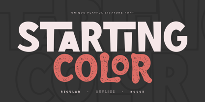 Starting Color is A Modern Playful and Unique Ligature Font. This font specially crafted for your design projects such as urban poster, unique design, modern for t-shirt designs, product packaging, merchandise, and so many more with easy to use but unique results are so playful. Enjoy to Design any your needs with unique, urban, and playful feel. What will you get: Starting Color Font (Regular, Outline, Rough) All Characters (from A to Z) Numbers and Punctuation Works on PC & Mac Simple installations PUA Encoded Thanks and have a wonderful day. :)
 - Sorority Hack by Fonthead Design,
$15.00 - Zombie Corpse by Senekaligrafika,
$12.00 “ZOMBIE CORPSE” Has hard strokes and a signature styles that speak to instant nightmare sensations,it was inspired by horror and thriller movie posters. “ZOMBIE CORPSE” will help you to create special and touching typographical design for your highway and streetwear projects, for branding, labeling, clothing, movie title, album cover, logos and many more. It is really universal and modern font. The owner of endless possibilities!
 - Filbert Color by Mans Greback,
$59.00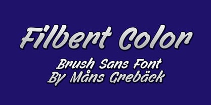
- Corpse Fairy by Otto Maurer,
$10.00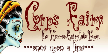
- Poeta Color by Tarallo Design,
$14.99 Poeta Color is an ornamental font for making patterns and decorating text. It contains floral and nature motifs. The symbols are versatile enough for simple decoration or thematic seasonal and holiday moods. Designers can use Poeta to make unique lines, fields, borders, or ornamentation within or around text. Try replacing a basic straight line with repeated symbols. Make a background to add visual interest to a design. Use the forms to decorate a chapter title or to mark the end of a magazine article. Replace a letter in a word with a symbol to create a memorable statement. This font began with sketches of patterns seen in ceramic tiles around Sicily. It is named Poeta because Sicily is an island rich in poetry traditions. Below is some helpful technical information. Using this font is simple. Install it and type. Symbols will appear instead of letters. Choose the precise symbols through a software’s glyph palette. Use the type/character menu controls to vary the spacing and density of patterns. All fonts are vector-based, OpenType, and fully scalable. Six of the fonts have different color or grey combinations. One of the fonts (solid) is a standard font. The font previews on this website will only display the font in black. See the slides to get an idea of the colors. Be assured that the colors are present in the files and will appear when loaded on the computer. The colors that are in each font: Primary: red, yellow, blue Secondary: orange, green, purple Tertiary: red-orange, yellow-orange, yellow-green, blue-green, blue-violet, red-violet Diverse: many different warm and cool colors Grey: three different greys from light to dark Gradient: a greyscale gradient Solid: standard font and can be colored normally Software that supports color SVG fonts: Photoshop, since 2017 llustrator, since 2018 InDesign, since 2019 QuarkXPress, since 2018 Pixelmator Sketch
 - An Creon - Unknown license

- CRAY AN? - 100% free

- Madison Ave. by Funk King,
$10.00 The Madison Ave. family started from Madison Ave. at Fontstruct.com. As my most downloaded font, this was an easy, although not necessarily logical choice to make – regarding taking an existing free font and attempting to offer it for purchase. The font is very basic and simple in its layout, but has achieved popularity over at Dafont with almost 80,000 downloads with its cool, understated nature and inherent sophistication. The original Madison Ave. is now 95 Madison Ave. A couple of glyphs have changed from the original, but mostly the set is the same. The big news here is the availability of multiple variations on the original. Ninety-five refers to the filter settings used to achieve the faint cross lines in the font. The sequence 95-100 provides a gradual fade to solid effect when used together. The other versions use variations on the filter settings that allow each its own distinctive flavor, while at the same time maintaining inherent characteristics of the original. Ninety-five is now joined by 55, 75, 97, 99, 100, 102, 105, 155, 175, 201, 202, and 275. 100 is the solid version which doesn’t contain the trademark lines found in 95. In 95-99, the line width varies to achieve subtle effects. 50 and 85 are distorted by reducing the filter settings in a somewhat minimizing fashion. In 102-205, these are distorted by increasing the filter settings above the normal which is what 100 represents. While some of the effects are extreme and challenge the legibility of text, these can be fun or edgy. They offer a cohesion that can be used to advantage for different projects that require the use of a modern font family.
 - Ave Maria by words+pictures,
$20.00 - Anes Ramuk by Imoodev,
$20.00 Anes Ramuk is modern typography fonts with visual elegance, smooth curves, and beautiful ligatures clear, making your work look true and attractive. A very versatile font that works in both large and small sizes. This font is suitable for a wide variety of projects such as invitations, logos, branding, magazine, photography, card, product packaging, mugs, quotes, poster, labels, signatures, and more. A font that is perfect for all business sectors including personal projects, studio, corporate, creative agency, industrial, company, etc.
 - An Education by David Engelby Foundry,
$25.00 Go ahead, and call it a rational serif. After all, An Education owes its basic style to the neoclassical typefaces like Bodoni and Didot. But it’s more than simply a rational approach – An Education is pure love for a classic expression of elegance (combined with a touch of European decadence, I mean, who needs Le Corbusier all the time?). An Education is a tailor made text font for those of you who crave elegant typographic design. Elegantly spice up your reports, your book layouts, your posters and many other designs – without sacrificing legibility or contrasts.


