10,000 search results
(0.026 seconds)
- CA Smut by Cape Arcona Type Foundry,
$19.00 Sometimes the ugliest pets can be the cutest ones. And the dirtiest fonts can be the most charming ones. Like CA Smut which comes in two styles that can be stacked on top of each other. “Regular” is the shadow, while “Fill” is the filling. Create little masterpieces by playing with different colors, offset or deviating tracking. You can even try to use the “Fill” style on its own, but do so at you own risk. The spacing and kerning is optimized for the use with “Regular”, so be open minded for surprising results. If you ever had the intention to design a horror movie poster, there’s no way around CA Smut.
 - Singolare by Latinotype,
$29.00 Singolare is a contemporary geometric Sans Serif with angular terminals and a great x height. Its main feature is the style difference between the lighter and heavier weights. The more weight it gains, the higher its singularity. With its weights, styles and layers variety, it's perfect for display use and short texts that require a visual impact. Singolare is composed by five weights, from Ultralight to Black. Every weight has its own stencil variation with expressive cuts and four decorative versions: three outline and one inline version, that can work on it’s own or overlapped to the black normal version (changing the colors of each layer) in order to amplify its usage possibilities.
 - CoughingNails by Ingrimayne Type,
$12.95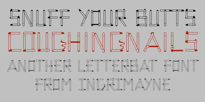 CoughingNails is a letterbat font composed of cigarettes and an occasional match.
 - Brasilica by CAST,
$45.00 Brasílica is a robust design, with wide proportions, that assimilates influences both from old style and modern types. This wide shapes, as well as the moderate contrast and sturdy serifs make it suitable to different conditions of printing. The sharp corners, as well as the abrupt connections and terminals are remarkable features of this typeface, that renders a sturdy and crisp texture, with a distinct aspect.
 - Rikna by Tour De Force,
$30.00 Rikna is compact, solid and gently condensed slab serif font family that comes in 14 styles. Imagined as family with ability to be used as main project font, Rikna’s visual flow of characters in composed paragraph reveals its high legibility in all sizes. With distinctive serifs, Rikna contains display characteristics with recommend the font for use in bigger sizes as well. Contains Fractions as Open Type Feature.
 - 1543HumaneJenson - Personal use only

- Quartan by Linotype,
$29.99Quartan is an industrial, unicase sans serif family, with three weights. The Austrian designer Maria Martina Schmitt developed this series of typefaces for designers to use when setting chunks of text en masse. Being a unicase design, Quartan¿s letterforms have no ascenders or descenders; lines of text may be stacked virtually on top of one other. This offers a multitude of possibilities for headline, logo, or corporate identity design. - Blanc by Latinotype,
$26.00 Blanc is a functional humanist sans typeface with a marked personality and great style that make it ideal for use in headlines. Blanc is an ode to neutrality: a geometric face characterised by low contrast between thick and thin strokes with calligraphic features that emphasise specific glyphs. Blanc comes with 8 weights and an inline version that make it well-suited for headings and subheadings, corporate designs, advertising, publishing, etc.
 - XXII Centar by Doubletwo Studios,
$19.00 Centar Sans is a simple, modern, universal, powerful, invisible but not characterless, sans serif family. The family is designed for identities & corporate projects. Its wide range of styles covers lots of possibilities of use, from headlines to texts. It supports a lot of languages including cyrillic and comes along with 19 OpenType features - Small Caps, ligatures, alternates and many more. Regular styles are FREE! Extended detail here. or here.
 - Donut Catchy by EmbunStudio2018,
$9.00 You came to the right place, if you need a Bold Clean Script font to make your project perfect such a logo design project, poster design, brand identity, heading, wedding, greeting cards, invitation and more this script handwritten font is into it ! I Created this font for social media need first, but i think this logo is great for corporate branding or logo design project too and boom ! Of Course !
 - Bargitta by Letterhend,
$13.00 Introducing a SVG font called Bargitta Script. This typeface has 3 different styles that you can use according your needs : Textured SVG, textured vector /rough, and solid. It has very nice look, very suitable for corporate branding, logos, documents, social media design, presentations, print design, web, and more. This typeface comes in uppercase and lowercase, with punctuation, symbols, numerals, stylistic set alternate, ligatures, and also has multilingual support.
 - TCF Noli by TypeCult Foundry,
$22.00 TCF Noli is a no nonsense straight-sided typeface with a soft technical appearance. Designed with seven weights and true matching italics, TCF Noli was specially developed with corporate and editorial projects in mind. The clarity of the letter forms and the openness of TCF Noli make it very readable in small sizes and suitable for every design purpose. TCF Noli is available with extended Latin language support.
 - Hexaframe CF by Connary Fagen,
$35.00 Hexaframe CF evokes the awe and potential of of heavy machinery and robotics. Clad in tough polygons and rounded edges, Hexaframe is a perfect typeface for corporate identity, STEM toys, and user interface design. Hexaframe CF pairs well with simple typefaces set in contrasting sizes, including Greycliff CF, Artifex CF, and Visby CF. All typefaces from Connary Fagen include free updates, including new features, and free technical support.
 - Betterlett by Digitype Studio,
$20.00 Betterlett is a classy handwritten font, designed to make it easy to create professional signature logos, photologo, labels, packaging, fashion, or any type of advertising purpose for both personal and corporate use. It contains stylistic alternates, ligatures, swashes, and multilingual support. We highly recommend using a program that supports OpenType features and Glyphs panels like many of Adobe apps and Corel Draw, so you can see and access all Glyph variations.
 - Arodora Pro by Arodora Type,
$40.00 Say hello to Arodora. Arodora is a creative sans serif family with modern and geometric lines. It easily adapts to all kinds of creative graphic works and screen applications and reflects you well with its modern appearance. Corporate identities, web designs, mobile applications, ui / ux designs will give you an advantage thanks to its unique appearance. Arodora also offers you Cyrillic Alphabet, Ligatures, Alternate Glyphs, and much more.
 - North Storm Typeface by FoxType,
$50.00 Introducing North Storm Display new generation Decorative Typeface. North Storm Typeface created with the vision of to attract the audience to your brand. The finest details of this typeface are methodically and mathematically created. North Storm is created with all the tasks of a corporate font and also for the usage in a variety of projects, including branding, logos, titles, headlines, posters, screens, display, digital ads, and everything else.
 - Sunbeam by Kustomtype,
$25.00 Sunbeam is a new, classy & modern typeface that looks incredible! The contrasting lines and vibrant shapes give sunbeam a sleek and elegant look. Sunbeam is a versatile typeface that's full of character, using optical correction for better legibility, sunbeam is the perfect fit for graphic design, editorial design, magazines, posters, logotypes, brands and corporate design. Sunbeam is designed by Coert De Decker in 2019 and published by Kustomtype Font Foundry.
 - Substance by FaceType,
$24.00 The grotesque workhorse: Substance fulfills the primary role of emphasizing content. Containing 8 weights + italics (800+ glyphs each) Substance is a workhorse with loads of subtle OpenType features (small caps, a choice of lining, tabular and old style figures, numerators, denominators, tabular figures and signs, fractions, ligatures), 21 currency signs and a diversity of symbols and arrows. Substance provides everything you need for demanding briefs like signage or corporate design.
 - Fathom by Device,
$39.00 Fathom is a refined flared-serif face that is elegant and robust, modern yet suggests a legacy. The generous lower-case x-height make it worm and readable. Seven weights, plus matching italics, cover all headline and text requirements. The addition of old-style numerals and tabular numerals for charts make it a versatile family for brochures, corporations, heritage projects, packaging, book covers, reports, signage, magazines and more.
 - Herzchen by Font-o-Rama,
$25.00Herzchen is a well developed sans serif font. The curving and swinging letter forms remind a little of serif fonts, on closer inspection, however, they rather remind of upright italics. Playful details give charm to the typeface and make Herzchen lively and distinctive. With four cuts the typeface is suitable for simple corporate and editorial design projects. In addition there are many ligatures in the expert-set for individual use. - PF Press by Parachute,
$45.00 Press combines aesthetic and functional attributes which make written text highly readable. It was originally designed for a newspaper with medium contrast to withstand harsh printing conditions. Its structure is quite narrow which makes this typeface ideal for body text and headlines where space is at premium. Supports Latin and Greek. This is a modern serif typeface which may be the right choice for newspapers, magazines and corporate communications.
 - Ryo Gothic PlusN by Adobe,
$79.00Ryo Gothic is a new Japanese sans serif (or gothic) kana typeface design. Created by Adobe type designer Ryoko Nishizuka , the typeface has a bright and speedy calligraphic touch and can be used to compose readable body text, as it gives a calm and well-controlled color to the typeset page. Supplied in OpenType format, each Ryo Gothic font includes hiragana, katakana and some punctuation marks and should be combined with the kanji and other glyphs in existing Japanese gothic typefaces that contain full character sets. This typeface family is available in seven weights--extra light, light, regular, medium, bold, heavy, and ultra heavy--which allow end users to select the best-matching weight for their favorite full-set Japanese gothic typeface. Creative professionals using the Japanese version of Adobe InDesign may use that program's Composite Font tool to easily combine Ryo Gothic with other typefaces. - Malaguena Stencil JNL by Jeff Levine,
$29.00 Malaguena Stencil JNL was derived from hand lettering found on an Art Deco-era piece of vintage sheet music for this familiar tune. According to Wikipedia: “Malagueña is the feminine form of the Spanish language adjective malagueño/ malagueña, ‘pertaining to Málaga’, a Spanish port city.” Additionally: "Malagueña", is a song by Cuban composer Ernesto Lecuona; written in 1928 it was originally the sixth movement of Lecuona's Suite Andalucia, to which he added lyrics in Spanish. The song has since become a popular, jazz, marching band, and drum corps standard and has been provided with lyrics in several languages.
 - Trade Gothic Display by Monotype,
$42.99 It’s a colorful world. Don’t limit yourself to black and white. The Trade Gothic® Display designs take advantage of color to create lively and compelling statements, making the designs ideal for advertising, branding, poster and publication projects. Based on the powerful Trade Gothic Condensed Heavy typeface, Monotype Studio designer Lynne Yun, created the fonts necessary to set both “beveled” and “embossed” characters in any color. Trade Gothic Display 1 (embossed) generates striking highlighted type, while Trade Gothic Display 2 (bevel) produces powerful shadow and outline effects. The designs are natural additions to the Trade Gothic Next family, and stand on their own as formidable display typefaces.
 - Poipoi by Dharma Type,
$14.99 Extraordinary impact and visual conspicuousness. Poipoi is a super 3D sans family for posters, logos and all display. The basic idea is not a brand new. The Stacking type system has been used since before wood type age. As you imagined, colored wood type(woodcut), many other engravings and contemporary printer machine print many colors separately with different printing plates for each color. Poipoi uses the same system for 3d effect. Please use Photoshop or Illustrator, or your favorite graphic design apps that can handle layers. Layers are the printing plates of wood type. You should be able to change text color for each layer. Poipoi "Standard" style is the base of this font family. You can add effects by stacking Highlight and shadow layers. Stacked layers in different color make the text in 3D. Instruction 1. Type your text as you like. 2. Set font-name "Poipoi" and font-style "Standard" 3. Set color of "Standard" layer. 4. Duplicate the "Standard" layer twice (One for Highlight, one for Shadow). 4'. The layer order should be Highlight, Standard, and Shadow from top to bottom. 5. Set font-style and color of "Highlight" and "Shadow" layers. 6. Adjust tracking if you need. (Please use same tracking value for all 3 layers.) For further detail, https://www.dropbox.com/s/xymis7dh5hwxn9q/Poipoi.pdf Poipoi Standard, Highlighted, and shadowed style can be used solely. Rounded terminals add soft, cute, and casual impressions to your design. Spec: Over 400 glyphs! Basic Latin ✓ Western Europe ✓ Central Europe ✓ South Eastern Europe ✓ Mac Roman ✓ Windows 1252 ✓ Adobe Latin 1 ✓ Adobe Latin 2 ✓ Adobe Latin 3 ✓ Almost all Latins are covered.
 - Midnight Story by Orenari,
$17.00 Midnight Story font is specially designed for spooky yet horror occasion. This font has rough texture, so it will bring the creepy atmosphere in every glyphs. It's really horror when your project didn't meet the perfect font. So let Midnight Story be friends with your design and craft projects.
 - Fibra One by Los Andes,
$26.00 Fibra One looks like a “soft” version of the Fibra font, but it is actually more than that—the second part of its name suggests that it is a reinterpretation of the original typeface. While this new version maintains the overall structure of Fibra and influence of the Avant Garde font, its shapes are different from those found in its predecessor—Fibra One features both soft corners and smooth transition between curved and straight sections. This gives the font a more dynamic and playful personality. Fibra One keeps the original contrast between curves and straight lines in glyphs such as ’n’ and ‘h’ (not found in rounded glyphs such as ‘a’ and ‘d’); details of display characters (e.g. three upper terminals in ‘W’ and projection off the stem in ‘A’); and exaggerated terminal in ‘R’. All these features give Fibra One a strong personality—a typeface that ‘gives you the chills’. Fibra One was specially designed for display use. The font has a very generous x-height that allows for use in corporate text, thanks to its good readability. Fibra One comes with 2 subfamilies—a more ’normal’ Basic family, with a smaller amount of stylistic features, for use in subheadings or any other type of text that requires formality, and an Alt family that shows off the true potential of the font, making it the perfect choice for magazine headlines, posters and logotypes.
 - Marketing Stencil by Jeff Levine,
$29.00 Vintage (circa 1960s) packaging for Parker Cartridge Pen Erasers had the product description printed in bold stencil lettering featuring a squared look with rounded corners. This design has been recreated digitally as Marketing Stencil JNL, which is available in both regular and oblique versions.
 - Stationer JNL by Jeff Levine,
$29.00 The 1938 sheet music for the official Coast Guard Marching Song "Semper Paratus" "(Always Ready)" offered up a hand lettered title in a bold block style with rounded corners and an inline. This is now available as Stationer JNL, in both regular and oblique versions.
 - Kometa by Kiril Zlatkov Type Foundry,
$40.00 Kometa Sans is a contemporary grotesk with a certain personality. She has a steady geometric skeleton, but its appearance is rather humanistic. The precise details of the artwork, the carefully drawn true italics, the six types of numerals, the variety of alternates, the broad range of open-type features and the extensive glyph set can meet most of the contemporary typographer’s demands for a neutral, but not boring type family for both long text and display use. Among the distinctive qualities of Kometa are also the forms of ligatures (both default and discretionary). They follow the natural constructive transitions between oval parts and stems, which is an advantage to mark, at least for designers who respect the beauty of clean forms. Note the specially designed Kometa Unicase sub-family, substantially enough to exist as a separate typeface. Its elegant and expressive letterforms are boosting further the power to create outstanding design work. Kometa Unicase has original and playful, yet reasonable approach to letterforms variety. Kometa has a very broad usability range – from logotypes and poster designs to corporate identities and complex editorial projects. The contemporary Cyrillics of Kometa allows easily completion of graphically consistent multilingual corporate and artistic design projects. Designed by Kiril Zlatkov and Vassil Kateliev.
 - Hont by Remedy667,
$18.00 Hont, the original Haunted Font is here. We've captured the essence of an old-school horror film and now you can use it to create awesome-looking titles for all your projects. With its chunky appearance, this font is perfect for vintage poster designs, t-shirt designs, logos, or anything that needs a hint of spooky. Hont is the ultimate Haunted Font that looks amazing on all projects. Inspired by classic mid-century horror films, it will give your projects just the right amount of classic horror. Features Doubles Elimination gives you a more natural look. Inspired by classic mid-century horror films. Includes a Remedy667 Font Catalog PDF, all your favorite fonts in one handy catalog. Possibly haunted, may possess you to create awesome work.
 - Be My Valentine by One Line Design,
$6.00 Spread a little love with the Be My Valentine display font. These capital letters are filled with love. 82 Glyphs. Letters A-Z, Numbers 0-9, Punctuation!?.’ In both Black & transparent (white) and black with colored heart. A-Z glyphs with colored heart are in lower case, check compatibility for colored fonts.
 - Cimero Pro - 100% free

- Vernacular Sans by jpFonts,
$19.95 The Vernacular trilogy was designed by Swiss designer Hans-Jürg Hunziker, who had worked for Adrian Frutiger in Paris for many years. Based on the concept of a transitional Linear Antiqua, he has developed a colorful bouquet of typefaces that contain the entire spectrum of typefaces for book design and corporate identity. Thanks to his "Swiss school" and his outstanding skills, he has succeeded in giving the typefaces a particularly noble and sympathetic expression. In addition to the Sans family, there is a Serif family and a Clarendon family, each of which, including the separately drawn italics, is equipped with 12 font weights that are finely tuned to one another. Each of the 3 font styles develops its own character, but thanks to a concept that brings the different font styles closer together, they also work well together and complement each other perfectly. Sans and Clarendon have a vertical axis and similar endings in contrast to the Serif, which has a traditional diagonal axis and horizontal endings. The straight stems and the proportions are used as an element to stress the closeness of the typeface-trilogy. They thus share a comon feature. All fonts contain tabular and proportional figures as well as old style figures. Small caps and small cap figures are also available in all fonts. In addition, some fonts have alternative characters available via style set, such as «g», which can be used to further vary the typeface. Vernacular offers all the options for well-kept typesetting for print and web - for small and large orders.
 - Vernacular Serif by jpFonts,
$19.95 The Vernacular trilogy was designed by Swiss designer Hans-Jürg Hunziker, who had worked for Adrian Frutiger in Paris for many years. Based on the concept of a transitional Linear Antiqua, he has developed a colorful bouquet of typefaces that contain the entire spectrum of typefaces for book design and corporate identity. Thanks to his "Swiss school" and his outstanding skills, he has succeeded in giving the typefaces a particularly noble and sympathetic expression. In addition to the Sans family, there is a Serif family and a Clarendon family, each of which, including the separately drawn italics, is equipped with 12 font weights that are finely tuned to one another. Each of the 3 font styles develops its own character, but thanks to a concept that brings the different font styles closer together, they also work well together and complement each other perfectly. Sans and Clarendon have a vertical axis and similar endings in contrast to the Serif, which has a traditional diagonal axis and horizontal endings. The straight stems and the proportions are used as an element to stress the closeness of the typeface-trilogy. They thus share a comon feature. All fonts contain tabular and proportional figures as well as old style figures. Small caps and small cap figures are also available in all fonts. In addition, some fonts have alternative characters available via style set, such as «g», which can be used to further vary the typeface. Vernacular offers all the options for well-kept typesetting for print and web - for small and large orders.
 - Vernacular Clarendon by jpFonts,
$19.95 The Vernacular trilogy was designed by Swiss designer Hans-Jürg Hunziker, who had worked for Adrian Frutiger in Paris for many years. Based on the concept of a transitional Linear Antiqua, he has developed a colorful bouquet of typefaces that contain the entire spectrum of typefaces for book design and corporate identity. Thanks to his "Swiss school" and his outstanding skills, he has succeeded in giving the typefaces a particularly noble and sympathetic expression. In addition to the Sans family, there is a Serif family and a Clarendon family, each of which, including the separately drawn italics, is equipped with 12 font weights that are finely tuned to one another. Each of the 3 font styles develops its own character, but thanks to a concept that brings the different font styles closer together, they also work well together and complement each other perfectly. Sans and Clarendon have a vertical axis and similar endings in contrast to the Serif, which has a traditional diagonal axis and horizontal endings. The straight stems and the proportions are used as an element to stress the closeness of the typeface-trilogy. They thus share a comon feature. All fonts contain tabular and proportional figures as well as old style figures. Small caps and small cap figures are also available in all fonts. In addition, some fonts have alternative characters available via style set, such as «g», which can be used to further vary the typeface. Vernacular offers all the options for well-kept typesetting for print and web - for small and large orders.
 - Penitentiary Gothic by E-phemera,
$30.00Penitentiary Gothic is a digital recreation of the letters used on California state license plates, designed in order to make props for movies and television shows. The regular style is meant to be used on its own, but the other four styles are meant to be used one on top of another in different colors to create an embossed 3D effect. For best results, use the fill style in a dark color on top of a light colored background. Put the lolite style directly on top of the fill style in 10 - 30% of the background color. Put the hilite style directly on top of that in 10 - 30% of your fill color. Put the shadow style directly on top of that using your background color plus 50 - 80% black. - ITC Ozwald by ITC,
$29.99ITC Ozwald was designed by David Farey and is a revival of a little-known typeface of American type designer Oswald Cooper called Cooper Fullface. The original was intended to be a modernized version of Bodoni and Farey captured all the charm, wit and creativity of the original in ITC Ozwald. - Pop Cubism by K-Type,
$20.00 The Pop Cubism fonts are inspired by Roy Lichtenstein who combined the strong outlines and benday dots of Pop Art with the fragmented viewpoints and facet line divisions of Cubism. The bold letterforms are derived from a variety of styles, both serif and sans, angular and rounded. Pop Cubism is available in two packages: Pop Cubism Shaded is a single font which contains the lines and dot tones for use in a single color. The Pop Cubism Color Kit contains three matching fonts (Pop Cubism Outline, Pop Cubism Halftone Underlay and Pop Cubism Color Underlay) for overlaying different colors of lines, dot tones, and background color.
 - Demented Avenger by Phat Phonts,
$20.00A splattery grunge font with ink blobs suitable for horror movies or Halloween use

