10,000 search results
(0.038 seconds)
- Bickley Script by ITC,
$29.00Bickley Script was designed by Alan Meeks in 1986 and is based on the handwriting forms popular at the end of the 19th century. The flowery capitals contrast beautifully with the delicate and reserved lower case letters, fit perfectly together and enhance the handwritten character of the font. Bickley Script looks as though it were written with a fine tipped pen and has an elegant, nostalgic charm. The font is best for headlines as well as short to middle length texts and should be set in point sizes of 14 or larger, and Bickley Script's capitals can also be used as initials with other alphabets. - Seagrass BF by Bomparte's Fonts,
$39.00 Inspired by lettering styles of the 1930s, Seagrass BF is jazzy and jumping as a Lindy Hop. As such it captures I believe, something of the spirit of that age, yet somehow retains a fresh, contemporary feel. Headlines, logos, packaging, signage and branding are just a few of many usages. Seagrass BF contains Stylistic Alternates and Stylistic Sets for uppercase letters Y and Z, as well as ampersand (&). Other OpenType features include Standard Ligatures and Contextual Alternates. These features should at all times be employed to optimize the appeal of your word settings. So whenever your visual communication demands an energetic, vibrant voice please consider Seagrass BF.
 - 1902 Loïe Fuller by GLC,
$45.00 This script font was inspired by the 1900s Art Nouveau style, in tribute to the well known American dancer Loïe Fuller. This font is specially developed for the OpenType possibilities. The TTF and OTF versions contain, besides all accented Western European Latin characters and ligatures, small caps, contextual alternates, more than seventy titling alternates, and others... It is used as variously as web-site titles, posters and fliers design or greeting cards, all various sorts of presentations, menus, certificates, letters. This font supports very strong enlargements as well as small sizes. When printed, it remain perfectly legible and elegant from 7 pts even if using an ordinary inkjet printer .
 - Amaretto by JVB Fonts,
$39.00 AMARETTO, inspired by classic structure of italics, as an original variation of vertical style. Ludovico Arrighi has given us the legacy of classical calligraphic structures that times later lays the foundations of Cancelleresca style and then, the italics as extension of a classic roman serif used in the Renaissance, as main typographic way of expression in Italian printed books. The name Amaretto reminds one of the most representative and delicious liqueur as strong distinctive Italian taste. AMARETTO can be used mainly in titles, long and display texts. Supports East Europe languages. Includes standard and discretionary ligatures, complete small caps, old style numbers, fractions, numerators and denominators and several OpenType features included.
 - PF Monumenta Pro by Parachute,
$69.00 Royal, majestic, elegant. These letters are based on Roman and Greek characters carved on stone. They come in 3 different styles. Normal and Shaded are designed to have serifs with a finer thinning. On the other hand, Metallic is bolder and simulates in the most realistic way three-dimensional metallic lettering. There are some alternate characters placed at lowercase positions as well as a few stylistic alternates which are accessed through the OpenType features. Pay attention to letters like Greek Omega (lowercase position) and Greek Xi (lowercase position) as well as B, R, K (lowercase position). Monumenta Pro was recently upgraded to support Latin, Greek and Cyrillic.
 - Nantua Flava by Characters Font Foundry,
$25.00 Nantua Flava XL is a display font by heart. It's preferably seen on posters or flyers. It's inspired by the Op Art style of lettering in the USA from the 1960s and 70s. But it holds also very futuristic elements so it work very well on futuristic techno party flyers and posters. Nantua Flava XLi speeds up your design. It's powerful as a Ferrari engine, strong as a steam locomotive. The very close innerforms and low contract make it perfectly suited for background patterns as well as big headline texts. The stiff little brother of this is simply called Nantua. They are a happy family.
 - Dream Flourish by Putracetol,
$28.00 Dream Flourish is a beautiful, attractive and luxurious font with a very unique swash. Swash in the form of a very beautiful flourish. This font is compatible with various themes and concepts, such as wedding themes, fun, luxury and others. This font can be combined with additional elements such as watercolor designs, clipart and sketches. This font is suitable for your projects such as logos, wedding invitations, branding, landing pages, apparel, posters, headlines, greeting cards, invitation cards, social media, crafting, quote and more. This font can be used and supported in various programs and OS, such as procreate, cricut, windows, macOS and others. This font is also support multi language.
 - Saturday Moonlight by Kotak Kuning Studio,
$17.00 Saturday Moonlight is a handwritten signature script with a natural & stylish flow. This font has a multitude of natural-looking ligatures in its OpenType features - making the font look as close to natural handwriting as possible. This collection of scripts is perfect for personal branding. This Font is perfect for many different projects such as logos & branding, invitation, stationery, wedding designs, social media posts, advertisements, product packaging, product designs, label, photography, watermark, special events, or anything. We highly recommend using a program that supports OpenType features and Glyphs panels such as Adobe Illustrator, Adobe Photoshop CC, Adobe InDesign, or CorelDraw, so you can see and access all Glyph variations.
 - Johnstemp by Linotype,
$29.99As a spinoff to his Tagesstempel™ design, Georg John created Johnstemp™ in 2008. The Johnstemp family has four weights, as well as a special Mix" variant. Each of the basic fonts (Light, Medium, Bold, and Heavy) contain many alternate glyphs, allowing users to set text that realistically simulates stamped impressions. For even faster design, Johnstemp Mix is the perfect choice; it contains letters with far more stylistic and weight variation out-of-the-box, and was developed to create even livelier impressions. Here as well, many alternates are included in the character set to prevent too much repetition of the same glyphs. " - Punkaholic by Sharkshock,
$115.00 Punkaholic started out as a loopy, all caps display font with a semi condensed feel. Before completion some of the letters such as A and W were given a more traditional look and were penciled in for alternates. In the end, however, they were added as uppercase characters instead. For this reason most words in lowercase vary in appearance from their uppercase counterparts. This dichotomy between straight lined capitals and rounded ones makes for some interesting contrasts. Punkaholic works best in less formal settings such as café menus, t-shirts, or children’s publications. It comes in 3 styles and contains Latin, extended Latin, punctuation, and kerning.
 - Samui Script by Eclectotype,
$40.00 Named for the island that I had the pleasure of calling home for four years, Samui Script is a lovingly made, hand-lettering-style, script font, with a bouncy baseline and exuberant character. Taking mid 20th century commercial lettering as its inspiration, it is no revival, or pale imitation of past forms. This font can be as contemporary as you need it to be, or as retro, or somewhere in between. A wealth of sophisticated OpenType features lie beneath the bouncy exterior, making for a versatile script font that performs well at headline sizes, but is also legible enough to set small amounts of copy.
 - FF Tundra by FontFont,
$68.99German type designer Ludwig Übele created this serif FontFont in 2011. The family has 12 weights, ranging from Extra Light to Bold (including italics) and is ideally suited for advertising and packaging, book text, editorial and publishing, music and nightlife as well as small text. FF Tundra provides advanced typographical support with features such as ligatures, small capitals, alternate characters, case-sensitive forms, fractions, and super- and subscript characters. It comes with a complete range of figure set options – oldstyle and lining figures, each in tabular and proportional widths. In 2011, FF Tundra received the TDC2 award. The typeface was also selected as one of Typographica’s favorite typefaces of 2011. - Cal Roman Black by Posterizer KG,
$19.00 Cal Roman Black is one more font from the PKG “Cal” (Calligraphic) group. This time for calligraphic sketches we used a wide brush instead of the iron pen. Instead of minuscule letters, there are Small Caps (which are almost the same weight as capitals). There was an intention to keep the spacing as small as possible, because of that, there is no obvious difference in the stroke thickness of the capitals and the lowercase capital letters. The difference in height is only one-third of the brush-width. Cal Roman Black font is rhythmic, informal, dark and hefty... romantic and strong at the same time (just like Ferdinand). As such, this font is widely used in the typographic creation of shorter and closely packed text forms such as magazine headlines, brochures and book covers, t-shirt designs, logos, posters, movie spots, banners...
 - Ganges by ROHH,
$40.00 Ganges is a condensed sans serif typeface inspired by Central European advertising typography from late XIX century. The font has condensed proportions and original letter shapes. Ganges is designed mainly for editorial design, especially for display use, as well as short paragraphs of text. Its narrow proportion makes it very practical to use for posters and magazine covers. Characteristic letter forms fit great for branding, logo and packaging design. It is also a very interesting choice for websites and e-book headlines. Ganges family consist of 27 fonts - 9 weights, 9 italics and 9 obliques. It supports extended set of latin languages, as well as broad number of OpenType features, such as case sensitive forms, standard and dicretionary ligatures, stylistic alternates, contextual alternates, lining, oldstyle and tabular figures, slashed zero, fractions, superscript and subscript, ordinals, currencies and symbols.
 - Atlantica by Jonahfonts,
$35.00 My pet peeve for many years has been with the 'rn' in small texts, especially with my smart phone. I felt that perhaps others may have the same peeve. I decided to try and fix that with Atlantica. As you can see in poster No. 4. "With the combination of 'rn' in small text it tends to appear as 'm'. Therefore it may be read as 's t e m' instead of 's t e r n'. Altalntica has an alternate 'rn'. By invoking the < Contextual-Alternate > feature. Atlantica will replace each 'rn' - or you may individually change them if you desire". Also note the deep cuts to help legibility for smaller texts. This combination apparently does not appear in many words, but when it does it can suggest a different word as in; eastern, stern, tarnish, Tornado, Turn and in some names as well.
 - Hutton by Fettle Foundry,
$10.00 Hutton is a sans-serif typeface with flattened overshoots, such as shoulders, arms, and bowls. There are seven weights, from light to bold, with matching oblique italics. Inspired by using a ruler to write straight lines, and offering additional horizontality to characters, Hutton’s flattened bowls are intended to evoke a sense of flatness and retro influence – as if drawn at a drafting table. Featuring closed counters and low-contrast, Hutton is closely related to grotesque sans serif designs of the 20th Century, but with something a little different. Included is comprehensive European language support with contextual kerning on common diacritic combinations – as well as localised alternatives for languages such as Polish. Also included are two stylistic sets, which feature characters with a more geometric quality or a more humanistic quality, depending on which you would like to bring to your design.
 - Hesse Antiqua by Monotype,
$21.99 Hesse Antiqua is the very first typeface designed by Gudrun Zapf von Hesse. It was a pioneering project originally created by her over 70 years ago as a set of brass punches to stamp into leather book covers and spines at the Bauer Type Foundry in Germany. In celebration of her 100th birthday on 2 January 2018, Ferdinand Ulrich and the Monotype Studio team collaborated with her to bring her brass punches to live as a digital font. Hesse Antiqua was developed with careful considerations and decisions to capture the nuance of the beautiful letterforms as they originally appeared in gold and blind stampings. We are pleased to introduce this modern OpenType typeface featuring a proper set of capitals and small capitals, figures, punctuation and some ornaments as well. Hesse Antiqua is best used at 36 points and above, as the designer intended.
 - FF Unit Slab by FontFont,
$104.99 German type designer Erik Spiekermann, American type designer Christian Schwartz, and New Zealand type designer Kris Sowersby created this slab FontFont in 2009. The family has 14 weights, ranging from Thin to Ultra (including italics) and is ideally suited for editorial and publishing, logo, branding and creative industries as well as web and screen design. FF Unit Slab provides advanced typographical support with features such as ligatures, small capitals, alternate characters, case-sensitive forms, fractions, and super- and subscript characters. It comes with a complete range of figure set options – oldstyle and lining figures, each in tabular and proportional widths. As well as Latin-based languages, the typeface family also supports the Cyrillic and Greek writing systems. This FontFont is a member of the FF Unit super family, which also includes FF Unit and FF Unit Rounded.
 - State Machine by Barnbrook Fonts,
$30.00 State Machine is a display typeface inspired by lettering applied to American and Russian Cold War-era military vehicles. It also features an alternate character set inspired by 1970s hand-made political banners. The name State Machine is a term found in both political theory and computer programming. The theoretical definition describes the political and bureaucratic organisation of a state as well as the repressive state apparatuses such as the military and police. Max Weber describes the state as "a human community that (successfully) claims the monopoly of the legitimate use of physical force within a given territory". In computer programming, a state machine is a mathematical model of computation used to design computer programs. It is conceived as an abstract machine that is in one of a finite number of states. It can change from one state to another when initiated by a triggering event or condition. Taken at a wider conceptual level, when these two definition are combined the meaning becomes analogous to a tool (such as a philosophical idea) with which to transform a society.
 - Kasia by ROHH,
$40.00 Kasia™ is a unique contemporary sans serif family, full of character and originality. It's soft and rounded shapes give it warm, friendly, playful and dynamic feel. Special ink traps serve as ornamental details in bigger sizes, making Kasia™ a wonderful display font family. In small sizes, Kasia™ is very clean and legible. Its proportions and optimized kerning make it a versatile, friendly and organic text family, that features broad variety of OpenType features. Thanks to its various advantages Kasia™ is a great choice for all kinds of design work, both print and on-screen. It is a great choice for branding, logo design and advertising, as well as all sorts of paragraph text. Kasia™ consists of 20 fonts - 10 weights and their corresponding italics. It has extended language support including cyrillic and true italics, as well as OpenType features, such as small caps, case sensitive forms, ligatures, stylistic alternates, contextual alternates, lining, oldstyle, tabular, small cap and circled figures, slashed zero, fractions, superscript and subscript, ordinals, currencies and symbols.
 - Zapfino Arabic by Linotype,
$29.99 Zapfino Arabic is designed by Nadine Chahine as the Arabic companion to Hermann Zapf’s iconic Zapfino typeface, with the approval of Prof. Zapf. The design is an evolution of Arabic calligraphic traditions that combines Naskh and Nastaaliq to form a backward slanted calligraphic style. The character proportions refer to Naskh traditions but the isolated and final forms bring with them an exaggerated swash-like movement that references the extravagant ascenders and descenders of Zapfino. The font contains a large number of contextual variants that work to create a smooth flow of pen movement, as well as 10 stylistic sets. The character set supports the Arabic language as well as basic Latin. Zapfino Arabic is meant to be used as a display typeface, for logos, greeting cards and short headlines. It could also work for short pieces of text, for poetry or chapter introductions, when used in a generous type size and with ample space around it. Its design is soft and elegant, and leaves a lot of room for typographic playfulness.
 - Axalp Grotesk by ROHH,
$39.00 Axalp Grotesk™ is a post-Swiss-Style modernist sans serif type family characterized by the play between elegant rounded shapes and sharp angular details. It is minimal, legible, well balanced and charismatic. Its heavy weights deliver powerful yet friendly impact. Thin ones emanate elegance, fine lines and precision. The family has very versatile proportions and generous x-height allowing a successful use for user interfaces, all sorts of display and branding scenarios, as well as a paragraph text typeface. Contemporary minimalistic approach makes Axalp Grotesk an outstanding design tool for creating modern visual identities and user interfaces. A truly universal sans serif family where beautiful forms and proportion work together with careful spacing, kerning and hand-hinting. Axalp Grotesk is an attractive contemporary alternative to the classics of Swiss Design School such as Akzidenz-Grotesk, Univers and Helvetica. It is bright, crisp, modern and friendly in character, and features an alternative stylistic set for more minimalistic and neutral look, simplifying such characters as “Q”, “J”, “a” and “y”. The family has extended latin language support, as well as broad number of OpenType features, such as stylistic alternates, case sensitive forms, ligatures, contextual alternates, lining, oldstyle, tabular and circled figures, slashed zero, fractions, superscript and subscript, ordinals, currencies and symbols.
 - Franzi Variable by Wannatype,
$211.00 The new sans-serif Franzi typeface family – as neutral as can be, but at the same time individual and striking. Its unmistakable character lies in the detail, with no effect pushing itself to the fore. As a wide-running typeface with a relatively large x-height, the typeface family is perfectly suited to small text sizes but, with its elegant details, it leaves nothing to be desired in display applications either. Originally designed with constructed, often rectangular elements, Franzi has gradually been rounded during the development process and is now less hard in order to guarantee optimal legibility. Franzi Variable is designed alongside the italic and the weight axes. The italics are softly and elegantly drawn, while the upright characters appear much more severe. The design appeal reveals itself in the two-storey ‘a’ – a tribute to legibility in body copy; however, for those who prefer the geometric in applications, an alternative single-storey ‘a’ is also available. All styles have small caps, superscript and subscript lowercase letters, lining, non-lining and small caps figures, fractions as well as several ligatures, alternative fonts, symbols and arrows. The Latin uppercase letters are also available as discreet swash variants. In addition to the extended Latin alphabet, the typeface family also includes the complete Greek, Cyrillic and International Phonetic Alphabet IPA. Franzi was created as a further development of an order to produce a sign for a therapy practice in Vienna’s Franz-Hochedlinger-Gasse – hence the name, which is more common as an abbreviation for Franziska than as a diminutive for the male name Franz: Franzi is therefore a hybrid typeface name which has female tendencies.
 - Staubach - 100% free

- De Futura - Unknown license

- Later On - Unknown license

- After Hours - Unknown license

- Tattersall by Elemeno,
$25.00Also available as part of the Zoot Suite collection. - Super Glue by PizzaDude.dk,
$20.00An upright futuristic double lined font, steady as hell! - Cross Worded by Funk King,
$5.00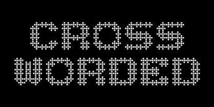 Each glyph is fashioned as a cross word puzzle.
 - Kids Serif by m u r,
$15.00An child's serif font, also known as "spiky" letters. - Dom Loves Mary by Correspondence Ink,
$39.99 Dom Loves Mary has a baby brother! Check out Fratello Nick here: http://www.myfonts.com/fonts/correspondence-ink/fratello-nick/ The DomLovesMary font family has all you need to create unique, custom stationery products. THE INSPIRATION BEHIND THE DOMLOVESMARY FONT FAMILY: DomLovesMary is named in memory of Dominic and Mary Sementelli, Debi’s in-laws. Dom and Mary were opposites who were truly “made for each other”. A snazzy dresser, Mary was feisty, loved to dance, sing, and be the life of the party. Dom was cool, calm and collected and was happy to shine the spotlight on the love of his life. They balanced each other out in a really great way. Going through some of her in-laws old photos, Debi found their wedding album. She was struck by the beautiful look on their faces as they got ready to start their life together. She saw the excitement, joy and anticipation of them envisioning “Una Bella Vita!” (A beautiful life!) She decided to create a hand-lettered font with them in mind represented by two totally different lettering styles that were, like Dom and Mary, “made for each other”. It’s her way of honoring them and sharing their beautiful life with all of the couples just starting theirs together. They truly had “Una Bella Vita” and we hope you do too. WHAT'S UNIQUE ABOUT THE DOMLOVESMARY FONT FAMILY: The SCRIPT & TEXT FONTS are lettering styles that were made to compliment each other. With a vintage, classic feel, they will add elegance to your design, while the TEXT serves to offer support with easy to read simplicity. In addition to the standard character set, each of the uniquely styled script fonts includes a collection of flourished ornaments. Use them to create corners, headers or other embellishments to complete the look. And if you really want to fancy things up, we offer two sets of 72 additional flourishes that were specifically made to add to upper and lower case letters for easy customization. Dress them up with one, two or more. It’s like choosing simple pearls or piling on the glitz! Or combine several to create unique flourished ornaments of your own. To add even more panache, we're pleased to present our ready made set of most frequently used ADD-ON WORDS. Created with the wedding client in mind, this set of 66 includes envelope friendly titles: Mr and Mrs, Mr, Mrs, Miss, Ms, Doctor, the Doctors, as well as words to fill out your invitation suite: RSVP, Respond, Save the Date, Accommodations, Directions and more! Easily create Bride and Groom signs or Thank You cards or tags with the click of a key. Or use angled words like “and, at, to, on, for, from and of” to add a special touch to your large groups of copy. PACKAGES: We are pleased to have a variety of customers. From professional invitation designers to DIY brides, publishing companies and website / blog designers among others. So we've created packages to help fit their diverse needs. Purchase just one of our beautiful DomLovesMary SCRIPT fonts, each with its collection of included flourishes or the PRO VERSION complete with ALL THREE script fonts and a combined total of over 100 flourished ornaments. Add our TEXT font, a set of FLOURISHES or ADD-ON WORDS. Love the idea of customizing your letters with all the possible combinations? We offer a special price when you purchase both sets of flourishes. Or choose our Accoutrements Package containing both sets of FLOURISHES for letter customization as well as our ADD-ON WORDS. Want to have it all? The “DomLovesMary Total Design” package is for you. Each of these packages are offered at a 25% savings. WHAT PROGRAM WILL YOU USE?: All of the font options come in both Pro and Standard format fonts. For those with programs that can take advantage of OpenType features (click on the link to see if the program your using is one of them) the Pro fonts are for you. http://www.typotheque.com/fonts/opentype_feature_support/ For others without the ability to use Open Type features, we provide all of the script fonts that comprise the Pro Version as separate versions (Regular, Contextual and Stylistic). If you are using a program like Microsoft Word, and want all three script fonts, you can still purchase the Pro Version (a $50.00 savings), and install the individual fonts bundled in the Standard Fonts folder. We have set it up so they will appear separately as DomLovesMary, DomLovesMary Contextual and DomLovesMary Stylistic in your fonts list. Exciting news! In an effort to help our customers access all the goodies that are normally only available in Open Type Capable programs (like the flourished ornaments that come with our script fonts), we have found a simple application that allows you to do just that. For this reason, we've made sure to unicode all of our characters and glyphs so that they will work in this type of program. There may be others, but we checked this one out and found that it works. Check out PopChar
 - Saissant by Magpie Paper Works,
$54.00 Edgy and modern, Saissant is a hand-drawn font that leaves an impression. Bold capitals and kinetic lowercase letters have been designed for emotional impact. Saissant includes multi-language support as well as contextual alternates and discretionary ligatures for a convincing calligraphic effect.
 - Friedhof by Storm Type Foundry,
$25.00Friedhof family is inspired by a tombstone lettering dated from about 1900. Beside the solid, fat style, it contains handtooled and shadowed (Geist + Deko) variations, as well as narrowed & lowercase styles. Note: Very complex, shadowed fonts may not work on slow machines! - Butternut by Ryan Keightley,
$19.00 Butternut’s origins can be traced back to handwriting in felt-tipped marker. Because of this, you’ll find a slight degree of roughness to the edges, yet a fluid softness to the letterforms themselves. As well as some weird, fun details here and there.
 - Bipolar Decorative by VersusTwin,
$45.00 A bolder condensed version of the Bipolar family of fonts, Bipolar Decorative has a level of ornamental sophistication and balancing that is surprising for its narrow spiny appearance. It's a neo-blackletter typeface that screams for experimental as well as serious use.
 - Diagond by Paragraph,
$- Sporting a uniform upward slope in the letterforms, Diagond is a contemporary decorative/display typeface with hints of the seventies and Art-Nouveau. The font contains some alternative lower-case glyphs, as well as ligatures, and East European, Turkish and Baltic languages support.
 - Roslyn Gothic LP by LetterPerfect,
$39.00 LetterPerfect's version of this distinctive sans serif design is both legible and approachable, and about as bold as a display font can be. Its friendly persona makes it an ideal choice for greeting cards and invitations, or for use with children's reading material.
 - Millrich Reading NF by Nick's Fonts,
$10.00The 1918 specimen book of the Miller and Richard Type Foundry of London and Edinburgh featured this endearing typeface. Both versions of this font include the complete Latin 1252 and Central European 1250 character sets, as well as a very tasty f_f_i ligature. - Appelsin by Bogstav,
$15.00 Perhaps all people knows that oranges are healthy. One single orange provides almost every daily need of vitamin C. This font is called Appelsin, which is the danish word for orange. Perhaps this font is just as healthy for your designs as well? ;)


