10,000 search results
(0.043 seconds)
- Ryo Gothic PlusN by Adobe,
$79.00Ryo Gothic is a new Japanese sans serif (or gothic) kana typeface design. Created by Adobe type designer Ryoko Nishizuka , the typeface has a bright and speedy calligraphic touch and can be used to compose readable body text, as it gives a calm and well-controlled color to the typeset page. Supplied in OpenType format, each Ryo Gothic font includes hiragana, katakana and some punctuation marks and should be combined with the kanji and other glyphs in existing Japanese gothic typefaces that contain full character sets. This typeface family is available in seven weights--extra light, light, regular, medium, bold, heavy, and ultra heavy--which allow end users to select the best-matching weight for their favorite full-set Japanese gothic typeface. Creative professionals using the Japanese version of Adobe InDesign may use that program's Composite Font tool to easily combine Ryo Gothic with other typefaces. - Mailart Rubberstamp - Unknown license

- Aorta by Gaslight,
$25.00 Aorta was designed for independent subcultural zine. It have stencil in place of lower-case and digit stencil in place of old style digit. Aorta good for headlines, posters, editorial design... Aorta have condensed proportion and good in solid matter.
 - Compact by ParaType,
$25.00 The typeface was designed at ParaType (ParaGraph) in 1991 by Vladimir Yefimov. Based on Anons by Gennady Baryshnikov. An extra condensed sans serif. For use in advertising and display typography. The decorative styles were added in 1997 by Alexander Tarbeev.
 - County Clerk JNL by Jeff Levine,
$29.00 County Clerk JNL was modeled after the vintage Hamilton wood type design Gothic Special, and is available in both regular and oblique versions. An early grotesk font, this condensed sans serif lends itself well to short headlines and brief body copy.
 - Marek Slab by Rosario Nocera,
$14.99 Marek is a slab serif font it takes it's name from a football player from the Naples soccer team “Marek Hamsik”. It is composed of 5 weights (thin, light, regular, bold and black with matching italics), it's ideal for big headers as for magazines, t-shirts, branding and much more. It is available in open type format and includes alternative fonts (a,K,k,g), ligatures, oldstyle and linear number. Moreover, it includes the glyph of the new bitcoin currency, supports more than 80 languages and it's composed of 392 glyphs.
 - Gutheng by Letterlite Studio,
$10.00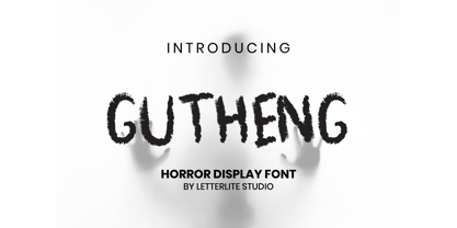 Gutheng - is a horror-themed font that is very mysterious and spooky. This font is very suitable to be used for book covers, titles, quotes, and others that require a font with a horror theme. What's Included : - Standard & Multilingual glyphs - Works on PC & Mac - Simple installations - Accessible in the Adobe Illustrator, Adobe Photoshop, Adobe InDesign, even work on Microsoft Word. - PUA Encoded Characters - Fully accessible without additional design software. - Fonts include multilingual support for; Afrikaans, Danish, Dutch, French, German, Indonesian, Irish, Italian, Norwegian, Portuguese, Scottish, Spanish, Swedish, Swiss. Hope you enjoy with our font!
 - Waika by Hazztype,
$16.00 Waika is a modern sans serif font that seamlessly blends a rounded aesthetic with condensed proportions, resulting in a contemporary and versatile typeface. Its smooth curves and absence of serifs contribute to a clean and friendly appearance, making it suitable for a wide range of applications. The deep inktrap adds a touch of sophistication and uniqueness to each character, ensuring legibility and visual appeal in various design contexts. Waika is a dynamic choice for projects seeking a balance between modernity and approachability.
 - Biomorph by Rillatype,
$20.00 Proudly Introducing, Biomorph! Biomorph is a brand new condensed sans font family released by us. This font is very suitable for your projects especially for brandingm publishing, titles, book, magazine, website, etc. Biomorph is font family that comes from thin, extra light, light, regular, medium, semibold, and bold version, with all of these styles gives yoiu freedom to design as you like!
 - Athletic Pro by Mandarin,
$29.00 Athletic Pro is an updated and revised version of Athletic Condensed. Added weight styles and a brand new designed Cyrillic alphabet. Practical and timeless, this display font does an excellent job on laying headlines and bold messages. With the variable font file you will have further personalisation and broader range of styles, it also contains the standard weights and styles.
 - Bolshy by K-Type,
$20.00 Bolshy is a stroppy font whose x-height has got ideas above its station, it’s ended up being equal to the cap height. Bolshy doesn’t go completely Bauhaus, and although the boundaries are somewhat blurred, the distinction between upper and lower case just about remains intact. There is something slightly Cyrillic about Bolshy’s bulbous terminals, exotic shapes and condensed curvature.
 - Lichtspiele Reklame by Typocalypse,
$29.00 Lichtspiele Reklame is the ultra condensed version of Lichtspiele inspired by the 1920s — the golden age of cinema — where neon lights and marquee letters decorated cinema facades. Lichtspiele Reklame is crafted for large narrow formats and contains the display font and two italics (italic & contra-italic), like in these 20s, a time where movie announcements were shown on huge so called Litfaßsäulen.
 - Royal Street by XO Type Co,
$40.00 Royal Street is a sleek, condensed sans family of six typefaces, from ExtraLight to ExtraBold, designed and built to be big and brash. Royal Street has an extended Latin character set tuned for 87 languages, and is designed with several common and discretionary ligatures, as well as case-sensitive punctuation. All features are accessible with CSS as well as in print.
 - Saddle Tramp JNL by Jeff Levine,
$29.00 The designers of wood type in the 1880s did not lack for inspiration or imagination. From extremely ornate designs to ultra compressed or condensed alphabets, there was no shortage of variety. Saddle Tramp JNL is one such compressed font. Its wide, bold design coupled with its squat appearance allows for multiple words in a headline without overuse of page space.
 - Vincente by Dharma Type,
$19.99 Vincente is a contemporary but Didone-look serif with condensed proportion. Inspired by vintage iron works and antique botanical pictorial book. Very simple and orthodox letter forms with some charming accent such as can be seen in "y". Sophisticated curves but they have human warmth as if they are hand-crafted. Consists of six weights and supporting almost all latin languages.
 - Film Poster by Fontsphere,
$12.00 Film Poster is an ultra condensed sans serif display typeface with geometric forms. It can be used in many creative ways, all kinds of graphics, posters, advertising materials, text composition. It fits perfectly for the film industry as well as many other fields. Font include multilingual support (Latin-1), uppercase and lowercase letters, numerals and a large range of punctuation.
 - Camy by Scholtz Fonts,
$9.50 I wanted to create a "handwriting" font which could be used professionally. I have often needed such a font with a variety of weights and styles for a particular project and have had to resort to mixing fonts, creating a rather messy, amateur job. Camy is named for a little village in South West France where I did much of the initial work on this font. Camy is ideal for contemporary display work, comes in ten styles, and has a contemporary appeal with its casual, easy to read letters. Camy was designed as a total professional package for designers looking for a handwritten font suitable for all kinds of contemporary display work: the idea being that once you have the Camy Professional Pack you don't have to waste time searching for other handwritten fonts. The Family: LIGHT -- NARROW - light weight, condensed width, delicate line -- MEDIUM - light weight, delicate line -- WIDE - light weight, expanded width, delicate line NORMAL WEIGHT -- NARROW - of medium weight and condensed width - perfect for limited space -- MEDIUM - of medium weight -- WIDE - of medium weight and expanded width BLACK - for best readability -- NARROW - condensed width for bolder statements in small areas without losing legibility -- MEDIUM - for bolder statements -- WIDE - expanded width for bolder statements FAT -- WIDE - for maximum impact Use a combination of styles for product branding, book covers, invitations, greeting cards. The Camy combination works well for both headings and body text. Camy contains over 250 characters - (upper and lower case characters, punctuation, numerals, symbols and accented characters are present). It has all the accented characters used in the major European languages.
 - CarnivalFest by Artyway,
$19.00 Introducing the "CarnivalFest" font, the perfect addition to any party or celebration! This colorful and playful font features rounded letters in a variety of bright hues, making it perfect for birthday invitations, carnival posters, and party headlines. Add a touch of fun and excitement to your event with "CarnivalFest"! Your download font file with: - Colored letters - Punctuation coverage - Alternate symbols with bubbles - Multilingual
 - Junge Holiday Cuts NF by Nick's Fonts,
$10.00A charming series of 26 holiday “type warmers” based on the works of Carl S. Junge for the Barnhart Brothers & Spindler type foundry in the 1920s. Single-color cuts are in the uppercase positions, while 13 of the cuts suitable for two-color usage occupy the lowercase in adjacent pairs; e.g., a and b, c and d, and so on. - Likely by Adam Ladd,
$25.00 Likely is a joyful, brush script type family with complementary sans and extras styles. Hand drawn freely but carefully, each font is designed to work together to present a vibrant and natural package. Layer and colorize the free Counter styles to easily enhance the color palette or use the over 170 matching catchwords and shapes to make your designs even more fun!
 - Royante - Personal use only

- Octavian by Monotype,
$29.99Octavian font was designed by Will Carter and David Kindersley for the Monotype Corporation in 1961. Mr. Carter writes: While the ultimate authority is the ancient inscriptional pattern, the physical characteristics of the present rendering are manifest in the economic proportions of the shapes and the modified relations of the strokes. Thus, the letters are narrower than the classical forms and their weight heavier." Octavian is a fine book font and works well for other text settings that are less demanding, such as magazines and brochures." - Polli Sans by Will Albin-Clark,
$- Polli Sans is a sans serif geometric font, designed with both proportional and fixed-width styles in mind. Polli is great for large scale display purposes and small scale copy. The proportional’s curvy form makes it super useful for title type, and the detailed technical fixed-width sub-family is perfect for any informative body of text. Polli is designed as an homage to common type practices of the early 21st centric corporate America. Borrowing from friendly styles you’ve seen before but with contemporary challenging elements.
 - Boulevard by Doeltype,
$22.00 Boulevard is a new romantic modern calligraphiy font with exquisite accents, and distinctive style that is perfect for your branding design. Modern calligraphy with many alternatives. Now this is an opentype! It's smart and in line with your wishes! You are welcome to use it, suitable for various purposes: logo, signatures, corporate symbol, wedding invitation, title, creative, t-shirt, business card, letterhead, nameplate, headings, label, poster, news, badge, letterhead, cutting, hot stamping, quotation, etc. Includes the initial letter to terminal, alternative, ligature and multiple language support.
 - Spacia by Designova,
$15.00 Spacia is a unique & modern Sans-Serif typeface specially designed for headlines, big text, branding, logotypes & display usage. The typeface could be the perfect choice for logo/logotype design, branding, marketing graphics, banners, posters, signage, corporate identities as well as for editorial design that can bring freshness and professionalism. Please see the examples shown above to get an idea of the capability of this typeface. Handcrafted and designed with powerful OpenType features in mind, each weight includes extended language support including Western European & Central European sets.
 - Aspasia by Mikus Vanags,
$18.00 The Aspasia is a decorative low contrast sans serif type family suited both for editorial and corporate design, available in five weights, ranging from Thin to Black. It was designed by Mikus Vanags in 2009 influenced by art-deco geometric typefaces and mastered for the needs of today. The Aspasia OpenType fonts have and extended character set to support Central/Eastern European languages like Polish, Czech and Latvian. The font includes old style and lining figures, regular and discretionary ligatures and multiple stylistic alternates.
 - Freunlaven JNL by Jeff Levine,
$29.00Freunlaven JNL is a wild and partying font with a name inspired by the nonsense verbage often uttered by Jerry Lewis in his comedy classics. - Mozer by Fontfabric,
$29.00 Mozer is a semi-condensed neo-grotesque type family of 16 styles ranging from Thin to Black matched with true italics. With a generous x-height, economical width, moderate contrast and overall solid appearance this typeface shows an uncompromising legibility merged with a contemporary spirit that has not lost its individuality, even in the small details like the discreet ink traps. Mozer covers Extended Latin, Cyrillic and Greek and is suited with plenty of OpenType features, such as localisations, ligatures; four type of numerals including figures and tabular; case-sensitive forms; alternatives etc. Mozer comes accessible and closer to all designer’s needs. Features: • Over 790 glyphs in 16 styles (Thin to Black); • Extended Latin, Cyrillic and Greek scripts for more than 130 languages; • Tall and balanced x-height; • Semi-condensed width proportions; • Moderate contrast and vertical stress; • Neo-grotesque characteristics and terminals with humanistic flavor. Designers: Ani Petrova, Mirela Belova, Nikolay Petroussenko
 - Al Seg33 by Nihar Mazumdar,
$1.00 Al Seg 33 is a moderately dense alphanumeric display. The 33 segments are made up of eight outer segments, and twenty-four inside segments, and a center dot. It has five diagonals in each corner.
 - Yusyad by Eyad Al-Samman,
$20.00 The typeface Yusyad is designed mainly for a very sentimental and emotional reason. Metaphorically, it is a modest artistic gift offered virtually from the designer to one of his beloved and cherished persons in this life, namely, his loyal and devoting wife. She represents one of the most essential motives for many artistic and non-artistic works that the designer achieved during his life. This was done through her tranquil personality, infinite patience, sincere support, and endless encouragement. The designer's partner (i.e., the significant other) lives with him along with their three children looking both always for a life full of peace, achievements, philanthropy, and of course love. The typeface's name Yusyad is a portmanteau word consists of two morphemes. It is a simple name-meshing for two different names. Those names represent the name of the designer's wife (Yusra) and the name of the designer (Eyad). Yusyad is like an epithet that ties the two partners' honest and eternal relationship until the last day of their lives. Technically, Yusyad is a sans-serif condensed and display typeface. It comprises seven fonts with dual styles and multiple weights. Specifically, it has two main styles, namely, the normal and the inline design. The normal style comes in five weights (i.e., thin, light, regular, bold, and black) whereas the inline style has two weights (i.e., regular and bold). The typeface is designed with more than 700 glyphs or characters. Its character set supports nearly most of the Central, Eastern, and Western European languages using Latin scripts including the Irish and the Vietnamese languages. The typeface is appropriate for any type of typographic and graphic designs in the web, print, and other media. It is also absolutely preferable to be used in the wide fields related to publication, press, services, and production industries. It can create a very impressive impact when used in movies' or TV-series titles, posters, products’ surfaces, logos, signage, novels, books, and magazines covers, medical packages, as well as the product and corporate branding. It has also both of lining and old-style numerals which makes it more suitable for any printing or designing purposes. To end, Yusyad's condensed appearance—especially the inline style—makes it very memorable, eye-catching, and striking for advertising, marketing, and promotional purposes.
 - Venice Serif by Unio Creative Solutions,
$5.00 Introducing “Venice Serif - Font Family” – a functional serif type system with a sleek structure which gives a strong personality while still maintaining high readability. Developed in three weights with matching obliques. The full set of weights (Light, Regular and Bold) counts more than 350 glyphs. The end result is a family with full multilingual capabilities and a coverage of several languages based on the Latin alphabet. This fashionable font family is the ideal choice for advertising, corporate design, packaging, editorial and branding. Specifications: - Files included: Venice Light, Venice Regular, Venice Bold with corresponding obliques - Multi-language support (Central, Eastern, Western European languages) - OpenType features
 - Memento by Linotype,
$29.99Memento is a 1993 design of the type artist Franco Luin, the creative mind behind a variety of types, for instance, Venus and Griffo Classico. Memento's high x-height allows it to be legible even in small point sizes. It is distinguished by its tiny triangular serifs, a characteristic reminiscent of the Dutch types of the 17th century. Memento is an extremely legible typeface with a classical touch. It is available in four different weights with corresponding italics and small caps. This range of weights along with its classic, neutral look makes it a versatile typeface which can be used in anything from books to corporate design to magazine typography. - Salient by Device,
$39.00 Elegant, classic yet contemporary. Salient is a updated interpretation of the Didot school of type design, typified by Giambattista Bodoni in Italy and the “modern” French styles of high-contrast fonts cut by Fermin Didot in Paris the early 19th century. Salient is not a historical revival but a contemporary reworking, using fewer pen-derived forms especially in the lower case. This gives it a cleaner edge. Instead of ball serifs, it uses lightly flicked stroke terminals. It is suitable for both text and headline, and the wide range of weights make it a versatile choice for books, magazines, reports, posers, packaging and corporate identities.
 - West West by Fenotype,
$25.00 West West is a high-contrast condensed display serif. West West has extra large x-height making it suitable for efficient choice for distinguishable display use such as headlines, packaging, magazines, posters and advertising, among any other. In large sizes, you can also try tighter tracking for maximum impact. With certain of Art Nouveau shapes and massive contrast West West is a great choice anywhere you need a stylish and fashionable touch.
 - Spindletop NF by Nick's Fonts,
$10.00One in the series of fonts called Whiz-Bang Wood Type, intended to be set large and tight. Spindletop’s ultra-condensed letterforms allow a lot of information to be packed into little horizontal space. Named for a famous East Texas oil field that made a lot of people rich in the early part of the twentieth century. Both versions of this font include the complete Unicode 1252 Latin and Unicode 1250 Central European character sets. - Tenby by Paragraph,
$12.00 Tenby is a series of modular geometric display sans serif fonts with a hint of Art Deco combined with a 1980s finish. The fonts' underlying grid is ten squares high. Their widths correspond to condensed (Tenby Four), normal (Tenby Five) semi-extended (Tenby Six), extended (Tenby Seven), and extra-extended (Tenby Eight). Each contains two weights, light and regular. Although smaller text sizes are still quite legible, the fonts work better at large sizes.
 - Neato Serif Rough by Adam Ladd,
$25.00 Neato Serif Rough is a hand drawn, quirky serif font with a textured, letterpress appearance. It features stylistic alternates, standard and discretionary ligatures, and swashes to add options and flair. The typeface has a unique blend of sophistication with its high contrast of thicks and thins and also playfulness with the distinct ball terminal characters—especially evident in the lowercase “e”. It is slightly condensed and great for display headlines, titles, packaging, branding, and more.
 - Dom Casual by URW Type Foundry,
$89.99 Dom Casual is a very condensed script, almost monotone, with irregular vertical strokes ending at different heights, and which suggests a freehand effect. It was designed by Pete Dom in 1951 for American Type Founders. As its name suggests, the Dom Casual font gives the appearance of a quick brush-like lettering and is suitable for setting titles, subheadings and short copy. There is some variations of stress in the rounded letters.
 - Pisak by Cuda Wianki,
$20.00How many times have you been looking for a handwritten yet not childish font without result? We have a nice solution for you-our brand new PISAK! :) Thanks to extra thin condensed letters PISAK is easy readable and ideal for text writing. Its subtle irregularity makes it warm and friendly good for unoficial designs. If you like the shape of the letters but you need a more official and regular version see our Lalalo font. - Armetica by Hsan Fonts,
$18.00 Armetica is an ultra condensed sans serif typeface with a unique personality. It comes in normal and display versions, with 9 weights, as well as italics totaling 18 fonts. Armetica is a modern elegant typeface that would be perfect for branding, logos, headlines or captions. The font could also work as a stylish text overlay on any background image you like, minimalist and warm while still being versatile enough to use anywhere!

