10,000 search results
(0.039 seconds)
- Love Glitch Personal Use - Personal use only

- Blue Screen Personal Use - Personal use only

- PF Bague Sans Std by Parachute,
$39.00 Bague Sans is an award-winning monoline typeface with a distinct and eye-catching personality. Despite its inspiration from early 20th century geometrics, it diverts from the mechanical rigidity of those typefaces by incorporating humanist characteristics, such as subtle variations in stroke width and open counter shapes with vertical endings. This is a very clean and legible typeface with a warm and well-balanced texture which is ideal for intense editorial use in magazines and newspapers. The most remarkable feature of Bague Sans is its vast array of uppercase alternates and ligatures which truly shine when set at display sizes. This typeface is automatically transformed into a flexible, charming and stylish typeface with strong modern aesthetics. Explore its dual personality, switch from Humanist to Geometric and vice versa by using alternate characters such as the single-storey a and single-storey g. From classic to modern, from excessive to neutral, Bague Sans is a multipurpose typeface which offers enormous possibilities and variations for editorial design, branding and corporate identity while it performs amazingly well on web. This superfamily includes 18 weights from Hairline to Ultra Black with a consistent and well-refined structure. It supports extended Latin such as Central European, Baltic, Turkish, Romanian and includes numerous alternates and ligatures for unlimited text variations. You may also want to check out Bague Sans Pro which supports Cyrillic and Greek as well.
 - WyomingStrudel by Ingrimayne Type,
$12.95 WyomingStrudel takes a bold version of WyomingSpaghetti and adds an internal decoration that resembles an exaggerated split serif. The WyomingStrudelInsert style contains only the ornament. It is intended to be used in layers with WyomingStrudel, either covering up the ornament or giving it a different color than the background color.
 - Ghost Reverie by Hanoded,
$15.00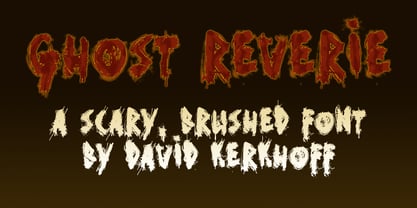 Scary, creepy, brushed horror font.
 - Tolstoy by TypeArt Foundry,
$45.00 Eucaliptus Companion with rounded corners.
 - Leviatan by Saskara Type,
$15.00 leviatan is a spooky display font featuring horror & scary characters This font is inspired by blood Add this font to your most creative ideas
 - Fontoddler by CozyFonts,
$20.00 Fontoddler Font Family, This font was created with the personality, in mind, of my two-and-a-half-year-old granddaughter Chloe Bella. I believe strongly that fonts have personalities that’s why we refer to their members as ‘characters’ or to be more accurate, ‘glyphs’. This font is playful, bold, colorful in form and design, a bit irregular, a bit informal, a bit irreverent, a bit humorous, a bit sassy, and a bit independent just like my little one. When used in color Fontoddler sings. She’ll be writing and creating visual words in just the nick of time. At 2 she started recognizing many colors and identifying people, places, animals, and objects and now she’s recognizing letters. I can’t wait for her to understand that this font was designed and named after her. Fontoddler currently exists in 3 styles, Medium, Heavy, and Heavy Outline. Naturally Heavy and Heavy Outline are congruous, ie. They are fitting together. I hope you enjoy and use this 24th font family from Cozyfonts Foundry. It will fit well with greeting cards, signage, birthday parties, holiday occasions, invites, stationary, headlines, logos, posters, cartoons, animation titles, movie titles and even sports events and sports logos. Have fun with this one. Tom Nikosey
 - Contemporary Sans by Ludwig Type,
$45.00 Contemporary Sans is a unique grotesque with a distinct contrast between its horizontal and vertical strokes that gives it a lively and elegant appearance. Friendly, subtly formed strokes and individual letter forms make it both legible and pleasant to read at small sizes, and striking at display sizes. Its narrow proportions make it a very easily useable typeface, particularly for narrow columns or tight headlines. It is suited to a wide range of applications, from corporate to editorial design, where a clear and distinctive impression is required. Visit this minisite to see the Contemporary Sans webfonts in action.
 - Edgewater by cm5dzyne,
$16.00Initially created for use in a logo and with a limited number of characters, Edgewater evolved into a full typeface suitable for everything from projects requiring a space-age, futuristic feel to logotype for the most refined, conservative corporations. Edgewater was joined in November, 2008, by Edgewater Hairline, which supports more than 30 languages and is especially attractive in larger point sizes. The hairline version also is a nice complement to the other fonts in the Edgewater series, though still striking enough to stand on its own as the dominant visual in a virtually unlimited number of displays. Timeless, unique and flexible. - Khews by Invasi Studio,
$15.00 Are you ready to add some fun to your designs? Khews is the perfect font for you! It has a modern and playful vibe with its unique cutoff letterform and inspiration from graffiti tagging. You'll love the casual and bubbly twist that Khews brings to any project. And here's the best part: Khews comes in two styles - regular color and outline - so you can mix and match to create the perfect design. Give it a try and see the magic for yourself! Ideal for posters, flyers, logos, and headlines. It pairs well with sans-serif and serif fonts. Despite its imperfections, it is casual yet legible and has a good blend of modern and casual styles.
 - Ardy Mass by Substance,
$12.00 Ardy Mass is a hand drawn and scanned type face available in italic, italic outline, regular & regular outline. Ardy Mass was drawn at a small scale with a fine nibbed black permanent marked pen.
 - Monbloc by Rui Nogueira,
$6.99 Monbloc is a typeface inspired by geometry and lines. It intends to be a practical font wich gives the designer the freedom to incorporate it in his wildest designs.
 - Sabron by Fontron,
$35.00Sabron Light is a very round font with the thickness at the corners rather than the side as in most typefaces. Serifs are swollen ends coming to a point. - Another Shabby by Zetafonts,
$39.00 Another Shabby is a script typeface family. Its shapes are defined by rough, wide brushstrokes, slightly rounded in corners to mimic the feel of a real handwritten casual script.
 - Runik Futhark by Tim Rolands,
$- Runik Futhark is a modern font incorporating the earliest Germanic-Norse runes, known as the Elder Futhark. It's a bold rendition ready for all your Viking raiding party needs!
 - Antique Stencils JNL by Jeff Levine,
$29.00 A butterfly, plants, animals, borders, embellishments, a center piece and corner pieces make up this assortment of charming stencil designs re-drawn from vintage sources for Antique Stencils JNL.
 - Eris Pro by DBSV,
$120.00 Rolling gemstones… The name "Eris" is again borrowed from Greek mythology, is related to the myth "the apples of Hesperides" which were gold and one of them got the Erida!!! More about this myth can be found on the web... And in this font (as in one section in the "Cyceon" font) I have mixed in the lower case with the capitals in many letters.I tried here to give a different illustration in lowercase letters, simply because of whims or because the monotony is tiring me!!! One can also mix here with two levels to get a third color depiction using the “ErisPro-Black” with “ErisPro-Strap” or “ErisPro-BlackIt” with “ErisPro-StrapIt” This series is composed and includes twenty-four fonts with 658 glyphs each, with true italics and supports Latin, Greek and Cyrillic.
 - Konstructa Humana Stencil by TypoGraphicDesign,
$19.00 CONCEPT/ CHARACTERISTICS »Konstrukta Humana Stencil« aka »Hot Cold« is a modern designed sans serif typeface with humanist influences and Stencil character. The partially strong line thickness difference (line contrast) gives the font a touch of elegance and creates tension as fats. The font comes in 3 font styles. From elegant warm tenderness »Thin« to the solid, bold, and robustness cold »Regular«. APPLICATION AREA The »Thin« font weight would probably dig on festive invitations and »Regular« as concise poster font. From headlines in magazines or websites about poster design and flyers to t-shirt design. Just type it. TECHNICAL SPECIFICATIONS Headline Font | Display Font | Sans Serif Stencil Font »Konstructa Humana Stencil« OpenType Font (Mac + Win) with 375 glyphs & 3 styles (regular, light, thin). With alternative letters, ligatures, accents & €.
 - Signatria - Personal use only

- Horyzen - Personal use only

- Western Deco JNL by Jeff Levine,
$29.00 The cover of the 1938 sheet music for "Treasure Island March" had its title hand lettered in a rough-hewn Western style with overtones of Art Deco influence. All of the characters were "cleaned up" for the digital font, but still retain the basic designs with their irregular, eccentric look. The result is Western Deco JNL, which is available in both regular and oblique versions.
 - Herbit by Lafontype,
$25.00 Herbit is a handwritten sans serif font designed with the principle "Irregularity in regularity" so that herbit produces different shapes on each side of the character but looks in harmony and still maintain readability. The family contains 7 weights from Light to black with multilingual support and is ideally suited for branding, logo, advertising and packaging needs, editorial and publishing, as well as web and screen design.
 - Halenoir by Ckhans Fonts,
$34.00 • Composed of 3 sets: Normal, Compact, Expanded. • Consisting of 3 distinct optical sizes: Display and Text, Expanded. • Comprises 102 fonts • Support for 28 languages: Afrikaans Albanian Catalan Croatian Czech Danish Dutch English Estonian Finnish French German Hungarian Icelandic Italian Latvian Lithuanian Maltese Norwegian Polish Portugese Romanian SlovakSlovenian Spanisch Swedish Turkish Zulu Swedish Turkish Zulu • Contains OpenType features with alternates or substitutes • Tabular Figures • Ordinal numbers • 74 icons (It will keep updating.) • 72 graphic patterns for designer (It will keep updating.) • 28 brand symbols (It will keep updating.) • 27 arrows glyphs • 0-99 line circled glyphs • 0-99 solid circled glyphs • A-Z line circled glyphs • A-Z solid circled glyphs Halenoir is a modern sans serif with a geometric touch that support for 28 languages. It comes in 10 weights, 102 uprights and its matching outlines, Obliques, pattern, so you can use them to your heart’s content, in each of which there are more than 801+ glyphs. Halenoir is composed of 3 types: Original, Compact, Expanded, and each is designed to be suitable for mobile, graphic, and editorial design. Halenoir comprises 102 fonts, consisting of three distinct optical sizes: Display and Text. Each one has been carefully tailored to the demands of its size. The larger Display versions are drawn to show off the subtlety of Halenoir and spaced with headlines in mind, while the Text sizes focus on legibility, using robust strokes and comfortably loose spaces. In the typeface, each weight includes extended language support, fractions, tabular figures, arrows, ligatures and more. Perfectly suited for graphic design and any display use. It could easily work for branding, web, signage, corporate as well as for editorial design. documents and folders, mobile interface. Useful links: Gravitica PDF Type Guide and Specimen (You can know how to use icons and arrows, other glyphs.)
 - Beleck by ArimaType,
$19.00 Beleck is a bold and horror display font. To make your creations look amazing, this font has the potential to take your creative ideas further. It is perfect for your horror designs and also a unique alternative to display designs. Beleck was designed for the needs of Halloween themed design concepts and events in October and November. Beleck is also perfect for quotes, greeting cards, invitations, posters, business cards, presentations and more.
 - Nicolas Cochin by Linotype,
$40.99Georges Peignot designed the font Nicolas Cochin based on copper engravings of the 18th century and Charles Malin cut the typeface in 1912 for the Paris foundry Deberny & Peignot. The font is named after the French engraver Charles Nicolas Cochin (1715-1790) although its style had little to do with that of the copper artist. Nicholas Cochin is a freer variation of another Peignot font, Cochin, a bit more balanced and elegant. - Ekorre by Mans Greback,
$49.00 Ekorre is a professional serif typeface. Drawn and created by Mans Greback in 2021, this creative font family has a vivid retro style and a strong personality, and is constructed with soft corners and flowing shapes. The letterforms express empathy, while retaining seriousness. It is provided in six complementing high-quality styles: Ekorre Regular, Ekorre Bold, Ekorre Black and each one as Italic. Ekorre is built with advanced OpenType functionality and has a guaranteed top-notch quality, containing stylistic alternates, ligatures and more features; all to give you full control and customizability. It has extensive lingual support, covering all Latin-based languages, from North Europa to South Africa, from America to South-East Asia. It contains all characters and symbols you'll ever need, including all punctuation and numbers.
 - PF Encore Sans Pro by Parachute,
$79.00 Encore Sans Pro is a sans serif which projects an image of reliability, authority and competence making it ideal for corporate applications. A functional typeface which combines utility with style. It’s subtle round characteristics such as the slightly curved-in edges, create a distinctly contemporary look, blending effectively traditional with modern details. Encore Sans Pro has received 3 international awards and distinctions including a Silver at the european ED Awards 2010. This is a contemporary typeface which may function as the perfect alternative to several overused classic sans. Encore Sans Pro does not pretend being different but it does claim its own personality. It is simple and stylish. Furthermore, it is extremely versatile. It comes with 22 weights and supports simultaneously Latin, Greek and Cyrillic. Each font contains 1535 glyphs and is loaded with 22 advanced OpenType features. Extreme weights, such as the elegant hairline, are carefully designed to establish an even color throughout, while ultra black despite its heavy characteristics is quite legible and powerful. Other intermediate weights such as light and book are ideal as body text for magazines and catalogs. Every font in this series has been completed with 270 copyright-free symbols, for packaging, public areas, environment, transportation, computers, fabric care and urban life.
 - Ananda Black Personal Use - Personal use only

- LITLLE KING PERSONAL USE - Personal use only

- Basic Map - Personal use only

- The Fright House by IKIIKOWRK,
$17.00 Proudly Present The Fright House - Classic Horror Type, created by ikiiko. Inspired by classic horror movie posters, The Fright House, with its retro appeal and traditional serif styling, revives the spirit of horror from the 1970s. The nostalgia and appeal of a past of dread is captured by this typeface, which pays homage to the typefaces that covered horror novels, movie posters, and spooky magazines during that time. The Fright House is a classic elongated condensed serif typeface with a timeless elegance inspired by 1970s fonts. With a precisely defined serif that gives it a sharp and unsettling feel. Each character has graceful contours and precise proportions, seamlessly blending vintage design with the thrilling charm of suspense. This typeface is perfect for an vintage poster, movie title, classic stuff, magazine layout, book cover, and also good for quotes, or simply as a stylish text overlay to any background image. What's included? Uppercase & Lowercase Number & Punctuation Ligature (Bonus) Multilingual Support Works on PC & Mac Get also a good offer & FREEBIE at our site : www.ikiiko.com Enjoy our font and if you have any questions, you can contact us by email : ikiikowrk@gmail.com
 - Multihalf by Luxfont,
$21.00 Introducing Neotype. Abstract font family with colored halves. An interesting and unusual fonts in the glitch style. Combination of clear shapes with soft gradients. Geometric color stylization of letters. Features: - Uppercase and lowercase the same size but different colors. - Transparency in letters. - Kerning. IMPORTANT: - Check the glyphs in the font before buying! - SVG fonts contain raster letters. - Check it www.colorfonts.wtf - Try a FREE DEMO version before buying. ld.luxfont@gmail.com
 - Joyeux Script by Elyas Beria,
$9.00 Is it modern, is it retro? Is it flowing, is it angular? It's all of these and more. Elegant and sophisticated, Joyeux© Script is a multilingual typeface in two weights that is perfect for any project that requires a touch of refinement, from invitations, labels, greeting and wedding cards, packaging, fashion, and logos to book covers and magazines. Includes: uppercase & lowercase regular and bold numbers and punctuation multilingual characters alternates ©2023
 - Grand by North Type,
$- Inspired by old school sign painting techniques, Grand is a display condensed sans serif that isn't shy to put its foot down. Its verticality and bulky curves combined with its sharp angular connections between the bowls and stems give Grand a distinctive look and feel. It comes in 12 styles (6 weights and accompanying italics), and supports over 200 languages. Grand Regular and Grand Italic are both available for free (personal and commercial use).
 - Lucemita - Personal use only

- OakPark by Ingrimayne Type,
$9.00 OakPark is a decorative or display family with an Art-Deco feel. It has high contrast with very thick stems that invite decoration. Eight members of the family have interior decoration and can be used individually or in layers over the regular style and under hollow style to create colorful text displays. These ten members are all-caps, but about half of the letters on the lower-case keys differ in some way from their counterparts on the upper-case keys. There is also a shadowed style and it can be layered with a shadowinside style. Completing the family are a style that has true lower case characters with an accompanying italics, and a style that has small caps on the lower-case keys.
 - Antipol by phospho,
$30.00 Antipol is a Sans Serif design that reverses the conventions of a regular Latin Sans Serif. With a weight emphasis on the horizontals and its vertical terminals Antipol radiates a 1970s charisma known from the like of Antique Olive. Its modern and avantgardistic attributes are most pronounced in the Hairline weight, where ultra thin lines meet distinctive arrowhead-corners. This particular weight is meant for display settings, think full-page magazine titles or posters. Antipol Wide and Antipol Extended are a generous statement for graphic design with enough space to let the type breathe: art catalogs, lead texts, invitations, letterheads or brand identity. Any style comes with a wide range of OpenType features that goes beyond a standard display font: Small Caps, Proportional and Tabular Oldstyle Figures and Lining Figures, Fractions, and much more. Type Specimen: http://bit.ly/2mxRCcA
 - Grafiker by Hanoded,
$15.00 Grafiker means 'Graphic Designer' in German. This fat, colored, uneven font with a 1001 uses was loosely based on the work of designers Oskar Kokoschka (1886 - 1980) and Jean Carlu (1900 - 1997). The glyphs were hand-drawn with a 0.5 roller ball and colored in with Chinese ink, using a stiff brush. The result is a lively, rather unusual font.
 - Bay Ridge JNL by Jeff Levine,
$29.00 Bay Ridge JNL, modeled from vintage sheet music lettering, is named for a neighborhood in the Southwest corner of the borough of Brooklyn, New York.


