10,000 search results
(0.033 seconds)
- Storyline by Comicraft,
$19.00 It starts slowly, gently drawing you in... you're introduced to a number of strangely interesting and compelling characters. The plot seems at first to be satisfyingly predictable, then -- suddenly -- the narrative takes a completely unexpected turn! The protagonist is thrown into a series of devastating and alarming twists and turns! The antagonist triumphs -- evil trounces good, mass hysteria seizes the city streets! Our Hero is separated from his One True Love, and it seems that she has fallen for The Villain of the Piece! Will Good Prevail? Will Evil Perish? Will Love Conquer All?!? I don't know yet -- that's as far as I've got. Don't worry, it has a Great Ending.
 - Zenit by Cuchi, qué tipo,
$9.95 As "Zenith" means, in an astronomical context, the highest point reached by a celestial body, my new typeface raises its drawing for carry it to the highest expression. In an effort to design a singular graphic and visual letters system, the contrasts and proportions of “Zenit” boosts up and are squeezed as much as possible, resulting in a very particular aesthetic, while still maintaining a certain grotesque reminiscence. Given its dynamic, postmodern, daring and futuristic style, “Zenit” is an ideal typeface for use in designs that want to discover new space worlds full of color and speed, still unexplored. “Zenit, the typeface that rockets you!.”
 - Chiavettieri by Kostic,
$50.00 Chiavettieri draws inspiration from Humanist types, marked by low contrast between thick and thin strokes and the angle of stress in the bowls of letters. On the other hand, generous x-height, clean angled serifs and sharp cuts in the ball terminals suggest a more contemporary look. All these characteristics make it a robust, well balanced, legible typeface ideally suited for book text, editorial and publishing, as well as web and screen text. With distinct Italics, small capitals, complete set of superior lowercase (Latin), oldstyle and lining figures (each in tabular and proportional widths), ligatures, fractions, superior and inferior characters – Chiavettieri is equipped for proper typography.
 - Yagi by Ably Creative,
$25.00 Yagi is a serif typeface that contrasts with old-fashioned proportions creating a more defined texture than your usual sans-serif, and Yagi is elegant enough for fashion, art, and luxury; yet sincere enough for serious business. And at 2 styles, ready for complex typographic demands. When we started this project, we wanted to try drawing modern serifs with accurately verified shapes and detailed elaboration of each character, making your text look great both on paper and on screen. Yagi creates unique and organic characters, with different sets of styles, you can change the feel of your designs from more organic to more standard. Let your designs fly!
 - Fulmar by CAST,
$45.00Named after a practical seabird, Fulmar is a modern Scotch intended for extended reading. More European than American, it draws on a range of influences from around the North Sea, from Fife’s Alexander Wilson to 17th-century French experiments in modulation and 18th-century Belgian flash, and combines them with contemporary structure and proportions. The result is crisp yet warm, steadfast yet lively, sharp yet robust, rational but humane. It can be appropriate for new translations, new histories and new understanding. With five weights, ten styles, small caps, a clamjamfry of OpenType features and unicorn manicules, Fulmar dispenses with sprawl while retaining range and dexterity. - Lilette by Elyas Beria,
$5.00 This elegant typeface came out of a quick, back-of-the-napkin, sketch I did for a different typeface. After toiling on that typeface I looked back at the sketch and realized that I had lost some of the elegance and playful character of my original sketch. So, it was back to the drawing board and Lilette was born. Lilette is fun but also serious. Playful but elegant. Personal yet also industrial. That’s the power of a slab serif. Perfect for magazine headlines, wedding invitations, signs, posters, slides, promotions, product design, branding, logos, and so much more. Make this versatile typeface with 10 styles yours.
 - HS Hadeel by Hiba Studio,
$50.00 HS Hadeel is a versatile display typeface designed for use in titles and graphic projects that require both Arabic, Persian and English characters. It draws inspiration from the modern kufi style and boasts a unique blend of sharp and curved lines that lend a beautiful and geometric structure to each character. The sharp endings at the bottom of each character add an additional aesthetic touch. With five weights available, ranging from Light to Black, HS Hadeel offers a diverse range of options for designers seeking to elevate their Arabic typography. Overall, HS Hadeel is a great choice for those seeking a visually striking and flexible typeface for their projects.
 - HS Hadeel Serif by Hiba Studio,
$50.00 HS Hadeel Serif is a versatile display typeface designed for use in titles and graphic projects that support Arabic, Persian and English. It draws inspiration from the modern kufi style and features a unique blend of sharp and curved lines that lend a beautiful and geometric structure to each character. Based on the original HS Hadeel typeface, HS Hadeel Serif includes a serif on some of its characters to provide a more traditional look. Two weights are available for this typeface: Regular and Bold. HS Hadeel Serif represents a valuable addition to Arabic typography, offering designers a visually striking and flexible option for their projects.
 - ITC Tempus Sans by ITC,
$29.99ITC Tempus is the work of British designer Phill Grimshaw. He claims that every calligrapher's aspiration is to draw perfect roman capitals with a pen, but admits that this is extremely difficult. For this typeface, Grimshaw used a fountain pen on cheap, porous paper and, of course, the ink bled. The resulting forms are classic but their rugged edges deviate from the perfection of roman type. And Tempus Sans is just Tempus with the serif surgically removed, yet the proportions of the characters work nicely," says Grimshaw. Because of its rough quality, the typeface works best in larger point sizes, yet maintains its characters even in smaller sizes." - Melodia by PintassilgoPrints,
$29.00 This one may look rather strange at a first sight, but it has the true power of coolify written pieces. (Please don’t use it to say “Attorneys’s Conference”, nor “Annual Statement of Accounts”, unless you mean them to be cool, which is very unlikely.) Melodia has 3 glyph drawings for each uppercase letter, 3 more for each lowercase and 2 for the numerals. There are even alternates for punctuation, go figure: there are 3 commas and 3 periods. Surprising. To activate the automatic cycling of all these alternates, simply turn on the Contextual Alternates feature in your application. And it doesn’t hurt to remind: use it only on cool stuff.
 - Henry VII by Greater Albion Typefounders,
$15.00 Henry VII draws it's inspiration from an inscription in Westminster Abbey dedicated to the memory of His Late Majesty of the same appellation. However, it is also in large part in the best tradition of 19th and 20th century Tudor revival. The inscription consisted wholly and completely of Capital Letter forms and we have 'imagined' all the rest in similar style, so Henry VII is very much a Mock Tudor work. Never the less, we feel it is great fun and ideal for lending an aire of 'Olde England' to any piece of design. Best used with 'Greensleeves' playing ever so softly in the background!
 - ITC Tempus Serif by ITC,
$29.99ITC Tempus is the work of British designer Phill Grimshaw. He claims that every calligrapher's aspiration is to draw perfect roman capitals with a pen, but admits that this is extremely difficult. For this typeface, Grimshaw used a fountain pen on cheap, porous paper and, of course, the ink bled. The resulting forms are classic but their rugged edges deviate from the perfection of roman type. And Tempus Sans is just Tempus with the serif surgically removed, yet the proportions of the characters work nicely," says Grimshaw. Because of its rough quality, the typeface works best in larger point sizes, yet maintains its characters even in smaller sizes. - Goudy Trajan Pro by CastleType,
$59.00 Goudy Trajan Pro is based on the drawings by F.W. Goudy of his rendition of the capital letters inscribed on the Trajan column in Rome, rather than on his subsequent metal type, Trajan (Title), released in 1930. Goudy Trajan Pro includes almost 1500 glyphs in each of three weights, including: uppercase, alternates, swash caps, small caps, vertically centered small(er) caps, dozens of fleurons, and much more. Supports Latin, Cyrillic and modern Greek scripts. Many thanks to Krassen Krestev, Sergiy Tkachenko, and Adam Twardoch for their suggestions for improving the Cyrillic glyphs; and to Alex Sheldon for his suggestions for swash caps and improved OpenType features.
 - Floridium Pro LV by No Bodoni,
$35.00 Floridium grew out of an affection for the old wood types of the 1800s. Painters Roman* was the initial inspiration. It was the source for the �banana� and �snake head� serifs. But the design�released by Adobe as Juniper�was too quirky to be useful. I tried to make it more sophisticated and modern while keeping the original personality of the 19th century types. The name resulted from a trip to Miami while the initial drawings were being made. Not the best way to name a typeface, but while we were in Miami Beach there was this tall blonde in a bright yellow bikini sitting on this bright yellow Porsche and...
 - LT Sweet Nothings - Personal use only

- Mottek - Personal use only

- Iron Lung - Personal use only

- Special K - 100% free

- 1529 Champ Fleury Initials by GLC,
$42.00 In 1529, Geofroy Tory, French scholar, engraver, printer, publisher and poet, was publishing the well known so called Champ Fleury, printed by Gilles de Gourmond, in Paris. It is a fully illustrated handbook where the author explains how to draw Roman characters. The font used for the text - a Humane/Jenson type - was not a very beautiful one, but rough and ready, and the book is well known for its capital letters designs. We are offering here the two complete historical type sets and more -- we have entirely redrawn the lacked letters: J, U and W, Eth, Lslash, Thorn and Oslash in the two initial forms. The text font, 1529 Champ Fleury Regular is now containing all characters for West European (including Celtic), Baltic, East and Central European and Turkish language, and the Initial set 1529 Champ Fleury Init is containing two complete alphabets, with a very great effort to be as close as possible to the original pictures.
 - Algarabia by Macizo.com.mx,
$30.00 • Algarabía "Joy" is a provocative and multilingual text face designed by Leonardo Vázquez. • It was created for a mexican magazine with the same name that uses it as the body text font, and now it's released for the public. • In 1397, Frederic Goudy's was asked to draw a face for the exclusive use of the University of California Press at Berkeley. The font was called California. In 1983 a digital version of this typeface was created by Aaron Burns and it was called ITC Berkeley. • Algarabía is inspired by ITC Berkeley, it keeps the calligraphic touch and weight, but it presents certain features in its design that might result unexpected, yet at the same time they are invisible when used as body text and provides the typeface its unique own personality. • Small Caps and Small caps italic, Included in each version. • Ideal for magazines, Art books or any editorial purposes where legibility and originality are needed.
 - Jellybrush by Sentinel Type,
$25.00Looking like gifted jelly and falling in between cushions and cat food, this plump and inviting letter mixes simplicity with organic style for a wide range of uses. Jellybrush's compact cursive forms and robust friendliness draw on artbrush scripts, blending brush effects with synthetic forms. A versatile workhorse suitable for: * Dairy & beverage * Sweets & soft drink * Five minute food & sauces * Pet food & accessories * Bathroom & kitchen * Cushions, pillows, rubber & swimming pool, etc. Jellybrush is designed to take squishing and outline treatments and still look good. Squish it down in your application of choice, the letter proportions withstand horizontal compression easily. Jellybrush italic is a subtly-slanted fully cursive variant with the character width, counter size and hanging figures required for good text performance. Designed for supplementary text for packaging and advertising comps and any application requiring readable text matching the main font. The font packages contain two (2) formats of Jellybrush, in OpenType & TrueType flavors. - Selectric Century by Indian Summer Studio,
$45.00 Also known as Schoolbook. 900+ glyphs. After Linn Boyd Benton's and Morris Fuller Benton's 1894 lower contrast version of Scotch Modern, Didone. The part of the large project on revival and further development (by drawing many additional glyphs) of the 20th century’s typewriters’ fonts. And especially the most famous, versatile and beautiful typewriter: IBM Selectric’s golfball fonts, lost for the civilization for many decades after ‘80s, not being created since then in digital vector form. This new sub-project started in July 2018 for the restoration of the most beautiful classical typefaces, used during the 20th century on the extremely rare now IBM Selectric Composer typewriters / desktop publishing systems. Together with Nick Hamze and the Right Reverend Theodore Munk, the collectors of old typewriters. IBM showed the perfect taste by developing these best historical book typefaces of the human civilization for typewriters. So people could type then using both the real book faces, and the famous classical ones.
 - Tatty by Scrowleyfonts,
$- Tatty is a sans serif, monoline font that is distinguished by the gentle, rounded, backward curves on the ascenders. I created it because I had a picture in my mind of a font that I wanted to use when designing images and logos for clients' websites but I could never find one that was just exactly right. Many years ago I worked for a sign-writing company. My job was to copy and enlarge letter sets from printed copy and then cut masks for airbrushing. One morning I arrived at my desk to find that the airbrush artist had written on a rough, rubbed out, scribbled on drawing of the letter ‘a’ - “make a letter happy, make it beautiful”. That was the brief I set myself in the design of Tatty - to make every letter happy and beautiful. The result is a flowing, elegant yet simple type which I believe works particularly well for poetry.
 - Ico Phone by Setup,
$19.95 Ico Phone is a set of 115 symbols depicting anything that happens on the screen of a regular mobile phone. To name a few, there are Bluetooth and sync icons, signal bars, battery statuses, media playback icons, USB symbol, lock icon as well as a wifi signal strength indicator. The style of Ico is inspired by the look of symbols used on the classic monochrome LCD displays. The symbols are monolinear with rounded corners, composed of a smallest possible number of elements. In addition, the rounded style is accompanied by a second style with sharp corners and more detailed drawing. All symbols of Ico share the same width, making the font compatible with the LCD typeface ION. Together, they are the perfect sollution for LCD style typography. Ico Phone is a part of a larger set. Have a look at the other available Ico fonts and don't forget to check back soon for even more additions.
 - Nemocón by Andinistas,
$59.67 Nemocon is a display font family designed by Carlos Fabian Camargo G. Nemocon It is ideal for making attractive messages. Nemocon has over 2200 glyphs distributed in 6 files OT designed from handmade lettering and usability testing. • Nemocon Script (1382 glyphs): based on the rotation of a flat tip brush. Its letters correspond to the uninterrupted calligraphic logic, as well as similar ingredients as the ones used in font Brush Script by Robert E. Smith, created for the American Type Founders in 1942. • Nemocon Tuscan (375 glyphs): Inspired by representative types of wood from the 19th century, specifically speedball brawny Tuscan capitals with serifs fishtail shaped. • Nemocon Catchwords (115 glyphs) + Nemocon Catchwords Shadow (115 glyphs): categorically inflated words with and without shadows, to accompany, highlight and prioritize. • Nemocon Dingbats (114 glyphs) + Nemocon Containers(150 glyphs): unconventional pictograms consisting warm and comforting thoughts designed to highlight words or phrases which needed multicolored illustrations or drawings in black and white.
 - Tyma Garamont by T4 Foundry,
$49.00The TYMA Garamont Roman was inspired by the Berner-Egenolff type sample from the 1560s. The Italic was inspired by a sample from Robert Granjon, also from the 1560s. The name TYMA is short for AB Typmatriser, a Swedish company founded 1948, because the Second World War stopped all import of matrices for Linotype and Intertype typesetting machines. It took until 1951-52 before the import was up to speed again. Until then, Sweden had to fend for itself. TYMA produced all technical equipment needed for type production, including the pantograph to cut the matrices, a complete set for each size and version. The templates for Garamont Roman were initiated by Henry Alm 1948. Bo Berndal was hired the following year, and continued the work by drawing and cutting templates for the rest of Garamont Roman, as well as for the remaining Garamont family. Bo Berndal stayed at TYMA until it went bankrupt in 1952. At that time Bo Berndal had already kick-started his career as type designer by drawing the typeface Reporter for one of the big daily newspapers, Aftonbladet, a version of Cheltenham for another daily, Dagens Nyheter, and copied several old typefaces for other customers. Librarian Sten G. Lindberg at The Royal Library of Stockholm, Kungliga Biblioteket, procured copies of original type samples. Henry Alm started the work in 1948, and Bo Berndal completed it - finally in this OpenType version. - Linotype Compendio by Linotype,
$40.99Linotype Compendio is a part of the Take Type Library, chosen from the contestants of the International Digital Type Design Contests from 1994 and 1997. Christian Bauer designed this font based on the basic forms of Transitional faces of the 17th century. The outer contours of the letters are purposely raw and irregular, much like alphabets printed on low-quality paper. The legibility of the font is thus reduced, making it necessary to use this font only for shorter texts or headlines, but it is exactly this characteristic which lends Linotype Compendio its distinctiveness. - Bare Knuckles by IKIIKOWRK,
$15.00 Introducing Bare Knuckles - Rawtype, created by ikiiko. Bare Knuckles is a raw and expressive brush font with a touch of street style. This type has a freestyle shape with a bold lines characterize this font. This typeface is perfect for an extreme sport event, poster, flyer, magazine cover, streetwear brand, fashion youth, quotes, or stylish text overlay to any background image. What's included? Uppercase & Lowercase Number & Punctuation Alternates & Stylistic Multilingual Support Enjoy our font and if you have any questions, you can contact us by email : ikiikowrk@gmail.com
 - Mikhael Handwritten by Letterara,
$16.00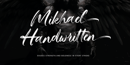 Introducing Mikhael Handwritten, an authentic brush script font that brings a raw and energetic vibe to your designs. With its dynamic strokes and natural brush texture, this font is crafted to make a bold statement in logos, posters, packaging, and various design projects. Its striking appearance and smooth flow make it an ideal choice for conveying a strong and stylish impression. PUA encoding ensures effortless access to all the expressive glyphs. Elevate your projects with Mikhael Handwritten, a font that effortlessly infuses vigor and character into your creative endeavors.
 - Lupulus by W Type Foundry,
$25.00 Lupulus is a typeface inspired by the works of german expressionist artist and type designer Rudolf Koch. Drawing inspiration from types such as Neuland and Kabel for some of its features, it possesses a gothic and contemporary essence. Its constant rhythm; strict, solemn, yet boldly exuberant keeps it clean and functional. Its expressiveness allows for a wide range of uses: short texts, headlines, posters and branding, for which it is exceptionally well-suited. Lupulus consists of 17 fonts: 8 weights, 8 italic variables and one free ornamental variable. Featuring alternate characters, it is a comprehensive and versatile set built to suit your design needs. It comes fully equipped with Opentype for any and all technical requirements. Learn about upcoming releases, work in progress and get to know us better! On Instagram W Type Foundry On facebook W Type Foundry wtypefoundry.com
 - Stonetype by Kustomtype,
$20.00 Stonetype is a typeface that was used by stonemasons in the 70s & 80s of the last century. When I was starting as a stonemason, these were the first characters I had to draw, by hand, back then on grave monuments and memorial plaques. The idea was born to digitize all the material, to be saved for eternity. By digitizing all and fine tuning, plus the addition of some main characters, Stonetype has now grown into a user-friendly typeface that can, now still, be used by stonemasons, to improve their creation process times. But Stonetype can also easily be used in modern and contemporary designs. Stonetype is the perfect fit for graphic design, editorial design, magazines, posters, logotypes, brands and corporate design. Stonetype is designed by Coert De Decker in 2019 and published by Kustomtype Font Foundry.
 - Acto by DSType,
$40.00 Acto is a type system designed as the sans serif counterpart of the previous released Acta. Both type families were designed in 2010 for the redesign of the Chilean newspaper La Tercera, but unlike some of our previous fonts (i.e., Leitura) Acto doesn't exactly match Acta in terms of structure, so they can live on their own. Acto is our first sans where the uppercase has the same height as the ascenders, so we decided to avoid common problems like the confusion between the I and the l, by drawing a curved l. We kept that spirit by removing the spurs on the b, g and q, resulting on a more warm typeface than Prelo, for instance. In the end it's a very powerful sans family, with eleven weights with matching italics, for editorial and corporate design.
 - Otama by Tim Donaldson,
$49.00 From the dainty light weight through to the striking UltraBold, Otama raises the bar to a new level of dangerous sophistication. Although easily classified alongside Modern typefaces such as Didot and Bodoni, Otama was purposely developed with minimum reference to these two visual heavy weights. In search of something more than a mere historical revival, Otama instead draws proportional reference from popular 20th century Transitional and Garalde typefaces with visual inspiration coming from calligraphic studies. Many characteristics from Tim Donaldson’s 2010 display face Pyes Pa were directly passed on in execution of Otama — The shoelaced k, e and a being the most obvious examples of this family relation. Refined over 2 years with well over 8,000 characters over 28 styles, Otama certainly deserves its place as a comprehensive and versatile typeface in any designer’s font library.
 - Varisse by AVP,
$19.00 Varisse spans over two centuries of type design and draws its inspiration from well-loved classics that are as fresh today as they were when they were created. The range stretches from a quintessential 18th century transitional serif to an uncompromising 20th century sans. Think Baskerville, think Gill. The idea was to create a family that shared similar forms and the same vertical metrics, allowing them to be mixed to provide impact and readability as required. With a generous x-height and a host of options, the Varisse family is ideally suited to branding, packaging, magazines and editorial. It also provides a wealth of opportunity in website presentation. The fonts are divided into five subfamilies by degree of ‘serification’. Varisse Sans Varisse Soft Sans Varisse (normal) Varisse Soft Serif Varisse Serif Each subfamily contains six weights and accompanying italics.
 - Escritura Hebrew by Vanarchiv,
$21.00 It was my first attempt to drawing a Hebrew alphabet to mach directly with other typeface (Latin) which I already designed. The Latin version is an handwriting display typeface influenced by chancery handwriting from the Italian Renaissance (broad-nib pen). One of the most typographic characteristic is there wavy forms, especially the serifs, where contains some of the main calligraphic references from this font family. The Hebrew script contain reverse contrast, the vertical proportions are more tall and the stroke weight is slightly more strong than latin lowercase to produce a correct visual balance between them, especially on small sizes (text proportions). This Hebrew square book-hand was influenced by Sephardic script style. The Latin characters contains interrupted strokes, the same was made for Hebrew letterforms to transpose correctly the same calligraphic approach between these two different alphabets.
 - Geronimo by Canada Type,
$24.95Geronimo is a rough poster script done in the spirit of brush calligraphy experiments conducted by American calligrapher and historian, Professor Alexander Nesbitt. This particular approach to brush script uses a pointed brush. Although Nesbitt considered the pointed brush corruptive and not at all suited to present day western letter forms, he put forth that with enough control of the brush (keeping it upright, maintaining stroke evenness, etc) even an unexperienced letterer can easily draw current day letters, though the result will always show characteristics of the letterer's own handwriting. Geronimo is a great choice for entertainment design, like book covers, film poster and packaging, and CD inserts. It also is a great overall display design for anything that seeks to depict adventure or an environment with a rough human element. Many alternates are sprinkled throughout the font. - MattsDinosaurStencils by Ingrimayne Type,
$11.95 This typeface is mostly composed of images of dinosaur skeletons drawn by Matthew Schenk and used as stencils for decoration. I thought they would also make a nice typeface. Check the key map—some of the very large critters are cut into pieces and put on several keys—this may help printing in some situations.
 - Jackerton by noggindoodle,
$15.00 Jackerton is a playful, hand-drawn typeface inspired by the doodles of the designer's father. Every word is a puzzle with pieces changing and shifting as you type. Over 50,000 words in more than 100 latin-based languages have been scrutinized to make sure each combination of letters fits together precisely from the 2,000+ ligatures.
 - Fontazia Insomnia by Deniart Systems,
$15.00 Let your night images come to life! The Fontazia Insomnia set features a strange and unusual assortment of surrealistic hand-drawn images - a tribute to the nocturnal spirits that seem to come to life during those hot sleepless summer nights. These characters are sure to add a little fun and mystery to any project.
 - Tabloid News by Jeff Levine,
$29.00 Sans serif characters re-drawn from old newspaper headlines (and used in the design for Late Breaking News JNL) were given a slab serif treatment in order to create a condensed type face with both grotesk and block influences. The end result is Tabloid News JNL, which is available in both regular and oblique versions.


