3,183 search results
(0.097 seconds)
- Chicle Pro by Sudtipos,
$19.00 In a much needed break from complex scripts and polished packaging fonts, Koziupa and Paul decide to show their playful side. Chicle is bold, stretchable, kid-proof, pet-resistant letters. This font is made to take the abuse of software used to put together the elaborate, attention-scrambling artwork of candy, cereal, and toy packaging, or whatever boxed obscenity contains cat and dog treats. Chicle is Spanish for bubble gum. It's a definite sugar fix — no substitutes.
 - Garment Bag Stencil JNL by Jeff Levine,
$29.00 Searching the internet for interesting type ideas leads one to many unusual items for sale online. An antique, hand-cut metal stencil from France with the word “Bagagens” [luggage] provided a condensed Art Deco design in a semi-stencil format (some solid letters, others with traditional ‘breaks’ within the characters). The digital version of the type style has a more traditional stencil character set. Garment Bag Stencil JNL is available in both regular and oblique versions.
 - Roxic by Thinkdust,
$10.00 Roxic doesn’t push boundaries, or break them; Roxic doesn’t recognise your pedestrian concept of boundaries. It doesn’t so much laugh in the face of convention as much as it refuses to acknowledge its very existence. Roxic is a font for the modern day, but without the layers of pretension so often associated with modernism. Elegantly conveying your message with its uniquely delicate sturdiness, Roxic is a font that people haven’t met before, but they can’t help but trust it.
 - Organic Tuesday by Bogstav,
$15.00 Sometimes you need things organised in a neat way. Organic Tuesday has that, but also a will to break free at the same time. Years ago I was at a restaurant where the menu was handwritten with a clumsy, but characteristic and charming, monospaced font. I must have focused so much on these letters that I can’t recall what I actually ate. But what I do remember is that it was a Tuesday, and the restaurant was organic!
 - Kroist by Just Font You,
$16.00 Kroist was born from the rebellious mindset to break the rules of perfection of typographic hierarchy. Pushing to the very edge of possibilities to craft something different yet remarkable in the industry. Combining the reference of classic band posters, old records, and a spirit to be loud in sending the message. Kroist will be your perfect choice for your logo, branding, music project, cover artwork, merchandise, apparel, clothing, fashion, movie title, serial project, and many more.
 - Motoya Aporo by Motoya,
$229.00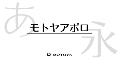 ????????????????????????????????????????????????????????????????????????????????????1969???????????2??????????????????? ????????????????????????????????????????????????????????????????????????????????????????????
 - Al Britania Ligatura by Aluyeah Studio,
$99.00 Britania Ligatura, a Ligature Addict Display Font Coming to you with 170+ stunning alternate and ligature to create a perfectly fashionable, beautiful, fancy, and elegant design. Features: OpenType support Multilingual support (15 languages) PUA Encoded Super Easy to Use alternates - It's OpenType support but you can easily call alternates character using special combination like A.2 B.2 a.2 b.2 etc. so you don't need special software. For special ligature you can use combination like a.n a.m u.b d.h etc To get results like the preview just type B.4r.ita.ni.2a.2 Liga.tur.a Thanks for checking out my font. I really hope you enjoy using it!
 - Institution - Unknown license

- Caristha by Abo Daniel,
$15.00 CARISTHA - the bouncy script - Caristha is great for branding, web design, product tag, wedding card, wedding invitation, logo, quotes, and more it comes in 2 styles of swash. Very easy to access ( You can see on presentation pictures) underscore+underscore+lowercase for titling swash v.1 lowercase+underscore+underscore for ending swash v.1 underscore+underscore+two+lowercase for titling swash v.2 lowercase+underscore+underscore+two for ending swash v.2 Features: Uppercase Lowercase 2 styles of swash (all lowercase) Numeral Multilingual Support Ligatures PUA encoded
 - Misguided by Set Sail Studios,
$14.00 Misguided; "to go astray". This brush font throws out the typography rulebook and breaks away from the mundane letterforms. Thick lines, thin lines, small letters, big letters - it has it all, and thrown into THREE hand-painted character sets which can be mixed up, lowercase or uppercase, giving you a massive amount of customisable layout options for each word. Misguided is guaranteed to add an eye-catching appeal to your logo designs, handwritten quotes, product packaging, merchandise & social media posts.
 - Atwin by Cubic Type,
$14.00Atwin is a modern remake of Franco Grignani’s Gemini. It is inspired by the unusual forms of the MICR numbers on bank cheques. Strangely rounded rectangles make the glyphs appear unfamiliar; an angular but also blobby design that disrupts and breaks away from tradition. Good in display sizes. You should use Atwin to add flair and confidence to sci-fi, futurist, outré, or just plain unusual materials. 13 additional alts are supplied in the A to Z alphabet. Kerned to perfection. Tight. - ALS Kraft by Art. Lebedev Studio,
$63.00 A simple rough font. Kraft is a rough techno-style sans serif meant for setting text in all capitals. Instead of lowercase letters there are capitals of smaller height but with the same stroke width. They make tighter type. Characters are pressed really close together which creates the visual rhythm of very narrow and very wide openings. The wide strokes allow free use of graphics. This font is designed for putting on coarse surfaces, for breaking, crumbing, scratching, or making stencils on concrete.
 - Changa by Tipo,
$12.00 Changa is a layered font intended for titles or short texts blocks, with its short ascenders and descenders and a set of lowercase letters inscribed within a square. The uppercases case gains slightly more in height and develops its morphology in a single height in order to make it possible to create text composition with minimum line spacing. Its counter-shapes are rectangular, featuring small curvatures in opposite vertexes which accompany and break the shapes, thus evoking a modern style.
 - Ticketing by K-Type,
$20.00 Ticketing is a monospaced font loosely based on the pixel style lettering of electronic ticketing, designed for clarity when cheaply printed at small sizes. Ticketing, however, has a larger x-height than is often found on ticket type. The glyphs were drawn on a square grid 13 wide by 22 high, though some accented characters are taller or extend below the baseline. The Space is a full character width, but the Non-Breaking Space is set to half the width of the glyphs.
 - Al Badlooking Brush by Aluyeah Studio,
$90.00 Badlooking Brush, the ugly duckling modern script font. Coming with 52 alternates, 9 stunning swash and super easy to use alternates. Very suitable for magazine, headline, website, ads, product package and all type of design project you have. Features: OpenType support Multilingual support (15 languages) PUA Encoded Super Easy to Use alternates - It's OpenType support but you can easily call alternates character using special combination like A.2 R.2 a.2 h.2 etc so you don't need a special software. To get results like the preview just type Badloo.2king B.2ru.2sh
 - Gunship - Personal use only

- Commonwealth - Unknown license

- Tele-Marines - Unknown license

- Crossten Soft by Emre Güven,
$3.00 Crossten Soft�s �modern geometric sans� family consists of 20 fonts. All family fonts contain 370 glyphs and are equipped with many typographic features. Crossten Soft is designed for those who prefer to use single-coded fonts not only in coding but also in many different graphic design environments. Idea; It came from creating a font with a single-spaced aesthetic, without breaking the soft, single-spaced fonts. Crossten Soft is a geometric sans single-spaced font with all typographic features except space and character spacing.
 - Alloca Mono by Daniel Gamage,
$29.99 To break from the rigidity of a typical monospaced font, Alloca includes weights that go above and beyond. From the wire-thin to the ultra-bold, you’ll be able to do a lot with one monospaced family. With OpenType features like slashed zeros, old style numerals, and case-sensitive forms, Alloca is versatile. It's great for displaying code, showcasing data, or even flowing your body copy. It has broad language support, too, with localized forms for Vietnamese, Polish, Catalan, and Dutch, to name a few.
 - Newark JNL by Jeff Levine,
$29.00 Inspired by a set of vintage alphabet game tile pieces, Newark JNL has similar traits to other slab serif Romans, but enough 'quirky' letter widths to break the rules and have it stand out on its own merits. The name derives from font work files in progress, often saved as 'new work' until a fitting name is decided upon. It seemed only right that this phrase be turned around into a font name itself. Newark JNL is available in both regular and oblique versions.
 - Ghino by Fontmachine,
$3.00 The Ghino family of "modern geometric sans" consists of 20 fonts. All the family's fonts contain 370 glyphs and are equipped with many typographic features. Ghino Text is designed for those who prefer to use single-coded fonts not only in coding but also in many different environments of graphic design. The idea came from creating a font with single-spaced aesthetics, without breaking the single-spaced fonts. Ghino is a geometric sans single-spaced font with all typographic features except spacing and character spacing.
 - Changing Times JNL by Jeff Levine,
$29.00 Changing Times JNL was inspired by the hand lettering on the cover of the 1929 sheet music for "Wedding Bells (Are Breaking Up that Old Gang of Mine)". While the font’s name is an extremely vague reference to the subject of the song itself, it also represents the fact that the lettering style (still reflecting some Art Nouveau influence) welcomes the dawning of the Art Deco movement with the thick-and-thin line letter forms. The type design is available in both regular and oblique versions.
 - Lauderdale JNL by Jeff Levine,
$29.00 It was a series of three different forts on various spots on the New River built during the Second Seminole War [in Florida] named for Major William Lauderdale. It was launched as the college students' spring break destination for many years thanks to the film "Where the Boys Are". It's the major city 23 miles North of Miami. But wait! There's more! Now it's an eclectic Art Deco-inspired typeface. Lauderdale JNL is based on vintage source material with many unusual letter shapes and angles.
 - Module by Sébastien Truchet,
$40.00 Sébastien Truchet designed a modular typographic system during his last year in the School of Fine Arts of Besançon. The system is made of a unique grid and 6 modules which are the components to build several typefaces. The most radical is the "2-2". The last one is the "10-12".This is the "2-3". The goal is to use a grid made of 2 modules in width and three in height. This version is the most pertinent minimalist typeface which keeps plasticity and legibility. There is a character set of capitals tied to the origin of the project
 - Marathon - Unknown license

- Drosselmeyer - Unknown license

- Al Mother Bakery by Aluyeah Studio,
$125.00 Hello Aluyeaholics! Mother Bakery, a handwriting inspired by the warm and fussy nature of a mother baking cakes for her children and grandchildren. Coming with 100+ stunning and super easy to use alternates and ligatures. Super Easy to Use alternates - You can easily call alternates using special combination like a.2 k.3 b.4 th cc etc. To get results like the preview just type Mother.2 Bak.7ery.2
 - Morning Cookie by Bogstav,
$17.00 Yet again, a font inspired by my work as a kindergarten teacher! The other day, I had a conversation with some of the kids, about what they ate for breakfast. Some had oatmeal, some bread and others yogurt. But this kid - he insisted that every morning, his mother would serve him cookies, “morning cookies”. It sounded too good to be true, and when I asked his mother, it turned out that “cookies” were actually bread, but to make it sound more appetising, they called it cookies! The letters are rounded and in some way quite naive, but still clear and legible. With an extreme ascender and descender, the font stands out with its oddities. I’ve added 3 different versions of each lowercase letter!
 - Evanston Alehouse by Kimmy Design,
$10.00 Evanston Alehouse is the first font in a larger collection of typefaces inspired by years leading up to the American prohibition. For the past two years I was living in Evanston, IL, a suburb of Chicago. After learning it was one of the birthplaces of the prohibition movement, I set out to learn more about it, and decided to develop a type collection that captures the dynamic era in our nation’s history. In the century that prefaced the ratification of the 18th amendment, saloons, taverns and alehouses boomed as the American working class enjoyed beer and discovered whiskey and gin. At the same time, the Temperance League was forming and gaining strength. By the turn of the century, these temperance societies were common in the culture of the country, with individual towns and states already on the move to abolish alcohol consumption. However, it was undeniable that by this time in history, America loved to drink. This font is inspired by the signage seen outside such drinking establishments. Back to the modern era, Evanston Alehouse is a 25 font family that includes 3 weights, 4 widths and 3 heights. It has special features that add depth to the font, with discretionary ligatures and stylistic alternatives. It also includes a complementary set of ornaments, including line breaks, frames, borders, and laurels. Here’s a snapshot of what you get with Evanston Alehouse: 2 Styles/Postions: Sharp (regular) and Round 3 Weights: Light, Medium and Black 4 Widths: 1826 (condensed), 1858 (narrow), 1893 (wide) and 1919 (expanded) 3 Heights: Capitals, lowercase and small caps 2 Alternatives: Discretionary Ligatures and Stylistic Alternatives 1 Ornament font with over 100 graphic extras
 - Cube - Unknown license

- XperimentypoTwoStripes - Unknown license

- XperimentypoTwo - Unknown license

- Philadelphia - Unknown license

- Gorlock - Unknown license

- Hefeweizen by David Thometz Design,
$24.95 As seen on Typophile.com, DTD Hefeweizen is a contemporary take on the textura blackletter style. Comprised of straight lines and angles sloped at ratios of 1/2 or 2/1, Hefeweizen is a highly geometric design with extensive alternates and ligatures.
 - PR Swirlies 05 by PR Fonts,
$10.50 Suitable for separating paragraphs, or framing text, this set of swirlies ornaments is drawn with a pointed brush, for a higher contrast appearance than swirlies 1 , 2, and 4. It also has a companion member, with a rough finish, called “Sand Drift”, suitable for natural, earthy subject matter. “Sand Drift” combines well with the following PR Fonts Items: Bramble Wood 2, Bramble Wood 1, Cauldron, Swirlies 1 Sand Drift, Hallow Doodles 1, Hallow Doodles 2.
 - Aaleyah by Aluyeah Studio,
$80.00 Aaleyah is a magnificent curved display font family. Use it to add vintage and mystique flavor to any design! It fits perfectly for your logo designs, headlines, music projects, social media posts, event posters, brand imagery, product packaging, quotes, merchandise, and more. Aaleyah has OpenType support, Multi-lingual support (15 languages) and is PUA Encoded. You can easily call alternates character using special combination like A.2 B.2 a.2 v.2 so you don't need special software. I really hope you enjoy using it! If you have any questions I'd be more than happy to answer them, just send me a message.
 - Bergsland Display by Hackberry Font Foundry,
$24.95 This is a display version of a stylized sans serif font family that is very high-waisted and sleek called Bergsland Fashion. This four-font set has a Regular and a Black plus the italics. The stroke is only slightly modulated. The letterforms are higher, with a more open aperture, and sprinkled with breaks to add light and sparkle. This an attempt at a readable sans serif for text. It has many OpenType features and 465 characters per font: Caps, lower case, small caps, old style figures, numerators, denominators, accents characters and so on.
 - Deco Slaughter by Woodcutter,
$45.00 Deco Slaughter is a unique typeface that blends the elegant Art Deco style with the visceral and broken aesthetic of horror typography. Each letter is meticulously crafted to evoke a sense of intrigue and mystery. The sophisticated and geometric lines of Art Deco intertwine with shattered and bleeding details, creating a striking contrast. This typeface is perfect for projects that aim to break conventions and stand out with a provocative aesthetic. Deco Slaughter captures the essence of classic style with a dark and disturbing twist, providing your designs with a distinctive and memorable character.


