10,000 search results
(0.04 seconds)
- Hetilica - Personal use only

- Bebas - Unknown license

- Kanna-W4 - Personal use only

- Fireye GF 3 - Unknown license

- Nue - Personal use only

- Geometry Soft Pro Bold N - 100% free

- Hertzace - Personal use only

- SquareType B - Personal use only

- 13_Fletcher - Personal use only

- Naxalite - Unknown license

- Olympus - Unknown license

- BastardusSans - 100% free

- Kijkwijzer - Unknown license

- Wurlitzer Pro by Red Rooster Collection,
$60.00 Steve Jackaman & Ashley Muir. This design was inspired by an early 20th century woodtype. Wurlitzer contains all the high-end features expected in a quality OpenType Pro font.
 - Billy by SparkyType,
$19.00The Billy family contains three individually useful and fun fonts. When combined, the energy and strengths of the different weights play off each other creating an essential family. - Clarence Pro by RodrigoTypo,
$29.00 Clarence pro, is a version with many alternatives such as ligatures and alternatives in letters, it also contains the Greek and Cyrillic alphabet, especially for children and teenagers!
 - Mondiale by PintassilgoPrints,
$15.00 Mondiale is a three-flavor unicase family with a tasty hand drawn feel. It contains uppercase letters and uses the lowercase as variations, providing flexibility for your designs.
 - Cross Stitch Formal by Gerald Gallo,
$20.00 Cross Stitch Formal is based on upper case characters 20 stitches tall and contains upper case characters A-Z. All characters are linked by at least one stitch.
 - Generic by More Etc,
$15.00 The Generic Typeface Collection is a series of sans-serif typefaces inspired by the craftsmanship of graphic design, typesetting, and printing in the analogue era – before Adobe, Macintosh computers and desktop publishing – when dinosaurs ruled the earth. With the use of various typesetting apparatuses or dry transfer type, photo copiers, and shooting layouts and paste-ups to film, the printed results was not as exact, precise and predictable as it is today. When examining old prints, it is difficult not to like the way that characters in over- or underexposed film have a special type of vibe to them that is often sadly lost in today’s pursuit of total perfection. Encouraged by this, I saw a need for a collection of typefaces that are non-clinical and non-conformist, and some that are coarse, rough and distorted – errors that might come from poor exposure when put on film, enlargements from small point texts, or maybe quality loss from successive generations of photocopies. Or all of the above. This is an attempt to incorporate spirit and personality into a set of typefaces without losing distinction. You might call it a homage to non-perfection. I call it human. The Generic Typeface Collection consists of 11 fonts divided into four series. The three standard series – the Formal Release series, the Coarse Copy series, and the Rough Display series – all contain three fonts each. The Extra Splendor series contains a couple of shadow fonts for that little extra sparkle. Formal Release – Handcrafted & Clean The Formal Release series features sans-serif typefaces for everyday use. They are handcrafted and clean, human and uncomplicated. The Formal Release series contains three typefaces that add tons of personality to any text. G10 FR ‘Slim’ – a slightly under-exposed and clean typeface in a regular weight (228 glyphs - 1 alternate) G20 FR ‘Classic’ – a properly exposed clean typeface in a bold weight (228 glyphs - 1 alternate) G30 FR ‘Bulky’ – a heavily over-exposed clean typeface in an ultra weight (228 glyphs - 1 alternate) Coarse Copy – Dirty & Rough The Coarse Copy series features non-conformist typefaces that are worn and rough, maybe after going through that bad copier a few times too much. The Coarse Copy series contains three sans-serif typefaces that add tons of spirit to any text without compromising too much on legibility. Try them on in poster-sizes and everyone will know that you mean business. G40 CC ‘Slender’ – an under-exposed coarse typeface in a regular weight (228 glyphs - 1 alternate) G50 CC ‘Typic’ – a properly exposed coarse typeface in a bold weight (228 glyphs - 1 alternate) G60 CC ‘Huge’ – a heavily over-exposed coarse typeface in an ultra weight (228 glyphs - 1 alternate) Rough Display – Faded & Decorative The Rough Display series features attention-seeking decorative typefaces in three feature-packed fonts. Faded and gritty like the image distortion and degradation from successive generations of photocopies, they are eye-catching typefaces intended to stand out in bigger point sizes. Use these typefaces for signage, headlines and similar situations were a strong typographic statement is desired. We have packed no less than 1,334 alternate characters and 212 discretionary ligatures into this series for a greater chance of not having characters that look exactly the same more than once. G70 RD ‘Slinky’ – an under-exposed rough and decorative typeface in a regular weight (741 glyphs – 448 alternates – 66 discretionary ligatures) G80 RD ‘Standard’ – a properly-exposed rough and decorative typeface in a bold weight (748 glyphs – 448 alternates – 73 discretionary ligatures) G90 RD ‘Swollen’ – a heavily over-exposed rough and decorative typeface in an ultra weight (748 glyphs – 448 alternates – 73 discretionary ligatures) Extra Splendor – Sparkling & Extraordinary The Extra Splendor series features two shadow typefaces for that little extra sparkle. One clean shadow to be used with G20 FR ‘Classic’, and one rough shadow to be used with G80 RD ‘Standard’. Having the shadows separate from the main typeface adds another layer of expressiveness in that you can try out color combinations for that extra splendor. Tips for matching (applies to both the base font and the shadow font): Set the kerning to Metric, not optical. Increase tracking to accommodate for the shadows extra width. G25 ES ‘Classic Shadow’ – a clean shadow to be used with G20 FR ‘Classic’ (228 glyphs – 1 alternate) G85 ES ‘Standard Shadow’ – a rough shadow to be used with 80 RD ‘Standard’ (227 glyphs) OpenType features – alternate characters and discretionary ligatures – can be accessed by using OpenType friendly professional design applications, such as Adobe Illustrator, Adobe InDesign, and Adobe Photoshop.
 - Paradise Lost by Hanoded,
$15.00 Paradise Lost is a 1667 poem by John Milton which mostly concerns the Biblical story of the Fall of Man, Eve's temptation by the devil and the expulsion of Adam and Eve from Eden. It's quite a hefty read, as the poem consists of ten books with over 10.000 lines of verse. Needless to say, I didn't read it all. But, it did give me inspiration for a font, which I called Paradise Lost. It's a good name, even though there is nothing Biblical about this font. Paradise Lost was created (pun intended) using a broken bamboo satay skewer and Chinese ink. It is all caps, but upper and lower case differ and like to mingle. I also included several ligatures for double lower case letters (aa, ee, jj, kk, etc.). Paradise Lost comes with an eternity of diacritics.
 - Peace by Burghal Design,
$29.00Don't you HATE it when this happens? You're protesting the war in Iraq, and the other protesters keep pointing at you and giggling. You can't figure out what they could possibly be laughing at...You look up and then it hits you: you're holding a sign that looks like it was made by your 5-year old kid brother. It's sloppy, the words are crooked, hell, it's BARELY READABLE. How is anyone ever going to take you seriously with THAT SIGN???? There's only one solution...To further your cause, you need Burghal Design's Peace font. Peace contains upper and lower letters, numbers, punctuation, even foreign accented characters! Clean, concise, and oh, SO legible, you'll have no problem getting your message across with this typeface. Who knows, you might even make the evening news. - BD Gitalona by Balibilly Design,
$22.00 We introduce our high-complex typeface. A wide range of serifs for text and display titles are divided into one prominent sub-family and four display sub-families. Comes shifted from serif to sans serif to fulfilling the completeness of this font family that we named BD Gitalona. In addition to these massive things, this font family is filled with an explorative and experimental decorative version that we present separately. Figure out the decorative version BD Gitalona Moxa to make the aesthetic appeal of this whole typeface! Inspiration The world of entertainment moves non-stop. One by one, figures appeared and left. We expect to create something to entertain previous trends with packaging more relevant to the present. More specifically, we admire and are inspired by some of the world's leading and top singers with a segmented nature. We imagine so many figures that can affect every viewer. However, each artist or singer has a segment because almost all of them have characteristics. The Design The basic design of this typeface begins with a transitional serif shape with sharp, shapeless corners. Then in the middle of the invention, there was an opportunity to explore it further from the readability side by adding an optical variable that can adjust the serif thickness when used together between large, medium to paragraph text sizes for editorials. The shift from serif to sans-serif with the contrast initiated by the shift of the serif family form as a different variable also makes this font richer in terms of the features it contains. Parts are expected to add to the user satisfaction with the complexity of this font. The Features BD Gitalona consists of one sub-family intended for body text with nine weights from Thin(100) to Black(900) and four other display sub-families such as Display serif, Flick, Harmony Sans and Contrast Sans. Each consists of four weights Thin(100), Regular Weight(400), Bold(700), and Black(900). And again, there are also retailed separately; the BD Gitalona Variable font, which is designed to accommodate all Subfamily in 1 font file, and BD Gitalona Moxa, an experimental typeface. A total of 700+ glyphs in each style. Advanced OpenType features functionally and aesthetically, such as Case-sensitive forms, small caps, standard and discretionary ligatures, stylistic alternates, ordinals, fractions, numerator, denominator, superscript, subscript, circled number, slashed zero, old-style figure, tabular and lining figure. Supports multi-languages including Western Europe, Central Europe, Southeast Europe, South America, and Oceania.
 - Milk Cursive by Okaycat,
$29.50 Milk Cursive is the healthy choice. Fortify your designs & fulfill your daily textual needs with these flowing, bubbly letters. Enjoy the refreshingly natural look of an every-man's calligraphy with a fat & wide style. Milk Cursive is extended, containing West European diacritics & ligatures, making it suitable for multilingual environments & publications. It also contains some icons as extra characters, such as a star, a heart, an arrow, flowers, a butterfly, and manicules (pointing hands). Go ahead and have fun with it!
 - Shallowent by HKL Studio,
$15.00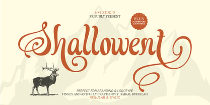 Shallowent is a stunning calligraphy font with a classic retro style, regular artistic swirls and slanted serifs come together to create a distinctive, high-quality and exclusive typeface that will bring vintage charm to your designs. This font is created with advanced OpenType functionality and has the best quality guarantee, contains stylistic and contextual alternatives, ligatures and other features; all to give you complete control and customization capabilities. It contains all the characters and symbols you need, including all punctuation and numbers.
 - Stallone by Suza Studio,
$19.00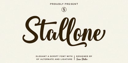 Stallone is a stunning Elegant Script font with a classic retro style, regular artistic swirls, coming together to create a distinctive, high-quality and exclusive typeface that will bring vintage charm to your designs. This font is created with advanced OpenType functionality and has the best quality guarantee, contains stylistic and contextual alternatives, ligatures and other features; all to give you complete control and customization capabilities. It contains all the characters and symbols you need, including all punctuation and numbers.
 - Kartell by ParaType,
$25.00 Kartell type family was designed by Oleg Karpinsky for ParaType in 2006. Design features: lower contrast between strokes and slim serifs. It consists of three weight styles with corresponding Italics. The Open Type version contains a lot of alternate characters and additional ligatures. Italic styles contain some alternate letterforms and lots of swash characters. Kartell is recommended for long text passages at magazines, books and booklets, as well as for headlines, logos, billboards, visit cards, newspaper adds and so on.
 - Burchelli by Putracetol,
$22.00 Burchelli - Bold Display Sans Font. Burchelli font makes for more fun, trendy and more lively. Burchelli is inspired by the extra bold font style and display sans. Burchelli has a surprise from alternate of sans serif that will make your work even more beautiful. Burchelli is perfect for a professional touch which makes it even more unique display and classic themes. But burchelli is also suitable for logos, branding, greeting cards, invitation cards, advertisements, titles, healines, book titles, stickers, packaging, quotes, posters, t-shirts/apparel, billboards and others. The alternative characters were divided into several Open Type features such as Swash, Stylistic Sets, Stylistic Alternates, Contextual Alternates, and Ligature. The Open Type features can be accessed by using Open Type savvy programs such as Adobe Illustrator, Adobe InDesign, Adobe Photoshop Corel Draw X version, And Microsoft Word. This font is also support multi language.
 - Vulnerable by Gian Studio,
$12.00 Vulnerable is an elegant script typeface inspired by a vintage type specimen I found some time ago at an art fair. Thin to thick contrasting lines and elegant curves make Beginta the perfect font for this type of logo and display purposes. Hope you enjoy it Feel free to contact me if you have any questions or concerns you may have and I will get back to you as soon as I can.
 - Debaya by Sensatype Studio,
$15.00 Debaya is an Old Retro Vintage Font An Old Retro Vintage font that special created with Display style for Headline Vintage Retro Project, Unique branding needs, with extra alternates in unique style that ready to add value of your brand. Debay Old Retro Vintage Font ready with: Lowercase and Uppercase characters Numbers and Punctuations Preview as a inspirations that you can do with Montainous font Available for PC and Mac Wish you enjoy our font.
 - TessieSpinners by Ingrimayne Type,
$13.95 A tessellation is a shape that can be used to completely fill the plane—simple examples are isosceles triangles, squares, and hexagons. Tessellation patterns are eye-catching and visually appealing, which is the reason that they have long been popular in a variety of decorative situations, such as quilting. Most of the shapes in TessieSpinners suggest a spinning motion. Most do not resemble real world objects. The TessieSpinners fonts contain shapes that can be used to construct tessellation patterns. It has two styles, an outline style and a filled or black style. The black style can be used to construct colored patterns. To see how patterns can be constructed, see the “Samples” file here. Most or all of these shapes were discovered/created by the font designer during the past twenty years in the process of designing maze books, coloring books, and a book about tessellations.(Earlier tessellation fonts from IngrimayneType, the TessieDingies fonts, lack a black or filled version so cannot do colored patterns. Make sure the leading is the same as font size or the rows will not line up.)
 - Nona Manis by Gilar Studio,
$16.00 Nona Manis is a Handwritten Display Font With 3 Style (Regular,Outline and Shadow) You Can Mix And Match for Your Awesome Project This fonts is ideal for crafting, branding and decorate your any project. This fonts are perfect for wedding invitation or your blog. Also with their help, you can create a logo or beautiful frame for your home. Or just use for your business, book covers, stationery, marketing, magazines and more. FEATURES : Uppercase & Lowercase Number & Punctuation More than 244 of glyphs Support for 60+ Multilingual languages PUA Encode 12 Ligatures Alternate 7 OpenType features ( aalt dlig frac liga ordn sups kern ) The font Nona Manis contains 18 ligatures in 3 OpenType features The alternative characters were divided into several Open Type features can be accessed by using Open Type savvy programs such as Adobe Illustrator, Adobe InDesign, Adobe Photoshop Corel Draw X version, And Microsoft Word. And this Font has given PUA unicode (specially coded fonts). so that all the alternate characters can easily be accessed in full by a craftsman or designer. Check my other Font here https://gilarstudio.com/
 - TessieBugs by Ingrimayne Type,
$23.95 A tessellation is a shape that can be used to completely fill the plane—simple examples are isosceles triangles, squares, and hexagons. Tessellation patterns are eye-catching and visually appealing, which is the reason that they have long been popular in a variety of decorative situations. These Tessie fonts have two family members, a solid style that must have different colors when used and an outline style. They can be used separately or they can be used in layers with the outline style on top of the solid style. For rows to align properly, leading must be the same as point size. To see how patterns can be constructed, see the “Samples” file here. TessieBugs contains shapes that resemble insects such as moths, ants, butterflies, and weevils. (Earlier tessellation fonts from IngrimayneType, the TessieDingies fonts, lack a black or filled version so cannot do colored patterns. The addition of a solid style that must be colored makes these new fonts a bit more difficult to use but offers far greater possibilities in getting visually interesting results.)
 - Bananas by Canada Type,
$30.00 In the history of 20th century graphic arts, the evolution of the informal sans serif has been a uniquely American phenomenon. The ongoing saga of this (still as popular as ever) sub-genre dates back to the maturity of the Industrial Age and early Hollywood film titling, runs through the prosperous times of interwar print publications, sees mass flourishing during the various media propagations of the film type era, and solidifies itself as arguably the most common design element in the latter years of the century. Fun, bouncy, playful, and highly exciting, the casual sans serif is now all over game packaging, film and animation titles, book covers, food boxes, concert posters, and pretty much everywhere design aims to induce excitement about a product or an event. The casual sans is the natural high pill of typesetting. We figured it was high time for the casual sans to adapt to 21st century technology, gain more versatility, and become as much fun to use as the emotions it triggers. So we’re quite excited to issue Bananas, a fun sans serif family in 6 weights and 3 widths that can be used anywhere your designer’s imagination can take you. Rather than being based on a single design, Bananas was sourced from multiple American film era faces, all from 1950s and 1960s, when the casual sans genre was at its popular peak. Headliners’ Catalina and its very similar cousin, Letter Graphics’ Carmel, served as initial study points. Then a few Dave West designs informed the design development and weighting process, before narrow and wide takes were sketched out and included in the family. The entire development process happened in a highly precise interpolative environment. All Bananas fonts come with a full glyph complement supporting the majority of Latin languages, as well as five sets of figures, automatic fractions, quite a few ligatures, biform/unicase shapes and other stylistic alternates.
 - Flower Sketch Neue by Okaycat,
$29.95 Okaycat presents "Flower Sketch Neue". Flower Sketch Neue contains beautiful illustrations of sunflowers, roses, tulips, olives, and leaves. You may also like our other fonts Flower Sketch and Orchids.
 - Bajt by Fontsphere,
$12.00 Geometric, pixel-art-style, minimalist font. BAJT contains uppercase letters, numbers and a large range of punctuation. Use for awesome display, illustrations, posters, logos, t-shirts, titles, and more..
 - Floral Ornaments by Gerald Gallo,
$20.00 For many centuries, Chinese cut paper designs have been in common use. Floral Ornaments was inspired by these floral cut paper designs and contains a selection of 114 ornaments.
 - Sulawesi by Morganismi,
$12.00 Sulawesi is an adventurous font imitating old map style. The family contains a text typeface, and a picture font with fish, sea creatures, monsters, old sail ships and stuff.
 - Mingray Mono by Rekord,
$39.00 Mingray Mono is a stylish Monospaced family in three weights. It contains old-style figures, small caps, fractions, ligatures, pictograms and arrows. Mingray Mono supports 85 Latin-based languages.
 - Mauer by Klaudia Krynicka,
$19.00 Mauer is a proportional, block, geometric font inspired by the advertisement in the polish weekly from 1937 "Tygodnik powszechny". This typeface family contains 3 styles: Regular, Black and Italics.
 - Butcher by RodrigoTypo,
$25.00 Butcher is a Rough font with 2 styles, a medium and a black to play with the weights, it contains the Greek and Cyrillic alphabet, special for action titles


