8,587 search results
(0.023 seconds)
- Skullbats by Canada Type,
$24.95Patrick Griffin's sister is a really annoying individual sometimes. Not only is she into theater, but she thinks everyone else in the universe is into it as well. So once in a while tickets to local or provincial Shakespearean plays get delivered to the mailbox or dropped off on the living room's table. And once in a while the tickets just cannot be "lost" or ignored. Three or four times a year, Patrick must be subjected to Olde Englishe Speake, umbrella dresses and squeezetops, featherhats and men in leggings, rhyme and treason, mortality and immorality, drama inflicted by some mama, and it never ends. Last June it was Hamlet. Again. Someone's (wink wink) idea of a good time. There he goes, the Prince of Denmark, holding that skull with the tips of his fingers like it's an alien egg. Alas, poor Yorick! Yadda yadda boop-bop-a-loo-bop. And so the idea of a font made of skulls was born. And what can we possibly be but conduits for such abhorring ideas? Where be our gibes, our songs, our flashes of merriment? Skullbats has more skulls than you'll ever see in your lifetime. At least we hope so. Scary skulls, funny skulls, evil skulls, strange skulls, pixel skulls, fiery skulls, surprised skulls, happy skulls, sad skulls, cow skulls, sketched skulls, profiled skulls, light bulb skulls, cartoon skulls, techno skulls, alien skulls, expressionist skulls, pirate skulls, horned skulls, and skulls with whacky headgear. You name it, it's there. There's even a disco skull there for you. We lost count at 90 skulls, but there's a few more in there. For a complete showing of the skulls in the font, consult the image in the MyFonts gallery. Patrick's sister didn't turn out to be so bad after all. After making this font, he couldn't help but notice that her skull was a bit small compared to his. So now he takes every opportunity to remind her that the size of the cranium is relative to what it houses. Her upcoming halloween present will be a shirt with guess-what on it. Shirts, now there's putting Skullbats to good use! - Pekin by HiH,
$15.00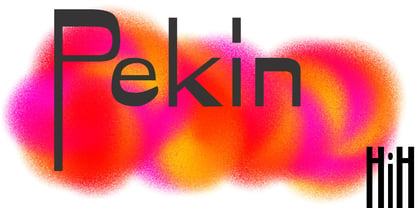 Pekin is an unusual design with an oriental flavor. It was originally designed by Ernst Lauschke and released by The Great Western Type Foundry of Chicago as “Dormer,” which is similar to the French verb ‘to sleep,’ not exactly a marketing triumph. Barnhart Bros. And Spindler (independently-operated subsidiary of ATF since 1911) bought Great Western in 1918. According to McGrew, AMERICAN METAL TYPEFACES of the TWENTIETH CENTURY, BB&S renamed the typeface prior printing their 1925 specimen book — guess they wanted something just a tad more exciting. Quirky, distinctive and fun. Pekin ML represents a major extension of the original release, with the following changes: 1. Added glyphs for the 1250 Central Europe, the 1252 Turkish and the 1257 Baltic Code Pages. Added glyphs to complete standard 1252 Western Europe Code Page. Special glyphs relocated and assigned Unicode codepoints, some in Private Use area. Total of 415 glyphs (compared to 218 glyphs in the original release). 2. 652 Kerning Pairs. Note: Ag, Aj and gj will cross unless kerned. Alternative A may also be used. 3. Added OpenType GSUB layout features: onum, salt, liga, dlig, hist, ornm and kern. 4. Revised vertical metrics for improved cross-platform line spacing. 5. Refined various glyph outlines, based on improved scans. 6. Added set of Tabular Numbers at cap height, based on original design; added Old-Style Numbers based on default design. 7. Added a bunch of alternative characters: 18 upper case letters, 10 lower case letters, 1 ampersand and 1 bullet. The alternate c is actually the original design, but I don't like it - easily confused with e. Alt E H M h m n r t are from the original design. I added the rest. 8. 7 Ligatures, 4 Ornaments, 18 Geometric Shapes, 6 Arrows and 12 Misc. Symbols. The zip package includes two versions of the font at no extra charge. There is an OTF version which is in Open PS (Post Script Type 1) format and a TTF version which is in Open TT (True Type)format. Use whichever works best for your applications.
 - Anselm Sans by Storm Type Foundry,
$63.00One of the good practices of today’s type foundries is that they release their type families as systems including both serif and sans serif type. Usually, the sources of inspiration need to be well tried with time and practice, since production of a type family is such a laborious and complex process. From the beginning, it needs to be clear that the result will be suited for universal use. Such systems, complete with the broad, multi-lingual variations permitted by the OpenType format, have become the elementary, default instrument of visual communication. Non-Latin scripts are useful for a wide scope of academic publications, for packaging and corporate systems alike. And what about outdoor advertisement designated for markets in developing countries? Cyrillics and Greek have become an integral part of our OpenType font systems. Maybe you noticed that the sans serif cuts have richer variety of the light – black scale. This is due to the fact that sans serif families tend to be less susceptible to deformities in form, and thus they are able to retain their original character throughout the full range of weights. On the other hand, the nature of serifed, contrasted cuts does not permit such extremes without sacrificing their characteristic features. Both weights were drawn by hand, only the Medium cut has been interpolated. Anselm Ten is a unique family of four cuts, slightly strengthened and adjusted for the setting in sizes around 10 pt and smaller, as its name indicates. The ancestry of Anselm goes back to Jannon, a slightly modified Old Style Roman. I drew Serapion back in 1997, so its spirit is youthful, a bit frisky, and it is charmed by romantic, playful details. Anselm succeeds it after ten years of evolution, it is a sober, reliable laborer, immune to all eccentricities. The most significant difference between Sebastian/Serapion and Anselm is the raised x-height of lowercase, which makes it ideal for applications in extensive texts. Our goal was to create an all-round type family, equally suitable for poetry, magazines, books, posters, and information systems. - Garalda by TypeTogether,
$49.00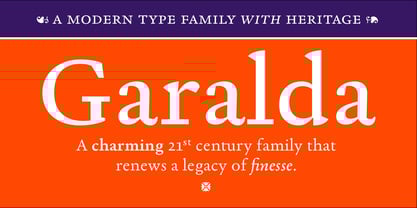 Type designer Xavier Dupré’s Garalda is a charming 21st century family that renews a legacy of finesse. As paragraphs on a page, Garalda’s overall impression is of a workaday personality, committed to the main purpose of the job: easy long-form reading. But setting it in display sizes proves something different: This reinvented Garamond is anything but basic. The Garalda story begins with the serendipitous finding of a book typeset in a rare Garalde, called Tory-Garamond, with which Dupré was not immediately familiar. This Garamond was used in bibliophile books in the decades surrounding 1920, but after that it became déclassé for an unknown reason. Dupré found the italic styles especially charming and discovered the family was probably the mythical Ollière Garamond cut from 1914. He obtained low resolution scans of the typeface and used them, rather than high resolution scans, as the basis for his new type family. This allowed Dupré the mental freedom to experiment and remix as he saw fit, culminating in a contemporary family with heritage. As seen in the simplistic rectangular serifs, Garalda is a humanist slab serif, but with a mix of angles and curves to give the classic shapes a fresh, unorthodox feeling. While almost invisible in paragraph text, these produce a graphic effect in display work. The set of ligatures in the roman and italics lend themselves to unique display use, such as creating lovely logotypes. In the italics, some swashes inspired by different historic Garamonds are included, sometimes breaking their curves to be more captivating. Just look at how the italic ‘*-s’ ligatures create ‘s’ with a cursive formation rather than merely a flowing slant. And how the roman ‘g’ link swings as wide as a trainer’s whip. These are all balanced by squared serifs in the roman to keep an overall mechanised regularity. The Garalda family comes in eight styles, includes some of the original arrows and ornaments, and speaks multiple languages for all typesetting needs, from pamphlets to fine book printing. The complete Garalda family, along with our entire catalogue, has been optimised for today’s varied screen uses.
 - TT Chocolates by TypeType,
$39.00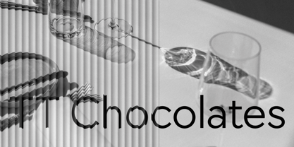 Introducing the third reincarnation of TT Chocolates! The popular typeface was updated to stay up-to-date with the latest requirements and trends in design! TT Chocolates is an elegant Humanist sans serif with a dense typesetting and well-balanced proportions similar to the classical tradition. This font's nice and friendly nature makes it seem like something close and familiar. It has earned a reputation among designers as the perfect font for confectionery, but the application range of the TypeType's "sweetest" typeface goes well beyond that! In 2023, we decided to do a full-scale font update referring to extensive sans-serif market research. We figured out where the trends are headed and what users want—this information helped us enhance TT Chocolates. Specifically, we introduced a new Condensed font version, a narrow font style with the authentic proportions of the standard version. At the same time, TT Chocolates Condensed boasts a more expressive personality than the base subfamily, which allows designers to solve even more creative tasks using only one typeface. The third version of TT Chocolates has become even more modern and advanced. A large number of characters, various OpenType features, and stylistic sets make the font suitable for multiple purposes and tasks. TT Chocolates is a perfect match for both branding and layouts. The font's dynamic shapes make it easy to read in small point sizes, allowing the eye to move effortlessly across the line. This typeface can also be used in web design due to the TrueType manual hinting option. TT Chocolates 3.000 includes: 29 font styles: 14 roman, 14 italic, and one variable font; Condensed version consisting of 14 new font styles; Carefully crafted contours; Optimized font rhythm and completely new kerning; Enhanced italics in basic subfamily; Variable font with three axes of variation: width, weight, and slant; 32 OpenType features, counting in 13 new ones; 901 characters in each font style—the character set has grown compared to the previous version, which had 629 characters in each font style; 230+ languages support, including the new ones: 35 Cyrillic-based and 16 Latin-based. Elevate your design's appeal with TT Chocolates!
 - Lady Rene by Sudtipos,
$59.00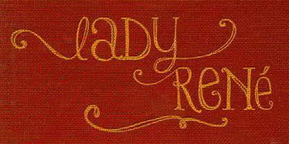 Looking back on my production to date, neither so little nor so large, it does not come as a surprise to find myself now introducing Lady René. A brief review of my career would read as follows: graphic designer graduated from Buenos Aires University, a 10-year professorship in Typography in the same institution, an illustrator in the making. For almost 15 years now my work has focused on the design of editorial pieces, predominantly books and CD sleeves. Typography proper has always been central to my research projects. All my obsessions eventually embodied as much the search for a perfect, spotless text as for a daring and provoking one. In my view, "how-to-say-something" ranks highest amongst a graphic designer’s responsibilities. It was in this vein that I called in the written word to illustrate, to draw, to narrate. Why not reverse the saying and proclaim that “a word is worth a thousand images”? If so, one single word could trigger endless meanings, associations, ideas, and memories in every reader’s mind. Language, we know, has a strong power and is a living expression of a culture. In my illustrations, letters and drawings reunite in one synergy said and unsaid, the finiteness of the message and the freedom of the free reading. And this is how and when, Lady René, my first born type font sees the light of day conceived out of a love of illustration and a reverence for the written word, recalling the whimsicality of the handmade drawing and reflecting its sensitive, warmth and spontaneity. Enabled by the characteristics of Open Type and the hard, outstanding work of designer Ale Paul, Lady René succeeds in composing texts in a simple, organic way by means of its contextual and stylistic alternates, swash characters, ligatures and connecting words. A bundle of decorative miscellanea completes the set of signs, enabling the user considerable freedom to create new typographic landscapes. Lady René is then prepared, very much like a character in a short story, to come to life in the reader’s mind. I expect you will enjoy her as much as I did creating her. Laura Varsky
 - LFT Etica Mono by TypeTogether,
$35.00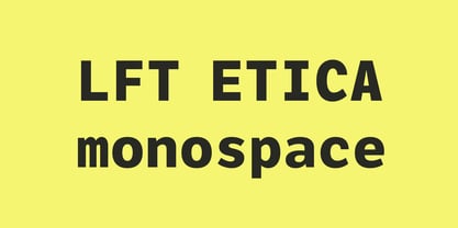 Milan-based Leftloft studio has produced a third leg to its hit Etica font family: LFT Etica Mono. Meant to be a coder’s go-to font for everyday use as much as a designer’s way to invoke a certain genre, it is part of a broader and more versatile family that already contains almost 80 sans and serif fonts. LFT Etica Mono’s ten weights carry the same modern, recognisable DNA of the Etica family while hewing to the defined requirements of a coding typeface: space, density, distinct forms, and clarity. It uses the same instroke on the ‘c’ and open form of the ‘a’ for which the Etica family is famous, but adds something new in the form of an additional italic style. Monospaced fonts usually incorporate slanted letters as italics, as does LFT Etica Mono, but its default italics have warmer, cursive shapes while the alternate italics are simply slanted. The default ‘a’ is a simplified bowl and stem instead of a two storey shape; the ‘d, f, i, l, t, y’ and others gain an outstroke tail; the ‘e’ is one smooth stroke; and the default ‘k’ is looped. These characters have basic, slanted alternates if the cursive look isn’t desired, and includes a set of arrows and geometric shapes. The monospaced design, by nature, makes the typeface useful in coding and in low readability situations. And how does LFT Etica Mono work from the designer’s perspective? The starting point was the need for a monospaced Etica companion intended for technical applications: captions in graphic layouts, small text, confined or predefined space, and overall tone. Flat terminals and counters maintain the colour and versatility of the original typeface, but choosing between the organic cursive or blunt slanted alphabet will give every layout its own character. Of particular aesthetic interest may be the & and % symbols. Designed to be applied to the common visual environment, the new LFT Etica Mono font family completes a more complex system. One benefit is to give an expressive tone — less serious and more friendly — to something inherently technical, to bytes and bots, to encode the beautiful life.
 - Noort by TypeTogether,
$51.60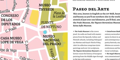 Juan Bruce’s Noort is not a type family for wayfinding or mapmaking alone, but for clarifying information and engaging readers along their own journey. The information designer’s role is to bring clarity and style to overwhelming amounts of information, which fortunately is Noort’s purpose as well. Hierarchies submit to its will and layering colour only adds more presence to its active posture. Noort’s design uses the proven editorial text features of a large x-height, ample spacing, and low contrast to check all the boxes for paragraph text use. But it’s the long serifs, wide characters, and overall typographic presence that make it resilient and ease the task of reading in small point sizes. These details mean Noort is able to demonstrate importance not only with its five pitch-perfect weights, but with its brindled colour within a layout. Noort’s roman and italic styles play off each other by transplanting their design features. The roman style’s serifs are transferred in substance but expectedly increased in speed in the italic styles. And the italic’s inktraps and separated strokes are echoed amidst the roman’s upright structure. Where digitisation could have removed the influence of the hand, Noort retains the analogue nature of its creation. This antiphonal seeding of details creates a cohesive family that is as fascinating as it is functional. Noort’s axis and serifs have a slightly varying ductus — the directional flow that aids reading and character clarity. Its latent obviousness in text sizes immediately becomes its signature style when bumped up to subhead sizes. And since Noort’s counters are so wide and welcoming, its heavier weights can expand more within themselves than along their exterior edges. Noort’s ten total fonts cover the Latin A Extended glyph set to bring its unbordered, globetrotting sensibilities to your projects. OpenType features include ligatures, fractions, and several figure styles, along with mature-rather-than-overbearing swashes. Aligned with TypeTogether’s commitment to produce high-quality type for the global market, the complete Noort family can set digital and printed works with ease, capitalising on the dual needs of clear information and fascinating textual artistry.
 - Anselm Serif by Storm Type Foundry,
$63.00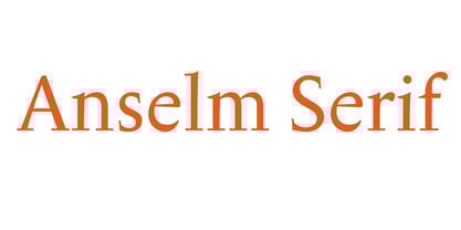 One of the good practices of today’s type foundries is that they release their type families as systems including both serif and sans serif type. Usually, the sources of inspiration need to be well tried with time and practice, since production of a type family is such a laborious and complex process. From the beginning, it needs to be clear that the result will be suited for universal use. Such systems, complete with the broad, multi-lingual variations permitted by the OpenType format, have become the elementary, default instrument of visual communication. Non-Latin scripts are useful for a wide scope of academic publications, for packaging and corporate systems alike. And what about outdoor advertisement designated for markets in developing countries? Cyrillics and Greek have become an integral part of our OpenType font systems. Maybe you noticed that the sans serif cuts have richer variety of the light – black scale. This is due to the fact that sans serif families tend to be less susceptible to deformities in form, and thus they are able to retain their original character throughout the full range of weights. On the other hand, the nature of serifed, contrasted cuts does not permit such extremes without sacrificing their characteristic features. Both weights were drawn by hand, only the Medium cut has been interpolated. Anselm Ten is a unique family of four cuts, slightly strengthened and adjusted for the setting in sizes around 10 pt and smaller, as its name indicates. The ancestry of Anselm goes back to Jannon , a slightly modified Old Style Roman. I drew Serapion back in 1997, so its spirit is youthful, a bit frisky, and it is charmed by romantic, playful details. Anselm succeeds it after ten years of evolution, it is a sober, reliable laborer, immune to all eccentricities. The most significant difference between Sebastian/Serapion and Anselm is the raised x-height of lowercase, which makes it ideal for applications in extensive texts. Our goal was to create an all-round type family, equally suitable for poetry, magazines, books, posters, and information systems.
 - P22 Operina by IHOF,
$24.95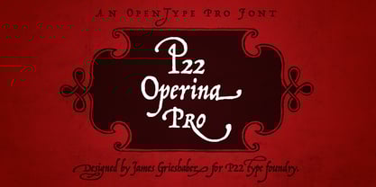 Operina is based on a 16th-century lettering model of the scribe Ludovico degli Arrighi (Vicentino Ludovico degli Arrighi) used in his 1522 instructional lettering book, "La Operina da Imparare di scrivere littera Cancellarescha." This book contains what is considered to be the earliest printed examples of Chancery Cursive. Rather than try to reproduce a perfect, smooth, type-like version of Ludovico's hand, which has been attempted in the past, the designer opted to leave in some rough edges and, thereby, create a look that mimics the endearing artifacts of quill and ink lettering on parchment. When reviving an old style, a designer is faced with many challenging decisions, such as whether to aim for ultimate authenticity or to modify the alphabet for modern use. The decision here was to create a font that resembles the 16th-century Italian hand-lettering master's, but is also useful to the contemporary user. Because the letters U u W w J j and our modern Arabic numerals were not in use during the advent of these original letterforms, these had to be interpolated. To make a complete and useable font set, we also had to fashion many of the extra and diacritical characters to match the look of the alphabet. There are three fonts in this set: Romano(simple), Corsivo(more complex), and Fiore(swash). Romano is the most subdued, it contains Roman looking caps and has lining figures. Corsivo is more elaborate, it has more decorative capital letters and an alternate version of the lowercase with longer ascenders and descenders, and old style figures. Fiore, the swash font, is the most elaborate with the longest ascenders and descenders. You may not wish to use the Fiore version on its own, especially as all caps; it is meant to enhance the other two alphabets because it contains the most elaborate capitals and has many extra ligatures. P22 Operina Pro is an OpenType version that contains over 1200 characters. It features Small Caps, Old Style Figures, full European, Cyrillic and Greek character sets and a new OpenType first with automatic Roman Numerals. Just type any number and with the feature, it will convert to Roman Numerals!
 - Juvenis by Storm Type Foundry,
$32.00Designs of characters that are almost forty years old can be already restored like a historical alphabet – by transferring them exactly into the computer with all their details. But, of course, it would not be Josef Tyfa, if he did not redesign the entire alphabet, and to such an extent that all that has remained from the original was practically the name. Tyfa published a sans-serif alphabet under the title Juvenis already in the second half of the past century. The type face had a large x-height of lower-case letters, a rather economizing design and one-sided serifs which were very daring for their time. In 1979 Tyfa returned to the idea of Juvenis, modified the letter “g” into a one-storey form, narrowed the design of the characters even further and added a bold and an inclined variant. This type face also shows the influence of Jaroslav Benda, evident in the open forms of the crotches of the diagonal strokes. Towards the end of 2001 the author presented a pile of tracing paper with dozens of variants of letter forms, but mainly with a new, more contemporary approach: the design is more open, the details softer, the figures and non-alphabetical characters in the entire set are more integral. The original intention to create a type face for printing children’s books thus became even more emphasized. Nevertheless, Juvenis with its new proportions far exceeds its original purpose. In the summer of 2002 we inserted all of this “into the machine” and designed new italics. The final computer form was completed in November 2002. All the twelve designs are divided into six variants of differing boldness with the corresponding italics. The darkness of the individual sizes does not increase linearly, but follows a curve which rises more steeply towards the boldest extreme. The human eye, on the contrary, perceives the darkening as a more fluent process, and the neighbouring designs are better graded. The x-height of lower-case letters is extraordinarily large, so that the printed type face in the size of nine points is perceived rather as “ten points” and at the same time the line spacing is not too dense. A further ingenious optical trick of Josef Tyfa is the figures, which are designed as moderately non-aligning ones. Thus an imaginary third horizontal is created in the proportional scheme of the entire type face family, which supports legibility and suitably supplements the original intention to create a children’s type face with elements of playfulness. The same applies to the overall soft expression of the alphabet. The serifs are varied; their balancing, however, is well-considered: the ascender of the lower-case “d” has no serif and the letter appears poor, while, for example, the letter “y”, or “x”, looks complicated. The only serif to be found in upper-case letters is in “J”, where it is used exclusively for the purpose of balancing the rounded descender. These anomalies, however, fit perfectly into the structure of any smoothly running text and shift Juvenis towards an original, contemporary expression. Tyfa also offers three alternative lower-case letters *. In the case of the letter “g” the designer follows the one-storey form he had contemplated in the eighties, while in “k” he returns to the Benda inspiration and in “u” adds a lower serif as a reminder of the calligraphic principle. It is above all the italics that are faithful to the tradition of handwritten lettering. The fairly complicated “k” is probably the strongest characteristic feature of Juvenis; all the diagonals in “z”, “v”, “w”, “y” are slightly flamboyant, and this also applies to the upper-case letters A, V, W, Y. Juvenis blends excellently with drawn illustrations, for it itself is modelled in a very creative way. Due to its unmistakable optical effect, however, it will find application not only in children’s literature, but also in orientation systems, on posters, in magazines and long short-stories. - Baskerville by Linotype,
$40.99John Baskerville (1706-1775) was an accomplished writing master and printer from Birmingham, England. He was the designer of several types, punchcut by John Handy, which are the basis for the fonts that bear the name Baskerville today. The excellent quality of his printing influenced such famous printers as Didot in France and Bodoni in Italy. Though he was known internationally as an innovator of technique and style, his high standards for paper and ink quality made it difficult for him to compete with local commercial printers. However, his fellow Englishmen imitated his types, and in 1768, Isaac Moore punchcut a version of Baskerville's letterforms for the Fry Foundry. Baskerville produced a masterpiece folio Bible for Cambridge University, and today, his types are considered to be fine representations of eighteenth century rationalism and neoclassicism. Legible and eminently dignified, Baskerville makes an excellent text typeface; and its sharp, high-contrast forms make it suitable for elegant advertising pieces as well. The Linotype portfolio offers many versions of this design: ITC New Baskerville® was designed by John Quaranda in 1978. Baskerville Cyrillic was designed by the Linotype Design Studio. Baskerville Greek was designed by Matthew Carter in 1978. Baskerville™ Classico was designed by Franko Luin in 1995." - Fresh Lemons by Yumna Type,
$15.00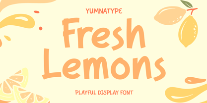 Your font choice is important because without the right font, you have a higher risk of failure to attract the audience's attention resulting in having a big trouble competing with competitors. A good font shows characters of your projects and makes them more prominent than the others. Therefore, Fresh Lemons is here to be the perfect, eye-catching font option. Fresh Lemons is a visually amazing display font with thin lines suitably applied for a more elegant, modern looking display. In addition, such a font shows professional, high quality nuances on your designs due to the simple forms and consistent proportions to be legible enough. You will receive a clipart as a bonus and you can also enjoy the available features here. Features: Ligatures Multilingual Supports PUA Encoded Numerals and Punctuations Fresh Lemons fits best for various design projects, such as brandings, posters, banners, headings, magazine covers, quotes, invitations, name cards, printed products, merchandise, social media, etc. Find out more ways to use this font by taking a look at the font preview. Thanks for purchasing our fonts. Hopefully, you have a great time using our font. Feel free to contact us anytime for further information or when you have trouble with the font. Thanks a lot and happy designing.
 - Baskerville Classico by Linotype,
$29.99John Baskerville (1706-1775) was an accomplished writing master and printer from Birmingham, England. He was the designer of several types, punchcut by John Handy, which are the basis for the fonts that bear the name Baskerville today. The excellent quality of his printing influenced such famous printers as Didot in France and Bodoni in Italy. Though he was known internationally as an innovator of technique and style, his high standards for paper and ink quality made it difficult for him to compete with local commercial printers. However, his fellow Englishmen imitated his types, and in 1768, Isaac Moore punchcut a version of Baskerville's letterforms for the Fry Foundry. Baskerville produced a masterpiece folio Bible for Cambridge University, and today, his types are considered to be fine representations of eighteenth century rationalism and neoclassicism. Legible and eminently dignified, Baskerville makes an excellent text typeface; and its sharp, high-contrast forms make it suitable for elegant advertising pieces as well. The Linotype portfolio offers many versions of this design: ITC New Baskerville® was designed by John Quaranda in 1978. Baskerville Cyrillic was designed by the Linotype Design Studio. Baskerville Greek was designed by Matthew Carter in 1978. Baskerville™ Classico was designed by Franko Luin in 1995." - Baskerville LT by Linotype,
$40.99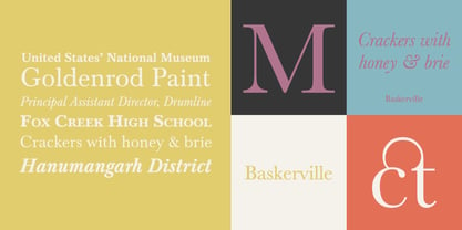 John Baskerville (1706-1775) was an accomplished writing master and printer from Birmingham, England. He was the designer of several types, punchcut by John Handy, which are the basis for the fonts that bear the name Baskerville today. The excellent quality of his printing influenced such famous printers as Didot in France and Bodoni in Italy. Though he was known internationally as an innovator of technique and style, his high standards for paper and ink quality made it difficult for him to compete with local commercial printers. However, his fellow Englishmen imitated his types, and in 1768, Isaac Moore punchcut a version of Baskerville's letterforms for the Fry Foundry. Baskerville produced a masterpiece folio Bible for Cambridge University, and today, his types are considered to be fine representations of eighteenth century rationalism and neoclassicism. Legible and eminently dignified, Baskerville makes an excellent text typeface; and its sharp, high-contrast forms make it suitable for elegant advertising pieces as well. The Linotype portfolio offers many versions of this design: ITC New Baskerville® was designed by John Quaranda in 1978. Baskerville Cyrillic was designed by the Linotype Design Studio. Baskerville Greek was designed by Matthew Carter in 1978. Baskerville™ Classico was designed by Franko Luin in 1995."
 - Monotype Baskerville by Monotype,
$29.99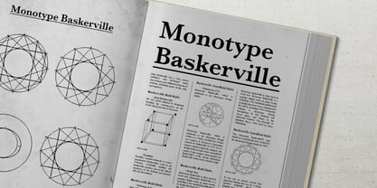 John Baskerville (1706-1775) was an accomplished writing master and printer from Birmingham, England. He was the designer of several types, punchcut by John Handy, which are the basis for the fonts that bear the name Baskerville today. The excellent quality of his printing influenced such famous printers as Didot in France and Bodoni in Italy. Though he was known internationally as an innovator of technique and style, his high standards for paper and ink quality made it difficult for him to compete with local commercial printers. However, his fellow Englishmen imitated his types, and in 1768, Isaac Moore punchcut a version of Baskerville's letterforms for the Fry Foundry. Baskerville produced a masterpiece folio Bible for Cambridge University, and today, his types are considered to be fine representations of eighteenth century rationalism and neoclassicism. Legible and eminently dignified, Baskerville makes an excellent text typeface; and its sharp, high-contrast forms make it suitable for elegant advertising pieces as well. The Linotype portfolio offers many versions of this design: ITC New Baskerville® was designed by John Quaranda in 1978. Baskerville Cyrillic was designed by the Linotype Design Studio. Baskerville Greek was designed by Matthew Carter in 1978. Baskerville™ Classico was designed by Franko Luin in 1995."
 - Baskerville LT Cyrilic by Linotype,
$29.99John Baskerville (1706-1775) was an accomplished writing master and printer from Birmingham, England. He was the designer of several types, punchcut by John Handy, which are the basis for the fonts that bear the name Baskerville today. The excellent quality of his printing influenced such famous printers as Didot in France and Bodoni in Italy. Though he was known internationally as an innovator of technique and style, his high standards for paper and ink quality made it difficult for him to compete with local commercial printers. However, his fellow Englishmen imitated his types, and in 1768, Isaac Moore punchcut a version of Baskerville's letterforms for the Fry Foundry. Baskerville produced a masterpiece folio Bible for Cambridge University, and today, his types are considered to be fine representations of eighteenth century rationalism and neoclassicism. Legible and eminently dignified, Baskerville makes an excellent text typeface; and its sharp, high-contrast forms make it suitable for elegant advertising pieces as well. The Linotype portfolio offers many versions of this design: ITC New Baskerville® was designed by John Quaranda in 1978. Baskerville Cyrillic was designed by the Linotype Design Studio. Baskerville Greek was designed by Matthew Carter in 1978. Baskerville™ Classico was designed by Franko Luin in 1995." - Pepper Sans by VIDI Visual Design Studio,
$17.99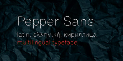 The core design of Pepper family, designed by VIDI Visual Design Studio, is the fingertip handwriting style inspired by children’s writings on windows. This distinctive low-contrast typeface combines characteristics from neo-grotesque and organic models. Warmer than most Helvetica inspired typefaces, Pepper has organic shapes, playful strokes, rounded endings, and a generous x-height which makes Pepper easy to read. This family could be used well for food packagings, content aimed for children, book covers, branding, high-impact titles and small body texts, advertising, editorial design and more. What makes Pepper Sans Vol.1 competent and more spicy then some other fonts is that it contains a set of more than 900 characters for each of 5 weights that support many Latin-based languages, Greek and Cyrillic. As the weight decreases, the typeface gains impact with becoming elegant, giving titles in (Hair, Thin or Light) a breath of fresh air. We derived a typeface family consisting of Hair, Thin, Light, Regular, Semi Bold in this Vol.1 edition. Typeface features: • 5 weights: Hair, Thin, Light, Regular, Semi Bold • Latin, Greek & Cyrillic multilingual support • More than 900 characters for each of 5 weights Font Specs: • Created: August 2020 • Files type: .ttf
 - Mr Palker by Letterhead Studio-YG,
$35.00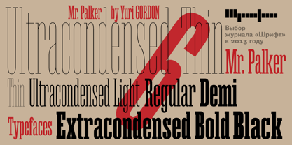 A slab serif Mr Palker and grotesque Mr Palkerson build one superfamily together. These are blank types. In a way even the display ones. Typefaces for newspapers, announcements, cheap advertising and police posters. Mr Palker and Mr Palkerson will turn every language into a fence. And due to six types of faces one can choose what material should the fence be made from — from Thin steel rods to the Black stone blocks. In their simplest appearance Mrs P&P are intended for the solid blank composition in victorian or industrial style. They are quite decent, a bit old-fashioned slab serif and grotesque with closed aperture. All my types have layers. Walker and Palkerson also do. Besides the standard set of symbols, they have 4 add-ons. 1. Alternate glyphs, including unicase ones. 2. Ligatures with A letter. 3. Extra tall small caps. 4. Two-storey ligatures. All this options are intended for the complex composition. The additional letters are rather eccentric as their main function here is to imitate the victorian oddities. Imitate, parody, just not repeat. There are lower-case As and Es in the set in height of small caps and uppercases. They can turn every writing into the unicase. The lower-case A (as well as uppercase and small caps version of it) has deliberately by my taste grown a ludicrous tail. To compensate it I’ve built all the possible ligatures - ад, ал, ая. There are 35 of this ligatures all together. Take a closer look at the Russian letters D, L, K, Ya from the main set as well as their alternates. The additional glyphs are one more comic than the other — on purpose to imitate (not to repeat!) the victorian set. This sets have lowercase numbers. And small caps numbers as well. What a modern typeface without them. They also have an У-letter with a generously curvy tail. As if before the WWI. The Latin of course has alternates as well. It has letters to make the perfect French sound more like the russian provincial version of it. The tails of Js and Ts can be made a little bit more open — or a little bit closed. My favorite feature here, an invention of a kind - extra tall small caps. It allows to compose logos with the small caped uppercases directly from the keyboard. The small caps of this typefaces are usually much taller than the customary ones. This is the kind of small caps that Palker and Palkerson have. More to that, the strokes’ weight and the letters width are corresponded to the uppercases. Just a ready set for making a logo a la 1913 style. With a unicase, one has to mind! One more trick with the tall small caps is a possibility to make them work like lower uppercases. Their height is just in between of lower- and uppercases. Isn’t it great to have an additional set of uppercase working ponies in stock for the case of emergency. And finally — the trademark of Palkers family, two-storey ligatures. They are made in the height of uppercases and turn every writing into an ornament or a puzzle of a kind, while at the same time making them much shorter. Each face has 90 of them. Mainly those are twins: CC, BB, DD and so on. ll this things are for the unhasty compositing, even for lettering. Which means that for the things which are not there you always should have Command+Option+O and some patience. Also — among the two storey ligatures one also can find some belvedere villas. All my types are glasses from the one kaleidoscope. The P&Ps family was preliminary part of the victorian set, which already has 1 Cents and Clarendorf - optionally one can add Costro, Gordoni, Handy, Guardy, Surplus, Red Ring, Red Square, Babaev to the list. And also Sklad, Odessa, Dreamland, Romb, Platinum - here, at Letterhead’s, every second one is victorian. All together our typefaces can allow one to set advertisement of any kind, even the trickiest one, and compose everything, from the coffee place’s menu to the antiquarian magazine.
 - Mr Palkerson by Letterhead Studio-YG,
$35.00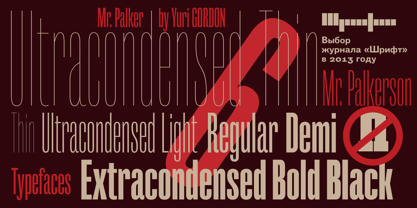 A grotesque Mr Palkerson and slab serif Mr Palker build one superfamily together. These are blank types. In a way even the display ones. Typefaces for newspapers, announcements, cheap advertising and police posters. Mr Palker and Mr Palkerson will turn every language into a fence. And due to six types of faces one can choose what material should the fence be made from — from Thin steel rods to the Black stone blocks. In their simplest appearance Mrs P&P are intended for the solid blank composition in victorian or industrial style. They are quite decent, a bit old-fashioned slab serif and grotesque with closed aperture. All my types have layers. Walker and Palkerson also do. Besides the standard set of symbols, they have 4 add-ons. 1. Alternate glyphs, including unicase ones. 2. Ligatures with A letter. 3. Extra tall small caps. 4. Two-storey ligatures. All this options are intended for the complex composition. The additional letters are rather eccentric as their main function here is to imitate the victorian oddities. Imitate, parody, just not repeat. There are lower-case As and Es in the set in height of small caps and uppercases. They can turn every writing into the unicase. The lower-case A (as well as uppercase and small caps version of it) has deliberately by my taste grown a ludicrous tail. To compensate it I’ve built all the possible ligatures - ад, ал, ая. There are 35 of this ligatures all together. Take a closer look at the Russian letters D, L, K, Ya from the main set as well as their alternates. The additional glyphs are one more comic than the other — on purpose to imitate (not to repeat!) the victorian set. This sets have lowercase numbers. And small caps numbers as well. What a modern typeface without them. They also have an У-letter with a generously curvy tail. As if before the WWI. The Latin of course has alternates as well. It has letters to make the perfect French sound more like the russian provincial version of it. The tails of Js and Ts can be made a little bit more open — or a little bit closed. My favorite feature here, an invention of a kind - extra tall small caps. It allows to compose logos with the small caped uppercases directly from the keyboard. The small caps of this typefaces are usually much taller than the customary ones. This is the kind of small caps that Palker and Palkerson have. More to that, the strokes’ weight and the letters width are corresponded to the uppercases. Just a ready set for making a logo a la 1913 style. With a unicase, one has to mind! One more trick with the tall small caps is a possibility to make them work like lower uppercases. Their height is just in between of lower- and uppercases. Isn’t it great to have an additional set of uppercase working ponies in stock for the case of emergency. And finally — the trademark of Palkerson family, two-storey ligatures. They are made in the height of uppercases and turn every writing into an ornament or a puzzle of a kind, while at the same time making them much shorter. Each face has 90 of them. Mainly those are twins: CC, BB, DD and so on. ll this things are for the unhasty compositing, even for lettering. Which means that for the things which are not there you always should have Command+Option+O and some patience. Also — among the two storey ligatures one also can find some belvedere villas. All my types are glasses from the one kaleidoscope. The P&Ps family was preliminary part of the victorian set, which already has 21 Cents and Clarendorf - optionally one can add Costro, Gordoni, Handy, Guardy, Surplus, Red Ring, Red Square, Babaev to the list. And also Sklad, Odessa, Dreamland, Romb, Platinum - here, at Letterhead’s, every second one is victorian. All together our typefaces can allow one to set advertisement of any kind, even the trickiest one, and compose everything, from the coffee place’s menu to the antiquarian magazine.
 - DIVERGENT - Personal use only

- LT Oksana - Personal use only

- Salma Alianda Script by FadeLine Studio,
$23.00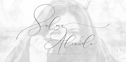 Introduce Salma Alianda Script! This is a modern font script. This font comes with a thin and italic style, made very slowly to get a neat result so it will create a very elegant impression on this font. Available 653 glyphs in it, so you can get used it freely and follow the current trend. With a style like this, this font will be suitable in use for logo's, branding projects, homeware designs, product packaging, mugs, quotes, posters, shopping bags, logo's, t-shirts, book covers, name card, invitation cards, greeting cards, and all your other lovely projects. You can use this font for your job very easily. Because there are many features in it. Contains the complete set of lower and uppercase letters, punctuation, numbers, web fonts, and multilingual support. This font also includes several ligatures and alternative style Stylistic Set For those of you who have software that is capable of working OpenType (Corel Draw / Photoshop / Illustrator / InDesign).
 - Korolev Rounded by Device,
$39.00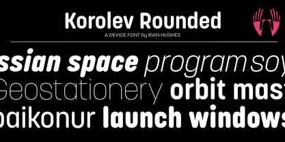 DF Korolev is a 72 weight geometric sans serif family based on lettering by an anonymous Soviet graphic designer from the propaganda displays at the Communist Red Square parade in 1937. It has been named in honor of Sergey Pavlovich Korolyov, or Korolev, considered by many to be the father of practical astronomics. Rational and robust, it is also elegant and refined. Tracings done in Illustrator over a photograph featuring this type pinned down some of the basic character shapes. These were then imported into FontLab, where the full glyph complement was developed. The lower-case has been designed from scratch, and adheres to the structural logic of the uppercase as closely as possible. The complete Korolev super-family includes standard, italic, condensed, and compressed versions, each in five weights. The Alternate families come with a double-story “a”. Authoritative yet friendly, Korolev Rounded is a versatile addition to the Korolev range.
 - Crypton by Type Innovations,
$39.00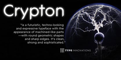 Crypton is a modern geometric design by Alex Kaczun. It’s an alternate style variation based on his popular Contax Pro family of fonts. The look is clean, smart and sophisticated—the chiseled end strokes reflect the rage of the 1980s; lettering that represented something to do with electronics, computers and outer space. It’s a futuristic sans-serif exploration of shape and form. This display font is not intended for text use. It was designed specifically for display headlines, logotype, branding and similar applications. The entire font has an original look which is strong and dynamic—it can be widely used in publications and advertising. Crypton is a futuristic, techno-looking and expressive typeface with the appearance of machined-like parts—round geometric shapes and sharp edges. This attractive display comes in roman with lower case and lining figures. The large Pro font character set supports most Central European and many Eastern European languages.
 - Kis Classico by Linotype,
$29.99Kis Classico™ is named after the Hungarian monk Miklós Kis who traveled to Amsterdam at the end of the seventeenth century to learn the art of printing. Amsterdam was a center of printing and punchcutting, and Kis cut his own type there in about 1685. For centuries, Kis's type was wrongly attributed to Anton Janson, a Dutch punchcutter who worked in Leipzig in the seventeenth century. Most versions of this type still go by the name Janson. In 1993, the Italian/Swedish type designer Franko Luin completed Kis Classico, his own contemporary interpretation of the Kis types. About the Kis/Janson story, Luin says: If you understand Hungarian I recommend you read the monograph, 'Tótfalusi Kis Miklós' by György Haiman, published in 1972 by Magyar Helikon. It has hundreds of reproductions from his Amsterdam period and from the time when he was an established printer in Kolozsvár (today's Cluj in Romania)." Kis Classico has five weights, and is an admirable version of this classic type. - Halberg by Krafted,
$10.00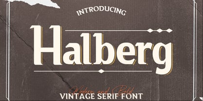 Wish to infuse some tradition and nostalgia into your project? Whether you’re working on a logo, promo materials, packaging, or invitations, we’ve got just the thing to elevate your design. Introducing Halberg - a Vintage Serif Font. From luxury brands to artisan businesses, Halberg has a timeless appeal to customers. Give it a shot and see how a great font improves the way people see you. What you’ll get: Multilingual & Ligature Support Full sets of Punctuation and Numerals Compatible with: Adobe Suite Microsoft Office Keynote Pages Software Requirements: The fonts that you’ll receive in the pack are widely supported by most software. In order to get the full functionality of the selection of standard ligatures (custom-created letters) in the script font, any software that can read OpenType fonts will work. We hope you enjoy this font and that it makes your branding sparkle! Feel free to reach out to us if you’d like more information or if you have any concerns.
 - Syarlina by Stripes Studio,
$14.00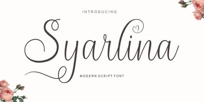 Introducing the latest font Syarlina Script with a kind of modern hand scratches, I hope you are interested in this font. It can easily and simply be used because there are a lot of features in it: Syarlina Script contains a complete set of lower and uppercase letters, assorted punctuation, numbers, multilingual support and also several ligatures and alternate style Stylistic. To enable the OpenType Stylistic alternates, you need a program that supports OpenType features such as Adobe Illustrator CS, Adobe Indesign & CorelDraw X6-X7, Microsoft Word 2010 or later versions. And there are additional ways to access alternates/swashes, using Character Map (Windows), Nexus Font (Windows), Font Book (Mac) or a software program such as PopChar (for Windows and Mac). How to access all alternative characters using Adobe Illustrator: https://www.youtube.com/watch?v=XzwjMkbB-wQ How to access all alternative characters, using Windows Character Map with Photoshop: https://www.youtube.com/watch?v=Go9vacoYmBw This Font has given PUA unicode. Thank you for your purchase!
 - Love Script by Positype,
$55.00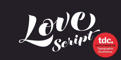 Love Script came about as a way to finally answer the requests by individuals to take my brush pen/marker lettering styles and turn them into a typeface. Literally, everything lined up perfectly and there was a renewed impetus to push this genre, this style of lettering I have adapted over the years into what will become a series of brush pen/marker typefaces. The first I chose to complete was a high-contrast variant… I seem to be attracted to high contrast, high energy letters (think Lust, Lust Slim and Lust Script). As I was finalizing everything, I kept saying ‘I love this script’, which ultimately led the christening of the typeface as Love Script. For more fun, visit the Love Script Minisite Designer’s note: for this font to truly sing, be sure you have Contextual Alternates on in your OpenType settings. Hope you love it as much as I do.
 - Jalliya by Madhaline Studio,
$25.00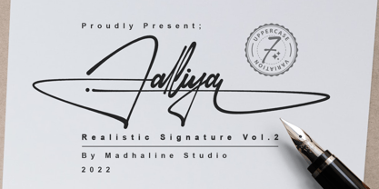 Jalliya is a realistic signature font Vol. 2 that has its own uniqueness and characteristics from a signature font, because it is handwritten manually, so it has the impression of a true signature. This font is carefully crafted with a modern touch. This font looks elegant, luxurious, natural with a beautiful signature touch. Jalliya would perfect for photography, watermark, social media posts, advertisements, logos & branding, invitation, product designs, label, stationery, wedding designs, product packaging, special events or anything that need signature taste. Your download will include 4 font files; ~ Jalliya One, Two, Three, Four, Five, Six and Seven A hand-made, all characters signature font which has a complete set of A-z characters. Includes a range of multilingual support, punctuation, ligature & alternate. ~ Jalliya Tail 1 & 2 A bonus set of 104 Uppercase & Lowercase with tail. Simply select this font and type any A-Z & a-z character to create one of the bonus elements.
 - Arial Nova by Monotype,
$45.99The Arial® Nova family takes Arial back to its roots. Character spacing has been adjusted and a number of subtle modifications were made to the design to return the shapes and proportions to those of the original 1982 design created for IBM's then new high-speed laser printers. Although these first Arial fonts, called "Sonora Sans" by IBM, were low-resolution bitmaps, it was apparent that the design could also be an important high-resolution digital typeface, and Arial was redrawn for Monotype's imagesetters in the late 1980s. In the process Arial evolved from its original design loosing some of its earlier personality. The restored Arial Nova family is made up of three weights of roman design of standard proportions and three weights of condensed - all with complementary italic designs. The Arial Nova family is also compatible with the fonts that Microsoft® provides in the Windows® 10 operating system. - Oliviar Sans by Adam Fathony,
$10.00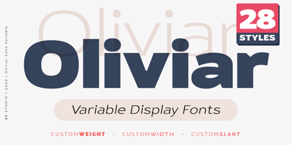 Oliviar Sans Variable is a modern sans serif with Grotesque touch. It's my experimental to study the new trends for the future fonts that is Variable Fonts. Inspired by a Geometrical fonts and also Humanist Sans serif. Created with 8 Masters that export to the traditional OTF to 28 Styles!. On the Applications that support variable fonts such as Adobe Illustrator & Photoshop, you can get more than only 28, you can customize the Weight, Width and Slant. Weight created from Thin (100) to Bold (900), Width created from Standard (100) to Expanded (900) and Slant based on degree angle from 1˚ to 10˚. There is a new slider icons for accessing this features Check on Last Display Image. Another advantage on the Variable fonts are you just need 1 files to install to your computer and it will install all the styles available. All of the Fonts are support for Multilanguage, Carefully Crafted.
 - Bellvyne by Krafted,
$10.00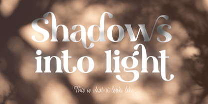 Looking for an elegant but unique serif font that looks equally great on screen as well as on paper? Introducing Bellvyne - A Serif Font. Stylish with a touch of modern, Bellvyne is perfect for making your brand stand out. It’s a great choice for web pages, apps, ads, banners, promotions, printed cards, packaging, and pretty much anything else your project needs. What you’ll get: Multilingual & Ligature Support Full sets of Punctuation and Numerals Compatible with: Adobe Suite Microsoft Office Keynote Pages Software Requirements: The fonts that you’ll receive in the pack are widely supported by most software. In order to get the full functionality of the selection of standard ligatures (custom created letters) in the script font, any software that can read OpenType fonts will work. We hope you enjoy this font and that it makes your branding sparkle! Feel free to reach out to us if you’d like more information or if you have any concerns.
 - Quaint Gothic SG by Spiece Graphics,
$39.00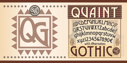 Distinctively Art Nouveau with a touch of Arts & Crafts, Quaint Gothic is a typographic gem from the late nineteenth century. Also known as Desdemona, this undulating and organic typeface is a versatile and refreshing alternative to many of the font designs on the market today. Quaint Gothic comes complete with an alternate set of caps and a new set of lowercase characters. And for your convenience, a nifty set of small caps and small figures are included in this version. You may also want to access the word-on-a-wave logotypes like “to” and “and” located in the special character slots. They’re great for constructing provocative headlines and titles. Quaint Gothic is also available as an OpenType font. It contains lining and oldstyle figures, prebuilt fractions, stylistic alternates, a wide variety of discretionary ligatures and word ornaments. These advanced features currently work in Adobe Creative Suite InDesign and Illustrator. Check for OpenType advanced feature support in other applications as it gradually becomes available with upgrades.
 - Haakke by Dawnland,
$13.00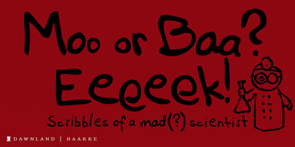 Haakke (or Håkke) - a casual, hand drawn (Stabilo OH pen, Fine) font with 4 alternates to all upper and lower case letters (a-z + å ä ö) as well as numbers for a realistic hand written look and feel! “Ligatures” have been created for double letters (TT, tt, ff, ll & LL (open type version of the font and open type compatible layout application required). Of course it holds all(?) the special characters that you will ever need. 451 glyphs... Haakke also includes symbols. Zodiak signs (letter a-l, upper case A-L write the corresponding name of the sign), planet signs (m-z, upper case M-Z write the corresponding name of the planet) triangles, squares and stars (from pentagrams (5 pointed) to Dodecagrams (12 pointed). (Write a 4, or shift-4 ("euro-sign", european keyboard, or "dollar sign", american keyboard) before your star or triangle and you will get a circle around it).
 - Chemicalife by IKIIKOWRK,
$15.00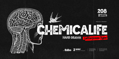 Proudly present Chemicalife - Hand Drawn Letterpress Type, created by ikiiko Take advantage of "Chemicalife," a stunning hand-drawn letterpress typeface created to take your poster designs to new heights, and embrace its retro appeal and aesthetic attraction. The distinctive "Regular" and "Rough" forms of this typeface, each with its own compelling personality, provide your projects an unsurpassed degree of versatility. Discover the world of purposeful imperfection with Chemicalife's "Rough" aesthetic. This variation celebrates the natural flaws of handcrafted artwork and is inspired by the genuine charm of vintage letterpress prints. Every word and character exudes an artistic rawness that gives your posters a sense of true craftsmanship. These imperfections and uneven edges are the telltale signs of an artist's touch. This typeface is perfect for an vintage poster, movie title, packaging, food & beverages, magazine design, fashion brand, classic stuff, quotes, or simply as a stylish text overlay to any background image. What's Included? 2 Weight : Regular & Rough Uppercase & Lowercase Numbers & Punctuation Multilingual Support Works on PC & Mac
 - Vergian by Krafted,
$10.00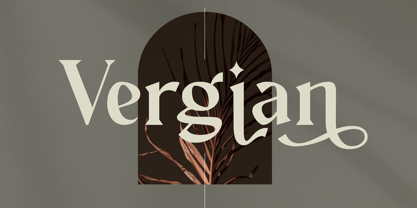 Looking for a striking font that’s easy on the eyes? Whether you need a font for your magazine, website, or book, we’ve got a solution. Introducing Vergian – a Modern Serif Font. Clean and easily legible, Vergian is the perfect choice for any text that needs to stand out. Check it out and see the difference that a great font can make. What you’ll get: Multilingual & Ligature Support Full sets of Punctuation and Numerals Compatible with: Adobe Suite Microsoft Office KeyNote Pages Software Requirements: The fonts that you’ll receive in the pack are widely supported by most software. In order to get the full functionality of the selection of standard ligatures (custom created letters) in the script font, any software that can read OpenType fonts will work. We hope you enjoy this font and that it makes your branding sparkle! Feel free to reach out to us if you’d like more information or if you have any concerns.
 - Coral Blush by Set Sail Studios,
$16.00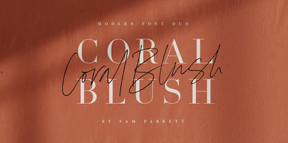 Explore a stunning typography pairing with Coral Blush; a carefully crafted and perfectly balanced set of elegant serif and realistic script typefaces. Here’s what’s included; Coral Blush Serif • An all-caps Serif font containing uppercase, all punctuation & numerals. Coral Blush Script • A thin and realistic textured handwriting font, hand-drawn with a real fine-tip pen. Contains, lowercase, uppercase, all punctuation & numerals. Also includes 88 built-in ligatures. Coral Blush Script Alt • This is a second version of Montrose Script, with a completely new set of upper & lowercase characters. 88 Script Ligatures • Coral Blush Script fonts contain 88 ligatures (double letter glyphs) to help your text flow more naturally and recreate authentic, handwritten text. Many programs will automatically have this feature switched on for you, but if you need any help accessing them, please feel free to drop me a message. Language Support; English, French, Italian, Spanish, Portuguese, German, Swedish, Norwegian, Danish, Dutch, Finnish, Indonesian, Malay, Hungarian, Polish, Turkish, Slovenian
 - Hudson NY Pro by Arkitype,
$15.00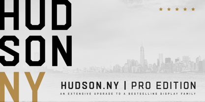 It's here and it's a major upgrade to Hudson NY. Weight variations and alternate glyphs were some of the requests that were being received for Hudson NY and these have all been taken care of in the Pro Edition of Hudson NY. Hudson NY Pro still comes in Regular, Serif and Slab styles now with completely re-drawn glyphs, there are now six weights as well as italics for each style. Some of the additional features included in the Pro Edition is Small Caps, Stylistic Sets and Alternate Glyphs. Hudson NY is now loads more versatile, it is the perfect Display family for sports, beverage and entertainment. Press versions have been dropped in the Pro Edition as these were the lesser used and sluggish fonts of the original Hudson NY family so the focus was to create a cleaner family with more usability options. Each Hudson NY style now also includes a Variable font which saves you the hassle of installing multiple font files.
 - Mr De Haviland Pro by Sudtipos,
$45.00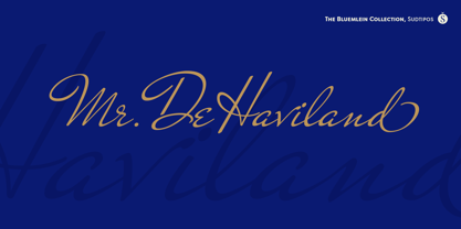 The Charles Bluemlein Script Collection is an intriguing reminder of the heady days of hand lettering and calligraphy in the United States. From the early 1930s through World War II, there were about 200 professional hand letterers working in New York City alone. This occupation saw its demise with the advent of photo lettering, and after digital typography, became virtually extinct. The odd way in which the Bluemlein scripts were assembled and created - by collecting different signatures and then building complete alphabets from them - is a fascinating calligraphic adventure. Because the set of constructed designs looked nothing like the original signatures, fictitious names were assigned to the new script typefaces. The typeface styles were then showcased in Higgins Ink catalogs. Alejandro Paul and Sudtipos bring the Bluemlein scripts back to life in a set of expanded digital versions, reflecting the demands of today’s designer. Extreme care has been taken to render the original scripts authentically, keeping the fictitious names originally assigned to them by Bluemlein.

