10,000 search results
(0.037 seconds)
- Jimbo by Adobe,
$29.00First used by the designer on his personal letterhead, Jimbo has an informal modern style. Use the Jimbo font family on posters, in advertisements and on packaging. - Steletto OS Flair by Jonahfonts,
$42.00 Condensed Oldstyle Gothic with flair. Great for tight-fitting headlines and other condensed titling situations such as headlines, ads, invitations, captions, packaging, bulletins, posters, and greeting cards.
 - Sambi Lemon by RahagitaType,
$15.00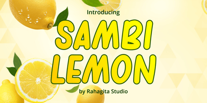 Sambi Lemon is an uppercase awesome font suitable for your many great project as branding, packaging, poster, comic, flyers, and more. Features: - Uppercase & Lowercase - Multi-lingual Support
 - RTCO Fransworth by Roams Type Co,
$12.00 RTCO Fransworth Inspired by Vintage Horror Novel & Movies Poster Typograhphy This font is suitable for graphic designs such as logotypes, merchandise, printed stickers, and other branding needs.
 - Sarmal by Ahmet Altun,
$19.00 The sarmal font contains ligatures that are functional and useful. It can be a stylish font choice for your posters, t-shirts, prints and many more works.
 - Handsta Signature by Nirmana Visual,
$19.00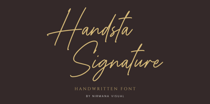 Handsta Signature a classy, contemporary of script font, inspired by Handwriting Signature. Ideally suited for advertising and packaging, festive occasions, editorial and publishing, creative industries and posters .
 - Bros Rover by Blankids,
$27.00 Introducing a new font is Bros Rover Classic Sans Serif. Bros Rover good for logotype, poster, badge, wedding invitation, book cover, tshirt design, packaging and any more.
 - Retro British by Nirmana Visual,
$29.00 Retro British A classy eighties Poster inspired serif, offers beautiful typographic harmony for a diversity of design projects, including logos & branding, social media posts, advertisements & product designs.
 - Meanwhile by Comicraft,
$49.00 'Suddenly --' just isn't 'Soon...' enough for some people, and 'Later...' isn't quite 'The Next Day...' 'Meanwhile...' lies inbetween 'Seconds pass...' and 'That Night...' and was designed by Comicraft's John 'With Just a few minutes to Go...' Roshell in order to tell the tales of Marvel's AVENGERS and FANTASTIC FOUR. 'And now, back to the action...'
 - Rachert by ahweproject,
$9.00 Rachert is a retro bold font that will bring you back to the 70s. Fall in love with its unique character and use it to create gorgeous wedding invitations, beautiful stationery art, eye-catching social media posts, and much more! Rachert is PUA encoded which means you can access all glyphs and swashes with ease!
 - Odaiba Soul by Megami Studios,
$12.50 The second in our Cool Japan series, Odaiba Soul echoes back to some of the futuristic amusement centers and entertainments found on Odaiba Island in Tokyo Bay. Tailored for sci-fi lettering, anime awesomeness or even just making flyers for a day trip across the Rainbow Bridge, this is one to keep in mind!
 - Sewing Patterns by Lauren Ashpole,
$15.00 When I created my first website, I loved using vintage sewing pattern illustrations in my designs. Thinking back on it, I wanted to create a dingbat inspired by those images and Sewing Patterns is the result. The font features ladies-fashions in silhouette form for uppercase and lowercase letters and childrens- styles for the numbers.
 - Danger Agenda by PizzaDude.dk,
$17.00 "Punk is not dead, grunge is not dread, skateboarding and grafitti is forever" - shouted by some (possibly drunk!) person one late night. I had these "wise" words in the back of my mind, while making this font. I wanted to capture the wildness of both punk/grunge/skateboarding and grafitti without overdoing any of them!
 - Kindness Power by PeachCreme,
$13.00 Kindness Power font set is a psychedelic and funky blend with a bubbly touch. This set is very well suited for use in logos, social media quotations, t-shirt designs, and many other scenarios. Kindness Power, which is available in four variations, undoubtedly ties your design together and provides it a laid-back feel.
 - Geisha Holiday by Okaycat,
$29.50 Geisha Holiday is an urban font with a unique look. The letters express slightly the formalized strokes of kanji characters but the overall tone is relaxation. Enjoy the laid back, modern, and distinctive style of Geisha Holiday. Geisha Holiday is extended, containing West European diacritics and ligatures, making it suitable for multilingual environments and publications.
 - Upperclass by Enrich Design,
$24.95Upperclass was a font I created back in 1995. I had a brainstorm about the uppercase letter “A”. I noticed that the cross bar for the letter A is always toward the bottom, what if I moved it toward the top. The result is a unique font, a great addition to your font collection. - Ghost Show by Solotype,
$19.95Back in the days when we earned our living with a travelling magic show, we took the shaded font Lithotint, filled it in, modified some characters, and here is the result. In those days, to use the font we had to cut and paste stats of individual letters by hand. You have it easier! - Dashy Danger by Bogstav,
$17.00 There is nothing dangerous about this font, but indeed something dashy! That may not make much sense, and that's the same with the font - unless you want to do something eye-catching and organic looking for kids! Dashy Danger is my laid back, kinda wild, legible but unpredictable kids font - with an organic twist!
 - RM Sans by Ray Meadows,
$19.00 RM Sans has been designed to offer an useful but inexpensive family of 5 regular weights; 3 condensed weights; 5 outline weights and an 'eco' alternative. Due to the modular nature of this design there may be a slight lack of smoothness to the curves at very large point sizes (around 100 pt and above).
 - Kaos by Wiescher Design,
$39.50 On a huge garbage bin in Lisbon I saw the sentence, “Perdidos no kaos”, which means lost in chaos and I really liked the rough stenciled lettering. Back home I designed a typeface that wasn't quite as chaotic as the lettering on the garbage container. Yours – always on the lookout for great typefaces – Gert Wiescher
 - Gearing by Heyfonts,
$15.00 Gearing is a typeface that is widely associated with the extreme music genre of death metal. It is characterized by its dark and aggressive appearance, evoking a sense of brutality and chaos. The font is typically designed with sharp edges, bold and angular letterforms, and intricate or distorted shapes. The death metal font typically features strong upper and lowercase letter variations, often with sharp, exaggerated serifs or thorn-like spikes. These embellishments contribute to its menacing and threatening aesthetic. The letters may also have broken or damaged elements, giving them a weathered or decayed look. Though death metal fonts come in various styles and variations, they often prioritize legibility and impact over ease of reading. This means that certain parts of the letters may be missing or disconnected, making them appear jagged or incomplete. Ligatures, which are unique letter combinations, are sometimes included in the font to add a sense of continuity or artwork to the overall design. In terms of color, death metal fonts are commonly depicted in monochromatic shades such as black, grey, or dark red to maintain their sinister appearance. The color contrast often enhances the sharpness and intensity of the font, making it more visually striking. Due to its association with the underground music scene, the death metal font has become an essential element in album covers, band logos, posters, and merchandise. It effectively conveys the aggressive and rebellious spirit of the genre, becoming instantly recognizable to fans and enthusiasts.
 - Condell Bio by Letritas,
$9.00 Condell Bio is part of the bigger Condell family: a project that involves series of typographies and whose early conception and development began in 2006. Unlike its Poster version , with its excessive and eccentric forms, Condell Bio tries to adapt itself to a monolinear shape, but conserving at the same time the organic character of its forms and endings. In this way Condell Bio is able to expanse its typographical use fields to a vaster scale. Condell’s endings and organic strokes haven’t been conceived in a structural way but stylistically. This means that Condell’s high readability doesn’t change and its original personality and idiosyncrasy as well. Condell can be said the ideal typography for connoting the corporation and brand identity, because of its high readability; especially its “eatable” forms, who collects images of food, are easily adaptable to food industry. Condell is highly recommended for the following products groups: cleansers, dish soaps, toothpastes, all sorts of personal hygiene products (shampoos, soaps,..), industrial cleanser products and also for products which refer to its softness, volatility and smoothness. Condell’s soft forms and nice endings, inspired through spontaneous brush strokes, give to the typography a very peculiar pleasant connotation. Its Italic (10 degrees inclination) has been produced singularly and not automatically calculated by the software. Condell Bio is composed of 16 fonts: from thin to black, whose weights are in regular and italic. Each singular weight has 600 characters and is composed of 206 languages.
 - Mi Negra by Letritas,
$25.00 Mi negra is a funny and hilarious typography designed especially for children, thought and created by Isabel de Gregorio. It could be described as an original combination between a semi-handwright and semi sans-serif font. Thanks to its structure and nice endings "Mi Negra" is recommended for composing short texts (logotypes, packing, posters, etc.). It may similarly be used for illustrations and comics, as well as in printing press works for children from 6 to 13 years old for instance. Mi Negra has been conceived to be a useful support in all kinds of illustrations works (please note that Isabel, the type designer, considers herself primarily an illustrator). The font designer of Mi Negra tells that every time she needed to provide some text data (i.e. in children infographies) and needed to make them more understandable and suitable for children, she used this typography. The former idea was than to create a font who could be a second option to comic sans, but as the project started to reveal its forms, it was clear that it was revealing another connotation and its own character. In this way, Mi Negra went on modifying its forms and the more it developed, the more it was showing its new characteristics and concepts. The family is composed of three weighs: Light, regular and black. It provides also interesting functional ligatures. It also includes a dingbat with nice doggies. It has 434 characters and can work with 208 languages.
 - Sales Pitch JNL by Jeff Levine,
$29.00 Have you ever wanted to set a headline within a burst, but found the drawing of all of those angles was a bit too tedious? Sales Pitch JNL solves that problem by setting letters, numbers and punctuation inside individual sections which, when typed out, generates an extended burst pattern. For a flat sided pair of end caps, use the left or right bracket keys. For burst ends, use the left or right brace keys. A blank space is located on the equal sign keystroke, and a wider blank space is on the plus sign. Keep in mind the optical illusion in some program that shows line gaps between characters on the screen. All characters have equal sidebar settings, and are flush with each other. Sales Pitch JNL contains the basic A-Z and 0-9 characters as well as numerous punctuation. For a companion font with a more complete character set, use Prankster JNL, the same type design, but without the burst pattern.
 - MGT American Copper by Magetype,
$29.00 American Copper Family is a vintage font inspired by an old American motorcycle logo. The logo looks very manly and strong, just like the motorbike. American Copper Script is the dominant one that turns the logo into a font. Whereas the Sans and Block family is a complement to the Script. But all three are a very good unit to be juxtaposed together. American Copper is a font made for you (designers) who love automotives: old cars and motorbikes. Anything related to automotive. Besides these two objects, this font is also very cool for music-themed design needs; rock n roll, metal, rockabilly, and others. Oh yes, Custom Culture is another very interesting thing to be depicted with this font. Workshop logo for example. It will look very unique with Interlock on American Copper Script. Pair it with American Copper Block. And, BOOM! The logo will look very manly. If you are curious, you can download the American Copper Script Demo version to try. Happy Designing. Cheers
 - Temeraire by TypeTogether,
$49.00 Quentin Schmerber’s Temeraire serif font family was not designed to be invisible. It is a typographic exploration meant to be seen — with its beauty, one could even say beheld. While some fonts aim to be as easily ignored as possible, Temeraire is offered as a gift to wide-eyed readers with its anything-but-boring character and its conspicuous inconsistency in styles. Most type families increase the weight of each character to expand the family. Instead, research into 17th century sources produced Temeraire’s wide range of letterforms, from the predictable to the odd and loosely related through time. Each style is designed to work alongside the others but are also standalone homages to specific parts of English lettering tradition: gravestone cutting, writing masters’ copperplates, Italiennes, and others. Temeraire’s Regular style is a contrast-loving Transitional Serif with vertical stress, making it great for period and classic works, ironic pieces, and modern throwbacks. The weight of the Bold squares off the ends of each glyph to give it stability, and the italic style rings true: flowing, contrasting, and purposefully inconsistent. Temeraire’s Display Black style is one salvaged from expressive gravestone artistry. The details most easily noticed are the ‘g’ with its descending bowl that has been pressed back up in the centre, and the additional serif on the ‘t’ crossbar that holds its neighbouring character at bay. (The ‘g’ and ‘Q’ have loopless alternates.) The final style is the Italienne, the horizontally stressed counterpoint to the family. By design its characters flow and bend in ways not in step with the rest of the family. All the weight has been pushed to either hemisphere within each glyph, resulting in a display style that demands space and peacefulness around it so its presence can impress. As with all TypeTogether families, Temeraire meets the current designer’s needs. Not only does its five styles shine in print work, it includes alternates for when the defaults are too boisterous and has been expertly crafted for screens. The Temeraire serif font family is resurrected from echoes in time and finds its family relation through impeccable taste.
 - Hnm by Krown Creative Factory,
$5.00 Hnm is a Geometric Sans Typeface with some bold and round glyphs to give a sense of confidence but also not rigid or strictly its a jovial Happy Typeface It can be used to create a range of design projects like posters, advertising and marketing flyers and even to printed items. It just requires you to use your imaginative strength and your design projects will look more native and even better pass your message. With this typeface you can create a party poster, movie flyer, advertising and marketing posters, it can also be used on branding items, Craft design, book covers, music cover arts, or any purpose of your choice to make your designs have that bold and confident look without looking too serious, feel free to play with this typeface.
 - Carnival by House Industries,
$33.00 Unlike the modest fonts in your menu content with discreetly imparting information, Carnival is conspicuous by design. Deliberately engineered to attract eyeballs, the typeface’s unmistakable silhouette produces a dramatic visual texture that stands out in print, on screen, or in any environment where your message demands to be noticed. The steady yet vibrant rhythm created by its letterforms also makes Carnival ideal for fashioning alphabet patterns and graphic devices. Flaunting a lean slender body anchored by stout stroke endings, Carnival turns conventional typographic thinking on its head by inverting the relative thickness of its stems and serifs. This reverse-contrast approach stretches all the way back to the roots of modern advertising, when similar types became the favorite for posters, packaging, and loads of consumer products during the 1800s. The striking style prevailed well into the next century, as Harold Horman, co-founder of New York City-based Photo-Lettering. Inc., modernized a version for the company’s popular film-typesetting service in the early 1940s. Digitized and expanded by Dan Reynolds in 2013, Carnival had previously been used exclusively for House Industries projects. Now you can get in on the action, and use this stunning slice of type history anytime you want your work to turn heads. SUGGESTED USES Carnival’s unique character commands attention, making it the perfect voice for promotional pieces, editorial design, labels, packaging, posters, and any other application that needs to strike the right tone. Like all good subversives, House Industries hides in plain sight while amplifying the look, feel and style of the world’s most interesting brands, products and people. Based in Delaware, visually influencing the world.
 - f1 Secuencia Quad ffp - Personal use only

- Great Escape by Typodermic,
$11.95 Welcome to the sleek and stylish world of Great Escape. This ultra-modern typeface is the perfect choice for anyone who wants to make a bold statement with their typography. With its geometric shapes and elegant softening, Great Escape offers a fresh take on traditional grotesque typefaces. What makes Great Escape truly unique is its compact design. This font is packed with all the authority and rationality you need to deliver a powerful message, but its compactness gives it a contemporary and minimalist feel. Perfect for tech-related projects or any modern design, Great Escape is a versatile and sophisticated typeface that can elevate any project. Available in 28 styles, Great Escape gives you plenty of options to choose from. You can select from seven different weights, two widths, and even italics, so you can customize your typography to suit your specific needs. Whether you’re designing a logo, creating a website, or crafting a marketing campaign, Great Escape is the perfect typeface to add a touch of elegance and sophistication to your work. So why wait? Embrace the power and precision of Great Escape today and give your projects the square, precise technological voice they deserve. Most Latin-based European writing systems are supported, including the following languages. Afaan Oromo, Afar, Afrikaans, Albanian, Alsatian, Aromanian, Aymara, Bashkir (Latin), Basque, Belarusian (Latin), Bemba, Bikol, Bosnian, Breton, Cape Verdean, Creole, Catalan, Cebuano, Chamorro, Chavacano, Chichewa, Crimean Tatar (Latin), Croatian, Czech, Danish, Dawan, Dholuo, Dutch, English, Estonian, Faroese, Fijian, Filipino, Finnish, French, Frisian, Friulian, Gagauz (Latin), Galician, Ganda, Genoese, German, Greenlandic, Guadeloupean Creole, Haitian Creole, Hawaiian, Hiligaynon, Hungarian, Icelandic, Ilocano, Indonesian, Irish, Italian, Jamaican, Kaqchikel, Karakalpak (Latin), Kashubian, Kikongo, Kinyarwanda, Kirundi, Kurdish (Latin), Latvian, Lithuanian, Lombard, Low Saxon, Luxembourgish, Maasai, Makhuwa, Malay, Maltese, Māori, Moldovan, Montenegrin, Ndebele, Neapolitan, Norwegian, Novial, Occitan, Ossetian (Latin), Papiamento, Piedmontese, Polish, Portuguese, Quechua, Rarotongan, Romanian, Romansh, Sami, Sango, Saramaccan, Sardinian, Scottish Gaelic, Serbian (Latin), Shona, Sicilian, Silesian, Slovak, Slovenian, Somali, Sorbian, Sotho, Spanish, Swahili, Swazi, Swedish, Tagalog, Tahitian, Tetum, Tongan, Tshiluba, Tsonga, Tswana, Tumbuka, Turkish, Turkmen (Latin), Tuvaluan, Uzbek (Latin), Venetian, Vepsian, Võro, Walloon, Waray-Waray, Wayuu, Welsh, Wolof, Xhosa, Yapese, Zapotec Zulu and Zuni.
 - PF Tempesta Five Extended is an intriguing font choice that draws attention for its distinct characteristics, meticulously designed by Yuusuke Kamiyamane. This font is an extension of the PF Tempesta...
- The font "Back In The USSR DL" is an evocative typeface crafted by Duncan Long, an artist renowned for his multifaceted creativity, encompassing illustrations, writing, and graphic design. This font ...
- Tombola by RMU,
$30.00 Inspired by painted letters of Otto Heim, "Tombola" reflects in a charming way the feelings of the Roaring Twenties, especially in advertisement and in the creation of posters.
 - Bernhard Fashion by URW Type Foundry,
$35.99 Bernhard Fashion is a fine line sans serif typeface designed by Lucian Bernhard in 1929. Use the Bernhard Fashion font for posters, book covers, promotional material and packaging.
 - Lesham by Saxofont,
$18.00 Lesham fonts include uppercase, lowercase, numbers, alternative, and puch. This modern look typeface is made for posters, web design, branding, illustrations, badges, shirt designs and several other works.
 - Fall Fashion JNL by Jeff Levine,
$29.00 Stencil-like lettering appearing on a 1930s WPA (Works Progress Administration) poster for the Pennsylvania Game Commission saying “Protect Our Birds” is the basis for Fall Fashion JNL.
 - Ghost Flames by Letterafandi Studio,
$14.00 Ghost Flames is a bold and spooky decorative font. Add it to your Halloween crafts, horror movie posters, t-shirts and anything else that requires a spectacular look.
 - Finesolla by Rockboys Studio,
$19.00 Finesolla is a cool brush script font. It’s perfect for creating logos, product branding, posters, social media posts and much more! Ignite your creativity with this fun font.
 - Friendly Shaded Sans by Greater Albion Typefounders,
$16.00 ‘FRIENDLY SHADED SANS’ is just what the name says. It’s a chubby and cheerful Sans Serif typeface that is ideal for poster work, headings and informal design generally.
 - Widia Hand Brush by BBA Key,
$10.00 Widia hand brush is a script in a new, modern, handmade calligraphy, with decorative characters, suitable for invitations, greeting cards, branding materials, business cards, quotes, posters, and more.
