10,000 search results
(0.052 seconds)
- KG Flavor And Frames Five by Kimberly Geswein,
$5.00 Fun frames and borders in a variety of styles. The binder tabs can be printed, folded, and adhered to binder page dividers.
 - Bluebeard by Canada Type,
$24.95Named after the famous French fairy tale, Bluebeard is a surprisingly legible, slightly worn-out mix of majestic blackletter majuscules and roman minuscules. Perfect for designs of old settings, like books of fairy tales, old war books, or anything historical. - AZ Grampa by Artist of Design,
$25.00 AZ Grampa font was inspired from old content type on vintage tins. This font utilizes an "old look" to the line work which is designed to have a "worn feel" to it. Ideal for use as content text in you design.
 - Italian Typewriter by Flanker,
$20.00 Italian Typewriter was designed by Leonardo Di Lena studying some Italian typewriters of the thirties and forties. Italian Typewriter is a monospaced font that can be used for any work that requires an old-fashioned look or an old-tech look.
 - Kitcat by Solotype,
$19.95This was a favorite of the old time job printers; decorative but readable. The MacKellar foundry was the largest and most creative of the old foundries, and decorative fonts like this one came out at the rate of several every year. - Struck Base PERSONAL USE ONLY PERSONAL USE ONLY - Personal use only

- Before the Rain - Personal use only

- Fillmore kk - Personal use only

- Racing Sunday by ahweproject,
$10.00 Racing Sunday is a modern techno display font and unique style that instantly add power and movement to your projects. Racing Sunday is very suitable for automotive magazine covers, racing game covers, logos & branding, product design, labels, and so on.
 - Alan Walker by Goodigital13,
$20.00 Perfectly suited to signature, stationery, logo, typography quotes, magazine or book cover, website header, clothing, branding, packaging design and more.perfectly suited to signature, stationery, logo, typography quotes, magazine or book cover, website header, flyer, clothing, branding, packaging design and more.
 - DARKMODE Helloween by WAP Type,
$15.00 Darkmode helloween was inspired from gothic, scary, protest, and horror nuance. Combine with hand drawn brush who make the typeface looks very instant and messy. Uses for film, quotes, cover book, title, cover album, logo, clothing, invitation, event, labels, poster, etc.
 - Arshin by madeDeduk,
$16.00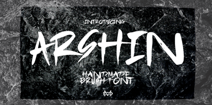 Arshin is a handmade brush font. This font is perfect for poster design, book covers, merchandise, fashion campaigns, newsletters, branding, advertising, magazines, greeting cards, album covers, and more. Features: - Uppercase & Lowercase - Numbers & Symbols - International Glyphs - Multilingual support - ligatures Enjoy it.
 - Debaya by Sensatype Studio,
$15.00 Debaya is an Old Retro Vintage Font An Old Retro Vintage font that special created with Display style for Headline Vintage Retro Project, Unique branding needs, with extra alternates in unique style that ready to add value of your brand. Debay Old Retro Vintage Font ready with: Lowercase and Uppercase characters Numbers and Punctuations Preview as a inspirations that you can do with Montainous font Available for PC and Mac Wish you enjoy our font.
 - MC Eddger by Maulana Creative,
$16.00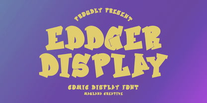 Eddger comic display font. Heavy stroke, fun character with a bit of ligatures. To give you an extra creative work. Eddger comic display font support multilingual more than 100+ language. This font is good for logo design, Social media, Movie Titles, Books Titles, a short text even a long text letter and good for your secondary text font with script or serif. Make a stunning work with Eddger comic display font. Cheers, Maulana Creative
 - LetterOMatic!, crafted by the renowned font foundry Blambot Fonts, is an epitome of creativity and functionality meshed into one captivating typeface. Blambot Fonts, known for its extensive collectio...
- Mage Candy by Mightyfire,
$15.00 Introducing Mage Candy - Multilingual Handwritten Comic Font, a whimsical and lively typeface that brings the charm of hand-drawn comic elements to your design projects. This font is a celebration of creativity and spontaneity, capturing the essence of playful doodles and energetic illustrations. With its irregular strokes and quirky letterforms, Mage Candy - Multilingual Handwritten Comic Font exudes a sense of authenticity, as if each character was crafted by a skilled comic book artist's pen. The characters dance across the page with a dynamic rhythm, creating a visual experience that is both entertaining and engaging. I hope you enjoy in creating something awesome using Mage Candy. Thank you! :)
 - Ongunkan Irk Bitig Viking by Runic World Tamgacı,
$99.00 This is the Viking font that I developed based on the letters in the Irk Bitig book, which is written with the brush line of the old Turkish runic alphabet, the information below. It was interesting work. Irk Bitig or Irq Bitig (Old Turkic: 𐰃𐰺𐰴 𐰋𐰃𐱅𐰃𐰏), known as the Book of Omens or Book of Divination in English, is a 9th-century manuscript book on divination that was discovered in the "Library Cave" of the Mogao Caves in Dunhuang, China, by Aurel Stein in 1907, and is now in the collection of the British Library in London, England. The book is written in Old Turkic using the Old Turkic script (also known as "Orkhon" or "Turkic runes"); it is the only known complete manuscript text written in the Old Turkic script. It is also an important source for early Turkic mythology.
 - Generis Slab by Linotype,
$29.00The idea for the Generis type system came to Erik Faulhaber while he was traveling in the USA. Seeing typefaces mixed together in a business district motivated him to create a new type system with interrelated forms. The first design scheme came about in 1997, following the space saving model of these American Gothics. Faulhaber then examined the demands of legibility and various communications media before finally developing the plan behind this type system. Generis’s design includes two individually designed styles; each of with is available with and without serifs, giving the type system four separate families. Each includes at least four basic weights: Light, Regular, Medium, and Bold. Further weights, small caps, old style figures, and true italics were added to each family where needed. The Generis type system is designed to meet both optical criteria and the highest possible measure of technical precision. Harmony, rhythm, legibility, and formal restraint make up the foreground. Generis combines aesthetic, technical, and economic advantages, which purposefully and efficiently cover the whole range of corporate communication needs. The unified basic form and the individual peculiarity of the styles lead to Generis’ systematic, total-package concept. The clear formal language of the Generis type system resides beneath the information, bringing appropriate typographic expression to high-level corporate identity systems, both in print and on screen. The condensed and aspiring nature of the letterforms allows for the efficient setting of body copy, and the economic use of the page. A range of accented characters allows text to be set in 48 Latin-based languages, offering maximal typographic free range. This previously unknown level of technical and design execution helps create higher quality typography in all areas of corporate communication. Optimal combinations within the type system: Generis Serif or Generis Slab with Generis Sans or Generis Simple. - Generis Serif by Linotype,
$29.00The idea for the Generis type system came to Erik Faulhaber while he was traveling in the USA. Seeing typefaces mixed together in a business district motivated him to create a new type system with interrelated forms. The first design scheme came about in 1997, following the space saving model of these American Gothics. Faulhaber then examined the demands of legibility and various communications media before finally developing the plan behind this type system. Generis’s design includes two individually designed styles; each of with is available with and without serifs, giving the type system four separate families. Each includes at least four basic weights: Light, Regular, Medium, and Bold. Further weights, small caps, old style figures, and true italics were added to each family where needed. The Generis type system is designed to meet both optical criteria and the highest possible measure of technical precision. Harmony, rhythm, legibility, and formal restraint make up the foreground. Generis combines aesthetic, technical, and economic advantages, which purposefully and efficiently cover the whole range of corporate communication needs. The unified basic form and the individual peculiarity of the styles lead to Generis’ systematic, total-package concept. The clear formal language of the Generis type system resides beneath the information, bringing appropriate typographic expression to high-level corporate identity systems, both in print and on screen. The condensed and aspiring nature of the letterforms allows for the efficient setting of body copy, and the economic use of the page. A range of accented characters allows text to be set in 48 Latin-based languages, offering maximal typographic free range. This previously unknown level of technical and design execution helps create higher quality typography in all areas of corporate communication. Optimal combinations within the type system: Generis Serif or Generis Slab with Generis Sans or Generis Simple. - Generis Simple by Linotype,
$39.00The idea for the Generis type system came to Erik Faulhaber while he was traveling in the USA. Seeing typefaces mixed together in a business district motivated him to create a new type system with interrelated forms. The first design scheme came about in 1997, following the space saving model of these American Gothics. Faulhaber then examined the demands of legibility and various communications media before finally developing the plan behind this type system. Generis’s design includes two individually designed styles; each of with is available with and without serifs, giving the type system four separate families. Each includes at least four basic weights: Light, Regular, Medium, and Bold. Further weights, small caps, old style figures, and true italics were added to each family where needed. The Generis type system is designed to meet both optical criteria and the highest possible measure of technical precision. Harmony, rhythm, legibility, and formal restraint make up the foreground. Generis combines aesthetic, technical, and economic advantages, which purposefully and efficiently cover the whole range of corporate communication needs. The unified basic form and the individual peculiarity of the styles lead to Generis’ systematic, total-package concept. The clear formal language of the Generis type system resides beneath the information, bringing appropriate typographic expression to high-level corporate identity systems, both in print and on screen. The condensed and aspiring nature of the letterforms allows for the efficient setting of body copy, and the economic use of the page. A range of accented characters allows text to be set in 48 Latin-based languages, offering maximal typographic free range. This previously unknown level of technical and design execution helps create higher quality typography in all areas of corporate communication. Optimal combinations within the type system: Generis Serif or Generis Slab with Generis Sans or Generis Simple. - Generis Sans by Linotype,
$29.00The idea for the Generis type system came to Erik Faulhaber while he was traveling in the USA. Seeing typefaces mixed together in a business district motivated him to create a new type system with interrelated forms. The first design scheme came about in 1997, following the space saving model of these American Gothics. Faulhaber then examined the demands of legibility and various communications media before finally developing the plan behind this type system. Generis’s design includes two individually designed styles; each of with is available with and without serifs, giving the type system four separate families. Each includes at least four basic weights: Light, Regular, Medium, and Bold. Further weights, small caps, old style figures, and true italics were added to each family where needed. The Generis type system is designed to meet both optical criteria and the highest possible measure of technical precision. Harmony, rhythm, legibility, and formal restraint make up the foreground. Generis combines aesthetic, technical, and economic advantages, which purposefully and efficiently cover the whole range of corporate communication needs. The unified basic form and the individual peculiarity of the styles lead to Generis’ systematic, total-package concept. The clear formal language of the Generis type system resides beneath the information, bringing appropriate typographic expression to high-level corporate identity systems, both in print and on screen. The condensed and aspiring nature of the letterforms allows for the efficient setting of body copy, and the economic use of the page. A range of accented characters allows text to be set in 48 Latin-based languages, offering maximal typographic free range. This previously unknown level of technical and design execution helps create higher quality typography in all areas of corporate communication. Optimal combinations within the type system: Generis Serif or Generis Slab with Generis Sans or Generis Simple. - Austin Antique by HiH,
$10.00 “More is better” may have been the motto of Richard Austin of Austin and Son’s Imperial Letter-Foundry on Worship Street at Finsbury Square in London when he designed and cut his Antique typeface. The year it was created is uncertain, but it is known to have appeared in a specimen book produced in 1827. At first glance, the upper case letters of Austin Antique look very much like Figgins Antique. But, upon examination, one will note that the Austin face is much darker. In general, the letters designed and cut by Richard Austin have fatter strokes, larger serifs and smaller counters -- more metal and less daylight. The premise was that the darker the letter, the more attention an ad using the typeface would receive. In old pictures of London and Paris one may see walls crowded with posters and “bills” -- competing for the attention of the passerby. Morris and Updike aside, the early nineteenth century marked the beginning of a commercial as well as industrial revolution. Patterns of commerce were changing. With new methods of marketing came the need for new typefaces to support the new methods. Foundries found the display types were very profitable and competed most energetically and creatively for the trade. There was a lot of trial-and-error. Some ideas faded away. Others, like the Antiques or Egyptians, were refined and developed. From them came the Clarendons that were to prove both popular and long lasting -- because they worked. Their job was to sell goods, not please the aesthetic sensibilities of the critics. They did their job well. Austin Antique has a full Western European character set, plus the following ligatures: ct, st, fi, fl, ff, ffi and ffl. Tabular numbers. Surprisingly readable.
 - Chupa10 - Unknown license

- Niobium - Unknown license

- Loop by Fontmill Foundry,
$15.00Loop started off as a few glyphs drawn up for a commercial job and evolved into a family with 6 weights. - Jantar Flow by CAST,
$45.00 Jantar Flow is a humanist sanserif type family tailored for continuous reading for both printing and screen. With its large x-height and low contrast it also performs very well in captions, side notes, and short paragraphs set in small sizes. Jantar Flow Italic is distinct and readable. Following a proper italic construction, it shows the fun side of the family yet keeps the features of the upright. Jantar Flow – as well as its teammate Jantar Sharp – comes in seven weights from ExtraLight to Heavy, each with accompanying italics. It has a tabular and proportional set of figures in both old style and lining options, and also a special set of hybrid figures sitting between x-height and capitals. Superscripts and subscripts are provided together with a vast collection of diacritics covering all European languages as well as a set of case-sensitive characters. Jantar, the pairing superfamily. ‘Jantar’ is an old Polish name for ‘amber’, a fossilised resin – a substance that is robust and organic at the same time. These qualities somehow reflect the feeling behind the Jantar families, ‘Flow’ and ‘Sharp’. Jantar Flow was designed along with Jantar Sharp. As part of the Jantar superfamily these two faces are perfectly paired: though not based on the same skeleton, they share the same design parameters and the same character set, but each one works independently with its peculiar features. Designed for publishing for print and web, as well as for branding, the Jantar superfamily was inspired by common font pairings of the digital age like Helvetica/Times or Verdana/Georgia. Jantar Flow and Jantar Sharp communicate with individual yet complementing voices, just like two trained acrobats can perform alone but also know well how to perform together.
 - Woodball by Intellecta Design,
$25.90a vintage remastered typeface, from the olds penmancraft booklets - LD Santa Fe by Illustration Ink,
$3.00Celebrate the old American West with LD Santa Fe. - Ale's Script by Oporto Design,
$9.90 Ale's Script was designed for comics and fun writing.
 - Hebrew Dot III by Samtype,
$34.00 Beautiful font to use in Book covers and Posters.
 - Fat Rhino by Pink Broccoli,
$14.00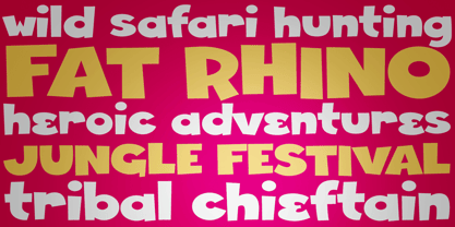 A heavyweight playful typeface with a children's comic feel.
 - Angry Ronin by Artcity,
$16.00 Font designed for lettering dialogue baloons in comic books.
 - Hebrew Dot by Samtype,
$34.00 Beautiful font to use in Book covers and Posters.
 - SL Titanes Pro by Sudtipos,
$25.00 An hommage to the catch show with comic influences.
 - Buddy Lotion by PizzaDude.dk,
$15.00A grafitti and comic like font trapped inside boxes! - Hello Arson by Dismantle Destroy,
$19.00 This font is great for CD covers and posters.
 - Hebrew Dot II by Samtype,
$34.00 Beautiful font to use in Book covers and Posters.
 - Fatality by Artcity,
$9.00 Font designed for lettering dialogue baloons in comic books.
 - Secession by HiH,
$14.00 Secession is a very readable typeface, suitable for short blocks of text. If you have grown weary of the standard sans-serif faces one sees all the time, you may want to use Secession as a fresh and distinctive substitute. Like Kunstler Grotesk, Secession is one of a number of typeface designs that attempts to reconcile Germany’s blackletter tradition with the international familiarity of roman letterforms in a simple, robust design suitable for meeting the demands of a modern industrial economy, while rejecting the extraneous ornamentation of the departing Victorian era. Unlike Kunstler Grotesk, Secession was designed with a lower case. Secession Bold was originally jointly released as Halbfette Secession by Bauer & Company of Stuttgart and H. Berthold AG of Berlin around 1898. The rest of the family was designed by HiH. The basic family of four: Text, Oblique, Bold and BoldOblique are available in two versions: one set with the standard contemporary lining or ranging numerals for spreadsheets and tables and one set of old-style figures (with OSF in font name) for use with text. The two versions of the basic family, Secession and Secession OSF were released in July 2006. Cousins include ExtraBold, SCOSF Text, and two multi-lingual versions of the text weight. Secession ML includes the Latin Extended-A character set in unicode format plus 17 ligatures and a few strays. Secession GreekML has all the characters of the ML version plus the unicode Greek set and 17 Greek ligatures. Release of the cousins took place in August and October of 2006. Click on BUYING CHOICES. Click on GLYPHS and use drop-down menus and slider to see the all the glyphs for the various fonts. Similar: Birmingham (Ref 100 Ornamental Alphabets, Solo); Spartana (Art Nouveau Display Alphabets, Solo)
 - Guhly by Ingo,
$35.00 A modern Sans Serif — prosaic, designed geometrically, beautiful in large sizes All the dimensions of the font are based on Factor 10. The general principle of construction leads to slim forms and nearly equally wide characters. So the font appears very solid but is actually difficult to decipher in longer texts. Along with the ”normal“ Guhly Regular there are also the two versions Guhly Light and Guhly Bold, whereas in each only the vertical strokes [Guhly Light] or horizontal [Guhly Bold] have been changed in strength. The result is a very individual decorative effect which slightly reflects old circus and western scripts. The lower case characters in the version Guhly Book are, therefore, optimized to be suitable for longer texts in smaller font sizes — because after all, sometimes you should read a bit more than just the headline… The design of a shampoo bottle stands behind the creation of this sans serif display font. Prominent, clearly constructed forms with circular arcs define its appearance. This is a font primarily designed for use with capital letters — for all sorts of advertising purposes, headlines and titles. But lower case letters also belong to a good functional font; so, of course, Guhly includes them and ligatures for the more ”critical“ letter combinations as well as stylistic alternates for the letters K (or k), V (v) and o. As a decorative “encore”, the Guhly family also contains the “normal” weight in two variants: on the one hand the Guhly Cutout – these are letters without counter, as if the letters were cut out and the internal surfaces fell out; and on the other hand the Guhly stencil – as the name suggests, a stencil font with the typical bars that give a stencil the necessary cohesion.


