10,000 search results
(0.037 seconds)
- Flatstock - 100% free

- LOL! - Personal use only

- Clocko by upirTYPO,
$7.00 Clocko automatically turns the time stamp text into an analog clocks using the OpenType ligatures. Even when the ligatures are turned off, the time is still visible and readable, and it does not change or ruin the layout. Perfect for web usage and even for small sizes. For a crisp look, please use sizes divisible by 30, for example 30pt or 60pt. To make a custom analog clock, type any uppercase or lowercase letter to have a border (see previews for examples), and then type the time in 12 hour or 24 hour format with or without seconds. Use colon, comma, semicolon, hyphen, period or plus as a separator. Few examples: 12:45 9:25:46 10.50 13:30.10 The borders can be mixed together for more interesting look, please see the screenshots above. An additional background shape can be added to the clocks by typing a symbol (! # $ % & ( ) < = > ) as a first character, for example %A12:40:55. Please note that in order to keep the clocks visible, the background shape and the clocks need to have a different colors.
 - ITC Batak by ITC,
$29.99In Northern Sumatra, the crystal clear waters of Lake Toba lap gently against the surrounding mountains. In the middle of the lake sits the island of Samosir, for centuries the secluded home of the Batak people. Visitors arrive by ferry into the tiny town of Tuk Tuk, escaping the heat and humidity of the Sumatran jungle. Throughout the village, restaurants and guest houses are adorned with hand-painted signs in bright colors. Perhaps due to Sumatra's long history of European colonization, the letterforms are reminiscent of those used for posters and handbills in America and Europe at the end of the 19th century, but with a distinctly Southeast Asian flavor. Charles Nix, intrigued by the combination of Victorian fancy and Batak arabesque, photographed, sketched and translated the letterforms into a design that is now ITC Batak. Named for the proud ancestors of Samosir's inhabitants, it is a bold condensed letter with hexagonal serifs - a sort of properly dressed grotesque. Batak is available in either Condensed or Condensed Bold. - Otherslide by IbeyDesign,
$17.00 Otherslide Handwritten Script Font is a beautiful and stylish handwritten font. It looks stunning on a variety of designs that need a natural touch.
 - So love by Sulthan Studio,
$12.00 So Love is a cute and adorable handwritten script font. It’s perfect for branding, logos, wedding invitations, diaries, cups, mugs, greeting cards, and more.
 - Coastland by Epiclinez,
$19.00 Coastland is a pretty handwritten script font. It’s simple and friendly style makes this font incredibly versatile, fitting a wide variety of creative ideas.
 - JH Mars by JH Fonts,
$50.00 JH Mars is a modern style typeface; it is designed based on old Koufi, Maghribi & Diwani scripts, typical for corporate identity, headlines, branding & signage...
 - Ashby by Corien’s Handwritingfonts,
$24.00 Ashby is a Spencerian based handwritten script, with elegant capital letters. Written with a flexible nib, which results in some beautiful line width variation.
 - Strongloves by FHFont,
$17.00 Strongloves is dry brush, hand-lettered script. It is suitable for design, element design, weddings, events, t-shirt, logos, badges, sticker, and awesome work.
 - Barokah Ramadhan by Gartype Studio,
$17.00 Barokah Ramadhan is script font inspired by arabic alphabet / calligraphy,come with alternate and multilingual features.This font very suitable for your arabic stylish design.
 - Moonlight In Tokyo by Epiclinez,
$18.00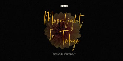 Moonlight In Tokyo is an authentic signature script font. This handwritten beauty is suitable from high-end sophisticated branding to simple memorable Instagram quotes.
 - Purify Signature by Aestherica Studio,
$9.00 Purify Signature is a modern and simple handwritten script font. Contemporary and fashionable, this font will look great for a wide variety of projects.
 - Jack Smith by Epiclinez,
$18.00 Jack Smith is a signature script font with a natural handwritten feel. This font is a good choice for branding and logotype design projects.
 - Ontime by Fontysia,
$15.00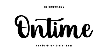 Ontime is a modern handwritten script font! This font is perfect for shirt designs, websites, branding, quotes, children's designs, blogs, logos, invitations and more!
 - Gallegos by profonts,
$51.99 Gallego Pro is a classical, pen-drawn upright script useful for many applications, e.g. book titles, ads, magazines or any kind of display work.
 - Dephiana by Nurf Designs,
$19.00 Dephiana is an elegant and bold stylish script font. Great for logos, wordmarks & signboard. Has several stylistic alternates that can be used as needed.
 - Navigate by Arendxstudio,
$15.00 Navigate is an elegant hand made with brush script and is perfect for wedding card designs, logotype, website headers, fashion design and much more.
 - Hortensia by ParaType,
$30.00Hortensia™ was designed by Natalia Vasilyeva and licensed by ParaType in 2001. An original calligraphic script. For use in advertising and display typography. - Quadrica by Sesa Grafika,
$32.00 Quadrica is a stylish, retro script font. Its unique letterforms make this font perfect for logos, social media posts, packaging, magazine covers, and more.
 - Bloena by Fype Co,
$14.00 Introducing Bloena casual handwritten script. Great for magazine layouts, crafting, branding, posters, websites, social media, greeting cards, invitations, mugs, frames, and so much more.
 - Luxe by Baseline Fonts,
$24.00Luxe is a casual, script style font designed to provide hep and playful results. Extended character set includes foreign language support for many countries. - Butter Milky by FHFont,
$19.00 Butter Milky is script font with handwritten vintage calligraphy style, with OpenType feature include of the font. Suitable for design, element design, event, logo.
 - Oh Beloved by Nissa Nana,
$19.00 Oh Beloved is a beautiful script font with a classy, elegant, and modern look. It will add a personal touch to any design project!
 - Lioness by Epiclinez,
$18.00 Lioness is a stunning script font with a strong character. It is suitable for logo, branding, packaging, apparel, wedding invitations, social media, and more.
 - Dominique by profonts,
$51.99 Distinctive and informal, this unusual script type style is suitable for a wide variety of display applications, particularly where a casual effect is desired.
 - Zinekiss by Pedro Teixeira,
$12.00 Zinekiss - for the love of black ink and zine culture. Zinekiss, is a font with a very natural/organic handrawn script of black ink
 - Nolita by Sakha Design,
$12.00 Introducing the Nolita Font Duo, a classy pair of script and serif fonts. Nolita offers beautiful typographic harmony for a diversity of design projects.
 - Minnie Brush by Lebbad Design,
$24.95 Minnie Brush is an modern upright brush script. This curly rough textured font is great for display use. It comes with numerous alternate characters.
 - Laredo by profonts,
$51.99 Distinctive and informal, this unusual script type style is suitable for a wide variety of display applications, particularly where a casual effect is desired.
 - Vesna by ParaType,
$30.00PT Vesna™ was designed by Natalia Vasilyeva in 2000. Licensed by ParaType. An original calligraphic script for use in advertising and display typography. - Caramello by FHFont,
$17.00 Caramello is a handwritten script font with signature style. Suitable for element design, weddings, events, t-shirts, logos, badges, stickers, and other awesome work.
 - Manita Px by Letradora,
$10.00 Manita is a quirky, humorous unicase face, reminiscent of comic lettering. Supports most Central and Western European scripts. Includes ligatures and several fun dingbats!
 - WindSong by TypeSETit,
$39.95 WindSong is a beautiful elongated script with extensive OpenType programming that gives a powerful solution to the design needs of the graphic design professional.
 - Komentator by Arendxstudio,
$13.00 Komentator is a monoline vintage script typeface which is created based on manual hand lettering with many features such as, stylistic set alternate, swashes.
 - Little Tokyo by Epiclinez,
$18.00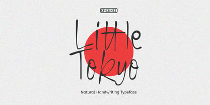 Little Tokyo is an authentic signature script font. This natural style handwritten font is suitable for various projects, such as logos, branding and packaging.
 - Fino by TypeTogether,
$35.00 Tall, stately, and refined, with a showy contrast between thick and thin, a certain kind of titling Didone has become synonymous with fashion. Ermin Međedović’s latest type system amplifies the most theatrical aspects of this genre while bringing an uncommon flexibility of style and variation to any type palette — particularly those required for editorial design. Fino is a Rational (or Modern) display serif with sharp details. Its fairly Title proportions produce a regular beat of bold stems at frequent intervals. One can add an unexpected twist to this plot line by introducing the alternate ‘C, D, G, O, and Q’ (found in the uppercase); these replace the standard, Title oval shapes with big, full, show-stopping round ones. Other alternate forms, along with a grand ensemble cast of ligatures, lets the director continually flip the script. This stage is set in three acts: Fino, Fino, and Fino Stencil. Each of these offer six weights and italics, and each actor is comfortable speaking any Latin-based language, from standard Hollywood English to the many accents of Eastern Europe. Finally, every style comes in two optical sizes, with Title having the finest hairlines for the biggest parts. This lets you put Fino to work in a variety of productions, from short texts (24pt–48pt settings) to epic titles. The complete Fino family, along with our entire catalogue, has been optimised for today’s varied screen uses. All these talents let Fino perform a range of roles far broader than your typical Bodoni or Didot.
 - Seventies by Lián Types,
$37.00 'Meeeeoooow'! Seventies is another of my 'funkadelic' attempts (1) to fill the existing gap of seventyish looking fonts. In my opinion, that decade has a hidden treasure regarding type that remains unexplored: Only very few fonts rescue its 'groovy' essence, its ‘colourful’ qualities. But, don't have a cow man , and keep on truckin! With Seventies, my new foxy mama , your projects will stand out among the rest. Since there’s not much information available about this kind of lettering I had to get ideas from other styles: Nowadays it’s easy to find all kind of books or guides to understand and practice how different styles of calligraphy and lettering should be done. However, for some reason, 60s and 70s letters seemed to ignore/be free of rules... Was this suggesting the birth of postmodernism? I incorporated some ideas of the copperplate style of calligraphy: The ductus of its forms may be compared to the way letters are made in snell/engrosser’s script. Obviously, this is just the idea behind; the delicacy of thins is replaced here with the graceful imprint of really thick thicks with a brushy look and tons of good vibe . Seventies will work awesome in posters, brands, magazines, book-covers of any kind, due to its modern look adapted to our century. Well, catch you on the flip~side ! STYLES To make you more psyched , Seventies is a layered font! See examples in the posters using Seventies Shade, Seventies Shine and Seventies Printed. NOTES (1) My first one was with Beatle in 2014.
 - Really No 2 W2G by Linotype,
$124.99Really No. 2 is a redesign and update of Linotype Really, a typeface that Gary Munch first designed in 1999. The new Really No. 2 offers seven weights (Light to Extra Bold), each with an Italic companion. Additionally, Really No. 2 offers significantly expanded language support possibilities. Customers may choose the Really No. 2 W1G fonts, which support a character set that will cover Greek and Cyrillic in addition to virtually all European languages. These are true pan-European fonts, capable of setting texts that will travel between Ireland and Russia, and from Norway to Turkey. Customers who do not require this level of language support may choose from the Really No. 2 Pro fonts (just the Latin script), the Really No. 2 Greek Pro fonts (which include both Latin and Greek), or the Really No. 2 Cyrillic Pro fonts (Latin and Cyrillic). Each weight in the Really No. 2 family includes small capitals and optional oldstyle figures, as well as several other OpenType features. Really No. 2's vertical measurements are slightly different than the old Linotype Really's; customers should not mix fonts from the two families together. As to the design of Really No. 2's letters, like Linotype Really, the characters' moderate-to-strong contrast of its strokes recalls the Transitional and Modern styles of Baskerville and Bodoni. A subtly oblique axis recalls the old-style faces of Caslon. Finally, sturdy serifs complete the typeface's realist sensibility: a clear, readable, no-nonsense text face, whose clean details offer the designer a high-impact selection. - Really No 2 Paneuropean by Linotype,
$103.99Really No. 2 is a redesign and update of Linotype Really, a typeface that Gary Munch first designed in 1999. The new Really No. 2 offers seven weights (Light to Extra Bold), each with an Italic companion. Additionally, Really No. 2 offers significantly expanded language support possibilities. Customers may choose the Really No. 2 W1G fonts, which support a character set that will cover Greek and Cyrillic in addition to virtually all European languages. These are true pan-European fonts, capable of setting texts that will travel between Ireland and Russia, and from Norway to Turkey. Customers who do not require this level of language support may choose from the Really No. 2 Pro fonts (just the Latin script), the Really No. 2 Greek Pro fonts (which include both Latin and Greek), or the Really No. 2 Cyrillic Pro fonts (Latin and Cyrillic). Each weight in the Really No. 2 family includes small capitals and optional oldstyle figures, as well as several other OpenType features. Really No. 2's vertical measurements are slightly different than the old Linotype Really's; customers should not mix fonts from the two families together. As to the design of Really No. 2's letters, like Linotype Really, the characters' moderate-to-strong contrast of its strokes recalls the Transitional and Modern styles of Baskerville and Bodoni. A subtly oblique axis recalls the old-style faces of Caslon. Finally, sturdy serifs complete the typeface's realist sensibility: a clear, readable, no-nonsense text face, whose clean details offer the designer a high-impact selection.

