7,991 search results
(0.023 seconds)
- Stuph by Tail Spin Studio,
$25.00Stuph Light is a collection of drawings pulled from one of the many sketch books Steve Zafarana is always doodling in. Because they are in a font, the drawings can be used in font format or opened and manipulated in vector programs like Freehand or Illustrator. Stuph Light continues to inflict upon an unsuspecting public Steves’ cockeyed outlook on the world that was started with ITC Fontoonies, ITC Gargoonies and ITC Backyard Beasties. Will this lunacy ever end? - Grapine by HansCo,
$19.00 Grapine is a Vintage typeface font. This collection of font is perfect for everything your project with vintage, retro, wild or organic style. It was made with the intention of being used for product Logo like a pomade, coffe, barber or packaging label. It’s great also for branding, logo designs, lettering, logotype, craft, posters and much more. Comes with a full uppercase, lowercase, numbers and punctuation + standard multilingual support. We recommend using Adobe Illustrator or Photoshop. Enjoy!
 - Vintage Wedding by Edyta Demurat,
$40.00 Vintage Wedding is a collection of 432 icons, divided into 4 categories. These symbols were selected and created in order to bring to mind the past times, yet at the same time, to retain the modern design. You can find here such rare and beautiful objects as phonograph or cult eyeglasses. The font includes many diverse elements, which will help you create compositions out of flowers, to choose commemorative vases, and even to dress the bride and groom!
 - Victorian Alphabets by Intellecta Design,
$24.00 Victorian Alphabets is a incoming family of complete victorian style alphabets, researched and developed upon a comprehensive number of vintage books, magazines and catalogues from XIX century. The "Victorian Alphabets A" font has just A' designs, performing 52 differnt A's to your use. And the Victorian Alphabets B and C has, too 52 B and C letters, only, each. You also can take a look in our massive collection of monograms, here : https://www.myfonts.com/fonts/intellecta/intellecta-monograms/
 - Gravitas by Studio K,
$45.00 This font owes its inspiration to the Bauhaus, the celebrated 1920s design collective which more or less invented modernism as we know it in the applied arts: from architecture and industrial design to graphics and typography. In its day, Bauhaus typography would have been considered brutally modern. Nowadays, when unadorned sans serifs are commonplace, it still has a freshness and quirkiness that sets it apart. With this new release I've tried to recapture the zeitgeist of those pioneering days.
 - Quilany by DYSA Studio,
$19.00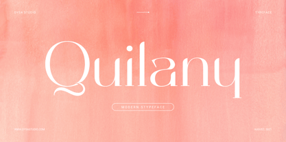 Quilany is a New Modern Serif Typeface. This another collection of Serif is perfect for your next branding project, excellent for your business. Quilany have a smooth edges, so this font gives an authentic handcrafted feel style. Quilany is perfect choice for people looking for clean, modern, minimalist, elegant, beauty design styles. Suitable for almost any graphic designs such as logo, branding materials, business cards, gift cards, t-shirt, cover, thumbnail, print, poster, photography, quotes .etc
 - Rawgly by DYSA Studio,
$19.00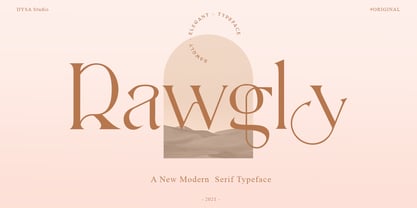 Rawgly is a New Modern Serif Typeface. This another collection of Serif is perfect for your next branding project, excellent for your business. Rawgly have a smooth edges, so this font gives an authentic handcrafted feel style. Rawgly is perfect choice for people looking for clean, modern, minimalist, elegant, beauty design styles. Suitable for almost any graphic designs such as logo, branding materials, business cards, gift cards, t-shirt, cover, thumbnail, print, poster, photography, quotes .etc
 - Alecto by Scriptorium,
$12.00For our modern/futuristic fonts collection we wanted something truly science fictional, so Dave Nalle designed the Alecto font, an original design with a futuristic look, but some echoes of the type designs and lettering of the Arts & Crafts period. It looks much more modern, but you can see echoes of some of our other fonts like Semiramis in the design. Alecto features multiple versions of many of the characters to make it ideal for designing logos and titles. - Worriment by The Ampersand Forest,
$20.00 Worriment is a simple, one-off typeface; part of the Dreads collection from the Ampersand Forest. He was born of a whimsical sense of queasiness and unease — he's not just scary, he's Scary Fun! A little kitsch, a little horror. Great for use on Halloween-themed designs, and reminiscent of a "wizarding" look. In terms of letterforms, Worriment is a quirky blackletter-latin hybrid with a sharp, slightly bouncy baseline, and jangly angles, suitable for display use.
 - Summer Paradise by DYSA Studio,
$19.00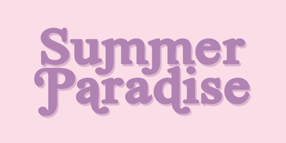 Summer Paradise a New Modern Serif Typeface. This another collection of Serif is perfect for your next branding project, excellent for your business. Summer Paradise have a smooth edges, so this font gives an authentic handcrafted feel style. Summer Paradise is perfect choice for people looking for clean, modern, minimalist, elegant, beauty design styles. Suitable for almost any graphic designs such as logo, branding materials, business cards, gift cards, t-shirt, cover, thumbnail, print, poster, photography, quotes .etc
 - Damian by I Can Be Your Type,
$10.00Damian is a font designed with simplicity in mind and a hint of flare to catch the attention of the user. The sans serif style is based off of the geometrical features of Futura and Univers. With the focus on the circle creating the forms this font is geared towards a feeling of modern art deco. The name comes from a colleague who asked to be named after the font, it was his birthday, how could I say no. - Gattermoon Handwritten Signature Font by Fontysia,
$12.00 Gattermoon Script takes you away for romantic rendezvous with your love of signature handwritten scripts. Slightly slick, slightly classy, Gattermoon is a must-have for any signature handwritten font collection. Gattermoon adds a different nuance because of its different slope. It's a little more cheerful and relaxed and tends to be more elegant. Perfect for: elegant branding, wedding stationery, romantic book cover designs, classy packaging, album covers, handwritten quotes, greeting cards, quirky social media posts and more.
 - Quensialy by DYSA Studio,
$19.00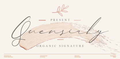 Quensialy is a new organic siganture font. This another collection of script is perfect for your next branding project, excellent for your business. Quensialy have a natural edges, so this font gives an authentic handcrafted feel style. Quensialy is perfect choice for people looking for clean, modern, minimalist, elegant, beauty design styles. Suitable for almost any graphic designs such as logo, branding materials, business cards, gift cards, t-shirt, cover, thumbnail, print, poster, photography, quotes .etc
 - Lazar by Discourse Type,
$5.00 Lazar takes its inspiration from the designs of early Russian designers like El Lissitzky. Designed initially as a custom font for a trainers collecting website it was expanded into a full family including a stencil, rounded and distressed styles. Lazar has a fresh and vibrant feel and is very flexible with its alternates lowercase characters, small caps and discretionary ligatures. It works well on posters, flyers and magazine. Mix all four styles to achieve unique typographic designs.
 - 1533 GLC Augereau Pro by GLC,
$42.00 This font was inspired by one of Antoine Augereau's three roman typefaces: the Gros Romain (±16 Pts) size, used in 1533 to print Le miroir de l'âme..., a religious poetic compilation by Marguerite de Navarre, sister of the French king François the first. It seems possible that Augereau may have also engraved italic styles. This alphabet, with its complete small caps collection, is covering all West, East and Central European languages (including Baltic and Celtic) and Turkish.
 - The Bold Street by Putracetol,
$21.00 Introducing The Bold Street. A Graffiti Style Font. Inspired by the graffiti art on the city streets, so I made it into a font. So that it will make it easier for you to make graffiti writing or designs. There are 54 ligatures that will make this font even cooler. so enjoy it! Suitable for many design project, branding, packaging, logo, wall art, headline, template, banner, poster, and so much more! This font is also support multi language.
 - Quietism High by Michael Rafailyk,
$20.00 Quietism High is an experimental subfamily that received a high contrast from Quietism Display and a high x-height from Quietism Text. It's still a Display typeface, albeit more graceful, wide and open. Other subfamilies: https://www.myfonts.com/collections/quietism-font-michael-rafailyk Scripts: Latin, Greek, Cyrillic. Languages: 480+ The promo images used “Sleeping Venus” painting by Giorgione, “The Creation of Adam” painting by Michelangelo, and “The Piazza and Church of Santa Maria Maggiore” painting by Giovanni Paolo Pannini.
 - 26 Flowers by Celebrity Fontz,
$24.99 26 Flowers is a digital revival and restoration of a beautiful collection of 26 individually unique ornamental letters from historical texts. Each of the 26 letters of the alphabet are contained in a square frame with a different flower in the background and an antique letter in the top right corner; hence, the name 26 Flowers. This highly ornamented typeface is perfect for leading off paragraphs or in any text dealing with the subject of flowers.
 - Bristone by Almarkha Type,
$29.00 Hello Everyone, Introduce our new collection, Bristone – Expanded Sans Family famous logos of Technology and brands that have very strong characteristics, Bristone has 6 Fonts that allow you to get a job with satisfying results. very suitable for posters, t-shirt, packaging, branding, logotype and more. Bristone font with strong and challenging nuances. very suitable for the title, typography, clothes, Poster, magazines, brochures, packaging,Websites and much more for your design needs, making your designs more modern and professional
 - Berkshire Pro by Stiggy & Sands,
$35.00 This family began with Berkshire Swash Pro, an alluring semi-sweet typestyle with a bold yet feminine flair to it. This was always meant to be a trio family, complete with Regular, Loops, and Swash Pro styles. See the last graphics for a comprehensive character map preview. Opentype features include: A collection of ligatures. Smallcaps. Full set of Inferiors and Superiors for limitless fractions. Tabular, Proportional figures for Berkshire Pro, and Oldstyle figure sets for Loops & Swash Pro.
 - Vintage Stencil Borders JNL by Jeff Levine,
$29.00 Vintage Stencil Borders JNL collects twenty-six decorative vintage and antique stencil border motifs for embellishing word copy set in stencil type or for any other decorative purpose. Please note: Commercial reproduction of these designs as stencils, stickers, decals, transfers, ink stamps or other decorative stand-alone products for resale requires a separate license. Contact Jeff Levine through the email address located in the PDF file provided with the font or from the online EULA text.
 - Rallisaguen by DYSA Studio,
$19.00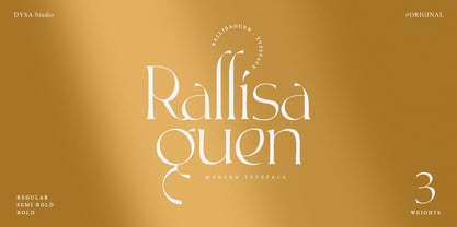 Rallisaguen is a New Modern Serif Font. This another collection of Serif is perfect for your next branding project, excellent for your business. Rallisaguen have a smooth edges, so this font gives an authentic handcrafted feel style. Rallisaguen is perfect choice for people looking for clean, modern, minimalist, elegant, beauty design styles. Suitable for almost any graphic designs such as logo, branding materials, business cards, gift cards, t-shirt, cover, thumbnail, print, poster, photography, quotes .etc
 - Monka by DYSA Studio,
$19.00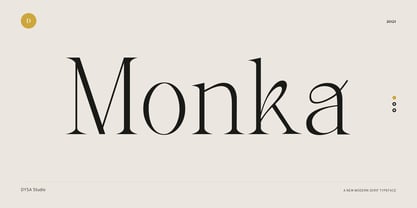 Monka is a New Modern Serif Typeface. This another collection of Serif is perfect for your next branding project, excellent for your business. Monka have a smooth edges, so this font gives an authentic handcrafted feel style. Monka is perfect choice for people looking for clean, modern, minimalist, elegant, beauty design styles. Suitable for almost any graphic designs such as logo, branding materials, business cards, gift cards, t-shirt, cover, thumbnail, print, poster, photography, quotes .etc
 - Mores by Graphicfresh,
$19.00 Mores - Minimal Sans Introducing a minimalist style font. Fonts that are suitable for branding, packaging, logos and others. This font comes in regular and medium formats. Including italics in it. If you like this font, don't forget to collect it and share it with your loved ones. If there are things you want to ask or problems you face with this font. Don't hesitate to ask us. Because we are very happy to help you. Thanks Graphicfresh
 - Rosiecated by sizimon,
$20.00 Introducing our New Collection, she is really pretty and sweet. Let's call Rosiecated, she's a stylish modern calligraphy with casual chic flair. She's perfect for packaging, wedding invites and cards, and branding. She will show you with a full set of lower & uppercase letters, a large range of punctuation, numerals, and multilingual support. What she have : Web Font PUA encode Multilingual support If you have any question please do not hesitate to contact me. Thank You!
 - Choxr by Almarkha Type,
$29.00 Hello Everyone, ntroduce our new collection, Choxr Font is inspired by famous logos of shoes and brands that have very strong characteristics, Choxr has 4 styles that allow you to get a job with satisfying results. very suitable for posters, tshirt, packaging, branding, logotype and more. Choxr font with strong and challenging nuances. very suitable for the title, typography, clothes, Poster, magazines, brochures, packaging,Websites and much more for your design needs, making your designs more modern and professional
 - Sailor Gothic by Design is Culture,
$39.00A font by Christian Acker (2003), based upon the practice of the Americana folk art tradition of tattoo design. Throughout the late 19th and 20th Centuries sailors would popularize and spread motifs, designs and styles by carrying this art around the world on their sleeves. A family of four fonts representing traditional styles is now available as a digital font. An accompanying collection of over 60 eps illustrations of tattoo "flash" are also available at cubanica.com. - Rotally by DYSA Studio,
$19.00 Rotally is a New Modern Serif Typeface. This another collection of Serif is perfect for your next branding project, excellent for your business. Rotally have a smooth edges, so this font gives an authentic handcrafted feel style. Rotally is perfect choice for people looking for clean, modern, minimalist, elegant, beauty design styles. Suitable for almost any graphic designs such as logo, branding materials, business cards, gift cards, t-shirt, cover, thumbnail, print, poster, photography, quotes .etc
 - Bakewell by Kimmy Design,
$25.00 Bakewell is the 4th typeface of the Winslow Type System. It's a low contrast sans-serif with ball terminals and a sweet disposition. The typeface includes a wide range of styles, widths and weights that make it a great addition to any type collection. From Narrow to Wide and Hairline to Bold, the font family offers extended optionality. Packed with Opentype Features, users can create one-of-a-kind designs perfectly tailored to their specific needs!
 - Fuel by VersusTwin,
$39.00 The Fuel typefaces are a modern update on the techno sans, complete with soft rounded corners as well as decorative inktraps. Stylistic Alternates included within all styles are alternates for the capital B, E, G, and R characters, as well as all of their accented siblings. The Fuel Complete package bundles all of the dynamic styles of the Fuel, Fuel Extended, Fuel Uni, Fuel Uni Extended, and Fuel Script typefaces into one powerhouse of a collection.
 - LiebeMenuLettering by LiebeFonts,
$19.90 LiebeMenuLettering is a collection of commonly used words and phrases found in restaurant signage and menus. Every phrase has been hand-lettered to give your menus or dinner invitations the handmade but professional look they deserve. The most frequently used restaurant terms from four different languages (English, Italian, French, and German) are included in this single font and can be used in any text or graphics application. Combine LiebeMenuLettering with our popular LiebeMenu and LiebeCook fonts.
 - Pomarosa by Andinistas,
$29.95 Pomarosa is a typographic family that consists of capital roman letters and twisted lower case letters set randomly. Each one of them is characterized by its multiple calibers and widths. Pomarosa was planned to accompany graphic works done with different techniques and materials such as hand made collages. The narrowness of its glyphs involve its audience with abstract imprecision. Its spirit was born between fabric snippets intervened with pencil and painting. Its three members work in group and also in words or phrases with a non-finished look. Regular Pomarosa and Standard Pomarosa have 260 glyphs each. Both of them simulate to have been done by a right-handed person that works with its left hand. Pomarosa dingbats has 26 illustrations useful for frames and textures.
 - Star Time Too JL is not merely a typeface but an embodiment of character and nostalgia, particularly for those with an affinity for the unique charm of retro aesthetics and the golden era of televisi...
- Rahere Sans by ULGA Type,
$18.98 Rahere is a humanist sans with subtle features that give the typeface a distinctive, warm appearance without distracting the reader. Legible at large and small sizes, Rahere is a versatile family suitable for a wide range of applications such as annual reports, advertising, brochures, catalogues, information signage, screen text and visual identities. For projects that need to convey a sense of authority or credibility, this is the ideal sans serif to use. The family consists of six weights ranging from light to extra bold with corresponding italics and the character set covers most of the major European languages. Each weight contains lining & non-aligning numerals in both proportional & tabular spacing. The tabular numerals share the same width across all weights and styles – a must for financial tables in annual reports. Spirited and lively, the italic lowercase is more cursive and calligraphic than the roman, although it harmonises perfectly, displaying enough character to create emphasis without looking out of place. When used on its own, for pull-out quotes or poetry, the italic exudes a charm that draws attention to the text. The typeface is named after Rahere, a 12th-century Anglo-Norman priest, who founded St Bartholomew's Hospital, London in 1123. I will always be indebted to Barts (as it is now commonly known) because in 2007 I was successfully treated for relapsed testicular cancer. Way back in 1992 I designed my first sans serif, Charlotte Sans, and although it was relatively successful, I was never really satisfied with the end result: not enough weights & italics, a small character set, lack of accented characters, and my design skills were still in their infancy. Whilst Rahere shares many common elements with Charlotte Sans, it is much more than just a reworking; it represents over 20 years of accumulated knowledge and experience as a designer.
 - Strenuous by Typodermic,
$11.95 Hey there, font fanatics. Feeling like your messages are falling flat and lacking some serious funk? Well, we’ve got just the typeface to turn that frown upside down! Introducing Strenuous, the unicase headline typeface with a fashion groove that’s sure to transport you straight back to the ‘1970s. But wait, there’s more! Strenuous isn’t just any old boring typeface—oh no. This baby is unique, distinctive, and funky. And with alternative uppercase and lowercase versions for some letters, you can mix things up and keep things interesting. And don’t even get us started on the eight weights and italics—this typeface is truly versatile and can handle anything you throw its way. So go ahead and give your message the voice it deserves with Strenuous. Your audience will thank you for the groovy vibes. Most Latin-based European writing systems are supported, including the following languages. Afaan Oromo, Afar, Afrikaans, Albanian, Alsatian, Aromanian, Aymara, Bashkir (Latin), Basque, Belarusian (Latin), Bemba, Bikol, Bosnian, Breton, Cape Verdean, Creole, Catalan, Cebuano, Chamorro, Chavacano, Chichewa, Crimean Tatar (Latin), Croatian, Czech, Danish, Dawan, Dholuo, Dutch, English, Estonian, Faroese, Fijian, Filipino, Finnish, French, Frisian, Friulian, Gagauz (Latin), Galician, Ganda, Genoese, German, Greenlandic, Guadeloupean Creole, Haitian Creole, Hawaiian, Hiligaynon, Hungarian, Icelandic, Ilocano, Indonesian, Irish, Italian, Jamaican, Kaqchikel, Karakalpak (Latin), Kashubian, Kikongo, Kinyarwanda, Kirundi, Kurdish (Latin), Latvian, Lithuanian, Lombard, Low Saxon, Luxembourgish, Maasai, Makhuwa, Malay, Maltese, Māori, Moldovan, Montenegrin, Ndebele, Neapolitan, Norwegian, Novial, Occitan, Ossetian (Latin), Papiamento, Piedmontese, Polish, Portuguese, Quechua, Rarotongan, Romanian, Romansh, Sami, Sango, Saramaccan, Sardinian, Scottish Gaelic, Serbian (Latin), Shona, Sicilian, Silesian, Slovak, Slovenian, Somali, Sorbian, Sotho, Spanish, Swahili, Swazi, Swedish, Tagalog, Tahitian, Tetum, Tongan, Tshiluba, Tsonga, Tswana, Tumbuka, Turkish, Turkmen (Latin), Tuvaluan, Uzbek (Latin), Venetian, Vepsian, Võro, Walloon, Waray-Waray, Wayuu, Welsh, Wolof, Xhosa, Yapese, Zapotec Zulu and Zuni.
 - Cooper Nouveau by House Industries,
$33.00 Few fonts reach cult status. Despite its ubiquity—and perhaps because of its lack of subtlety—for a hundred years Cooper continues to draw the faithful. It’s even come to define an entire typographic genre and recently starred in its own documentary. Cooper Nouveau is Dave West’s imaginative contribution to the Cooper oeuvre. Drawn in 1966, Nouveau refreshes Oswald Cooper’s original italic with an energetic pitch, simplified contours, and a plump friendly figure. Uniform strokes and generous curves push the font’s playful personality and springy silhouette even further. A selection of swashed characters and ligatures offers options for lively logos and strong captions. While Cooper Nouveau looks laid-back and easy-going, it’s more than capable of pulling it’s own typographic weight. Put it to work where relaxed needs to project confident. Set Nouveau large for eye-magnet posters, packaging, and advertisements. Maximize its youthful energy for kids’ themes, craft action, and apparel bounce. Or set it alongside a master like Benguiat Buffalo or Chalet to show how Cooper Nouveau can communicate on paper and screens with an inherent ability to speak the language of style in many tongues. But like any cult icon: beware! Cooper has a way of setting the needle, and Nouveau just may become your go-to design fix. FEATURES ALTERNATES: Cooper Nouveau contains several alternate characters, which add flair to your designs and can help solve spacing issues LIGATURES: Many letter combinations in Cooper Nouveau form a ligature to solve spacing issues and produce more pleasing designs. COOPER NOUVEAU CREDITS Typeface Design: Dave West Digitization: Dave Foster Typeface Direction: Ben Kiel, with Ken Barber Like all good subversives, House Industries hides in plain sight while amplifying the look, feel and style of the world’s most interesting brands, products and people. Based in Delaware, visually influencing the world.
 - Avenir Next Thai by Linotype,
$79.00 Avenir Next Pro is a new take on a classic face—it’s the result of a project whose goal was to take a beautifully designed sans and update it so that its technical standards surpass the status quo, leaving us with a truly superior sans family. This family is not only an update though; in fact it is the expansion of the original concept that takes the Avenir Next design to the next level. In addition to the standard styles ranging from ultralight to heavy, this 32-font collection offers condensed faces that rival any other sans on the market in on and off—screen readability at any size alongside heavy weights that would make excellent display faces in their own right and have the ability to pair well with so many contemporary serif body types. Overall, the family’s design is clean, straightforward and works brilliantly for blocks of copy and headlines alike. Akira Kobayashi worked alongside Avenir’s esteemed creator Adrian Frutiger to bring Avenir Next Pro to life. It was Akira’s ability to bring his own finesse and ideas for expansion into the project while remaining true to Frutiger’s original intent, that makes this not just a modern typeface, but one ahead of its time. Avenir Next Variables are font files which are featuring two axis, weight and width. They have a preset instance from UltraLight to Heavy and Condensed to Roman width. The preset instances are: Condensed UltraLight, Condensed UltraLight Italic, Condensed Thin, Condensed Thin Italic, Condensed Light, Condensed Light Italic, Condensed, Condensed Italic, Condensed Demi, Condensed Demi Italic, Condensed Medium, Condensed Medium Italic, Condensed Bold, Condensed Bold Italic, Condensed Heavy, Condensed Heavy Italic, UltraLight, UltraLight Italic, Thin, Thin Italic, Light, Light Italic, Regular, Italic, Demi, Demi Italic, Medium, Medium Italic, Bold, Bold Italic, Heavy, Heavy Italic.
 - Avenir Next Rounded by Linotype,
$42.99Avenir Next Pro is a new take on a classic face—it’s the result of a project whose goal was to take a beautifully designed sans and update it so that its technical standards surpass the status quo, leaving us with a truly superior sans family. This family is not only an update though; in fact it is the expansion of the original concept that takes the Avenir Next design to the next level. In addition to the standard styles ranging from ultralight to heavy, this 32-font collection offers condensed faces that rival any other sans on the market in on and off—screen readability at any size alongside heavy weights that would make excellent display faces in their own right and have the ability to pair well with so many contemporary serif body types. Overall, the family’s design is clean, straightforward and works brilliantly for blocks of copy and headlines alike. Akira Kobayashi worked alongside Avenir’s esteemed creator Adrian Frutiger to bring Avenir Next Pro to life. It was Akira’s ability to bring his own finesse and ideas for expansion into the project while remaining true to Frutiger’s original intent, that makes this not just a modern typeface, but one ahead of its time. Avenir Next Variables are font files which are featuring two axis, weight and width. They have a preset instance from UltraLight to Heavy and Condensed to Roman width. The preset instances are: Condensed UltraLight, Condensed UltraLight Italic, Condensed Thin, Condensed Thin Italic, Condensed Light, Condensed Light Italic, Condensed, Condensed Italic, Condensed Demi, Condensed Demi Italic, Condensed Medium, Condensed Medium Italic, Condensed Bold, Condensed Bold Italic, Condensed Heavy, Condensed Heavy Italic, UltraLight, UltraLight Italic, Thin, Thin Italic, Light, Light Italic, Regular, Italic, Demi, Demi Italic, Medium, Medium Italic, Bold, Bold Italic, Heavy, Heavy Italic. - Temeraire by TypeTogether,
$49.00 Quentin Schmerber’s Temeraire serif font family was not designed to be invisible. It is a typographic exploration meant to be seen — with its beauty, one could even say beheld. While some fonts aim to be as easily ignored as possible, Temeraire is offered as a gift to wide-eyed readers with its anything-but-boring character and its conspicuous inconsistency in styles. Most type families increase the weight of each character to expand the family. Instead, research into 17th century sources produced Temeraire’s wide range of letterforms, from the predictable to the odd and loosely related through time. Each style is designed to work alongside the others but are also standalone homages to specific parts of English lettering tradition: gravestone cutting, writing masters’ copperplates, Italiennes, and others. Temeraire’s Regular style is a contrast-loving Transitional Serif with vertical stress, making it great for period and classic works, ironic pieces, and modern throwbacks. The weight of the Bold squares off the ends of each glyph to give it stability, and the italic style rings true: flowing, contrasting, and purposefully inconsistent. Temeraire’s Display Black style is one salvaged from expressive gravestone artistry. The details most easily noticed are the ‘g’ with its descending bowl that has been pressed back up in the centre, and the additional serif on the ‘t’ crossbar that holds its neighbouring character at bay. (The ‘g’ and ‘Q’ have loopless alternates.) The final style is the Italienne, the horizontally stressed counterpoint to the family. By design its characters flow and bend in ways not in step with the rest of the family. All the weight has been pushed to either hemisphere within each glyph, resulting in a display style that demands space and peacefulness around it so its presence can impress. As with all TypeTogether families, Temeraire meets the current designer’s needs. Not only does its five styles shine in print work, it includes alternates for when the defaults are too boisterous and has been expertly crafted for screens. The Temeraire serif font family is resurrected from echoes in time and finds its family relation through impeccable taste.
 - Mariage by Linotype,
$40.99Morris Fuller Benton, the principal designer of the American Type Founders, designed Mariage in 1901. Mariage, which has been sold under a plethora of different names during the last century, is a blackletter typeface belonging to the Old English category. The term blackletter refers to typefaces that stem out of the historical printing traditions of northern Europe. These letters, called gebrochene Schriften, or "broken type" in German, are normally elaborately bent and distorted. Their forms often print large amounts of ink upon the page, creating text that leaves a heavy, black impression. The Old English style is a subset of blackletter type that dates back to 1498, when Wynken de Worde introduced textura style printing to England. Continental printers had been printing with textura style letters since Gutenberg's invention of the printing press fifty years earlier. Italian printers stopped using them around 1470. For northern Europeans, texturas remained the most popular form of typeface design until the invention of the fraktur style in Nuremberg. Mariage is heavily classicized sort of Old English type. During the Victorian era, designers admired the Middle Ages for its chivalric, community-based values and its pre-industrial lifestyle. Yet they also found the basic medieval textura letterform too difficult to read by present standards. They desired to modernize this old style. Today, this sort of update is often referred to not as "modernization" but as classicism. Benton's design for ATF builds upon earlier Victorian classicist interpretations of Old English/textura letters. For an example of what these Victorian designs looked like, check out the popular 1990 revival of the genre, Old English . Old English style types often appear drastically different from other blackletters. For contrast, compare Mariage to a classical German fraktur design, Fette Fraktur , a schwabacher style face, or the popular early 20th Century calligraphic gothic from Linotype, Wilhelm Klingspor Gotisch . Especially in the United States, classicist Old English typefaces are thought to espouse tradition and journalistic integrity. These features, together with the inherent, complex beauty of Mariage's forms, make this typeface a perfect choice for certificates, awards, and newsletter mastheads.