10,000 search results
(0.041 seconds)
- Callingstone by Heinzel Std,
$12.00 Callingstone is an elegant and modern sans serif font. Fall for its ravishing style and use it to create gorgeous wedding invitations, beautiful stationary art, eye-catching social media posts, and much more! This font is PUA encoded which means you can access all of the amazing glyphs and ligature with ease! Features : Callingstone Regular, sans serif font All Caps, Numerals and more punctuations. Multilingual support for various languages Open Type Format
 - Junior Clerk JNL by Jeff Levine,
$29.00 Junior Clerk JNL is the plain sans serif version of the lettering found on the cover of the sheet music for 1919's "The World is Waiting for the Sunrise". The song title was originally set in a decorative sans serif with an engraved line adorning each character. This version of the more fanciful design is available as the companion font Legal Eagle JNL. Junior Clerk JNL is available in both regular and oblique versions.
 - Brother Garage by Edignwn Type,
$18.00 Introducing Brother Garage, the ultimate vintage motorcycle-inspired font collection designed to bring the spirit of the garage to your designs. This combines the best of stencil serif and sans serif fonts. With three unique styles - regular, rough, and stamp - Brother Garage offers authenticity, allowing you to effortlessly bring your designs with the rustic and classic looks. But that's not all! Alongside the Brother Garage fonts, you'll receive a fantastic bonus of 13 crafted illustrations.
 - Norden by Heinzel Std,
$17.00 Norden is an elegant and modern all caps serif font. Fall for its ravishing style and use it to create gorgeous logos, headline, title, branding, wedding invitations, beautiful stationary art, eye-catching social media posts, and much more! This font is PUA encoded which means you can access all of the amazing glyphs with ease! Features : Norden Regular version, serif font All Caps, Numerals and more punctuations. Multilingual support for various languages
 - GLORY ANGEL by Masa Type,
$17.00 Glory Angel is a sophisticated ligature serif from us. This typeface has been made carefully to make sure its premium quality and luxury feel. The ligatures makes this typeface unique and stands out rather than the regular serif font. Very suitable for logo, headline, tittle, and the other various formal forms such as invitations, labels, logos, magazines, books, greeting / wedding cards, packaging, fashion, make up, stationery, novels, labels or any type of advertising purpose.
 - MC Sarscy by Maulana Creative,
$15.00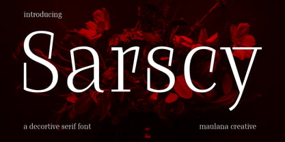 Sarscy is a decorative serif font. Regular stroke, fun character with a bit of ligatures and alternates. To give you an extra creative work. Sarscy font support multilingual more than 100+ language. This font is good for logo design, Social media, Movie Titles, Books Titles, a short text even a long text letter and good for your secondary text font with script or serif. Make a stunning work with Sarscy font. Cheers, Maulana Creative
 - Bodrum Stencil by Bülent Yüksel,
$19.00 Bodrum Collection: 1- Bodrum Sans 2- Bodrum Sweet 3- Bodrum Stencil 4- Bodrum Slab 5- Bodrum Styte 6- Bodrum Soft Bodrum Stencil is a stencil serif type family. Designed by Bülent Yüksel in 2018/19. The font, influenced by style serifs, popular in the 1920s and 30s, is based on optically corrected geometric forms for better readability. Bodrum Stencil is not purely geometric; it has vertical strokes that are thicker than the horizontals, an “o” that is not a perfect circle, and shortened ascenders. These nuances aid in legibility and give "Bodrum Stencil" a harmonious and sensible appearance for both texts and headlines. Bodrum Stencil provides advanced typographical support for Latin-based languages. An extended character set, supporting Central, Western and Eastern European languages, rounds up the family. The designation “Bodrum Stencil 14 Regular” forms the central point. "Bodrum Stencil" is available in 10 weights (Hair, Thin, Extra-Light, Light, Regular, Meduim, Bold, Extra-Bold, Heavy and Black) and 10 matching italics. The family contains a set of 650+ characters. Case-Sensitive Forms, Classes and Features, Small Caps from Letter Cases, Fractions, Superior, Inferior, Denominator, Numerator, Old Style Figures just one touch easy In all graphic programs. Bodrum Stencil is the perfect font for web use.
 - Bodrum Soft by Bülent Yüksel,
$19.00 You can download Bodrum Soft PDF Type Specimen here . "Bodrum Soft" is a rounded sans serif type family, designed by Bülent Yüksel in 20018/19. The font, influenced by serif styles that were popular in the 1920s and 30s, is based on optically corrected geometric forms for a better readability. "Bodrum Soft" is not purely geometric; it has vertical strokes that are thicker than the horizontals, an “o” that is not a perfect circle, and shortened ascenders. These nuances helps the legibility and gives "Bodrum Soft" an harmonious and sensible appearance for both texts and headlines. Bodrum Soft provides advanced typographical support for Latin-based languages. An extended character set, supporting Central, Western and Eastern European languages, rounds up the family. “Bodrum Soft 14 Regular” forms the central point. "Bodrum Soft" is available in 10 weights (Hair, Thin, Extra-Light, Light, Regular, Medium, Bold, Extra-Bold, Heavy and Black) and 10 matching italics. The family contains a set of 650+ characters. Case-Sensitive Forms, Classes and Features, Small Caps from Letter Cases, Fractions, Superior, Inferior, Denominator, Numerator, Old Style Figures can be accessed with one simple touch in all graphic programs. Bodrum Soft is the perfect font for web use. I hope you enjoy using it!
 - Local Brewery Collection by Cultivated Mind,
$29.00 Local Brewery is back with a new vintage inspired font collection that includes a script, two sans serif fonts, icons and extras. The sans serif fonts and the script include regular, semi-bold and bold weights. The script is monoline with smooth edges. The sans serif fonts have a smooth edge with all caps letters. Local Brewery Script comes with caps and lowercase alternates. These alternates will give your designs an extra flair and uniqueness. The script and sans serif fonts work exceptionally well together. Use Local Brewery for packaging, products, websites, marketing and beer branding.
 - Maribor by Dima Pole,
$30.00 Maribor is a slab serif font with nice shapes, they are both soft and angular. It is perceived calmly and with a twist. Maribor means "Mara`s pinery". The energy of the Universe, reflecting the modification, renewal and change for the better is called Mara; Ancient wise ancestors called it so. Today it is known as the goddess Mara in the Vedic worldview of the Slavic-Aryan peoples. Maribor is a multilingual font, it contains characters for 104 Latin languages and all Slavic, including all capitals for them. There are all major currency signs, including the ruble and the Euro. Many OpenType features allow you to make a variety of compositions; as well as to see the font from the new side thanks to the stylistic sets for the Slavic alphabets.
 - Beeching by Greater Albion Typefounders,
$14.95 Beeching is a family of six typefaces designed to combine extreme legibility with a hint of retrospective character. It is inspired by the lettering used in the Leslie Green designed stations of the London Underground and is as up to date today as it was the day those stations opened. The Beeching faces (Regular, Bold, Small Capitals, Small Capitals Bold, Shadowed and Small Capitals Shadowed) are ideal for use in large scale signage that needs to be seen over long distances. We feel the family provides a clear demonstration that traditional details, such as serifs and ligatures serve to enhance legibility.
 - PF Synch Pro by Parachute,
$79.00 An industrial strength slab-serif typeface which performs equally well with headlines as well as longer text. It differs from the stiff almost mechanical structure of other slabs, by introducing distinct letterforms in characters like ‘f’, ‘r’ and managing at the same time to combine effectively the typeface’s round parts with deep cuts and sharp inner corners, which add an interesting character to this otherwise contemporary series. PF Synch Pro consists of 4 fonts from black to regular. It is loaded with 3 special OpenType features and offers multilingual support for all European languages including Greek and Cyrillic.
 - Toontime - Unknown license

- McGarey - Unknown license

- Elizabeth - Unknown license

- ThamesCondensed - Unknown license

- Nixon - Unknown license

- GlitzyCurl - Unknown license

- Textur - Unknown license

- Konanur - Unknown license

- Rabbit - Unknown license

- GlitzyJewel - Unknown license

- Beckett - Unknown license

- GlitzyFlash - Unknown license

- HelvLight - Unknown license

- Paris - Unknown license

- Varah - Unknown license

- Peridot - Unknown license

- Inthacity - Unknown license

- Champlin - Unknown license

- Bagilean Geliayditan by Gold Type,
$12.00 Bagilean Geliayditan is the new editorial serif with all clean and soft lines, tight curves, and a trendy and elegant look! Bagilean Geliayditan has 16 fonts. which comes with 2 font family styles: - Bagilean Geliayditan: Regular, Italic, Medium, Medium Italic, Condensed, Condensed Italic, Outline and Outline Italic. - Bagilean Geliayditan Elegant: Regular, Italic, Medium, Medium Italic, Condensed, Condensed Italic, Outline and Outline Italic. Bagilean Geliayditan is perfect for your design needs such as to create nostalgic designs but still clean and elegant such as headlines, magazines, logos, packaging, editorials, titles, branding projects, logo designs, packaging, magazine titles, advertisements, short or long texts. Etc......
 - Pro League 2020 by Alphabet Agency,
$20.00 Pro League 2020 font family is a sleek modern sans serif font family that provides italic and weight options that balance well with each other and provide various options for the user. If you are looking to present a clean, sleek professional look that is easy on the eyes - then this is a font family for you. Pro League 2020 font family contains 6 fonts - Pro League 2020 Condensed Regular, Pro League 2020 Condensed Regular Italic, Pro League 2020 Condensed Light, Pro League 2020 Condensed Light Italic, Pro League 2020 Condensed Extra Light and Pro League 2020 Condensed Extra Light Italic.
 - Editors Note by Jen Wagner Co.,
$17.00 Say hello to the Editor's Note Family, an editorial serif display that includes 16 fonts, regular and italic, from Hairline weight to Bold, and still has all the clean lines, tight curves, and trendy minimalist vibes! I've been loving the clean, editorial type trend happening in design right now (let's be real, there's always a place for timeless editorial type). Editor's Note is a stunningly crisp upper and lowercase typeface that looks incredible in both large settings as a display text (think big headers, pretty quotes, calls to action, etc.). I've been loving combining the regular and italic, especially in big, bold quotes.
 - Hudson NY by Andrew Footit,
$12.00 Hudson NY is a display font that gives you strong and bold typography with three different styles that make up the family, a regular, serif and slab serif. Hudson NY is an adaptation and progression of Roper Font, and like Roper font it comes in regular and a press versions, giving the user some cool options when creating artwork. The golden thread that ties this family together is its American sports and college styling, it gives Hudson NY an authentic look but at the same time there is a modern approach to the character set. I would like to thank the talented Kurt Dee for allowing me to use his awesome pictures of New York City to create this the overall theme for this project, please go check out his instagram @kurtdee.
 - FS Brabo Paneuropean by Fontsmith,
$90.00Worldly Even though it’s a new arrival, FS Brabo has seen the world. Designed by a Brazilian working in London and studying in Belgium under a Dutchman, it’s certainly well-travelled. And it was inspired by the extraordinary archive of early book typefaces at the world-renowned Plantin-Moretus Museum in Antwerp, while Fernando Mello was attending Frank Blokland’s Expert class Type Design course at the Plantin Institute of Typography. It was there that Fernando became engrossed in the collection of early metal type, matrices, punches and type samples by figures such as Garamond and Granjon. So much so that he took on the mighty task of developing ‘a beautiful, functional, serifed text font’ of his own. Heroic FS Brabo’s journey from sketch to font family took an epic three years, starting in Antwerp, continuing at Fontsmith in London, and reaching its conclusion back in Fernando’s home city of São Paulo. No wonder Fernando was reminded of another titanic face-off: that of Antwerp’s Roman hero of legend, Silvius Brabo, and the evil ogre, Antigoon. Brabo came to the town’s rescue after the tyrannical giant had been charging ships’ captains extortionate taxes and chopping off the hands of those who refused to pay up. Having finally downed Antigoon after a long and terrible duel, Brabo cut off the giant’s own hand and threw it into the river Scheldt, unwittingly giving the town its name: the Dutch for ‘hand-throw’ is hand werpen. What better way for Fernando to name his literary typeface than after the hero of Antwerp’s oldest tale? The garalde factor FS Brabo is not a revival, but a very much a contemporary, personal interpretation of a garalde – a class of typeface originating in the 16th century that includes Bembo, Garamond and Plantin, with characteristically rounded serifs and moderate contrast between strokes. Brabo’s ‘ct’ and ‘st’ ligatures, upper-case italic swashes and contextual ending ligatures – ‘as’, ‘is’, ‘us’ – all preserve the beauty and character of traditional typefaces, but its serifs are chunkier than a garalde. Their sharp cuts and squared edges give them a crispness at text sizes, helping to bring a beautifully bookish personality to hardworking modern applications. A workhorse with pedigree It may give the appearance of a simple, four-weight typeface, but FS Brabo has hidden depths beneath its simplicity and beauty. OpenType features such as cap italic swashes, contextual ending swashes – programmed only to appear at the end of words – and stylistic alternatives make this a complete and well-equipped typeface. Comprehensive testing was carried out at text and display sizes, too, to prevent counters from filling in. All of which makes FS Brabo a very modern take on a traditional workhorse serif typeface: colourful and versatile enough to adorn not just editorial projects but also signage, advertising and logotypes. - FS Brabo by Fontsmith,
$80.00 Worldly Even though it’s a new arrival, FS Brabo has seen the world. Designed by a Brazilian working in London and studying in Belgium under a Dutchman, it’s certainly well-travelled. And it was inspired by the extraordinary archive of early book typefaces at the world-renowned Plantin-Moretus Museum in Antwerp, while Fernando Mello was attending Frank Blokland’s Expert class Type Design course at the Plantin Institute of Typography. It was there that Fernando became engrossed in the collection of early metal type, matrices, punches and type samples by figures such as Garamond and Granjon. So much so that he took on the mighty task of developing ‘a beautiful, functional, serifed text font’ of his own. Heroic FS Brabo’s journey from sketch to font family took an epic three years, starting in Antwerp, continuing at Fontsmith in London, and reaching its conclusion back in Fernando’s home city of São Paulo. No wonder Fernando was reminded of another titanic face-off: that of Antwerp’s Roman hero of legend, Silvius Brabo, and the evil ogre, Antigoon. Brabo came to the town’s rescue after the tyrannical giant had been charging ships’ captains extortionate taxes and chopping off the hands of those who refused to pay up. Having finally downed Antigoon after a long and terrible duel, Brabo cut off the giant’s own hand and threw it into the river Scheldt, unwittingly giving the town its name: the Dutch for ‘hand-throw’ is hand werpen. What better way for Fernando to name his literary typeface than after the hero of Antwerp’s oldest tale? The garalde factor FS Brabo is not a revival, but a very much a contemporary, personal interpretation of a garalde – a class of typeface originating in the 16th century that includes Bembo, Garamond and Plantin, with characteristically rounded serifs and moderate contrast between strokes. Brabo’s ‘ct’ and ‘st’ ligatures, upper-case italic swashes and contextual ending ligatures – ‘as’, ‘is’, ‘us’ – all preserve the beauty and character of traditional typefaces, but its serifs are chunkier than a garalde. Their sharp cuts and squared edges give them a crispness at text sizes, helping to bring a beautifully bookish personality to hardworking modern applications. A workhorse with pedigree It may give the appearance of a simple, four-weight typeface, but FS Brabo has hidden depths beneath its simplicity and beauty. OpenType features such as cap italic swashes, contextual ending swashes – programmed only to appear at the end of words – and stylistic alternatives make this a complete and well-equipped typeface. Comprehensive testing was carried out at text and display sizes, too, to prevent counters from filling in. All of which makes FS Brabo a very modern take on a traditional workhorse serif typeface: colourful and versatile enough to adorn not just editorial projects but also signage, advertising and logotypes.
 - Valfieris Aged by insigne,
$21.99Valfieris Aged looks as though it just came off an antique printing press. Ink has pooled in the serifs and on the corners, and the metal did not make full contact with the paper in center of the letters. Valfieris Aged includes a full set of OpenType alternates for every character in the English alphabet, swash alternates, ending swashes, titling alternates, oldstyle figures, historical forms, small caps and 64 discretionary ligatures. These ligatures are used to alter the appearance of the type so that the printing appears realistic and without any duplicate letters to detract from the antique appearance. - M Computer PRC by Monotype HK,
$523.99 PRC series fonts are in Unicode encoding and consists covers GB 2312 character set. It conforms to GB12345 standard. The character glyphs are based on the regular simplified Simplified Chinese writing form and style. It is generally used in China Mainland PRC and Singapore.
 - Tostada - 100% free

- Ferro Rosso - Personal use only


