10,000 search results
(0.017 seconds)
- Sodaster by WNGSTD,
$15.00 Sodaster is a lovely and delicate script font that exudes elegance and class. This font was particularly crafted for those who need a beautiful and refreshing look to their designs. Sodaster is PUA encoded which means you can access all glyphs and swashes with ease!
 - Herradura by Graviton,
$12.00 Herradura font family has been designed for Graviton Font Foundry by Pablo Balcells in 2013. It is a wood-type slab serif typeface with a slightly techno angular look. Herradura consists of 8 styles including 4 shadowed styles, each containing framed characters and endings.
 - Athoor Style by Suamzu Art,
$10.00 Athoor Style fonts are serif fonts that combine signature styles and retro textures, Athoor style fonts are very easy to use in a variety of your design work such as posters, company logos, company brochures, marketing on websites, magazines, book covers, business cards, clothes, resume and all design work, come up with your best ideas for coming up with the best style of this font. Athoor Style fonts comes with 3 kinds of fonts ligature swash alternate fonts. enjoy the best design work.
 - Fontanio by Ardyanatypes,
$15.00 Fontanio Font comes in a retro psychedelic style. Fontanio has 7 usable weights from thin to thick, making it suitable for any design style. Many designers use this type of font for projects with the theme of happiness and fun. Fontanio is perfect for any project that has a retro and classic style. Fontanio also comes with multiple languages, making it easy to use for any country and language use, and also comes with alternative styles to make your designs more attractive,
 - Lovely Flowers by Fargun Studio,
$14.00 Lovely Flowers is modern script that perfect for photography, branding, signature. It is so beautiful and classy for your projects. This font has given PUA code (specially coded fonts). So that all the alternate characters can easily be accessed in full by a craftsman or designer.
 - Hadesz PRO by JOEBOB graphics,
$28.00 Hadesz is a lusty and playful font with a rough, brushy texture. It comes with an abundance of opentype features, which make for the handwritten authenticity one looks for in a handwriting font. Hadesz comes in two versions: Basic (without ligatures) and PRO (the complete set).
 - Hamdany by Fargun Studio,
$16.00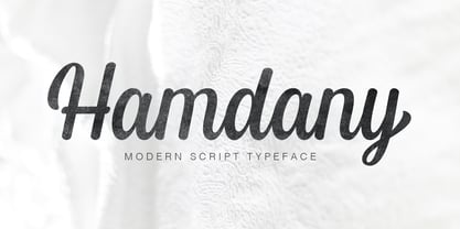 Hamdany is modern script typeface that perfect for photography, branding, signature. It is so beautiful and classy for your projects. This Font has given PUA code (specially coded fonts). So that all the alternate characters can easily be accessed in full by a craftsman or designer.
 - Fragilly by Sarid Ezra,
$15.00 Fragilly is a modern calligraphic font that will make your project more stunning. It comes with cute and quirky vibes. There's also essential ligatures that will you often use! Also comes with multilingual support and PUA encoded! Sent me an email to saridezra@gmail.com for more information!
 - Volante by Hindia Studio,
$12.00 Volante is a gorgeous condensed sans serif typeface that comes with various stylistic alternates and discretionary ligatures. It comes with multiple weights, from thin to heavy, with 3 extra outline styles. This is perfect to sweeten up your headlines, branding visual identity, editorial, poster, and etc.
 - Hadesz BASIC by JOEBOB graphics,
$17.00 Hadesz is a lusty and playful font with a rough, brushy texture. It comes with an abundance of opentype features, which make for the handwritten authenticity one looks for in a handwriting font. Hadesz comes in two versions: Basic (without ligatures) and PRO (the complete set)
 - Hanthem Script by Fargun Studio,
$14.00 Hanthem Script is modern script that perfect for photography, branding, signature. It is so beautiful and classy for your projects. This Font has given PUA code (specially coded fonts). So that all the alternate characters can easily be accessed in full by a craftsman or designer.
 - Frutiger Next Paneuropean by Linotype,
$99.00Frutiger Next is Adrian Frutiger's and Linotype's completely new interpretation of the well known typeface Frutiger released in 2000. For these revised forms, the areas of application are almost limitless. Frutiger Next can be used for anything from office communications to multimedia to complex printed materials. The Frutiger Next family contains small caps, oldstyle figures, and other figure options in every font. Adrian Frutiger's eponymous typeface has been used for decades, everywhere from airport signage to book text to corporate logos to the smallest web graphics. The Italics in the original version of Frutiger were based very closely on the Roman forms; in Frutiger Next, they have been re-designed to be true Italics. - Opal Bulgarian by Context Foundry,
$6.00 Opal Bulgarian is a humanistic sans serif typeface of a modern type, inspired by the famous Optima typeface (designed by Hermann Zapf). Opal Bulgarian consists of 2 weights and corresponding italics. Opal Bulgarian is suitable for body texts; for titles; for corporate identity. Opal Bulgarian continues the design of Opal BulgarianCYR, designed in 1992 by Zhivko Stankulov. In compare to Opal BulgarianCYR the new font family Opal Bulgarian has more glyphs and cover more languages. A number of shortcomings in the construction of the glyphs have been eliminated, and the design as a whole has been updated. Opal Bulgarian is available with active support and upgradeability. Licensees will receive all new versions of the font free of charge.
 - Camden by Geoffrey Lee,
$18.00Camden is based on the types used in Camden's 'Remaines concerning Britaine' published in London in 1638. The object was to avoid the contradiction inherent in most 'distressed' typefaces made to give the effect of the imperfections in old print. This means that apparently worn characters are perfectly repeated throughout a setting. The makeup of the Camden fonts means that, with a little extra keying time, alternate characters may be brought in which overcome this. Also many characters are provided which have 'period identities' such as the long s with ligatures, tied sorts ct, sp and st, swash characters in the italic and the double vv, all of which can add a specific age identity. - Footloose by BA Graphics,
$45.00 Footloose was a work in progress when its original designer, my friend and colleague Bob Alonso, passed away. Back then just 14 lowercase letters were designed so far. Several years have since gone by, but lately I took on the task of developing Bob’s design into a full-fledged font. The distinctive style of his supplied letterforms provided much inspiration. In blocks of short text there is a dynamic that communicates much verve and vigor, owing in part to gracefully curving lines and high contrast of stroke weight. I guess you could say that this project has been a sort of “passing on of the baton”; and I trust that Bob would have been pleased with the outcome.
 - Dip Pen JNL by Jeff Levine,
$29.00 Answer Songs have been around for [probably] just as long as there have been songs. 1917's "If I Catch the Guy Who Wrote Poor Butterfly" was the answer to the 1916 hit "Poor Butterfly" [by Raymond Hubbell and John Golden], which in turn was inspired by the Puccini opera "Madame Butterfly". "Poor Butterfly" was so popular that this "answer" tune had as part of its lyrics "That melody haunts me in my sleep; it seems to creep." Nonetheless, the sheet music for William Jerome and Arthur Green's comic lament had the title hand lettered with an oval nib lettering pen and is now availably as a digital type face called Dip Pen JNL.
 - LCT Sbire by LCT,
$49.00 This Font is born basing itself on several standard typographic models. Inspired by our calligraphic drawings, the idea was to synthesize these many shapes into a unique font that can be used commonly. The slab base has been gradually humanized. The serifs have been carved, refined, rounded off, in order to galvanize the font and ease the task of reading in lower case. The angle of attack of the round letters is an echo of the 15 Century typographic heritage. It was important for us to create an expressive and humanized font, which could also be used for edition. The purpose was to confront the Ancient typographic canon of beauty with some funny and fancyful elements.
 - UNicod Sans by Mostardesign,
$26.00 This font has been especially designed for Mostardesign Studio by Olivier Gourvat. Created in 2010, this font family has been designed to serve sectors like financial services, modern industries, business and many more activities who needs a modern aspect in their communication. Its square proportions make the design very readable at a wide range of sizes. Shapes give the face a unique futuristic look and is a very practical choice for modern headlines, branding, text and web fonts work. The family contains also an alternative set with simplified letters designed especially for text and a unique stylistic set for titles and branding. UNicod Sans is available in 5 weights with corresponding italics and 2 styles.
 - Antariksa by Abo Daniel,
$15.00 Antariksa is a very modern and futuristic, according to the meaning of its name which means "outer space" in Indonesian. Antariksa is great for Signature, logos, branding, advertising, titling, quotes, and more. I've created 2 style alternates, so this product has 3 different styles. You can combine the alternates as you like to make for different combinations. I am also including a Slant version, to give even more possibility. The ending swashes make this product so complete and perfect. The are very easy to access: you only need to add underscore 2x after the lowercase character. For example ( a _ _ ) it will be "a" with ending swash. So, don't hesitate to purchase this product. It is fantastic. Regards, Abo Daniel
 - Egon by TipografiaRamis,
$29.00 Egon is a contemporary Slab-Serif typeface family built in ten styles—extra-light, light, regular, bold and black weights in roman and italic respectably. This is a refreshed (second) edition of Egon Serif, originally designed in 2008. The typeface has been updated—four new styles in ExtraLight and Black weights were added to the family and minor adjustments to glyph shapes (mostly italics) have been made.The typeface is designed with industrial and architectural flavor, as homage to Egon Eiermann, one of Germany’s great architects of 20th century. Egon is ideal as text and display font for publication use. Egon is released as OpenType single master with a Western CP1252 character set.
 - PF Square Sans Pro by Parachute,
$79.00 Designer Panos Vassiliou created Square Sans Pro in his quest for a true square-like text typeface which could balance simplicity with vitality and enhance with its subtle power the identity of any product or service, without compromising its characteristics as a text typeface. The family consists of 12 fonts—from extrablack to thin—including true italics. It supports 19 special OpenType features like small caps, fractions, ordinals, etc. and offers multilingual support for all European languages including Greek and Cyrillic. Finally, every font in this family has been completed with 270 copyright-free symbols, some of which have been proposed by several international organizations for packaging, public areas, environment, transportation, computers, fabric care and urban life.
 - Eixample Villa by Type-Ø-Tones,
$55.00 The Eixample project is inspired by modernist signage of various examples found in the Eixample neighbourhood in Barcelona. The name of each subfamily is related to its location or to specific elements of the original sign. Villa is the abbreviation for Carrer Villarroel (Villarroel Street), where the Villarroel Pharmacy has been displaying this sign since the first quarter of the twentieth century. The Eixample Villa typeface system consists of sturdy letters free of ornaments with an industrial aspect. Only the treatment of the curves borrows modernist features. Like the rest of the families in the Eixample series, Villa shows its origin as a display font, but it has been engineered to give good results at small sizes as well.
 - Neue Haas Grotesk Text by Linotype,
$33.99The original metal Neue Haas Grotesk™ would, in the late 1950s become Helvetica®. But, over the years, Helvetica would move away from its roots. Some of the features that made Neue Haas Grotesk so good were expunged or altered owing to comprimises dictated by technological changes. Christian Schwartz says Neue Haas Grotesk was originally produced for typesetting by hand in a range of sizes from 5 to 72 points, but digital Helvetica has always been one-size-fits-all, which leads to unfortunate compromises."""" Schwartz's digital revival sets the record straight, so to speak. What was lost in Neue Haas Grotesk's transition to the digital Helvetica of today, has been resurrected in this faithful digital revival. The Regular and Bold weights of Helvetica were redesigned for the Linotype machine; those alterations remained when Helvetica was adapted for phototypesetting. During the 1980s, the family was redrawn and released as Neue Helvetica. Schwartz's revival of the original Helvetica, his new Neue Haas Grotesk, comes complete with a number of Max Miedinger's alternates, including a flat-legged R. Eight display weights, from Thin to Black, plus a further three weights drawn specifically for text make this much more than a revival - it's a versatile, well-drawn grot with all the right ingredients. The Thin weight (originally requested by Bloomberg Businessweek) is very fine, very thin indeed, and reveals the true skeleton of these iconic letterforms. Available as a family of OpenType fonts with a very large Pro character set, Neue Haas Grotesk supports most Central European and many Eastern European languages. - Gallos by W Type Foundry,
$25.00 What comes to your mind if I say Architype, Geometric, Gaelic, and Uncial? An impossible combination of features? An unrealistic setup of tastes as weird as your music list? Or some part of a joke told by your favourite comedian? Just chill and stick to the idea that is possible. Gallos combines the conceptual historical elegance of the Uncials with the practical rationalism of the Geometric style. Moreover, this typeface is composed by two sub families: Gallos Uncial and Gallos Architype. The letters “M”, “N”, “W”, “a”, “m”, “n”, “r”, and “w” differ between these two models. The first one is related to both: The Uncial script aspect displaying the leaned “a” with a closed bowl, and the classical geometric style depicting more conventional uppercase and lowercase letters “m” and “n”. The Architype one is inspired by Paul Renner’s Architype model, thus the leaned “a” has an open counter, the “r” is composed by a stem and a dot, and the rest of the mentioned letters were built using square rational features. Both models are connected by classical Uncial features such as the curved stroke “e” and curved shaft “t”, and with Gaelic vibes which can be seen in uppercase and lowercase letters “K” and “X”. Also, the curved descender “g” and “y”, alongside the curved stem “z” connect really well with the rest of the system and provide more uniqueness to the Gallos type family. Without further ado, we say to you: let’s make Uncials popular again!
 - Amerika Pro by CheapProFonts,
$- This is the 200th font released by CheapProFonts, and again I wanted to make something special - so I have chosen to upgrade another well-known font by the infamous Fredrick "Apostrophe" Nader: Amerika! The whole character set for this stylish font has been polished for consistent baseline placement and serif thickness, and proper overshoots has been implemented. All the alternate letterforms (and some new ones) have been included as OpenType alternates AND they have now been made available with accents, too! The Greek and Cyrillic letterforms are properly encoded and kerned. I hope many will enjoy the improvements - and naturally: it is still free! ALL fonts from CheapProFonts have very extensive language support: They contain some unusual diacritic letters (some of which are contained in the Latin Extended-B Unicode block) supporting: Cornish, Filipino (Tagalog), Guarani, Luxembourgian, Malagasy, Romanian, Ulithian and Welsh. They also contain all glyphs in the Latin Extended-A Unicode block (which among others cover the Central European and Baltic areas) supporting: Afrikaans, Belarusian (Lacinka), Bosnian, Catalan, Chichewa, Croatian, Czech, Dutch, Esperanto, Greenlandic, Hungarian, Kashubian, Kurdish (Kurmanji), Latvian, Lithuanian, Maltese, Maori, Polish, Saami (Inari), Saami (North), Serbian (latin), Slovak(ian), Slovene, Sorbian (Lower), Sorbian (Upper), Turkish and Turkmen. And they of course contain all the usual "western" glyphs supporting: Albanian, Basque, Breton, Chamorro, Danish, Estonian, Faroese, Finnish, French, Frisian, Galican, German, Icelandic, Indonesian, Irish (Gaelic), Italian, Northern Sotho, Norwegian, Occitan, Portuguese, Rhaeto-Romance, Sami (Lule), Sami (South), Scots (Gaelic), Spanish, Swedish, Tswana, Walloon and Yapese.
 - Pixelette - Unknown license

- Marfhaus - Unknown license

- Drunk Punk - Unknown license

- Bethlehem Star by HiH,
$10.00 For much of the world, the last half of December encompasses the beginning of winter and the a season of gift-giving, marked by Hanukkah and Christmas. It is generally accepted that the tradition of giving of gifts at this time was begun by The Three Wisemen. As described in The Gospel According to Matthew, the wisemen, led by a star from a distant land to the east, found the baby Jesus. First, they worshipped him and then, "they presented him with gifts: gold, frankincense and myrrh." (Matthew 2:11). Thus began the tradition of celebrating the birth of Christ with the giving of gifts. There is a parallel tradition in the Jewish faith of the giving of gelt or gold at Hanakkuh to help support poor students, in keeping with the rich history of scholarship that is fundamental to the rabbinic system. Inevitably, in our secular culture, there has been a blending and a secularization of these traditions. The reasons have gotton lost in the “gimme.” What is often overlooked is what Paul realized when he told Timothy, “Neglect not the gift that is in thee.” The most importent gift is the gift inside of us, the gift of sacrificial love for others. When we let that gift be diminished in our minds amid the clutter of modern day material seeking, we can recall the prophesy of Micah over 2800 years ago, But thou, Bethlehem Ephratah, though thou be little among the thousands of Judah, yet out of thee shall he come forth unto me that is to be ruler in Israel: whose goings forth have been from of old, from everlasting." (Micah 5:2 KJV) Never underestimate the impact you have on others. Words of kindness can change people’s lives. The Talmud says that the highest form of wisdom is kindness. Be wise this holiday season. The font BETHLEHEM STAR was originally designed for the church to which I belong, The Star Bethlehem Church of Ansonia, Connecticut, USA and is based on the typeface Accent with the permission of URW++ of Hamburg, Germany. You might choose BETHLEHEM STAR for your personal greetings as well as for flyers and programs at your church this holiday season. Like most display fonts, it is most effective at 18 points and larger. Like most script fonts, it is most effective when set with both upper and lower case. All caps with this font is like eating two pieces of pecan pie — too much of a good thing.
 - Lid by One Fonty Day,
$15.00 Lid is a handwritten, versatile typeface. The non-cursive script is uncomplicated, unpretentious and easy to read. The typeface comes in three different styles; Pen, Brush and Marker. Each style has a different touch, but all three styles come together perfectly. Most of the european languages are supported.
 - Oyukis Ghost by Hanoded,
$10.00 Oyuki's Ghost is a scary typeface made with a steel pen and Chinese Ink. The name comes from a painting by Maruyama Okyo (1733–1795), which depicts his mistress who died young. Maruyama Okyo claimed she haunted him in his sleep. The font comes with extensive language support.
 - Zombie Starfish by Hanoded,
$15.00 Ever seen a zombie starfish? No? Well, neither have I. But this font actually comes close! Zombie Starfish, despite its name, is quite a happy cartoon font. It comes in three styles (regular, eroded and dots), plus accompanying italics. Use it for book covers, seafood restaurants or packaging.
 - HGWelles by Just My Type,
$20.00 Designed for a privately-published luxury edition of The Time Machine, HGWelles Ultralight, Regular and Bold are now being made available to the public. This is the Welles of the early 20th century, seeing many of his predictions coming true and anticipating the shape of things yet to come.
 - Affair by Sudtipos,
$99.00 Type designers are crazy people. Not crazy in the sense that they think we are Napoleon, but in the sense that the sky can be falling, wars tearing the world apart, disasters splitting the very ground we walk on, plagues circling continents to pick victims randomly, yet we will still perform our ever optimistic task of making some little spot of the world more appealing to the human eye. We ought to be proud of ourselves, I believe. Optimism is hard to come by these days. Regardless of our own personal reasons for doing what we do, the very thing we do is in itself an act of optimism and belief in the inherent beauty that exists within humanity. As recently as ten years ago, I wouldn't have been able to choose the amazing obscure profession I now have, wouldn't have been able to be humbled by the history that falls into my hands and slides in front of my eyes every day, wouldn't have been able to live and work across previously impenetrable cultural lines as I do now, and wouldn't have been able to raise my glass of Malbeck wine to toast every type designer who was before me, is with me, and will be after me. As recently as ten years ago, I wouldn't have been able to mean these words as I wrote them: It’s a small world. Yes, it is a small world, and a wonderfully complex one too. With so much information drowning our senses by the minute, it has become difficult to find clear meaning in almost anything. Something throughout the day is bound to make us feel even smaller in this small world. Most of us find comfort in a routine. Some of us find extended families. But in the end we are all Eleanor Rigbys, lonely on the inside and waiting for a miracle to come. If a miracle can make the world small, another one can perhaps give us meaning. And sometimes a miracle happens for a split second, then gets buried until a crazy type designer finds it. I was on my honeymoon in New York City when I first stumbled upon the letters that eventually started this Affair. A simple, content tourist walking down the streets formerly unknown to me except through pop music and film references. Browsing the shops of the city that made Bob Dylan, Lou Reed, and a thousand other artists. Trying to chase away the tourist mentality, wondering what it would be like to actually live in the city of a billion tiny lights. Tourists don't go to libraries in foreign cities. So I walked into one. Two hours later I wasn't in New York anymore. I wasn't anywhere substantial. I was the crazy type designer at the apex of insanity. La La Land, alphabet heaven, curves and twirls and loops and swashes, ribbons and bows and naked letters. I'm probably not the very first person on this planet to be seduced into starting an Affair while on his honeymoon, but it is something to tease my better half about once in a while. To this day I can't decide if I actually found the worn book, or if the book itself called for me. Its spine was nothing special, sitting on a shelf, tightly flanked by similar spines on either side. Yet it was the only one I picked off that shelf. And I looked at only one page in it before walking to the photocopier and cheating it with an Argentine coin, since I didn't have the American quarter it wanted. That was the beginning. I am now writing this after the Affair is over. And it was an Affair to remember, to pull a phrase. Right now, long after I have drawn and digitized and tested this alphabet, and long after I saw what some of this generation’s type designers saw in it, I have the luxury to speculate on what Affair really is, what made me begin and finish it, what cultural expressions it has, and so on. But in all honesty it wasn't like that. Much like in my Ministry Script experience, I was a driven man, a lover walking the ledge, an infatuated student following the instructions of his teacher while seeing her as a perfect angel. I am not exaggerating when I say that the letters themselves told me how to extend them. I was exploited by an alphabet, and it felt great. Unlike my experience with Ministry Script, where the objective was to push the technology to its limits, this Affair felt like the most natural and casual sequence of processions in the world – my hand following the grid, the grid following what my hand had already done – a circle of creation contained in one square computer cell, then doing it all over again. By contrast, it was the lousiest feeling in the world when I finally reached the conclusion that the Affair was done. What would I do now? Would any commitment I make from now on constitute a betrayal of these past precious months? I'm largely over all that now, of course. I like to think I'm a better man now because of the experience. Affair is an enormous, intricately calligraphic OpenType font based on a 9x9 photocopy of a page from a 1950s lettering book. In any calligraphic font, the global parameters for developing the characters are usually quite volatile and hard to pin down, but in this case it was particularly difficult because the photocopy was too gray and the letters were of different sizes, very intertwined and scan-impossible. So finishing the first few characters in order to establish the global rhythm was quite a long process, after which the work became a unique soothing, numbing routine by which I will always remember this Affair. The result of all the work, at least to the eyes of this crazy designer, is 1950s American lettering with a very Argentine wrapper. My Affair is infused with the spirit of filete, dulce de leche, yerba mate, and Carlos Gardel. Upon finishing the font I was fortunate enough that a few of my colleagues, great type designers and probably much saner than I am, agreed to show me how they envision my Affair in action. The beauty they showed me makes me feel small and yearn for the world to be even smaller now – at least small enough so that my international colleagues and I can meet and exchange stories over a good parrilla. These people, whose kindness is very deserving of my gratitude, and whose beautiful art is very deserving of your appreciation, are in no particular order: Corey Holms, Mariano Lopez Hiriart, Xavier Dupré, Alejandro Ros, Rebecca Alaccari, Laura Meseguer, Neil Summerour, Eduardo Manso, and the Doma group. You can see how they envisioned using Affair in the section of this booklet entitled A Foreign Affair. The rest of this booklet contains all the obligatory technical details that should come with a font this massive. I hope this Affair can bring you as much peace and satisfaction as it brought me, and I hope it can help your imagination soar like mine did when I was doing my duty for beauty.
 - Tuffy - 100% free

- Kinryu - Unknown license

- Tuffy - 100% free

- The Spring by Sakha Design,
$14.00 The Spring is a romantic and sweet handwritten font. It looks astonishing on love letters, greeting cards, logos, business cards, and every other design which needs a personalized touch. This font is PUA encoded which means you can access all of the glyphs and swashes with ease!
 - Andyou by Sakha Design,
$12.00 Andyou is a lovely and delicate script font that exudes elegance and class. This font was particularly crafted for those who need a beautiful and refreshing look to their designs. Andyou is PUA encoded which means you can access all of the glyphs and swashes with ease!
 - Hello Dark by Andrey Font Design,
$9.00 Hello Dark is a thick-lettered and spooky decorative font. It is perfectly suitable for any Halloween-related project or crafty idea! The only limit is your imagination. Hello Dark is PUA encoded which means you can access all of the amazing glyphs and ligatures with ease!


