8,036 search results
(0.02 seconds)
- Bredston by Uncurve,
$30.00 Bredston is an aesthetic vintage typography font, inspired from the past, elegant signage, gold leaf , sign painting and old label product. Bredston comes with tons of alternates characters to make more eye cacthy . It is suitable for authentic logos, headings, sign painting, posters, letterhead, branding, magazines, album covers, book covers, movies, apparel design, flyers, greeting cards, product packaging, and more. You just combine with the another font like script , serif or san serif font and adding some effect finally BOOM..!! you get a great design for your project.
 - Sho by Linotype,
$29.99Karl Georg Hoefer’s Sho first appeared in 1992 with Linotype-Hell. The font is a part of the package Calligraphy for Print, which also contains Ruling Script and Wiesbaden Swing. Calligraphy for Print 2 completes the set. These packages offer modern calligraphy fonts particularly well-suited to use in posters, magazines and advertisements. Sho distinguishes itself in the extreme contrast between the strokes. A unique characteristic of the font is the way it uses simple round forms in some of its letters, giving it a peppy and playful feel. - HWT Mardell by Hamilton Wood Type Collection,
$24.95 The Hamilton Wood Type & Printing Museum staff is honored to partner with New York-based graphic designer Louise Fili on her first font release project. The new font, “Mardell,” is named for Hamilton retiree and wood type cutter Mardell Doubek. This is the fourth font to be cut for the museum as part of the Wood Type Legacy Project. "The bold, lively angularity of Italian futurist letterforms made it a natural choice for wood type.” says Fili. This digital version presents Fili’s wood type design for use in web and print applications.
 - Astine Sophiya Script by madjack.font,
$13.00 Astine Sophiya Script, a handwritten script font inspired by handwriting with an aesthetic touch. Aliya Script is flexible enough for web and print and can be used in a variety of projects such as stationery, packaging, apparel, wedding stationery, prints, quotes, social media graphics, planners, greeting cards, logos, branding and much more. The script includes a set of uppercase characters, numbers, symbols, two sets of lowercase letters, and ligatures. Complete Set of standard alphabet and punctuation marks Additional set of brushed lowercase endings Handwritten ligature. Thank you so much for checking out my shop!
 - Anicon Sans by NREY,
$19.00 Anicon Sans font family consist of 18 weight: from Thin to Black, each weight paired by italic. Also including Latin & Cyrillic language support with more than 35 languages. Anicon is a superfamily, semi condensed sans serif and slab serif with humanistic forms in the characters. This font was crafted with the intention to present clean, legible, multipurpose characters that are easy to read wether it's on screen or print. Fit for all purposes; text, display, headline, print, corporate identity, logo, branding, product, infographic, photography and other applications and medium.
 - Athelas by TypeTogether,
$65.00 An attempt to go back towards the beauty of fine book printing, inspired in Britain's literary classics. Athelas takes full advantage of the typographic silence, that white space in the margins, between the columns, the lines, the words, the lettershapes and finally, within the characters themselves. It is also intended to take advantage of the great advances and technical developments made in offset printing. Athelas shows its best side in finely crafted book editions and good printing conditions. Athelas has a large character set that covers most of the languages that use the Latin script. Although inspired in British literature, this typeface respects the cultural values behind different languages, where diacritic marks have an utterly important role. Athelas features four weights and about 800 characters per weight, including small caps, discretionary ligatures, fractions, a complete range of numerals for every use and a set of ornaments and arrows.
 - Pobla by Tipo Pèpel,
$22.00 Optimum readability in small bodies with scarce interlining, under poor printing conditions such as in newspapers, where velocity and bad quality’s irregular surface papers, truly distort strokes was the challenge taken. Pobla was designed with this in mind, hence Patau present a hybrid between the conventional strokes of a serif’s classical roman type and markedly “fractured” forms inside, providing a unique personality to this typographic family, where calligraphic’s humanistic axis is visibly broken with the straight axis of the fabricated letters. Subtle details in the serifs, give it a modern look to a classic skeleton. Very pronounced ink traps get the shapes rounded in the printed product to artificially increase the average medium-eye and promote reading in the small sizes it was designed for. An absolutely handwriting look for the italics, where the rupture of the stroke marks a white’s subtle change to only whisper in the printing surface a slight difference, but without fuss and so not to break the rhythm of reading. And as we are used to, a complete set of OpenType features, where you will find small caps, fractions, ligatures, old numerals and tabular, discretionary ligatures and support for 220 languages; and all available in twelve weights to meet the needs of any newspaper printing.
 - Madison Street by Studioways,
$40.00 Madison Street is a font family with 8 fabulously fun typefaces! Eliza Gwendalyn & Jim Lyles of Studioways have teamed up with Spencerian calligrapher Elaina DeBoard to create a classic pointed pen calligraphy font. From its ornamental monograms, to its variety of complimentary text styles, and to its Madison Street Pro, with its elegant stylistic swashes and OpenType goodies, there is a font for every designer. Enjoy the sleek Madison Street Sans, Serif or Script, paired with the Ornaments font, complete with ornate monograms, or use each typeface on its own! Madison Street Pro has all the OpenType bells and whistles. The Ligature feature automatically substitutes beginning and ending letterforms, as well as 100 ligatures. Turn on the Swash feature for elegantly sweeping swash lowercase forms. Enable Stylistic Alternates for even more variations. There are also 10 Style Sets to chose from. And many more OT features! Madison Street is a basic version of the Pro font, intended for users who do not have OpenType savvy applications. Madison Street Stylistic is also a basic version of the Pro font, intended for users who do not have OpenType savvy applications. It has stylistically different ascenders and descenders. Madison Street Swash is intended to be used with the basic fonts, Madison Street and Madison Street Stylistic. It has lowercase beginning and ending swash glyphs and cannot be used to set text by itself. Madison Street Sans, Serif, and Script are text fonts modeled after the handwriting of Elaina. They are intended to be complimentary to any of the script fonts. However, you'll need to set them at a smaller point size (about 1/3 the size) in order to get the preferred scale and weight. Finally, the hairline weight of the Madison Street script fonts is very thin, and at small sizes up to 40 pt, you may notice some breaking up when printing to desktop printers. To remedy this, we recommend outline stroking the text a small amount (.1 -.3 value). this should improve the output without adding to much weight overall.
 - Paralucent by Device,
$39.00 Paralucent is versatile all-purpose modern sans. Available in seven weights, from Thin to Heavy, and in two widths each with corresponding italics, it avoids some of the more eccentric calligraphic quirks of Akzidenz or Helvetica or the cool precision of Univers for an elegant, functional, yet warm design. There are two additions to the core 28-weight family: a three-weight stencil set, and a four weight text family. The text weights have been adjusted for use at small point sizes, and feature more open character shapes, looser inter-letter spacing for improved readability, and lining numerals for use in listings and tables. Several core ideas inform Paralucent’s design. Prime attention has given to the negative space between characters, giving a more even “colour”, especially in text. For example, the J, L and T have shorter arms than comparable sans typefaces, while the M and W are wider. The A has a lower bar, opening up the interior counter. An unusually high lower-case x-height again helps to give a more even colour and improve legibility. Care has been taken to rationalise repeated elements like the tails on lower-case letters, or the Q and the “ear” of the g. Typographic design solutions that are consistent across all these features add more stylistic cohesion. ‘Ink traps’ are exaggerated incisions used to open up a letter's narrower internal angles, which can become clogged with ink, especially in small point sizes. Now largely redundant due to the high quality of modern print, they are still sometimes used as a stylistic quirk or design feature. Now that digital fonts are often reversed or outlined, or enlarged to enormous sizes, these can also lead to unexpected or obtrusive results. Paralucent takes these inevitable digital manipulations into account, and adds optical corrections without resort to ink traps. The family has been picked up by many UK and US publishers, featuring heavily in magazines like Loaded, Heat and TV Quick, as well as high-end coffee-table photography books and gallery websites. A perennial Device bestseller.
 - Caption by Graffiti Fonts,
$19.99As its name suggests Captions is a font created to mimic the small legible bodies of text that often accompany pieces & productions. The letters were originally created with spray paint & rendered solid & smooth. - Strong Passion by Seemly Fonts,
$14.00 Strong Passion is a cool, clean, and simple display font. It will look stunning on any food menu, poster, flyer, or print. Use this font for your designs and explore its endless possibilities.
 - Kenza by Alex Camacho Studio,
$20.00 Kenza is a serif geometric font, which is inspired by letterpress printing. Hand crafted wood letters used in the mid-20th century. It is characterized by being large, bold poster-block movable type.
 - Restoe Iboe by Green Adventure Studio,
$20.00 Restoe Iboe is a quirky and cartoon like display font. It is perfect for headings, flyers, greeting cards, product packaging, book covers, printed quotes, logotype, apparel design, instagram post, album covers, and more.
 - Primitive Tuscan JNL by Jeff Levine,
$29.00 Re-drawn from examples of vintage wood type, Primitive Tuscan JNL captures the essence of early letterpress printing of the 1800s; the styles of which were most closely associated with the Old West.
 - Sunmood by Seemly Fonts,
$12.00 A distinctive display font is called Sunmood. This font looks great on stationary, logos, t-shirts, papers, print designs, website headers, picture frames, flyers, album covers, posters, and image sliders, among other things.
 - Drum by Peliken,
$12.00 Drum - handmade brush display font in grunge style. This font doesn't have lowercase glyphs. That makes it perfect for headlines, design logos, quotes prints on t-shirts, rock festivals. Includes Russian Cyrillic characters.
 - Bedrock by BA Graphics,
$45.00A rock solid face that works well in many of today's applications. Sets extreamly well for both large and small sizes. And with very little morter between the joints sets nice and tight. - Leader Santa by Seemly Fonts,
$12.00 Leader Santa is a brand new display font. Leader Santa is perfectly suited for stationery, t-shirt, paper, print design, website header, photo frame, flyer, music cover, poster, image slider, and much more.
 - Keishue by Rometheme,
$12.00 Keishue is a modern handwritten typeface, beautiful and luxurious. This elegant and beautiful font is stylish and versatile so you can use in a plethora of designs in both digital and print applications.
 - Rockabilly by TypeCase.std,
$17.00Rockabilly is a modern, minimalist serif that works beautifully in modern design pieces, clean lines; serifs are modern, and a little vintage. Looks great in logo work, magazine titles, books and printed materials. - Darkening by Seemly Fonts,
$12.00 Darkening is a brush display font. This font works well for many different things, including stationary, logos, t-shirts, papers, print designs, website headers, picture frames, flyers, album covers, posters, and image sliders.
 - Chevin Eco by G-Type,
$39.00 Chevin Eco is a whimsical display variation on the original Chevin typeface with knocked-out circular holes producing a glitzy neon effect that saves toner when printed. Simultaneously glamorous, green and good fun.
 - Argufy by Ali Hamidi,
$10.00 Argufy is a cool, vintage styled and organic display font. It will look stunning on any food menu, poster flyer or print. Use this font for your designs and explore its endless possibilities.
 - Luruh by Sebeningjingga,
$5.00 Luruh are inspired by the flow of running and melting water. Luruh is guaranteed to make your text stand out - perfect for logos, printed quotes, invitations, cards, product packaging, and headers. Publisher: Sebeningjingga
 - Dot Grid by Essqué Productions,
$35.00 A font that can be used to simulate old dot-matrix style printing, older receipts, or even as marquee light lettering. Includes extended Latin diacritics, Roman Numerals, and Greek, Hebrew, and Cyrillic Alphabets.
 - Lovesome by Seemly Fonts,
$14.00 Lovesome is a brand-new, brushed display font. Lovesome is perfectly suited for stationery, logos, t-shirts, paper, print designs, website headers, photo frames, flyers, music covers, posters, image sliders, and much more.
 - Spirals by Turtle Arts,
$20.00Spirals is a doodle-style font with lots of - you guessed it - spirals! This alphabet looks great printed out big or small. Use this alphabet whenever a playful approach to typography is needed. - Junior Printer JNL by Jeff Levine,
$29.00 The hand-lettered name of the "Junior Showcard Printer" (a 1930s-era rubber stamp printing set manufactured by the Superior Marking Equipment Company of Chicago) served as the prototype for Junior Printer JNL.
 - Ingenue by Seemly Fonts,
$14.00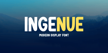 Ingenue is a friendly and simple display font. It is perfectly suited for stationery, logos, t-shirt, paper, print design, website headers, photo frames, flyers, music covers, posters, image sliders, and much more.
 - Conscious Valentine by Seemly Fonts,
$14.00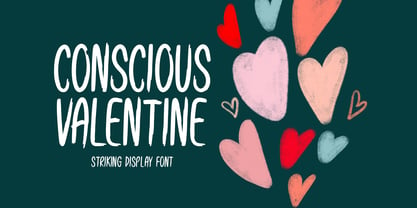 Conscious Valentine is a brushed display font. Conscious Valentine is perfectly suited for stationery, logos, t-shirt, paper, print designs, website headers, photo frames, flyers, music covers, posters, image sliders, and much more.
 - Keep Me by Seemly Fonts,
$12.00 Keep Me is a brand new display font. Keep Me is perfectly suited for stationery, t-shirt, paper, print design, website header, photo frame, flyer, music cover, poster, image slider, and much more.
 - IM FELL FLOWERS 1 - Unknown license

- Abril Titling by TypeTogether,
$35.00 Abril is an extension of the Abril typographic system that was engineered as a response to a very specific requirement from the editorial design community: a low contrast typeface for head- lines. Given its broad range of styles though, Abril deserves to be considered a separate font family on its own. Based on the original text styles of Abril, the letter shapes are sturdy, very legible, and deliver a newsy and trustworthy feel. The accented editorial style of the Scotch Roman finds continuity in this new type family, but some of the details have been ironed out for improved performance in headline, both in print and on screen. The family is conceived as four series of different widths, with four weights in each series plus matching italics, a total of 32 fonts. This wide range of styles allows for setting titles at almost any size. The wider series are aimed for smaller point sizes while the con- densed weights can deliver a striking and cohesive appearance as front cover headlines. Abril was designed as a versatile tool for those graphic and web designers looking for a workhorse with high impact. It is also an excellent companion for the rest of the Abril type family: Abril Titling and Abril Narrow.
 - Mon Nicolette by Sudtipos,
$49.00 This is a digital revival by Cristóbal Henestrosa based on an experimental typeface named Charter, designed – yet never fully accomplished – by the prominent William Addison Dwiggins. It is an upright italic, unconnected script typeface, whose main features are a pronounced contrast, condensed forms and exaggerated ascenders. While Dwiggins worked on this project from 1937 to 1955, he only completed the lowercase and a few other characters. However, it was used to set a specimen in 1942 and a short novel in 1946. The sources that Cristóbal used for Mon Nicolette were the original sketches by WAD as well as printing trails kept at the Boston Public Library, and a copy of the 1946 edition of The Song-Story of Aucassin and Nicolette. This gorgeous typeface can be used successfully in headlines, subheads and short passages of text from 12 points onwards, in applications such as fashion magazines, soft news, advertising, poetry, albums, and book covers. This project started ten years ago, while Cristóbal was studying the Type@Cooper Extended Program at New York City. A previous version was selected to be part of the Biennial Tipos Latinos 2018, and now Mon Nicolette is finally ready for commercial distribution with Sudtipos… and we are very proud of it! Festina lente.
 - Schorel by insigne,
$29.00 Schorel commands the room and sets the audience at ease. This new Scotch Roman typeface from insigne is a confident personality with a tasteful amount of contrast. Cool, sharp, balanced, and contemporary, Schorel not only delivers well in longer texts, but can use its mass to meet the needs of subheadlines, callouts, and other similar projects. Scotch typefaces initially come from Scottish foundries, popular in the United States in the late 18th century. This beautiful genre of type grew in popularity through the Victorian era and most of the 20th century to make regular appearance in books, magazines, newspapers, and advertisements. Schorel itself, with its moderate contrast and organic design, features short ascenders and descenders and calligraphic italics. The design features a few ball terminals, but mostly touts its bracket serifs, which come to a sharp point. The typeface, ideal for medium to large sizes, is useful for both headlines and text, carefully created for both print and screen. This OpenType font supports most Latin-based languages. Schorel has nine weights and a true italic, and many special features such as small caps, fractions, old-style figures, and numerous extras complete each font. It’s every bit a delight to your reader’s eye.
 - Epica Pro by Sudtipos,
$49.00 Epica is a contemporary interpretation of the Venetian Renaissance types. A humanist type family with a contemporary design. This family encompasses different typographic scenarios with emphasis in style and functional equilibrium. Its letterforms show the visual richness of Epica that includes some calligraphic reminiscences perfectly legible in small and display sizes. Its strong personality makes it distinguish, because it perfectly combines the elegance of antique typographies and the forcefulness of contemporary ones. This family has been designed in two different moments. Epica Serif, which have a more classical design, was finished 5 years ago in its first version. The first sketches were drew 8 years ago during the Master of Type Design at the University of Buenos Aires. Through the years was re design in several times to the point of reaching its current version. On the other hand, Epica Sans was completed in 2020 and is the counterpart of Epica Serif. A complementary system designed to enrich the serif version and give new options for hierarchy and composition. This is a versatile type family perfectly fit for books, editorial, and usage in print and on screens. It possesses great legibility in body texts, which makes it ideal for extended reading and supports a variety of languages.
 - Eurotypo Bodoni by Eurotypo,
$48.00 Talking about the numerous types that today bear the name of Giambattista Bodoni are a kind of tribute as much to his reputation as a printer as to his ability as designer and engraver. In fact, all of them tent to be more in the way or style of Bodoni than simply copy of his letterforms. Like many other type designers, we’ve been seduced also to develop our own point of view of his work, nowadays enriched by some features of OpenType format that allows a variety of combinations: standard ligatures, discretional ligatures, stylistic alternates and old styles figures. Whereas the Bodoni serif in the capitals was of the same weight as the thin stroke but joined with a very slight fillet (Bracket) and the lowercase serif were like his French rivals, the Didots, featured straight- edged serifs that were unbracketed. The ascenders and descenders of this new Bodoni are shorter, giving in this way, more space for enlarge x high. Specially designed for editorial design and advertising, can be used in magazines, annual reports and all kind of fine print materials or web pages. The beauty of his letterforms can enrich headlines; this font can also be used as body text for its good legibility and accurate kerning.
 - Wolby by LetterMaker,
$16.00 Wolby is a rough and organic hand drawn typefamily which draws inspiration from a variety of sources such as sign painting, hand lettering, comic books, cartoons, health food, sticks and stones to name a few. The letter shapes were all originally created by writing with a pointed brush. The use of one writing tool results in an aesthetical harmony between the very different styles making them all fit together. The family consists of eight styles; upright and slanted caps in regular and bold, a layered block style in fill, outline and shadow styles and a lively script. Wolby is capapble of creating very different moods depending on which style you choose to highlight. Because of it’s aesthetics, range of styles and extensive language support, Wolby is especially suitable for use in advertising, packaging design and gritty branding & fashion design. When using the layered block styles you’ll get the best result by placing the shadow layer on the bottom, the fill in the middle and the outline layer on top. These can also be combined freely so you can use just shadow + fill, shadow + outline or fill + outline. The script style is armed with a set of ligatures and swash capitals which allow you to supercharge your designs.
 - Wanted Poster Caps - Unknown license

- Our Generation by Seemly Fonts,
$12.00 Our Generation is a brand new handwritten font. Our Generation is perfectly suited for stationery, logos, t-shirt, paper, print design, website header, photo frame, flyer, music cover, poster, image slider, and much more.

